Sugamo Shinkin Bank / Tokyo
With more interest
In a radical shift from its traditional brand identity, Sugamo Shinkin Bank has adopted an innovative and colourful design for its new Niiza branch. It looks more like an art gallery than a bank, and that seems to be having an uplifting impact on both staff and customers.
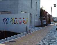
The quiet street is lined with low-rise houses and neatly tiled pavements. But there is one building that stands out in this otherwise ordinary Tokyo suburb: a grey concrete cube with a rainbow splash of colours on its façade. Niiza, a suburban commuter haven around an hour by train from central Tokyo in Saitama prefecture, may seem an unlikely setting for experimental design but this is where Sugamo Shinkin Bank, a Tokyo- and Saitama-based chain founded in 1922, has opened its latest, most innovative branch.
Until now the bank has not been renowned for its creative credentials – its previous 42 branches are far more conventional. But last year, the president, Kazuhisa Tamura, decided to launch an experimental one-off design project. The idea was to create a more lively experience. The new bank features a colourful, fresh brand identity, homely interiors and striking architecture. While there are no plans to roll out the concept across the company, it marks a bold move to break out from the typical, prescriptive blueprints more commonly associated with financial institutions.
On approach, the pared-down exterior bears little resemblance to a bank. The smooth, two-storey, grey concrete building was created by Takeo Igarashi Architectural Office and Ushigome Architects, two Tokyo-based practices behind several earlier Sugamo Shinkin branches. Customers arrive through a discreet entrance on one side of the building, making their way across wooden decking – there’s no ugly plastic in sight. Windows flood the rooms with daylight.


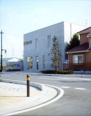
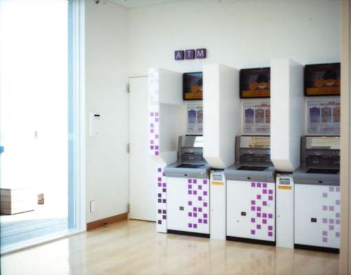
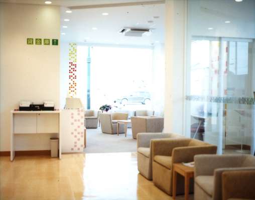

Most eye-catching, however, are the colours. The re-imagined candy-coloured logo – in stark contrast to the firm’s standard royal blue and red one – takes the form of an abstract code of small neat squares, made up of 23 different hues of pinks, yellows, purples and blues. The square colour theme was created by designer Emmanuelle Moureaux (also responsible for the interior design and signage). Inside, there are no confusing signs. Instead, zones are colour-coded: the waiting area is hot pink, the counters are green, the meeting space blue, the ATMs are purple.
“The square shape is central to the concept,” says Moureaux. “A square is somewhere people can gather. It is very compact and it also ties in with the precision associated with financial thinking.” Colour has always played a central theme in the works of Moureaux, a French Tokyo-based designer whose previous creations range from beauty salons to cookery schools. The design was commissioned after bank president Tamura spotted Moureaux’s colourful ABC Cooking Studio in the Tokyo Midtown development. “They wanted a brand new look for a branch, something fresh and different,” she says.
“I have never designed a bank before so it was an interesting challenge. Usually in a bank, you find conventional colours such as red or blue. But in the case of this bank, I had the image of lots of coloured pieces of confetti.”
Yoshiyuki Murakami, a manager at the bank’s general affairs department who oversaw the design of the branch, is proud of the results. “We wanted to create a place where customers could relax. This is a completely different concept from our other branches, which are more traditional. We hope it will attract more young customers.”
What the staff say
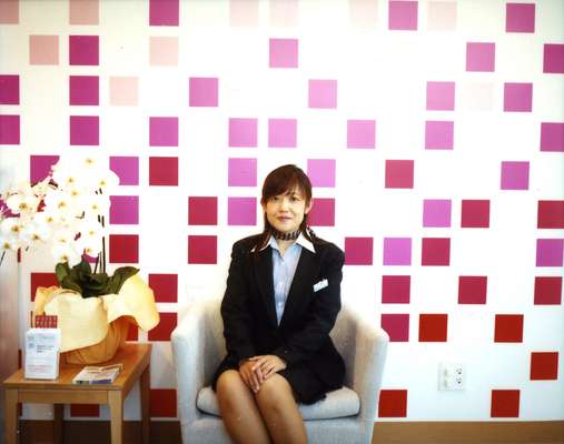
Rie Takanashi, 40
Loan teller, with 22 years’ service at the bank
“Here, it is so quiet. The ceiling is higher and the space is bigger and lighter. It’s a relaxing place to work. People have been coming in off the street just to ask what the building is. It’s caught people’s attention as something a bit different.”
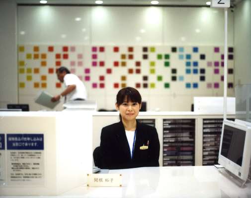
Yuko Sekine, 31
Consultant teller, with the bank since 2001
“My old branch was very traditional and very busy. I was a bit perplexed when I first saw this place as it is so different from what you’d expect from a bank and I was worried about how I would be able to do my job here. But now I enjoy it. I like the fact that I can get to know my customers better and provide better service.”
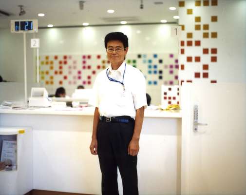
Tatsuya Takahashi, 52
Section chief, has worked at the bank for 29 years
“I moved from the bank’s oldest branch to the bank’s newest branch. I admit I was very surprised when I first saw this bank. It just doesn’t look like a bank. But I like the fact that here the space is very light and bright. I have an uplifting feeling when I come into this place. My previous branch left a heavier impression on people.”
