
Three new branding projects raising the bar for graphic design
Having a strong graphic identity and clear visual language matters for everyone from small design brands and independent restaurants, to whole neighbourhoods. Here are three new, standout projects setting today’s design standard.
1.
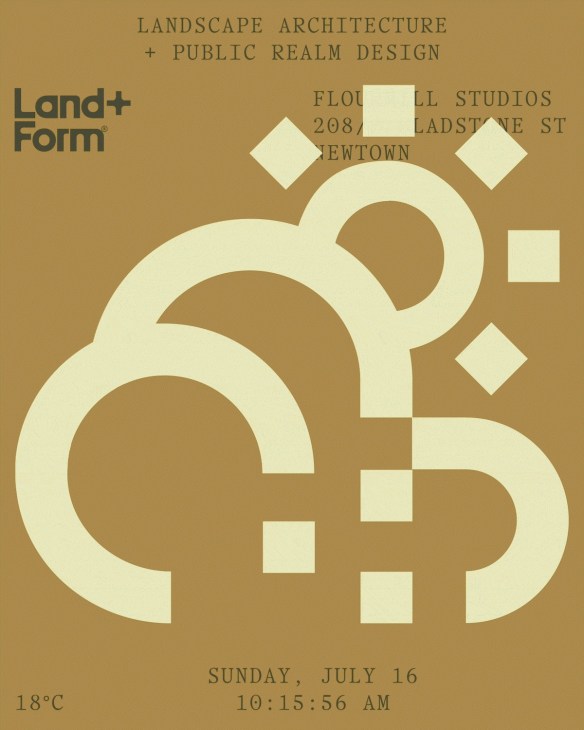
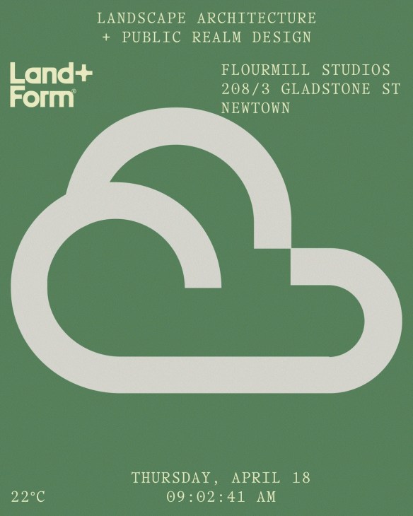
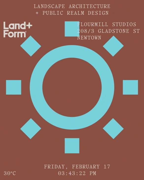
The Studio: Land + Form by Studio Mimu, Australia
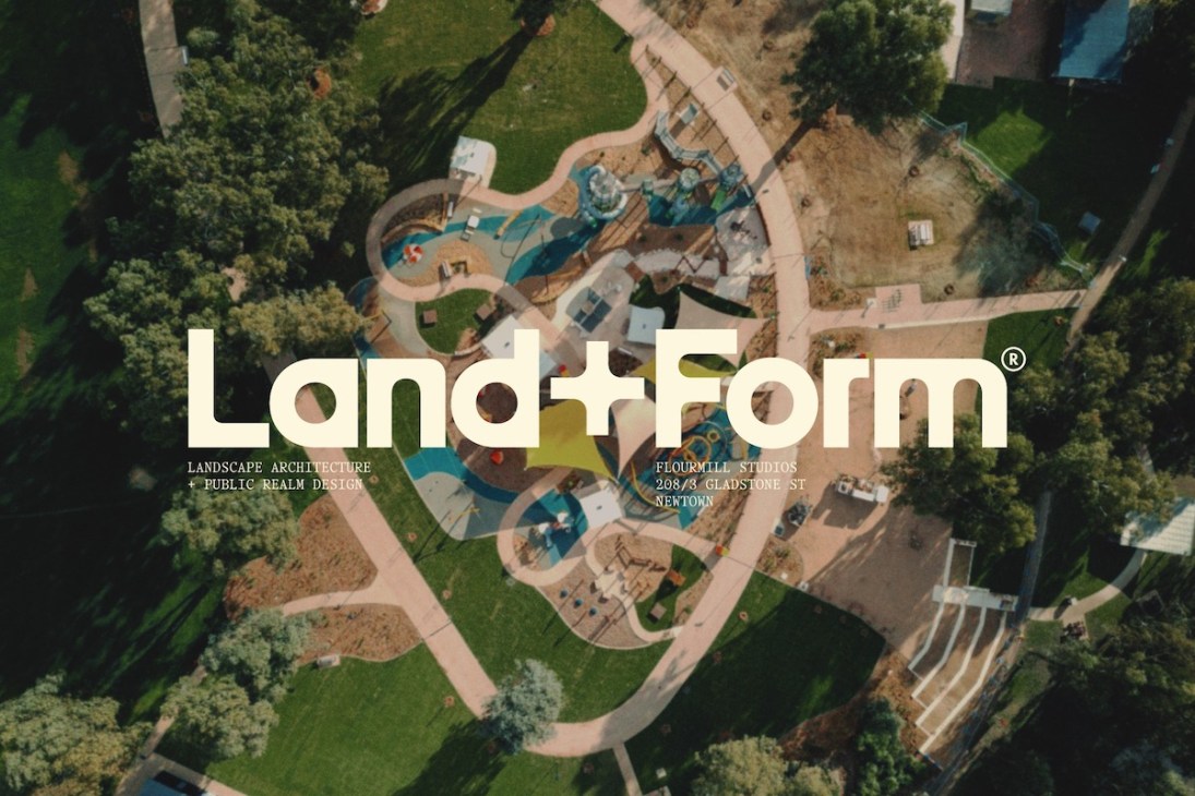
“Landscape architects are seen as the ‘hippies’ of architecture.” This was the feedback given by the team at Sydney-based landscape studio Land + Form to branding specialists Studio Mimu. The latter had been charged with delivering a new identity to the former and, rather than seeing this countercultural feedback as a bad thing, the creative team saw it as an opportunity. “We knew that this was a great jumping off point for creating something that emphasised nature over ego,” says Mike Souvanthalisith, who co-founded Studio Mimu with Muriel Ann Ricafrente.
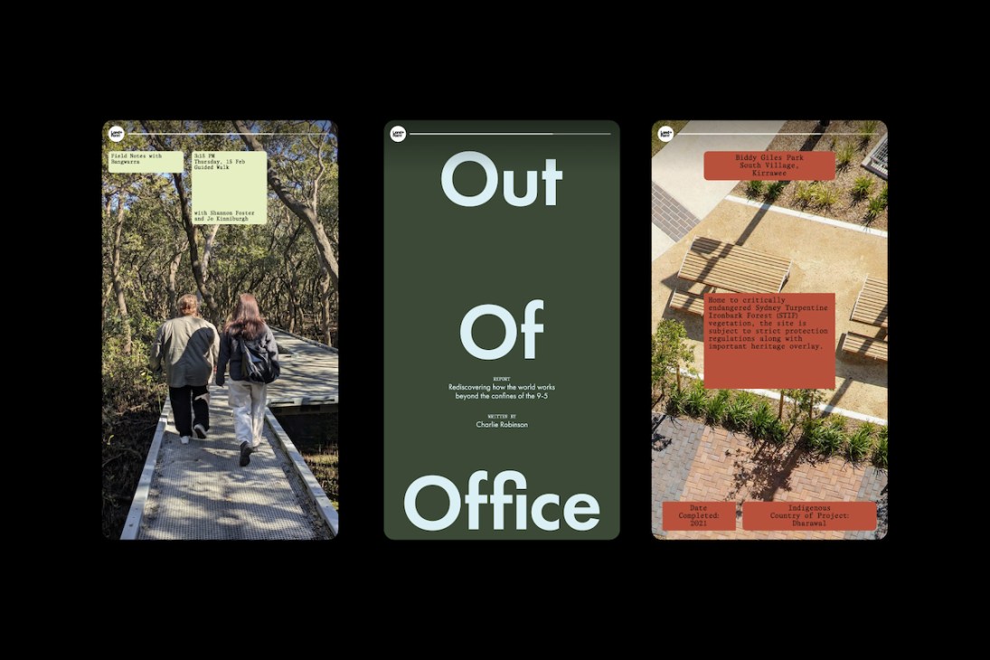
The resulting identity, brand guidelines and website design features an earthy suite of colours that draw inspiration from native Australian landscapes – plus a new logo, created by cutting a custom version of the “Reform” typeface from digital foundry Source Type. “The pairing of chamfered shapes and sharp corners [on the logo] was inspired by the team’s philosophy around creating harmony between people, place and country,” says Ricafrente. Hippies, sure – but certainly ones with good taste.
2.
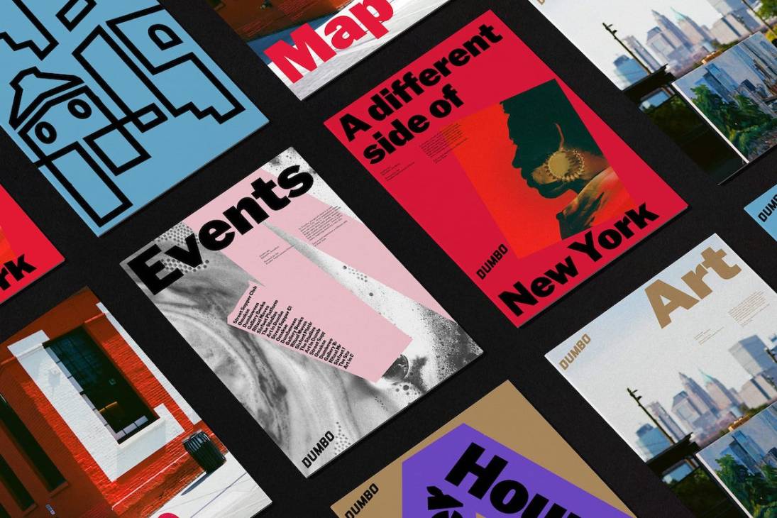
The neighbourhood: Dumbo by DNCO, US
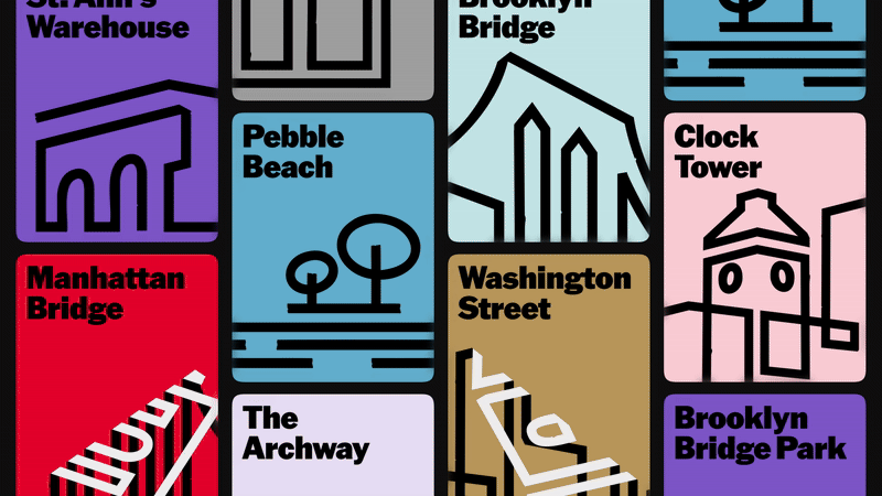
How do you capture the essence of an entire neighbourhood? This was the challenge faced by London and New York-based branding agency DNCO when rethinking the visual identity for Brooklyn’s Dumbo district. “The challenge was to reassert Dumbo’s character – not as a backdrop but as a bold, layered and forward-thinking neighbourhood,” says Luis Mendoza, DNCO’s managing director for North America. “For us, it starts with deeply understanding the place. Dumbo, home to our New York studio, is full of contradictions: industrial and imaginative, historic and future-facing, polished and rough around the edges. You don’t brand that with a single logo or slogan. You build a system that can hold all of that tension and express it dynamically.”
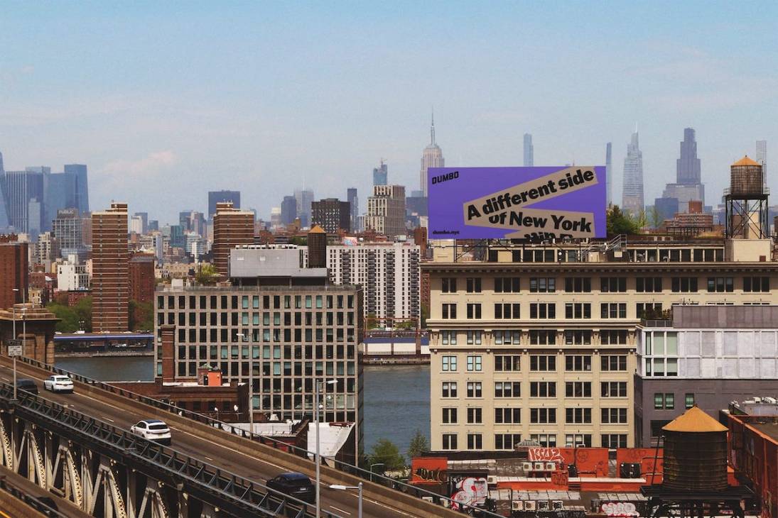
Keeping the original logo for continuity, DNCO created a graphic-tape motif, inspired by the humble cardboard box, which was invented in the area. The tape visual directs the eye, adds movement and makes for a satisfying piece of motion design as the logo is pulled away. It’s a crafty nod to local history. A chunky sans-serif typeface sits on bold, bright colours and the result looks simple yet refined. “We never wanted the identity to feel sterile or over-worked,” adds Mendoza. The new design is in use across a range of communications, from civic planning and social media to street signage and cultural programming. Playful and versatile, the rebrand successfully represents Dumbo as, in Mendoza’s own words, “a different side to New York”.
3.
The restaurant: Primo Posto by Panglossian Studio, Hong Kong
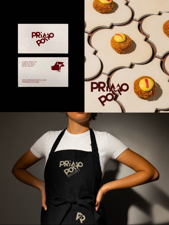
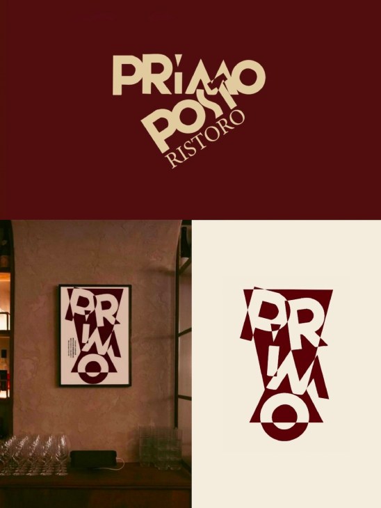
Those looking for a slice of Milanese hospitality in Hong Kong’s Sheung Wan neighbourhood would do well to stop by the trattoria Primo Posto (First Place). Beyond serving beloved classics such as cotoletta alla Milanese and riso al salto, the ristoro boasts a vibrant new graphic identity by Shenzhen, Hong Kong and Venice-based Panglossian Studio. Drawing inspiration from Italian futurism, particularly painter Fortunato Depero’s bold, rhythmic visuals, the new branding is dynamic, active and playful. Case in point is a “P” logo defined by overlaid linework and a palette of contrasting yet harmonious tones.
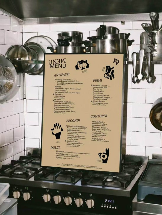
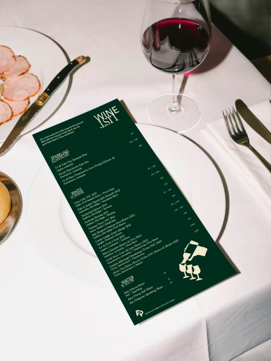
Depero’s influence can also be seen in the illustrations of classic Italian hand gestures, which are cleverly woven into everything from the menus to the wine list. “The gestures are a playful nod to the clichés that people often associate with the Milanese. It’s a way to make guests smile, to have a point of connection with something familiar,” says Sara Biancaccio, Panglossian Studio’s Milan-born co-founder. “These motions are then elevated through a graphic system inspired by Depero’s striking visual language. The result is a brand that’s rhythmic, expressive and full of character; something that invites curiosity and connection rather than simply replicating tradition.”
wearepanglossian.com