
What Japanese design can teach us about decent communication
A new London exhibition explores how clever visual design – from Olympic pictograms to global fonts – helps us communicate better across borders, cultures and even political divides.
How we communicate with each other matters. In a global era defined by petty partisan politics – where the US is divided along lines red and blue, and similar fractures appear worldwide – dialogue has never been more important. At the risk of seeming nostalgic, there was a time when Australia’s prime minister and opposition leader would sit down for a glass of scotch together at the end of a working day – a sign of civility in the face of conflict. Perhaps then we need to look to the past for inspiration. Or, better yet, to the universal language of signs and symbols.
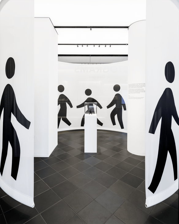
A new exhibition at Japan House London, Pictograms: Iconic Japanese Designs, explores how visual symbols convey information across cultural boundaries. Think of the universal exit sign with its green background and running figure or the simple symbols that denote toilets worldwide. These graphics, called pictograms, create visual language that transcends linguistic barriers and breaks down cultural divides. The exhibition traces these symbols’ history, including the pioneering work of Otto Neurath. Following the First World War, Neurath and his wife, Marie, developed a system that translated complex data into simple visual symbols, helping displaced people to navigate unfamiliar cities without understanding the local language. The showcase also highlights Japanese designer Tanaka Ikko, whose team created pictograms for the 1964 Tokyo Olympics. Unlike previous Games, which relied on multilingual signage, Tokyo became the first Olympics where symbols could be read by everyone, regardless of their native tongue.
Today similar principles drive typography across different scripts. US foundry Sharp Type has developed fonts that allow disparate writing systems – Latin, Arabic, Japanese and others – to appear graphically harmonious while remaining true to their origins. Meanwhile, designers Ian Party, Pascal Zoghbi and the studio Swiss Typefaces created Zeyn, a contemporary Arabic and Latin font that sacrifices neither script for the other.
Could this exhibition and these typographic examples present a framework for better human communication? Good pictograms and typefaces work across cultures by tapping into shared human experiences and recognisable forms, regardless of where we are in the world. Similarly, effective communication finds common reference points – shared values, experiences or concerns that transcend political or cultural divides. Perhaps this is why Sharp Type’s bespoke font is being used for corporate communications across the globe and why pictograms have been universally adopted. All of this begs the question: what’s the pictogram for a couple glasses of scotch shared between political adversaries?
Nic Monisse is Monocle’s design editor. ‘Pictograms: Iconic Japanese Designs’ at Japan House London runs until 9 November 2025.
Read next: The Monocle City Guide to Tokyo, featuring the best hotels, restaurants and retail spots in the Japanese capital