Just your type - Issue 110 - Magazine | Monocle
/

thumbnail text

Most daring design

Yukiko, Berlin

17318-2092-gebhart_de_koekkoek-5a5cd36a83f1b_1.jpg

Berlin design studio Yukiko’s first foray into editorial design was Flaneur magazine, launched in 2013. It won acclaim not only thanks to its proposition (each issue covers one street in a different city) but for its daring feel. “Flaneur is what it is because we didn’t know what we were doing at the beginning,” says Yukiko co-founder Michelle Phillips. “Not knowing how the structure of a magazine works gave us a different take on how someone should read a magazine.” Five years later, Yukiko is firmly established as an editorial design studio. Besides Flaneur and new magazine Sofa, Yukiko designs and art directs Berlin fashion magazine Sleek, women’s magazine Libertine, the German newspaper Die Zeit’s children’s magazine Leo, as well as several more artistic zines.

“I always think the next magazine we do will be super classic,” Phillips says. “We never do it. It just doesn’t make sense when I’m faced with this juicy content that’s all about ‘now’.” This focus on urgent timeliness is how magazine design differs profoundly from books, which Yukiko does a lot of these days. “A magazine should be of its time and a book should transcend that.”

Top mascot

NHK, Tokyo

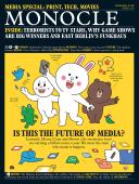
The Japanese affinity for mascots doesn’t skip the media world and while dogs such as Fuji TV’s “Laugh-chan” and Nikkan Kogyo Shimbun newspaper’s “Monotan” are cute and approachable, our top pick goes to a mascot of a little less discernibility. Public broadcaster Nippon Hoso Kyokai (nhk) has “Domo-kun”, an imaginary being, square in shape with a large mouth and covered in short hair. There is no animal like him on the planet and the ubiquity of his design plays into nhk’s role as an independent public media brand for everyone. According to nhk, Domo is a hugely communicative Japanese word used to express “hello”, “goodbye” and “thank you” all at the same time. Domo-kun, therefore, has plenty of responsibility on his square shoulders but thankfully his popularity has led to nhk introducing a full mascot family to join him. His posse includes rabbit grandpa “Usaji” and weasel girl “Ta-chan”. Aside from a Domo-kun animation television show that reaches 170 countries this busy mascot has a dedicated website, “Domo-kun Museum”, that spells out all the details and history about him and his group of his friends.

Bravest new face

La Repubblica, Milan

6b0a4199-5a5cca26a3b74.jpg

Since its inception in 1976, Rome-based newspaper La Repubblica has stood out on newsstands with its Berliner format, use of colour and preference for hard news. Now the paper is again betting on the beauty of print through a comprehensive redesign.

La Repubblica has gone from six to five columns on its page grid and introduced a new font, Eugenio. Created by award-winning graphic studio Commercial Type, its name pays homage to the newspaper’s founder Eugenio Scalfari and is a fresh take on the classic Bodoni font previously favoured by the paper. “We wanted something contemporary that was more legible,” says deputy art director Francesco Franchi. “If you look at the ‘O’, there is now more white space.” Long-time subscribers have welcomed the new look. “Readers in their sixties and seventies love it,” adds Franchi. “They say they don’t need their glasses as much to read smaller print.”

The layout uses less colour and favours a vertical reading style, with a column at the edge of each page announcing the section. Franchi uses graphic icons to draw the eye, with symbols for everything from economic topics to Italian cities.

Favourite format

Le Un, Paris

monocle-issue-110-19901_adj-5a5ccab50f2bc.jpg

Le Un covers just one subject in depth. Its colourful format combines cartoons, illustration, infographics (and a good dash of humour) with writing from a broad church of experts. Scientists opine alongside poets, artists, sociologists, filmmakers and journalists. It’s an approach designed to interrogate the news and allow a true understanding of one grand question from the French national state of emergency to the environment.

Using a design and visual identity developed by the graphic impressario Antoine Ricardou, its pages are made up of large folded sheets which start as an A4 offering and expand to a tabloid, broadsheet and then to giant poster “roadmap”.

With each format, the editorial approach shifts. Publishing director Eric Fottorino says the first A4 page is sensitive, emotional and literary while the large poster spread “is an invitation to travel to a place where the imagination and the rational come together”. The result is a beautiful, clever, tactile and philosophical refuge from conventional news reporting.

Q&A

Thomas Kartsolis

Süddeutsche Zeitun

Munich

From a spaghetti-splattered face of Austrian artist Erwin Wurm on its cover to outlandish fashion editorials, the art direction of Thomas Kartsolis in the German weekend newspaper magazine continues to shock and inspire.

How would you describe Süddeutsche Zeitung Magazin’s design?
It’s an attempt to surprise with an idea that’s not totally conforming. We can afford to do things that are outside the box or only interesting at second glance. Since it doesn’t have to be sold at newsstands, we’re free to experiment with the cover. Typography is more so-so since it’s a weekly magazine and you can’t spend a lot of time on pages. It has to function. But we try to introduce variety.

And you always surprise people.
Sometimes you have an idea and have to wait for the right story to execute it. Once we printed just a phone number on the cover. It was for an interview about curiosity. When people called it, an editor would tell them about the story. But we’d had the idea before. Sometimes you have to build the story afterwards.

Most characterful cover

Cleo, Bangkok

monocle-issue-110-19906-5a5ccd840e0cf.jpg

As an up-and-coming design capital, the art direction of Bangkok’s print media continues to impress us. Our favourite Thai cover this year comes courtesy of teen read Cleo. Rather than taking safe bets to cater to its youthful audience, it continues to surprise in its art direction (bombastic colours, zany typography and weird cover lines). Its July and November covers are a homage to 1980s fashion – influenced by TV’s nostalgic return to the style best seen in Stranger Things.

Best editorial crossover

Offshore Studio, Zürich

offshore_hkb_augumented_realit-5a5cce312933c.jpg

Editorially speaking, too often what makes a good read is translated poorly to a digital format by media brands. Offshore Studio in Zürich is known for the fastidious attention to design in their print editorial work, which includes celebrated independent title Migrant Journal. Lately they have been applying this same level of attention to delivering strong editorial content online. The trick, they say, is to look at digital as a new medium altogether and apply the best storytelling process to it.

“A media researcher once said it takes 30 years for one media format coming out of the other to emancipate itself and find its own language,” says Christoph Miler, who founded the firm with Isabel Seiffert in 2016. “Now it’s online emancipating itself from books and magazines.”

For a recent digital publication for the Centre for Fine Arts in Brussels, Offshore took an experimental approach with great effect. Part of this includes commissioning artists to form a “gif collection”. “In the digital space you have to open up to all of these formats – sound, vision – and use these strengths,” says Seiffert.

Most handsome HQ

Snøhetta, Paris

te_snohetta_le_monde_mg_8371_l-5a5ccedf74928.jpg

Winning an international competition to design the new headquarters of French newspaper Le Monde was only the first challenge Norway’s Snøhetta faced in a process that will result in the opening of one of the world’s smartest new media buildings in 2018. We speak to senior architect Frank Denis Foray.

What was the brief?
They wanted to create an important building in the centre of Paris. As a news organisation Le Monde need to be at the right place at the right time, so they can move fast when something happens. It was first about the site location and then about how the building interacts with the city.

How did you form a design that the public would appreciate?
The building, being a bridge form, creates a public forum. Here we can have a dialogue with people rather than simply broadcasting an idea to them through the design. The bottom of the arch, for example, features a programmable grid of led lights, which is much better than a big TV screen. It can still be used to create messages but in an abstract way. It complements the public plaza rather than becoming its focal point.

The shape of the building must have caused some difficulties, structurally?
We also had the complexity of the site sitting on top of a train station. It was a challenge technically of course, but the way we tackle a brief like this is by working with scaled down models. It’s essential. Gathered around the models with the team and talking and thinking about the design, you see the problems and the solutions much more clearly.

Ripest re-launch

Olive magazine, Tokyo

For young Japanese women studying at universities and entering the workforce in the 1980s and 1990s, Olive was a must-read. Launched in 1982 by publisher Magazine House, the biweekly gave readers a taste of culture that was far from Japan’s mainstream. In a stylish manner the title breezily explained French films and featured everything from European café culture to Tokyo’s Shibuya-kei music scene of the 1990s. The magazine’s run ended in 2000 and an attempt at a makeover a few years later flopped.

Takahiro Kinoshita, editor-in-chief of lifestyle and culture monthly Popeye (who successfully turned this title’s fortunes around), now wants to make a case for an Olive revival. In December 2017, Kinoshita’s editorial team tested the waters with an 84-page version of Olive as an insert to Popeye’s January issue.

A big focus of the revamp was the design, which take cues from the eclecticism of story styles from contemporary Popeye and blends in pure nostalgia from 1980s heyday Olive. In keeping with tradition Kinoshita and Popeye’s art director Akinobu Maeda used the same font and Olive Oyl character on the debut issue of the original on an eye-catching cover.

In a country with more than 3,600 magazine titles and a sector that’s crowded with the likes of &Premium, Ku:nel and Nylon Japan, attracting readers won’t be easy. But we are thrilled Kinoshita is making an effort to put the Magazine for City Girls back on newsstands, where it belongs.

Top media design resource

‘The Outline’, New York

It’s the question on every straight-thinking media player’s mind: just what is the correct digital model? And while many online outlets have gone the way of garish bells-and-whistles and hyperbolic click-bait, The Outline has gone the opposite direction.

“I didn’t want to spend my time at a place where you just have to crack out content,” says founder Josh Topolsky, leaning back in a chair at The Outline’s Manhattan base. But it’s not just about the insightful copy (“Why pundits are wrong on Democrats and immigration” or “Bitcoin is none of the things it was supposed to be” being two recent headlines) – it’s also a thing of beauty.

The colour scheme undoubtedly skews towards youth but the design is also highly considered. Topolsky, who had worked for Vox and Bloomberg prior to starting The Outline, invested a chunk of the start-up money in building bespoke software that allows the team to generate easily replicable and aesthetically pleasing illustrations (a retouched or filtered photo overlaid with smart typography, for example). And that’s where French design director Stéphane Elbaz steps in. His job, in his own words, is “finding a connection between the content and design” and that means using his own illustration skills and sometimes his famed typography (also used by the Élysée Palace, no less).

Even the adverts haven’t been skimped on. “We’re interested in a certain set of advertisers who want to spend thoughtful dollars,” says Topolsky. And that means The Outline – which was initially built for mobile – has beautifully crafted paid space that both blends with the rest of the site and works as a “digital magazine ad”. Indeed, from its articles – around five a day are produced – to its looks, The Outline taps up that growing set of consumers tired of the empty noise. Hats off.

Share on:

X

Facebook

LinkedIn

LINE

Email

Go back: Contents
Next:

Entertaining

/

sign in to monocle

new to monocle?

Subscriptions start from £120.

Subscribe now

Loading...

/

15

15

Live
Monocle Radio

00:0001:00

  • The Pacific Shift