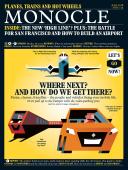
Architecture - Issue 114 - Magazine | Monocle
/

thumbnail text

Studio profile

Fearon hay — Auckland

Tim Hay and Jeff Fearon talk about their Auckland-based architecture practice in chapters. Chapter one began in their mid-twenties when designing second homes near the beach. Subsequent chapters, written over the course of 20 years, have brought the practice closer to its city milieu, at home and overseas: restaurants and heritage repurposing in Auckland, a hotel in Taiwan and a mixed-use office and retail project in Hong Kong.

Both men have lost count of which chapter they are on today but placemaking has also become part of the story. The rookie property developers acquired an old bulk-store warehouse for their new studio in Parnell that opened in 2016. The addition of a bar, restaurant, tailor and roastery on the site has breathed new life into a largely forgotten neighbourhood, where grass had started to grow on the pavement. “The joke when Jeff and I moved to this side of town, against the flow, was, ‘Who stole all the children?’” says Hay, who now looks out on a lively street scene full of young people.

A small team of fewer than 20 designers belies the studio’s output and speaks to its dna. The two directors work on the design process for every project. “A lot of the design happens verbally,” says Fearon. “We always carry a pencil because we are always in conversation and the words between us start describing how things might develop.”

Is there a definitive building yet? “No, we are just starting,” joke the Kiwi pair in unison while standing at one of the studio’s high tables, which they use to promote conversation and movement. Fearon is proud that people recognise their style but he is at a loss to describe it. “There’s no device or silhouette or motif that is distinctively us. Lots of people have tried to put it into a sentence but we don’t want to be limited.”
fearonhay.com

Notable projects:

1.
The Imperial Buildings, Auckland

Creating a new laneway through a turn of the 20th-century building in downtown Auckland put the studio on the hospitality map.

2.
Bishop Selwyn Chapel, Auckland

This award-winning community building with a gilded ceiling manages to shine in the shadows of a huge cathedral and church. Clean lines and glass walls place the Lord’s house in Fearon Hay’s canon.

3.
Yat Fu Lane, Hong Kong
Fearon Hay created a three-storey retail and office space, inserting a signature spiral staircase to connect each of the floors. Light now floods into the open-plan spaces.

Q&A

David Quincoces

Quincoces-Dragò & Partners

Milan

Madrid-born David Lopez Quincoces moved to Milan to study interior design and never left. His firm, Quincoces-Dragò & Partners, is known for slender reinterpretations of mid-century styles.

How many chairs do you design each year?
I design a lot more than the ones I eventually produce.

Let’s talk about one that was produced: the Vigo lounge chair for Potocco.
I started from a simple sketch, thinking about the lines and curves of the object. I worked around the concept that I was applying to Loom, another piece in the Potocco collection, working with a light structure and the thin line that is the leather. The balance of metal and leather creates the piece.

A lot of your furniture pieces have very slender legs.
Steel allows you to work in a graphic way, to give lightness to the object. Normally in the mid-century they used to work with solid wooden legs, so it was a continuation of the furniture itself and gave it some kind of solidity. In this case, my idea was to make the design lighter.
quincocesdrago.com

Potential for growth

Sydney

Australian property developer Lendlease is aiming to start a nationwide timber boom after the success of its seven-storey International House Sydney. Cross-laminated timber (clt) from Austria was used due to its relevance to the site where wooden warehouses once stood. The glass and timber façade is impressing the city’s designers, and Jonathan Evans, director of Tzannes, an architecture firm, says clt could be produced at home: “Sydney is not going to be a full timber city but we’ll see more of it.”
tzannes.com.au

Small wonders

by Nolan Giles

It was as flamboyant and flabbergasting an event as ever but this year’s Milan Design Week turned its outlook towards a smaller realm. Properties in cities are getting pricier, living is getting cosier and even top-tier furniture brands are taking cues from functionality master Ikea when thinking about design for the shrinking home. Yet the big plays in the small arena were lacklustre. At least I thought so until I veered my glance away from the meek pastel pinks and greens – the theme colours of newer compact creations – and toward the showrooms of Italy’s mainstay furniture companies.

Though the work of these legacy brands tends to promote plushness over practicality, the Italians are still addressing the emerging cosy market, just in a more considered manner. Rather than launching new pieces in trend-driven colours and shapes that will soon date they are delving deep into the archive and reissuing works for the smaller home from a bygone era. Lombardy’s Cassina is betting on a gap in the market for its masterful re-edition of student dormitory furniture designed in 1959 by Charlotte Perriand and Le Corbusier for Paris’s Maison du Brésil. Another reissue of triangular tables from Perriand in timber is shaped to squeeze into even the snuggest of corners. Older Danish brands such as Gubi also impressed by reintroducing Marcel Gascoin’s C Chair, which was designed for small French homes springing up in the wake of the Second World War.

As we learn in our look at the relaunch of pedway paths in London (see Design - Sky walkers, in this issue), there’s plenty of room in contemporary design for history. The world might be changing but it’s not time to throw out the rule book on what makes good design just yet.

Let’s fix: Palace of Culture and Science

Warsaw

The problem:
The Stalinist Palace of Culture and Science, completed in 1955, towers over Warsaw as a de facto symbol of the city. The building itself has architectural value, its façades are decorated with socialist realist statues and inside are a cinema, museums, theatres, offices, cafés and bars. A gift from the ussr, the palace draws mixed feelings from Poles, with some seeing it as an ugly reminder of the communist past.

What went wrong?
The tower has its place in Warsaw’s urban fabric but the square around it needs a fix. Near the central metro and railway stations, it’s a stopover for first-time visitors but its ugly, overgrown carpark means that it’s not a place to linger.

Monocle fix:
The carpark needs a green focus: a park would provide better air quality for the polluted city. “The Palace of Culture is a heavy building; a green park would show Warsaw’s welcoming, open nature. Developers shouldn’t build up every centimetre of the city,” says Jan Spiewak of the Free City Warsaw Association.

Child benefits  

Lancy, Switzerland

When thinking up a nursery, making room for an outdoor playground is as important as designing great classrooms. That’s why Geneva-based architecture studio Lacroix Chessex made sure the interior and exterior spaces of this nursery in the Swiss town of Lancy were well balanced in terms of size. Cladding the school’s façade and the playing area’s floor in timber has created a seamless continuity between the two areas, in addition to giving the structure a sense of welcoming warmth. By sinking the playground slightly below ground level and surrounding it with a continuous bench, the architects have defined a space that feels protected but not enclosed.
lacroixchessex.ch

Share on:

X

Facebook

LinkedIn

LINE

Email

Go back: Contents
Next:

Expo

/

sign in to monocle

new to monocle?

Subscriptions start from £120.

Subscribe now

Loading...

/

15

15

Live
Monocle Radio

00:0001:00

  • Monocle on Design