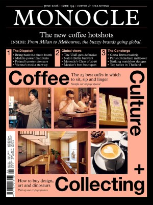
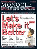
Get the look - Issue 118 - Magazine | Monocle
/

thumbnail text

From a neat set of fonts and a colour scheme to an entire visual identity across numerous platforms, the business of branding has mutated over the past few decades. And as it embraces ever more technology, it has become increasingly difficult for entrepreneurs in need of help to get up to speed with the torrent of content being produced. Is the internet leading to uniformity? And what will the future look like as branding agencies compete for clients? Time to find out.


1

Naomi Hirabayashi

Founder, Plug-in Graphic, Tokyo

From her sunny three-person studio in Tokyo’s Aoyama neighbourhood, brand designer Naomi Hirabayashi has created identities for a seemingly endless list of clients. She is in demand thanks to her crisp graphics that cut through stereotypes of gender and nationality, allowing products as diverse as magazines, cosmetics and kimonos to stand out on a crowded shelf.

“I’m a details person,” she says, laughing. “Some might say I’m difficult but I prefer to say that I’m particular.” Her dream assignment is when she can do the whole job, from coming up with a name to creating the brand identity. “That way I can control the whole process.” She got to do just that with Guntu, a luxury wooden boat hotel that takes guests around Japan’s Inland Sea, and with Y & Sons, a young kimono brand that was founded by the scion of old Tokyo brand Yamato.

Even if she doesn’t like the name of a product she just gets on with it (“That’s part of the job”). Indeed, Hirabayashi’s studio, Plug-in Graphic, has an impressively varied client list that includes Muji and fashion brand Arts & Science via Japan Tobacco; she was also art director of Ginza, one of Japan’s biggest fashion magazines, for three years, although she says the fast pace didn’t always suit her perfectionist tendencies.

Graphic designers, she says, used to just be conduits for clients’ wishes; now there is more of a dialogue. Hirabayashi is at a stage where she can skip the ad company in the middle and speak directly to the clients. “One of the most important things is matching the branding to the value of the product,” she says. There’s no point in masking a cheap product with expensive-looking branding. She points to the redesign she gave to a budget laundry soap called Utamaro, which has been around since 1957. Hirayabashi gave it a suitably unpretentious makeover that wouldn’t alienate the core customer.

Hirabayashi also shows the branding she designed for Three, a high-end Japanese skincare brand which prides itself on the quality of its ingredients. Instead of creating ostentatious graphics and fancy packaging, Hirabayashi went in the opposite direction, using recycled cardboard boxes and simple designs that announce the ingredient list on the front of the box. The result is a product that shows its status but in an intelligent, understated way. “This brand is about purity and the branding reflects that,” she says. The eco-conscious shopper is also comforted by the packaging, “particularly since the box gets thrown away the minute you open it”.

For a Japanese graphic designer there are issues that English-speaking counterparts rarely face. “Many Japanese people don’t understand English well – the letters look like symbols. Half the time people don’t care about the meaning of the words, they just like the way the letters look.” She recently redesigned the brand book for Japanese fashion firm United Arrows. “Ninety-five per cent of readers are Japanese yet the brand was sending out something entirely in English.” She switched to Japanese, making it more useful to a buyer or journalist and turning it into a thing of hieroglyphic beauty for non-Japanese speakers.

Although products are viewed on multiple platforms these days, Hirabayashi doesn’t see the core principles of branding changing. “If I think about old Japanese hyakkaten [department stores], they were already designing logos and making packaging that suited the products’ values, and thinking how to attract customers, 200 year ago.”
plug-in.co.uk

Hirabayashi’s brand picks:

1.
United Nations
The design of the UN emblem was based on a projection of the world from the North Pole, encircled by crossed olive branches. The United Nations blue – representing peace – was chosen in 1945. “The UN brand is so strong that someone can simply put a blue cover on a helmet and you still know it’s the UN,” says Hirabayashi.

2.
Munich Olympics, 1972

Otl Aicher produced an Olympic design classic and gave the Games its first mascot (Waldi the dachshund). “The design is flawless but more than that, the colours and font were calculated to work in situations that weren’t even related to sport, such as parking tickets.”

3.
Lufthansa redesign

The German Airline refreshed its corporate identity and livery earlier this year in collaboration with Munich studio Martin et Karczinski. “The redesign is so subtle that it might not be obvious to the average person, but as designers we appreciate the precision.”

2

Emmett Shine

Founder and executive creative director, Gin Lane Media, New York

It started as a neat trick to gain respect from prospective clients: give his small enterprise the official-sounding title of Gin Lane Media (named after a street near where he grew up on Long Island). At the time Emmett Shine had dropped out of studying photography to launch a T-shirt and skateboard company, which led to working for a range of arts-world clients providing what he calls “creative services”, from website design to photography. He soon combined these facets into full-range branding work.

Shine’s agency has sought work with young companies who are shaking up their respective industries, from Sweetgreen salad chain to Harry’s razors via Jaja tequila and Hims, a recent New York subway favourite that sells products tackling male health-and-beauty taboos.

Is branding now all about guiding consumers through an experience?
We try to think about brands as if they’ve come to life and you engage with them in a conversational manner. The website now is just one part of that. A brand becomes a persona or a personality; it becomes an avatar. What is the personality of that brand? Is it cheeky? Is it sophisticated? Is it witty? Would it dress in slacks? Would it dress in formal trousers? Would it show up to work late and be a wonderful presence or would it be prompt? The more human brands are, the more they have to hold themselves accountable – and the more people will buy into them.

What advice would you give to entrepreneurs who are branding or rebranding a business?
Go out and speak to as many people as possible. Have actual phone calls and actually get coffees. Sit down and listen to people for whatever area or market you’re thinking about moving into. And don’t make a solution and look for a problem; once you find a pain point, you can build a solution around it.

How have clients’ demands changed over the years?
In the beginning people would ask us for “outputs”: build up a website; come up with a campaign for us; do some design work for this. It then transitioned to doing more brand work for digital. And now we’ve got to: “Can you design the heart and soul of my business, as well as how my business communicates to the outside world across all touch points?”

What’s your prediction for the future?
In the past year and a half we’ve been seeing this notion of “personalisation”, rather than “personal”. To build a personalised experience is a lot harder: you have to know more information about me, specifically about what I’m looking for and to be able to serve me with either products or services that match what I’m seeking.
ginlane.com


3

Adrian Shaughnessy

Graphic designer and lecturer, London

Alongside teaching at the Royal College of Art in London, Shaughnessy is a self-trained graphic designer who co-founded design practice Intro in 1989 before leaving in 2004 to pursue a career in writing and lecturing. In 2005 he published a design handbook for aspiring graphic artists called How to be a Graphic Designer Without Losing Your Soul, which has sold some 80,000 copies. His recent research project on FHK Henrion looks at the graphic designer’s career and advocacy of the television as the medium to define modern visual culture, something his students are now grappling with in the rapidly changing online age. On top of lecturing, Shaughnessy’s current project is independent publishing venture Unit Editions, which he co-founded in 2010, producing books for designers and students.

Is visual communication changing?
Yes and the reason is digital. It’s changed the way the public views and regards visual communication; it’s changed the way practitioners deliver it; and it’s opened up many new possibilities, most of which are very exciting. A lot of communication is electronic, meaning it can be animated, fluid and highly mobile. If I were to counter that with a slightly more jaundiced view, I think clients have latched onto the idea of “branding” and, because we’ve moved on from what was known as identity design to branding design, there’s a tendency for clients to take much more ownership over the production of it.

I think that’s resulted in a change of terrain: you have cases of bad design that are actually good branding. The Virgin logo is an example: in pure design terms it is pretty ghastly but in branding terms it is an absolute smash hit.

If design isn’t applicable to branding nowadays, how do you brand?
Everyone wants branding to do much more than just be an identifier and I think that’s distorted the playing field. If you apply the principles of design – clarity or appropriateness – you will get better results. A way to think about this is to take famous brands and look at the description of what their intention is; they are pretty much interchangeable.

Is it true that a lot of brands seem to draw from the same playbook?
Very much so. Having the courage to break out of that will reap the best results though. Take a stand! Saying that, you still need to think about function and the need to create something that stays in the memory. Think about the icons on your phone. There are some that you’ll remember without any hesitation and some of them you won’t remember at all. Icon design is a really good way of refining and honing a mark or a symbol that stays in the memory.

Students these days are exposed to so much visual material online. How does this inform designs?
It leads to a uniformity, particularly on a global scale. You go to Japan or Seattle and it’s all the same. I just got back from Russia and I went to a shopping mall. I realised architecturally, typographically, retail-design wise, I could have been anywhere in the world.

What trends in branding will we see?
For me, the next big change in design and advertising is artificial intelligence. There are people doing it already – and I think we are close to clients being able to sit at their computer and create their own branding.
uniteditions.com  

Shaughnessy’s brand picks:

1.
Bata Shoes
Although the design has changed four times since the company’s foundation in 1894, the Bata Shoes logo still has its quirky charm. “I like the way the logo was used on the company’s Essex factory roof,” says Shaughnessy. “For me it passes the T-shirt test: would I wear a T-shirt with this logo on it? Absolutely.”

2.
Bauhaus-Archiv

Designed by Pentagram partner Sascha Lobe, the Bauhaus-Archiv branding campaign aims to give the new Berlin museum a memorable but historically considerate aesthetic. “It is intelligent and endlessly variable without becoming confusing, and works across numerous platforms.”

3.
Strelka Institute

The branding for this Moscow project was designed by the UK’s OK-RM, which also created its in-house digital-first publisher of design and architecture, Strelka Press. “A brilliant modular brand identity. It deals well with the need to be bilingual and functions in two and three dimensions.”

4

Emily Heyward

Co-founder and chief strategist, Red Antler, New York

Brooklyn-based branding agency Red Antler has become a go-to stop for new companies in search of identities. But when Emily Heyward co-founded the firm in 2007, the rise of direct-to-consumer brands was still a far-off reality. The explosion of e-commerce was in its early days but what Heyward and partners JB Osborne and Simon Endres saw was a growing number of New York-based entrepreneurs and start-ups. They also saw that these new businesses rarely dedicated much of their time or brain power to developing their brand, failing to recognise what the trio of advertising veterans already knew: an attractive visual identity and well-articulated brand narrative are essential to standing out in a crowded marketplace.

Red Antler was born to fill the void and it has done just that, finding success with the likes of mattress powerhouse Casper – which was valued at $750m last year – and the sustainable shoe-maker Allbirds. Heyward tells us where the industry is headed and how to keep brands fresh and engaging.

Are the principles of branding the same across newer mediums or has it become a different game these days?
One of the key differences is that you need to be present and embedded in so many more places. But the principles of brand-building are somewhat timeless: have a clear idea of the story you want to tell and then apply that everywhere you show up. But the consumer is going to get bored if you’re showing up the exact same way on Instagram as you are on your website. You’ve got to find a way have one voice but with a lot of nuance and surprise built into it.

In an increasingly crowded marketplace, is articulating the core idea behind a brand of increasing importance?
Now you’ll have three businesses launching at the same time selling the same thing, so it’s much more important to figure out an emotional hook. How are you going to get people to fall in love out of the gate before your competition wins over that audience? You need to make sure you’re being clear about the problem that you’re solving for people on not just a functional level but on an emotional level. How can you build a brand that speaks to an emotional truth that connects with people long term? Starting with strategy and making sure that you’ve got a unique idea is what leads to fresh work.

How should entrepreneurs be thinking about branding their start-ups to ensure that they stay ahead of the competition?
Brand is a living and breathing thing; it needs to constantly evolve. That doesn’t mean you need to change your logo but the experience around the core identity needs to stay fresh. [Eyewear brand] Warby Parker is the gold standard. It has continued to execute flawlessly, and it keeps pushing what its brand is, but always with a very clear commitment to what the brand is all about.

Where do you see the industry heading over the course of the next few years?
I don’t think that you can survive in the 2020s by being a company that just focuses on a logo, a set of typefaces and a few colours. That’s just not how brands live in the world these days.
redantler.com

Heyward’s brand picks:

1.
Warby Parker
Since the direct-to-consumer eyewear brand launched in 2010 its identity, designed by Brooklyn-based agency High Tide, has evolved. “It has continued to execute not only flawlessly but with surprise,” says Heyward.

2.
OkCupid, ‘DTF’ campaign

From industry mainstay Wieden + Kennedy, this playful outdoor campaign is a refreshing approach to dating in an era where it’s been reduced to little more than swiping on a smartphone. “When all the dating apps launched, OkCupid lost some of its relevance. But the new campaign reintroduced it in a way that felt bold and like a new take on the category.”

3.
Good American

The LA-based denim and clothing label’s identity and narrative are defined by a modern approach to femininity and fashion. Its online shop even allows shoppers to change models for different body types. “You need to think about your digital experience, advertising, packaging, social and video content all as one thing.”

Share on:

X

Facebook

LinkedIn

LINE

Email

Go back: Contents
Next:

Culture

/

sign in to monocle

new to monocle?

Subscriptions start from £120.

Subscribe now

Loading...

/

15

15

Live
Monocle Radio

00:0001:00

  • Monocle Weekends