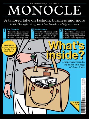
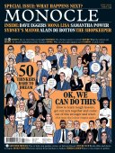
4. Seeing is believing - Issue 134 - Magazine | Monocle
/

thumbnail text

Trying to get an editorial designer to explain the importance of infographics can be an impossible task. To Francesco Franchi, deputy creative director of Italian newspaper La Repubblica, the appeal is obvious. “Well, it’s the power of visualisation; it’s important to use different languages,” he says. “Think about the impact of the chart on the front page of the New York Times showing the number of unemployment claims. The final column took up the whole page, from the bottom all the way to the masthead. It might look like a simple line but it gives you, at a glance, an idea of the scale of what’s happening. An image can speak louder than words.”

He has a point. By now, most people will recognise the so-called “flattening the curve” chart, with its clear message: how many lives will these two lines have helped to save? Franchi thinks that graphs might have contributed to shifting people’s behaviour. “Images are immediate,” he says. “It’s like when you see illustrations to explain emergency procedures on a flight – or a road sign. Seeing a curve rising on a graph generates more fear than just reading a number. It’s like teaching things to a child with an illustrated textbook as opposed to just saying them out loud. That’s always been the power of infographics but right now we notice it more because we crave explanations.”

Readers’ expectations and a renewed interest in seeing the visualisation of data might have ramifications for news outlets and lead to more frequent one-off designs. “People’s willingness to see things of this kind could change the way they look at newspapers,” says Franchi. “Editorial teams used to believe that making special editions took a lot of effort. Now many realise that all you need is to have an idea and a story to tell.”

The opportunity to radically rethink the role and format of a newspaper, however disruptive and economically challenging the current times might be, provides fertile ground for creative directors. “This is a very interesting time for a designer who works in this field,” says Franchi. “They can try to create something different from what they’re used to – something that has cut-through.” Many titles have experimented with dashboards and interactive maps – some more elaborate and colourful than others. For Franchi, in a situation like this pandemic – when the data is uncompromisingly ugly – clarity remains king. “The message of many line graphs is so strong that you don’t really need to add any aesthetic element; the line speaks for itself.”

As for papers that have created such things as tongue-and-cheek illustrated guides to making your own mask, Franchi believes that it’s all a matter of context. Irony only fits with opinion or comment pieces; there’s something reassuring about “representing making a mask as though it were a DIY project – to pass the time”.

Yet, Franchi says, the biggest lesson that papers will have to learn from the pandemic goes beyond pushing the boundaries of imagery. “It’s a time to study, read and learn how we can start again,” he says. “After coronavirus, newspapers will have to change.” With profits dented and an older readership getting to grips with digital, many will be tempted to concentrate their efforts online. But this is an important moment for print too, he says – an occasion to redefine its role, turning into a high-quality, concentrated version of what the newspaper was before. “Let’s go to print to increase our quality,” he says. “Print is becoming the new media.” 


About the interviewee: Before joining La Repubblica, Franchi made his name designing infographics for IL, a smart supplement of newspaper Il Sole 24 Ore.

Share on:

X

Facebook

LinkedIn

LINE

Email

Go back: Contents
Next:

Expo

/

sign in to monocle

new to monocle?

Subscriptions start from £120.

Subscribe now

Loading...

/

15

15

Live
Monocle Radio

00:0001:00

  • Global Music