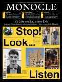
Making a mark - Issue 147 - Magazine | Monocle
/

thumbnail text

The challenge

It sounds simple but get it wrong and you’ll only be making a bad impression. The task at hand? To come up with a good logo for your fledgling business, or perhaps refresh its design after your brand has been plodding along nicely but unremarkably for 20 years.

In some ways this challenge is easier than it used to be. In the digital age, businesses have more means of communication to lean on than ever before, meaning that a logo is only one part of an ever-expanding identity. But a logo still has the power to provoke an emotional reaction in someone, whether it’s amusement, an impression of authority or simply a subliminal sense of trust. The best logos communicate a company’s vital essence without trying to do too much. Their power of association is vital but they don’t try to oversell. Remember: as much as a logo is there to help, it needs to be built on solid foundations. So a symbol isn’t worth anything if it isn’t backed up by a company that is invested in excellence or has a top product to sell.

We speak to five experts about what constitutes a successful logo and asked them to talk about the designs that most inspire them.

147_2_b_business-school.jpg
2147_2_b_business-school.jpg

Lance Wyman

Now in his eighties, New York-based Wyman is best known for his much-admired logo for the Mexico 1968 Olympic Games. But he has also worked on symbols for everything from the Mexico City metro system to the moose logo at Minnesota Zoo. 

“A good logo has a meaning attached to it that vibes in a positive way. Form is one thing but it has to communicate something that catches you. The analogy that strikes me is: there’s a good joke and there’s a bad joke. With a bad joke, no matter how much explaining you do, it’s not going to get good – and the same is true of logos. If the intended message isn’t there, it isn’t there. So there is a certain obvious quality that has to be present. Once you know the obvious and can transform it, you’re normally on pretty fertile ground for recognition and communication. Sometimes the obvious isn’t so ‘seeable’ and you have to make it visible.

If a picture is worth a thousand words then maybe an icon is worth a thousand pictures because a lot can be contained in a visual mark. Don’t try to say too much, though; it can mean a lot without saying it. The bottom line hasn’t changed for logos. The periods we go through represent styles rather than meaning.”

CBS: “An early logo using the eye for visual communication. It’s such a powerful, understandable form. The strength of the communication was in the way it was used.”

Bass ale: “The foresight of using a simple logo – a red triangle – to represent the product, had power. Having a simple mark probably influenced everything after that.”


Maurus Fraser

Fraser began his career in New York at creative agency Nice, where he led design operations for Elizabeth Arden and Valentino. On returning to Europe, he set up the London outpost of i-d Media. In 2001 he joined monocle’s sister organisation, Winkreative, to lead the creative team.

“You want a logo to be distinctive; to stand out from the competition. Some brands convince themselves that they don’t have any competitors but you need to be aware of what others are doing. Sometimes you might like a service or a product but perhaps the logo is letting it down. A logo is the first impression, which still has huge meaning although today’s logos can lean on other elements: they might be animated; they might be haptic.

Brands used to rely heavily on their logo to define themselves and there were some incredibly clever ideas that made you think of the service or product on multiple positive levels. There was the cbc [Canadian Broadcasting Corporation] logo that made you think of global communication, or the cbs eye, which evoked a sense of seeing and absorbing the world from a new perspective. There is a conceptual complexity there but the ideas have been simplified and made accessible. Be careful with your symbolism, though; you don’t want to patronise your audience. But people do enjoy a sense of discovery in a logo.”

Kia: “This redesign is trying to be a word and a symbol. The letters are in there and it’s a nod to the Hyundai mother-brand identity. You can see motion and progression. It’s a symbol that stands out and there’s some purpose; it feels like an upgrade.”


3147_2_b_business-school.jpg

Marina Willer

London-based Willer is a partner at design consultancy Pentagram. She was previously lead creative director at Wolff Olins brand agency. She has worked on the visual identities of clients including Rolls-Royce, Beeline telecommunications in Russia and London’s Southbank Centre. 

“When we look at a logo we try to find iconic ideas. But I’m also aware that the most powerful identities of our times are often less about a symbol and more about open systems with which people can engage in different ways, largely because of the prevalence of digital. People expect to engage more and it’s less of a one-way dialogue than it was before. But there’s also something about the best of the heritage logos: a weight, a glamour and even an idiosyncratic gesture.

Recently at Pentagram we have been working on more open systems that can change easily. You can also see that with the likes of Google, which is always making a big effort to alter its logo. The power of simplicity is really important because a logo can’t communicate many ideas at the same time; it has to focus on one point of view that it wants to express. Whether it’s a system or a symbol, if you try to express too many messages at the same time then you will end up just confusing everyone.”

National Rail, UK: “This is a logo that you can draw on a napkin and you will always remember it. There’s a simplicity to it.”

Woolmark: “This is for the real beauty of it. You keep looking at the positive and the negative and the logo just draws you in.”

Radek Wojcik

Wojcik, an Australian, is the creative director of Made Thought, a London-based branding agency with clients including Paul Smith and  the Museum of Modern Art in New York. 

“Embedded narrative results in a good, memorable mark that stands the test of time. It’s behind the success of many iconic logos. Apple is the obvious example because, yes, it’s big, it’s recognisable. But it carries weight because of the stories associated with it: the logo is said to nod to Alan Turing, the computing pioneer who ended his life with the bite of a poison apple.

Logos need to communicate a whole culture. When I see the concentric lines and circles of the Mexico 1968 Olympic logo, it doesn’t just evoke the 1960s, it represents the country’s indigenous art. It’s an intrinsic representation of Mexico. And this is important: a logo needs to be a beautiful bridge, a metaphor, a pure representation of a brand’s values.”

Stüssy: “This captures 1980s California. The surf and skate culture of the time and place is locked into it.”

SBS: “This TV channel brought news to Australians who came from all over the world. The logo is a projection of the world, expressing the story of Australia.”

Loewe: “This heritage mark has been very nicely modernised. It can be embroidered, stamped onto leather or worked into a buckle.”

Tony Brook

Since co-founding London-based design studio Spin in 1992, Yorkshireman Brook has picked up a spate of awards for work that has spanned print, digital and television. 

“The first logo that I have chosen, British Steel’s, is the first that I was consciously aware of. I would have been seven or eight when I saw it and it stuck with me all through college and after. It was an incredibly powerful and memorable mark and you got the impression that it really said something about steel. Visually it’s memorable too. It has the seed of an idea within it and it has some purity of expression. This is what logos are about for me – they need to have gravity. And if they’re beautiful too, they’re easier to like.

A good logo should also be something you can scribble onto an exercise book at school. It needs to be repeatable and expressive, and to have that element of brevity that makes it truly memorable.”

British Steel: “It just has a lovely contrast in the harshness and the clipped shape of the steel. Designer and artist David Gentleman was inspired by pieces of bent metal. That gives it an extra level of interest.”

London Electricity Board: “This is by fhk Henrion, the grandad of identity design. It’s sparky and active, with such a strong identity.”

Randstad: “I couldn’t tell you about the concept behind it but it looks new to this day.”

Share on:

X

Facebook

LinkedIn

LINE

Email

Go back: Contents
Next:

Inventory and Expo: Where to go, buy and eat

/

sign in to monocle

new to monocle?

Subscriptions start from £120.

Subscribe now

Loading...

/

15

15

Live
Monocle Radio

00:0001:00

  • The Stack