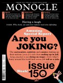
Funny business - Issue 150 - Magazine | Monocle
/

thumbnail text

For graphic designers, creating work that is funny is rarely part of their brief. The industry floods social-media channels with profile-raising work that’s supposed to push boundaries and provoke a client and audience’s imagination by “interrogating the brief” (as art directors tend to preach). So surely injecting some humour into a project might evoke surprise and make a campaign more memorable? Or maybe not. “Graphic designers are mostly men who take themselves too seriously,” says one (female) graphic designer when asked why so few projects are laugh-out-loud funny or even designed to raise a smile.

To dispel the notion that a lack of design humour is entirely down to men being boring, it’s worth noting that, actually, graphic designers are not predominantly male. The gender ratio, according to US industry bodies, is about 60 per cent female to 40 per cent male. But the scales are tipped in favour of the boys when looking at holders of the top jobs in the field. Perhaps the biggest problem is that adding humour into the creative equation today often comes at too big a risk.

ddb-dolye-dane-bernbach-du-sseldorf-de-1974-the-french-hav_1.jpg
anonym-de-usa-um-1975-big-cargo-problems-make-us-smile-l_1.jpg

Lufthansa
Otl Aicher, Germany
1974-1975

It’s fair to say that art directors got away with more cheekiness back in the day but that’s not to say that everything they created was crass. The compelling campaigns and witty copywriting that went into the marketing of German national carrier Lufthansa defined the brand against its competitors in the 1970s. It’s noteworthy for bold typography, clean graphics and willingness to make fun of itself – and its home nation.

“Historically, the best design was ideas-based and clever but a lot of that is gone; humour is gone,” says Rob Duncan, a UK-born, San Francisco-based creative director with global firm Mucho. He credits witty London designers of the 1960s and 1970s, such as Alan Fletcher and Bob Gill, co-founders of the now-global firm Pentagram, for producing the daring type of design we don’t see enough of these days and that still inspires his own output.

For Duncan, good design is visual work featuring “a brilliant idea that is amazingly crafted”. This might once have been executed with a provocative tagline, a cheeky image or an illustration poking fun at the audience. But these are now rarities. “We live in a society where we need to be careful with what we say in the office so we don’t offend anybody,” he says. “How can you create work that surprises or even shocks?”

Duncan jokes that his design team is the only one on America’s west coast – a place where technology brands with soulless visual identities tend to thrive – that strives for smiles whenever possible in its work. A case in point is its concept for Piedmont Art Walk, where a “funny little character”, a cute mascot made up of the letters A, R and T, marches merrily across outdoor advertising and event signage. “It’s always about raising that smile but raising it to certain degrees depending on the audience,” says Duncan. “For our recent rebrand of Visa, even though they’re a very corporate, serious company, we saw the opportunity for an intelligent and clever solution, where the wit was about making people say ‘aha’, not making them laugh out loud.”

“Even though the title was talking about sexual subjects to its audience, the editors still had a problem showing a naked person or a penis, so I had to sneak them in there”

For German graphic designer Mirko Borsche, who is founder of Munich-based studio Bureau Borsche and one of the world’s top names in creative branding with a client list that includes Balenciaga and Inter Milan football team, funniness is synonymous with intelligence. “Humour is one of the most intelligent ways to communicate,” says Borsche. “If you think about classic Pixar films, they use this kind of ‘in-between’ humour to make both kids and adults laugh; it’s extremely clever.” Borsche is known for the humour in his design output, though not all of it is family friendly. He recalls a time when he and one of his interns planted numerous hidden jokes – and doodles of penises – into youth magazine Jetzt, a title that his firm was producing for German newspaper Süddeutsche Zeitung. Names of illustrators making reference to a certain part of the male anatomy were invented and snuck into the publication too. “Even though the title was talking about sexual subjects to its audience, the editors still had a problem showing a naked person or a penis,” he says.

ko-ln_2_1.jpg

Schauspiel Köln
Herburg Weiland, Germany
2021

Sometimes big, bold typography is all a designer needs to command people’s attention and simultaneously raise a smile. This simple message from the Schauspiel Köln theatre had all the more impact during a pandemic, when kissing in public became a touch more taboo.

Lemonland Media Lab
Bureau Borsche, Germany
2018

20180522_lemonland_presentation-7-copy.jpg
20180522_lemonland_presentation-9-copy.jpg
20180522_lemonland_presentation-10-copy.jpg
20180522_lemonland_presentation-11-copy.jpg
20180522_lemonland_presentation-16-copy.jpg
20180522_lemonland_presentation-23-copy.jpg

This illustrated campaign for Luxembourg’s Lemonland Media Lab by Bureau Borsche doesn’t just reference the citrus fruit in question across the tongue-in-cheek campaign. Look closely and you’ll see that each of the characters’ legs is a letter L, in a reference to the company’s name.

While magazine work allows Borsche some room for pushing the humour envelope, he says that injecting laughs into commercial projects is trickier. “Humour is very subjective,” he says. “And you’re always walking a very fine line when you’re using it.” The designer counts a project for Luxembourg publisher Lemonland Media Lab as an example of how funny graphics can not only create persuasive advertising but also positively affect the client’s company culture. Bureau Borsche’s campaign used illustrations of fruit characters, including a lemon, making bad jokes to one another. “The work helped the new company to determine its tone of voice, which allowed them to think and act in a more humorous direction with their clients and with each other,” says Borsche.

While it’s easier for an acclaimed designer to go toe to toe with an editor or to win over a client by drawing on humour, for those entering the industry, banking on being funny is tough. “Humour is something so personal,” says Meret Mächler, a final-year student at Zürich’s University of the Arts and a practising graphic designer. “So it’s difficult to apply it to design and hope that everyone laughs along with you.”

Piedmont Art Walk
Mucho, USA
2021

Understanding the audience is key in selecting the right tone for the execution of any graphic design. For a family event such as the Piedmont Art Walk, Mucho knew that it could have a bit of fun with the art direction. With this in mind, the studio came up with this smart and simply designed mascot that conveyed a message while raising a smile at the same time.

img_1579.jpeg
14-mucho-piedmont-art-walk-vertical-banners.jpg
03-mucho-piedmont-art-walk-tote-bag.jpg

Filmpodium

Meret Mächler, Switzerland
2020

Designed for Filmpodium, an arthouse cinema in Zürich, this clever poster design was created by student Meret Mächler while she was studying at Zürich University of the Arts. Plastered with laughter, the striking design was used to draw attention to a French comedy-film festival.

Last year, works displayed on Zürich’s famous poster boards provided laughs – literally – thanks to a competition she won to promote a French comedy film festival through witty graphic design. In a cool orange, the text “ah ah” (apparently the French equivalent of “ha ha”) was repeated en masse across posters filling these billboards. It was a simple solution that quickly lightened the mood of passersby while drawing interest in what all this laughing text was promoting.

“The work helped the new company to determine its tone of voice, which allowed them to think and act in a more humorous direction with their clients”

Mächler says that she is becoming more comfortable projecting a sense of humour – a trait that she values in herself – into her work. She also sees a bigger opportunity for her generation to design with jest at the core of its output. “Irony might be the phenomenon of my generation of designers,” she says. “At least, this is what I am experiencing among my peers. We are a little stuck visually. There is not much newness being created. There is a lot of sampling and remixing but there is nothing entirely fresh any more. The only thing that is left is comment. We are characterised by uncertainty due to various global crises and there is a general feeling of apathy that is reflected in contemporary graphic design,” she says. “We use irony to comment on our environment.” But she adds that this commentary is where the fun begins.

Alongside the rise of meme culture, she says that young designers are increasingly making fun of conventional design tropes, for example by using frowned-upon fonts such as Comic Sans. “That’s how we want to use type,” says Mächler. “We will use Comic Sans again because it is different and because it’s not ‘considered’.”

Loewe
M/M Paris, France
2021

loewe_show_in_a_newspaper_box_elements_f008_0008.jpg

As the pandemic forced fashion shows to cancel, brands turned to digital marketing and design to get their messages across. This print publication stood out for its wit and impeccable delivery, highlighting Loewe’s collection off the runway in an engaging manner.

dsc06426_1.jpg

News & Coffee
Tiago Majuelos, Spain
2020

 Illustration is a clever way to add humour to a message, a tactic deployed with panache by the team behind News & Coffee. Championing Spain’s creative industry, the company works with a different illustrator for every new kiosk that it opens. We’re particularly fond of the way they depict breaking news.

Mosh
Universal Favourite, Australia
2020

Oli Ozden, design director at Sydney studio Universal Favourite, says that Australian audiences are easier for designers to have a laugh with, due to the nation’s tendency to show affection by making fun of one another. But deploying comedy on a campaign about men’s health issues still requires sensitivity, which the firm employed deftly on this job.

moshassets_6.jpg
moshassets_5.jpg

Feeling a bit sunnier about the future of humour in the design industry, our journey winds to an end on the streets of Spain – in Barcelona, to be precise. This is where the News & Coffee newsstand franchise, founded by Pablo Pardo, has deployed amusing design to great effect. The business is a clever concept that has transformed run-down kiosks in the beachside city into coffee and magazine shops. To draw the attention of its target clientele, the team asked illustrators to create caricature versions of local characters from each of the neighbourhoods where it was launching kiosks to adorn the newsstands. While the results weren’t always flattering to their subjects, the work has ingratiated the new kiosks with residents.

“We took a risk with a bold, cheeky tone of voice but knew that as long as the drawings made people smile and not feel insulted, then it would work,” says Gautier Robial, News & Coffee’s bright managing director. “And it did. The people of the neighbourhood saw it as an homage to them. It empowered them and we thought, ‘Let’s just keep going’. We helped grow an entire franchise model across Spain using this funny tone of voice.”

Share on:

X

Facebook

LinkedIn

LINE

Email

Go back: Contents
Next:

Inventory and Expo: Where to go, buy and eat

/

sign in to monocle

new to monocle?

Subscriptions start from £120.

Subscribe now

Loading...

/

15

15

Live
Monocle Radio

00:0001:00

  • Global Music