The Agenda: Design | Monocle
/

thumbnail text

architecture –– norway
Cabin essence

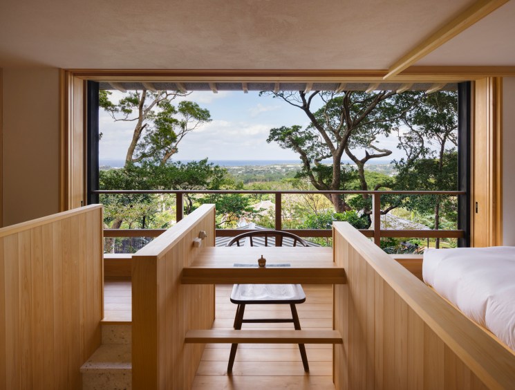
Porsgrunn-based studio Feste Landscape Architecture has designed a series of cabins for the Norwegian county of Agder. Located in various landscapes across the region, the 25 identical structures cater to those who want to immerse themselves in nature. Each has floor-to-ceiling windows, a fireplace and a built-in library. In 2021, Agder County Council commissioned Feste to create homely cabins that could be installed in remote locations. It was a priority of the project’s lead designers, David Fjågesund and Sigurd Aanby, that the natural environment would not be compromised.

dsc_2654.jpg
dsc_2727-kopi.jpg

Their solution was to develop a modular design that could be prefabricated elsewhere and then positioned by helicopter. “This eliminated the need to use heavy vehicles and machinery to [install the cabins], which could have caused a lot of damage,” says Fjågesund. The designers were also eager for the cabin experience to feel distinct at every location. “By carefully selecting the plots and making considered interventions in the landscape, we gave each cabin its own unique quality,” he says. The result is a model for rolling out modular construction in a way that’s sensitive to nature and doesn’t feel repetitive.
feste.no


On Design
nic monisse on...
‘The Curse’ 

There are very few series about architects and designers doing good. Which is why The Curse, from US network Showtime and starring Emma Stone and Nathan Fielder, is so exciting. It follows a couple (Stone and Fielder) and their efforts building eco-conscious housing in the small community of Española, New Mexico. Their distinctive, mirror-clad homes are airtight with robust insulation, enhanced by the selection of sustainable appliances and white goods for a top energy-efficiency rating.

The design-minded duo almost immediately hit speed bumps when tenants move in: one throws out a brand-new induction cooktop and puts a gas one in its place; another requests the installation of an air-conditioner. Some simply complain that they don’t want a toilet that doubles as a washbasin, no matter how much water it might save. In short, no matter how well intentioned, the ambition of the show’s designer duo is too radical for their “everyday” clients. It’s a reminder that while profound change is necessary to combat environmental challenges, it can only be considered progress if people actually stick to the plan.

In short, no matter how well intentioned, the ambition of the show’s designer duo is too radical for their ‘everyday’ clients

The show seems to suggest that instead of clean and green renovation projects that completely tip on its head a resident’s understanding of how a home operates or should look, making small tweaks, such as switching out single-pane windows for insulated options or installing discreet solar panels on a roof, should be considered. These elements don’t infringe on quality of life and are much more likely to receive uptake, making them a more effective way to influence change. This could also pave the way for bigger shifts.

This slower, gentle approach is surely better than a quick and radical one that is ultimately abandoned. The only flaw, I can see, is that this wouldn’t make for exciting television. 

For more design and architecture analysis, subscribe to the Monocle Minute On Design newsletter at monocle.com/minute


gallery –– mexico
Outer limits

Sitting on the Oaxacan coastline in Puerto Escondido, Mexico, Meridiano is an exhibition space that challenges the conventional art-gallery model. “We wanted artists to have a space that reacts directly to the natural environment,” says Nicholas Olney, who co-founded Meridiano with Boris Vervoordt in February 2023. “That’s why there’s no ceiling, allowing an openness to its sounds, the weather, the sun, the moon and the stars.” 

meridiano-sesion4-0006_1x0a4648-hdr.jpg

The gallery buildings, which were designed by architects Axel Vervoordt and Tatsuro Miki, are accessed via a secluded pathway, immediately immersing visitors in the surrounding natural environment. The two main rooms – a square, open-air space and a rectangular area with an oculus opening in its ceiling – act as a kind of sundial. “With overhead views of the changing sky, the open spaces welcome the outside in and add layers to the sensory experience,” says Olney. “The architecture invites visitors to contemplate the artwork through the shifting environmental conditions. There’s an ever-evolving interplay of light and shadow.” 

It’s an experience that is enhanced by the magnetism of the Pacific coastline. “There’s this feeling of being on the edge of the Earth here,” he says. “And the edge is where interesting things happen. It’s where interactions occur and things are most fertile, including the thoughts and ideas of the artists. That’s why Meridiano is unlike any other place in the world to show art.”
meridiano.art


furniture –– usa
Play time

Think that if you’ve seen one Eames armchair, you’ve seen them all? Think again. A new archive space in Richmond, California, reveals just how prolific industrial designers Ray and Charles Eames were, bringing together everything from their earliest prototypes to the ephemera that they collected over the course of their careers.

While there’s no shortage of ottomans or the couple’s signature moulded plastic seats at the Eames Archives, located in the Eames Institute of Infinite Curiosity, the curators have taken an idiosyncratic, playful approach to celebrating their design philosophy. Here, you’ll find not only the duo’s iconic work and prototypes but also items such as toys and stationery that they gathered from around the world.

“We call it a working collection because Charles and Ray kept things even when they were broken, so that they could figure out how to make them better the next time,” says Llisa Demetrios, the couple’s youngest granddaughter and the Eames Institute’s chief curator. Demetrios and the collections team have built the inaugural show from the 40,000 objects in the family’s collection. It’s a tribute to the world that Ray and Charles lived in, where thinking and designing happened through making, with surprisingly few sketches or drawings included.

eames-archives_credit-nicholas-calcott-3.jpg
eames-archives_credit-nicholas-calcott-8.jpg
eames-archives_credit-nicholas-calcott-10.jpg

Among the objects that fill the vitrines are notes on the silver-paper linings that Ray liked to pluck from cigarette cartons, early paintings by Charles and Ray, and correspondence between the couple and their contemporaries. Drawers overflow with paper cutouts of people, used for making design maquettes by hand. Look under a stool and you’ll find a label designating who in the Eames office this perch was reserved for.

Apart from the meticulously preserved house where the designers lived in Los Angeles, there had never been a space dedicated to their collection until now. According to the Eames Institute, the couple’s interest in finding materials that don’t cost the Earth and creating products that last is particularly relevant now. “We hope that this is an organisation that does more than preserve the past,” says its president and ceo, John Cary. “It could offer a road map to the future.”
eamesinstitute.org


urbanism –– amsterdam
Vicious cycles

Grace Charlton on the urban blight of the Dutch capital’s two-wheeled road warriors.


Set on a network of waterways, Amsterdam has a compact city centre: many of its distinctive Dutch classicist buildings are crammed between canals. Given this limited space, the bike has become the logical mode of transport for traversing the city. It became dominant in the 1970s partly as a result of concern over traffic-related deaths; the 1973 oil crisis also increased anti-car sentiment. In the years since, Amsterdam has been celebrated for its urban design, revered as the world’s capital of cycling and held up as a prime example of a metropolis that prioritises people-friendly transport.

ag-d-illo-171-1-.png

Today, however, the Dutch capital is a tangled jungle of bike frames piled on top of each other, many of which can be found at the bottom of the canals or abandoned on bridges. On a recent city break, I found its central neighbourhoods almost impossible to navigate. Waiting for my flight home at Schiphol airport, I couldn’t help but feel relieved that I no longer had to dodge a peloton of two-wheeled racers every time I wanted to cross the street. Cyclists rule Amsterdam’s roads, with bike lanes taking up as much space as those for cars. Meanwhile, pedestrians are squeezed onto narrow footpaths.

Many bike riders seem proud of their utter disregard of traffic lights, people walking or even common decency, often tailgating those in their path and never slowing down – parents with prams and the elderly, be warned. Over three days, I heard too many bike bells being rung passive-aggressively at people who were simply attempting to enjoy a stroll through the Negen Straatjes or Jordaan neighbourhoods.

It begs the question: in the same way that the city’s roads have been carved up to make way for bike lanes, should cyclists in the city now be forced to make more room for pedestrians? Or should cars be removed entirely for the benefit of those on two feet or two wheels? Either way, the current system is unsustainable. Perhaps the city’s central neighbourhoods could be improved by a little more pedestrianisation. At its best, a public space is just that: public, for all to share and use. Amsterdam could do with a reminder of that. 


Illustrator: James Yates

Share on:

X

Facebook

LinkedIn

LINE

Email

Go back: Contents
Next:

Global views: Long reads

/

sign in to monocle

new to monocle?

Subscriptions start from £120.

Subscribe now

Loading...

/

15

15

Live
Monocle Radio

00:0001:00

  • The Curator