Practice makes perfect | Monocle
/

thumbnail text

the typographer
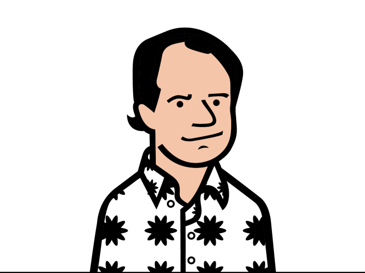
Mark Gowing
Graphic designer, Sydney, Australia

241002_mark-gowing-3272.jpg
Mark Gowing in his studio

Mark Gowing is an Australian artist and designer whose 30-year career has been typified by type. His explorations of letters and language has been widely deployed across a range of fonts. He’s also a graphic designer, having worked on type for Artspace Sydney, identity and branding for Hopscotch Films and poster design for Euroluce Lighting.

It’s work that has seen Gowing win a gold medal at the International Poster Biennale in Warsaw – becoming the first Australian to do so – as well as awards from type organisations in the US, Japan and Mexico. In 2013 he was welcomed into the agi (Alliance Graphique Internationale), a global group of leading practitioners. Additionally, as an artist, Gowing’s regular pilgrimages to the edges of typographic abstraction are increasingly informing his design work.

As Gowing prepares to launch his new type practice, The Letters, monocle visits his home and studio in Newtown, Sydney, to chat about his new company, the future of design amid constant disruption and why he no longer views himself as multidisciplinary.

241002_mark-gowing-3221.jpg
Just my type
241002_mark-gowing-3226.jpg
Building blocks


241002_mark-gowing-3162.jpg
On the tiles

When did you discover design?
When I was about 13 or 14, my grandfather showed me the typography book he made when he studied signwriting. I still have this book full of his typography. He used to catch me drawing structural things and copying logos. He explained to me what typography was and I thought, “Yeah, that’s cool.”

So being an artist was never on the cards?
Growing up in country New South Wales, becoming an artist wasn’t really an option. I got work experience at a children’s book publisher on the Central Coast and just locked into it. By 16, I was hired as an apprentice and left school to start work. It was an amazing environment and the art directors just kept throwing me into the deep end and moving me around into different roles. It’s served me so well. Just get dirty and don’t be precious about your place in it all; that matters in the end but it doesn’t matter in the beginning.

When did you start designing typefaces?
I’ve been designing typefaces since the digital boom of the late 1980s and early 1990s. The Apple Mac changed design and there was a big rift, of digital versus analogue, that was really exciting to be around. Digital font software made designing your own fonts accessible. Before that you were drawing types by hand and you couldn’t reproduce them effectively and efficiently. Suddenly you could design a font, key it in and use it in your own work.

It’s interesting, in light of the disruption facing design right now, that you saw the digital font boom as an opportunity.
The one thing that’s always defined the design industry is that it’s never been the same. Change is the only constant. I’ve never known it to be anything but that. I walked in the door as computers started happening, so I saw nothing but change from day one. It’s normal, healthy and good. What matters is thinking – and if you’re really worried about machines taking your job then I’m not sure you’re actually thinking. A generation grew up casting type out of metal but I would never have been able to make type without computers. So yes, there’ll be loss along the way but you can survive by relying on your thinking rather than your mechanical output.

You established Mark Gowing Studio in 1997. What will The Letters do differently?
I realised that I really needed to focus on the way that I practise because it has become very diverse and difficult to manage. So the entirety of my design practice will be officially typographically led. The Letters will offer retail fonts but we’ll also help customers with their trademark, their logotypes and high- level typographic problems. We’ll work on installations, posters and publications, and assist with all the normal design challenges but from a typographic point of view.

Has your expansion into fine arts changed your approach to design?
For a long time, design influenced my art but now art is starting to affect how I design things. If you look at the Bauhaus movement, they taught design as an art. Kurt Schwitters and Josef Albers didn’t say, “I’m doing design now, I’m doing art now.” They just made and didn’t really differentiate. I no longer see art and design as two things; it’s not as clear-cut to me as it once was. I don’t think of myself as wearing two hats. Instead I just feel like I’m wearing one big, weird hat.
theletters.co


The craftsman
Ini Archibong
Industrial designer, Neuchâtel, Switzerland

240913_monocle_ini_archibong_0063.jpg

Nigerian-American industrial designer Ini Archibong is known for work that taps into heritage and craft traditions. As part of Craft X Tech, a cross-cultural initiative that pairs craftspeople from Japan’s Tohoku region with international creators, Archibong recently collaborated with artisans who specialise in tsugaru nuri, a type of layered lacquerware. “Don’t ask me about the Karaoke nights in Japan,” he laughs. The result is Artifact # VII, a playful egg-shaped piece that emits a sound when you hover your hand over it.

You like to include spirituality in your design practice. Why is that?
Simply put, when I started on the journey to becoming a creator it was a spiritual mission. It took me out of a more mundane perspective on what I was here [on this planet] to do. For better or worse, being a designer is more than a job. I don’t necessarily design from a place of practicality. I make functional things but the way that they come about is intuitive.

Where does your inclination towards world-building come from?
Fantasy, comics, movies, cartoons. As a kid, I was in church on Sunday and reading every day. I loved books by CS Lewis and L Frank Baum. When I would read them, I was in a different world; it was my escape.

How does this translate to the project with the craftspeople of  Tohoku?
It was an amazing project to work on with the craftspeople, who went beyond lacquer: it’s the layers, the texture, all these things that give it the pattern it has. I love design that’s chaotic and that feels organic. The piece also emits sound, which reacts to your presence. It’s part of a wider series of artefacts that fit in to what I call a “mythology of the children of the diaspora”.

Which diaspora are you referring to?
That’s the question. It starts from the West African diaspora that I come from but there’s going to come a point, with a more globalised future, where everyone will be part of a diaspora. My goal with these pieces is to retell some of the mythology that has been told over the centuries in a new context, with a mentality focused on a globalised humanity. I keep it vague so people can fill in the gaps.
designbyini.com


the spiritualist
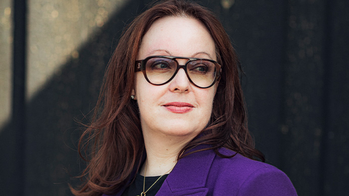
Alison Brooks
Architect,
London, UK

Following her graduation from Ontario’s University of Waterloo, Canadian-born, London-based architect Alison Brooks worked with Ron Arad before establishing her namesake practice in 1996. “I really wanted to work on public projects and housing, which was different to what I was working on with Ron,” she tells monocle from the ground floor of her newly finished mixed-use building, Cadence, in Kings Cross. “Housing is the critical social and civic project of architecture because it impacts daily quality of life for its residents and the public.” It’s an ambition that she has since fulfilled, working on a host of award-winning residences and multi-residential housing projects across the globe. Here, Brooks elucidates on architectural spirituality and how best to translate the intangible – community, connection, nature – into bricks and mortar.

alison-brooks_meet-the-designers_elena-heatherwick-3.jpg
Brooks in the lobby of Cadence, Kings Cross
alison-brooks_meet-the-designers_elena-heatherwick-9.jpg
Loping arches

You established your practice in 1996. How did your early projects inform your work?
The first two commissions I had were the results of the only two letters I wrote when I first started, which is incredible. One resulted in the vxo House in London, which was the first private residence I designed. As an architect, such projects are remarkable because, when you design somebody’s private house, it must stand up to scrutiny every day from the same person – so you really have to master every detail.

Tell us about your latest project, Cadence.
It’s situated on an irregular shaped plot and has 163 apartments in the scheme. I always try to bring unexpected moments to my work and with Cadence it came in the form of its arches. It felt like a bit of a leap of faith because it sometimes feels like arches have been banished in contemporary architecture. The key thing with this design, though, is that the arches are at different heights and have different widths, which respond to the building’s structural irregularity and introduces dynamism. It means that Cadence looks it’s walking, in a kind of animal-like way, because there’s no order or rhythm to its arches. Its structure is more lyrical and organic, which helps make it feel more human.

What other methods do you use to make architecture feel more human?
The way I work is to try to respond to context in a meaningful way; context is everything in architecture. Context can be physical, cultural or even spiritual, which is something that I’ve been starting to think about more consciously. This comes partly from working in Canada and learning from its indigenous people’s worldview and way of thinking, and tapping into animism – the idea that nature is made up of beings with which we can form relationships. It also comes from spending summers in the Canadian wilderness; when you’re alone out there you really need to believe that nature is on your side.

How can this outlook relate to architecture more broadly?
We’re all trying to find ways of practising in a more sustainable and responsible way in response to the climate crisis but there’s also a crisis of meaning. We can start to address this by recalibrating our relationship with nature and bringing spirituality into our way of thinking about architecture. Architects talk about a sense of place a lot but there’s a spirit of place too. We also need to address social value and try to make places that help people feel like they belong to a community and place. Feeling at home somewhere is fundamental to human wellbeing.

How do you translate something intangible – spirituality, community and connection – into something tangible?
One of the ways this can be done is through form and materials. With Cadence, we used a particular orange-red brick which emphasised the mass of the building but also paid tribute to George Gilbert Scott and his masterful work at the nearby St Pancras Hotel and Station. A similar effect can also be achieved by tapping into both collective and personal memory. For example, by using elongated bricks and terrazzo for the public spaces in Cadence, the Venetian architecture that inspired both myself and Scott is evoked. On other projects, like Oxford’s Cohen Quad, I’ve used American black cherry, as a tribute to my mother who loved the material and sparked my interest in architecture.

Given that your focus is on residential architecture, how do you feel when a project is complete and people move in?
It’s like taking your child to their wedding; you kiss them goodbye and off they go to live their life. The building will change and you have to accept that. But if people are using it, it shows that they want to invest in the place.
alisonbrooksarchitects.com


Five projects
Top type and branding works and projects by Mark Gowing Studio.

1. Artspace Sydney Logotype and custom typeface development for a leading art organisation
2. Hopscotch Films Identity development work for one of Australia’s top production companies
3. Sherman Contemporary Art Foundation Type-led exhibition poster designs
4. Preservation Music CD cover for  Christian Kiefer and Tom Carter’s ‘From the Great American Songbook’
5. Australian Graphic Design Association Poster set for ‘Australian Poster Biennale’

Share on:

X

Facebook

LinkedIn

LINE

Email

Go back: Contents
Next:

Inventory & Expo: Where to go, buy and eat

/

sign in to monocle

new to monocle?

Subscriptions start from £120.

Subscribe now

Loading...

/

15

15

Live
Monocle Radio

00:0001:00

  • The Briefing