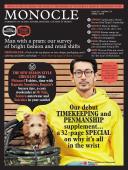
Design - Issue 92 - Magazine | Monocle
/

thumbnail text

Barn stormer

Gresham [ARCHITECTURE]

With bright living quarters facing Oregon’s Cascade mountain range and an easily accessible apparatus bay, the new fire station in Portland’s neighbouring city of Gresham proves that essential services can be sleek as well as functional. Fire Station 76 serves a community of family farms and was designed by Hennebery Eddy Architects to mimic the simple wooden agricultural buildings common to the area.

In a nod to firefighters’ work, the studio cannily harnessed flames to finish the structure: the exterior’s timber panels were treated with shou sugi ban, an ancient Japanese technique that burns the wood’s surface to make it rot-resistant. “The treatment transforms the destructive manner of fire into one of beauty and protection,” says Michelle Vo of Hennebery Eddy. In January the firm took home a national Wood Design award for its efforts.
henneberyeddy.com


Poster boy

Beirut [BOOKS]

A Technicolor tome spanning 50 years of Lebanon’s cinema history, Tonight, Cinema in Lebanon: 1929-1979 examines the art of designing the nation’s film posters. The book showcases the archive of its author, Abboudi Abou Jaoudé, a collector and publisher of hand-printed Lebanese film posters and adverts, alongside essays in both Arabic and English on the history of the country’s print culture. Beirut-based graphic designers Studio Safar worked hand-in-glove with Abou Jaoudé, from editorial conception to art direction; the result will please graphic designers and cinephiles alike.
studiosafar.com

Against the grain

Copenhagen [FURNITURE]

Kim Dolva and Søren Bech Jespersen met while training as cabinet-makers before joining forces to start Copenhagen-based design collective Københavns Møbelsnedkeri in 2006. After working on commission-only furniture for a decade, the 18-strong team of wood-turners, designers and architects launched its first non-bespoke collection. The New Classics line includes 20 signature pieces, from chairs and shelving systems to mirrors and lamps. “We do what the industry could not do: the handmade, the unique, the custom made,” says Dolva.
kbhsnedkeri.dk


Blocked out

Toronto [ARCHITECTURE]

Nestled among the oaks of Moore Park Ravine in Toronto, this three-storey modernist-inspired residence was masterminded by Canadian architect Angela Tsementzis. As the building is set on a slope, Tsementzis opted for concrete as the structure’s primary material to provide durability, as well as a striking counterpoint to the surrounding foliage. 
“The main living spaces are in the middle and cantilevered to the rear with views into the treetops,” says Tsementzis. Owners John and Diti Pylypczak have found this section to be their favourite. “It is a tranquil refuge after an exhausting day,” says John.
concrete.ca


High benchmark

New York [FURNITURE]

With its hand-woven black rush seating and ash structure, this bench by oft-overlooked US modernist designer Mel Smilow is ripe for rediscovery. The sleek piece was originally created by Smilow in 1956 and has been brought back to life by his daughter Judy. An industrial designer in her own right, Judy set up Smilow Design after chancing upon her father’s original drawings. She is reviving his brand of everyday-use design, which followed the humble Shaker aesthetic and simplicity of Japanese shibusa.
smilowdesign.com

Swatch and learn

Nordic design is becoming more playful with pigments; just as well, as colour conveys a multitude of moods.

Sophie Grove

As spring beckoned in Europe, the design world headed north to the Stockholm Furniture & Light Fair where, despite long, dark Baltic winters, Nordic producers were on sunny form. Finnish company Poiat revealed a new vivid copper-orange palette for its Lavitta chair, the Republic of Fritz Hansen presented one of its classics in bright coral and the creative director of Fredensborg-based brand Menu told us that he felt his peers were eschewing pure, functional forms and moving towards the colourful playfulness of the French and Dutch design worlds. They are, he said, “almost Italian in their outlook”. Do some nations feel at liberty to play with colour more than others? It’s a question I pondered when flicking through the swatches of ochre, burnt umber and earth-red of a rare cloth-bound book, The Colours of Rome. Put together by John Sutcliffe, it is an exploration of the social, environmental and human reasons our cities – and cultures – adopt certain colours. Southern Europe is defined by vibrant tones but it didn’t necessarily choose them. Hues aren’t just a question of national aesthetic preference but a complex mix of history, happenstance and necessity. There’s a reason the plastered façades in the Provençale village of Roussillon are painted red: it was the centre of the ochre industry and surrounded by mines that produced the pigment for export. As an artist, Sutcliffe has spent many years in Greece and his new book (launching at the Manhattan Fine Press Book Fair in April) is a similar enquiry into the colours of the Cyclades. While these islands are now synonymous with bright whitewash, blue and red geraniums, historic streetscapes suggest they were once an array of pinks, yellows, greens and purples. Sutcliffe spent many happy days scraping paint samples from “crash corners” of buildings to rediscover the colours. (These field samples are replicated on hand-painted swatches in the book.) So why the contemporary preference for blue and white? Sutcliffe suspects it is a product of the tourist industry’s drive for uniformity – and also the fact that the industrial production techniques for ultra-marine came about around the time of Greek Independence in 1829, triggering a patriotic azure painting splurge. And, of course, there’s the sea: he found no blue building façades in Rome. Does any of this have an impact on how designers use colour? Do some cultures play more than others? It’s true that Italians such as Osvaldo Borsani and Gaetano Pesce have been great proponents of bright red, yellow and green. The use of vivid colour is by no means anathema to Scandinavian design culture: think of Verner Panton. (Indeed, Swedish façades have been painted Falun red since the 1700s.) Contemporary Nordic designers’ past success working in oak, rattan and leather shouldn’t hinder them from invoking a riot of colour in their work. Lines are blurring and it’s a good thing. Let’s face it: a splash of coral, orange or aquamarine at this time of year can only brighten all our moods. 

Come to past

Helsinki [museum]

Finland’s capital is wary of large-scale cultural projects (its waterside Guggenheim plan has been the subject of much urban conflict) but Helsinki City Museum’s new venue has hit the spot between conservation and development. Spanning half a block of 18th- and 19th-century residences around three courtyards in Helsinki’s historic heart, the museum’s launch in May will open up five buildings not previously accessible to the public. Aimed at telling the stories of the city through photographs, everyday objects and period interiors, the museum’s identity was conceived by agency Werklig, which drew from old posters in the museum’s collection. The focus is on accessibility and entry is free – a rarity here. “We want everybody to have the opportunity to fall in love with Helsinki,” says museum director Tiina Merisalo.
hel.fi

Share on:

X

Facebook

LinkedIn

LINE

Email

Go back: Contents
Next:

Edits

/

sign in to monocle

new to monocle?

Subscriptions start from £120.

Subscribe now

Loading...

/

15

15

Live
Monocle Radio

00:0001:00

  • Konfekt Korner