Brothers in arms | Monocle
/

thumbnail text

At a time when defence forces are under increased scrutiny when it comes to recruitment and deployment due to wars raging in Europe and the Middle East, it might seem peculiar that some armed services are concerned not only with their military prowess but their image too. “The war in Ukraine changed a lot,” says Markus Gut, a partner at Farner, a Zürich-based communications agency. “Some people had doubts about whether the Swiss army was strong enough or could protect us. But the Swiss armed forces had never had a brand and so we were asked to create one. It wasn’t just a matter of saying, ‘We are competent’ or ‘We are proud’; it had to be something strong that you could feel.”

On a sunny afternoon, Gut is taking monocle on a tour of the company’s office on Loewenstrasse, where he and a small team of branding specialists, led by Farner’s consulting director Martin Fawer, have spent the past year creating an identity for the country’s famously neutral military service. The studio has developed a logo, colour palette and typeface for use on everything from uniforms and storage containers to websites and official documents. “The goal for us was to craft something unique, Swiss and timeless,” says Gut. “The corporate design of Swiss Railways is a good example of what we wanted to build,” he adds, referring to the red-and-white logo by Swiss designer Hans Hartmann, which was introduced in 1972. “It’s very Swiss.”

But why, in a country where it is compulsory for every man over the age of 18 to serve in the military, does having a strong, recognisable and attractive identity matter? “The aim is for our soldiers to recognise themselves in the brand and to carry their experiences as ambassadors [of the Swiss army] into civilian life,” says Glenn Müller Amstutz, the head of defence communications who commissioned the project. “It is also the face that our army shows other countries, which is why it was important to do it in the Swiss style,” adds Gut.

jm5r1751.jpg
Markus Gut, partner at Farner
jm5r1852.jpg
Farner team at work
jm5r1654.jpg
Work in progress

To develop an identity that spoke to soldiers, other forces around the world (which the neutral Swiss encounter during joint training operations) and civilians, the Farner team conducted a number of consultation workshops. “We worked with the army to sharpen its profile, conducting the whole process together,” says Fawer, who led a series of interviews with male and female soldiers of various ranks at the army’s communications office in Bern.  “We asked them, ‘What do you think about the army? What is important about it? What is its attitude?’ This was followed by several workshops, where we showed them how other armies’ brands – like the British army and the German army – are presented.”

“The aim is for our soldiers to recognise themselves in the brand”

The results led the Farner team to pin down four key values for the Swiss army – a military that is “stolz, diszipliniert, kameradschaftlich und kompetent” (proud, disciplined, comradely and competent) – and to the design of a logo. It was a first for the Swiss army which, until that point, had lacked one and instead, as neither a government administrative unit or an institution, simply used the Swiss flag as its official mark.

“That was one of the desires of Thomas Süssli, the chief of the Swiss armed forces. He wanted to have a logo but the design had to reflect the army’s values. You can’t just tell Martin to make a nice logo,” says Gut, nodding at Fawer. “He will reply, ‘What is it for? What are the company’s values?’”

Brand new look
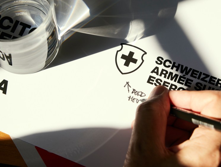
The newly designed core elements including logos, guidelines, advertising executions and digital application.

eyjwyxroijoic2nod2vpemvylwfybwvlxc9mawxlxc9fttzizmdkefnhwnh5n1pmu1rves5qcgcifq-schweizer-armee-p4tzfzafv3hv9fx5myhog__r3-xc-j7igykufynrtnc.jpg
eyjwyxroijoic2nod2vpemvylwfybwvlxc9mawxlxc9luwrhwxlxzmpwznrxbmrfcvndsy5qcgcifq-schweizer-armee-esjac1nxvk5lhcnabfzbtcdcmdxxugwhmezmtu2jd8s.jpg

To give the new logo a Swissness and respond to the values of pride, discipline, camaraderie and competence, the team turned to Helvetia for inspiration – an allegorical female figure wielding a spear and a shield with the Swiss flag emblazoned on it. “Everyone in Switzerland knows Helvetia because she is on our coins,” says Gut, pointing at a one-franc piece that shows Helvetia drawn by 19th-century German artist Albert Walch. Farner used the outline of the Walch-drawn shield on the coin as the basis for the new logo. “It made sense: the shield is a symbol of defence and the message is that the army is here to protect you,” says Gut. “No other company uses the shield in their branding.”

“From Helvetia’s shield to Helvetica typescript, it is very Swiss”

jm5r1961.jpg
At work in the Farner office
jm5r1345.jpg
Design review

To further differentiate the new logo – in a country where red-and-white crosses are ubiquitous across state and private brands – the team chose black, white and red as its colours. “From Swiss army knives to chocolate, many firms here use the red and white as a sign of quality,” said Gut. “The black is actually a non-colour.”

For the typography, the studio chose Helvetica, the classic typeface that was developed in 1957 by Swiss font designers Max Miedinger and Eduard Hoffmann, which it used to display the words “Swiss army” in the country’s four national languages. This rooted the visual identity even more firmly in Swiss design tradition. “From Helvetia’s shield to Helvetica typescript, it is all very Swiss,” says Gut. “It couldn’t work for another country’s army but it is perfect for Switzerland.”

It’s a reminder that branding matters – and, at a time when the threat of war can sometimes feel imminent, it is essential for armed forces to have a strong brand identity that reflects their principles and elicits confidence in the populations that they protect.

Share on:

X

Facebook

LinkedIn

LINE

Email

Go back: Contents
Next:

Fashion

/

sign in to monocle

new to monocle?

Subscriptions start from £120.

Subscribe now

Loading...

/

15

15

Live
Monocle Radio

00:0001:00

  • The Pacific Shift