Chain reaction
Despite cleaning up the Belgian capital’s congested centre, an anti-car initiative has divided opinion. We meet the policy’s architects – and some of its opponents.
When it comes to cities, first impressions are often damning. Despite its plentiful baroque and neo-gothic architecture, Brussels isn’t deemed one of Europe’s great cities. If you were visiting the Belgian capital just five years ago, you would have had to do a lot of waiting at pedestrian crossings. Perhaps you wouldn’t have thought this very strange. Most large European cities, even those that are thousands of years old, adapted fairly frictionlessly to the advent of the car.
Indeed, Brussels worked particularly hard to transition from hooves and feet to four wheels. From the 1950s and 1970s, as part of an ominously named policy called the Manhattan Project, it built flyovers in downtown neighbourhoods, bulldozed large swaths of the city centre to connect its main northern and southern railway stations, placed metro stops beneath office buildings so that commuters could make a swift entry and exit, and constructed a new central rail terminus. The intention was to create a city that was utopian in its embrace of mechanised travel. The result was a city that literally became a byword for traffic, pollution and poor urban planning: “Brusselisation” means haphazard and ineffective redevelopment.
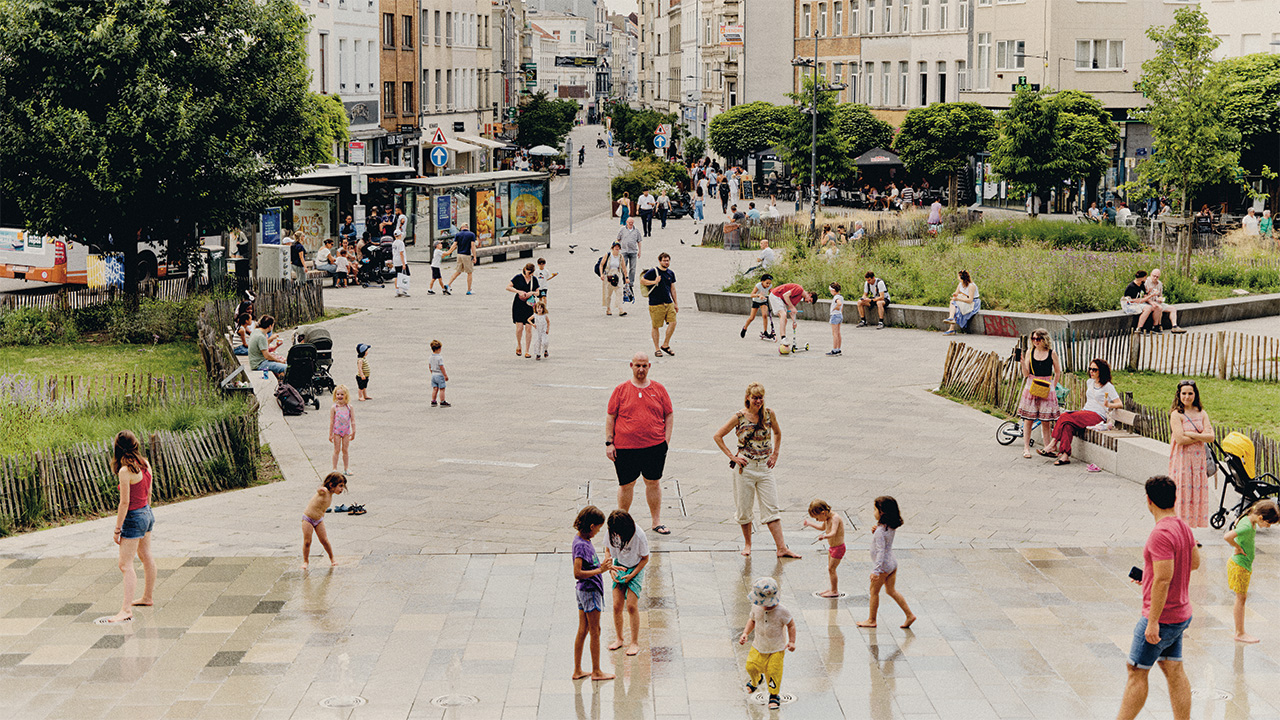
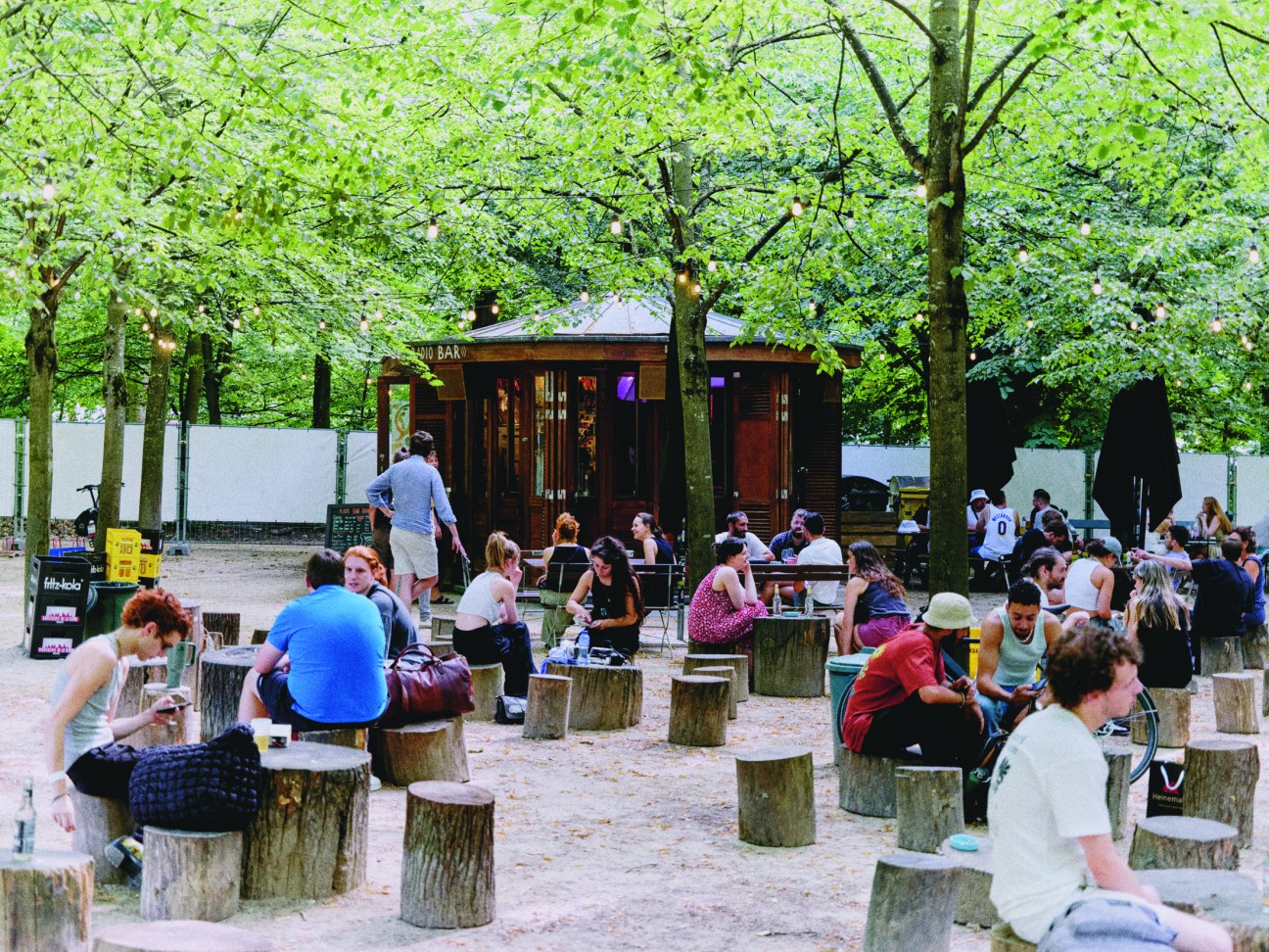
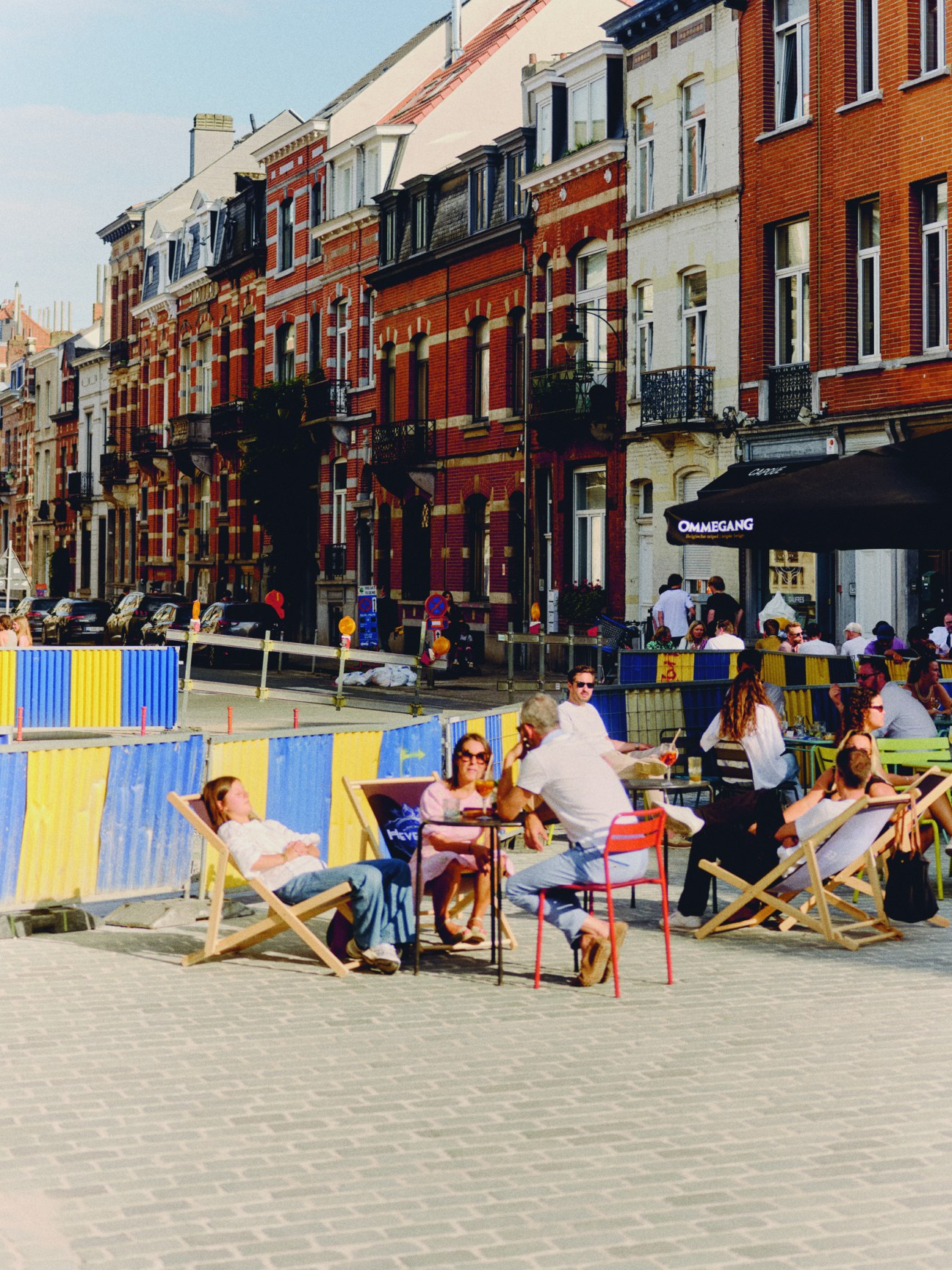
On a magnificently sunny July afternoon, monocle arrives in a city that is almost unrecognisable from that description. Brussels’ main thoroughfare, Boulevard Anspach, is full of people sauntering, strolling, strutting or simply standing still. There are many bicycles but not a car in sight. Then we hear a phrase that will be repeated to us many times over the next 36 hours: “This place used to be horrible.”
Brussels’ transformation from car-choked hellhole to walker’s paradise is largely the result of a series of highly interventionist regional mobility plans. The most famous of these, the Good Move Initiative, was launched in 2022 with the aim of – among other things, such as improving public transport and cycling infrastructure – reducing automotive traffic by 24 per cent by 2030.

Down a side street on the sun-drenched terrace of an Italian restaurant, we meet Pascal Smet, self-described “father of Good Move”. This soubriquet is not hyperbolic. Smet was the minister of mobility and public works in the Brussels-Capital Region government when Good Move was in the planning phase and secretary of state for urbanism and heritage when it was implemented. He is a disciple of Jan Gehl, the Danish architect and urban designer whose career has focused on reorienting cities away from cars towards pedestrians and cyclists. “The core function of a city is interaction between people – and people cannot interact in their cars,” says Smet, leaning over his spaghetti amatriciana.
In a white linen shirt and natty wire-framed glasses, the 57-year-old, who represents the Dutch-speaking Socialist Party, Vooruit (“Onward”), is more fashionable than you might expect of a politician but he has the irrepressible energy of the soapbox campaigner. Despite having recently undergone hip-replacement surgery after a cycling accident, Smet doesn’t stop either talking or moving the whole time he is with monocle.
His limp seems to be an appropriate physical manifestation of the recent slings and arrows that his brainchild has endured. To say that Good Move has been polarising would be understating the effect that the initiative has had on Brussels’ politics. Its car policies were arguably the defining issue in the region’s parliamentary elections in June, elections that returned a majority of votes for parties that actively campaigned on an anti-Good Move platform. Though the byzantine nature of the Belgian electoral system makes analysing the results, let alone forming a government, difficult, even the father of Good Move concedes that it faces an uncertain future. “The overall majority of the people voted Good Move out,” says Smet. But this does not mean that Brussels’ car-free revolution is over or that it has failed.
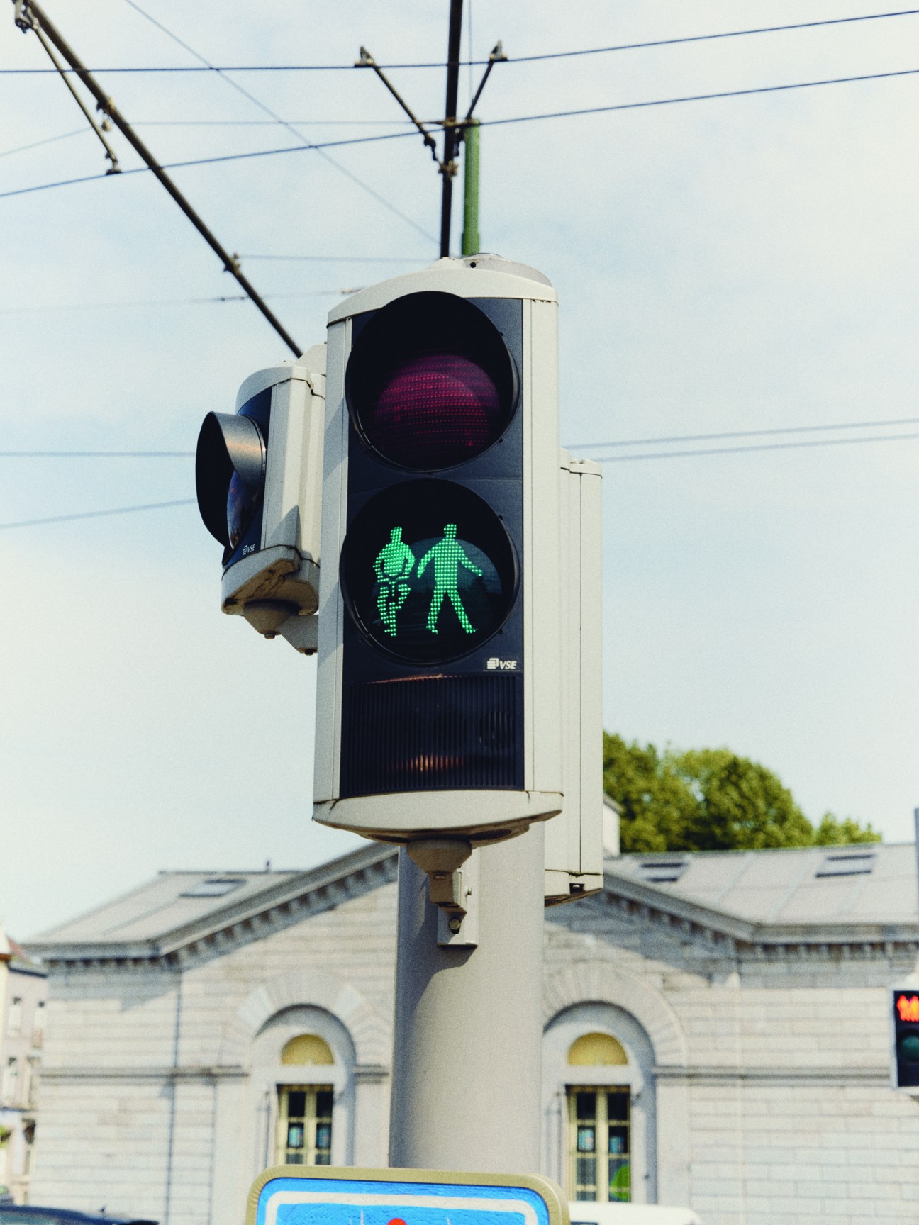
A strange thing happened in June’s election. In Brussels, a French-speaking-majority city in a Dutch-speaking region, candidates and parties are split into lists based on language. In theory, voters can put their “X” next to someone who does not speak the same language as them but, in reality, this is rare. However, this year, despite there being only 50,000 registered Dutch-speaking voters in Brussels, the region’s Dutch-speaking parties received about 80,000 votes, meaning that 30,000 French speakers (out of about 200,000) voted on non-linguistic lines. The main beneficiaries of this were the Dutch-speaking Greens, who many believe were lent votes by French speakers who are pro-Good Move.
Brussels vs the car
1958
Brusselisation
In preparation for the 1958 World’s Fair, the Belgian federal government began a huge redevelopment of the city, knocking down many townhouses to build multilane highways and flyovers.
1971
Grand Place picnic
Brussels’ main square became perhaps the world’s most beautiful car park in the postwar era. In 1971 hundreds of Bruxellois staged a picnic blocking vehicles’ access to the Grand Place. They secured a ban on parking here but people could still drive through until 1991.
1989
Creation of the Brussels-Capital Region
Until 1989, Brussels was administered by the federal government, which largely treated it as a city for commuters. After it became its own region, the hard work of reversing the mistakes of the past began.
2015
Pedestrianisation of the Boulevard Anspach
After a series of picnics in the style of the Grand Place protest, Brussels’ main thoroughfare was almost completely pedestrianised.
2020
Good Move is launched
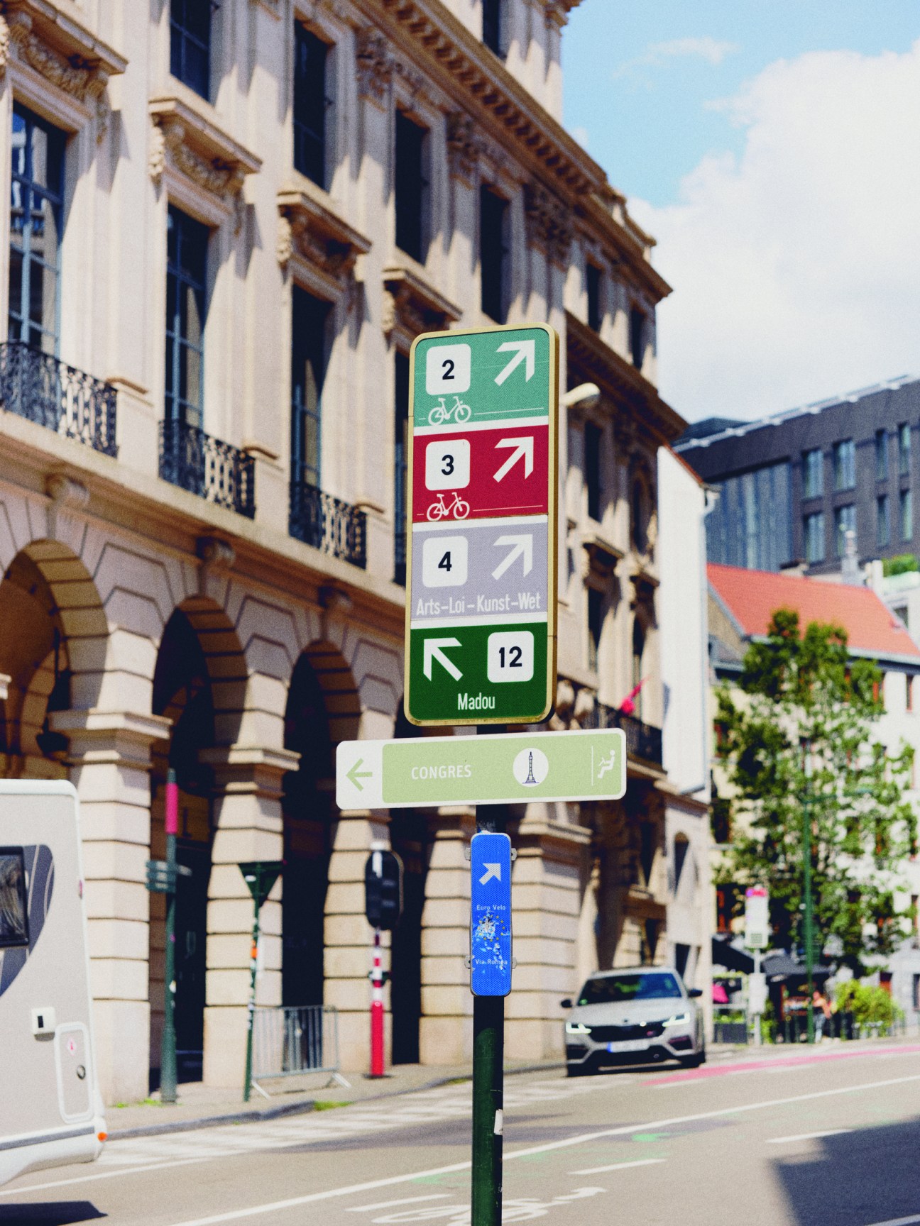
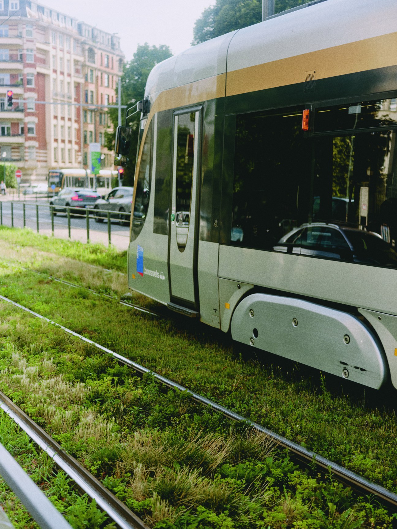
The Good Move plan includes the introduction of new tram and bus lines, the expansion of bike paths and the planting of 20,000 trees but is now most associated with moves to reduce the number of car journeys.
Good movers and headshakers: key figures in Brussels’ car debate

‘Father of Good Move’, Socialist Party
Over 20 years in Brussels’ government, Smet spearheaded radical mobility measures such as the introduction of Uber, the new No 9 tram line and the pedestrianisation of the city centre.
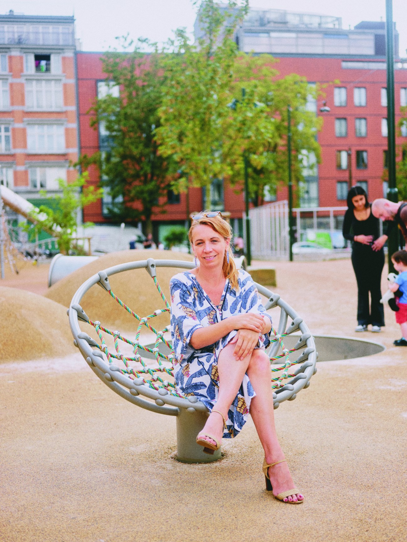
Secretary of state for urban planning (at time of writing), Socialist Party
Persoons took over from Smet as secretary of state for urban planning in 2023. She says that the Greens did well in the elections because, “The people who were in favour of Good Move, the middle classes, saw the Greens as the purest form of [the policy].”
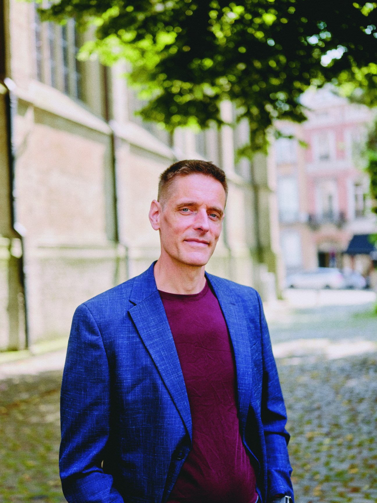
Member of the Brussels parliament, Belgian Workers’ Party (PVDA)
The far-left pvda won big in June’s regional elections on a platform attacking Good Move’s anti-car policies. “Of course, we want fewer cars,” he says. “We don’t like traffic jams. But politically you need to come up with alternatives and solutions.”
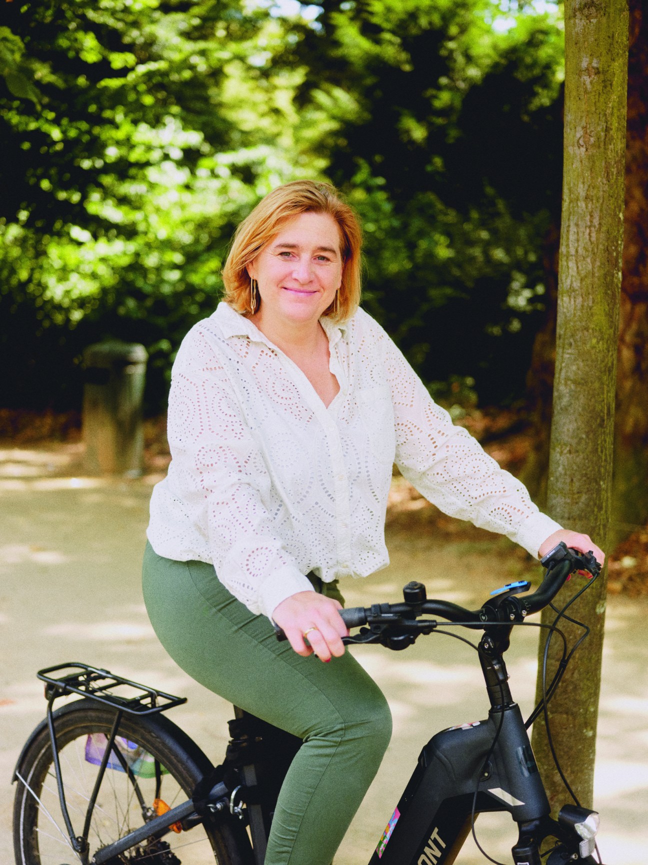
Minister of mobility, public works and road safety (at time of writing), Green Party
Van den Brandt’s Dutch-speaking Greens became the figureheads of Good Move in the June elections. She won re-election but will have to form a coalition with parties opposed to the policy. “Getting rid of cars is like quitting smoking,” she says. “It’s hard but you feel better once you’ve done it.”
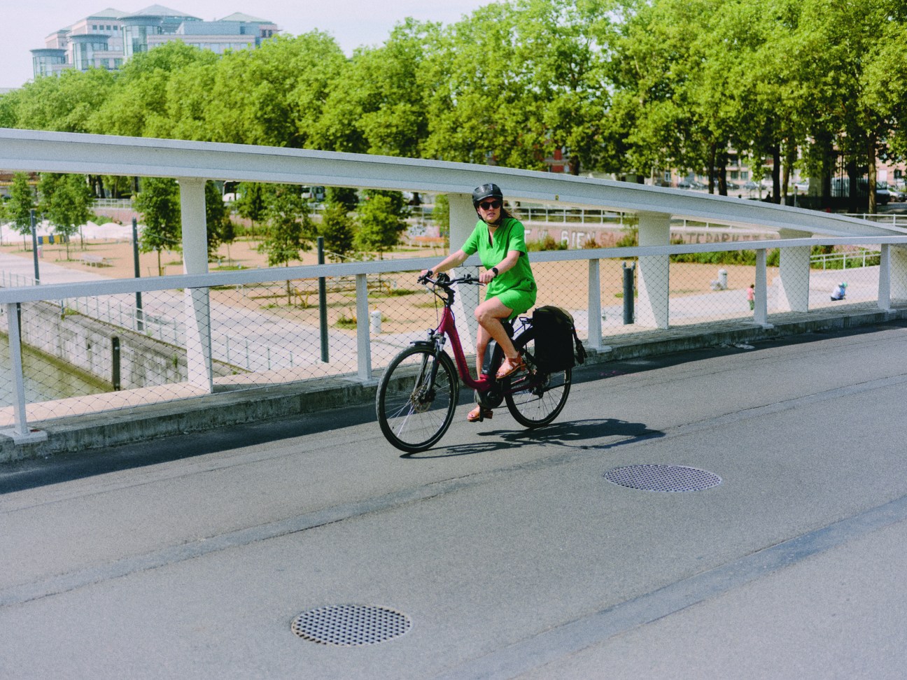
We meet the leader of Brussels’ Greens in Parc de Bruxelles, a large 18th-century royal park opposite the Belgian parliament building. Elke van den Brandt is also the incumbent minister of mobility. Even though Good Move was launched by Smet and the Socialists, today it is more associated with Van den Brandt and the Greens, who have greater representation in the Brussels parliament and have made the initiative the cornerstone of their agenda. Naturally, Van den Brandt arrives for our meeting on a bicycle, which she has ridden directly from negotiations to form a new government. She has a warm smile and manner but is bullish about the policy. “The future of Good Move is the future of Brussels,” she says. Is a scrapping or at least scaling-back of the plan on the agenda in the talks? She admits it is but shoots back: “Remember, the most expensive infrastructure is not cycling or walking. If you look at Copenhagen, they made all those cycling changes when the city was nearly bankrupt. They asked themselves, ‘What’s the cheapest way for people to get around?’ And they invested what money they had in cycling infrastructure.”
These are salient points. The first concerns what a city can afford to do. After all, politics is the art of the possible and, during financially straitened times, it is important to focus on what can be achieved with the means at your disposal. The second point concerns what a city wants to be. The Danish capital, with its plentiful bike lanes, excellent public transport and pedestrianised centre, is seen as a model for progressive urban leaders around the world but its transformation into a mobility mecca came after decades of debate and protest.
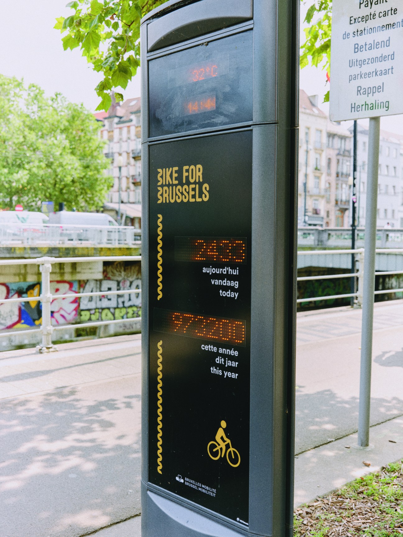
Indeed, Brussels’ metamorphosis has been achieved in a far shorter period of time. Beyond the politics, the data is astounding. Between 2022 and 2023, after a year of Good Move, 20 per cent fewer cars were counted in the city centre, with these numbers dropping as much as 50 per cent during rush hour. There was a 21 per cent drop in road accidents, and a 69 per cent drop in related fatalities, while levels of toxic nitrogen dioxide (no2) dropped by as much as 35 per cent at some particularly busy intersections – significant in a region that was estimated to suffer 900 premature deaths a year related to air pollution. But hard data, though important, is perhaps not as influential as that difficult-to-quantify thing: emotion. How people travel around the place in which they live is a highly charged issue; in Brussels tempers have frayed on several occasions since Good Move was rolled out. Whereas in the city centre, known as the Pentagon, cars have been almost completely banished, in neighbourhoods beyond its boundaries, implementation has been trickier.
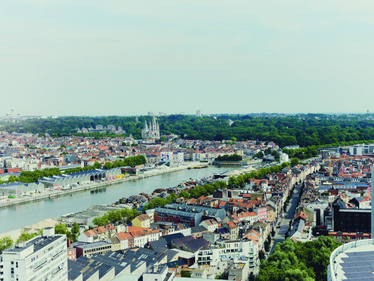
Two months after the closure of large roads in the centre, concrete blocks and works barriers started appearing in working-class neighbourhoods such as Schaerbeek and Cureghem, which also have large immigrant populations. In both areas, after construction vehicles were set ablaze and police were attacked, the roadblocks were removed.
Pro-Good Move politicians believe that this was largely a problem of communication. Van den Brandt blames the mode of delivery. “The participation phase was during coronavirus, so we had a lot of online meetings,” she says. But Smet blames the message itself. “I learned that you cannot go to the people and tell them, ‘We are going to get rid of the cars,’” he says. “You say, ‘We want to have a car-free square because we want your kids to play, we want you to sit on a terrace and have something to eat.’”
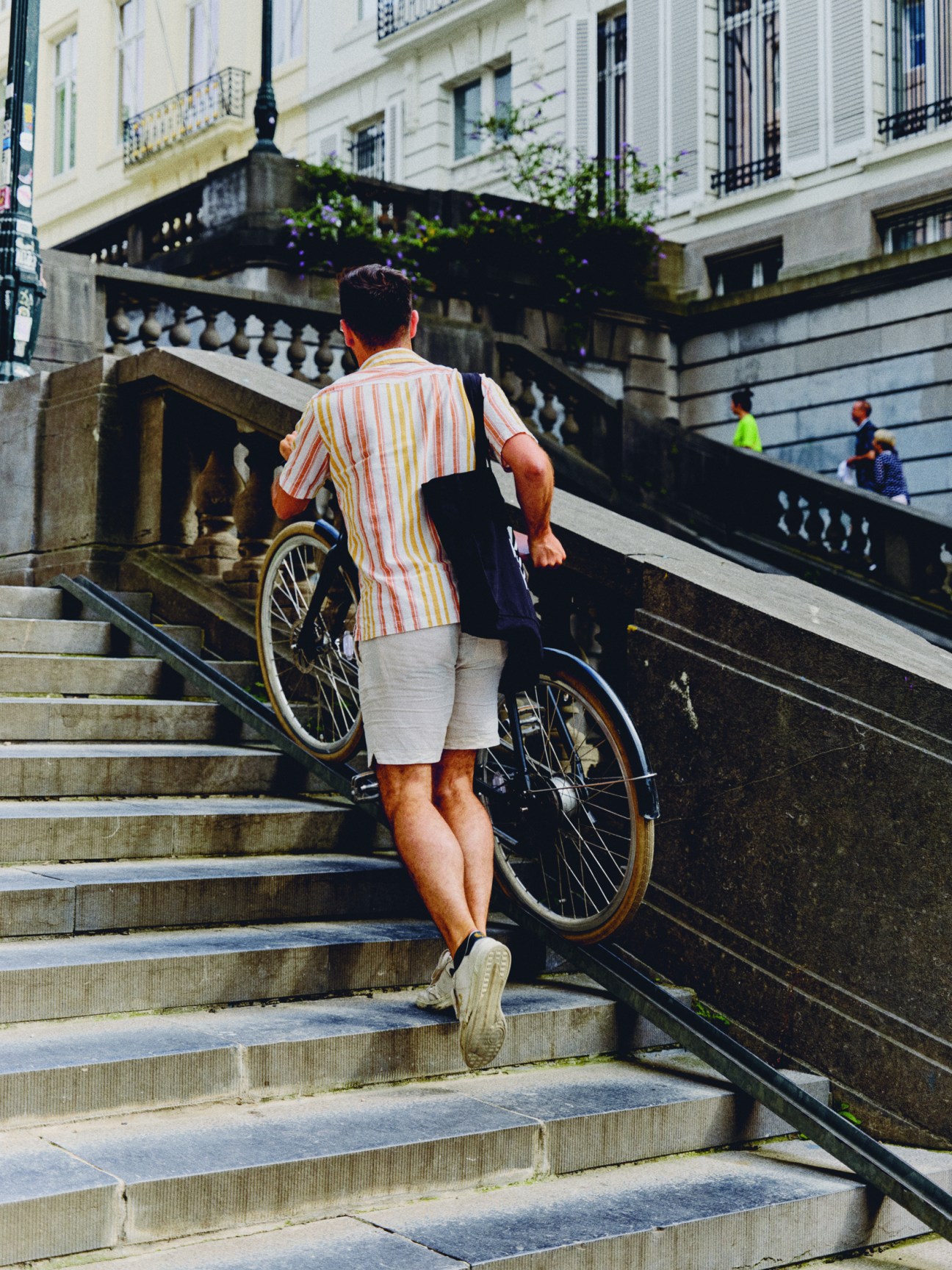
A five-minute cycle from the Pentagon, Cureghem is a largely African and Maghrebi neighbourhood. On a blazing Friday afternoon, large groups of men congregate in the shade outside the mosque and around the area’s many garages and secondhand car dealerships – it is immediately obvious that the automotive industry is a large employer here. monocle’s guides, Damiaan and Alessio, usually so voluble, seem a little subdued. It is difficult to get people to speak to us, much less to give their full name or have their photograph taken. But 46-year-old Boubacar does explain that the roadblocks just “appeared, with no warning,” after which, “you felt like you were in a labyrinth, like you were stuck in your neighbourhood”.
This is a common charge levelled at Good Move by black and Arab Bruxellois – that it’s designed to keep them away from the rest of the city’s largely white population. Indeed, an Arab parliamentarian from Vooruit, Fouad Ahidar, left the party and campaigned on an independent ticket, focusing primarily on two issues: Palestine and Good Move. His new Team Fouad Ahidar party won three seats to Vooruit’s two. While Ahidar was a vocal presence during the campaign, residents say that the city’s political leaders abandoned them in the immediate aftermath of Good Move’s introduction to Cureghem. “We didn’t understand who we had to talk to, which politician this had come from,” says 46-year-old Mamadou, leaning against a vintage Mercedes.
Two years later, however, during the election campaign, they had many championing their cause. These included the Workers’ Party of Belgium (pvda), a far-left group that won 15 out of 89 seats in the Brussels parliament. monocle meets one of its MPs, Jan Busselen, in a hotel bar. A lot of what we have heard and seen in Brussels seems to align with the view that, though the way that Good Move has been implemented can be contentious, the means justify the ends. Busselen disagrees. “It’s a very paternalistic way of looking at people – that we’re going to put measures in place and people aren’t smart enough to comprehend that it is better for them,” he says. “And it is dangerous because it pushes naturally left-wing voters into the arms of the right and conspiracy theorists.”
As Smet says, private car ownership also has another dimension in immigrant communities. “They’re a symbol of success, freedom, a ticket to a girlfriend and an extension of your living room,” he says. Ans Persoons, an ally of Smet’s who assumed the role of secretary of state for urbanism and heritage after he resigned following a scandal involving the mayor of Tehran, says, “It’s not about mobility and public space. More than anything, it’s about identity and gentrification.”
She’s right – mobility and public space are ineluctably political and as such have been sucked into the wider culture war concerning identity that has subsumed European politics in recent years. Cities around the world – but especially in Europe, where the transition away from cars is happening more quickly – have seen the issue lead to violence. “If you change things, there’s a lot of reaction,” says Van den Brandt. “It’s no different in Paris or Berlin.”
But unlike those places, Brussels’ politics is now defined by whether you are pro- or anti-car. Smet is unequivocal. “People will say that the biggest mistake that humanity ever made was introducing the privately owned car to an urban environment,” he says. But while his future, for now, looks to be away from frontline politics, Van den Brandt and Persoons will have to continue the battle of persuading people that getting rid of cars is a good move. Arriving in Brussels on a sunny afternoon, it is difficult not to get a favourable impression of the changes that the city has made in this regard. And if its leaders can continue to make improvements to people’s mobility, in years to come, Brusselisation might start to be seen as a positive thing.


