
The iPhone Air’s design team on how they built the phone that redefines ‘thin’
In Cupertino, Monocle sits down with Apple’s design team to uncover how the 5.6mm model was engineered, coloured and crafted – and why design, not algorithms, guides the brand’s future.
In a saturated market, how do you create phones that capture the world’s attention? Apple always leans into its heritage as a design-led brand and its latest line-up of devices combines this philosophy with what it believes are step-change engineering advances, as well as new colours and materials.
Ahead of the handsets’ release on Friday 19 September, Monocle sat down at Apple Park in Cupertino, California, with three members of the design leadership team: John Ternus, the senior vice president of hardware engineering; Molly Anderson, the vice-president of industrial design; and Alan Dye, the vice-president of human interface design, to hear about the planning and ambition behind the launches.
How to stand out from the crowd
Smartphones have started to blur together when it comes to design: a glossy screen on the front, glass on the back, and a cluster of cameras that look nearly identical from brand to brand. Apple’s challenge was clear – how do you make this year’s model feel genuinely new? Apple has sought to solve this problem with its latest releases, some of which look strikingly different from the iPhones they replace – including one that seems impossibly slim and another that’s designed to deliver new colours to market.
The company’s thinnest-ever phone is the iPhone Air. It’s just 5.6mm thick, excluding the protruding camera panel (Samsung’s closest effort measures 5.8mm). Realising this design wasn’t easy. “In my experience, the best engineering work and invention always comes from constraints,” says Ternus. “If you’re trying to solve an easy problem, you do half-arsed work. When you’re trying to solve a seemingly impossible one, that’s when the real creativity and invention happen. We love the challenge.”
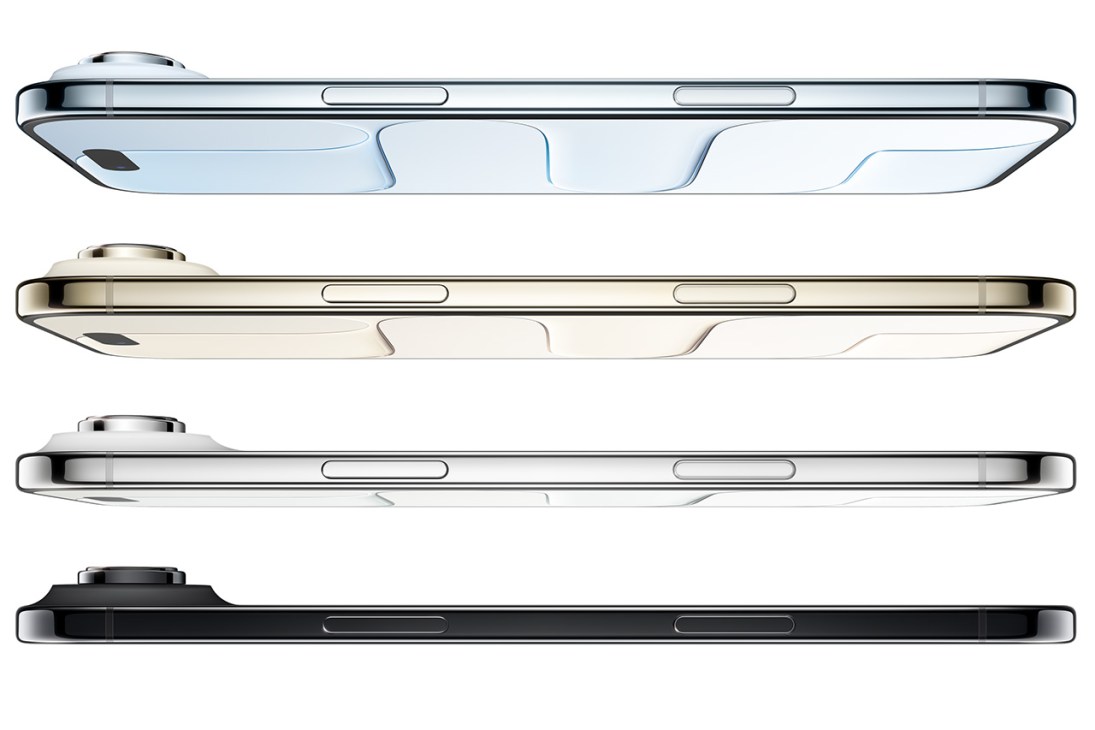
So why is now the right time for the iPhone Air to glide into view? “It’s about multiple pieces coming together,” says Anderson. “A lot of material innovation allowed us to get to this point – we couldn’t make [the iPhone Air] out of aluminium, for instance.” That’s why the frame is made of titanium, a stronger material. With a phone this thin, there were worries that it would warp. In an earlier session at Apple’s HQ, a technician urged me to attempt bending the new model – I failed. Then they stress tested it in a machine at a pressure of up to 60kg and it still refused to buckle.
The bet on battery
But is all this enough to ensure the iPhone Air’s success? Though durability might not be in doubt, is there room to fit in a powerful battery with enough stamina?
“Battery quality is important in our products,” says Ternus. “To achieve great battery life in this phone we needed all the pieces to work together to realise the vision that we are always trying to achieve: where the phone disappears into the user’s hand and they’re just interacting with the content. We could have done it sooner but it wouldn’t have been this product.” That vision, of a slab of glass with nothing to keep you from being immersed in what’s on the screen, has been a north star for Apple since the first iPhone, co-designed by Jony Ive in 2007.
The iPhone Air feels almost like a single sheet of glass with a screen made from Apple’s proprietary material, Ceramic Shield, which is toughened to withstand scratches and resist damage when dropped. The phone’s thinness gives it a conspicuous lightness that is different from other models and takes a moment to get used to.
Why colour matters
The iPhone Air comes in four shades: cloud white, sky blue and light gold in a glossy finish and a matte, space black. “We’re always looking at refining the colour and texture on the back glass, and there’s extreme subtlety to that. It was unclear whether we were going to do a black because we love how the lighter hues evoke the feeling of airiness and lightness,” says Anderson. “But with the black it becomes a monolithic piece of glass. You almost don’t see the beginning and the end of the glass, as the part lines just disappear. And we felt it was the perfect complement because the black makes the phone feel even thinner,” she adds.
In the flesh, the matte finish almost seems to absorb light, like a tiny black hole. Black is regularly the most popular colour choice for tech products, so it makes sense that Apple would include it in the line-up as well.
The Silicon Valley giant is also launching the iPhone 17 Pro and iPhone 17 Pro Max this month – its most advanced and powerful handsets. Phones with powerful processors tend to get hot, so Apple has switched from the titanium used in previous iPhone Pro models to an aluminium unibody to allow better heat dissipation. “The thermal conductivity is 20 times better than the titanium we previously used,” says Ternus. There’s another benefit to the change: colour. Until now, all iPhone Pro models were only available in muted hues. This year, alongside deep-blue and silver options, there’s another, surprising choice: cosmic orange.
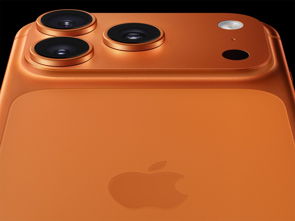
“The colour, material and design start together,” says Anderson. The process involves a conversation about what materials we’re going to use, what finishes and how we want to colour it. The lovely thing about aluminium is that it anodises. Anodising is an incredible process and we love the shades that can be achieved from it. We wanted to use colour to express the updated material and see the joy in that.” Apple has used orange before, for instance, on the iPhone’s ringer switch. “Orange was specifically chosen because it’s a very utilitarian colour, such as Safety Orange and International Orange [a standard hue that’s most known for decorating the Golden Gate Bridge],” she adds. “We felt this was a great place to express the performance quality and the tool-like characteristics of the iPhone Pro in a way that’s different to the finishes and the palette of the iPhone Air.”
The other new element for the latest iPhones is the software. A striking design called Liquid Glass mimics the appearance of glass in digital form. “We wanted it to feel very tactile,” says Dye. “When you push your finger down, the glass effect comes up to meet your finger, on the volume slider, for example. On the iPhone Air, the sensation is heightened even more because it feels like you’re in direct contact with the digital content beneath the effect. We love it when hardware and software feel connected.”
Much of the smartphone industry is laser-focused on artificial intelligence and the features and benefits that it will bring. Yet Apple’s AI innovations are due to bear fruit in the coming months rather than now. Instead it has chosen to emphasise the idea that good design, both in hardware and software, is more important. And it hopes that this will see the new products win favour with its audience, even as prices hit new heights.
Read next: By focusing on human interaction, Apple proves that there’s more to get excited about than AI