
Issues
Walking distance
Essex Road in London’s Islington neighbourhood has been tweaked and gentrified in recent years. There has been the familiar influx of bijou coffee shops and cool bicycle retailers but, as you head northeast down the road, it also strikes you how little has really changed: Steve Hatt, the fishmongers, is as busy as ever (although perhaps fewer whelks and more sea bass are requested these days); the bathroom plumbing store is still there; and, look, there’s that taxidermy shop Get Stuffed. It’s a road where old and new, trade and commerce, still happily muddle along. Perhaps that’s why the arrival of storied bespoke shoe-maker Henry Maxwell shouldn’t seem so surprising.
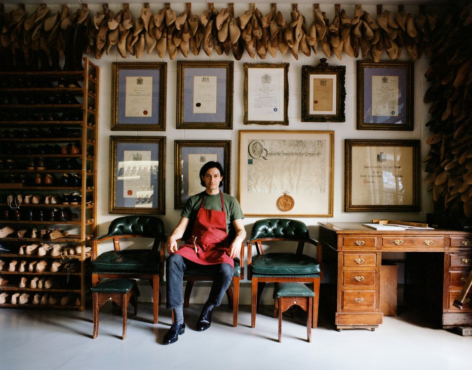
The Henry Maxwell team, previously ensconced in refined Jermyn Street in the West End, arrived in their new headquarters in September. They are now resident in a neat, brightly lit unit in a converted piano factory, its courtyard rammed with vans belonging to contractors for new tenants but also an old Merc owned by Henry Maxwell’s managing director and last-maker, 42-year-old Simon Bolzoni.
The departure from Jermyn Street was triggered by the business being rattled by the pandemic – more on this in a moment – but, insists Bolzoni (and the company’s owner and chairman, Richard Edgecliffe-Johnson, agrees), it presents a unique opportunity to reinvent a very high-end luxury business and to make it feel vital again. “I respect our role as custodians of heritage but it’s then hard detaching from people’s expectations, especially in the West End,” says Bolzoni. “We cannot get bogged down. Our customers like the fact that we are now looking forwards. People can get fatigued by heritage.”
In this new outpost, Bolzoni believes that, without the terrifying overheads of an sw1 postcode, the brand has the best chance to focus on making impeccable bespoke shoes and taking care of a healthy list of men – and some women – who pay more than £5,000 for a pair of Maxwell shoes. And its home already looks like a home: the walls are covered in old lasts, hung like pheasants in a butcher’s window. There is also an old gold-handled desk, some comfy green-leather chairs, a piece of carpet cut from the chairman’s office, and the last-making bench, all brought from the old gaff. But no one is pretending that this isn’t all rather fresh. That’s the whole point.
But let’s get through the history bit, which is as tangled as a jumble of old laces. We’ll start in 1750 when a gentleman called Henry Maxwell founded an innovative spur-making business that gained him royal warrants from King George IV and resulted in his designs being displayed at the Great Exhibition of 1851. In the 20th century, as trotting around on your steed gave way to hitting the automobile’s accelerator (or getting your chauffeur to oblige), the spur business transformed into a shoe and boot one. In recent years, however, the Maxwell name, the brand, has been rather quiet. But here comes another twist in the tale that you need to know about.
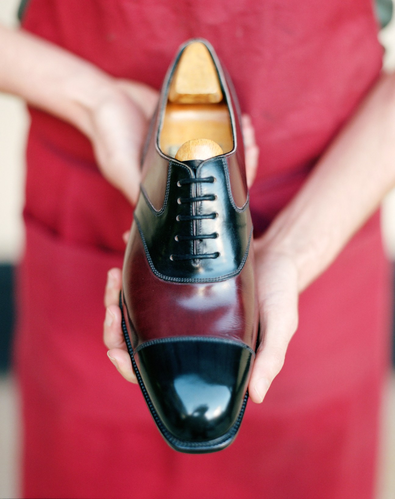
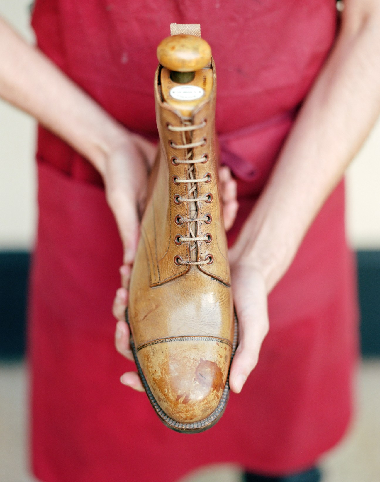
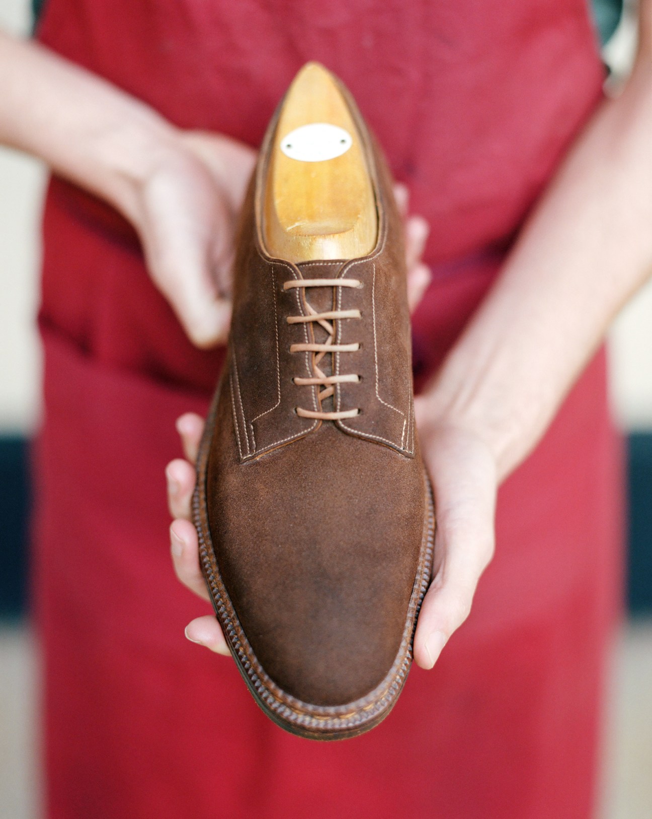
Richard Edgecliffe-Johnson had enjoyed a successful city career but wanted more thrills in his life and left for new adventures. One day, while playing backgammon (he’s a leading figure in the game), he met the widow of a man who had owned two pukka shoe businesses – Foster & Son, maker of ready-to-wear shoes, and Henry Maxwell. “This was in 2006,” says Edgecliffe-Johnson. “I said that I would get involved if I could secure a controlling interest. And then, in 2010, I bought out the remaining shareholders.”
From here, trade ticked along nicely. There was a shop on Jermyn Street. In 2018 a new Foster & Son factory opened in Northampton. Maxwell was still around as part of the business, tending to a small but dedicated list of devotees. Then came the pandemic and all bets were off. Suddenly the eye-watering West End rents could not be tolerated. The shop shut. The factory was closed down and then sold. Foster & Son stopped trading.
This is when both men saw the light. “It was painful but it was a golden opportunity,” says Bolzoni. “We could strip the business back to what it should be: bespoke.” Edgecliffe-Johnson agrees, adding that the West End’s glory days had passed in many ways. “Rents and rates were high in Jermyn Street and footfall low,” he says. “So it was a case of, ‘If you can’t go back to yesterday…’ It doesn’t work.’”
So that’s why we are here today on Essex Road, where the neighbours are not gentlemen’s shirt-makers but a hairdresser called Crops & Bobbers. Bolzoni greets us wearing a red apron over his jeans and T-shirt, and a pair of scuffed black shoes (he’s never had time to make himself a pair of Maxwell’s). He has long black hair and a straight-backed posture; perhaps a leftover from the four years that he spent on runways and in fashion campaigns as a model for the likes of Prada and Marc Jacobs.
But after those four years he wanted out. He got a job in a menswear boutique; became a buyer. “I was buying Vivienne Westwood and Maison Margiela,” he says. “Alexander McQueen was a customer but it was hard to find good English shoes; people were buying thin-soled Italian ones,” he adds, with a slight hint of disdain.
Then one day he was in an antiquarian bookshop in Charing Cross Road and found a hefty Victorian title about making boots and shoes. “I knew that this was what I wanted to do,” says Bolzoni. “I went to George Cleverley but they were not training anyone. I walked down to Foster & Son and pushed open the door. The shop was empty but then this man appeared who turned out to be Terry Moore, the master last-maker. I hadn’t thought about last-making as all the books are about the shoe-making; pattern cutting. He told me that it was a dying trade but we got chatting and we realised that we were from the same part of town and then he said, ‘Wait a moment,’ and he went upstairs. Richard had just bought the business and [Moore] said to him, ‘I want to see if this kid can do last-making. I’ll take him over to my workshop next Wednesday. If he can do it, I will train him.’” The day became a week, the week turned into three years.
“It takes that time,” says Bolzoni. “He would make the right foot; I’d then make the mirror image for the other foot – but it’s never the same shape. It’s all about problem solving.” And the tools don’t help: you start with a long, fixed, sword-like blade to chop lumps of hard beech. And then there’s that strange mix of physical force and tender crafting. And feet.
You’d think that the rest would be history. But Bolzoni left the firm in order to take care of his baby, fell into starting a fashion label and ended up spending eight years out of the firm. In 2017 he found his way back to working with Edgecliffe-Johnson, rejoining on the shop floor, then working his way up to MD and also, more significantly, the last-maker.
The last-maker is perhaps the most important person in a bespoke shoe business. The point of contact for the customer, they are the designer, the salesperson and a craftsman. “You have to get to know customers and to understand them,” says Bolzoni. “We want to make something that’s perfect for you and in the right context.”
At this point we rejoin the story when the pandemic is locking the doors one final time on numerous businesses; pulling down the shutters on cherished brands. But Bolzoni and Edgecliffe-Johnson see a way ahead. “We needed to do something radical,” says Bolzoni. “We did a whole new business plan. Took it to pieces, stripped it back and rebuilt it from there.” But with the press full of stories about the death of formal attire and the abandoning of the office, a focus on bespoke shoes could look like a risk. Bolzoni disagrees. “Our customers are free-thinking and they like what we are doing; they see themselves in us. They tend to be successful – heads of companies or owners of their own businesses – and they like coming here.” And they are still spending.
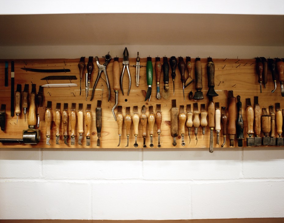
For a business like this to thrive, it doesn’t need thousands of customers but it does need those who love the process of having something made, care about being part of this world, want comfort, like to look good and have wealth. Henry Maxwell has many lifetime customers who own several pairs of these leather masterpieces.
Bolzoni isn’t alone in his mission. Reece Cox, an Australian-born pattern cutter, works at the atelier, as does leather goods-maker Conor Masters, who specialises in hand-stitched briefcases and dispatch boxes. They are a youthful, focused team and clearly get on (Cox chips in from his bench when Bolzoni can’t recall a date). It’s a company that has a great history but also the air of a start-up.
Bolzoni is confident. “It takes about a year from walking in the door to getting your first pair of shoes and there’s also a finite number of shoes that we can make,” he says. “I imagine that we could see people waiting up to two years as the business grows. You’ll be pleased you got in.” And though most of his customers are in their fifties, others are in their twenties.
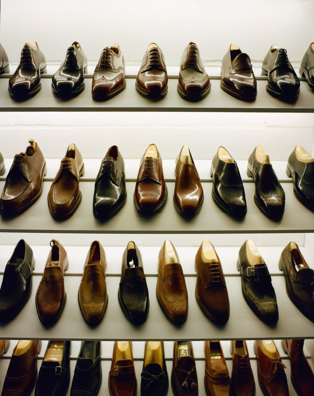
At the end of our conversation, Bolzoni shows me some of the samples that he has on display. There’s a full-saddle loafer in crocodile, a co-respondent in brown and beige, a lace-up boot. Some of these shoes were made 100 years ago but if you saw someone in, say, the nice loafers, you’d think they were yesterday’s designs. It’s heritage like this that great brands such as Hermès and Goyard have used to create very modern businesses. Henry Maxwell can surely tap into a little of the same spirit, stitching together past and future and finding people who are determined that Mr Bolzoni will not be the last man standing.
henrymaxwell.co.uk
Wrapped up
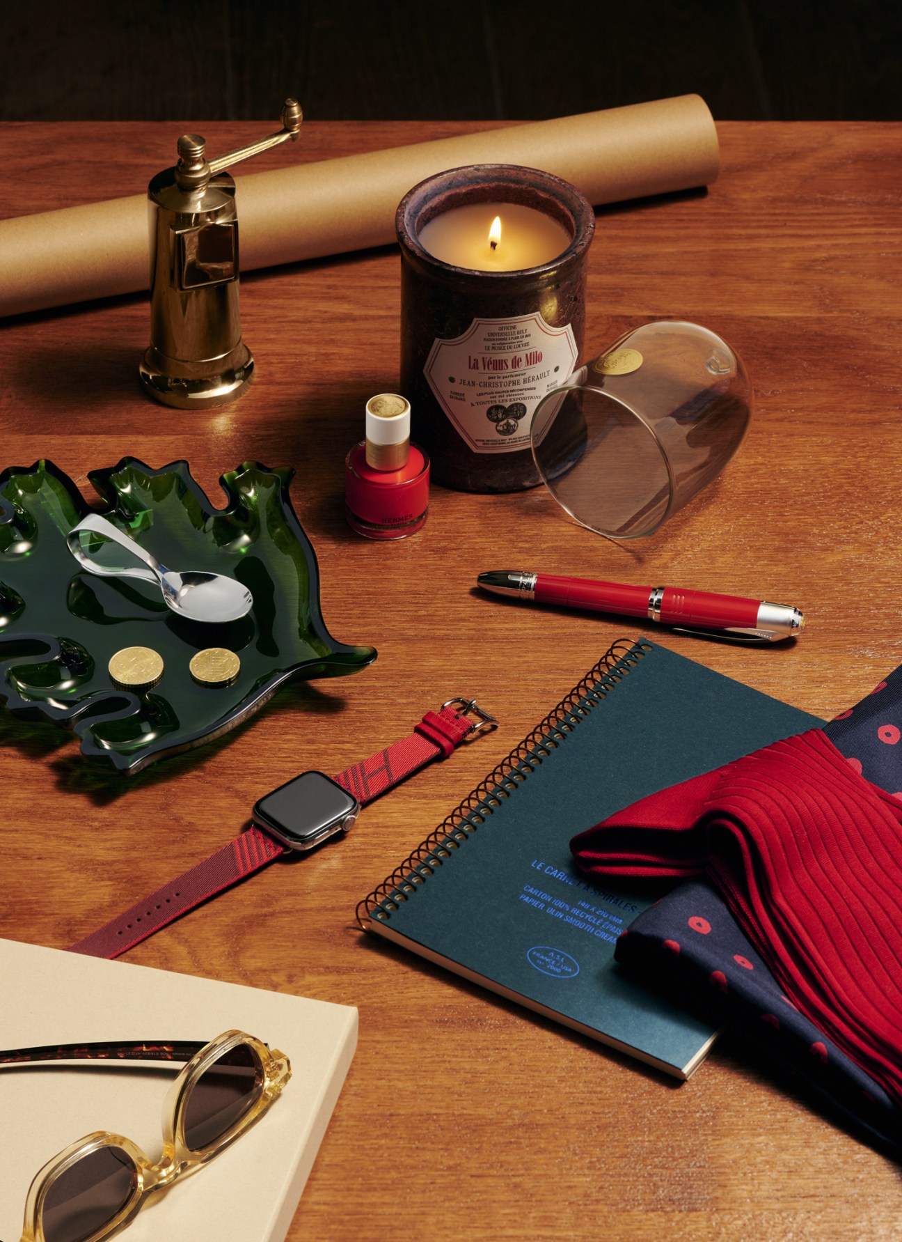


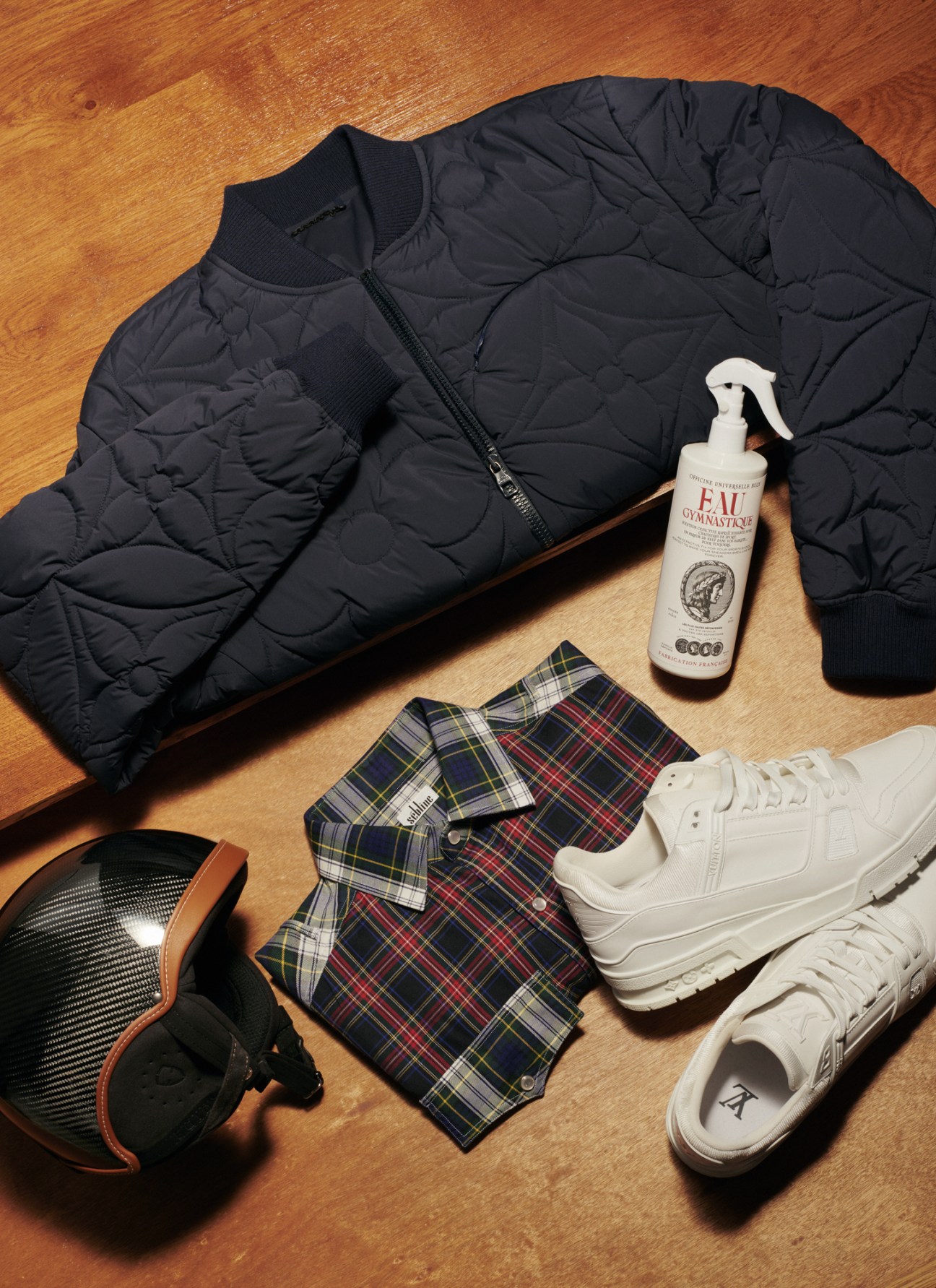


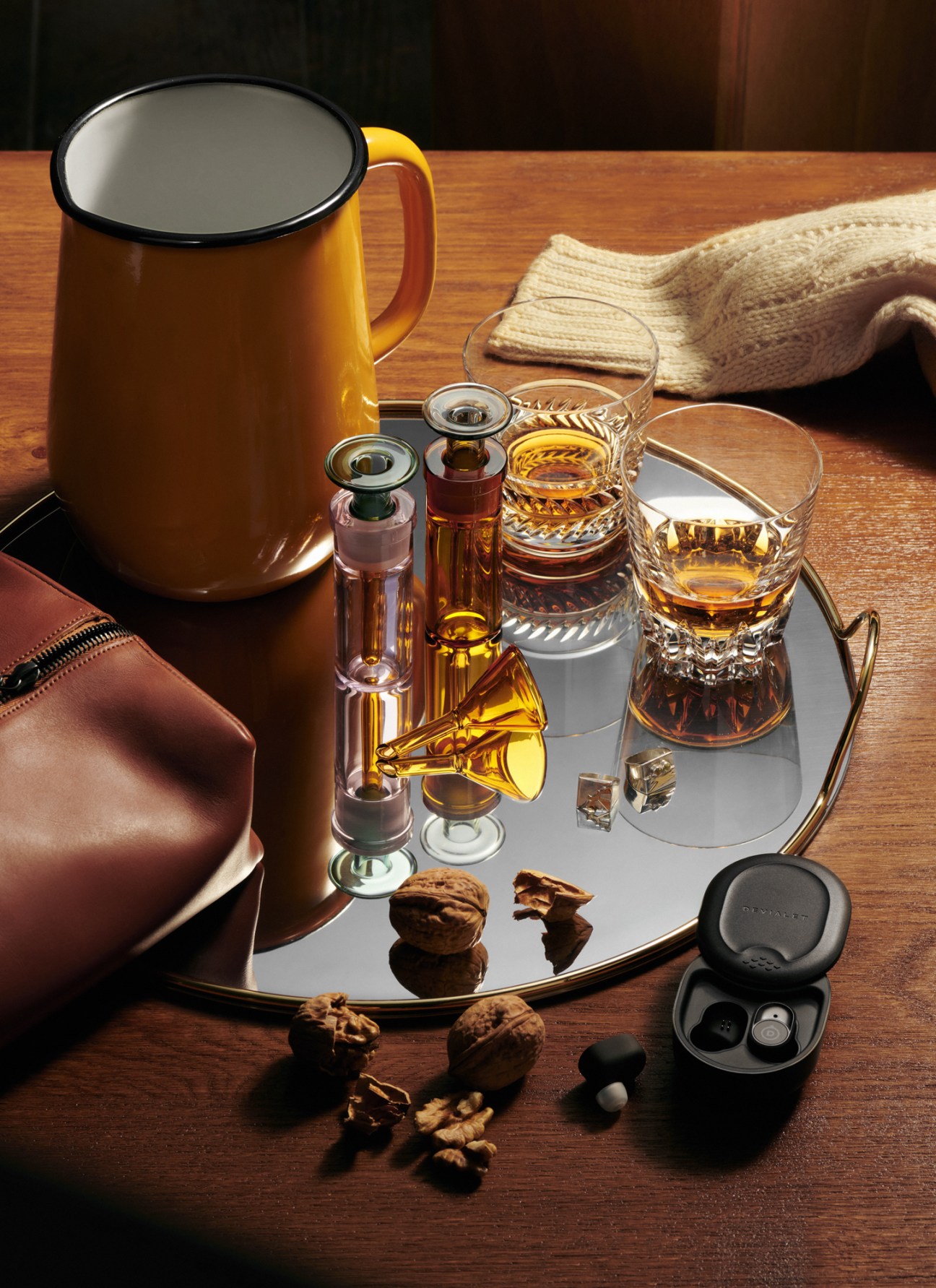
Stylist: Daphné Hézard
Winds of change
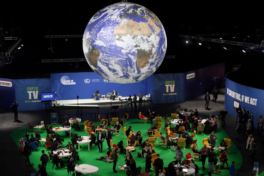
Billed as the final chance to save the planet, the latest UN Climate Change Conference – Cop26 in Glasgow, Scotland – was a momentous event. The aim of this gathering of world leaders, activists and corporations was to extract pledges that are aimed at countries limiting global warming to 1.5c above pre-industrial levels. At the host venue, the Scottish Event Campus, the sense of urgency was palpable, as was the defiance among smaller nations – the ones that are often left paying the price for larger countries’ climate inaction.
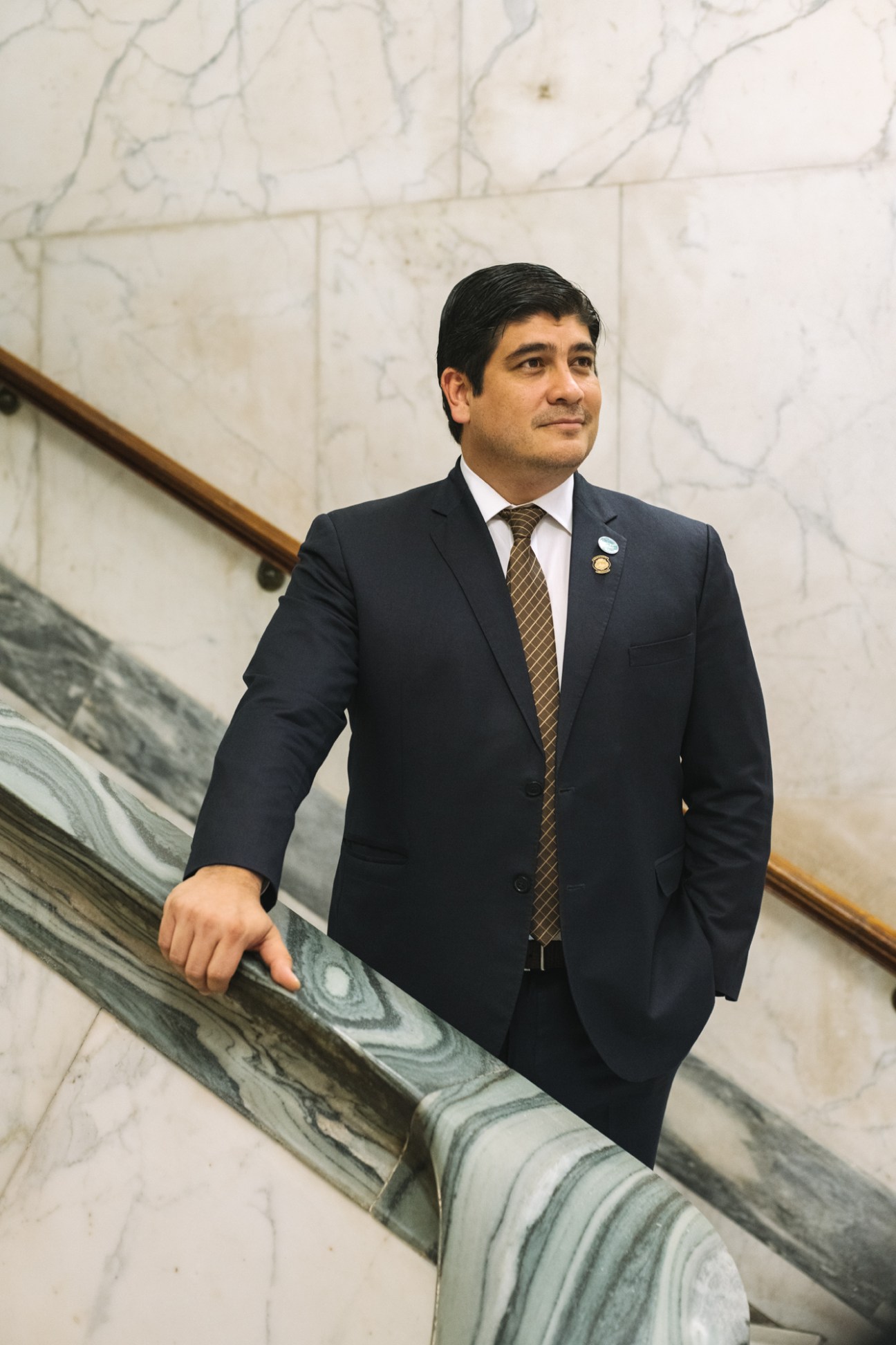
“If the world was a private company and its leaders ceos of corporations, we would all be fired and out of business.” These were the words of Costa Rica’s president, Carlos Alvarado Quesada, as he addressed the plenary room packed with his counterparts.
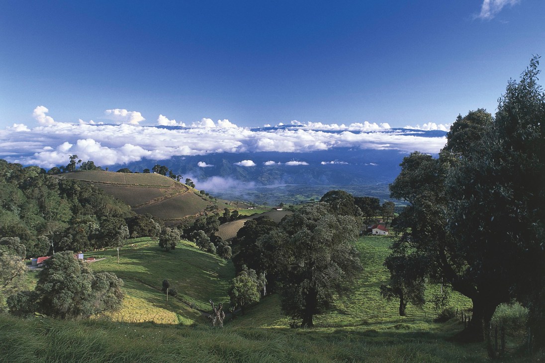
The Central American nation might have a population of a little more than five million people but it has emerged as a leading influencer in the fight against climate change. Over a quarter of its territory is rainforest protected from exploitation and, together with its oceans, it holds 5 per cent of the world’s biodiversity.
“If the world was a private company and its leaders CEOs of corporations, we would all be fired and out of business”
In 2019, Costa Rica launched an ambitious plan to decarbonise its economy, setting a goal to achieve zero carbon emissions by 2050 and a ban on gas and oil exploration. A progressive reforestation programme means that 53 per cent of its territory is green, while more than 22 per cent of Costa Rica’s entire coffee production is low-carbon and sustainable.
At the summit, Costa Rica partnered with Denmark to launch the Beyond Oil and Gas Alliance, intended to assist governments in phasing out oil and gas production. Monocle caught up with President Alvarado at Cop26, just after he’d signed a landmark agreement on ocean conservation with his Central American neighbours.
What needed to be achieved at Cop26?
The first target was intangible: the necessity for action. We talk a lot about the 1.5c, and we talk about goals of finance. But I believe that people around the world now understand a little bit more the risk of losing the planet. So if we manage to raise awareness of why this is so urgent and that becomes a trigger in order to push leaders around the world – such as myself – to act, then that’s success.
What is standing in the way of an effective multilateral climate plan? For example, the Cop26 deforestation announcement was met with widespread approval but it’s non-binding. How do we make these actions binding?
There are many national constraints; we’re talking about multilateral agreements with hundreds of countries. We set goals together but after that there’s the internal politics of how each country implements them. Many of these policies face resistance because there’s always resistance to change. I believe that change is going to happen but there’s a lack of time to achieve that. One thing that I’m worried about is that I perceive that, in a couple of months, we’ll start seeing more and more of a game of pointing fingers at those who do not comply with what’s necessary. I’ve started to see that already in the developing world. Many of us are suffering the consequences of climate change – we are experiencing extreme weather, but we do not use as many fossil fuels. So if we do not start seeing changes or changing behaviours, particularly in the countries that need to change their behaviours, I foresee that there’s going to be a lot more finger-pointing at those who are not delivering.
In your speech to other world leaders, you mentioned precisely that, saying that the developed world needs to pull their act together. Aren’t we at that finger-pointing stage already?
We’re about to get to that point. We’ve been talking a lot with the island states, particularly with the Caribbean islands but also with the Seychelles and Marshall Islands. In their case, the situation is really critical. They’re currently basically pledging for their existence and the right to exist. I truly believe that’s going to change the way in which diplomacy works. And it might even change the narrative of how we try to persuade others – if we can raise awareness of how people have been affected around the world, all because of the great polluters that are not changing their behaviour.

Costa Rica has set a goal to be carbon neutral by 2050, the same year as the UK and USA. But isn’t the truth that by 2050, it’ll be too late?
Well, yes, but in our case, we created that goal in 2019; we were the first country to have a decarbonisation plan. And the plan is to fully decarbonise our economy, which means completely abolishing the use of fossil fuels. Our contribution is not as important in terms of the quantity but the Costa Rican contribution is important in terms of the example, because we have demonstrated that you can reverse deforestation. We have demonstrated that a medium developing country in Central America can be 99.5 per cent clean and renewable, and still produce electricity. We have demonstrated that you can expand your conservation areas in the oceans without necessarily being a developed country with lots of resources. So with those examples, and with the nama coffee producers [Costa Rica’s governmental programme to reduce coffee production’s carbon footprint and water use] – all that shows what is possible. Our contribution is not necessarily in the quantities; it is in providing examples that show how change is possible.
You just mentioned Costa Rica setting an example when it comes to ocean conservation. You’ve recently signed a Clean Seas Pledge. Who was involved and how was it negotiated?
Costa Rica launched this pledge a couple of years ago with both France and the UK: The High Ambition Coalition for Earth and People. The goal is to protect 30 per cent of the territory of each country, both in land and in oceans as well. Just a couple of hours ago, here at Cop26, Panama, Colombia, Ecuador and Costa Rica committed to protect a joint area, to create a large conservation area that brings together Cocos Island in Costa Rica, Galápagos in Ecuador and very important areas of Panama and Colombia. This is a concrete example of how you can create a very large, protected area that’s going to make a difference.
Costa Rica is a leader in conservation and climate activism, not only in Latin America but the world. But isn’t it easier to enact climate policy in a small monocultural democracy than a large, multicultural one like, say, the US or UK, with very divided electorates?
No, we are a very diverse country. We have a very polarised debate, similar to what happens in other nations. But the fact that we have a polarised debate and have still managed to do things – that’s an example of what is possible. I will also challenge the idea that we are “small”. We are the largest exporter of pineapple worldwide and 92 per cent of our territory is ocean. Our scale is not as small as it’s been pictured. Change is a matter of will; it is not a matter of scale. If that argument were to be true, then you would say to Gandhi, Mandela or Martin Luther King that change is not possible because your cause is too big. But I believe that change is possible. They managed by being individuals who had the moral courage to change the face of a nation and the world. I believe that courageous and moral leadership is what’s required to make change actually happen.
The CV
2006: Graduates with a master’s in political science
2013: Becomes communications director for presidential campaign of Luis Guillermo Solís
2014: Named minister of human development and social inclusion, then becomes minister of labour two years later
2018: Elected president at the age of 38
Cold moves
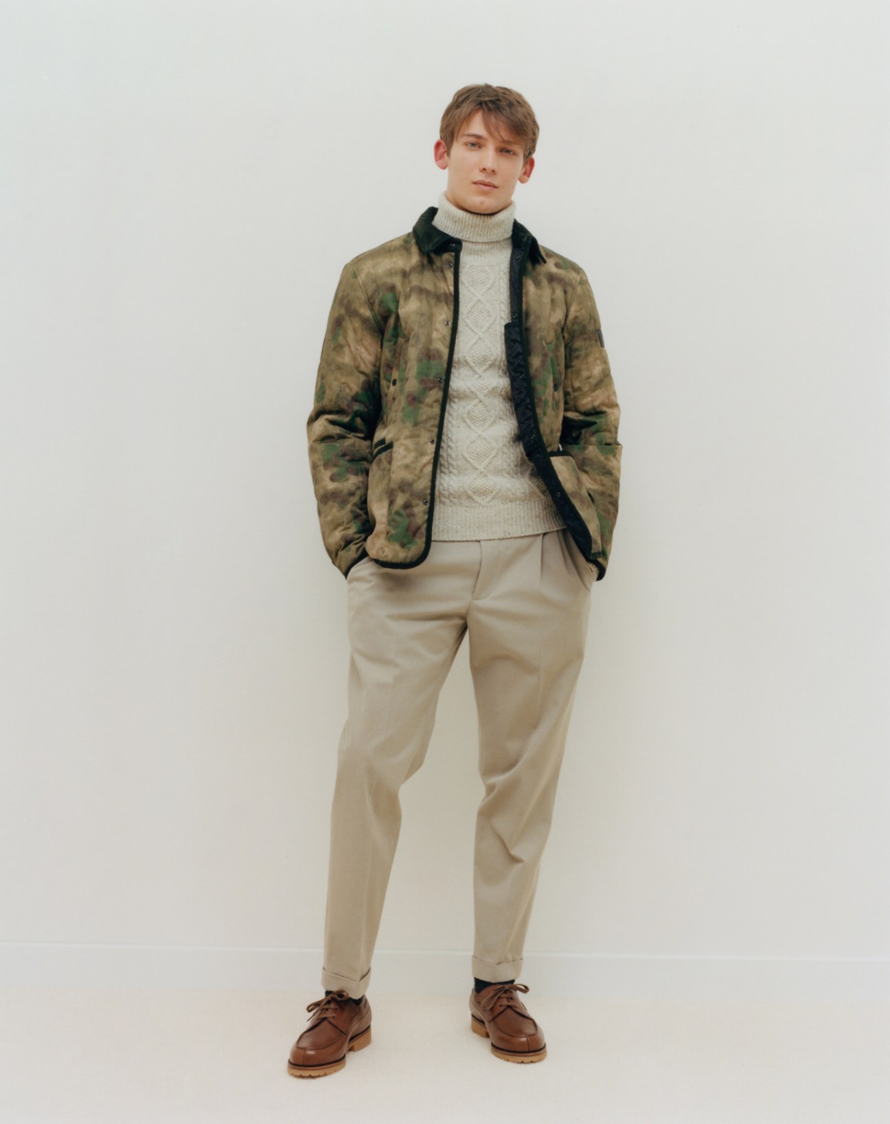
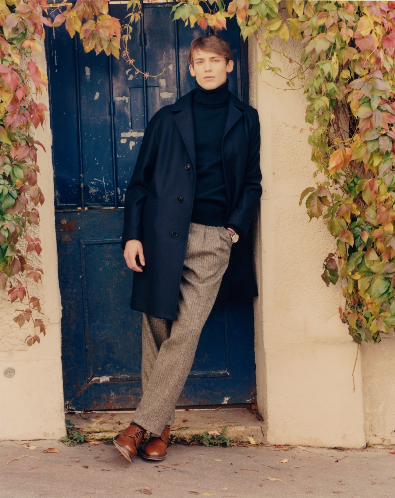
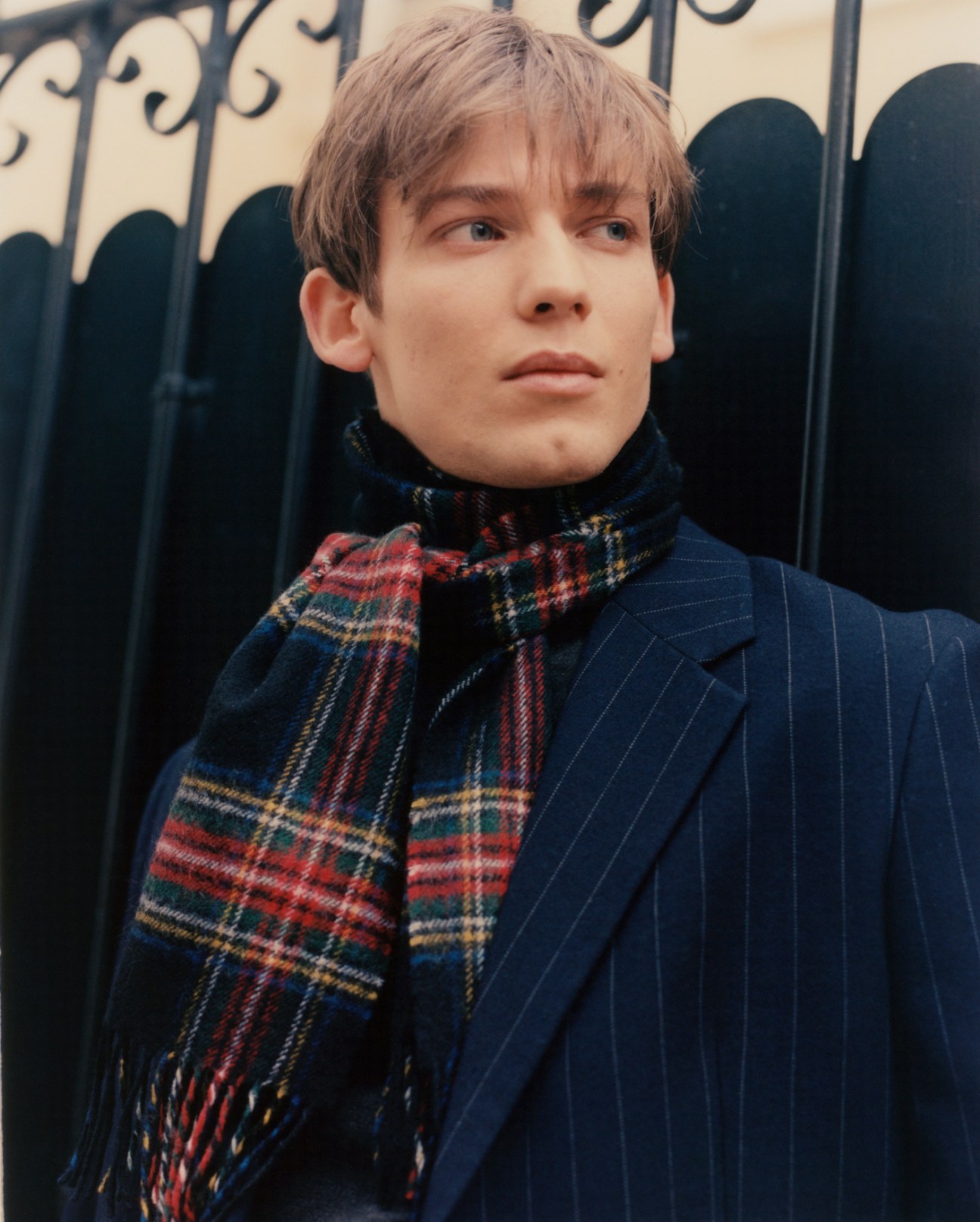
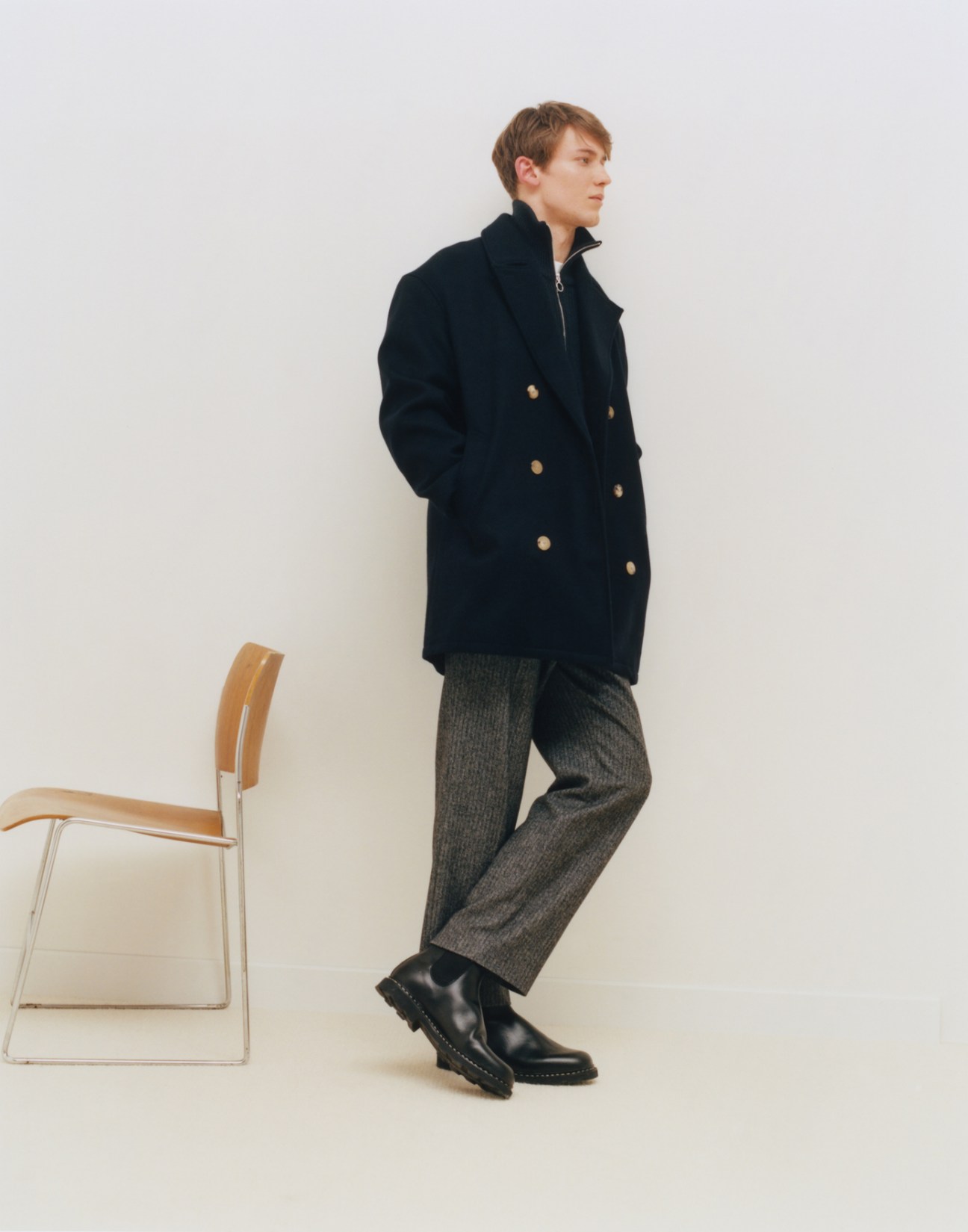
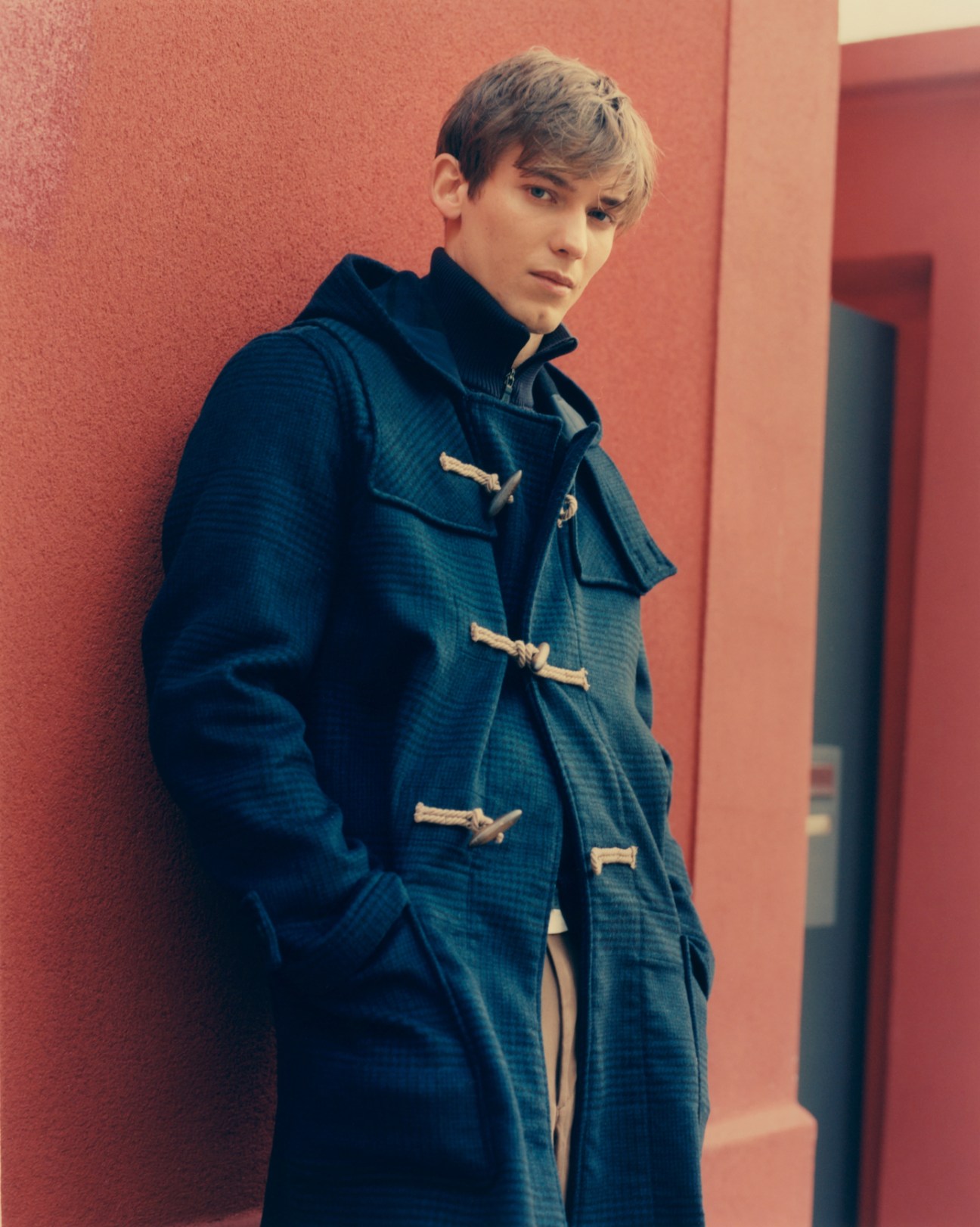
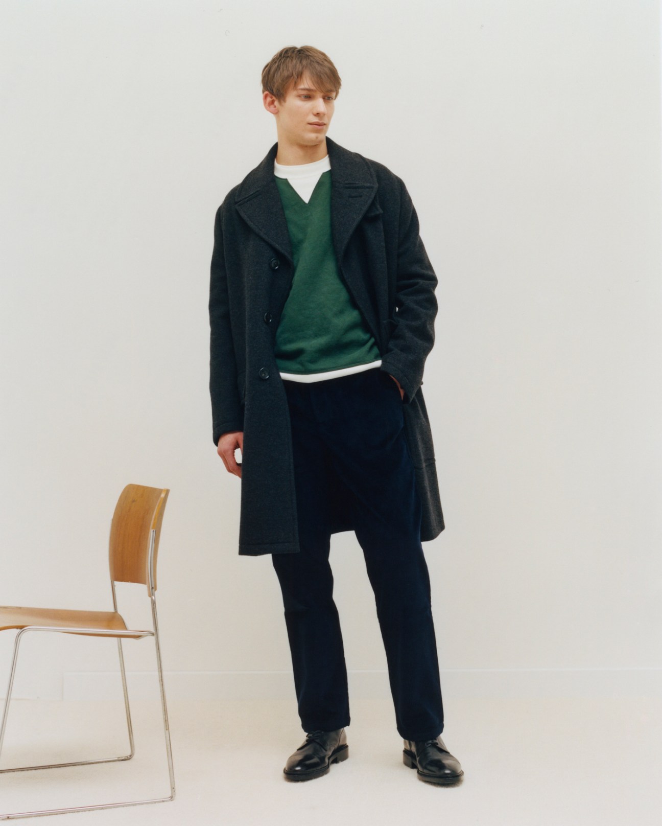
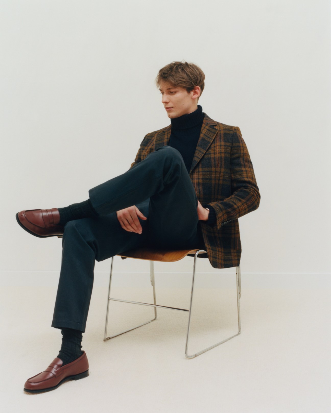
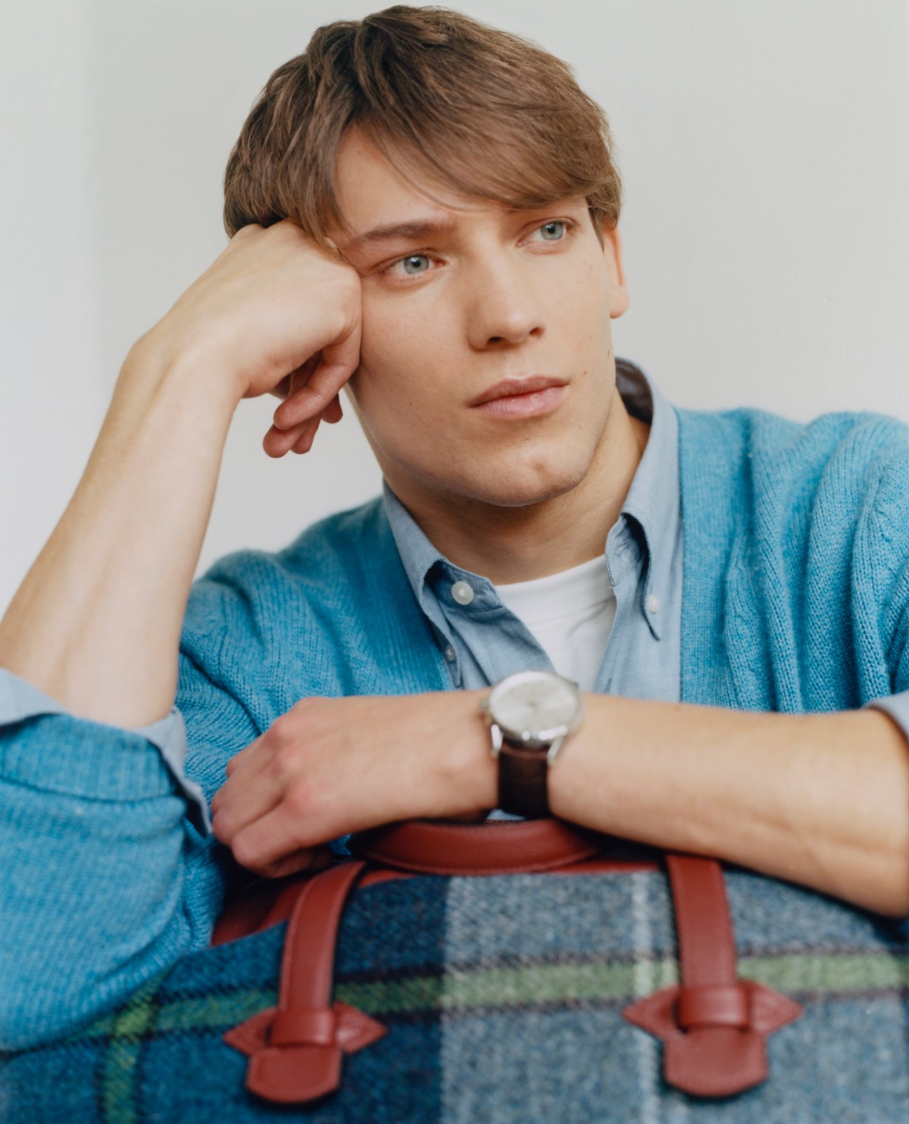
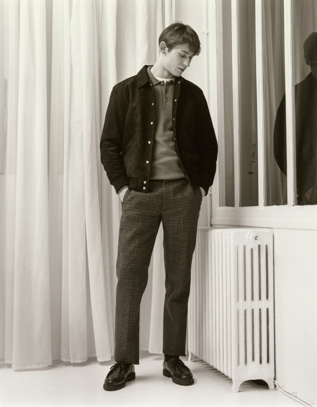
Model: Christopher Einla
Hair: Damien Lacoussade
Make-up: Emilie Plume
Stylist: Loyc Falque
Stylist’s assistant: Laura Cheron
Return to hope
It’s day three of the Libya Build 2021 exhibition and Ghaleb Gheblawi is busy greeting visitors at downtown Tripoli’s elegant fairground. Gheblawi is an architect and one of the organisers of what is advertised as “the biggest construction expo in north Africa”. Almost 200 exhibitors are participating, including companies from Turkey, Italy, Greece, Tunisia and Austria. Displays offer glimpses of what Libya’s future could look like. These include handsomely designed residential projects and a plan for improved public transport in the congested capital.
“We have some hope now,” Gheblawi tells me over espresso, cups of which fuel daily life in Libya. It’s the first time since 2014 – the year that post-Gaddafi Libya slid into civil conflict – that the exhibition has been possible. Organisers say that this year’s event couldn’t be more timely or necessary. The country faces a massive reconstruction bill after years of war; conservative estimates put it at more than $100bn (€87bn).
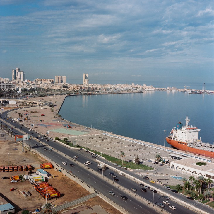
My arrival into Tripoli was also an immediate reminder of the list of repairs that the country needs to tackle. The city’s international airport was destroyed during militia clashes seven years ago, so flights currently land at a smaller site on a former US airbase. Plans to reopen tip, as Libyans refer to the main airport, have been delayed repeatedly. War damage notwithstanding, Libya’s creaking Gaddafi-era infrastructure, from roads to sanitation systems, also needs a complete overhaul.
Visiting a government office shortly after landing, I spotted a tourism ministry poster that I first saw in a hotel in Benghazi, Libya’s second city, in February 2011. It was just days after the beginning of anti-Gaddafi protests, which later tipped into armed insurrection. “Libya is a daydream,” it declared in bold capital letters set against a now-faded green background. The slogan seemed rather surreal in 2011 and still does today, 10 years after the ruler was overthrown.
Libya under Gaddafi was far from a daydream. It was also not an easy place to visit or get to know. Throughout much of the 42 years between Gaddafi’s rise – he came to power following a military coup in 1969 – and fall, Libya was a pariah state, isolated and choked by sanctions. From the mid-2000s, a tentative opening up saw prospective investors and organised tour groups enter under tightly controlled conditions. But for much of the world, Libya was Gaddafi and Gaddafi was Libya. That was how the increasingly flamboyant man known as the Brother Leader preferred it.
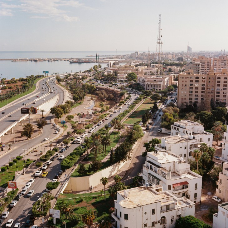
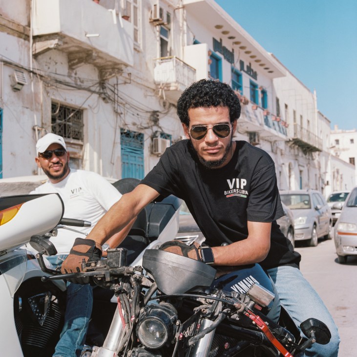
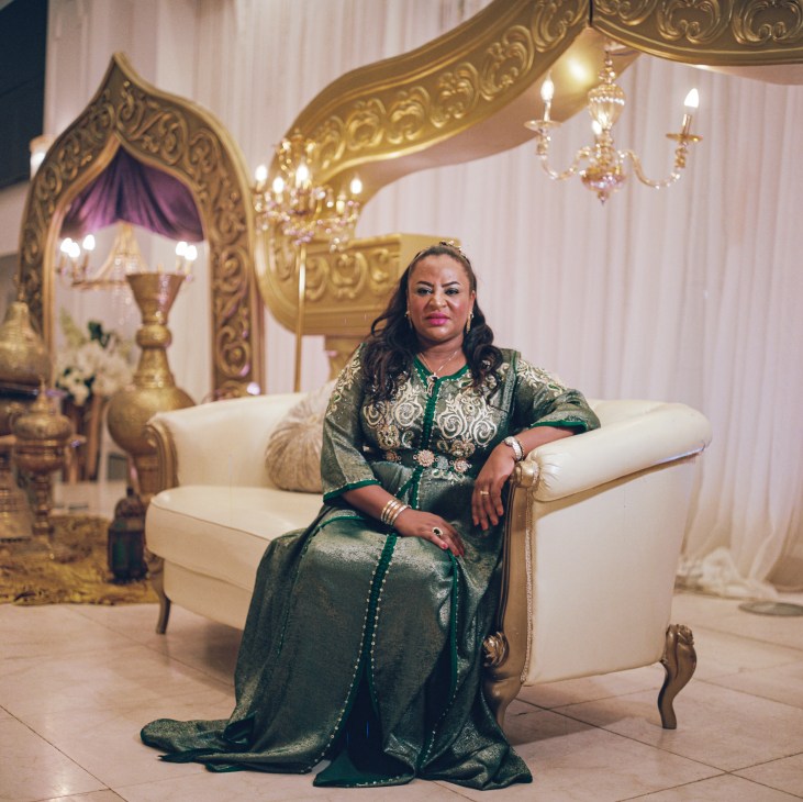
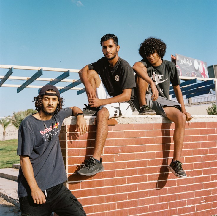
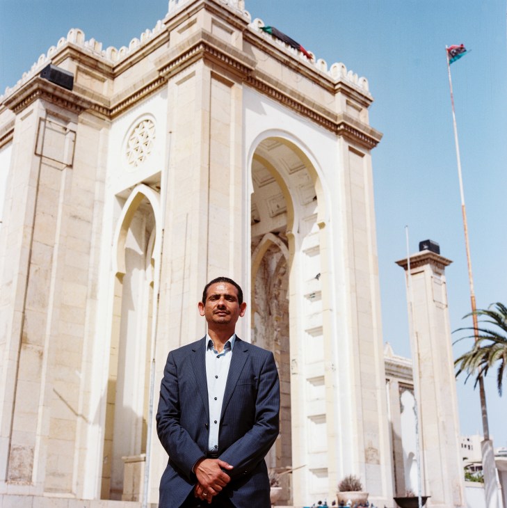
And then he was gone, killed during a popular uprising that drew in a Nato-led intervention mandated by the UN. Libya’s transition from dictatorship to democracy promised to be anything but simple. Gaddafi’s eccentric and often brutal experiment in governance relied on dense patronage networks, along with ad hoc edicts that made Libyans feel, as one friend put it, that the ground was constantly shifting beneath their feet. Despite all this, in the heady aftermath of Gaddafi’s toppling, many Libyans had sky-high expectations. “We will soon be a new Dubai on the Mediterranean,” several told me in late 2011. Others dreamt of seeing the country emerge as the Switzerland of north Africa.
And then he was gone, killed during a popular uprising that drew in a Nato-led intervention mandated by the UN. Libya’s transition from dictatorship to democracy promised to be anything but simple. Gaddafi’s eccentric and often brutal experiment in governance relied on dense patronage networks, along with ad hoc edicts that made Libyans feel, as one friend put it, that the ground was constantly shifting beneath their feet. Despite all this, in the heady aftermath of Gaddafi’s toppling, many Libyans had sky-high expectations. “We will soon be a new Dubai on the Mediterranean,” several told me in late 2011. Others dreamt of seeing the country emerge as the Switzerland of north Africa.
For casual observers at the time, Libya could, on paper at least, appear deceptively straightforward. It has a predominantly Sunni Muslim population of less than seven million, with none of the sectarian and ethnic cleavages that have fed conflict in Syria and Iraq or the literacy challenges that hobble neighbouring Egypt. Most Libyans are urbanised and live in cities or towns, which are strung along the 1,770km long Mediterranean coastline. It’s a strikingly youthful nation: about two thirds of Libyans are under 30 years old. Their country is home to Africa’s largest oil reserves. Given all that, more than a few Western diplomats believed in 2011 that Libya had the potential to become a success story of what many then referred to as the Arab Spring. Some still insist that this is the case. “If you look at the fundamentals of Libya, it is an El Dorado,” says Husni Bey, a prominent Libyan business figure who owns a private holding company. “We have everything we need to succeed but the challenge has always been how to manage it.”
In 2012, Libya held parliamentary elections for the first time in more than 40 years, only to plunge into civil conflict two years later. Since 2014 the country has not only been at war with itself but also at the mercy of multiple external meddlers, most recently Turkey and Russia. I lived in Tripoli in 2014 and watched Libya’s fragile transition unravel in large part due to the ambitions of Khalifa Haftar, a septuagenarian general who was an ally of Gaddafi in 1969 but later defected. When I met Haftar that summer, he had just launched unauthorised operations in Benghazi while his militia allies attacked parliament in Tripoli. Haftar, who had been accused of attempting a coup earlier that year, was prickly during our conversation but an aide breezily told me that his ultimate aim was to “rule” Libya.
His most recent attempt to realise that goal started with an offensive in April 2019 to capture Tripoli from the internationally recognised government. It ended in failure more than a year later when his forces – among them Russian mercenaries – withdrew from the capital’s hinterland. When I returned to Tripoli late this autumn, anti-Haftar posters could still be found in the city. Driving around the suburbs where much of the fighting took place, the physical destruction was still visible. Key to Haftar’s routing was a Turkish military intervention in support of the Tripoli government. Ankara is now an influential player, to the chagrin of those that backed the ageing general, including the uae, Egypt and France.
The last time I visited Tripoli was just a couple of months before the pandemic struck. The capital was tense; its outskirts were being besieged by Haftar. Residents complained to me that they felt they were no longer in control of their own destiny, such was the level of foreign interference in Libya. Almost two years on, it feels very different. A ceasefire signed in October 2020 has endured. There are some checkpoints in the outer districts of the city but few in the centre. Rena Effendi, the photographer accompanying me, is surprised on her first visit to Libya not to see more armed men on the streets.
Last March a new government, the fruit of a UN dialogue process, was tasked with steering the country towards elections. It includes a number of women, including Libya’s first female foreign minister, Najla Mangoush, who has a phd in conflict resolution. Several Libyan women told me that they are proud to have her representing the country on the world stage.
There’s a mood of cautious optimism. Since the installation of what is known as the Government of National Unity (GNU), dozens of foreign dignitaries have made their way to Tripoli, while investors can once again be found in the city’s hotel lobbies. A number of embassies have reopened for the first time since 2014, when they and the UN mission were evacuated during a fierce militia battle for control of the capital. Many residents say that daily life in the city feels more relaxed than it has at any point over the past seven years. New cafés and juice bars (alcohol has been illegal in Libya since Gaddafi banned it soon after coming to power) have opened, along with clothing and home decor shops. International f&b companies remain wary of the Libyan market, with the exception of bakery chain Cinnabon, which caused a stir – and long queues – in 2012 when it became the first American franchise to open here. Copycat versions of well-known chains have been shut down by authorities. Libyans joke that whoever gets the franchise for international fast-food chains will become the country’s wealthiest person.
Dar el-Fergiani, Libya’s oldest family-run publisher with several bookstores in Tripoli, was a regular haunt when I lived here. It’s the place to find Libya-related titles that are out of print elsewhere, or more contemporary works such as The Return, the Pulitzer prize-winning memoir by Hisham Matar, a Libyan writer whose dissident father disappeared in Gaddafi’s prisons. I pick up a novel by another prominent Libyan author, Tuareg novelist Ibrahim al-Koni, and catch up with Usama Fergiani, one of the brothers behind the company. “I’m more optimistic than at any time since 2011,” he tells me. “Every war, like every game, has its end.”
We call in for lunch at al-Safir, an Indian restaurant and one of the most popular spots in town. The owner tells me that he has no shortage of customers, despite a pandemic that has hit Libya harder than most other countries in north Africa. The chairman of its National Oil Corporation popped by some days before, as did a European foreign minister. At a nearby table, Chinese businessmen tuck into platters of the house specials.
The gnu’s prime minister, Abdulhamid Dabaiba, a wealthy tycoon with family links to Gaddafi-era development projects, is keen to present Libya as open for business. Others are more circumspect. “My advice to foreign investors is to watch and wait,” one Libyan who works in the construction sector tells me over another round of espressos; he doesn’t want to give his name due to the sensitivities of the situation. “We’re not ready just yet. Build your networks here but wait to spend your money. Challenges remain.”
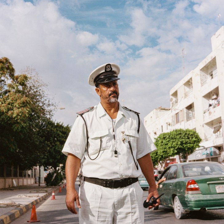
The biggest obstacle is security. To first-time visitors, Tripoli’s traffic police, in their pristine white uniforms, might provide some semblance of normality but militia skirmishes remain an all-too-regular occurrence here and elsewhere in the country. Since 2011 no government has had a monopoly on force. Efforts to disband the militias and build national security forces acceptable to all have been piecemeal. Many argue that until that happens, no progress that Libya makes will be sustainable.
“It all comes down to proper security,” says one Libyan official, who did not want to give their name because they were not authorised to speak on the record.
“Without professional national security forces and an end to militia culture, everything else is window-dressing.”
Those who have exploited Libya’s chaos and porous borders over the past decade include Islamic State and smugglers of many varieties, particularly those involved in human trafficking. The highly lucrative business of spiriting people through Libya to Europe has become multinational, connecting Libyan organised crime with counterparts elsewhere in Africa. Some migrants are subjected to forced labour. Others are detained in horrendous conditions. Ordinary Libyans are increasingly resentful of the fact that their country has become such a hub for human traffickers and a transit point for people desperate to get to Europe. In October, just before I arrived, government forces rounded up some 5,000 migrants in Tripoli. I hear some sympathy for migrants but most Libyans I speak to say that they support the government’s actions. Meanwhile, migrant workers who gather for weekend mass at St Francis’ church – built by the Italians in downtown Tripoli in the 1920s – tell me that they fear further crackdowns.
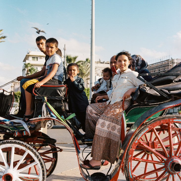
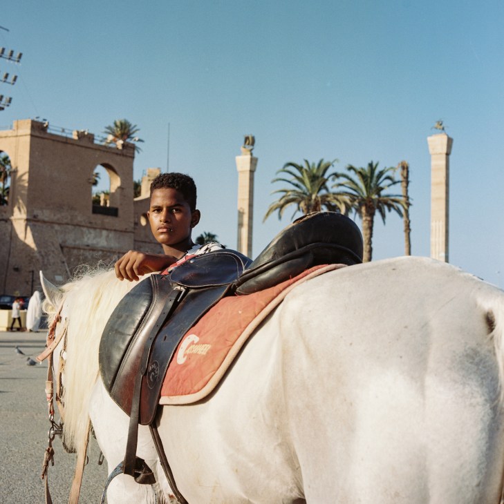
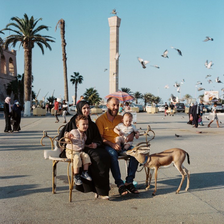
Central Tripoli is a microcosm of Libya’s past, from ancient times to the more recent Ottoman, Italian and British occupations that preceded King Idris. The ascetic monarch declared the country independent in 1951 and was later deposed in the coup that ushered in Gaddafi’s rule. When I lived here, one of my favourite weekend rituals was an early Friday morning stroll through my neighbourhood, the old Italian quarter in the city centre. The streets are quiet on Fridays, making it easier to appreciate the layers of history in a neighbourhood bracketed at one end by the former king’s palace and, at the other, Martyrs’ Square, previously known as Green Square, where Gaddafi liked to give speeches. One evening at sunset, I watch as families gather on the wide plaza. Children beg their parents for a ride on horse-drawn carriages, while others feed squawking seagulls that swoop in from the Mediterranean.
On the other side of Martyrs’ Square lies the heart of old Tripoli. This is the medina, a warren of narrow streets and alleyways where gold merchants ply their trade alongside artisan workshops, galleries, mosques, churches – Anglican and Greek Orthodox – and the crumbling edifice of what was once the city’s main synagogue (for centuries Libya was long home to one of north Africa’s largest Jewish populations).
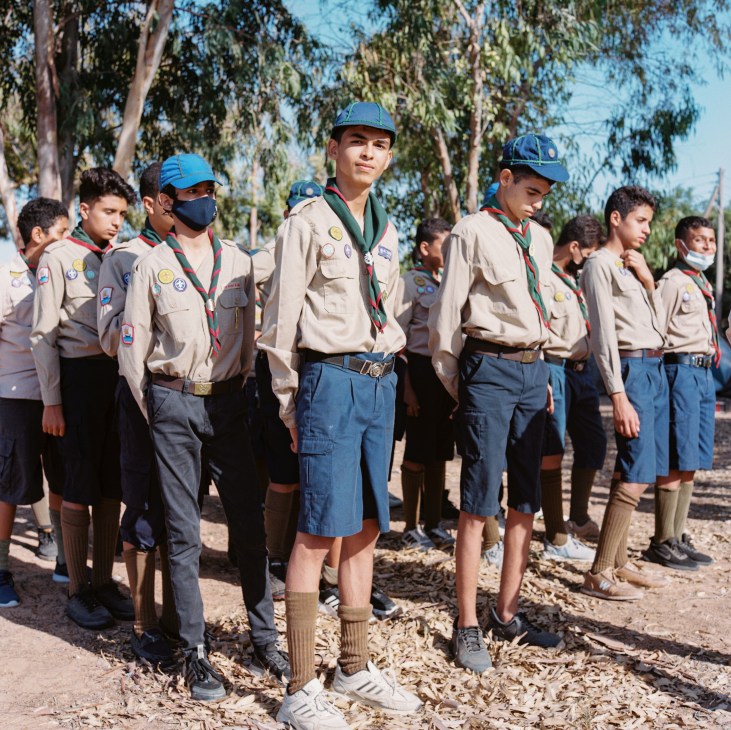
I am guided around the medina by Hadia Gana, an artist who is involved in efforts to preserve the area and restore its neglected historical treasures. It’s one of many initiatives that would have been impossible under Gaddafi-era laws banning people from meeting in groups. An exception was the hugely popular Scouts movement, first established in Libya during the monarchy period, which was the only real civil-society organisation permitted under Gaddafi. Today there are many more, focused on issues including human rights, women’s empowerment and cultural expression – even if the country’s civil-society space often comes under pressure from those who feel threatened by it, including militias.
“Gathering people makes things happen,” says Gana. “During the 2011 revolution we saw so much creativity burst forth. We are a post-traumatic society in many ways. My generation has the imprint of the former regime but the younger generation is different.”
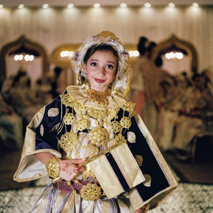
Young Libyans helped to drive the uprising that ousted Gaddafi but they have borne the brunt of 10 years of dashed hopes since then. Some have tried to encourage entrepreneurship in the idiosyncratic rentier state that Gaddafi left behind but many struggle with unemployment. Others chafe under what remains a conservative society: most social events, including weddings, are segregated and cafés where young men and women mix are sometimes raided by hardline Salafists (Sunni fundamentalists). Diminished prospects mean that many cannot afford to get married, delaying what is considered a key marker of adulthood in Libya. The government sought to address this by introducing a marriage grant for couples last summer. Critics dismiss the payment as a populist gesture but others, including at a wedding I attend one evening, argue that it could have a stabilising effect. “Better our youth get married than join a militia,” a dentist in Tripoli tells me.
As the sun sinks below the Mediterranean, Mohamed Abu Qasim and Obaid Otmanmajid, both students in their early twenties, practise their parkour moves by the seafront. Neither believes that the future is bright in Libya. Both yearn for a better life abroad. “It’s difficult to see opportunity here,” says Otmanmajid. “At least not any time soon.”
In recent years, a growing number of young Libyans have decided to migrate. Some have taken smugglers’ boats to Europe. Among them was MC Swat, a well-known rapper who provided one of the soundtracks to the 2011 uprising. His later work, much of it skewering the post-Gaddafi dispensation, prompted death threats from various armed groups, forcing him to flee. He now lives in Italy.
Greater Tripoli is less appealing than the historical centre. A hodge-podge of architectural styles, its ugliest buildings were built during Gaddafi’s first decades in power. The colour green, the ruler’s favourite, was a recurring theme, picked out in design features now bleached by the sun. The most forbidding place is Abu Salim prison, where 1,200 dissidents were massacred by regime forces in 1996, an episode that helped to spark the 2011 revolt. Today some Libyans want to see the abandoned jail turned into a reconciliation centre.
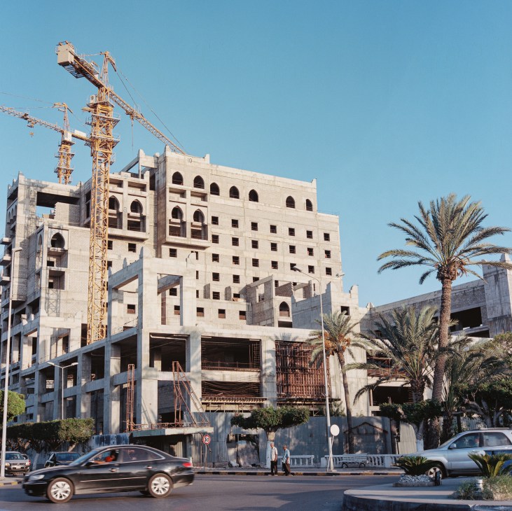
In the final years of Gaddafi’s rule, his regime commissioned leading architects for statement projects as it sought to persuade the world that Libya was changing. Zaha Hadid was to design the grandiosely titled People’s Conference Hall in Tripoli. Norman Foster was to oversee the development of what was pitched as the “world’s first eco-region” in the Green Mountains area of northeast Libya. In 2008, London-based architectural firm Metropolitan Workshop won a competition to design a “museum of conflict” in Tripoli which, they said, would “provide a unique platform to showcase Libya’s national story to domestic and international audiences, and educate future generations on the price of conflict”. None of these projects came to pass. Several others were interrupted by the uprising in 2011 and never completed. Dotted around Tripoli are deserted construction sites – one half-built hotel by the corniche resembles a ruined wedding cake – and cranes that have been at a standstill since 2011.
Gaddafi’s legacy includes not only an economy that is almost completely dependent on hydrocarbons but also one of the world’s largest public payrolls. Economic reform remains a gargantuan task that every post-Gaddafi government has largely shied away from. Some Libyans like to cite a line attributed to King Idris when oil was first discovered in the 1950s. “‘I wish you had found water,” he is said to have told American technicians. “Water makes men work. Oil makes men dream.”
If all goes according to plan – the roadmap that the UN hopes will finally lead Libya out of a lost decade – Libyans will have a new parliament in 2022, replacing the highly dysfunctional legislature elected in 2014. Libya might also get its first president, though many are wary of such a system in a nation still recovering from Gaddafi’s iron fist.
Libyans are proud of their country, a storied land on which Phoenicians, ancient Greeks and Romans once strode. They left behind some of the world’s finest classical ruins, including Leptis Magna, one of Libya’s five Unesco World Heritage sites. What has often seemed an impossible aspiration – developing tourism as a means of economic diversification in post-Gaddafi Libya – came a small step closer this autumn with the arrival of the first organised tour group to visit since 2011. Today’s Libya might still be a world away from the daydream of old tourism ministry slogans but that hasn’t stopped many of its people from daring to hope.
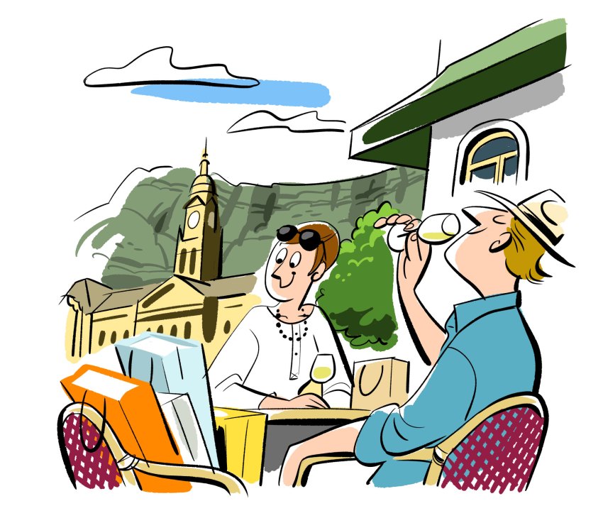
Bags of potential
Surprises in store
Cape Town
Cape Town has many superb shops stocking items that you can’t get outside South Africa. AKJP Studio, a fashion studio on Kloof Street, has brands from rising designers including Sindiso Khumalo and Lukhanyo Mdingi, as well as jewellery by Pichulik. A few doors down, Ashanti Design sells baskets and bean bags. Further downtown, off bustling Bree Street, is Chandler House, where ceramicist Michael Chandler sells paintings and ceramics, including his own. At the adjoining gallery space, exhibitions by South African artists are always on rotation. A short walk away is Mungo, a textile company that weaves towels, throws and blankets. Next up is Sans, a slick marketplace selling homeware and food, from wine to tableware. Finish your shopping spree with a coffee at Arthur’s Mini Super. Grab a seat on the pavement and order a sandwich, then fill up on regional produce.
Swiss watch
Zürich
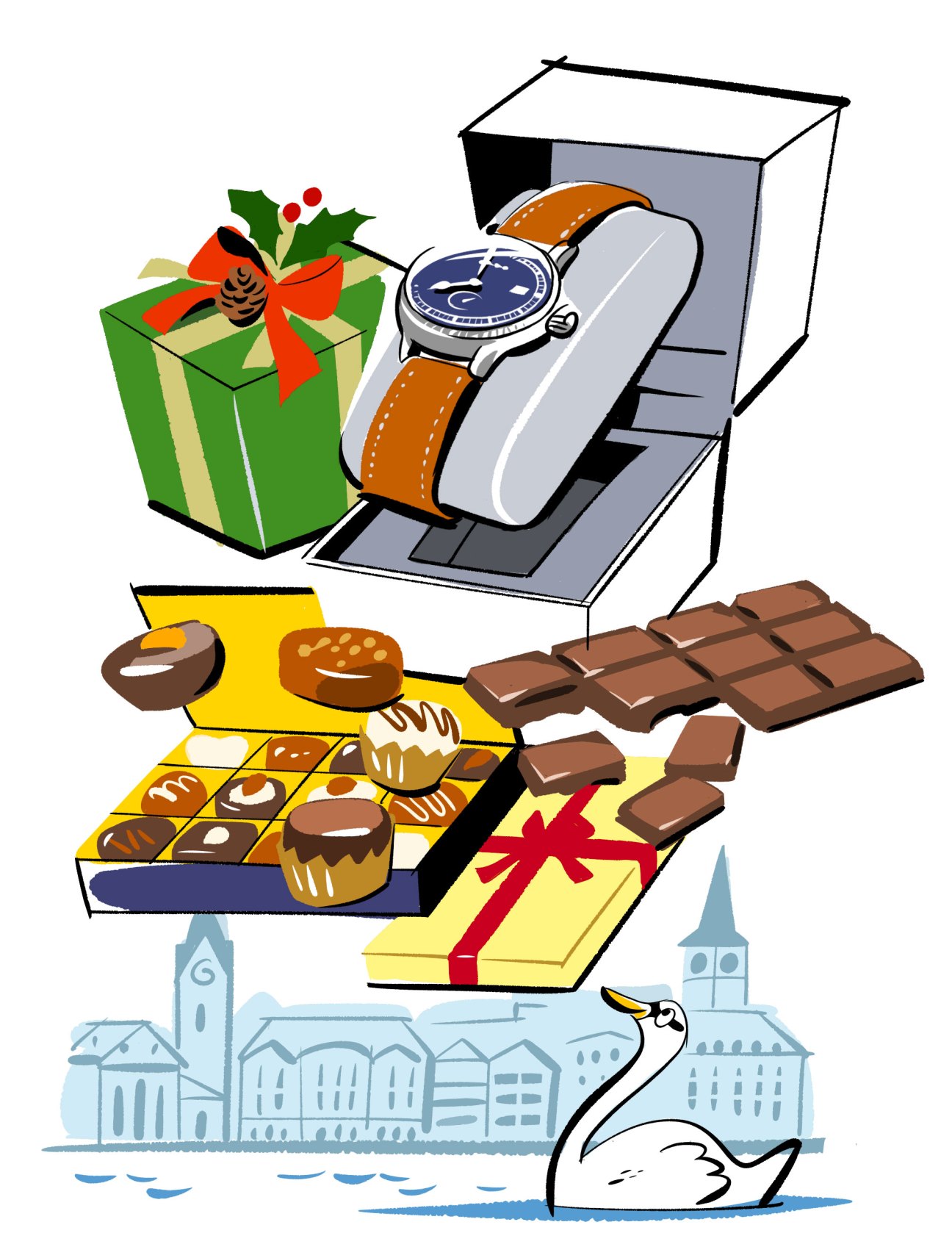
In keeping with its chocolate-box looks, Zürich’s old town stocks some excellent Christmas treats. An easy start, for homeware, pens, pots and everyday goods, is Fabrikat. Just a few doors down, Rien Ne Va Plus is the best place for board games and other ways to entertain the family. The do-it-yourself sets have delighted children (and adults) for more than 30 years. Another excellent stop for Christmas finds are the antique shops around Kirchgasse: EOS Buchantiquariat Benz stocks vintage posters, art books and prints (be ready to rummage – the best aren’t always the easiest to find). For more printed wares, the Travel Book Shop specialises in guide books, maps and cookbooks, all sorted by destination. Its well-travelled team are also on hand to point you in the right direction.
For treats that are closer to home, try Hobel. This small space is part of a cabinet-makers’ co-operative and stocks all manner of household items, from glassware to candles and cutting boards. You’ll find products here from Swiss manufacturers and some international finds too. If it’s something unique you’re after then head to vintage-watch specialist Jim Gerber to get your hands on a time-tested Rolex or Patek Philippe. Or perhaps you fancy some comely comestibles from H Schwarzenbach? The family-owned shop sells coffee, chocolate and other goodies from Switzerland and around the globe. Round things off with a trip to Monocle’s Zürich outpost in Seefeld for coffee and a browse, then drop by Trunk Zürich next door for a fetching new outfit.
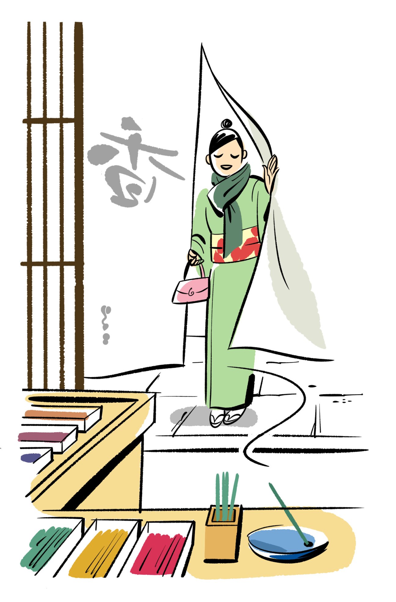
On the scent
Kyoto
Compact Kyoto is full of small and charming speciality shops. Start your festive spree at the recently reopened Kyukyodo flagship in Teramachi to buy beautiful silkscreen-printed postcards and maybe a few calligraphy brushes to help with that new year resolution about writing more letters. If you feel like a fragrance then head to incense specialist Shoyeido’s main space in Nakagyo, for something woody. How about treating yourself to a pair of bespoke Japanese sandals at Hakimono Sekizuka? Craftsman Shinji Sekizuka can knock up a pair in no time that will work just as well with a Western wardrobe.
After a 25-minute taxi journey northeast, visit Murakami Kaishindo’s café for a coffee and something sweet, such as the “Russian Cake” biscuits or Teramachi vanilla pudding. Just around the corner, Ippodo sells the best Japanese tea and teapots; both the traditional tea caddy and modern gift box come immaculately wrapped. For a particularly handy present, Onishi Tsune Shoten is a sensu specialist, offering all manner of folding fans.
Present company
Milan
Milan is Italy’s most cosmopolitan city so you’ll find gifts hailing from near and far. Start in the Navigli district at Tenoha, a Japanese concept store selling stationery, fashion and food from Nippon. Next to the Duomo is the stylish boutique of Argentine perfumer Fueguia 1833, which manufactures its scents in Milan, draws on South America for ideas and uses natural ingredients. Then venture to Brera and the charming shop of fashion designer Massimo Alba, where naturally dyed Italian-made cashmere jumpers catch the eye. In nearby Corso Garibaldi, pop into the shop of Turin chocolatier Guido Gobino for bite-sized heaven; the gianduiotto and cremino dark sweets are a must. Move on to Isola and visit Pijama, maker of soft cases and bags in fetching prints to disguise digital devices. Unwind with an espresso or aperitivo at Goto, Giovanni Fiorin’s contemporary Italian bar serving the peerless wine of indigenous varietals from Piemonte to Puglia, along with well-aged prosciutto and parmigiano reggiano. Don’t leave without a house panettone from Modena.
Market leader
Munich
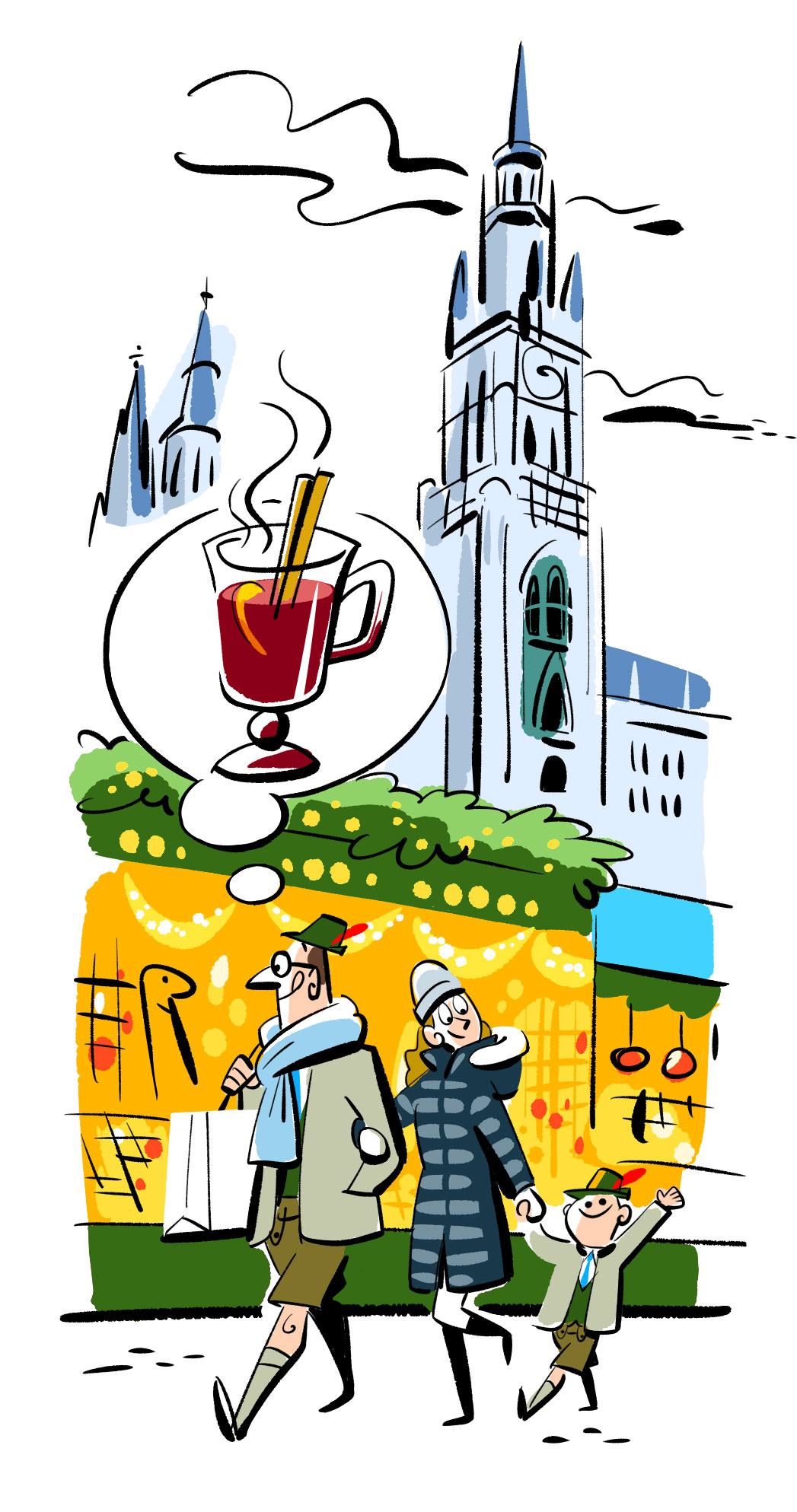
Bavaria’s capital is especially welcoming at this time of year thanks to its many inviting bars and museums. Get a taste for the city at the Viktualienmarkt in the Old Town. One of Europe’s largest open-air markets, it has sold everything from food to flowers and spices since 1807. Warm up with a mulled wine before heading to Soda on Rumfordstrasse for magazines and books on art and culture. Next up is Stereo Muc by the 17th-century Hofgarten. Expect menswear from Barena, Aspesi, Sunspel and more. For a mix of global and Bavarian labels, head to Lodenfrey on Maffeistrasse. This six-level department store near the gothic Frauenkirche offers tailor-made clothing and the city’s best selection of traditional Trachten, worn on festive occasions.
There’s more Alpine fashion at Luis Trenker, which recently opened in the Fünf Höfe complex up the road from Maximilianstrasse. It’s close to Manufactum on Dienerstrasse, which sells everything from hardy homeware to fashion and has a good delicatessen (which can also be said of Dallmayr down the road). Next up is glove-maker Roeckl on Marienplatz. Founded in 1839, the family business sells hand-stitched leather gloves and accessories. Finish with a drink and hearty fillet at Brenner, in the former stables of Munich’s royal residence.
Independent spirit
Toronto

Shall we start with a case or two of wine? Toronto’s famously rigid alcohol-sales laws were eased recently, meaning that a slew of excellent independent bottle shops now dot the city. Grape Glass in Little Portugal and Paradise Grapevine in Christie Pits are two of the best, stocking vintages from the nearby Niagara wine region and further afield. Another small innovation from the past year came from Type Books, a Monocle favourite. Its Mystery Bags, into which the shop’s well-read staff place a selection that they think you’d like, have become popular. While you’re there, take a spin to Cosmos Records, which specialises in rare vinyl, particularly funk, soul and disco. If you’re considering investing in a new set of wheels then try the small Mariposa Bicycles workshop, near the Aga Khan Museum northeast of downtown. It has produced bespoke road bicycles since 1969.
For a pit-stop, head back downtown for coffee at Milky’s. Its playful interior was designed by Toronto’s Batay-Csorba studio and has a good selection of well-sourced beans, plus pots and drip-makers by design studios in Japan and elsewhere. For stocking fillers, head to Spacing Store, south of Chinatown. It’s full of city-inspired trinkets, while a subscription to its own quarterly urban-affairs magazine, Spacing, is a good gift for those intrigued by what makes Toronto tick.
What’s cooking?
London
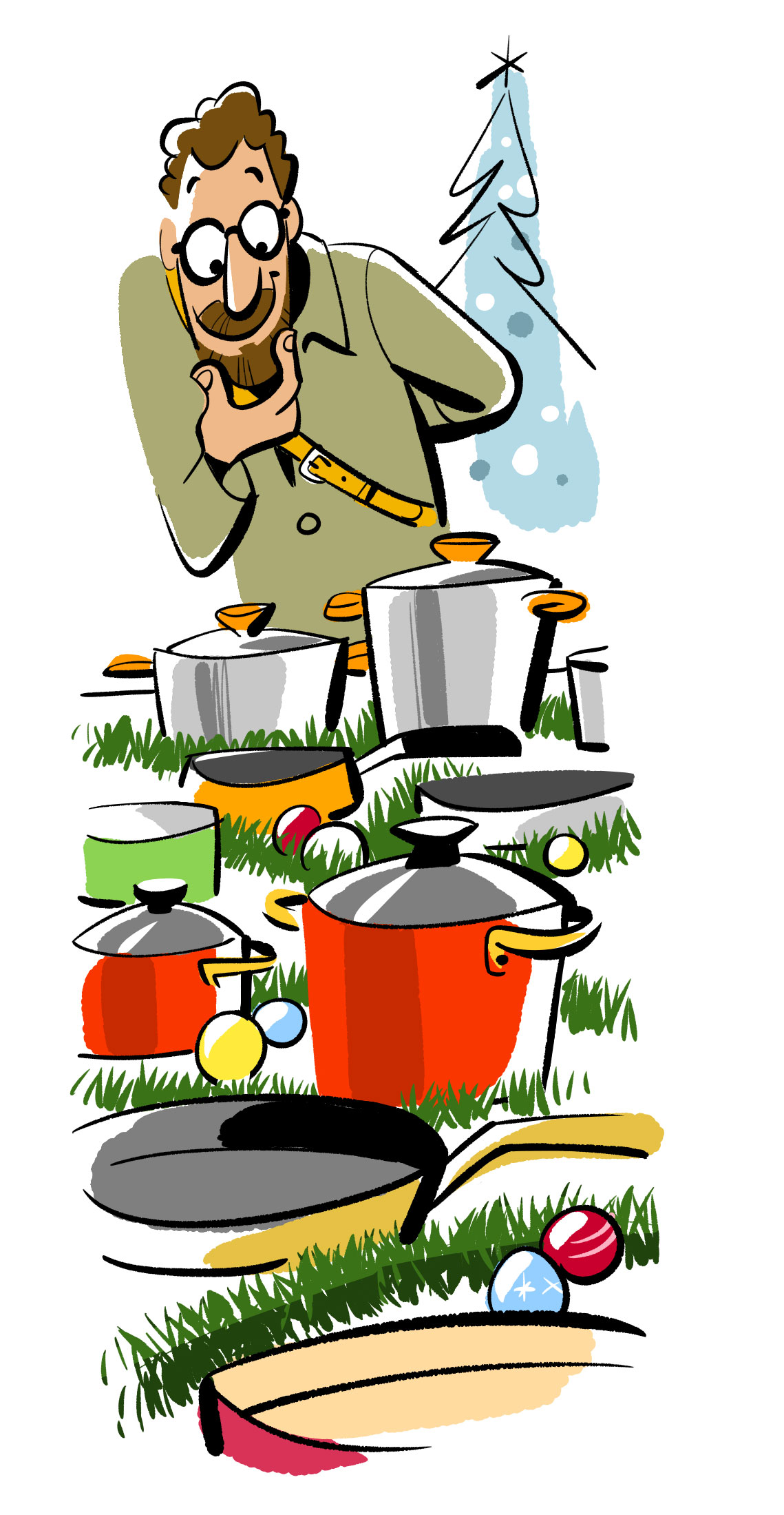
We start our spree on Hampstead High Street at Borough Kitchen cook shop, which is great for either festive prep or gifts. We have our eye on a set of Mauviel copper saucepans. Then it’s time for a hamper from Panzer’s, a Jewish deli that’s served the community since 1944 and is a superb spot for cheese, jam, honey and smoked salmon. Refuel at Soutine in St John’s Wood with a slice of apple tart and a café au lait, then dive down to King’s Cross for some denim from Blackhorse Lane Ateliers in Coal Drops Yard. But the West End is still the best place to soak up the season and Liberty is great for decorations, stationery, lotions, potions – and the Aoyama incense from Astier de Villatte. Foyles should be your pilgrimage for all things printed, from where you can dash to Studio Nicholson’s new space on Broadwick Street for clothing; then Lina Stores Delicatessen on Brewer Street for a Panettone. Pantechnicon in Belgravia is a Nordic-Japanese joint with many gift options and a rooftop restaurant in which to admire your spoils. — tr
Mapping and wrapping
San Francisco
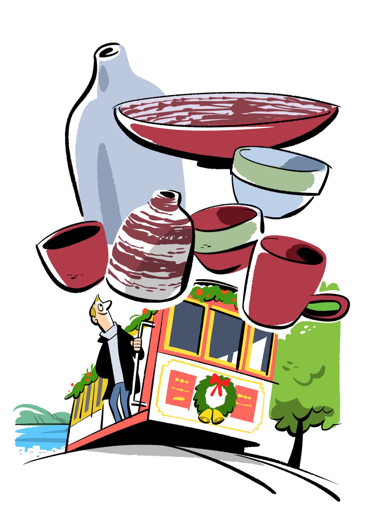
With no single central retail district per se, shopping in San Francisco generally means a little bouncing between neighbourhoods. We begin at March, a glass-fronted home and kitchen shop in Pacific Heights. Inside the airy white-tiled space are long wooden tables laden with ceramics, baskets and vases, as well as larder items such as jam for the home cook. Clothing shop 45r and design store The Future Perfect are also close by. A 10-minute drive south in Hayes Valley is True Sake, an intimate blue-fronted bottle shop filled with tall shelves, fridges and a wide table displaying a varied selection of rice wine. A few doors down is Reliquary, for vintage and modern clothing, and accessories such as beautifully knitted hats and hand-poured candles.
Another 10 minutes south in the Mission is Monocle favourite Heath Ceramics, a lofty showroom right next to the factory, where shoppers can peek into the production process. The California brand has been crafting dinnerware and tiles since 1948. Next door is Heath Newsstand, where magazine lovers will find a selection of independent (sometimes hard-to-find) magazines, as well as accessories such as woven socks, pens and seasonal blooms. For a post-shopping snack and glass of wine, Tartine, a bakery known for open sandwiches on slices of sourdough, is a few steps away. Last up is a trip to map and print specialist Schein & Schein in North Beach.
Generously inclined
Lisbon
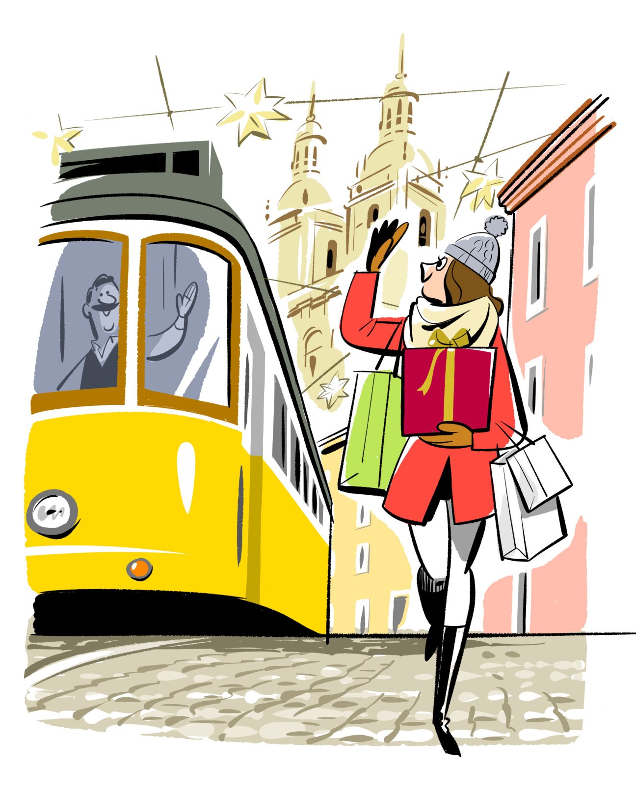
Despite being built across seven hills, the Portuguese capital is a gratifyingly walkable city. Heading up our retail hit list is Chapelaria Azevedo Rua, a Lisbon institution dating from 1886, which stocks manifold hats, including trilbies, bowlers, berets and a dapper range that riffs on regional Portuguese headgear. A shortish walk away from Baixa is Chiado, where you should keep your eyes peeled for a diminutive space on Rua do Carmo called Luvaria Ulisses. Here you can get your hands on a pair of excellent custom- made cashmere-lined gloves. For more Portuguese goodies – and perhaps a bottle or two of port – we suggest a visit to A Vida Portuguesa’s space on Rua Anchieta. After dashing down to Javá Rooftop for a quick coffee and a bite to eat, you can jump in a taxi for a short ride north to well-heeled Príncipe Real and Embaixada, a residence dating from 1877 in which a cluster of independent shops now sell everything from woollen throws to vinyl records and cosmetics.
Nearby, both Kolovrat and Maison Nuno Gama have you covered for clothing, including suits, shirts and shoes. We’re then heading over to the Alcântara neighbourhood where Margarida Fabrica offers a wonderful collection of ceramics. The closing chapter of our tour is at Livraria Ler Devagar, a palace of print that’s piled high with a best-in-class bookshop that’s all housed in a former newspaper-printing facility.
Thai before you buy
Bangkok
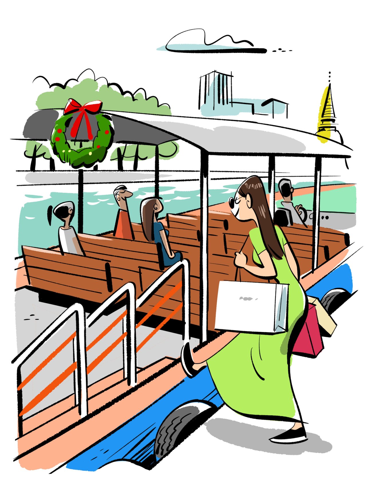
Life in Bangkok seems to gravitate towards the banks of the Chao Phraya River, so we’re going with the flow by starting our Christmas shopping at IconSiam, one of the Thai capital’s newest and shiniest megamalls. Head to The Selected on the second floor for a cross-section of budding Thai brands, as well as goodies from abroad, including Timo Trunks. It’s not all about malls, though. Architect Duangrit Bunnag’s The Jam Factory compound next door houses a lovely garden to enjoy before browsing the bookshelves at Candide. Then take a river taxi to the east bank to visit one of Bunnag’s newer projects, Warehouse 30. Here 30_6 has something for everyone, including Praat scents and leather sandals by Rawit. While there, pop into nearby ATT 19 for Southeast Asian ceramics and art.
Those seeking something a little different should head to Charoen Krung Road and Central: The Original Store. A modern riff on Central Group’s original site from Chinatown that 70 years ago started selling imported magazines. It now stocks clothing, books, music and more. Pick up an iced coffee at Siwilai Café on the first floor and take the BTS to CentralWorld. Studio 360 on the fifth floor is a stationer where a notebook from local brand Zequenz is a good gift for the writers and diarists in your life. Last up is a taxi to Sathorn. Thailand is known for furniture and Podium’s showroom has a new furniture line on display called Neorient, designed by Bangkok studio Atelier 21. A cane stool from its eye-catching previous collaboration is a cracking Christmas present.
Merry masterclass
How to
Start a fire
We’ve turned to a star Swedish chef for his tips on creating a heartwarming hearth around which to warm yourself. Here are Nik’s tips for a chestnut-roasting inferno that burns brightly and smells good too.

Niklas Ekstedt
Chef and restaurateur
“Growing up in Northern Sweden, it was my dad who taught me how to light fires. I remember that the first thing he told me was that you can’t make a fire with damp wood, which remains true. He also taught me that you have to start small and then grow it. The smaller you can start a fire the better. The most common mistake that people make when lighting a fire is to ambitiously put vast logs on too early – that will just kill the flame. At home we always burn birch wood and start off with the bark. To create the kindling, I’ll carve the bark into very small pieces and then use some small sticks, which I light with matches to get things going. It’s a very nice smell. When the fire’s roaring, we like to heat a cast-iron pan over the fire and add sugar, cognac and spices to it. It’s a Swedish version of mulled wine called glögg.”
How to
Wrap a present
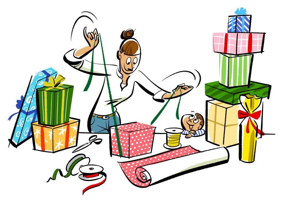
A neat and nattily wrapped gift shows more than the giver’s dexterity with double-sided tape; it suggests that care and attention has been put into the process. And if all else fails? Bows and ribbons to the resuce.
Kristina Heinrichs
Owner of stationery shop RSVP Papier in Berlin
“The secret – though it’s not that secret – is to always cut the wrapping paper the right size for the gift you’re wrapping. It can’t be too big or too little but you can cut any excess as you go along. I always fold over exposed edges of the paper to make it look neater and we use double-sided tape to hold down the folds so there’s nothing visible on the paper. I like combining different patterns, so for the finishing touch I use a strip of leftover wrapping paper from a different design to create a kind of band that I wrap around the present. I’ve worked at places before that used to go in for really extravagant wrapping, but the service we offer our customers is much more subtle. We use all different kinds of paper, including a really delicate, gold-speckled variety that I love. My technique for tackling awkward shapes involves cutting a large square of wrapping paper and placing the object diagonally against one of the corners. You then fold the edges in before wrapping the rest of the paper around the item. My old boss told me to think of it like a fishmonger wrapping up a fish at the market. If all else fails, remember that a beautiful ribbon can also hide all manner of sins.”

How to
Create a playlist
Spinning a festive playlist that’s upbeat but without too many camp Christmas clichés is a delicate art. Here’s how one DJ does it.
Nelson ‘Junior’ Luis Fernando Martínez
Head of music at Libertine, the bar at Casa Bonay, Barcelona
“The thing about creating a Christmas party playlist is that everyone is usually pretty plastered by the time the music comes on. I’m not advocating getting drunk but it can certainly help to be on the same level as your guests. I’m from Venezuela, where Christmas parties mean traditional gaita music or salsa. I’m not into traditional Christmas songs but I do like throwing in a few that people might not recognise as a Christmas song, such as “Player’s Ball” by Outkast and “La Murga” by Willie Colón. But I would recommend keeping an eye on how everyone’s reacting to the music and skipping, nixing and changing the playlist as you go. When it comes to creating a more relaxed ambience for a drinks party or getting cosy round the fire, my favourite thing to put on is A Charlie Brown Christmas. It’s a jazz record by Vince Guaraldi Trio that we had growing up. It has a slightly melancholic feel to it but all the best Christmas songs do.”
How to
Decorate your tree
Whether you’re putting up a tasteful fir with a few time-tested trinkets or feeling a little more avant garde about your adornments, we have tips aplenty from the owner of an exquisite homeware shop.

Sofie Hellsing
Co-founder of design shop Artilleriet in Gothenburg
“When it comes to tarting up your tree, more is always more. I love a really magical, Willy Wonka-style tree. At Artilleriet, the team behind the shop put our heads together and come up with a theme for the trees. This year we went with green-glass baubles and star-shaped garland lights from German brand Herrnhuter. At home, it’s important that the decoration of the tree has a really personal feel to it and my children love decking it out with everything from candles to little flags. I draw the line at tinsel. We collect a tree from a stall in our town’s main square and then make decorations as a family by melting colourful hard candies to create stained-glass-style ornaments. I would recommend collecting ornaments over the years and picking up a couple of new ones every Christmas. It’s also worth visiting vintage shops to find beautiful old ones. I started collecting baubles when my children were born and some of my favourites resemble famous people: we have everyone from Ruth Bader Ginsburg to Barack Obama and Yayoi Kusama.”
How to
Forage for decorations
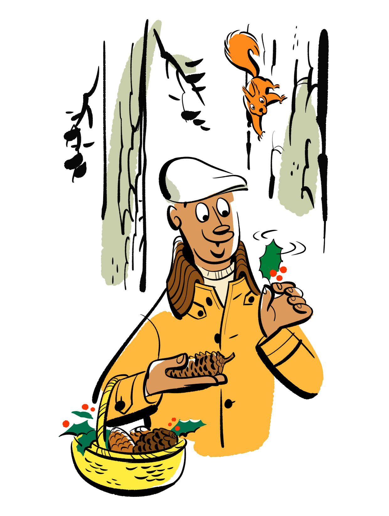
Decking those halls shouldn’t involve unfurling tinsel or retrieving tired plastic tat from the attic. A trip to the woods could be a better bet.
Kitten Grayson
London-based florist
“I head into a nearby woodland when looking for things to decorate my home in winter. If you’re doing the same, take a pair of secateurs and a basket and keep an eye for things that have gone into dormancy, such as Queen Anne’s Lace, which is this beautiful, structural flower. You want to pick up things from the forest floor such as beech nuts, thistles or fallen branches. Old Man’s Beard (a fluffy-flowered climbing shrub) is also excellent and you don’t need much to create a beautiful centrepiece. Any leaves you find can be threaded onto clear string or gold wire, which you can then wrap around a branch or make into a garland. But don’t go too over the top: these decorations are more striking pared back. Getting out there and finding everything is also just as enjoyable as the decorations themselves. It’s good to get into nature and bring a little bit back home.”
Tables of contentment
The manner in which you lay on a spread is almost as important as what’s served. It’s why we’ve asked a few of our favourite people, from cultural commentators to culinary whizzes and a top concierge, just what Christmas means to them. Some talk animatedly about their favourite dishes, others offer some do’s and don’ts for the big day. One even comes clean about wishing his guests would leave more promptly.
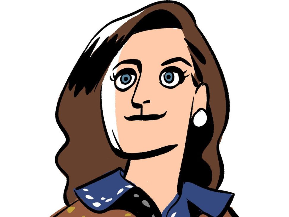
Jennifer Roberts
CEO, Design Miami
Miami
“The company is more important but I love the actual table-setting too. Our Jewish Christmas Eve is a family affair. Every member selects a favourite dish. There’s a tradition of hors d’oeuvres with a starter of crabmeat-stuffed avocado, cheese fondue and green salad; and we have a family recipe for mocha cake with something called ‘hard sauce’, which is basically vanilla, icing sugar and butter. It’s strange but it makes everyone happy. I also like a good chenin blanc. Less so honey-roasted ham, Santa figurines or fingerbowls.”
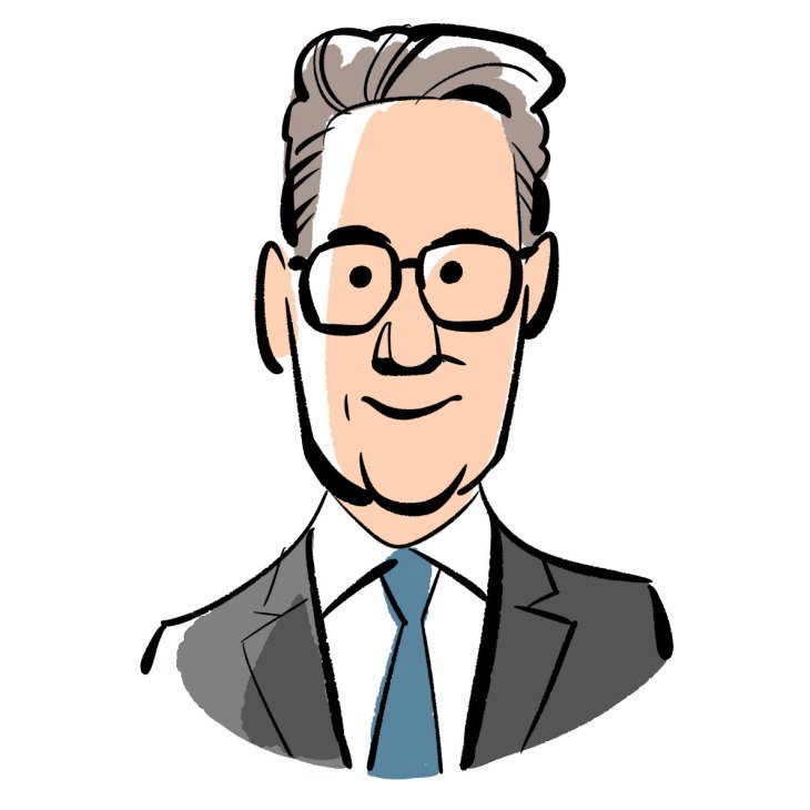
Peter York
Cultural commentator and president of The Media Society
London
“Christmas dinner should be different from a normal meal and have a crazed, ritualistic element in its presentation, irrespective of whether it tastes nice or not. There should ideally be a big turkey or joint and many side dishes, containing things that are never usually eaten. But avoid centrepieces so magnificent that people can’t converse with those on the opposite side of the table. Don’t bring out the china, silver or glass, which will divert too much attention from the food. And don’t employ table placement by rank. Make sure that you’re sitting at one end so you can see everyone. (If you have a long, straight table, sit in the middle.) I like asti spumante sparkling wine to drink, followed by Baileys with pudding – and I avoid excitable knitwear.”
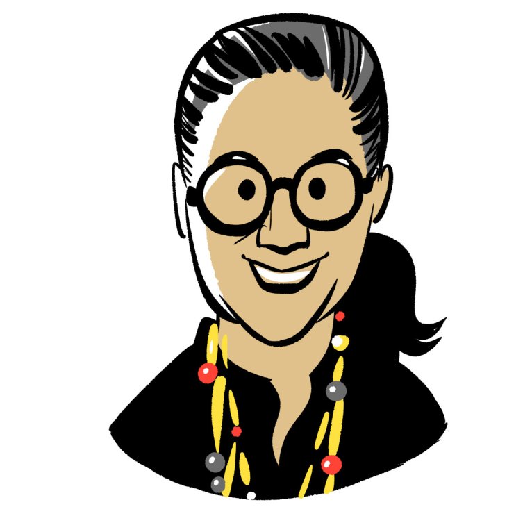
Kylie Kwong
Chef, restaurateur and cookery book author
Sydney
“Sydney recently emerged from a five-month lockdown, so the only real rule seems to be to engage in endless holiday dinners to make up for all of that precious lost time. I love cooking with Australian ingredients: stir-fried sweet yabbies, a native freshwater crustacean, with XO sauce; native lemon aspen and Geraldton wax; steamed school prawns with ginger, shallot and native sea parsley; my Australian-Cantonese coleslaw with native bush mint; plus deep-fried silken tofu with native ‘old man saltbush’ salt and finger lime. Forget the fancy tablecloth; it’s all best eaten with your hands and plenty of chilled drinks.”

Teo Yang
Interior designer
Seoul
“I plan every detail, from the guests’ arrival to their happy goodbyes. They’re greeted by candles in the garden and with warm towels to cleanse their hands. Then there’s champagne with snacks and music. In the dining room are seasonal flower arrangements. I serve my family a four- or five-course meal, with a choice of two wines. I like fun desserts, such as ice cream with caramel popcorn and gold leaf. Then there’s more wine and some tea. I also like to prepare small gifts for guests to take home.”

Andrea Rasca
Founder, Mercato Metropolitano
London
“Hosting is about making people happy and at ease. I love a well-dressed table and candles. Warm light is essential. It’s also about tradition; I use plates that I’ve had for years. On the menu are prawn-cocktail salad, tortellini with capon broth, a barolo-based stew, polenta and panettone with a lightly flavoured cream. I’d start with a franciacorta, then opt for a barbaresco or a barolo.”

Elena Reygadas
Chef and restaurateur
Mexico City
“I lay everything on the table so I can have a meal without needing to get up. That’s best for continuous conversation too. I ask people to bring a favourite Christmas dish so we can eat food cooked by us all; I like the idea of a collectively made dinner. I always make romeritos, a Mexican dish of seepweed with mole. I like hot, spiced fruit punch with tejocote, guava, tamarind and sugar cane. And don’t forget flowers. We get poinsettias, which are from Mexico. The Aztecs called them cuetlaxóchitl (‘wilting flower’) and saw them as a symbol of the life cycle.”

Mirkku Kullberg
CEO, Glasshouse Helsinki
Helsinki
“I have two daughters and love having them and their families with us. Dinner is served after 19.00 but we have a festive porridge at about noon after the Christmas Peace is announced on TV. First we have the fish dishes and drink schnapps, then ham with wine and beer. After the main courses, there’s a break before the sweets and cheese. Always have good chocolate available. Take your time and do everything with care. Create traditions. Make time for joy and hope. Write your own Christmas stories.”
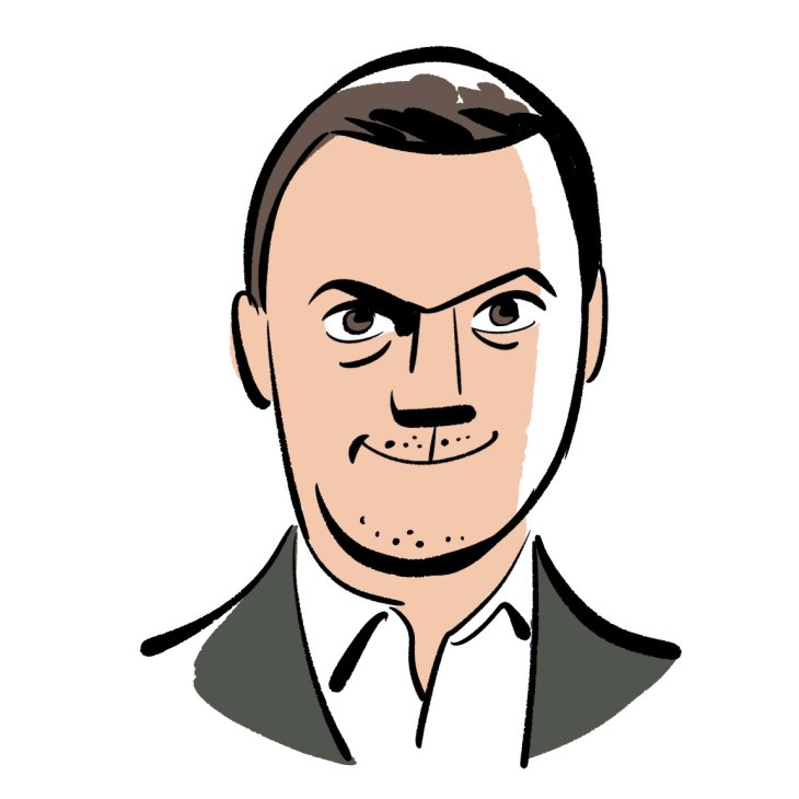
Adrian Moore
Concierge and author
Paris
“I’m not too fussy about table dressing. There’ll be a bird (usually Bresse chicken), plus foie gras and smoked salmon – all Parisian staples, though I’m Anglo-Canadian. The cheese will be from Laiterie la Chapelle, most likely a raw cow’s milk tomme, and bread from La Boulangerie Pajol. We’ll drink natural wine, probably a bottle with uneven fermentation and a funky tang – rumour has it that it won’t give you a hangover. As the evening winds down, there might be a bit of Bing or Frank, along with more wine to fuel that warm and fuzzy holiday feeling.”

Larkin Erdmann
Gallerist
Zürich
“Always decorate the table with some seasonal fruit, branches and leaves. For Christmas I suggest pine-tree branches and candles. Dinner should always be as cosy and boozy as possible. Start your guests off with a punch or a cocktail. Christmas dinners should be convivial; my go-tos are pots of goulash, fondue, or a big bowl of fresh truffle pasta. Dinners shouldn’t be too formal. Think fuzzy sweaters rather than ties; leave the fancy dresses at home and bring the ugly sweaters out – it’s the only time of year when you can get away with them.”

Isay Weinfeld
Architect
São Paulo
“I watch the Luis Buñuel film The Discreet Charm of the Bourgeoisie before laying the table. I eat matzo-ball soup, gefilte fish, vareniki dumplings and latkes. Once the table is set, I usually stand by the window and wait for my guests to come, worrying that no one will show up. Once they arrive, I can’t wait for them to leave. And what don’t I want to see on the table? A cockroach!”

Darina Allen
Cookery book author and founder of Ballymaloe Cookery School
County Cork
“I like decorating the table with holly, mistletoe, Oaxacan carved animals, candles and my Christmas napkins. When you have children coming home from around the world, they don’t want you to change a thing. We usually have oysters as a starter, then roast turkey, stuffed with a buttery, herby stuffing and served with lots of gravy. We also love celery in a creamy sauce and sprouts. To drink? A grape and melon cocktail with fresh mint.”

Nabil Debs
Co-founder, Arthaus International
Beirut
“I try to make it as warm and inviting as possible, so people feel comfortable and enjoy each other’s company. That means that the place can’t be overdecorated. We have turkey, stuffing, oysters, vegetables and gravy; it’s almost like a British dinner. And make sure that everything is on the table from the start: I like to serve myself. My advice is to avoid inviting people that you don’t really want to see and try to avoid awkward situations too (this can be rather difficult). You could say that about any day but it’s particularly important at Christmas.”

Thomas Chatterton Williams
Author and cultural critic
Paris
“I’m a fan of using the nicest things that you own, even when it isn’t a particularly important occasion, while not making a big fuss of it. In France it’s easy to find well-preserved sets of vintage porcelain, crystal and silverware, so I try to take advantage of that. There should also always be colourful cloth napkins and table linen. Place settings don’t have to match perfectly. And a beautiful red wine looks so much more significant when it’s transferred from the bottle into a decanter. My mother makes delicious, homey American holiday meals involving baked ham, huge turkeys, gravy, greens and a genuinely unforgettable sweet potato pie. In Paris, my mother-in-law makes equally impressive, more refined fare: a turkey or capon that she wraps in lard, served with mounds of baked apples and chestnuts and a celery purée. I don’t want to see any smartphones, plastic bottles, cigarette packets, scented candles or empty glasses on the table. When it comes to drinks, we don’t need to reinvent the wheel: everyone feels best when champagne is flowing.”
World in reach
After more than a year of isolationist introspection, diplomats gradually returned to the rough and tumble of international relations in 2021. And alongside the usual geopolitical tensions in their in-trays were deep existential problems, such as future pandemics and climate change.
Though the current pandemic is not over, its grip on our freedoms has been loosened and the scientific and political mobilisations that it engendered offer a salutary reminder of human resourcefulness under pressure. The rapid development of coronavirus vaccines hopefully augurs the kind of lightning-quick innovation that might help the world avert climate disaster. It also shows how intellectual property and medical resources might be shared. When it came to the rollout, countries you’d have expected to knock it out of the park (Japan, New Zealand, Germany) struggled, while those that had handled other aspects of the pandemic poorly (the US and UK) surged ahead. But by the end of 2021, the main differences were between rich and poor. As Chris Smith of the University of Cambridge explains, countries willing to share patents and donate vaccines will no doubt have had an eye on soft power. Given all this, we’ve included the number of vaccines donated to global distribution initiative Covax, and money pledged to the UN’s Green Climate Fund among the metrics we have used to judge this year’s runners and riders.
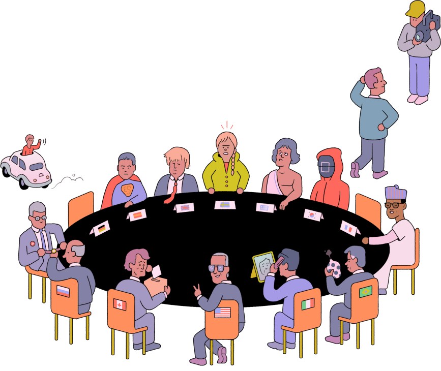
Then there’s the less existential but still essential stuff. Pandemic-induced immurement led to a boom for content providers. Countries such as France, as Mary Fitzgerald notes, spotted the opportunity to shape the narrative about themselves through TV shows and other forms of culture. But many technology firms whose profits surged as their services became indispensable drew resentment.
Last year’s survey came with a caveat: “It’s been a hard year…” In terms of difficulty, 2021 wouldn’t rate much lower but it is at least ending on a more positive note: at the time of writing, Christmas has yet to be cancelled. Of course, occasional soul-searching can reap rewards and the hope is that all of that time indoors has made countries appreciate the things that they have, as well as what they admire in others.
1.
Italy
Since its bounceback from the pandemic, Italians have been winning hearts and minds on all fronts.
There was a moment last summer when Italians thought that they would win everything. Having triumphed at Eurovision with svelte rockers Måneskin, claimed victory in football’s Euro 2020 and struck gold in the 100m sprint and 4x100m relay in Tokyo, Italians assumed that it would be Wimbledon next – and after that the moon. The top spot in our survey is surely the next best thing.
The country had plenty to be smug about. Despite becoming Europe’s first coronavirus hotspot in 2020, its much-maligned government soon got on top of the emergency. Italy has implemented one of the world’s strictest vaccine-passport systems to much controversy but it appears to be working to keep cases down. To the surprise of those who portray Italians as rule-averse, a population scarred by the terrifying first wave has been largely observant of mask mandates and containment measures – a reminder of how much this nation believes in the power of community.
The Bel Paese might not have been as keen as its tourism rivals in the Med, Greece and Spain, to drop travel restrictions and let visitors in but you couldn’t tell at the bagni, where sunloungers were booked up all the way down the country. By successfully staging comeback editions of the Venice Biennale of Architecture and Milan’s much-missed Salone del Mobile, Italy proved that it remains the most credible global meeting point for the design industry.
Its political class, however, isn’t as dependable. In February, Mario Draghi became head of a ramshackle coalition – the country’s third prime minister in six years. Continuous petty crises undermine Italy’s trustworthiness, as do news of mafia mega-trials. Nonetheless, with its soft-power riches accumulated over the course of centuries, from culture to cuisine, Italy can always count on the world’s affection, even when it’s a bit too self-satisfied for its own good.
In numbers:
World Heritage Sites: 58
2020 Olympic medals: 40
Good: Celebrated since antiquity for its culture, cuisine, architecture and design, Italy has made an art of its way of life, winning the world’s swooning admiration.
Bad: On the flipside of this idyllic image that the country projects are corruption and a sclerotic bureaucracy, which continue to undermine its global reputation.
Case of give and take
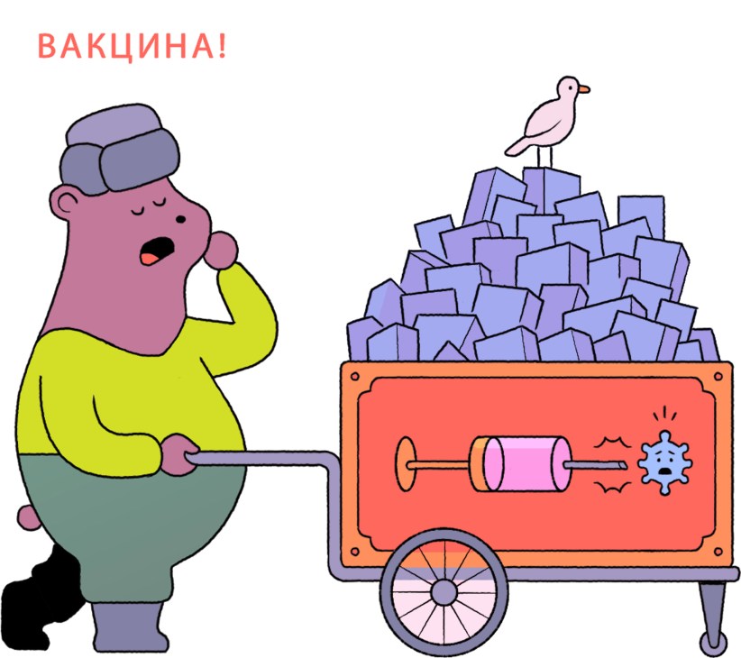
As poorer nations struggle to get their people jabbed, vaccine diplomacy is on the rise.
Half of the world’s population has been vaccinated against coronavirus. This is nothing short of miraculous; it was as recently as December 2020 that a British woman made history as the first member of the public to be jabbed.
But the global data reveals a less rosy picture. Less than 1 per cent of those in poorer countries have been vaccinated. This, the who claims, is prolonging the pandemic. “If there’s Covid anywhere, there’s Covid everywhere,” said Melinda Gates in 2020.
The silver lining, as many countries have realised, is that this situation has made vaccine diplomacy a major soft-power mechanism. Protecting a population from coronavirus offers nations a pathway to economic stability and recovery, so providing vaccines to cash-poor (but often resource-rich) countries gives the donor the opportunity to reward old friends and make new ones.
Serbia, home to two Confucius Institutes (Chinese-funded cultural promotion organisations), was one of the earliest recipients of Chinese vaccines. Recently it laid the foundation stone for a new Sinopharm factory outside Belgrade. Unlike its Balkan neighbours, the country is now awash with vaccines. Was this Chinese goodwill, or a way to rub the EU up the wrong way? Europe, meanwhile, is dishing out vaccines to other jab-starved Balkan nations to counter the Russian influence won with Sputnik V vaccines.
Some vaccination offers come with strings attached. China’s donations to Honduras were allegedly accompanied by the expectation that the latter would drop its recognition of Taiwan’s autonomy; Ukraine found itself pressured to overlook Chinese treatment of certain minority groups. Japanese and US donations to Taiwan, on the other hand, were met with accusations of meddling from Beijing. “Never let a good crisis go to waste,” Winston Churchill counselled. Many nations have evidently risen to that challenge.
2.
USA
Trump might be gone but the global superpower remains riven with internal divisions.
The pandemic showed the world the best and worst of the US. The rapid development of vaccines by Pfizer and Moderna attested to the country’s capacity for large-scale innovation, validating its free-market approach to drug patents. Yet nearly everything else laid bare the country’s shortcomings. Its decentralised political system couldn’t easily co-ordinate to solve national problems, creating an incoherent patchwork of local rules that didn’t always align with federal policies. While large numbers of Americans refused freely available vaccines, their government did little to move surplus doses (or the technology necessary to produce new ones) to needier populations overseas. After a 20th century in which the US exported cutting-edge science, it is today being hobbled by a mix of rabid anti-intellectualism and insular nationalism.
A world that looked forward to Donald Trump’s departure has found that not enough has changed with Joe Biden in the White House. Fierce internal divisions have paralysed his administration’s ability to act globally, especially on climate issues, and fights over the legitimacy of the 2020 election undermine Washington’s efforts to promote democracy worldwide.
If there is any point of domestic unanimity, it is cynicism towards the technology giants and their unaccountable power. Just a decade or so ago, Apple, Google, Facebook and Twitter were the great American soft-power success stories whose communication tools empowered people worldwide. Now we’re less likely to think of the Twitter user in Tahrir Square than the Burmese genocidaires using Facebook to spread hate. When it comes to US global influence, it doesn’t matter how many blockbuster movies, pop hits or basketball highlights course through its networks as long as Silicon Valley is viewed as a machine shop for the world’s demagogues and tyrants.
In numbers:
Covax donations: €3bn
Top-100 companies: 58
Good: The land of free enterprise remains a world leader in technological innovation. Its creative industries are also still a powerful, persuasive force.
Bad: Increasing numbers now believe that some of those innovators amassed such incredible wealth by avoiding taxes, and stoking division and hatred.
All howl and no bite
For China’s ‘wolf-warrior’ diplomacy, 2021 was a year of multiple failures.

For a country that has spent a fortune building a global media network, distributing piles of newspapers around the world, broadcasting in most languages and tweeting like there’s no tomorrow, China has got very little bang for its buck.
Its “wolf-warrior” diplomacy, named after a nationalistic action film in which Chinese heroes thrash their American adversaries, has been a disaster. China’s diplomats, once reasonably well behaved, have indulged in snarling invective against their host countries. In France, for example, the ambassador was rebuked after his embassy’s website claimed that the staff of a French care home had “abandoned their posts overnight, leaving their residents to die of hunger”.
In the early days of the pandemic, China tried to build a reputation for generosity by funding vaccination programmes in Asia, Latin America and the Middle East. But there were two problems: Chinese vaccines were found to be less effective than Western ones and their swift creation served as a reminder of the origins of the pandemic. Today, Beijing claims that its low coronavirus death rate demonstrates the superiority of its political system over shambolic liberal democracies. The system has its merits but any good impression was cancelled out in 2021 by the crushing of Hong Kong’s democratic aspirations and continued reports of crimes against humanity in Xinjiang.
One insight into China’s continuing soft-power efforts came with the closing down of thousands of fake social media accounts, many of which had been dedicated to amplifying the messages of loyal Communist Party servants such as Liu Xiaoming, former ambassador to the UK. A closer examination of his followers reveals that few of them have any of their own. The sound of one hand clapping as bots applaud themselves is testament to a year of a nation’s flagging soft-power success.
3.
Denmark
Glory days are here – so who’s complaining?
Denmark has never before enjoyed such soft power. Another Round (called Druk in Danish) won the best foreign-language film Oscar. Its national football team reached the semi-finals of Euro 2020, at which Christian Eriksen’s collapse and recovery captured people’s imagination worldwide. Copenhagen’s Noma won its third Michelin star and topped the World’s 50 Best Restaurants list; second place went to another Copenhagen three-star, Geranium.
The economy is bouncing back better from coronavirus disruptions than just about any other European nation. Denmark also had one of the world’s most effective responses to the pandemic.
None of this has stopped them complaining – about, say, prime minister Mette Frederiksen’s autocratic approach. Then again, if there had been Danes present at the parting of the Red Sea, they would probably have complained about Moses’s lack of accountability. Danes have never had it so good and never been as good at telling the world how good they have it.
In numbers:
Fully vaccinated: 75 per cent
Embassies abroad: 71
Good: Danish restaurants and film-makers are riding high, receiving more well-deserved attention than ever. Its pandemic response might have been the world’s best.
Bad: While by no means representative of the country as a whole, xenophobic political parties are giving off a negative international image.
4.
France
Despite a few false steps, the country is exporting fresh, modern takes on the Gallic way of life.
France has long been selling the world on its way of life, even if it increasingly struggles to define what that is at home. Emmanuel Macron’s election in 2017 sent French soft power soaring; the youthful president always seemed to impress more abroad – but as the end of his first term approaches, the picture is rather mixed in L’Hexagone. Much foreign reporting focuses on how he has taken a more reactionary turn as he considers the realities of re-election in 2022 with the far-right snapping at his heels. That has dulled his much-vaunted savoir-faire – as has the fact that social media has extended the reach of bitter domestic debates about identity and immigration far beyond France.
Many were surprised to discover that the birthplace of Louis Pasteur has one of the world’s most vaccine-sceptical populations. It was only when Macron told the French that they couldn’t go to restaurants or cafés without getting jabbed that many got vaccinated.
France’s geopolitical standing took a knock when Australia cancelled a $60bn (€52bn) submarine deal in favour of closer ties with the US and the UK, prompting Paris to recall its ambassadors from both Canberra and Washington. A decision to greatly reduce visas for Tunisians, Moroccans and Algerians following a spat over returning migrants to those countries strained relations with the Maghreb, as did ill-judged remarks by Macron on France’s colonial past in Algeria.
But it hasn’t all been challenges and missteps for France in 2021. In recent years, the international success of French streaming series – among them The Bureau, Call My Agent! and Lupin – has helped to burnish the image of modern France. Macron sees opportunity here and this year promised substantial investment to help the film and TV industry compete with Netflix and Amazon as part of a bold new plan to make the country “a nation of innovation”.
In numbers:
UN climate fund: €1.2bn paid
Nobel laureates: 69
Good: Paris remains the global centre of sartorial design, even if the money is moving east. As Europe changes, France has an opportunity to reinvent itself.
Bad: The 2022 presidential election portends a fractious few months. As per tradition, the far right will make plenty of noise. Macron must resist a descent to its level.
5.
Germany
A nation built on stability braces for an era of change.
It’s perhaps a sign of how much stability means to Germany that Angela Merkel introduced her presumed successor, Olaf Scholz, to other world leaders during October’s g20 summit, despite the fact that he was from a different party and hadn’t even been crowned chancellor yet.
Despite such efforts to project continuity, stability and Mutti are inextricably linked. So much of Germany’s recent soft power has been wrapped in her gravitas that it’s hard not to see the country’s influence taking a hit with her retirement. Added to this is the unstable nature of the federal election result, which forced three parties from across the political spectrum to consider a rare coalition. A post-Merkel government could prove less stable – and so less decisive – in its global dealings.
The pandemic exposed cracks in Germany’s social cohesion, with a patchwork of state regulations causing disarray. Parts of the former East Germany in particular have posted low rates of vaccination.
Germany’s major companies face a less-assured future as they pull back from Chinese interests and retool to combat climate change. Tesla’s Gigafactory near Berlin, on the home turf of car manufacturers, might just be the wake-up call that German industry needs to once again set a global example.
In numbers:
Covax donations: €832m
World Heritage Sites: 51
Good: Germany has taken a high moral stand against Chinese actions in Xinjiang. Its reputation for stability is matched by one of moral consistency.
Bad: Outgoing chancellor Angela Merkel’s departure from the world stage will be a significant loss to pragmatic multilateralism and the rules-based international order.
How to hold a summit
Hosting a successful summit requires good taste, sensitivity and a sharp eye for details.
In the 1990s, Jon Allen, who later served as Canada’s ambassador to Israel and Spain, was tasked with overseeing a summit between Mexican president Ernesto Zedillo and Canadian prime minister Jean Chrétien. Its centrepiece was a silver-service breakfast intended to showcase the best of Canadian cuisine and hospitality. But come the hour, it became clear that an error had occurred. Instead of an à la carte banquet, there was an all-you-can-eat buffet, the sort of spread you’d more likely find at a service station than at a meeting between world leaders.
“There were a lot of surprised looks,” says Allen, now a senior fellow at the University of Toronto’s Munk School of Global Affairs. “But these things happen and sometimes they’re good for conversation. In the case of the Mexican president, [the response] was less than positive,” he says, laughing.
For a country hosting a summit, details matter, both to the success of the event itself and to the host’s soft-power standing. “There are so many things to consider,” says Andrea Insch, an associate professor at New Zealand’s Otago University, who researches summits. “They can be powerful mechanisms to raise a place’s profile.”
Every detail can leave an impression. At the Cop26 summit in Glasgow, 80 per cent of the food served was sourced in Scotland; the meals on the menus were accompanied not by calorie counts but by carbon footprints.
The media centre for the 2018 G7 summit in Québec City showcased equipment created in Montréal, one of Canada’s technology hubs; journalists were given packs of postcards designed by indigenous artists that could be sent anywhere, postage paid. At the 2020 event in the UK county of Cornwall, the conference tables used for leaders’ meetings were made from Cornish wood by local furniture-maker Scott Woyka.
Yet there’s a fine line between thoughtfulness and gimmickry. At the first meeting between Donald Trump and Kim Jong-un in Singapore, the commemorative coffee cups, water bottles and notepads offered to attendees looked more like trinkets you’d find at a tourist attraction than those at a major diplomatic event.
Getting the right tone can’t be taken for granted. “In all foreign policy, it’s events that really drive agendas,” says Allen. “It’s important that leaders meet face to face. And the setting can help.”

6.
Switzerland
The peaceable nation remains an exceptional host, even as it clashes with the EU.
Switzerland’s diplomatic skills were tested on a number of occasions this year. After tough negotiations with the EU over their political and economic relationship, Switzerland decided to pull the plug. The EU reacted with disdain; now that the UK has gone, the 26 cantons have filled its shoes to become the bloc’s defiant little island, albeit one that is landlocked.
Exports of goods have returned to pre-pandemic levels, with demand for Swiss watches higher than before the pandemic hit. Joe Biden and Vladimir Putin were each given one of those famously reliable timepieces when they met for their first face-to-face meeting as presidents in Geneva in June. That summit reminded the world of Switzerland’s supreme hosting skills. The federal governor told diplomats, “Welcome to the city of peace.” With Zürich hosting a surprise meeting between the foreign ministers of the US and China, Switzerland’s neutrality was once again a hard-to-beat selling point.
The Swiss can look back at a relatively successful year in diplomacy. The tense relationship with the EU notwithstanding, those two summits and its solid tackling of the pandemic still place its star higher than most countries of a similar size. Its candidature for a mandate in the UN security council for 2023 and 2024 is well under way, highlighting its good standing worldwide.
Even though its number of vaccinations remains low compared to that of other western European countries, Switzerland managed to keep its residents happy and its restrictions to a minimum. The hard lockdowns in neighbouring countries were in sharp contrast to the mostly gentle nudges by the Swiss authorities. And judging by the few empty shopfronts and low unemployment rate, this tactic seems to have worked rather well. Switzerland is once again looking towards a bright diplomatic future.
In numbers:
Top-100 companies: 3 (but there’s also Roger Federer, the sporting gift who keeps on giving)
Visa-free travel: 190 countries
Good: Switzerland has maintained its crucial role as a land of peace and diplomacy. It remains the go-to host for international bodies and summits.
Bad: The country’s increasing friction with the EU could lead to economic and political recriminations, potentially harming its much-vaunted neutrality.
7.
Japan
The Land of the Rising Sun’s unique culture is loved across the world.
Japanese culture remains a potent force. Tokyo collective Teamlab is making some of the most exciting digital art available: epic digital waterfalls, animals and flowers that move and morph. Cities clamour to host Teamlab’s shows; its best-known project, Borderless, in Tokyo’s Odaiba district, is also the world’s most visited museum (2.2 million visitors in 2019).
Haruki Murakami might have missed out (again) on the Nobel prize for literature but Japan’s female novelists have never been more widely read – the likes of Mieko Kawakami, Sayaka Murata and Natsuko Imamura already sell in big numbers in Japan and are now doing so in translation.
The country’s top-tier architects are building all over the globe and its chefs are everywhere. Japanese bakers, once preoccupied with sliced white, are now masters of everything from pâtisserie to sourdough and have opened outposts internationally. Japan continues to bring something fresh and the world is happy to lap it up.
In numbers:
Covax donations: €821m
UN climate fund: €1.3bn paid
Good: Alongside its bountiful cultural offerings, the world’s third-largest economy boasts engineering and mobility giants that are skilled in winning friends and contracts.
Bad: As the sexism scandals surrounding the Tokyo Olympics underscored, Japan still has some catching up to do when it comes to promoting women.
8.
Canada
Despite problems at home, the North American country is respected on the world stage.
Canada has had a difficult year. Reckonings for the historic mistreatment of its indigenous population, the effect of climate change in record-breaking heatwaves and wildfires, and the pandemic’s ongoing pressures brought deep introspection. Prime minister Justin Trudeau compounded his slide in popularity by calling an election that many Canadians considered unnecessary.
But the success of the country’s vaccination programme (after early stumbles) and the emergency economic measures put in place to deal with coronavirus received praise, and Trudeau still impresses on the world stage even if he has lost fans at home.
Canada’s green economy is booming. Electric bus manufacturer NewFlyer exports zero-carbon vehicles all over the world and Harbour Air, North America’s largest commercial seaplane company, completed the first test flight of a fully battery-powered aircraft in 2021.
It has been a good year for Canada’s cultural exports too: superstar rapper Drake’s latest album, Certified Lover Boy, is one of the most-streamed albums of 2021, while The Weeknd, Justin Bieber and Shawn Mendes kept us dancing through lockdown. Children’s TV programmes such as Paw Patrol, produced in Toronto, remain hugely popular worldwide. Sports success saw 19-year-old Leylah Fernandez’s ascent to the US Open final against (Toronto-born) Emma Raducanu and Olympic golds for sprinter Andre De Grasse and Canada’s national women’s football team in Tokyo. Preparations are under way for the 2026 Fifa World Cup, which Canada will co-host with the US and Mexico.
Another formidable female Canadian is the new governor-general Mary Simon, the first indigenous person to be appointed to the role. This could set the tone for Canada’s soft power this year: despite turbulence at home, the North American giant is ready to lead as an exemplary middle-sized power.
In numbers:
Fully vaccinated: 74 per cent
2020 Olympic medals: 24
Good: Migration has been well managed for years. Canada has long exported the image of itself as caring and adaptable – a sensible, more progressive cousin of the US.
Bad: Trudeau seemed to have more purpose when Donald Trump was US president. Without such an obvious counterpoint, his own gaffes are now under more scrutiny.
9.
UK
Britain’s post-imperial cultural reach continues to shorten.
The UK’s pre-eminent soft-power assets of music, design, art and actors once served as checks on its waning hard power. Today, British musicians such as Ed Sheeran, Dua Lipa and Adele continue to top international charts but it’s hard to imagine that their legacies will endure. Even James Bond is having second thoughts.
Then, of course, there’s the B word: not Brexit but Boris. Much has been made of Johnson’s election-winning prowess but beyond British shores, his bumbling Wodehousian shtick falls flat.
And then there is Brexit. Although most Britons (whether for or against it) will have been slightly relieved when the Brexit transition period ended on 1 January 2021, on the world stage, from Hong Kong to Kabul, it hasn’t been hard to spot signs of the country’s diminished status.
Perhaps the best that the UK can hope for post-Brexit is a similar position to Switzerland: a dependable economic partner and host of summits. To this end, its (at time of writing) fairly successful organisation of Cop26 should help. But the likelihood of the former imperial hegemon pursuing Swiss-style political neutrality is a long way off. Unsure of itself at home, the island nation is at risk of losing influence abroad.
In numbers:
Nobel laureates: 131
2020 Olympic medals: 65
Good: Despite its diminished reputation, the country remains globally minded, with secure bonds with Anglosphere nations such as the US and Australia.
Bad: Boris Johnson. Beyond the UK’s shores, his boosterism simply seems daft. That’s not to mention the ongoing tensions with the EU related to Brexit.
10.
Greece
The modern state is enjoying an artistic renaissance – and there’s plenty of past to mine.
Modern Greece’s bicentennial celebrations might have been dampened by the pandemic but that hasn’t put a stopper on the country’s blooming cultural revival. In the capital, two major contemporary art spaces have opened: the poetically (and suitably) named Former Public Tobacco Factory and the Museum of Contemporary Art (EMST), which is housed in what was once the brewery of Fix beer.
As a fifth of Greece’s economy relies on tourism, the country breathed a sigh of relief when 2021’s visitor numbers surpassed expectations, approaching the levels of 2019, a record year. They’re not out of the water yet but prime minister Kyriakos Mitsotakis’s move to make Greece the first EU country to introduce a coronavirus passport seems to have paid off. Now the Greek National Tourism Organisation is getting ready to push a campaign promoting the country’s winter destinations.
Greek myths continue to enchant, with an ever-growing catalogue of modern adaptations. This year, for example, saw the release of the third part in US author Scarlett St Clair’s popular Hades and Persephone series. When it comes to contemporary mythology, the country has finally put itself on the Hollywood map, with a set of production incentives introduced in 2018 beginning to pay off. This year’s credits include Knives Out 2, filmed in Mykonos and Porto Heli, and the latest in The Expendables franchise, in which the elderly action heroes gallivant around Thessaloniki.
Greece has also been investing in non-fictional defence and diplomacy. The country’s fraught relationship with neighbouring Turkey is still at the fore; Mitsotakis has prioritised strengthening relations with allies such as the US and France to counter it. In September, as part of a defence pact with the latter, the country secured six more Rafale fighter jets to bolster its position in the region.
In numbers:
Foreign aid budget: €323m
World Heritage Sites: 18
Good: Greece’s thriving tourism industry has long converted visitors into committed supporters, helping to remind the world of the richness of its culture.
Bad: Geography too often has had the effect of dragging the country into regional spats; its anti-migrant wall along the Turkish border is among the latest flashpoints.
11.
Sweden
Despite its poor virus strategy, Sweden has international respect.
Traditionally, Sweden has projected soft power with confidence. Last year it looked as though that confidence might have been dented by the country’s chosen pandemic strategy: no lockdown in pursuit of herd immunity, followed by recalibration when that was proven untenable.
The number of coronavirus deaths and current cases towers above its comparable Nordic neighbours but Swedish society has bounced back in line with them. The country again looks set to retain its solid soft-power credentials, underpinned by a largely egalitarian society, high levels of trust and an international reputation boosted by globally successful businesses such as Ikea, h&m and Spotify.
Unlike Norway, Sweden’s green credentials are not dented by a large petroleum sector. The country is aiming for net zero emissions by 2045 and is unusually visible in the global climate debate, thanks to young Swede Greta Thunberg.
Sweden has a considerable reputation for soft power and pursues the feminist foreign policy that it adopted in 2014. At home, though, there’s growing unease over immigration, which has been exploited by the far right. If Sweden can check this, it could soon take the top spot; incredible for a country of only 10 million.
In numbers:
UN climate fund: €507m paid
Foreign aid budget: €4.5bn
Good: Sweden’s early decision to keep society open in the face of the coronavirus pandemic was seen by some as a sign that its leaders had faith in its people…
Bad: …but it was also viewed as a case of a nation trusting too much to luck. After disastrously failing to achieve herd immunity in its population, it changed course.
12.
Portugal
Six years of stability have strengthened this nation’s hand.
In 2021, Portugal showed why it is important to be a good host – and the value of doing so when the rest of the world is not so sure about guests. The past year has seen more than 64,000 people move to the country thanks to its progressive laws, quality of life, investment opportunities and safety – Portugal currently ranks as the world’s fourth safest country, according to the Global Peace Index. It hosted international athletes as they prepared for Tokyo 2020 and this autumn more than 40,000 people descended on Lisbon to attend Web Summit, the world’s flagship technology conference.
Portugal has been flexing its soft power might for decades. It maintains close relationships with all nations across the Lusophone world – even offering vaccines and other supplies during the pandemic – and the geopolitical influence of the Community of Portuguese Language Countries continues to grow.
It’s easy to forget that not so long ago Portugal was in the middle of a major financial crisis. Six years of socialist government have helped to steer the ship in the right direction and, despite recent calls for early elections in 2022, there are many reasons for the Portuguese to be optimistic about their country’s future.
In numbers:
Fully vaccinated: 86 per cent
Visa-free travel: 188 countries
Good: Unlike many former colonial powers, Portugal maintains an easy relationship with its old empire, leaving it with friends across Africa.
Bad: The global success of Nando’s aside, Portuguese food culture has been a curiously slow export, despite its winning combinations of meat, seafood and spices.
13.
South Korea
Creative excellence is beyond question but can policy follow?
South Korea has been an industrial powerhouse for decades, quietly playing a part in the global supply chain for products ranging from semiconductors and container ships to cars and electronics. But the country rarely had a chance to show its fun, creative side to the world – until now.
Global attention is being paid for all the right reasons: boy band bts has topped the charts worldwide several times; Samsung has released market-leading foldable smartphones; South Korea-produced series Squid Game has become Netflix’s most viewed debut show and Seoul’s handling of the pandemic was lauded by the World Health Organization.
It’s too early to tell whether these hits will amount to a stable boost in international clout. South Korea’s creators excel in world-class entertainment but many of these global hits portray severe social ills. Technology, songs and shows only go so far. The country must also take the chance to show that it can lead in areas such as policy-making and problem-solving.
In numbers:
Embassies abroad: 118
Top-100 universities: 2
Good: South Korea prides itself on being one of the safest places in Asia for the international media, actively supporting journalists and organisations from abroad.
Bad: Squid Game. It is undoubtedly an excellent show but the dystopian society it portrays is perhaps not quite the image the country seeks to promote.
14.
Norway
Leading on electric vehicles and environmental policy.
Norway has consistently punched above its weight in international diplomacy. Since the pandemic began it has already acted as a facilitator of talks between the Venezuelan government and its opposition.
Besides its reputation as a neutral player on the world stage, the most important tool in Norway’s soft-power kit is the Government Pension Fund (also known as the Oil Fund), worth more than $1.3trn (€1.1trn). The decision to disinvest in fossil fuels sends a strong signal to other global investors of the direction Norway wants to take. As the world enters the end-game of tackling climate change, the country is furthering its green credentials by proposing to triple tax on co2 by 2030.
Norway remains the electric-vehicle capital of the world: close to 80 per cent of new cars sold there are fully electric. But as a major oil and gas producer, it could do more, perhaps by following neighbour Denmark in setting an end-date for new petroleum exploration.
While the pandemic put the brakes on many traditional soft-power channels, it highlighted others. Norway topped Bloomberg’s Covid Resilience Ranking for nearly the whole of 2021 due to the way the country dealt with the virus with the least possible social and economic damage.
In numbers:
Embassies abroad: 90
UN climate fund: €237m paid
Good: With its aggressive position on carbon usage, Norway is setting the benchmark in terms of efforts to create a greener society (just don’t mention the oil).
Bad: Despite offering a unique aesthetic and outlook, the country is all too often outshone on the cultural and design fronts by its Nordic neighbours.
15.
The Netherlands
The famously forward-thinking nation has a lot to give.
The Dutch take such pride in their reputation as global leaders that they even refer to themselves as a gidsland, or guide country. Many articles have been written about what the world can learn from the Netherlands in everything from child-rearing to recycling.
But the country’s reputation as a leading liberal voice has taken a walloping recently. A scandal over false accusations of childcare fraud, in which people from ethnic backgrounds were most affected, brought down the government in 2021 and the Black Lives Matter movement has shone an unfavourable light on the Dutch Zwarte Piet (Black Pete) blackface tradition at Christmas.
The erratic response to coronavirus further tarnished the country’s reputation, with a curfew order sparking riots. There is hope for making up lost ground, though: the Dutch are global leaders in practical solutions to the most pressing environmental issues facing the world today. Their expertise in developing cycling infrastructure is in high demand as countries seek to lessen their reliance on cars, and the long history of water and flood management in the Netherlands is proving to be an invaluable export as countries across the world plan for rising water levels caused by climate change.
In numbers:
Foreign aid: €4.5bn
Visa-free travel: 191
Good: The egalitarian housing and urbanism of the country’s architectural and engineering firms are internationally admired for good reason.
Bad: Embarrassingly, however, it was a firm from the Netherlands that built the widely panned Marble Arch Mound in central London.
16.
Australia
Kudos for locking the virus out has waned over time.
In 2021, Australia tested the assumption that absence makes the heart grow fonder. As most of the world tried to learn to live with coronavirus, Australia’s tactic was to lock it out – along with everything else, including many thousands of its own citizens.
The country’s early response to the pandemic won it considerable soft-power kudos, reinforcing the more admirable aspects of its national image: practical, stoical and self-sufficient. Its dip in the rankings since is due to some less commendable traits that have re-emerged in the obstinate pursuit of a policy increasingly better described as parochial, panicky and self-regarding.
The idea of Australia as a confident, gregarious, engaged nation is actually a pretty recent one. Its response to coronavirus saw the retreat into an older and, perhaps for some of its people and politicians, more comfortable identity as a remote island, largely unbothered by or with the rest of the planet.
Australia’s reputation will recover, in this regard and in others; it is generally well thought of, mostly with good reason. But to repurpose its best-known tourism slogan, the response to its re-emergence might be along the lines of: “Where the bloody hell have you been?”
In numbers:
2020 Olympic medals: 46
Top-100 streaming artists: 1
Good: At its best, Australia is seen as a sunny, youthful and easy-going country: a land of high wages and opportunity, where almost everyone is fit and athletic.
Bad: At its worst, it is seen as closed, grumpy and intolerant. Unless it amends its immigration and climate policies, its image could soon be irreparably damaged.
The pandemic’s winners and losers
Ben Page, CEO of Ipsos Mori, on how responses to coronavirus shaped nations’ global standing.
Just as the pandemic changed everyone’s lives, it disrupted international relations. Some countries have emerged with their status enhanced, while others have suffered blows to their reputation. According to the Anholt Ipsos Nation Brands Index, a survey of 60,000 people in 20 countries, Germany sailed through 2021 as the world’s highest-regarded country for the fifth year in a row. Its reputational strengths lie in the quality of its products and its strong governance, as well as its industriousness, sport and seriousness.
The same survey shows that the US has made up some lost ground. Memories of Donald Trump’s name-calling, enthusiasm for untested medicines and disastrous pandemic response seem to be receding. Joe Biden might be dull – but after the excitement of the Trump years, perhaps dull is good. In contrast, China remains a long way behind most Western countries; it’s far behind Belgium and Italy, for example. Its success in controlling the pandemic has not helped it make much progress.
Though still well regarded overall, the UK’s reputation has suffered: it fell from second to fifth place globally. Positive perceptions of the nation’s contributions to fields ranging from technology to culture and education were weakened more by Brexit than the pandemic. Leaving the EU has made the UK seem less welcoming to foreigners, reducing its international approval.
The pandemic’s reputational winners have been Germany, New Zealand, South Korea and Taiwan. All received widespread praise for their effective initial responses to coronavirus, even if the “hermit kingdom” approach of New Zealand eventually gave way. In terms of how the g20 public regards it, liberal democracies outperformed autocracies in 2021. This should offer comfort to those who fear that the former are in retreat and that Russian or Chinese-style techno-authoritarianism is on the march.
17.
Spain
Politicians and media stars on a world-class charm offensive.
On msnbc’s flagship show Morning Joe earlier in 2021, Spain’s prime minister, Pedro Sánchez, was eager to drum up investor confidence and talk about his milestone female-majority cabinet. US audiences, beguiled by his good looks, dubbed the former basketball player the Spanish “Superman” on social media.
This was a stark contrast to 2012, when Mariano Rajoy was photographed walking down New York’s Sixth Avenue smoking a cigar at the height of Spain’s credit crunch. Sánchez’s successful stint on the morning TV circuit shows that a charming face always helps when selling your country abroad.
Spain’s other soft-power ambassadors include nouveau-flamenco singer Rosalía; chef José Andrés, a regular on US TV; and director Pedro Almodóvar, who is back on top form, having opened the Venice Film Festival with Madres Paralelas. Streaming services are giving Spanish series a leg-up; teen drama Élite and Money Heist are two of Netflix’s most-watched shows.
Valencia will shine as World Design Capital in 2022 and if tourist numbers for last summer are an indication, Spain is as attractive as ever. The country’s reliable, much-loved cast of global stars helps to put a human face on España’s unassailable vivacity.
In numbers:
World Heritage Sites: 49
Embassies abroad: 122
Good: Spain’s beauty, both physical and cultural, has been causing outsiders to swoon for centuries. More recently, it has emerged as a leader on progressive issues.
Bad: Why do the country’s leaders so rarely make any mark outside of the Spanish-speaking world? Pedro Sánchez could soon change that.
18.
New Zealand
A standard-setting virus response needs a follow-up act.
Though initially a boon, New Zealand’s isolation is starting to jeopardise the country’s status on the global stage.
Inability to contain an outbreak of the Delta variant in August exposed the country’s lagging vaccination rates and, crucially, its lack of preparedness. An October vaxathon proved as charming as it was effective, with about 2.5 per cent of the population receiving a jab within 24 hours.
The country’s 2021 budget committed nz$300m (€185m) towards low-emission technologies but a cultural attachment to the car remains one of the biggest hurdles to becoming a global leader on climate progress.
In sport, New Zealand finished 13th on the medal table at Tokyo 2020, collecting a record total of 20 medals.
Meanwhile, a petition tabled by the Maori Party proposed switching the country’s name to the indigenous Aotearoa, and while that might not happen, the proposal reminded outside observers of the country’s relative openness to the acknowledgement of its pre-colonial identity.
But the world’s patience for watching from afar is wearing thin. New Zealand needs to find a way to allow visitors back in, because a picture is never quite the same as the real thing.
In numbers:
Visa-free travel: 136 countries
2020 Olympic medals: 20
Good: As well as a country blessed with stunning landscapes, it has become a sort of moral superpower that projects an image of fairness and tolerance to the world.
Bad: Its isolationism verges on the pathological, while its increasing closeness with China threatens to undermine its hard-earned moral authority.
19.
Nigeria
A country with great cultural reach in the face of many problems.
Nigerian Nobel laureate Wole Soyinka’s new book refers to his country as the “land of the happiest people on Earth”, a title that’s both satirical and literal. The country faces staggering challenges – armed violence, deeply entrenched political corruption, a sclerotic, oil-dependent economy, poverty and a ballooning population – but Nigeria punches above its weight culturally.
Nollywood, the Lagos-based film industry, made a staggering 2,599 films in 2020, compared to 441 from the much better-funded Bollywood. Nigerian film and TV is spreading to global platforms such as Netflix. Nigerian musicians including Wizkid, Tiwa Savage and Davido have global followings and frequently collaborate with US and UK superstars. Soyinka’s younger colleagues on the country’s vibrant literary scene write satire, literary fiction and sci-fi that have attracted devoted followings in the West, and Nigeria’s technology scene is hugely innovative despite heavy-handed attempts at regulation.
In numbers:
Fully vaccinated: 1.5 per cent
Embassies abroad: 97
Good: It is increasingly being acknowledged abroad for its astounding art, literature and film output that matches the vivacity of the nation’s youthful population.
Bad: With urban chaos in the country’s west and a full-blown insurgency in its east, Nigeria is at risk of wasting its chance of a lasting reinvention.
20.
Brazil
A country with an unequalled reputation for fun and football.
With arch-populist Jair Bolsonaro as president since 2019, Brazil’s soft-power appeal has suffered a battering in recent years. The country’s handling of coronavirus, deforestation and absurd spats with other world leaders revealed a surprising side to what had previously seemed a fun-loving nation.
But 2022 could represent the beginning of a move to get the country’s considerable cultural mojo working again. A presidential election should hopefully see an end to Bolsonaro’s divisive politics and the return of Brazil’s excellent diplomatic service – after all, mere mention of the country can still cause many people to smile.
The country’s vaccination programme is picking up, buoyed by the fact that very few Brazilians are anti-vaxxers. In other fields, Brazilian design remains well-regarded and the country is home to some incredible singers, from Anitta to Luedji Luna. Local streamers such as Globoplay have spread internationally – a great way to celebrate the country’s exciting telenovelas (steamy Verdades Secretas is an excellent place to start). And to top it all, there’s a World Cup trophy to be won in 2022, which is always a real possibility for the most famous of all footballing nations.
In numbers:
Visa-free travel: 171 countries
World Heritage Sites: 23
Good: Both the nation and its people spark joy worldwide, with a cultural and sporting presence that few other countries can hope to match.
Bad: Bolsonaro has stoked and unleashed his nation’s worst instincts, encouraging deforestation while making a supreme mess of the pandemic.
Indonesia’s rising star
Jonatan Christie, the pre-eminent player in Southeast Asian badminton, could go global.
Sporting stars often fly the flag for their country but rarely do they achieve name recognition at an international level. Of those who do, few come from Asia and fewer still from Southeast Asia. Badminton player Jonatan Christie could be the athlete to change that.
In October, Christie was the star of the Indonesian team who flew to Denmark and smashed their way to victory in the Thomas Cup, defeating champions China in one of the sport’s top team competitions. Victory for the Southeast Asian country was all the sweeter for ending a near 20-year drought and securing its position as badminton’s most decorated nation. The hard-hitting (and good-looking) 24-year-old is an idol in Indonesia, where badminton is the national sport, but continued success on the world stage could see Christie become Asia’s answer to Cristiano Ronaldo.
Badminton connects East Asian countries like no other sport. Travellers in the region will see street-level games on pavements and in parks, often with just a few basic markings on the ground. There’s something about the soft, elegant, almost meditative, back-and-forth flight of a shuttlecock that suits the climate, temperament and dense urban landscape, although the elegance and grace is smashed in the fast-paced professional game that Asian countries dominate. In fact, Denmark is the only non-Asian nation to have lifted the Thomas Cup, when they beat Indonesia in the 2016 final.
Christie rose to prominence by winning gold on home soil at the Asian Games in 2018. His shirtless celebration, revealing a ripped torso, sent fans into a frenzy. Three years later, more than two million people follow him on Instagram – about four times more than his higher-ranked Danish peer Viktor Axelsen, who won gold in Tokyo. A family tragedy hampered Christie’s own Olympic medal dreams but he is expected to star at December’s world championships in Spain and the Asian Games in China next year.
Indonesia is overdue a soft-power superstar. The former Dutch colony is the world’s fourth most populous country but many would struggle to name one of its exports.
The hopes of a nation of close to 275 million should not rest on one man’s shoulders but Christie could be a role model for a newly assertive Indonesia – a much-needed conciliatory power in a fractious region.
Urbanism and design: Global
The Urbanist – Turin
Future track
The most beloved silhouette on Turin’s skyline, the 1920s-built Lingotto factory produced Fiat cars until its closure in the 1980s. The complex was redeveloped by Italian architect Renzo Piano and the track was left in its original form – until now.
La Pista 500 is a new garden made where the dark asphalt used to be, creating a public green space for the city. “The main concern was to have spontaneous nature and biodiversity,” says Benedetto Camerana, the architect behind this urban oasis. “We wanted nature to conquer the roof, as is typical when an industrial area is abandoned.” The result is 28 islands, which act like giant plant pots, scattered around the rooftop, containing more than 300 different indigenous plant species.
While the environmental side is clear, there’s also a social facet to Camerana’s concept. “We want people to come here and use the space. There’s room for sporting activities, a running track and an area for yoga and meditation,” he says. “There’s also the cultural side, with the Pinacoteca Agnelli Museum, a restaurant, a bar and of course the view – we are 28 meters above the city,” says Camerana.
Paying homage to the heritage of the site, part of the test track has been preserved for its original purpose of driving, with a futuristic nod. “This is a monument to industrial memory,” says Camerana. “The track is now only for electric cars and is dedicated to the future, as a contemporary redesign of an icon of the past.”
Parks – New York
Another life
Among New York’s network of parks and public urban gardens, Elizabeth Street Garden is curious. Nestled between the city’s Soho and Little Italy neighbourhoods, the garden has been created by Allan Reiver, an antique-shop owner whose showroom once sat beside the park’s plot. In 1990 he cajoled city hall into leasing him the land and then set about transforming it from a small, urban junkyard into an outdoor antiques gallery dotted with stone carvings, statues and monuments sourced from his shop next door. Over the years, his small, sanctuary-like garden became a de facto public space, beloved of residents.
But Reiver, whose long white hair and moustache made him as recognisable a neighbourhood fixture as the garden he created, died in 2021, aged 78, putting the decade-long legal effort to save the park in doubt. Opinion on its future is now split: some believe that the garden’s time has come to its natural end, particularly given that the city intends to build affordable housing for the elderly on it. But others have redoubled their efforts to save it.
Two urban ideals – public space for all and affordable homes for the vulnerable – have found a crucible in Elizabeth Street Garden. But urban curiosities such as the garden are often easy casualties of an ever more populous and densely packed city. Very much like the monuments Reiver filled it with, the garden’s fate should be handled delicately, and with care.
Design
Cities – Denmark
Home comforts
To avoid gentrification, new city developments in Denmark have to provide homes for people from all walks of life. The new HQ for kab, Denmark’s largest administrator of non-profit housing, has emphasised clever architecture in its commissioning.
International Copenhagen-based firm Henning Larsen approached the task by incorporating residential references to encourage staff to work over various interior settings resembling living rooms, gardens and kitchens.
“In the KAB House, we added layers of visibility, texture and beauty to what is usually a very practical space,” says Troels Dam Madsen, associate design director at Henning Larsen.
There is a garden on top of the building from which splendid views of the city and harbour stretch out.
Architecture – Tokyo
Fitting places
An exhibition at Toto Gallery Ma in Tokyo is a rite of passage for any Japanese architect. A compact two-storey space with an outdoor terrace, it encourages the stars to distil their ideas down to something less sprawling than a full retrospective and puts them on an equal footing with lesser names. The current show looks at the work of two of Japanese architecture’s biggest names: Kazuyo Sejima and Ryue Nishizawa.
Each has their own practice but both have also worked together as sanaa since 1995 and are renowned for open, light-filled buildings, such as the Rolex Learning Centre in Lausanne and the New Museum in New York. This is their second exhibition at Gallery Ma; the first was in 2003 and a lot has happened since then, not least sanaa winning the Pritzker prize in 2010.
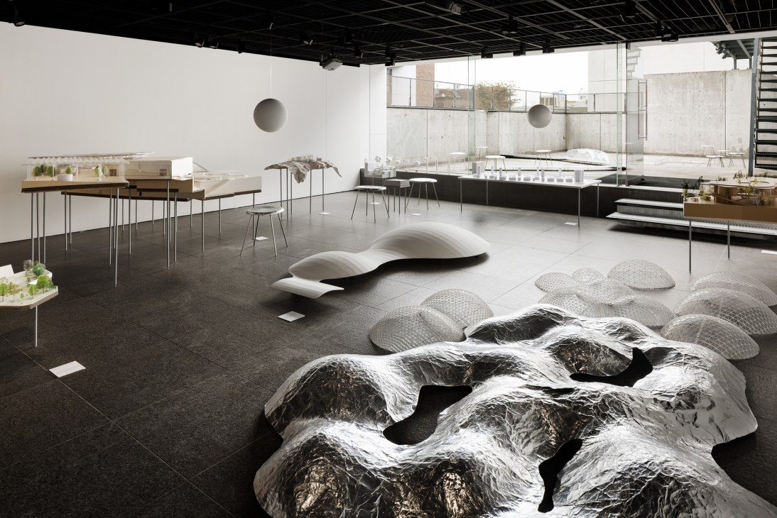
This exhibition is a display of models of new work by the architects, together and separately. The models are fascinating mini sculptures, particularly those with more challenging topographies, and their geographical breadth is a reminder of the global nature of top-flight architecture. There is the extension of the Art Gallery of New South Wales overlooking Sydney Harbour, a renovation project in the historic French town of Selestat; a new maritime museum in Shenzhen; and a gymnasium for the Japanese city of Kagawa. The lightly worn general theme is how the architects’ works relate to their environments, as shown in footage of Nishizawa’s House in Los Vilos, a low-rise concrete wave overlooking the Chilean coast.
This is a refreshingly succinct show and is all the more revealing for being stripped to its essentials. As the two architects have said, “We too are hoping to make new discoveries through this exhibition.”
jp.toto.com
On Design
Nolan Giles on…
The Swiss way
As a resident, you rarely think about how design makes life in Switzerland easy – you just get used to it. The city tram and train network, for example, will get you almost anywhere in less than 30 minutes. And with the route-tracking transport app, you simply, satisfyingly, swipe a big red slider on and off as you board or leave a tram. Things just work here. From architecture and civil engineering to graphics, furniture and interiors, Swiss design makes quiet improvements to life in a practical and elegant manner. A few companies, such as architects Herzog & De Meuron, furniture firms Vitra and usm, and sportswear brand On, traverse borders but much is internal.
The Design Prize Switzerland, run from the small town of Langenthal and largely unknown abroad, reflects this. Every other year it honours industry heroes little known outside the country. In doing so it recognises the subtle excellence of Swiss design.
The winners of the 2021 prize, announced in November, include a handsome wooden chair with armrests sloped to make getting in and out of it easy for the elderly. Designed by Sarah Hossli, a student from Ecal university in Lausanne, the Lotte chair contrasts a curvy blonde timber frame with beautiful beige textile-lined comfy cushions. It’s a piece of design that would work as well in a high-end hotel, as it would in an elderly care facility. Other winners are champions of the circular economy: compostable knives and forks for takeaways and a trainer from On, which, once worn down, can be shredded and recycled into another pair of its shoes.
In my time here I’ve been struck by the sophistication of barns, designed to enhance humane husbandry. I’ve learnt that white goods can be wonderfully designed, thanks to the many hours I’ve spent in the town of Zug with our friends from V-Zug. While it’s great to see this brand pushing into a global market with its products, and On going public on the New York Stock Exchange to great fanfare, perhaps the only negative thing about Swiss design is that it often doesn’t breach the nation’s borders. The probable cause is that Switzerland is such a comfortable place to live and work, and that customers here have the means to pay top-dollar for well-made goods. But the rest of the world would benefit from the talented designers of this nation pushing themselves out of their national comfort zone to help everyone else.
Images: Nacása & Partners Inc, Benedetto Camerana, Alamy