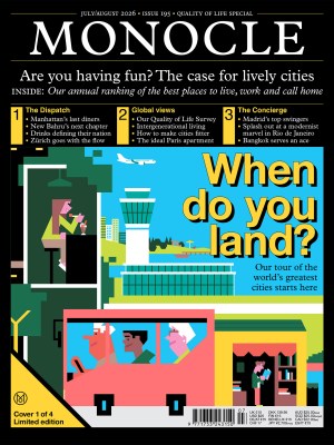

Issues
Feel good summer fits: Three fashion designers defining warm-weather style in Rio, Milan and Palma
1.
Escapista
Milan
For the Milanese, the arrival of summer means time away, typically spent at the beach, to escape the sweltering heat and humidity that envelops the Lombard capital. To explore these ideas of leisure and escape, fashion-industry veteran Leonardo Girombelli left his career with luxury brands – mostly in e-commerce for the likes of Yoox, Prada and Tod’s – and branched out on his own.
Earlier this year he debuted his menswear label, Escapista, with a 40-piece collection inspired by the colours and moods of Mediterranean life. “I wanted the name to be poetic and to hint at travel,” says Girombelli. It also pays homage to the Escapist, a superhero featured in US author Michael Chabon’s novel The Amazing Adventures of Kavalier & Clay.
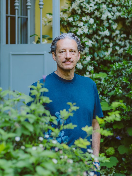
Girombelli grew up “immersed in textiles” in Italy’s Marche region, watching his parents run a clothing factory and produce seasonal collections for womenswear label Genny. By leaving e-commerce to launch his own resortwear label, he was coming full circle. “I wanted to create something authentic that would let me go at my own pace,” adds Girombelli, who has nurtured a network of trusted fabric suppliers and producers across Italy.
The brand’s T-shirts are cut loose to suit warmer climes and made from organic cotton in Puglia, then garment-dyed to give them a lived-in look. Collarless shirts are made using the same process, while the label’s Atlas bomber jackets are made from sturdy cotton sourced from the Marche region. For swimsuits, Girombelli turned to Portugal, creating trunks that feature playful details such as wooden beads on the drawstrings.
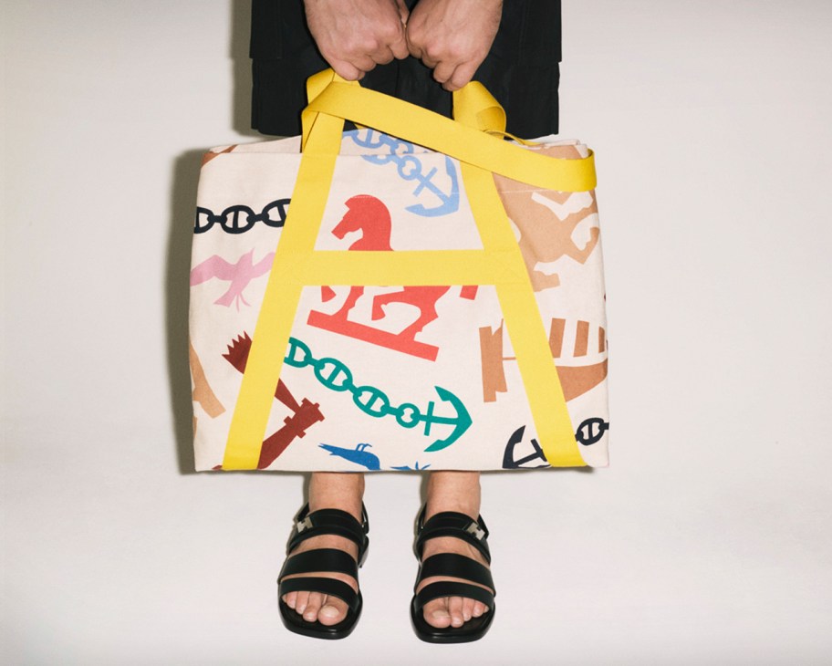
The collection also includes a range of bags – from totes with large external pockets to oversized duffels – designed for grab-and-go trips. “The aim was not to overdo it on this initial release and focus on making a small selection of well-constructed garments,” says Girombelli. “I wanted to create those evergreen pieces that become staples in one’s wardrobe.”
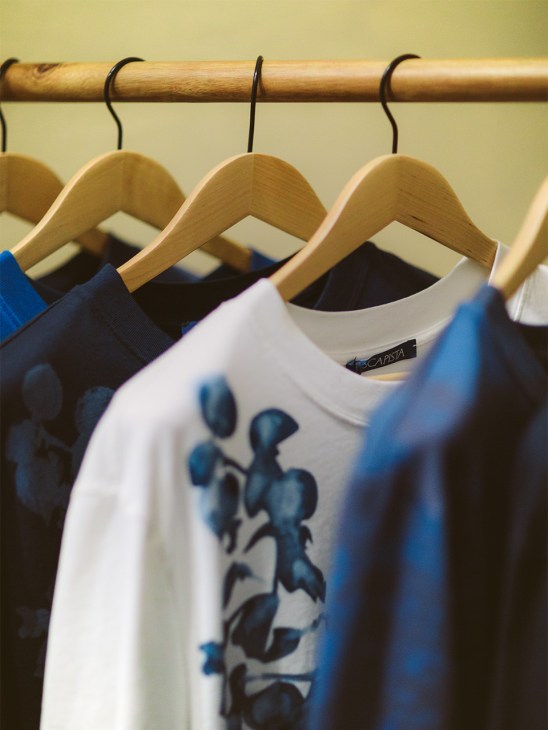
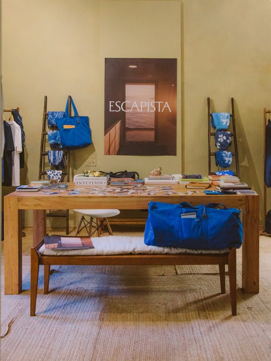
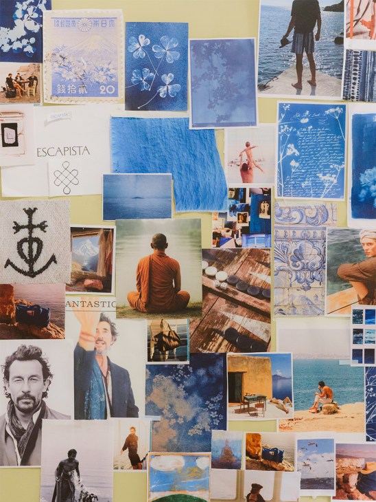

The blue colour palette, evocative of the sea and sky, was inspired by a mood board pulling together images of ferry rides to the Greek islands, with a touch of Morocco, Iberia and Italian summer haunts. As for the brand’s logo, a subtle “Esc” is discreetly embroidered on the hems of shirts or the sides of pockets – a playful nod to the escape key on computer keyboards.
So far, the market seems to approve of Girombelli’s sunny vision. In just a few months, Escapista has secured space in multibrand shops in Pantelleria, Toulouse and Rome, as well as in resort properties in Comporta, Bendor Island and Ibiza. There are many people, it seems, who harbour hopes of a summer escape.
escapista.com
2.
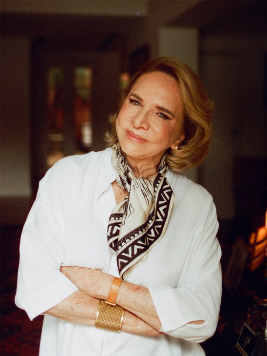
Lenny Niemeyer
Rio de Janeiro
Since launching her eponymous label 35 years ago, Brazilian designer Lenny Niemeyer has helped to redefine the image of her home country’s swimwear, fusing elegance with a playful sense of joie de vivre. Niemeyer was born in Santos in the state of São Paulo but is Carioca in spirit – she is known for her love of good parties and days spent in the sun. She spends much of her time in Rio de Janeiro, where she lives with her family in a house overlooking the Rodrigo de Freitas Lagoon. It’s a popular spot in creative Carioca circles: Niemeyer often opens her doors to host gatherings for as many as 900 people. She recently celebrated the anticipated return of Rio Fashion Week, which injected a welcome dose of energy and money into a fashion scene that had been eclipsed by São Paulo.
Here, the designer tells Monocle about hosting, staying on top of Brazil’s swimwear market and what’s next for her brand.
Why did you start your brand in Rio de Janeiro?
After studying architecture and industrial design in São Paulo, I married someone from Rio and moved here. No company would hire me so I started making bikinis for some of my friends from São Paulo, purely for fun.
When did things begin to change?
It was around the time of the Collor Plan [economic reforms carried out in Brazil between 1990 and 1992], when a lot of people went bankrupt. I was working from my garage with a pattern maker, selling clothes to various brands. But they started cancelling orders, leaving me with more than 30kg of fabric. I was given the opportunity to take over a design shop that was closing in Ipanema and decided to take the risk. I started to establish a loyal customer base and opened shops in São Paulo, Rio and the south of Brazil.
How did you come up with your signature style of swimwear?
For me, beach fashion isn’t limited to the sand. I like experimenting with materials that are more commonly used for evening wear, such as silk, which is both natural and lightweight. My swimwear isn’t about being the sexiest or the most revealing. I focus on pattern making, colour and silhouettes with larger waists. When customers feel good in your designs, they will come back. I love it when I meet women who say that they still own Lenny Niemeyer bikinis from 20 years ago.
Why was it important for you to be part of Rio Fashion Week this year?
I had always fought to keep Rio Fashion Week running. When I heard that it was coming back, I wanted to have a retrospective. Our biggest challenge was using old designs but making everything feel new.
Tell us about your plans to expand beyond your home country.
We have a distributor in Europe but exporting our products is still expensive. I want to expand our retail network in Brazil first. International expansion will be a long process that I’m leaving to my daughter, Bel.
Tell us about your decision to bring Bel on board as creative director.
I’m at an age when I need to think about legacy. I want to ensure the company’s continuity. Bel has the same values as me. She has travelled a lot and now she’s back with a big desire to refresh the business.
Can Rio become a city that the world looks to for swimwear trends?
Definitely. Visitors are coming here wanting to buy Brazilian bikinis, including my designs. European women, in particular, are now more open to swimwear from this country.
What makes a good summer party?
It’s essential to have plenty of ice and all kinds of drinks. Your guests can help themselves. You then need good music and the right mix: journalists, artists, actresses, movie stars, bloggers. Sometimes, I meet people who were introduced at one of my parties and are still close to this day – and that means a lot to me. I don’t throw those very big parties anymore but I still think that it is important to help create connections between people.
lennyniemeyer.com.br
3.
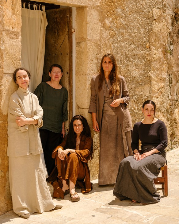
Cortana
Palma
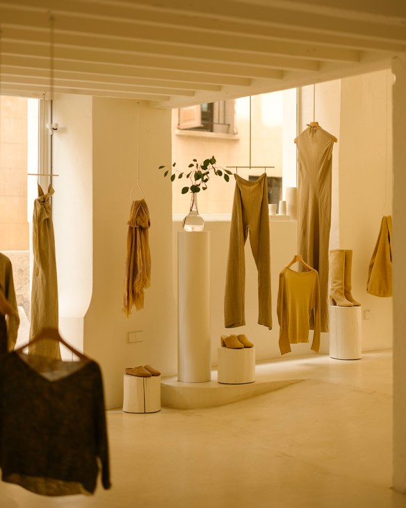
Cortana’s flagship shop in Palma stands apart from typical fashion boutiques. There are no mannequins in sight. Instead, soft linen trousers and silk crepe dresses hang at varying heights from the ceiling, like paintings in a gallery. “We work hard on every garment, fabric and print so I like to give my pieces a leading role,” says Rosa Esteva, who founded the brand in 2001. “I come from the art world and have been curating exhibitions from a young age. It’s about giving each piece the space that it deserves.”
Esteva, who grew up in Son Servera, a small medieval town in the island’s northeast, recently moved back to Mallorca from Barcelona. Since then, she has doubled down on her commitment to working with local artisans and has taken on projects beyond fashion, investing in the revival of hemp farming on the island.
The Cortana shop is in a restored townhouse, a maze of rooms with whitewashed walls. A narrow corridor leads from cosy nooks to light-filled rooms and a garden shaded by palm trees. It was designed by architecture firm Esteva i Esteva, led by Rosa’s brother, Tomeu, and father, Antoni, known for working on the homes and ateliers of artists such as Miquel Barceló and Joan Miró.
Esteva emerges from a dressing room in a green linen ensemble that exemplifies her minimalist style: a boat-neck top with mid-length sleeves and a long fitted skirt. Each piece is anchored in references to art and nature, and created from fabrics such as silk, linen and cashmere. “I want my clothes to feel like a moment that people take for themselves – like eating a healthy meal or meditating,” she says.
This morning the shop is quiet. Browsing inside are regulars including Palma resident Joana Maria Vives. Esteva steps into the changing room to adjust the fit of a pair of cinnamon trousers. “I like to see how customers interact with the clothing,” she says, kneeling to pin a hem. “Whether it was deliberate or not, you have created a community,” Vives tells her. “We don’t come here just to shop. We feel part of a concept, a way of being.”
While some of the brand’s operations are in Barcelona, Cortana’s design studio is now based in Son Servera, where Esteva was raised in a creative household. During her childhood, her father was always sketching house designs. Her mother, a florist who now runs country hotel Son Gener, taught her composition through flower arranging. After studying art and then fashion design in Barcelona, Esteva launched several brands, selling her handmade creations at friends’ shops. She founded Cortana at the age of 26 but it was a different proposition back then – her first collection featured a series of haute-couture dresses and long velvet coats. Its pieces caught the eye of buyers at Jean Pierre Bua, one of Barcelona’s top fashion boutiques at the time, and quickly gathered a loyal following.
Cortana now releases four collections a year. Pieces cut on the bias – an artisanal technique that allows the fabric to follow the body’s contours – have become a signature. The label prioritises comfort and its designs are often multifunctional. Dresses can be wrapped in different ways, tops become dresses and bags become scarves.
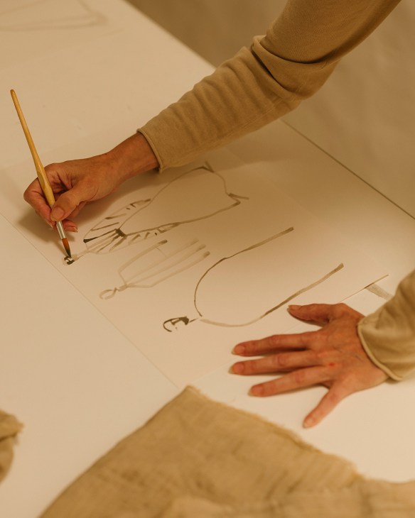
Monocle meets Esteva in Sa Pleta Freda, one of the oldest homes in Son Servera. Her father turned it into an art gallery in the 1970s and she has repurposed the upper floor as her studio. Here, she paints or sketches; her custom prints emerge from her watercolours. She makes full use of the space, pinning swatches of fabric onto the walls, picking up a pair of scissors and wrapping herself in fabrics to help her visualise the final design. “I find working on a computer impossible,” she says.
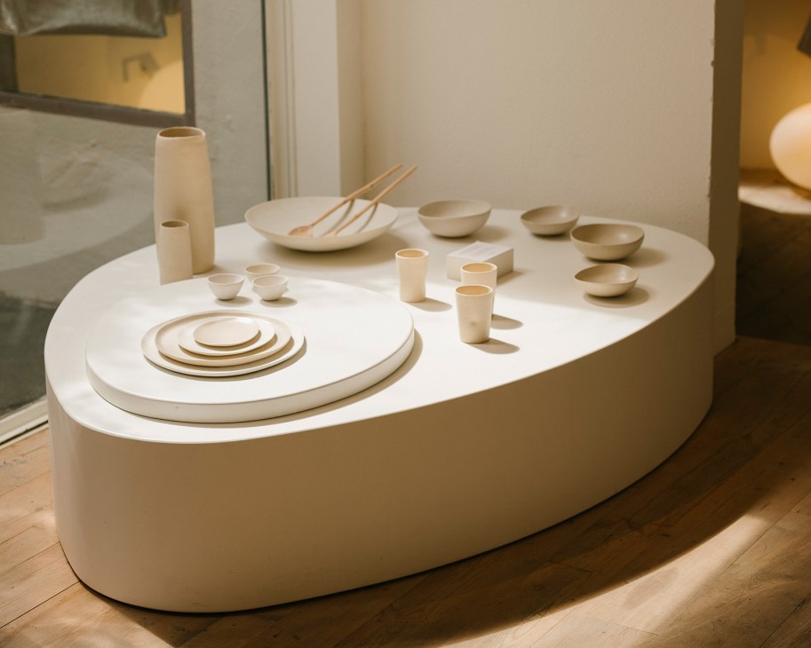
Esteva’s husband, Luke Matthews, runs Cortana’s business operations. He meets Monocle for breakfast at Es Racó d’Artà, a minimalist wellness retreat in an 18th-century farmhouse that is run by Esteva’s family. “Rosa designs very intuitively,” he says. “It’s more about how you feel in the clothes than how you look.” Es Racó d’Artà uses some of Cortana’s homeware line – ceramic cups, plates and jugs made by local artisans. Esteva also designed the staff’s linen trousers and tunics.
Interest in the brand has been growing, particularly in China, where Cortana is working with local partners to reach young, fashion-conscious consumers. There are plans to open outposts overseas and Esteva has been expanding into new categories. “We’re partnering with shops that we admire,” says Matthews.
Esteva has always drawn inspiration from Mallorca and its nature but this has been amplified since she moved back there. Living in the countryside has triggered a burst of creativity. The brand has since expanded into bags, shoes, homeware and perfume.
Her wellness-inspired approach starts with selecting natural materials. Back in the shop, Esteva runs her fingers along the racks in front of us: there’s a poncho in cupro (a regenerated cellulose fibre made from cotton waste) and a top crafted from ramie, a nettle-based fibre.

Cortana works with a local association to revive hemp farming near the town of Sa Pobla. Once widely grown on the island, hemp is known for improving soil, capturing carbon dioxide and filtering water. “Tourism is the dominant sector here so diversifying and giving opportunities to other business models that also have a future is essential,” says Marta Cabrero Iglesias, a childhood friend of Esteva who is helping to lead the initiative.
The idea was born when a woman gave Esteva hemp stockings that had been made in Mallorca some 200 years earlier. Her curiosity piqued, she began researching this lost tradition. Another turning point came when Cortana organised a weaving workshop. “It became a dialogue about Mallorca’s textile future,” she says. While Mallorcan hemp could eventually feature in Cortana’s designs, Esteva says that this isn’t the goal. “What matters is that we are doing something good for the land.” Her grounded vision is an example of how to run a growing business while still giving back – and making the most of sunny island living.
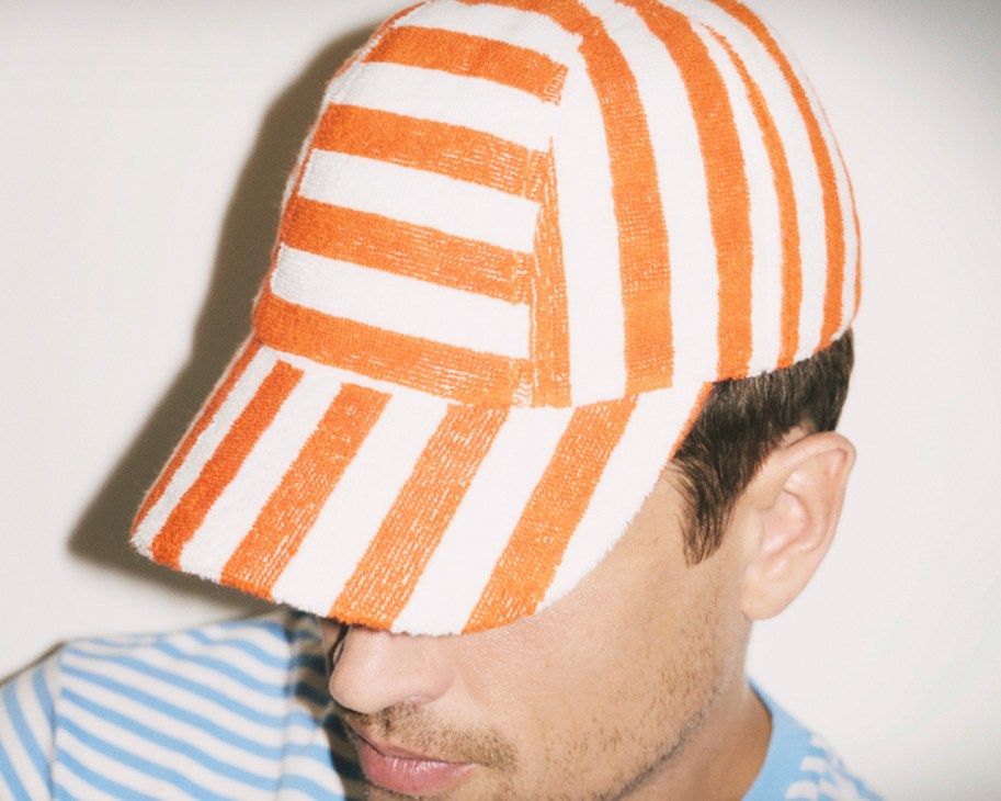
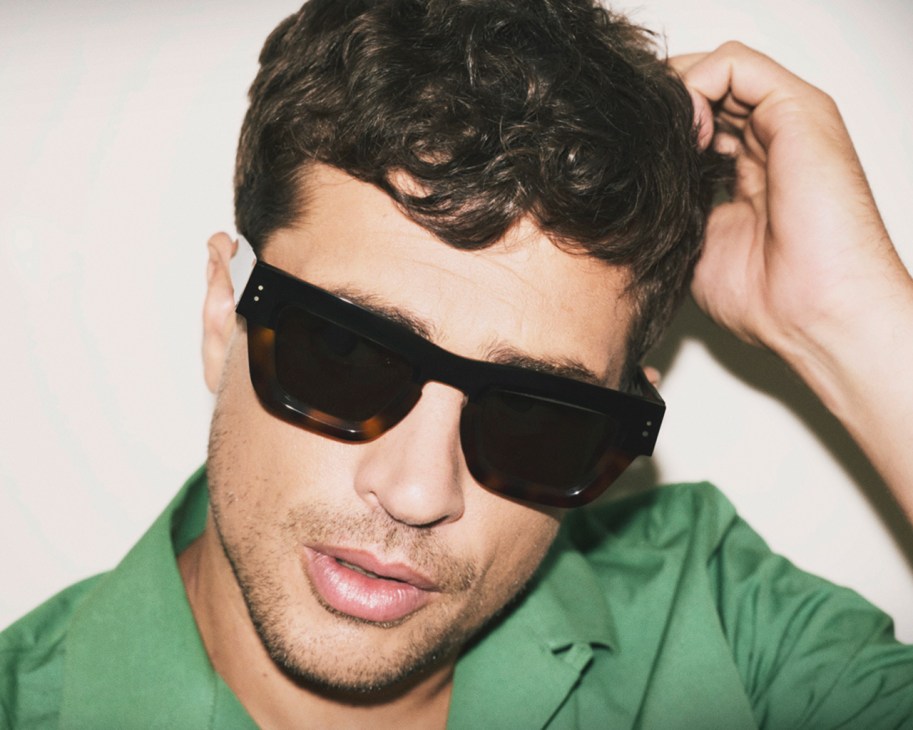
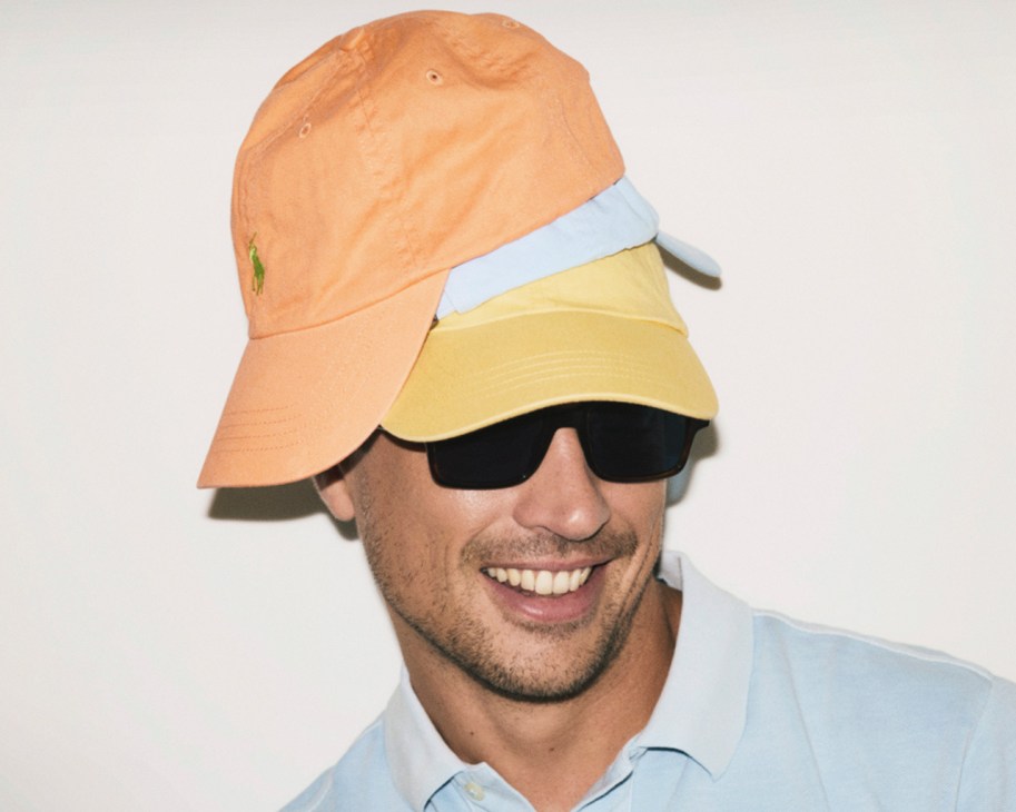
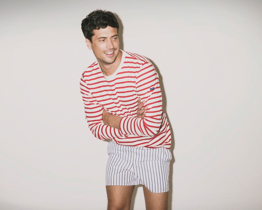
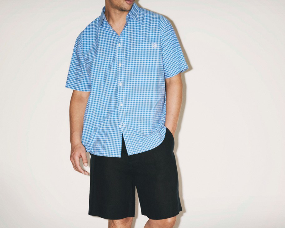
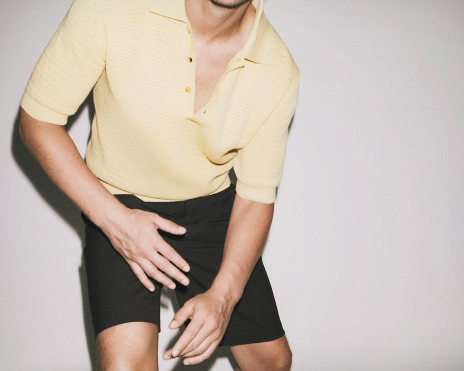
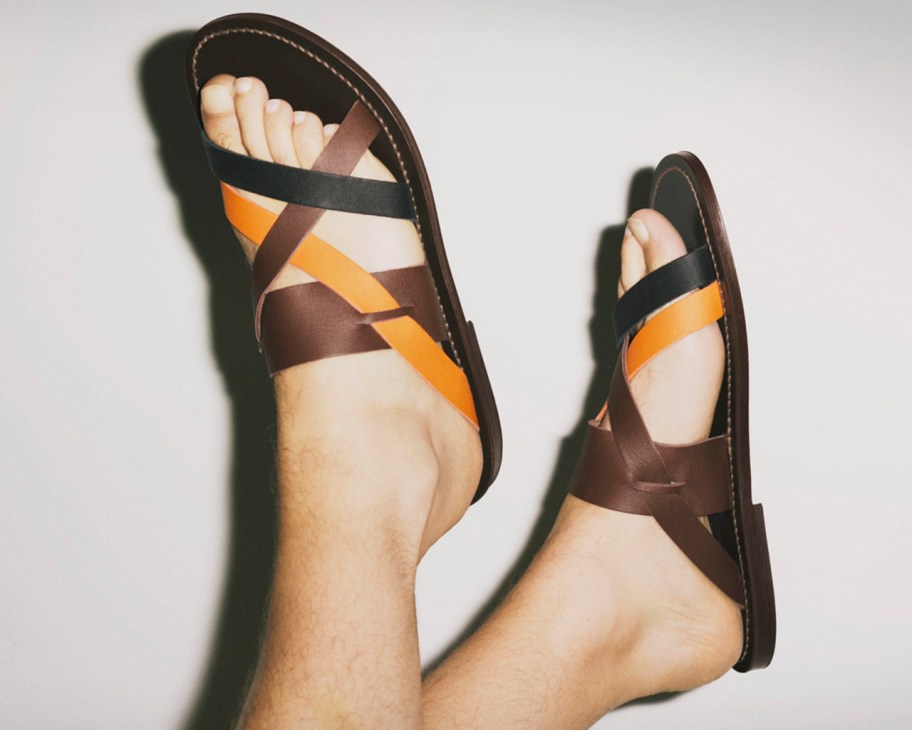
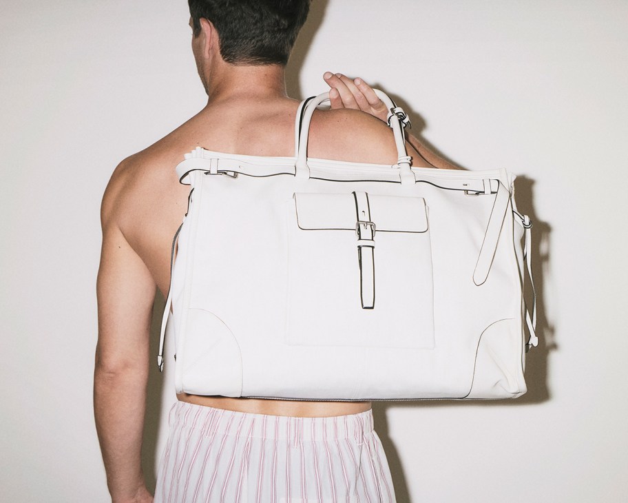
Fix up, look sharp: The most stylish menswear for summer 2026
Bucket hat by A Kind of Guise, shirt by Margaret Howell
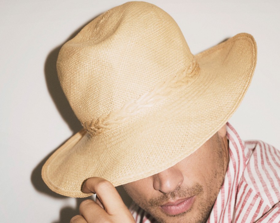
Hat and shirt by Loro Piana

Sunglasses by Maison Lassalle, shirt by Works and Days

Sunglasses by Jacques Marie Mage, jumper by De Bonne Facture

Sunglasses by A Kind of Guise, towel by Tekla

Sunglasses by Ray-Ban
Cap by Hermès, T-shirt by Polo Ralph Lauren
Sunglasses by Maison Lassalle, shirt by Celine

Sunglasses by Persol, polo shirt by Gieves & Hawkes

Cap by Works and Days, glasses by Jacques Marie Mage, jacket by Agnès B
Caps and polo shirt by Polo Ralph Lauren, sunglasses by L’Ingénieur Chevallier
Top by Saint James, underpants by Ami
Shirt by Loewe 3 Paula’s Ibiza, shorts by MHL by Margaret Howell
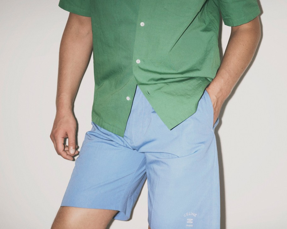
Shirt and shorts by Celine

Jacket, T-shirt and shorts by Prada
Shirt and shorts by De Bonne Facture

Polo shirts by Polo Ralph Lauren, sunglasses by Ray-Ban

Jacket, shirt and shorts by Zegna

Jacket and short by Dior, T-shirt by Works and Days

Polo shirt by Gieves & Hawkes, shoes by John Lobb
Shorts by MHL by Margaret Howell, bag and sandals by Hermès
Shirt by Margaret Howell, trousers by Officine Générale
Trousers by Officine Générale, trainers by Spring Court

Beach towel by Hermès
Trousers by Levi’s, shoes by J M Weston

Sunglasses by Ferragamo, shirt by Works and Days, trainers by Bensimon
Sandals by K Jacques
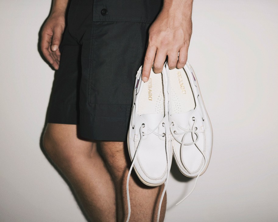
Shorts by MHL by Margaret Howell, shoes by Sebago
Shorts and bag by Prada
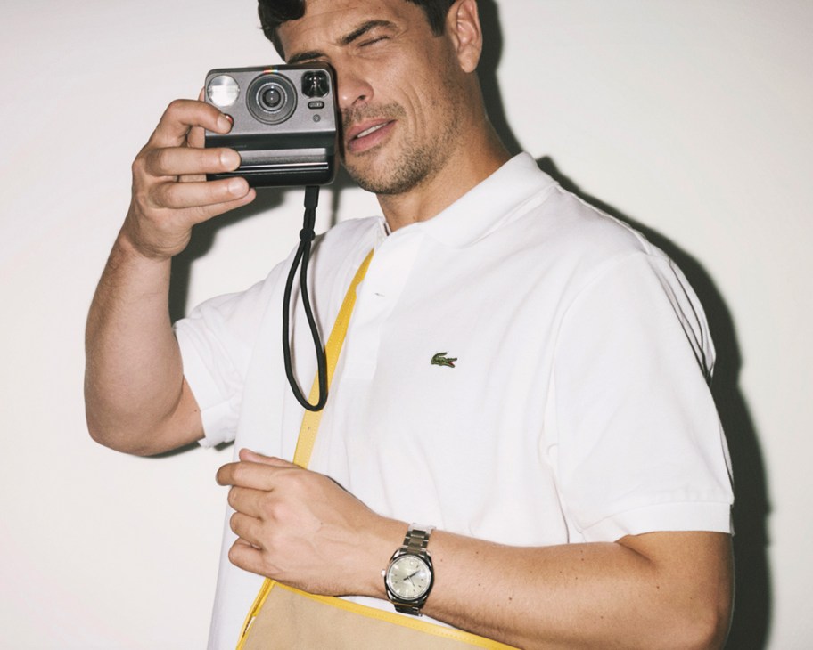
Polo shirt by Lacoste, bag by L/Uniform, watch by Omega
Trousers and shoes by Loro Piana
Stylist: Daphné Hézard
Fashion assistant: Charlotte Grébert
Hair and make-up: Audrey Payet
Model: Timothé Echelard
A day in the life of Ibiza’s Cala Llonga beach, one of Europe’s favourite suntraps
Before our toes touch the sand, let’s get a run of this beach. The sun is still a few moments from rising over the eastern Mediterranean – we have some time.
Ibiza’s Cala Llonga is one of those easy-to-picture postcard scenes. The sand blanketed with sunbeds. A panoply of different skin pigments are all vying for a healthier hue. Thickets of pine trees swallow the cliffside, where gigantic hotels jut out like postmodern megaliths. Every day, people gaze at the boats bobbing in the water, wondering whether they will ever be so lucky. It’s been this way – at different scales – for nearly six decades. The first major pioneering hotel, Playa Dorada, opened its doors on the beach’s left flank in 1969. Back then, pedal-powered swans made of fibreglass were predecessors of the inflatable flamingos seen bouncing in the water today.
Cala Llonga’s sandy shoreline is protected by a stretch of narrow cove (llonga – it’s in the name) carved naturally into the island’s eastern coast. This beach is emblematic of a much larger story. There is the island’s evolution from agrarian outpost to gregarious hotspot; the rise upon rise of tourism, or what philosopher Yves Michaud called “the industrialisation of pleasure”. And, of course, the adaptability of locals to serve and sate all and sundry. Most recently, new developments around Cala Llonga have mirrored the island’s wider embrace of high-end holidaymakers. But the seaside town’s prevailing sense of solidarity remains untrammelled. Spending a full day on these sands offers a glimpse of the many interrelated stories at play here. Now, a few seconds before the sun appears, let’s see who’s down on the sand.


Brimming with intensity is Dutch visitor Seth Kamphuijs, who is sitting and doing breathwork while staring into the pink-tinged sunrise. After a few words, he wastes no time before promoting his upcoming retreat. Early morning appears to be the shared province of wellness-seekers like Kamphuijs and workers scoping out another day under the sun. As a yoga class lays out its mats, the overseers of five demarcated territories for hamacas (sunbeds) – a pair of which will set you back €30 for the day – are busy dusting and straightening their beach furniture.
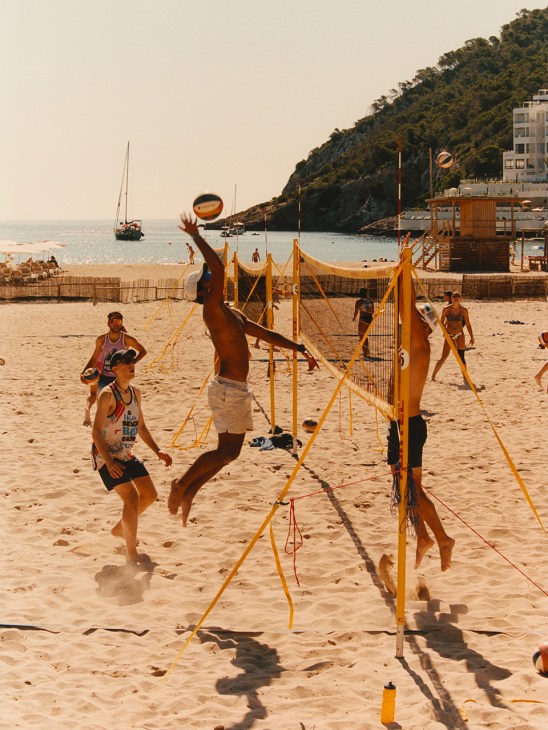
Across most of Ibiza, slow starts invariably stem from long nights. This beach has always been a favourite with families though. Some, toddlers in tow, are already arriving just before 10.00. We have an inkling that those longer, naughtier nights are wired into a few of these parents’ not-too-distant, still-cherished memory banks. In harmony with the sun, all sorts of activity starts heating up. Beach volleyball courts fill with leaping and bounding bodies for a training session. Dads drag parasols into position before initiating games of padel with their sons. The neatly ordered spread of beige hamacas starts to fill. In about an hour’s time, multi-toned towels will be held down by heavy bodies and restless minds. You can take your pick of pastimes on this shoreline: some do sudoku, others clutch summer novels. There’s lots of suntanning and screen-scrolling too.
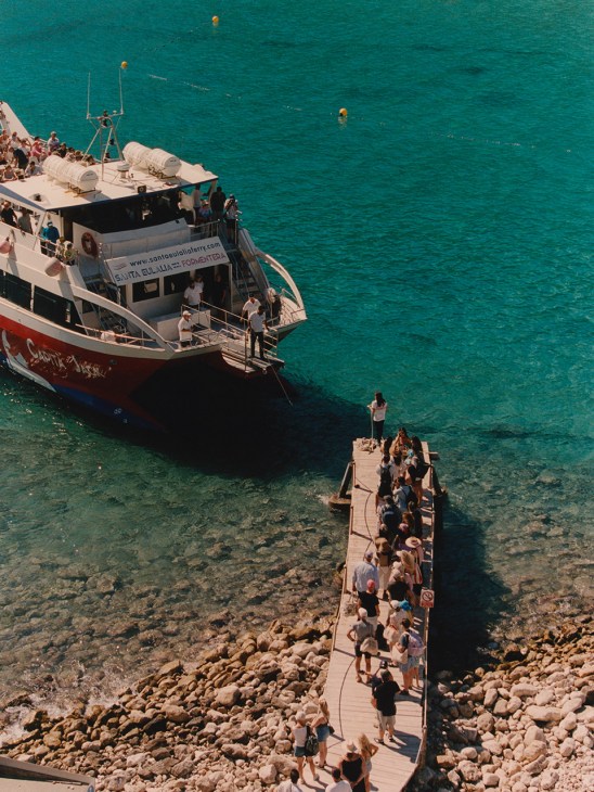
At 10.43 a ship’s horn heralds the arrival of the inter-island ferry, a relic of the past that still chugs along. Two dozen passengers queue atop the wooden pier, all packed and ready for a day on the second Pityusic island, Formentera. The Torres family formalised informal beach-hopping boat rides back in the late 1960s with a proper ferry service aboard the llaüt Virgen de Fátima, the same year that Playa Dorada opened its doors. In 1972, the route expanded to Formentera – a 40-minute ride on a good day. There’s only one daily service there and back, which might explain why today’s line formed before 10.00, brimming with eager faces ready to swap this stretch of paradise for another. In the case of Formentera, we can confirm that the sea is indeed bluer on the other side.
“Coco, tengo cocos!” A small bucket of unbroken coconuts in hand, Tomás weaves his way through the masses, hawking his sip-and-snack treats with a burst of semi-song. At €10 a pop, he cheekily assures us, a purchase “will neither make me rich, nor you poor”, then opens the shell with his knife, waits for us to drink the electrolyte-rich water and carves out the flesh for us to snack on. “They’re cracking down on little guys like me working on the beach,” he says. “On a good day, I might sell up to 50 coconuts – but I have to always keep an eye out for the police.”
He’s not the only one. Last year, the island’s coastal authority ordered the beach’s two surviving quioscos (beach bars) to shut down, then issued a demolition order. It’s part of the Balearic Islands’ wider clean-up of makeshift architecture peppering these cliffsides, some of which stretches back decades, was never legal and now finds itself in the crosshairs of unsympathetic administrators. The other side of this story is a wave of investor consortiums snapping up rickety resorts and transforming them into high-end hotels.
In 2023, the 154-key Mondrian Ibiza opened on the site of the Hotel Playa Dorada, which had since become a three-star establishment. Its arrival and the more well-heeled guests who came with it have spurred similarly stylish restaurants to open around the shoreline. Industry data shows that the resulting increase in visitor numbers has led to expenditure topping €4.25bn in 2025 (about 85 per cent of Ibiza’s GDP). And while stays are getting shorter, nearly 3.4 million travellers touched down on the island last year – up from 3.27 million in 2024 and 70 per cent higher than in 2001. Once synonymous with the package-holiday crowd, the contrasts visible along Cala Llonga illustrate the latest uptick. A little way along the beach, a snorkel-wearing good Samaritan emerges from the water clutching a sliver of plastic and a sand-encrusted aluminium can. Behind him, channelling their inner children, a senior couple splash each other atop duelling pink inflatables. Here, people tend to reveal themselves. When you think about it, it’s an especially peculiar place – even though too much overthinking can feel a little misplaced.


For those who savour the salted air, sand on skin and full-bodied submission to heat and happenstance, a spot on the playa is one of life’s meridian moments. All other mandatory mechanics – the deskbound clacking on keyboards, the staring at spreadsheets, the endless chores and chagrin of the everyday – have finally led here: a down-tempo laydown where trivial troubles seem to melt away. A sense of relief is written across the many faces staring out to sea, observing and being observed. Unless you’ve come to play a proper ball game, the beach stretches out interstitial time – the time between time. It is a place of liminal leisure where one arrives, has nowhere to go and finally finds a moment to be truly present. There’s suddenly space for play, for pause, for flickers of pensive reflection. And yes, even a forceful splash or two with your companion.
If the pinkening backs of several heedless tourists are anything to go by, it’s high time to seek shelter from the relentless sun. After a short walk along Carretera Cala Llonga, the town’s main street, we order a couple of cañas at the Madisson bar. There, we meet its proprietor, Pepe – and barely get a word in edgewise. He tells us how he was born on this very beach, back when there was only a single farmhouse facing the shoreline. Back when Pepe was in nappies, his father would drive a donkey-drawn cart to lay out the beach beds; then came the quioscos, the makeshift guesthouses, increasing numbers of tourists and finally the monumental construction projects. Pepe is a football fanatic so his retro-styled wood-and-Perspex panelled establishment doubles as an exhibition space for old sporting photos. He points to a picture of the playa’s original football pitch, which was built in 1959 and has been the home ground of the local club ever since. It has even attracted occasional football stars from the mainland. The other framed photos in the bar offer vignettes of long-gone halcyon days. So is Pepe nostalgic for those slow-fading, simpler times?
“People say how beautiful it was back then – cojones!” he exclaims, squashing any notion of sentimentality with Spain’s linguistic equivalent of “bullshit”. He explains: “In those days, I only owned one pair of trousers and shoes, there was no electricity and it took me an hour to walk to school. Now it’s not uncommon to see a Ferrari here.” For the record, there is no Italian stallion-emblazoned sports car in Pepe’s life – the 77-year-old, who is well known and beloved by returning visitors, prefers motorbikes. “He’s good with people; tourists always followed him wherever he set up shop,” says his daughter Laura, who splits her time between managing the bar with her sister Elena and filling in the gaps in her father’s story. There’s a lot to tell, too, the family having been in this spot since the mid-1980s.
Back on the sand, a punchy remix of Simple Minds’ “Don’t You (Forget About Me)” blares across the cove. The DJ on the decks beside the Hyde Hotel pool, which adjoins the Mondrian, is unaware that several portable speakers on the sand have cranked up their volume as a sonic countermeasure. It’s now past 16.00, the hottest part of the day, and the energy on the beach softens. Even the group of UD Ibiza football players, enjoying their off-season break with a cooler full of beers and a low-stakes ball game, have surrendered to the sun.
The day’s first instance of drama comes in the form of a jellyfish sting. Little Leo is promptly treated by attentive lifeguards who later clarify that this kind of thing – along with ensuring that oblivious swimmers don’t get squashed by the daily ferry – is about as dramatic as their job gets. “Why is it always Leo?” cries a friend of the boy’s mother (rather unhelpfully) as the group decamps back to their hotel.


By 18.00 the beach crowd has started to thin. As a few volleyball players return to the nets, we meet restaurateur Antia Pagant, who has brought her baby, Roco, to Cala Llonga’s playground. “There’s been a spirited effort to restore the beach,” she says. “Things like standardising the colour and the make of the sunbeds, and keeping the atmosphere family friendly.” She also tells us about Klaus, the beach’s seasoned bohemian and permanent resident for nearly 20 years, who has always been happy to give local businesses a helping hand. “Recently, a community-led effort collected funds for him to visit the dentist,” she says. “Cala Llonga is nice like that.”
This part of Ibiza was immortalised in Elliot Paul’s oft-recommended 1937 novel The Life and Death of a Spanish Town, which is set in neighbouring Santa Eulalia (a town that has since swelled to the size of a small city). While Paul charts the tragedy of the civil war in the spiritual self-destruction of a village community, he also captures the area’s prevailing beauty. His description of “a life more suited to human limitations and capacities, a rhythm more in accord with beneficent natural surroundings, a verdant sub-tropical landscape by the sea” feels entirely familiar as the sun dips below the horizon.
With a whole day of sand having sifted through Cala Llonga’s hourglass, it’s easy to behold the balancing power of the beach. A place where life’s ups and downs temper, simmer and then slow; where busy bodies meet newly calmed minds and a burst of cheering celebrates a barefoot goal, harmonising with a light siesta snore. And all of us adjust unwittingly to the natural cadence of sea and shore, until tomorrow and another sunrise.
Cala Llonga through the hourglass
06.33: Early morning sun peeks over the hills and the Med horizon
07.05: A motorised beachcomber cleans the sand
08.15: Meditators line the shoreline to practise morning breathwork
09.09: A yoga class on the playa strikes a warrior pose towards the sun
09.30: Raúl kicks off the day’s first multicourt volleyball practice
09.45: Sunbeds sit prepped and ready for another daily onslaught of towels and torsos
10.43: The ferry docks promptly at the pier, where a patient queue of passengers awaits
11.03: Beach beds or hamacas are already half full
12.10: The first wave of swimmers slips into the water for one of many cooling dips
13.31: A Brit is overheard complaining about everyone being on their phones – while talking on his phone
14.00: First round of lunchtime paella served at Sonrojo restaurant
15.30: Music begins blaring across the beach from the DJ decks at the Hyde Hotel pool
16.00: The harshest heat of the day hits the beach; a lull in all sporting activities ensues
17.00: Sunbeds sit half empty and seagulls begin to circle and swoop at any sign of scraps
17.45: First sign of strife: lifeguards attend to a jellyfish sting
18.30: Volleyball players return to the nets for another round of friendlies
19.01: Hamacas lie empty; families begin trouping back to their cars
19.16: Ferry Capita Jack returns, dropping off a boatload of slightly burnt daytrippers from Formentera
19.30: The beach tractor traverses the sand to empty overflowing bins
19.45: The footballers’ tally of beer bottles now numbers 24
20.00: A handful of people remains on the shore. The sea turns an opaque shade of turquoise
20.30: The flurry of dinner service is underway at restaurant Nun; the waiter doesn’t recommend the fish
21.00: The sun sets behind an eastern hill, 10 minutes earlier than on the island’s west side
21.30: The Mondrian’s elevated beach bar fills with freshly showered, sunkissed faces
22.00: The tinkle of drinks and conversation sees out another glorious day at the beach
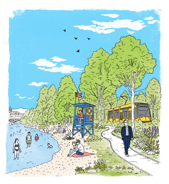
The long awaited revamp of Budapest’s largest public park might finally be here
It is a sunny summer’s day in Népliget. Known as the People’s Park, it’s Budapest’s biggest public green space, covering some 100 hectares to the southeast of the centre. But rather than being an urban refuge for the city’s residents, it has been at the forefront of the country’s culture wars for years. Under former Hungarian prime minister Viktor Orbán’s government, redevelopment plans worth HUF50bn (€141.3m) were thwarted. This was because the push to remove concrete paving, bring in new amenities and add more greenery had been proposed by the city’s left-leaning mayor Gergely Karácsony. For many, the lack of investment was symbolic of the way the capital’s urbanism revamp had been caught in the political crosshairs of a divided country.
Now, however, change is in the air. With the election of a new government that is amenable to Karácsony’s proposals, newly unlocked EU funding of €16.4bn could finally provide the necessary capital for urbanism projects such as this to be realised, along with tramline upgrades in the suburbs and accessible Danube swimming zones. For ordinary Budapestians, it feels as though this could finally be the summer that their city escapes political deadlock and delivers on the quality of life that they have been craving.
Comment
Updating green spaces in our cities should not be underestimated as a smart urbanism strategy. As places in which to cultivate, come together and cool off, well-maintained urban parks should be a municipal priority, especially as we experience a warming planet. It’s not just your city’s residents who will thank you – biodiversity will bloom too.
Further reading:
Neighbourhood enclave: Budapest’s Napraforgo Street
Put down the Coca-Cola. Stay hydrated this summer with these soft drinks from around the world
Every country has its own way of cooling down – and it often starts with an ice-cold soft drink. A nation’s beverage of choice can also serve an ambassadorial role, offering an authentic taste of its culture while evoking memories of childhood holidays and long, languid summers. Here are some of our favourites.
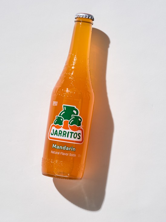
Jarritos
Mexico
In 1950 chemist Don Francisco “El Güero” Hill started making sodas in his Mexico City dining room. His first attempt, a coffee-flavoured drink, failed. His second, using tamarind, was a hit. Within a decade, Jarritos – Hill’s brand of soft drinks – was distributed across 80 per cent of Mexico’s states, available in a range of flavours including mandarin and lime.
Priced so that a schoolchild can afford a bottle alongside a media torta at break time, Jarritos embedded itself into the fabric of ordinary life. That accessibility is inseparable from its appeal: known as the “official drink of tacos”, Jarritos become the go-to accompaniment to spicy street food. Its name refers to small clay jugs that are traditionally used to keep beverages cool, while the formula honours the flavours of the Mexican orchard.
jarritos.com
Ramune
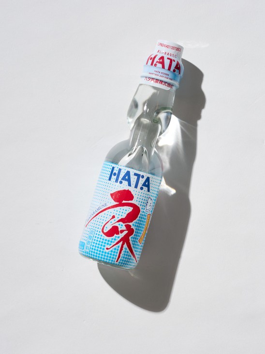
Japan
Originally marketed as a cholera remedy, Ramune has disarmingly simple ingredients: fizzy water, flavourings, sugar and citric acid. The origins of this lemon-lime soda remain contested, though one oft-repeated account credits Scottish pharmacist Alexander Cameron Sim, who is said to have introduced the carbonated drink in Kobe in 1884, inspired by the western lemonade.
But its appeal has never been based on its taste alone. Much of its charm lies in the ritual of opening the Codd-neck bottle: pressing the marble down with a pop and releasing a rush of bubbles.
hata-kosen.co.jp
Cockta
Slovenia
While much of the world gulped down Coca-Cola and other caffeine-fuelled drinks in the mid-20th century, a homegrown alternative was winning fans in Slovenia. Launched in 1953, Cockta (short for “cocktail”) blends 11 mountain botanicals including rosehip, a Slovenian staple foraged from wild hillsides.
Though synonymous with summer, Cockta debuted at a ski-jumping championship in Planica to link the brand image with an active lifestyle. Advertising posters later featured athletes climbing mountain peaks in shorts and water skiing in one-piece bathers, all while holding a bottle of Cockta. Today, that winter debut is best enjoyed in a glass with a single ice cube and garnished with a slice of orange.
cockta.eu

Sumol
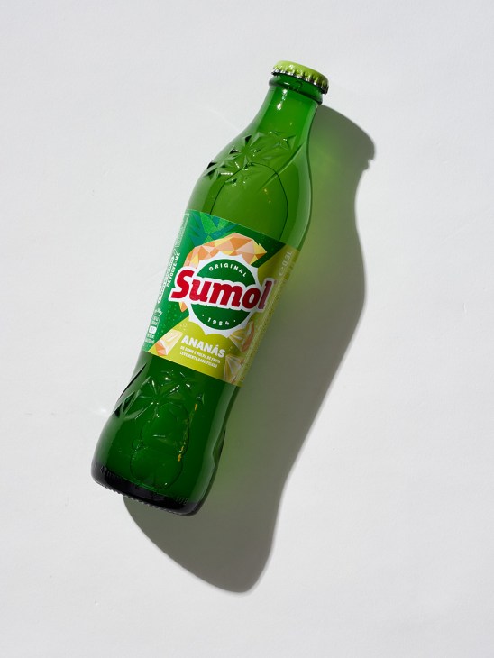
Portugal
A portmanteau of sumo (juice) and sol (sun), Sumol was Portugal’s first soft drink made from pasteurised orange juice when it was launched in 1954. A pineapple flavour followed and the brand’s logo was soon plastered across the country on billboards, napkin holders, bottle openers.
This savvy marketing, which was ambitious for a nation that was then under dictatorship, became as recognisable as the drink itself. In South Africa, which has a large Portuguese community, Sumol remains ubiquitous: it makes for a refreshing pairing with piri-piri and the catchy television jingles of the 1960s and 1970s still sit in the public imagination.
Today, Sumol continues to tap into Portuguese youth culture through new flavours and partnerships with sports and music events – but for no demographic does it evoke the feeling of summer quite like it does for those who came of age with it.
sumolcompal.pt
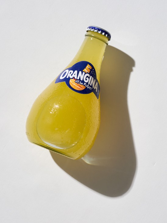
Orangina
France
Everyone who grew up in France between the 1970s and 1990s will remember Orangina’s slogan “Secouez- moi” (“Shake me”). In 1935, French entrepreneur Léon Beton encountered Spanish pharmacist Dr Agustín Trigo at the Marseille Trade Fair, who was presenting a pulpy orange concentrate called Naranjina. Trigo’s invention would become the basis for Orangina, which launched commercially the following year.
The sparkling orange drink contains real citrus pulp, which tends to sink to the bottom of the distinctive bulbous bottle, so a good shake is necessary. For many, the sight of that bottle – inspired by the shape of an orange – still conjures memories of trips to the beach in Brittany. Today, Orangina is owned by Japanese multinational Suntory and is available in more than 60 countries.
orangina.eu
Crodino
Italy
Named after Crodo, the Alpine town in Piedmont where it was created in 1965, Crodino made a splash when iconic French actress Brigitte Bardot starred in its first publicity campaigns in the mid-1960s and 1970s.
While its name has changed over the years – the drink was originally released under the name Picador – the Crodino recipe has remained proudly unchanged. The non-alcoholic bitter apéritif is a blend of 15 herbs and spices, including cardamom, cloves and coriander, which are left to infuse for up to six months.
Since Crodino’s acquisition by the Campari Group in 1995, its popularity has spread to Austria, Switzerland, France and the UK, as well as the US, where it satisfies Americans’ seemingly insatiable appetite for all things Italian.
crodino.com

ARTICLE CREDITS
WRITERS:
- Natalie Stoclet
- Julia Mio Inuma
- Alexandra Aldea
- Gaia Lutz
- Adrian Moore
- Rossella Frigerio
The clinic selling ‘scientific wellness’ in the heart of Bangkok
Wellness is a fast-growing industry in Thailand and Bangkok Dusit Medical Services (BDMS), the country’s largest private health-care group, has set its sights on becoming a global leader. Thailand’s flagbearer for preventative medicine, BDMS has a flagship address in central Bangkok and a portfolio to match, including 60 hospitals, drug-making laboratories and a nationwide pharmacy with more than 140 stores.
A decade ago, the group’s late founder, Prasert Prasarttong-Osoth, decided to build the standalone BDMS Wellness Clinic in the Thai capital’s Lumphini neighbourhood and appointed doctor-turned-longevity-guru Tanupol Virunhagarun (also known as Dr Amp) as its CEO.
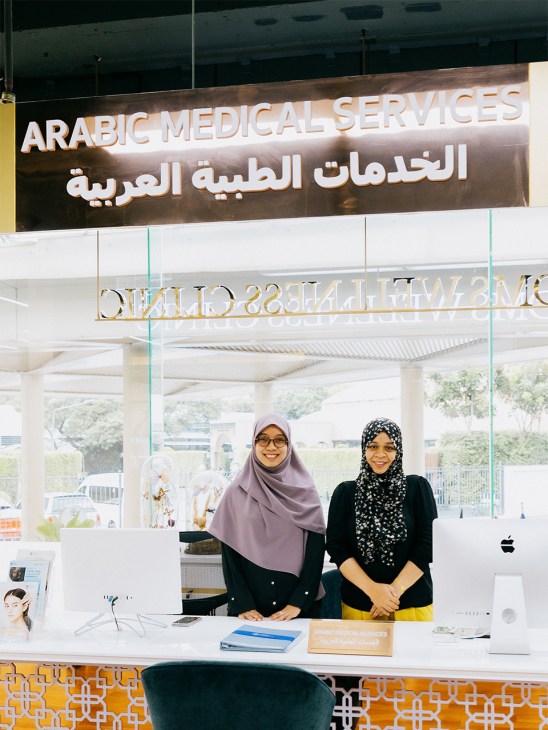
The clinic now accounts for 12 per cent of the wider group’s revenue. Dr Amp plans to reach 20 percent within the next five years. Across eight storeys, its services range from fertility and brain health to an on-site lab making personalised supplements. Its suite of blood tests, scans and other procedures measures organ health, hormone levels, cancer risk, muscle density and biological age.
The gold standard “Blueprint” package to screen for cancers, degenerative illnesses and gut biomes costs €15,000 and requires upwards of 20 tubes of blood, a team of doctors and a catalogue of machines. “We call this scientific wellness,” says Virunhagarun when Monocle visits. “Coronavirus helped us by raising awareness and encouraging people to take better care of themselves.”
The clinic is designed to look more like a house than a hospital; a chandelier-strewn home that’s accustomed to welcoming royalty (princesses and sheiks get to use a special lift). “Health is the new luxury and we sell life to people around the world,” says Virunhagarun. Some 70 per cent of patients are international and many fly in from the Middle East. Monocle spots several middle-aged men from the Gulf roaming the clinic in blue pyjamas, while wives and kids move from couch to couch, waiting for dad to finish.

By the end of the decade, these family visits several times a year could turn into a more permanent arrangement. Last year, the BDMS Wellness Clinic broke ground on a mega-complex called Wellera, slated for 2029. The mixed-used development will combine a hotel, clinic, fitness studio, retail, restaurants and 262 residences on a plot overlooking Lumpini Park.
The €400m investment is double what BDMS spent on the flagship clinic a short drive away. Besides hospital-grade air and water across the two towers, a nurses’ station will be manned around the clock, ambulances will be on standby and a helicopter ready to fly to Bangkok Hospital. Virunhagarun talks about a drone pad for transporting clients at even greater speed. “No one in the world has done a wellness concept like this before,” he tells Monocle before we head off for a swim and an early night.
bdmswellness.com
Hop on board: Six luxurious train routes to take this summer
As turbulent geopolitics play havoc with air travel, this could be the summer of spontaneous rail journeys. There’s little that’s more comforting than the lulling rhythms of an overnight train, especially when you are assured a snug bed and unrivalled views.
Luxury train companies have upped their game in recent years, with notable examples including Belmond’s excursions across South America and Rovos Rail’s weeklong South African journeys. The Golden Eagle Silk Road Express whisks travellers from Beijing to Tashkent in opulent interiors with stops in ancient locations, including Samarkand and Xi’an. And if you’re looking for a Rocky Mountains adventure, Canyon Spirit’s new Denver to Salt Lake City itinerary offers just that (plus all the trimmings).
Imminent arrivals on the scene, such as France’s Le Grand Tour, are also offering a refreshing mix of retro glamour and modern comforts. Slower forms of travel have their unique charms. Watching the landscape gradually change outside the window as your train cruises across a country (or even a continent) is a rewarding, meditative experience – made all the more pleasurable by plush upholstery and a well-assembled drinks menu.
So if you have your eye on a slower, more scenic itinerary this summer, here is our departure board of new routes leaving from a station near you.

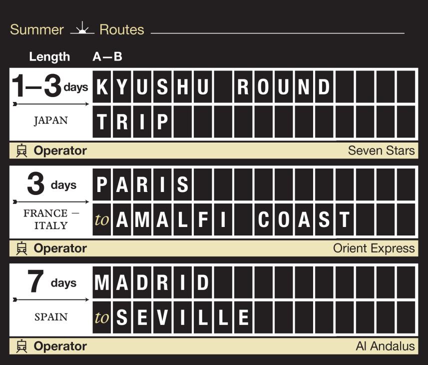
1.
China – Uzbekistan
Route: Beijing to Tashkent
Operator: Golden Eagle Silk Road Express
Length: 22 days
2.
USA
Route: Denver to Salt Lake City
Operator: Canyon Spirit
Length: 3 days
3.
Australia
Route: Adelaide to Darwin
Operator: The Ghan
Length: 4 days
4.
Japan
Route: Kyushu round trip
Operator: Seven Stars
Length: 1 – 3 days
5.
France – Italy
Route: Paris to the Amalfi Coast
Operator: Orient Express
Length: 3 days
6.
Spain
Route: Madrid to Seville
Operator: Al Andalus
Length: 7 days
Comment
Slower forms of travel have their unique charms. Watching the landscape gradually change outside the window as your train cruises across a country (or even a continent) is a rewarding, meditative experience – made all the more pleasurable by plush upholstery and a well-assembled drinks menu.
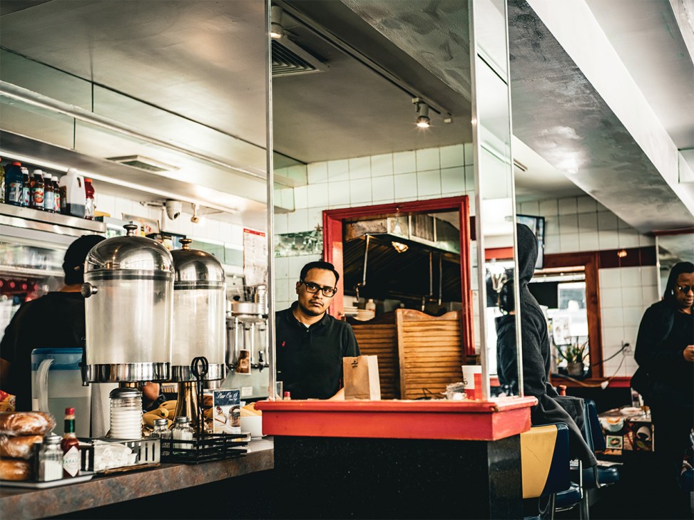
Last orders for Star on 18, the classic Manhattan street-corner diner
For a while it seemed as though the standalone diner on the corner of Manhattan’s 10th Avenue and 18th Street would reach its 100th birthday. But its prime location beside an empty lot in the Chelsea neighbourhood – once a big advantage – has turned out to be its downfall. Star on 18 has gone by a few names in its time and been subject to several makeovers. A photograph taken in 1940 shows the metal-clad structure in the shadow of a sagging tenement.
Pre-fabricated, portable “railroad cars” of this kind – named for their interiors, reminiscent of a train’s dining wagon – were traditionally made in New Jersey, then hoisted onto a truck bound for whichever bit of New York offered a siding of empty space. In the mid-20th century, they were ubiquitous.
A 1980 snapshot of the Star on 18 building – then known as Corfu Diner, a nod to its Hellenic-American ownership – shows its metal shell dented, timeworn and etched with graffiti. At the end of the 20th century, the Gioulis family took it over. “My parents came from Greece,” the current owner, Betty, tells Monocle as she taps on a calculator at the till, on one of the diner’s final days in business. “We had another diner in Midtown called Starlight that we gave to someone else, so we called this one Star on 18.” Betty shrugs. “Starlight closed.”
Now this neighbourhood institution is closing too. It outlasted most of its peers and its departure leaves just three diners of its type in Manhattan. It’s a victim of change that has been supercharged by the flourishing of the High Line, directly opposite. The elevated railway track was transformed from a debris-strewn ribbon of weeds into a much-loved walkway and urban attraction. Today almost everyone wants to live beside it and property in the area is at a premium.
Some have long considered Star on 18 as one of this glass-and-concrete metropolis’s last remaining spots of chaos and colour. The laminated menu offers everything from cereal to the “diet delight” chicken and spinach. Bacon rashers and eggs sizzle on a grill, while fries seethe in the golden depths of a deep-fat fryer. Steaming food is whisked through a serving hatch. Blue and yellow booths seat a few dozen customers when it gets busy. Here, bus drivers mingle with High Line staff and local residents, and a steady stream of out-of-towners rub shoulders with hungry families. “We get all types,” says Betty.
There’s no fanfare around the end of Star on 18. Few seem to know that its doors are closing. Change in cities can happen too gradually to discern with the naked eye. “This place is one of those last, stubborn holdouts,” says Phil, a regular. “It’s a proper diner on the corner.” As for Betty, she’s eyeing up an opportunity in Long Island City. “We’ll see,” she says. “If it comes off, maybe it’ll be a new Star.”
Further reading:
Monocle’s complete city guide to New York
Where to shop in Manhattan now: Five multi-brand retailers worth visiting
The irreplaceable value of humanity in the age of AI
Our relationship with artificial intelligence is a paradox of intimacy and alienation. We are endlessly curious about testing a machine’s limits but also harbour a quiet dread that, as algorithms improve, our humanity is somehow being diminished.
The industry claims that we are on the cusp of “artificial superintelligence” – a notion that implies that intelligence is a matter of mere computation and logic. But I disagree. I tend to think of it more as a feature of experience, of being alive. Optimists view AI as a crane for intellectual heavy lifting, while sceptics see it as a threat. The truth lies somewhere in between. Machines might soon hold a monopoly on facts but humans will always be able to fall back on their birthright: their humanity. Through global AI workshops and decades of teaching and consulting (and occasionally redesigning a good old-fashioned newspaper), I have identified four areas where humans will always have an edge – where we will remain the pilots and machines will be the passengers.

Matters of experience
In early 2026, Yann LeCun, the former chief AI scientist at Meta, argued that the current obsession with large language models (LLMs) such as Claude or Chatgpt is a “dead end”, because they fall down for a lack of what he called a “world model”. While LLMs require the equivalent of 400,000 years of reading to function, a four-year-old human can attain superior logic in just 16,000 hours.
The difference is that text is a low-quality abstraction, while tactile experience offers a high-bandwidth education: in gravity, spatial constraints and physics. AI could, for instance, describe a glass falling off a table but it can’t feel or understand the physical stakes.
In Gabriel García Márquez’s novel One Hundred Years of Solitude, there’s a description of blood flowing out of a house, turning corners and climbing steps to find a mother’s feet. AI could perhaps calculate the viscosity and coordinates of that path but it lacks the world model to understand the gravity – physically and emotionally – of the journey. If we were to rely solely on AI, we would produce a world of realism without magic.
Once more, with feeling
A human writer can grasp the weight of mortality. An AI merely works out the frequency and placement of the words used to describe it. The technology presents what it finds; humans write and draw what they feel.
When Hamlet ponders, “To be, or not to be?” AI can identify the full line’s iambic pentameter and the statistical probability of the next word. However, it cannot comprehend the cultural ghost of the question – the intersection of honour, grief and historical context. Where humans inhabit and understand the struggle, AI recites a script. It exists in a vacuum of data and doesn’t wonder about its place in the universe because it doesn’t occupy a place. It occupies a server. “AI is changing the signature of creativity,” says Nina Begus, the founder of the artificial humanities group at the University of California, Berkeley. “While creativity might no longer be solely in the human domain, this tension is bringing more value to biological and embodied intelligences.”
Star quality
Roberto Trotta, a theoretical physicist based at the Scuola Internazionale Superiore di Studi Avanzati in Trieste and Imperial College London, suggests that human intelligence has been shaped by an ancestral need to navigate the cosmos. We need to contemplate our place within it – to be “starborn”, as he poetically puts it. AI operates in a silicon silo, lacking the existential stakes of metabolism and mortality. When I ask Trotta how he views the role of creativity as AI surges, he says that originality is exclusively human.
Consider Salvador Dalí’s surrealist paintings of melted clocks. To an AI, these are distorted pixels. To a human, they might represent finitude. We comprehend the metaphor, the “softness” of time, because we age and decay. An AI, existing in a timeless digital fugue, has the optics of the image but lacks the existential vertigo of a creature that lives and dies by the clock. “Human-generated content will increasingly become premium, like organic food today,” says Trotta. “AI slop for the masses, certified human for the few – human certification will add a veneer of exclusivity, becoming a status symbol of sorts.”
Following the scent
The phrase “scent of the human” came to me during a speech that I delivered at a conference for journalists in Bergen, Norway. The audience immediately recognised what it meant, which signalled something important that reporters seemed to pick up on intuitively. Human intelligence is informed by subconscious processing: of pheromones, stress markers and the visceral understanding and interpreting of other living beings. This scent also underlines the irreducible essence of empathy and trust. Until a machine can share the breath and the organic signature of life, it will remain a mind without comprehension: a nose without scent receptors.
A war correspondent reporting from the ruins of a city, for instance, doesn’t just see devastation. He or she smells it, sensing the mix of pulverised concrete alongside the hunger on a child’s face. An AI can analyse a drone feed and classify rubble through pixels but it’s immune to the atmosphere of trauma: the odours and subtle signals that it could never intuit. It can report a flow of casualties but not inhale the human tragedy.
Present and correct
I predict that the most influential creators 10 years from now won’t be those who can prompt the most complex algorithms. Instead, they will be people who can plant their feet firmly on the ground and proclaim, “I was here.” In an era of infinite, seemingly perfect but totally synthetic content, the most valuable commodity will be humanity: unprogrammable evidence that a story passed through a living limbic system.
Human creativity isn’t a statistical derivation of what came before. It’s an organic response to being alive, to being afraid and to being together. AI might hold the map of our collective past but only a human – grounded in the physical, a witness to the present – can fathom the way forward.
Three key takeaways
1.
The map versus the terrain: AI might know the co-ordinates but humans can feel the ground.
2.
Information versus wisdom: Where machines can process data, humans experience meaning.
3.
The mirror versus the source: The technology reflects our past. Human creativity can still shape the future.
About the writer:
The CEO of Garcia Media, Mario Garcia is also an adjunct professor at Columbia University’s Graduate School of Journalism. His next book is The Virtuoso Machine: Finding the Scent of the Human at the Controls of AI.
Your verbs are more powerful than you think: Why thoughtful language matters even more today
“If you need me,” said the server, handing out menus, “just ‘Hey, lady’ me.” I had just sat down in a busy diner in the mountains of North Carolina, a place where plainspoken friendliness is as common as bears in the backyard. Even so, this woman’s cheerful suggestion disarmed me. I liked her panache. She had flipped what is ordinarily a rude exclamation into a signal of warmth and subversive wit. She had made it a positive verb.
I have been thinking about the power of verbs as our language slips out of our control. AI slop and autocompleted sentences drain the life out of writing. Political speech floods us with crudeness and obfuscation. I’m American, so you’ll forgive me for claiming bragging rights to the worst of it all – the bizarre rants, threats and verbal chaos coming from our leaders in Washington.
To deepen our connections with one another, we need to spruce up our verbs. My encounter in the diner shows how reclaiming or creating vivid, active ones can be an act of humanity and resistance. Verbs are the engine of meaning. When we choose them with care, we improve communication, in speech or any kind of prose, in the workplace or the writing cave. For almost 30 years I was a dance critic and arts reporter for The Washington Post and relied on strong, dynamic verbs to tell stories and transmit the visceral excitement of the performing arts.
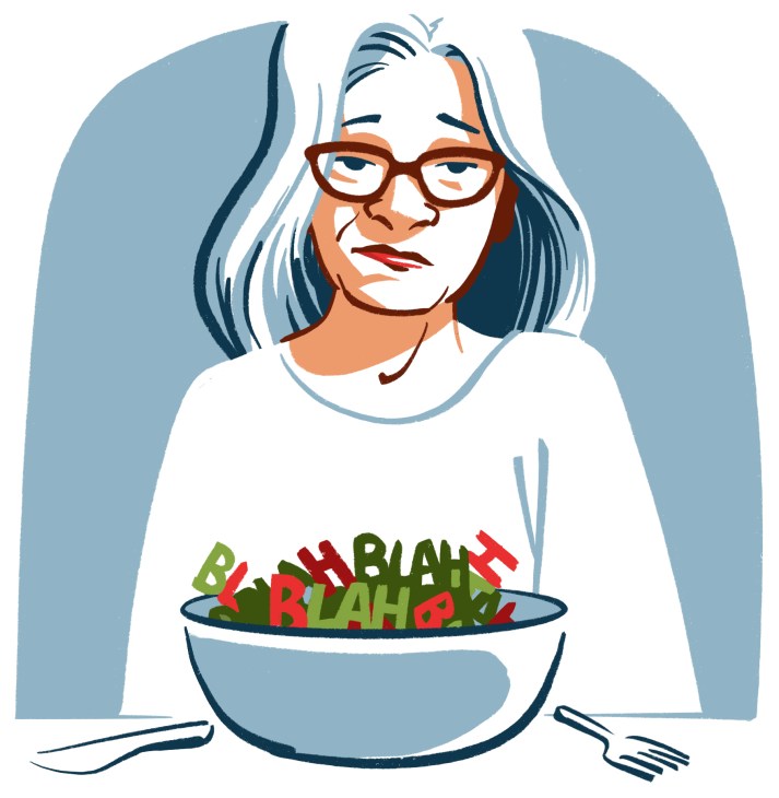
What I’m proposing here and in my recent book on the subject is the practice of thoughtful verb use. This is not a grand solution to impersonal and alienating language. Rather, it’s a discipline of small steps to add meaning, compassion and even joy to our discourse. Verbs are not only the secret soul of language. They are descriptive tools too. They spark imagery and emotion. One excellent verb can suggest a whole story. A jeweller’s website that I stumble across describes its turquoise as having “slipped from the sky”. An exaggeration, yes, but it conjures a harmless dream of magic and flight. A bus ad for a science museum in San Francisco urges, “Tinker, touch, test, experiment, notice, play!” And I’m hooked. I linger over “tinker” and “play” and see myself happily fiddling with levers and springs and possibly emerging from the gift shop with a deck of 3D cat cards and an ant farm.
Outside the creative sphere, strong verbs restore moral clarity. It takes humility to own the truth and say, “I made a mistake,” instead of, “Mistakes were made.” The passive voice sounds weak and evasive. Honesty lives in active, accurate verbs.
Yet the latter can feel risky when we’re accustomed to euphemisms. Corporate jargon turns “lay off” into odd nouns that hide the truth: “a simplified operating model”, “a strategic pivot”, “a rightsizing”.
Tell the plain truth in strong, clear verbs, however, and you can gain widespread praise. Airbnb’s CEO, Brian Chesky, discovered this in 2020. Facing the coronavirus pandemic’s chokehold on travel, he wrote a straightforward letter to employees. No doublespeak: nearly 1,900 of them “will have to leave Airbnb”. He chose blunt verbs and compassionate ones (“We will have to part with teammates who we love and value”). Chesky also stated his aim “to take care of those that are leaving”. Some responded on social media with gratitude for his manner and a tone so refreshing that the news media took note.
Verb choice shapes our relationships. In the 1960s, psychologist Marshall Rosenberg developed Nonviolent Communication, an influential training programme to foster empathy and avoid conflict. A key strategy is to make “I” statements with active verbs expressing specific observations, not generalities. “You’re always late for meetings” prompts defensiveness. “I noticed that you came in late twice last week” might invite a conversation.
“Honour the verb” is a cherished tenet of journalism: do so and you honour your audience. AI hasn’t learnt this. A self-described “book-marketing specialist” recently sent me a pitch via email, offering to promote my style guide on verbs in attention-grabbing ways. But they hid the point in bot-generated word sludge: “In reviewing the current presentation, I noticed opportunities where the emotional intelligence of the book could be reflected more intentionally across its discovery structure. That creates an unusual discoverability challenge…”
You bet it does.
Vague, maddening garbage such as this is spreading so quickly that you might fear that it’s unstoppable. But it’s not. Ignore the bloodless LLM rumble. Let’s slow down, consider what we mean to say and choose natural language with the clearest words – starting with a subject, a verb and the truth.
About the writer:
Sarah Kaufman is a Pulitzer Prize-winning critic, a writing teacher and the author of Verb Your Enthusiasm: How to Master the Art of the Verb and Transform Your Writing. Her work also appears in the New York Times, Wall Street Journal and Washington Post.