
Issues
The Japanese miniature artist who takes the little things in stride
Artist Tatsuya Tanaka doesn’t see the world like everyone else. Where we see a paper cup, he sees a drum; where we see a bunch of parsley, he sees a forest. He looks at any object, no matter how humdrum, as potential material for one of his tiny creations: witty, miniaturised versions of daily life. Tanaka’s scenes are funny and fascinating. But just as impressive is his productivity: he has created an artwork every day since 20 April 2011.
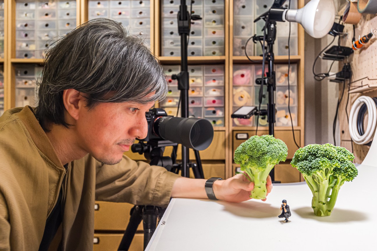
Before he became a full-time artist, Tanaka (pictured) was working as a graphic designer. “When Instagram was starting up, I had a few miniature models at home and started posting pictures of them as a hobby,” he says. “But people said that they wanted to see something daily.”

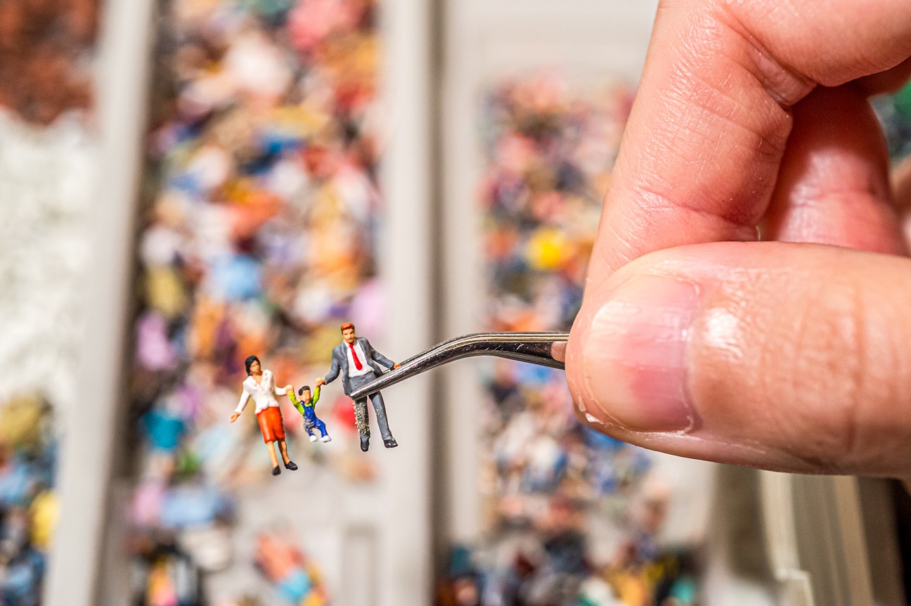
Tanaka’s studio is on an upper floor of a regular block of flats in the laid-back Japanese city of Kagoshima. “Studio” might be a stretch: his workspace is a compact – and meticulously tidy – room in the home that he shares with his wife and two sons. He sits at a desk surrounded by drawers of carefully sorted and labelled miniatures – miniscule Converse trainers, diminutive dogs and tiny jeeps, scooters and camper vans. There are crowds of tiny people too, all grouped by profession, from surgeons to snow jumpers and sumo wrestlers. There are pagodas and wooden houses; even a troupe of Japanese festival musicians; and many versions of Tanaka himself.
The artist works with a small team – his wife, an assistant and a manager – and rents another apartment in an adjacent building that is full of figures, plastic food and old electrical appliances. “I collect everything,” he says. “You never know when it might be useful.” Apart from the odd gifted camera lens, Tanaka has mostly resisted sponsorship. Snack companies have asked him to feature their products in his work but he always says no. “If I had to stick to certain brands, it would limit what I do,” he says. He writes books (several of which have been translated into English and French), publishes a physical calendar every year and is touring his Miniature Life exhibition, which has attracted more than two million visitors.
“Books can take you to places you will never experience,” he says. “It’s the same with my work. I can create miniature worlds and go anywhere.” And he’s bringing along people from all over the world. “Most adults are so busy living their lives, worrying about work, food and laundry – there’s no time to think about creativity,” he says. “Seeing these miniatures seems to bring out the inner child in people.” That’s no small feat.
miniature-calendar.com
How Nakijin Tsuwabuki creates a unique destination rooted in natural landscape
“In Nakijin, there’s a saying: noon nen shiga,” says Miyako Shimmi with a smile. “In the Okinawan language, this means that while there might be nothing here, Nakijin will satisfy your heart. There are no resort hotels or theatres; there’s nothing of that kind. But upon coming here, you’ll be fulfilled by the natural landscape that is the pride of Nakijin.”
Located on the northern side of the Motobu peninsula on Okinawa’s main island, the village of Nakijin is a place where life ambles by at a leisurely pace. Fukugi-lined streets lead through traditional settlements towards crystal-clear coves, while lush forests envelop the mountains. Within these peaceful surroundings, Miyako and Seiichi Shimmi opened their villa Nakijin Tsuwabuki on the winter solstice in 2022.
Four years in the making, the project has seen a partly forested site spanning almost 3,000 sq m become the setting for an exclusive villa limited to one booking per night. Miyako’s early encounters with the place, which had grown wild after intermittent periods of agricultural use, provided a taste of its natural charm and potential, leading her to envision ways to preserve and share the unique mountain landscape.
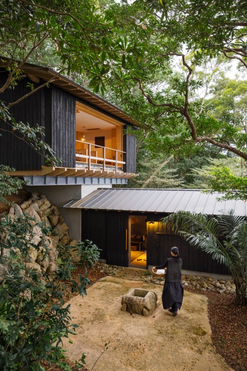
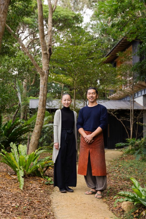
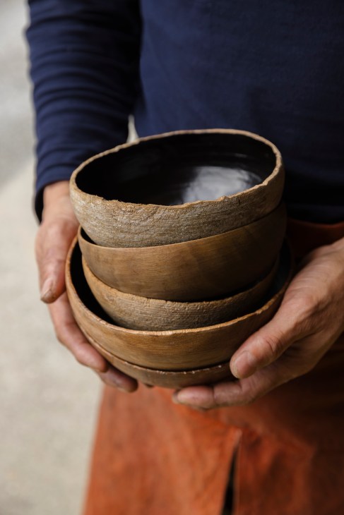
As a newcomer to Okinawa, she began assembling a team of collaborators from scratch, starting with ceramicist and sculptor Koichi Uchida. Inspired by Uchida’s efforts to preserve banko-yaki ceramics in her hometown of Yokkaichi, she brought him onto the project as an advisor to help form something that could endure for generations to come. The ceramicist would help to shape the project, while also creating the reception tea space and its ceramic tableware, along with selecting a range of antique furniture.

During the early stages of the project, Miyako was also introduced to Nanjo-based architect Hiroyuki Yamaguchi, who worked closely with her to bring the vision to life. “Upon joining the project, my first thought was to cherish and respect the site,” says Yamaguchi. “We surveyed almost everything, including individual tree heights and locations, then determined how best to work with the topography while minimising our impact.”
“Rather than focusing on the architecture, I was more interested in the act of moving between buildings through the living, breathing forest”
Considering the unique nature of the site, initial plans for multiple villas were replaced with a concept that focused on enriching the experience of a single group of guests. Yamaguchi’s comprehensive studies, which included the production of hundreds of models in pursuit of the ideal configuration and scale, led to a design in which the main bedroom, dining area and open-air bath are dispersed throughout the landscape. “Rather than focusing on the architecture, I was more interested in the act of moving between buildings through the living, breathing forest,” says Yamaguchi. “Instead of imposing myself on the design, I sought to create something that would take precedence in its own right.”

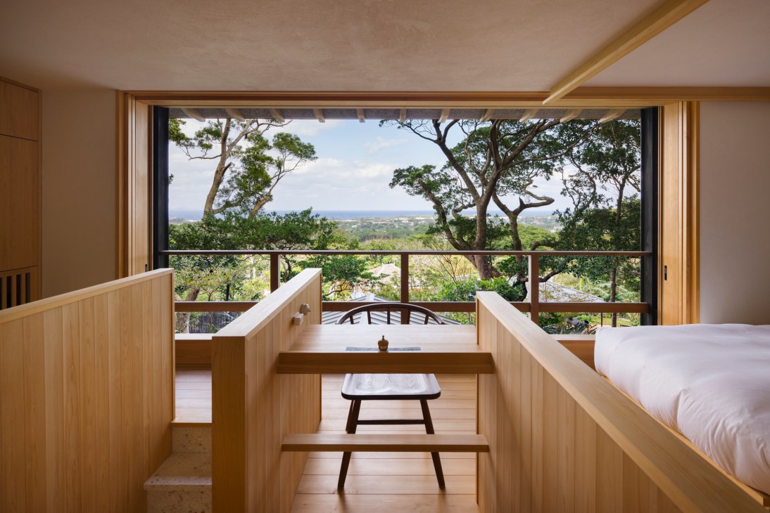
The architect’s ongoing dialogue with the owners, coupled with a desire to find harmony between built and natural forms, yielded spaces that merge and complement their surroundings. Perched among the treetops, the main bedroom opens to the forest on one side, while on the other, ocean views unfurl through a break in the foliage.
Arriving at the space via a staircase of Ryukyu limestone, one is greeted by a calm interior wrapped in Hinoki cypress. The attention to detail extends further, from the original Tsuwabuki confectionery to the height of the custom-made bed bases, which have been carefully calculated to offer the best views of the horizon.
“For evening meals, local chefs can be arranged to cook a private dinner to savour. Even the sea salt is drawn from Nakijin waters”
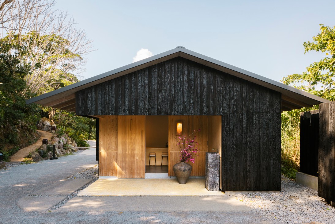
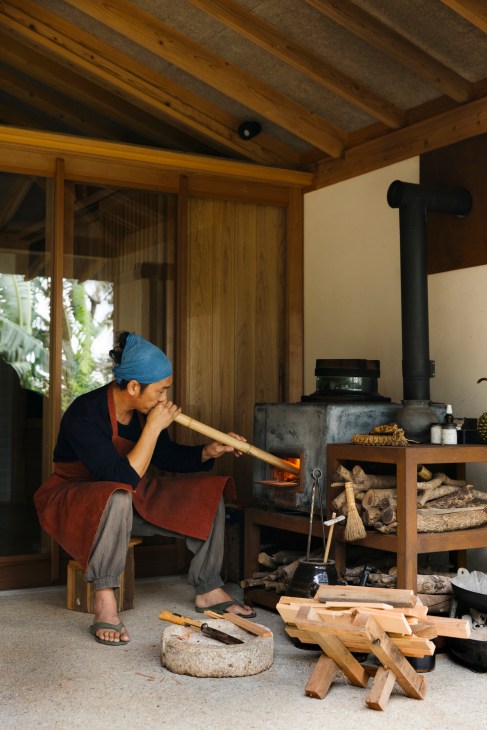

The dining area, which is just a short stroll down the slope, hosts a daily breakfast service. Prepared by Seiichi with the warmth of a home-cooked meal, the menu centres on just-milled rice prepared on a wood-burning stove. An emphasis on local organic produce sees a range of Okinawan flavours worked into the morning spread, whether it be locally caught snapper, freshly made shima dofu (island tofu) or mangoes from a nearby farm. Pickles and condiments are made in-house; even the sea salt used here is drawn from Nakijin waters. For evening meals, chefs can be arranged to cook a private dinner to savour.
Through every facet of the Nakijin Tsuwabuki experience, which begins with tea in the intimate reception space, the owners seek to create something truly original. Consistently drawing from the power of the Nakijin landscape, incorporating elements both new and inherited, they have crafted a place to feel at home and relax in the company of nature. “I believe that true luxury is the special feeling that comes from things that can only be experienced there and then, whether it be architecture, people or cuisine,” says Miyako. “Therein lies the spirit of Tsuwabuki’s hospitality.
Carving out a niche in the timber-furniture industry
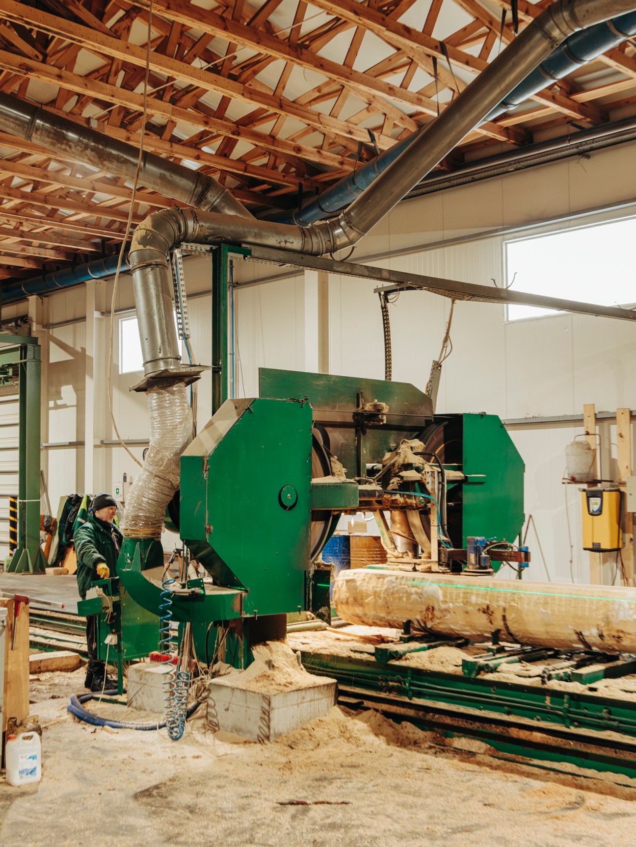
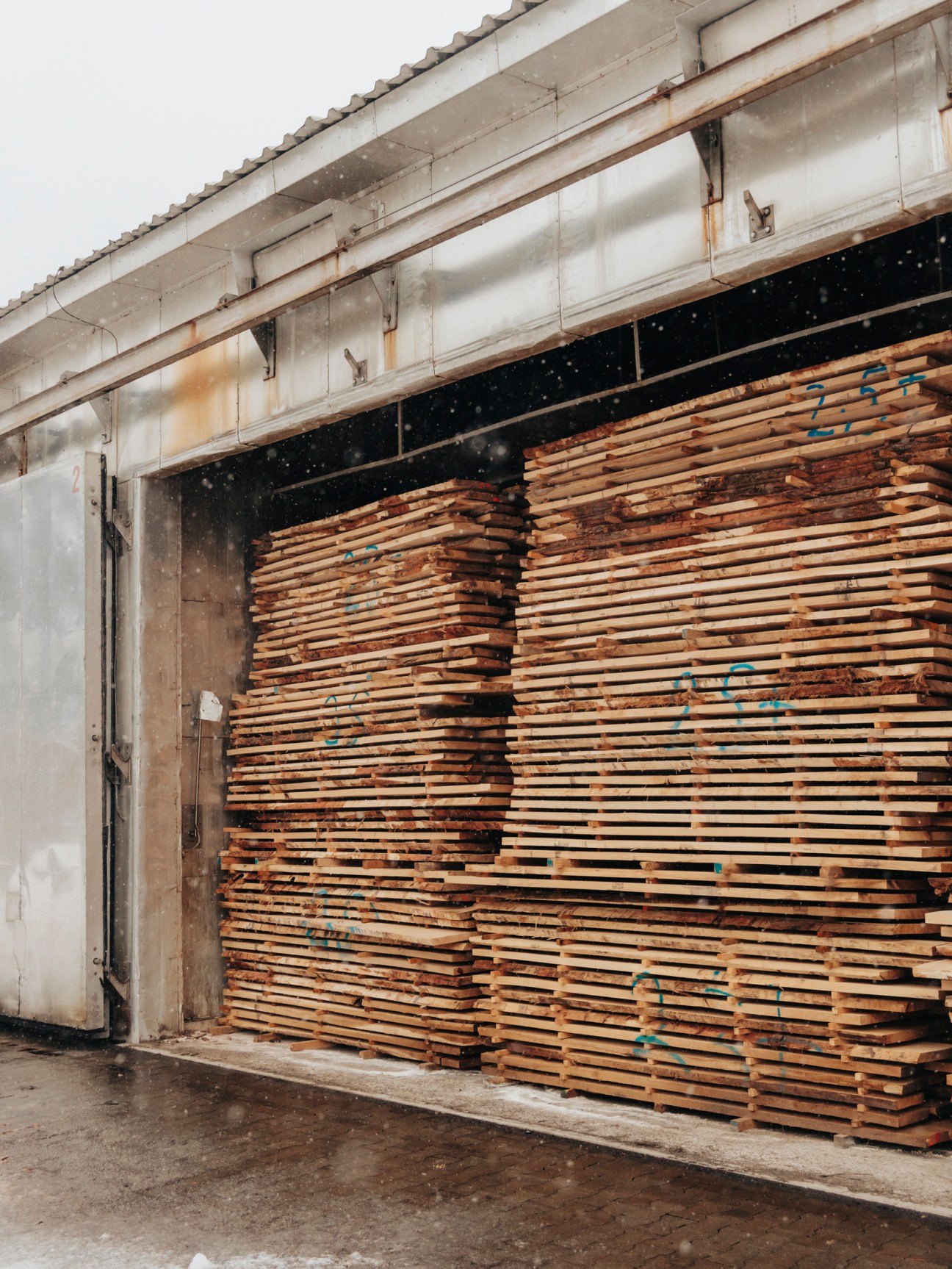
In late winter the weather conditions at Kleniewski Tartak can make work difficult. Surrounded by the dark forests of southeastern Poland, the sawmill is covered in snow when Monocle arrives. And yet it is buzzing with activity. Trucks rumble in, loaded with fresh supplies of wood, and cranes whir into action, extending their claws into the air.


The busy scene is emblematic of Poland. The country’s economy has flourished since the fall of communism in 1989 and, with more than a third of its landscape covered in forests, international furniture brands across the globe have taken note of Poland’s plentiful resources and robust financial system. It’s a situation that has helped to transform the country into the world’s third-largest exporter of furniture. Kleniewski Tartak is prospering.

Success hasn’t been effortless. “When I took over the sawmill from my father in 2017, we were mainly selling to the domestic market,” says Kleniewski Tartak’s owner, Waldemar Kleniewski. “I needed to show international clients that we were a modern company.” Buying Italian and Swedish machines to modernise production, Kleniewski shifted to processing raw oak and decentralised decision-making to employees. It involved breaking with the standards that had existed in Poland for decades, says Kleniewski. “It is the right way to do business.”
At 29, Kleniewski is young for a sawmill owner. But his entrepreneurial energy is common across the country. Down a winding road through the forest, Monocle finds two of Kleniewski’s local customers: Beata Woloszyn and Damian Wasyl, a young couple who co-founded the furniture company Raw just over a decade ago.
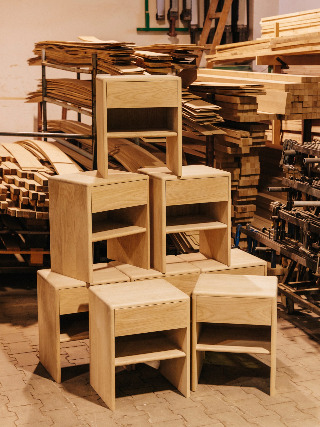
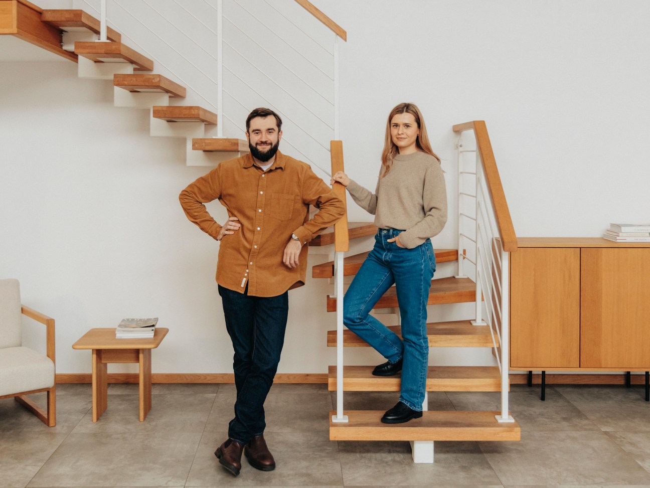
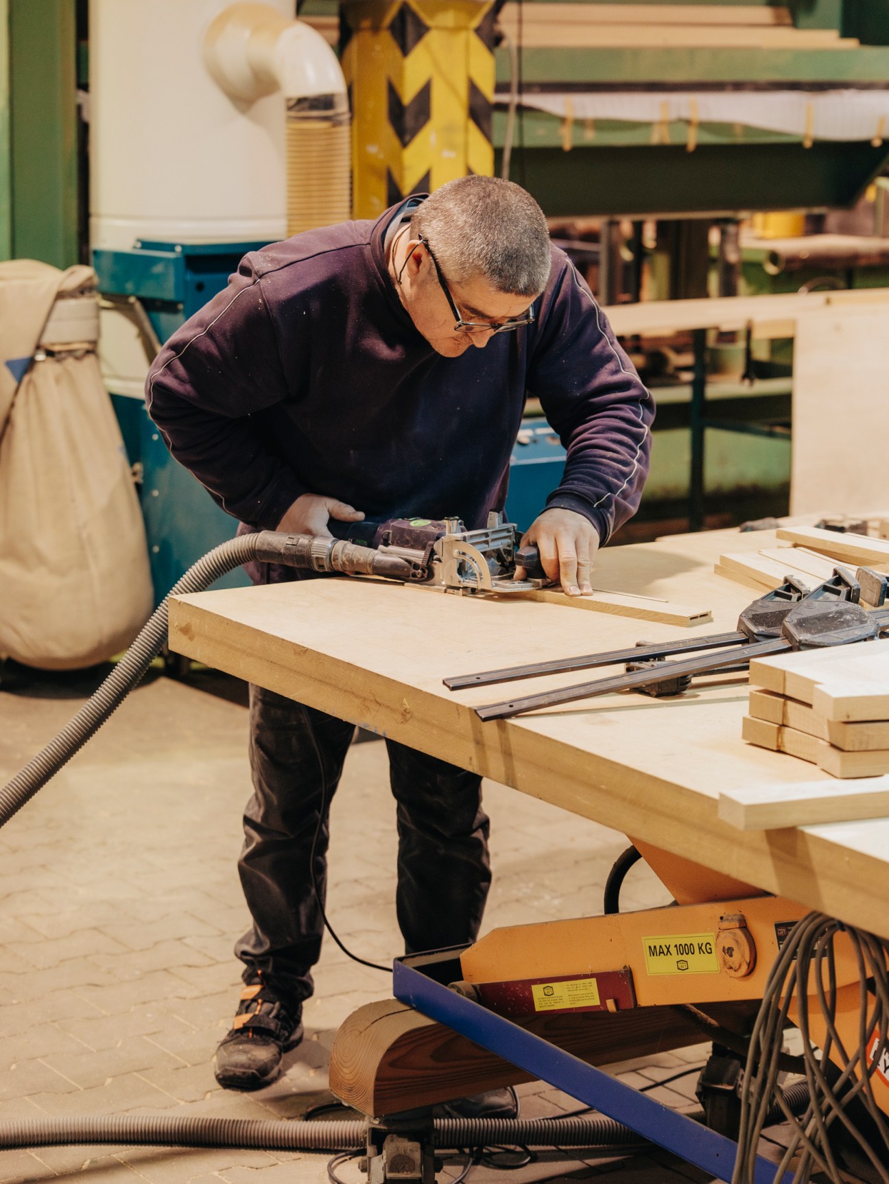
Their path to establishing the brand is atypical for the furniture industry. Both born in the small town of Tomaszow Lubelski, it took moving hundreds of kilometres away to Warsaw – and in the case of Wasyl to Rotterdam – to realise their true calling. “I’m a third-generation carpenter,” says Wasyl. “But while my predecessors had to focus on filling in the gaps left in the market by communism, making everything from fences to doors, we can focus on the current shortage: affordable, high-quality furniture made from natural materials.” The pair ultimately returned to their hometown to set up Raw and Woloszyn says that they received an immediate, positive reaction from the community and customers. “Poles want furniture made in Poland now, not Germany or Italy,” he says. “That desire is increasing around Europe too.”
With only a handful of workers, Raw is on the smaller end of Polish furniture brands. It is in the country’s centre, in a triangle between the three cities of Lodz, Wroclaw and Poznan, where manufacturing for major international brands, including Denmark’s Fritz Hansen and Sweden’s Ikea, can be found. Also in this fertile production region is Converis, a company dedicated to rotomoulding, a plastic moulding process used to create large pieces of furniture. “Half of our customers are domestic and the other half international,” says Converis director Tomasz Dyszkant, inspecting a stack of multicoloured pieces, which will soon be made into a playground in Israel. “A Danish company designed them, we manufacture, then they are shipped off across the world.”
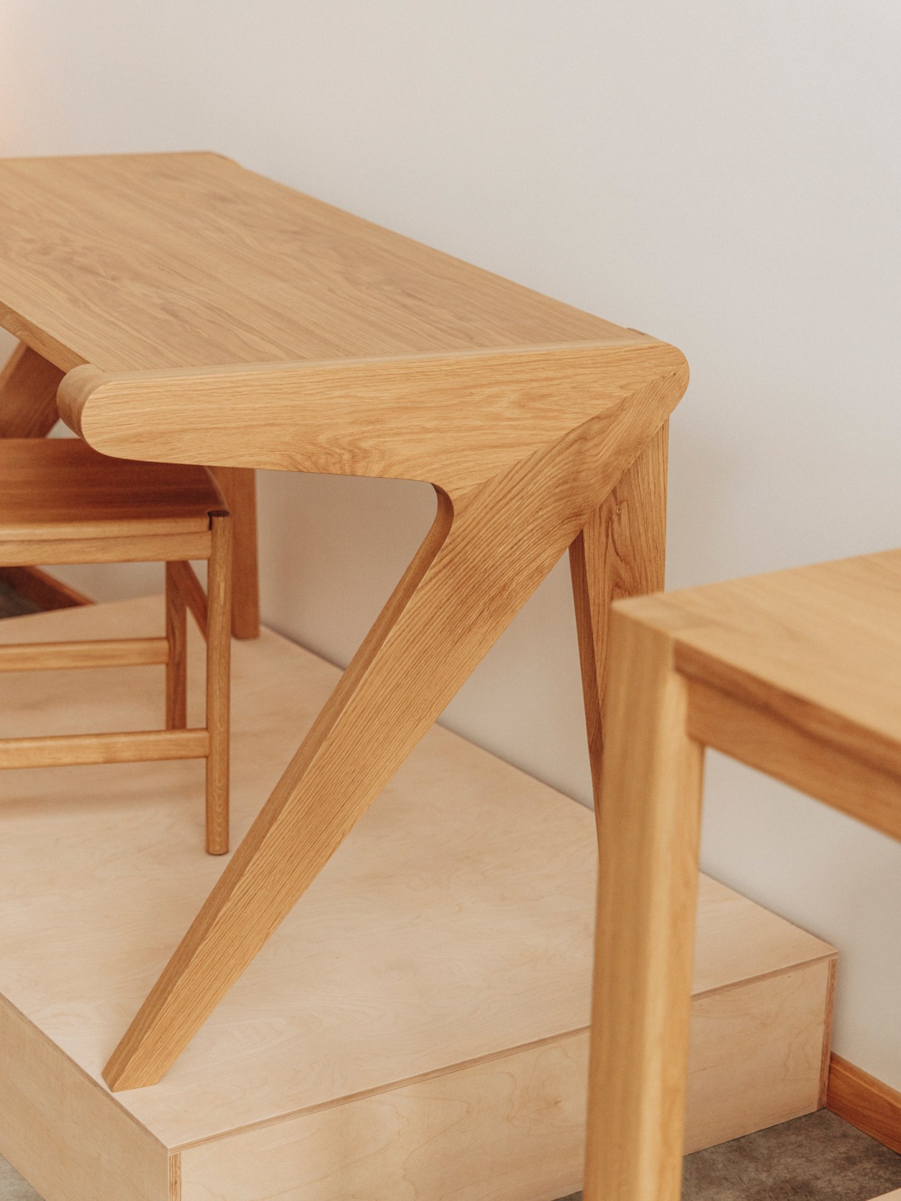
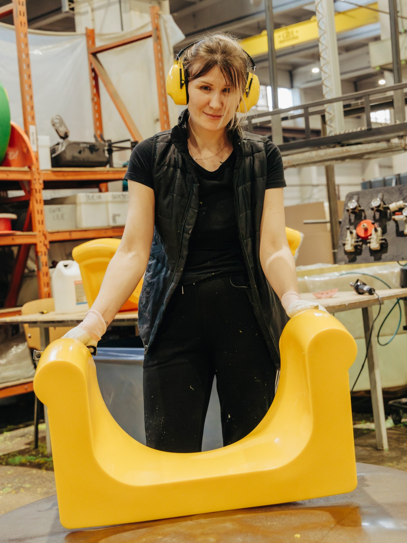
When Monocle visits, the Converis team is creating Polish brand Vzor’s iconic chair, RM58, by pouring resin into metal moulds and setting it in an oven heated to 220C. “Designers are on the lookout for new possibilities and technologies,” says Dyszkant, who is overseeing the work. “There are exciting developments on the horizon.”
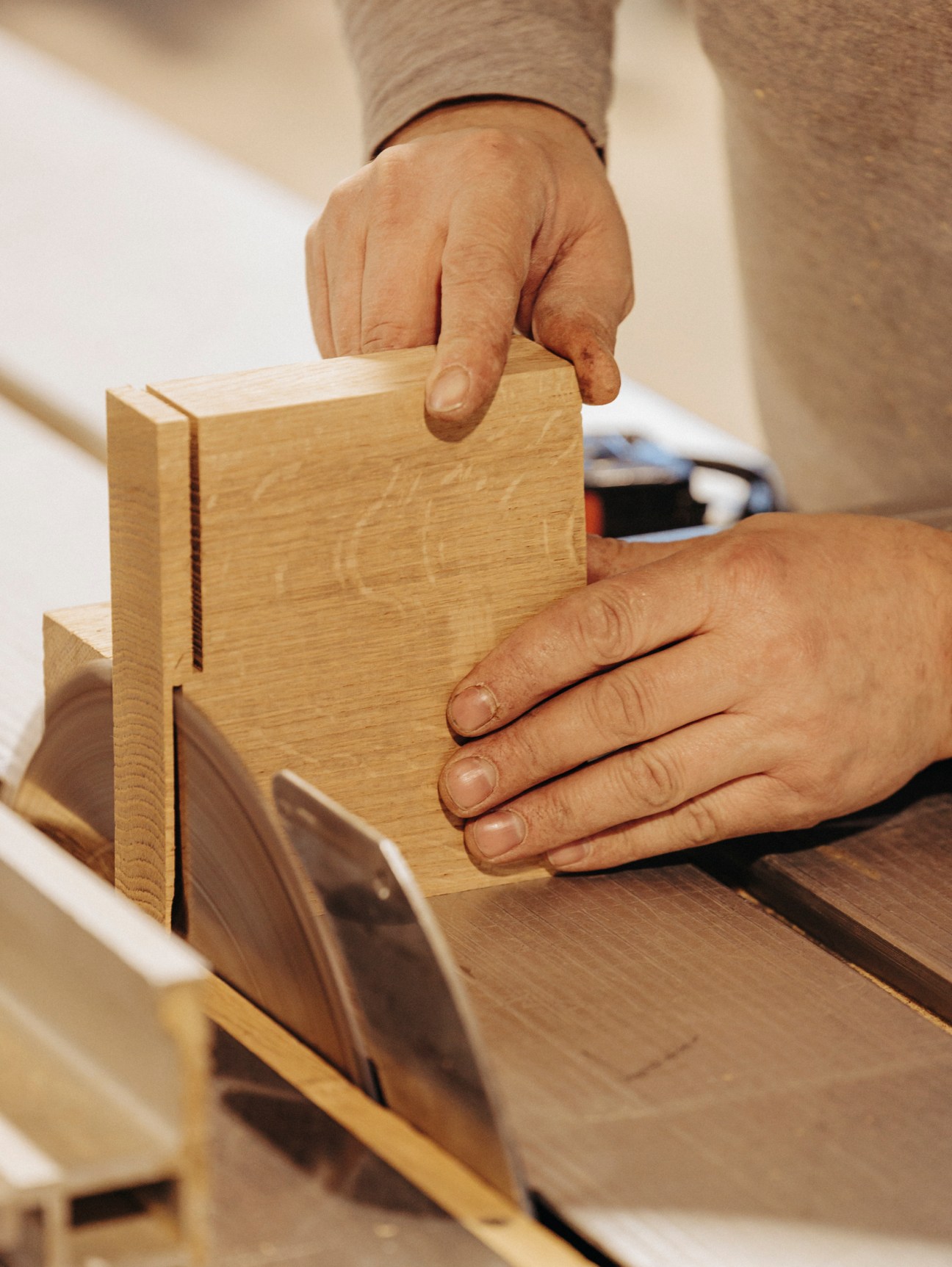
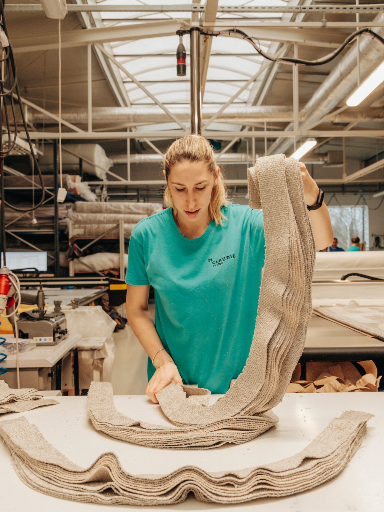
In another factory, Claudie Design, managers attest to the importance of the wider region too – specifically Ukrainian workers. Though there was a large influx following Russia’s invasion in 2022, they had long been filling gaps in Poland’s workforce. Producing its own brand furniture, the factory carries out orders for brands both foreign and domestic.

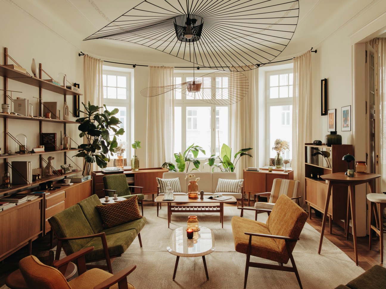
While manufacturing takes place in the regions, Warsaw is the country’s design capital. In the city’s downtown, at Polish brand 366 Concept’s showroom, the sense of a place buzzing with international connections is obvious. It is the perfect setting for their namesake piece: the 366 armchair. Designed by Jozef Chierowski in 1960, the chair instantly became an icon of Polish design, says the brand’s co-founder, Maciek Cypryk. “But it couldn’t break onto the international stage because of communist rule. Our design heritage remained unrecognised for too long.” Now reconnected to the world, the showroom’s Parisian feel is deliberate – after all, France is the brand’s biggest market.

And while there’s a design heritage to be tapped into, there’s also an urgency to secure Poland’s design future – an ambition continued by the School of Form, Poland’s leading design institution. Part of swps University, School of Form was founded in 2011 by Piotr Voelkel, a Polish businessman. “Though Voelkel had a furniture business based here in Poland, he couldn’t find any well-educated designers in the country to work with,” says the school’s artistic director, Agnieszka Jacobson-Cielecka. The school was formed in collaboration with Lidewij Edelkoort, former director of Eindhoven’s Design Academy.
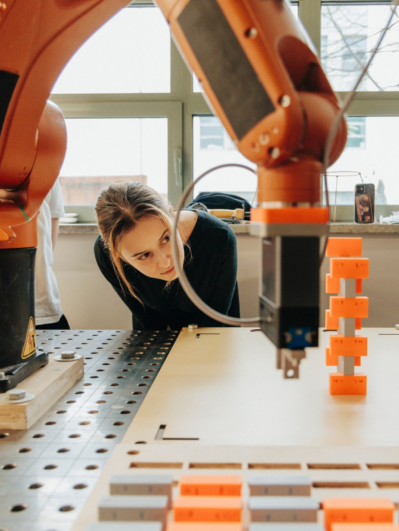
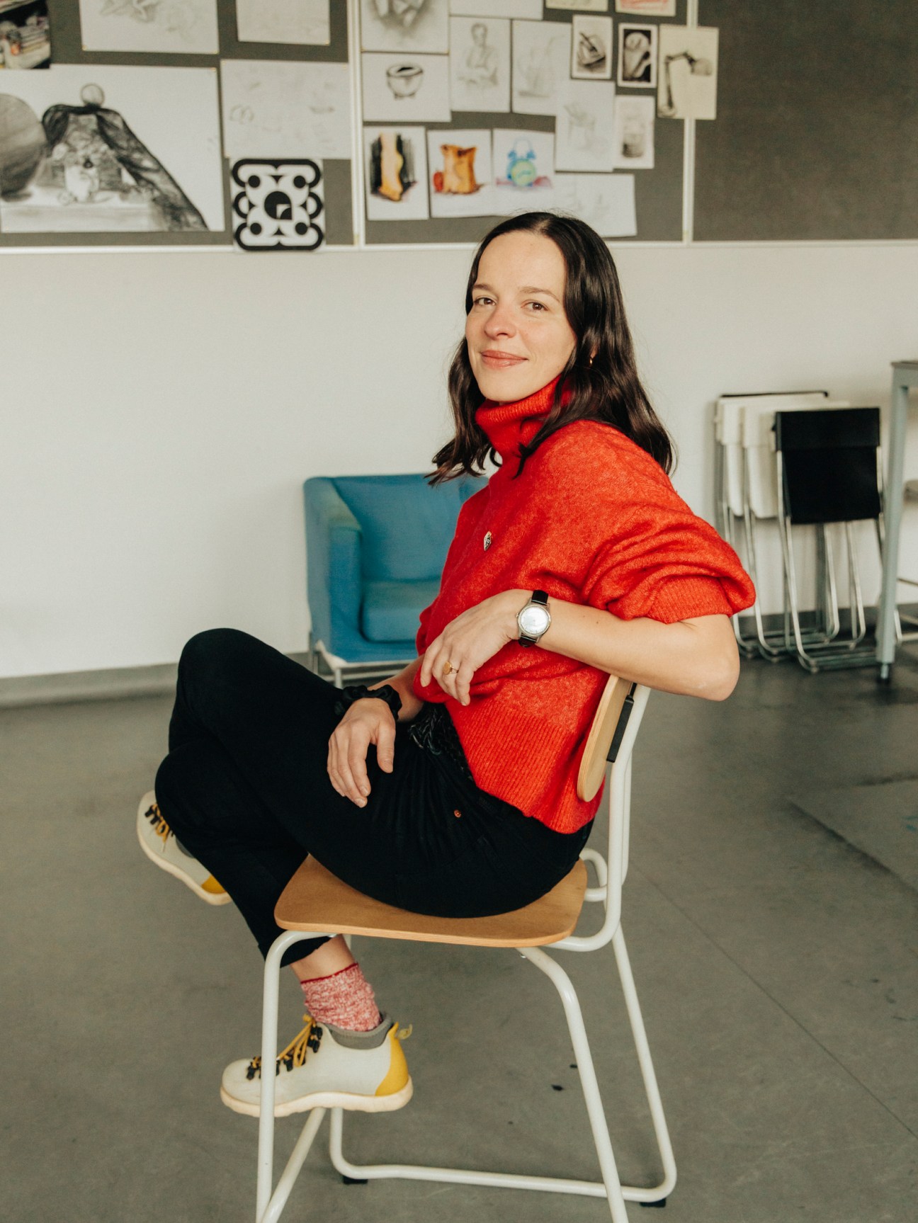
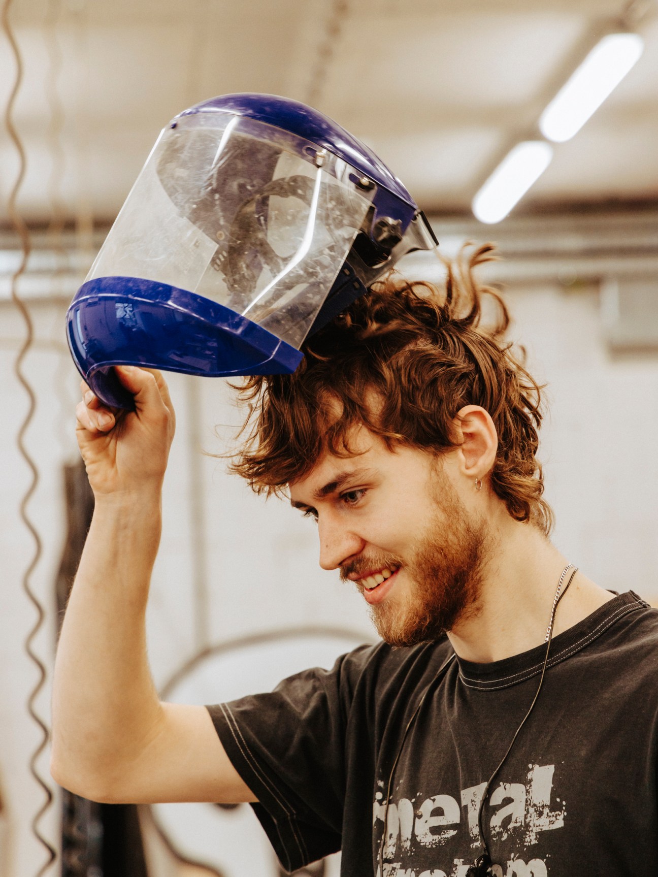
As former artistic director of Lodz Furniture Festival and long-time curator, Jacobson-Cielecka is used to bringing people together. “We wanted to create a juncture where different mediums, experiences and influences meet,” she says. Students are invited to meet international designers several times a year. Polish tutors with experience abroad are also sought out. Down the corridor, Londoner Stas Macleod is working with students in the metal workshop, while Westminster School of Architecture alumna Megi Malinowska is teaching product design.

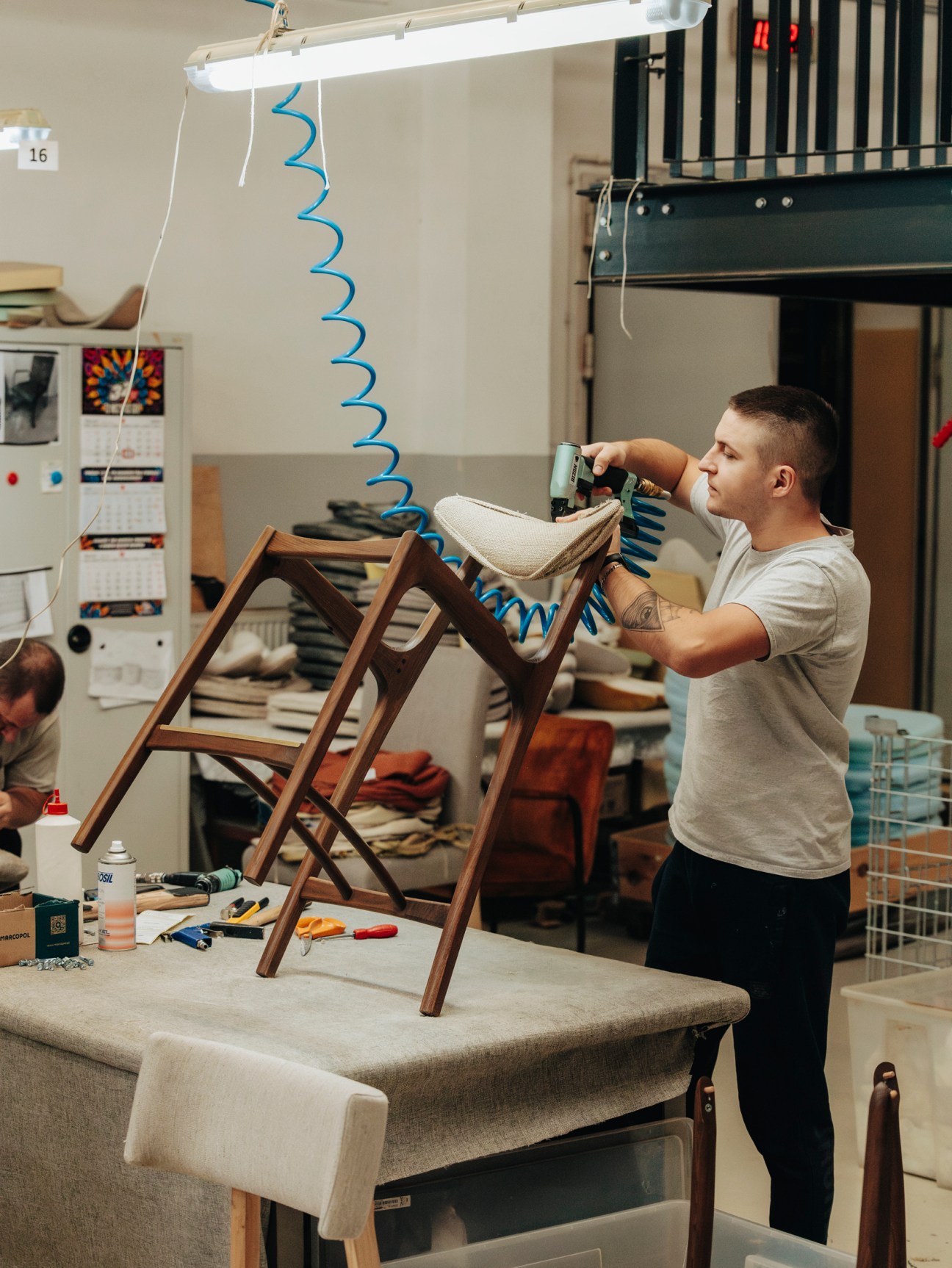
In the carpentry room, Monocle catches up with Szymon Pasierb, head of the school’s prototyping workshops. Returning to Poland after studying at London Metropolitan University, Pasierb is focused on reviving Poland’s forgotten education traditions. “With the changes of the past decades, Poland lost its craft schools,” says Pasierb. “But if you read the papers and listen to people’s conversations, you can sense that there is a need for them.” Pointing towards the northern port city of Gdansk and the southern, mountainous town of Zakopane, Pasierb says that the country has its own craft traditions to be proud of.
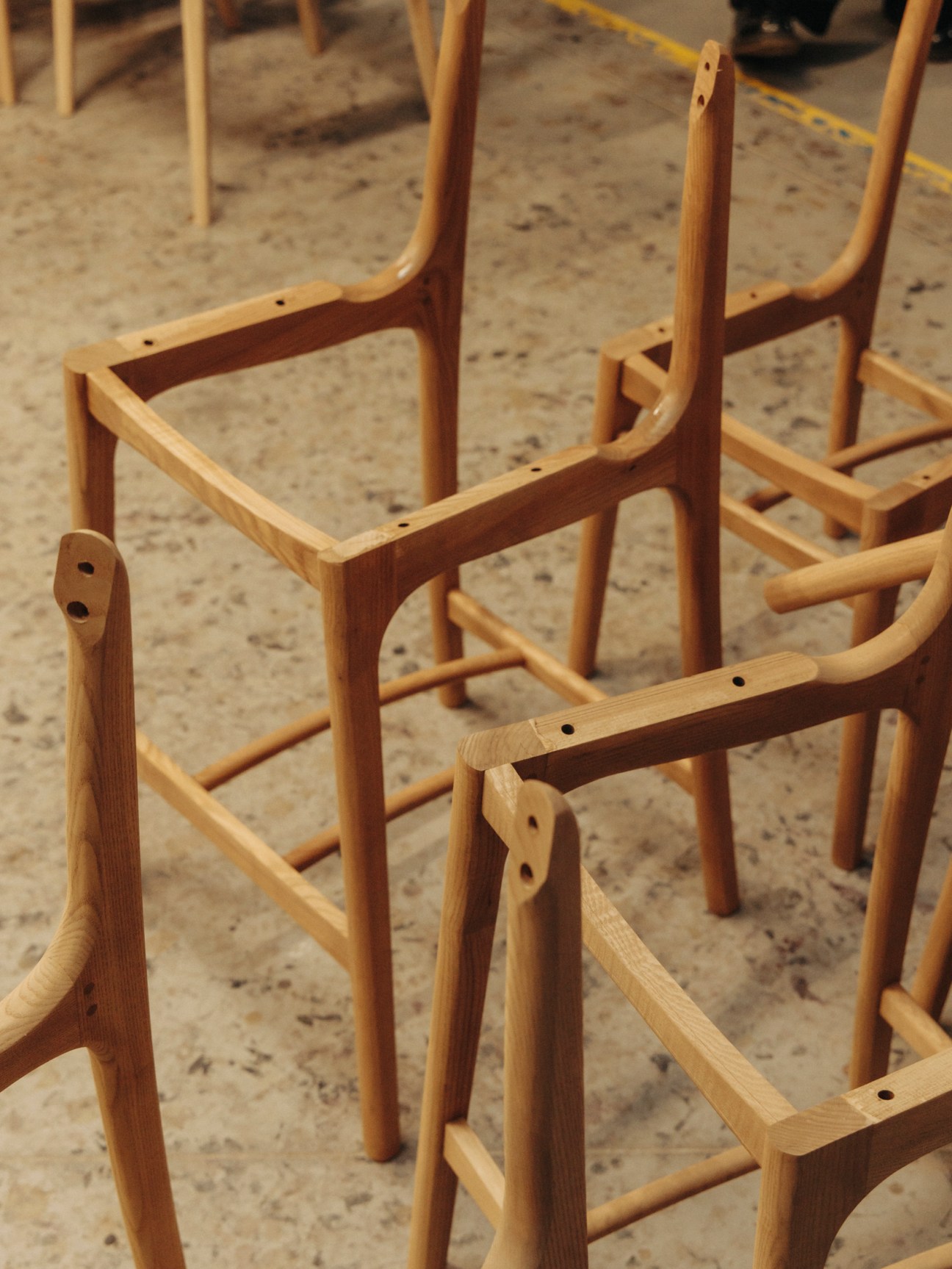
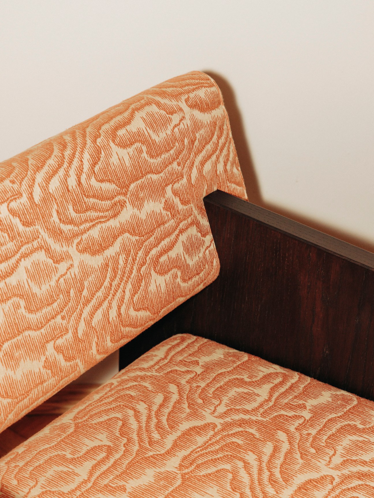
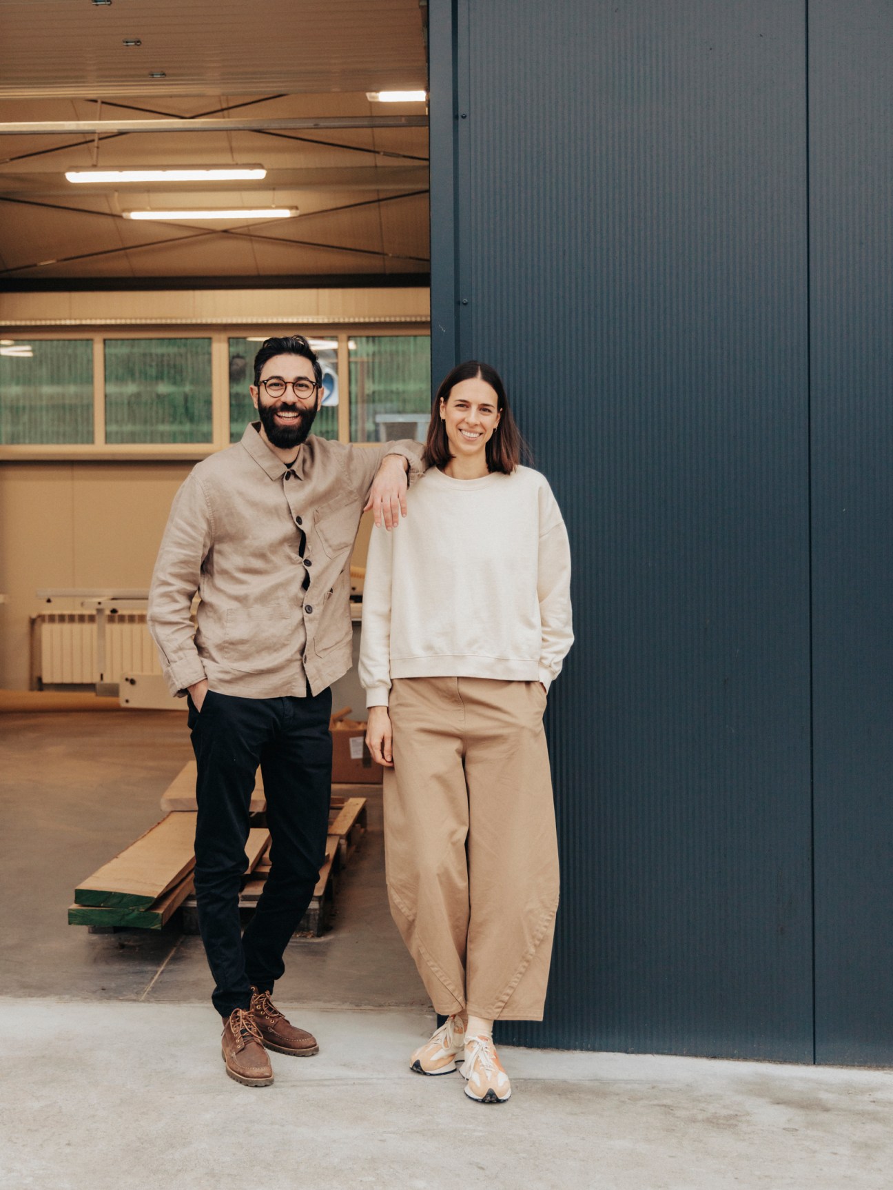
An hour’s drive out of the capital and monocle finds evidence of that craft bubbling away. Domenico Russo and Kaja Alaszkiewicz met in Italy, when Alaszkiewicz was on a university exchange programme from Warsaw. Moving to the UK together after graduation proved to be the catalyst for establishing their own business: in London, Russo stumbled across a furniture workshop in the city’s east that inspired him to swap a desk for a workbench. “My grandfather was a woodworker back in Italy and all my memories came flooding back,” says Russo. “I realised that I needed to make a change.”
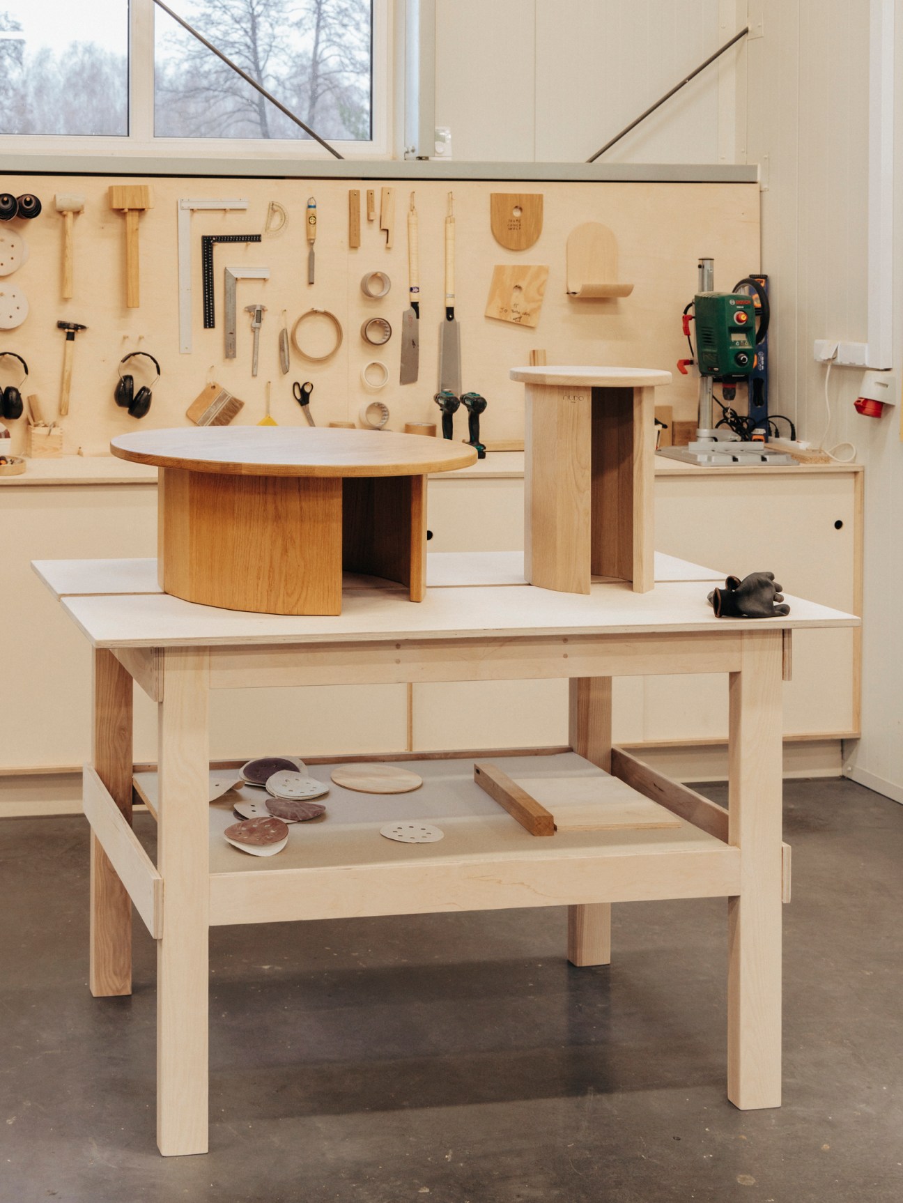
The couple set up their furniture brand Nudo in 2018 and chose the Warsaw region as the location. “It’s not as expensive as London and there is a feeling that things are happening here,” says Alaszkiewicz. The mix of Polish craft and Italian heritage has proved essential for success.
In Warsaw’s Mokotow district, Maja Ganszyniec, Polish designer and founder of Nurt, greets Monocle at her brand’s showroom. “Back in 2000, it wasn’t just that Poland was a different country; it was a different universe,” she says. Being a satellite state of the ussr had frozen the country in time, Ganszyniec explains, depriving it of everything from clothes to cars. “Ikea had started manufacturing in our country in the 1960s but we weren’t even able to buy the pieces they were making.”

However, unlike so many others, Ganszyniec grew up with a glimpse behind the Iron Curtain. “My childhood home was a beautiful 1930s villa,” she says. “It was filled with furniture from all over Europe. I knew that things had been different once.”
Studying abroad in Milan and then at London’s Royal College of Art, Ganszyniec felt instinctively that her country had something to offer. “Often when people want to compliment my designs or Polish design, they’ll say it looks Scandinavian. But that’s a back-handed compliment,” she says. “We share a sea, nature, architectural styles, history; of course the designs are similar.” She has made it her life’s work to achieve recognition for Poland’s own style and aesthetic. “When someone says ‘Polish design’, people don’t have famous names or iconic pieces to relate to. Our job is to build up that picture.”
There are challenges to maintain momentum but Ganszyniec says that Poland will always prosper because of its people’s innate curiosity. “Imagine you are in the most remote place on Earth,” she says. “You think that there is no one there but lift up a rock and you’ll find a Polish person. We were held back for so long. But now that we’re free, no one can stop us.”
Hungry for something new? Feed your gastronomic curiosity with fresh takes from all across the globe
Roter Delfin
Zürich
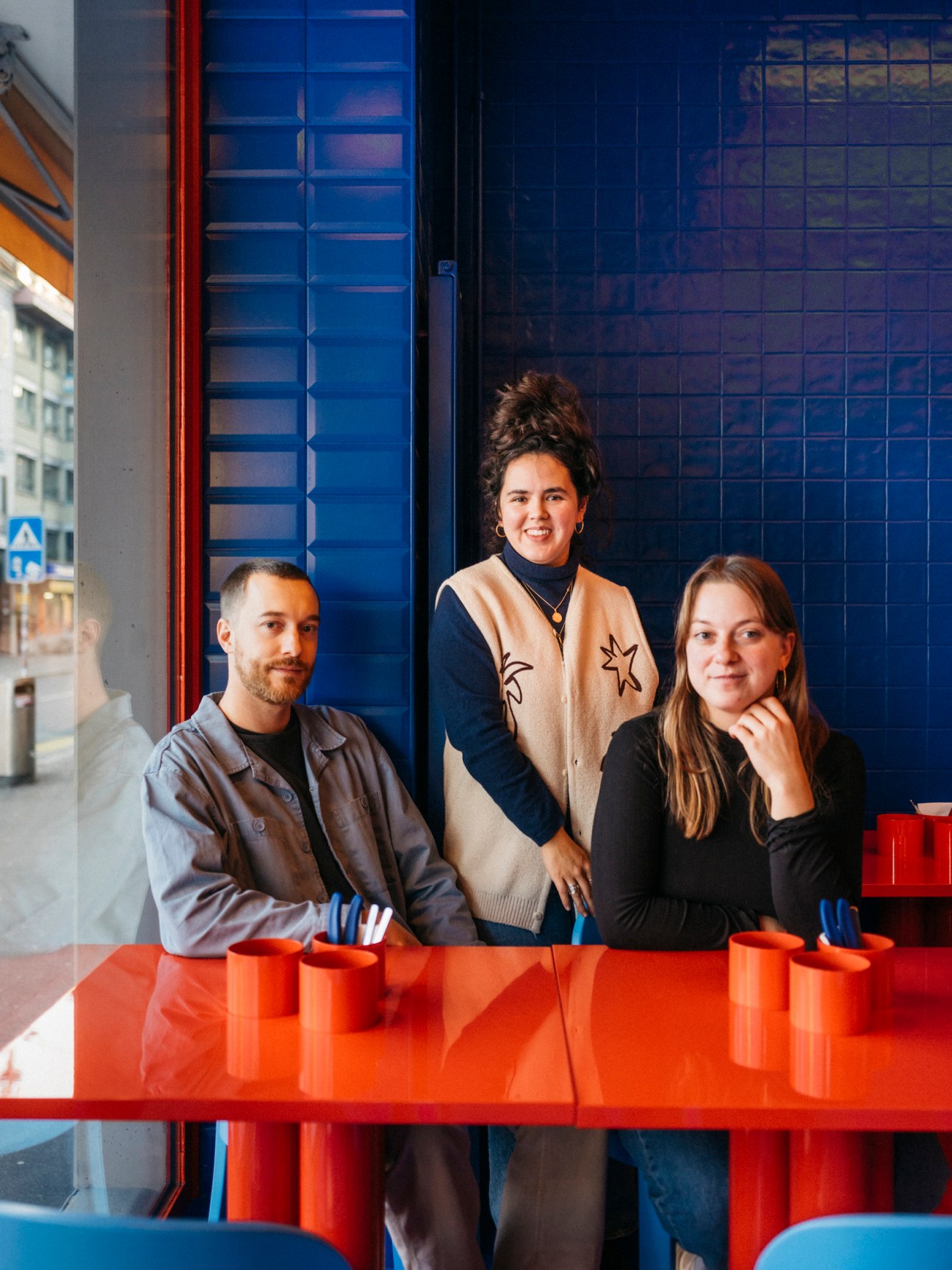
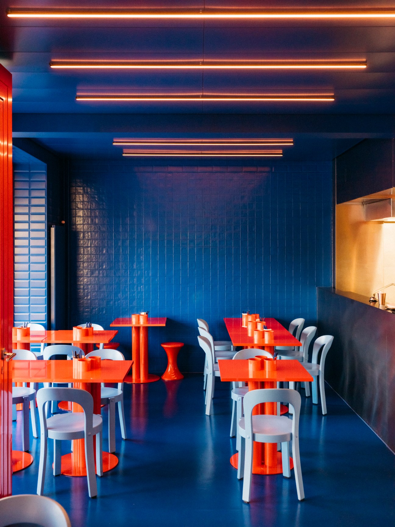
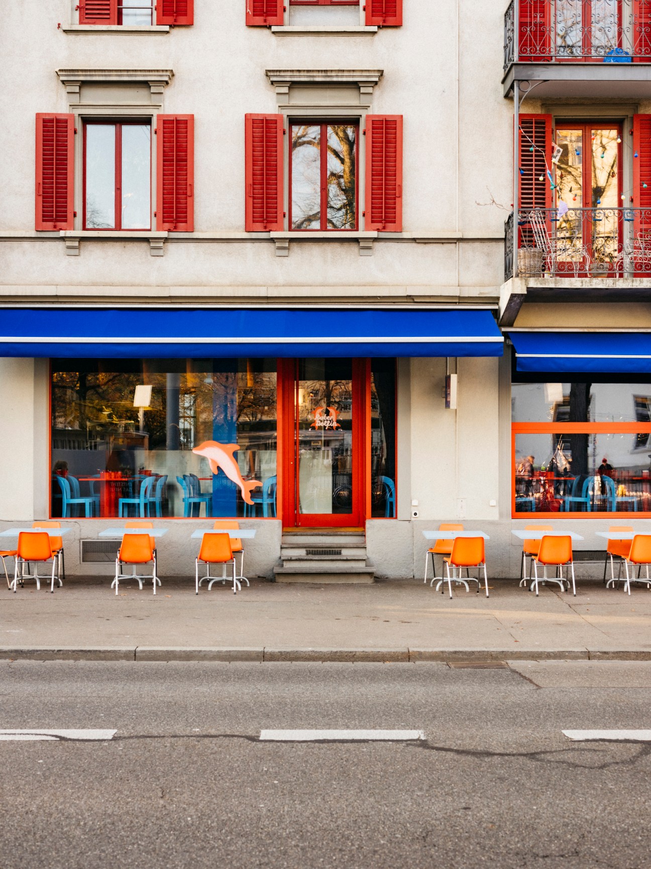
Roter Delfin is a celebration of simple food done well – specifically, bread and butter. Meret Diener and Linda Hüsser (a former Monocle staffer) met at Lausanne Hospitality School. Following the successful 2021 launch of their first venture serving grilled cheese sandwiches, they opened Zur Goldige Guttere restaurant in Zürich in 2022.
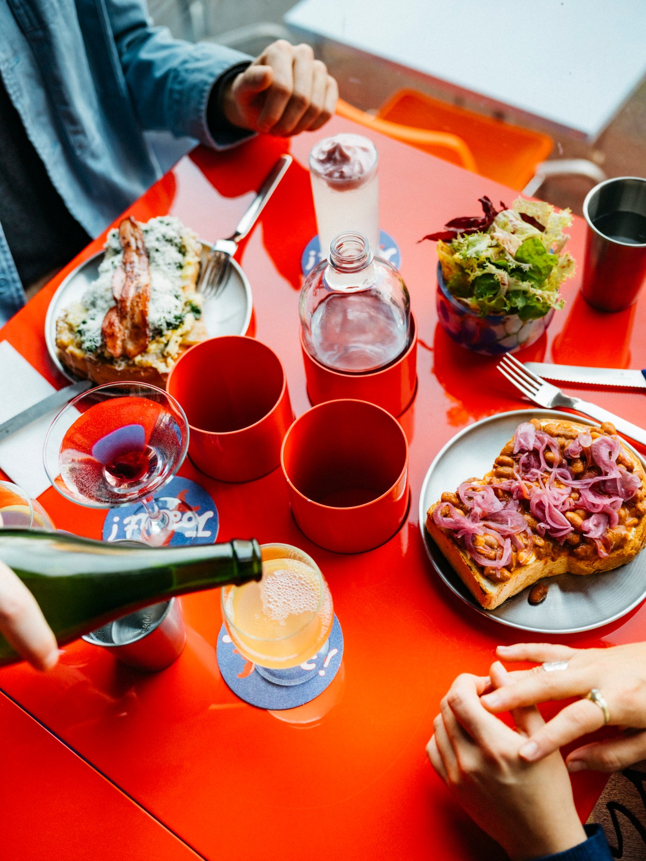
Teaming up with Samuel Kürz (pictured with Hüsser, centre, and Diener), they have now opened a second restaurant in the city, this time focusing on bread. “We wanted to create a place that’s open from morning until late – for breakfast, lunch, dinner or just a drink,” says Hüsser of the space on Langstrasse. Its small but well-considered menu offers comfort food, from scrambled eggs on toast with honey-glazed bacon to pulled pork and savoury apple sauce. The trio take pride in using locally sourced ingredients. Much of what they serve is made in-house, from the pickles and dough to the evening cocktails.
roterdelfin.ch
Recipe
Shallot and porcini tarte Tatin
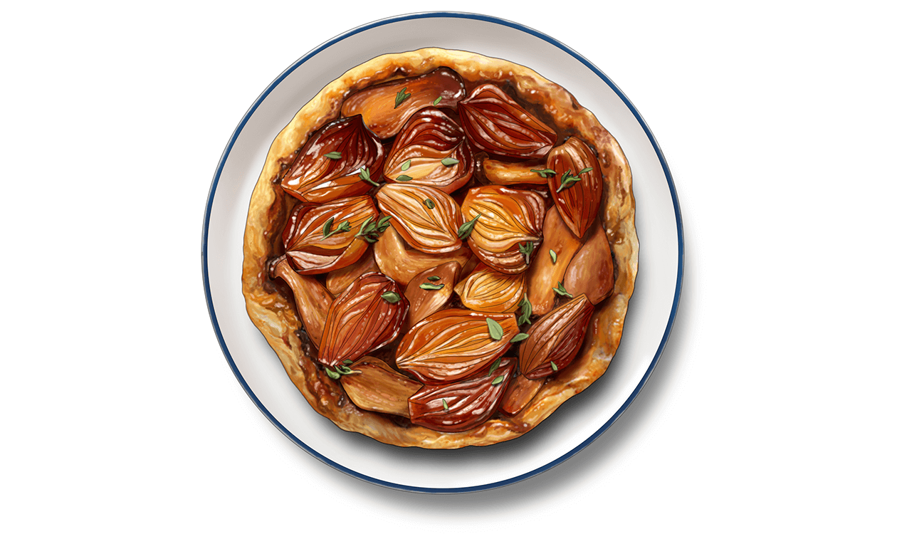
What could be better than a shallot and porcini tarte Tatin for your Sunday brunch? This savoury riff on the classic French dessert will have you wondering why you hadn’t tried it before.
Serves 4
Ingredients
100g white caster sugar
40g butter, cut into pieces
2 tbsps balsamic vinegar
1 tbsp thyme leaves
300g shallots, cut lengthwise into thirds
100g porcini mushrooms, sliced
Puff pastry, rolled out into a tart shape (diameter of 32cm)
Salt
Black pepper
Method
1.
Preheat your oven to 220C. Evenly spread the sugar on baking paper in a tray and place in the middle of the oven. Allow to caramelise until light brown (about 7 minutes), then remove.
2.
Spread the butter, vinegar and thyme on the caramel.
3.
Arrange the shallots and porcini mushrooms on top so that they overlap slightly.
4.
Return the tray to the oven and bake for about 20 minutes, then remove.
5.
Prick the pastry dough tightly with a fork and place loosely on top of the shallots. Press the dough between the shallots and the edge of pan.
6.
Return to the oven for 15 minutes. Remove and allow it to stand for 2 minutes. Turn out onto a cake plate, peel off the baking paper and season. Serve warm or cold.
ralphschelling.com
Sune
London
Located at the foot of bustling Broadway Market, Sune is a perfect fit with its east London neighbourhood. Launched by Honey Spencer and Charlie Sims, the restaurant is a welcoming, unfussy space without a hint of haughtiness, despite Sims’s background of working front of house at Noma. Its comely interiors are all timber floors and tabletops, with high stools beside the floor-to-ceiling window and a zinc-topped terracotta-brick bar.
Chef Michael Robins’s inventive snacks include a confit egg on a thick, Jenga-block-shaped wodge of potato and strozzapreti (a pasta whose name literally translates as “priest stranglers”), which comes freckled with pickled mushrooms and an egg yolk. The red mullet is seasoned with salty sea herbs and is served swimming in a smoky broth. We particularly enjoyed the side of grilled potatoes in a silky brown-butter sauce.
For afters, we ordered poached pear on a creamy white-chocolate crème anglaise that begs to be finished. A menu this pleasing demands a second visit.
sune.restaurant
Dotori and Soopoollim
Berlin
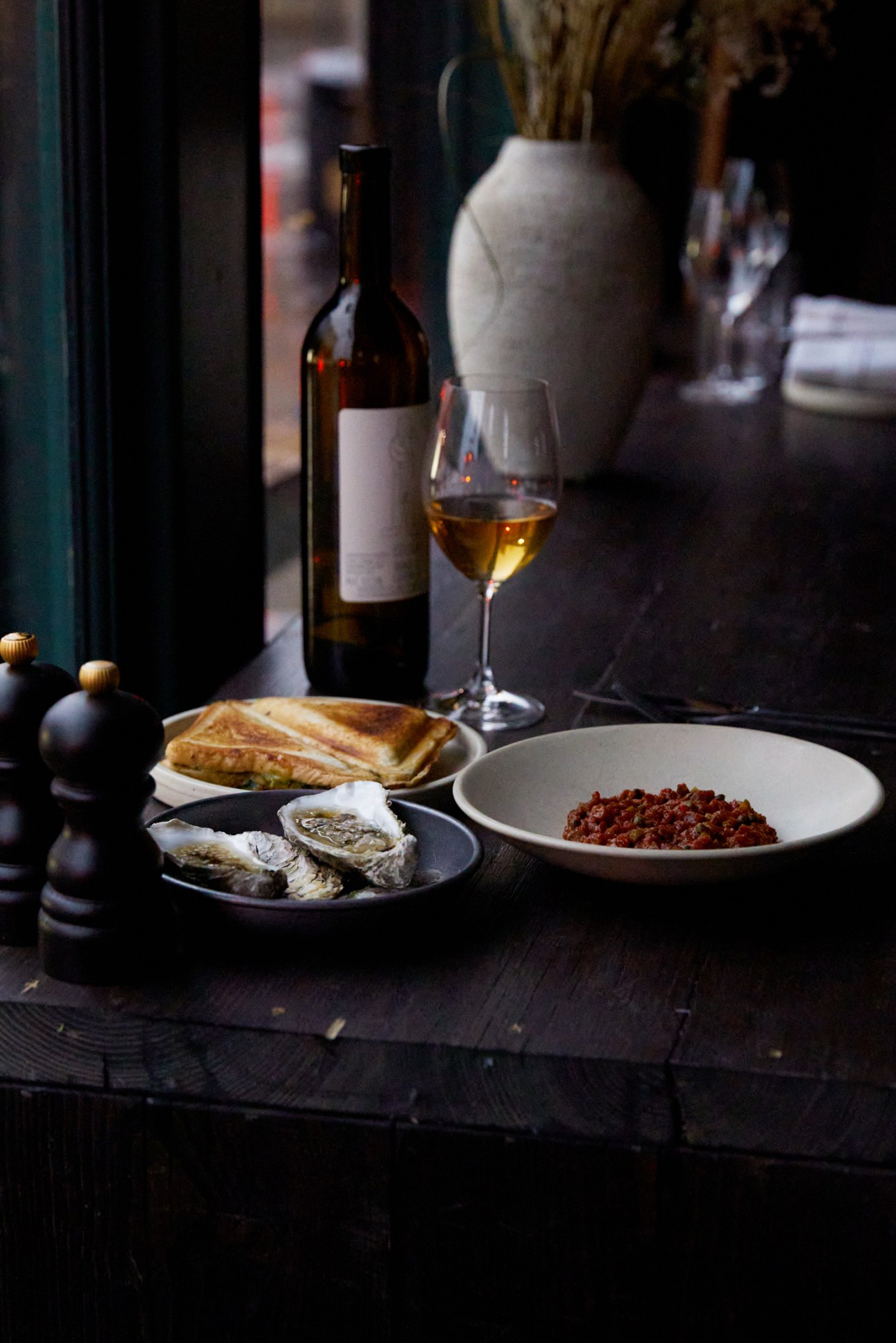
Korean cuisine has long appealed to Berliners. Wine bar Dotori, which opened last July in the city’s Weissensee neighbourhood, specialisies in anju, small plates eaten with booze. Pair dishes such as haemul pajeon (seafood and spring onion pancake) and fresh kimchi with drinks such as Czech craft beer Métaphore. The restaurant’s goal is to serve Korean food as it is eaten in its homeland. “Our dishes aren’t watered down for a perceived difference in palate,” says co-founder Dax Defranco.
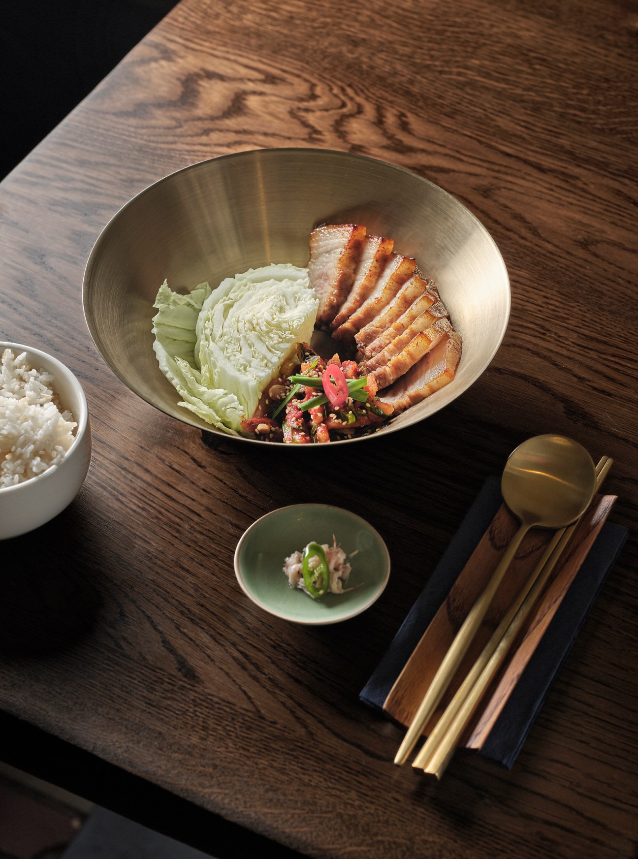
For a contemporary take on the Korean tradition of drinking tea for medicinal purposes, head to Mitte’s Soopoollim, which opened in September. Try the ssanghwacha tea, made from a blend of ingredients including goji berry, ginger, liquorice and arrowroot, accompanied by the white bibimbap, which is made to the recipe of founder Yurim Byun’s mother.
dotori.berlin; Ackerstrasse 149, Mitte

Inventory: Travel
With new hotels and restorations alike waiving the design rules, European rail getting back on track and a luxury long-haul bus project, travellers can expect the unexpected this year. Plus, we plug in to a few technological innovations that will be music to your ears.
1.
The Hotel Maria
Helsinki
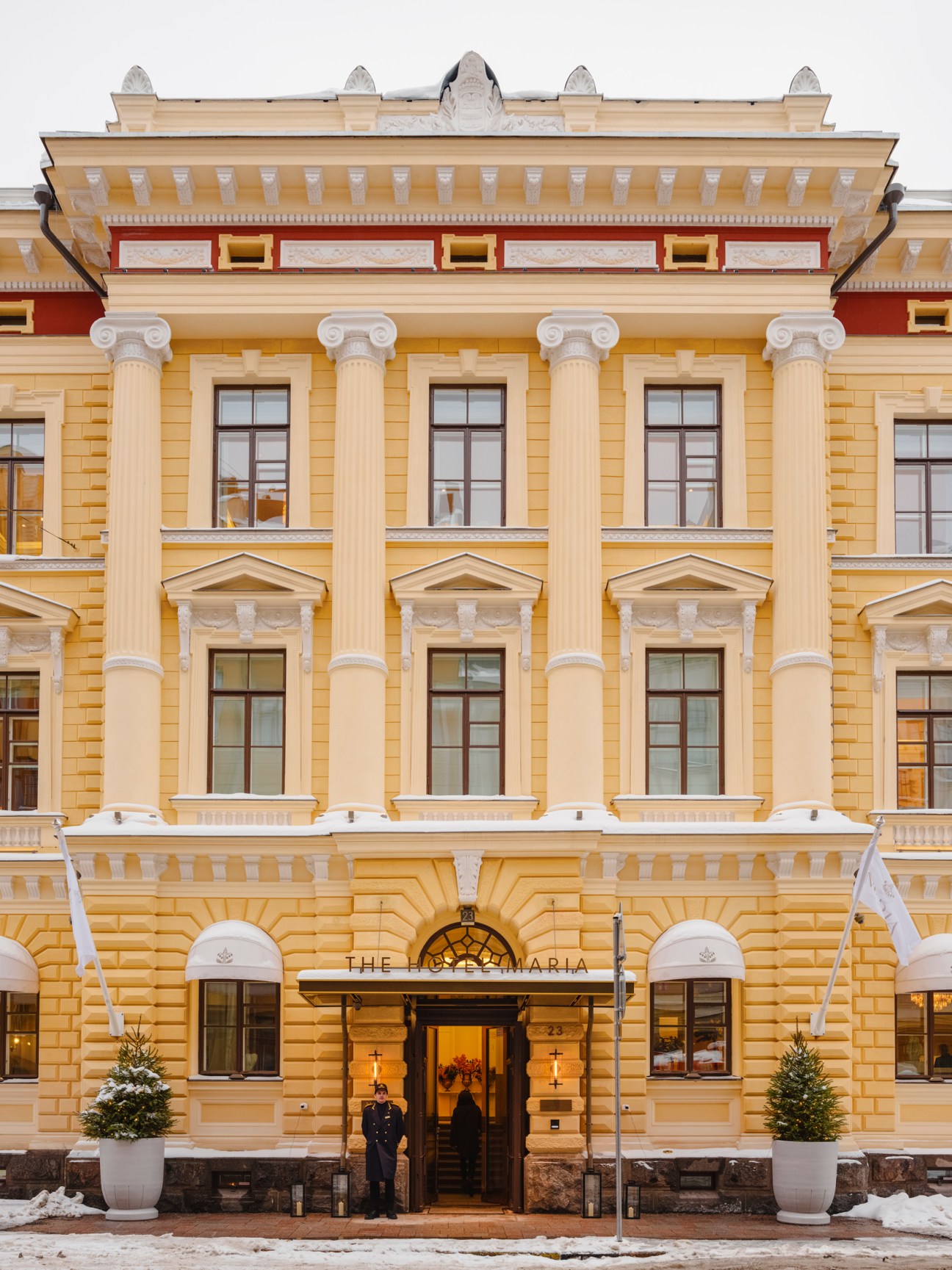
In Helsinki’s historic Kruununhaka district, four protected neo-renaissance buildings have been renovated into a new five-star offering, The Hotel Maria. The residence boasts the largest number of suites (38) in the city, as well as private saunas and bespoke services such as in-room butlers. Its founders spent a great deal of time staying at some of Europe’s leading high-end hotels and felt that Helsinki lacked somewhere that could compete. “We hear the same message from luxury travel agents who cater to international tourists in Finland,” the hotel’s commercial director, Heli Mende, tells Monocle as she shows us around the 160 sq m Imperial Suite.
While many of Helsinki’s luxury properties lean on Nordic minimalism, The Hotel Maria confidently opts for elegant finishes, such as art deco-inspired chandeliers, a white and ivory colour palette and natural textures, including marble and wood. There are even subtle nods to the hotel’s heritage, with one room displaying its original wallpapers and ceiling paintings. “We commissioned several works by Helsinki-based painter Pia Feinik, who uses Finnish landscapes to inspire her art,” says Mende.
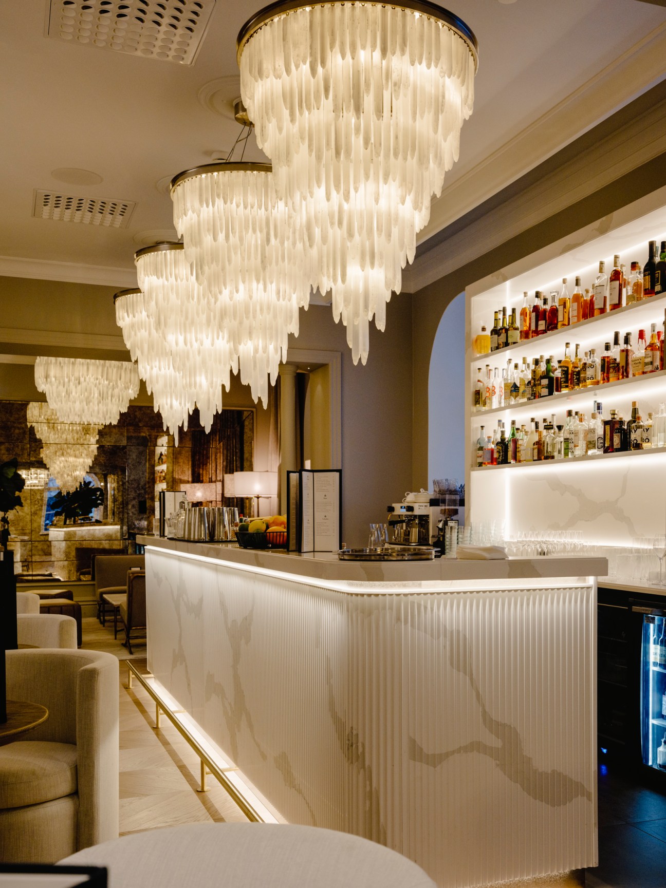
The heart of the hotel is the Maria Spa, with its large atrium allowing for generous natural light and hanging greenery. In between treatments from Finnish skincare brand Niki Newd, guests can enjoy the hot sauna and ice-cold plunge pool – another popular Suomi pastime. If you needed any further encouragement to unwind, the sleek bar provides guests with signature cocktails and rare champagnes. In addition to drinks, the hotel’s two restaurants offer delicacies such as wild-caught fish and reindeer from a herder in Lapland.
The Hotel Maria is the latest opening that has tapped into Helsinki’s growing luxury market – and its take on grandeur is a welcome addition to both the Finnish capital and northern Europe’s offering of high-end residences.
2.
Twiliner
Europe
The bus hasn’t always been the most popular form of overnight transport – and certainly not the most luxurious. This is something that travel company Twiliner is seeking to change with a bus that has all of the amenities of flying First Class – think wi-fi, a snack bar and 21 seats that can be reclined for a good night’s sleep. Its maiden voyage between Zürich and Barcelona is scheduled for late 2024. We caught up with Twiliner’s co-founder Luca Bortolani to discuss his company’s plans to disrupt intercity travel in Europe.
How did Twiliner start?
Luxury night buses don’t exist in Europe. We wanted to create an alternative to flying, so we asked people what could convince them to swap the plane for the bus. They wanted to be comfortable and use their time well. Privacy and sustainability were also important considerations. That’s how we came to the idea of putting a First Class plane seat on a bus.
Why would someone choose a bus over a plane?
We know that people want to be more sustainable. Some people also need to travel early in the morning but don’t want to take a flight at 05.00. We want to make travel a more joyful experience.
Why Zürich to Barcelona?
It’s a popular flight path with a mix of business travellers and young people. We want to roll out 25 routes across Europe. Our next one will be from Geneva to Brussels.
3.
The Orient Express and La Minerva
Rome
The Accor-owned Orient Express (not to be confused with Belmond’s version) has partnered with Arsenale to launch luxury rail project La Dolce Vita. The service will cross Italy via six stops, which include the Alps, Rome, Venice and the southern coast. The original Orient Express cars feature renovated cabins and suites, and a restaurant that celebrates Italian gastronomy. “Italians are relaxed but appreciate luxury,” says Anne Benichou, vice-president of global communications, partnerships and retail at Accor. “This is clear in the design of the train.”

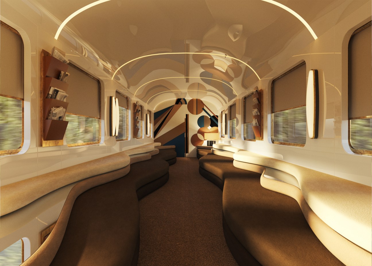
The experience is paired with the brand’s new La Minerva Hotel in Rome’s Pantheon district, a refurbished 17th-century building that will serve as a stopover for passengers. The Orient Express’s expansion is only just starting to gain steam – next is a hotel in Venice, a sailing ship and the return of the classic Paris-Istanbul train route, which ran from 1883 to 1977.
4.
Regina
Biarritz
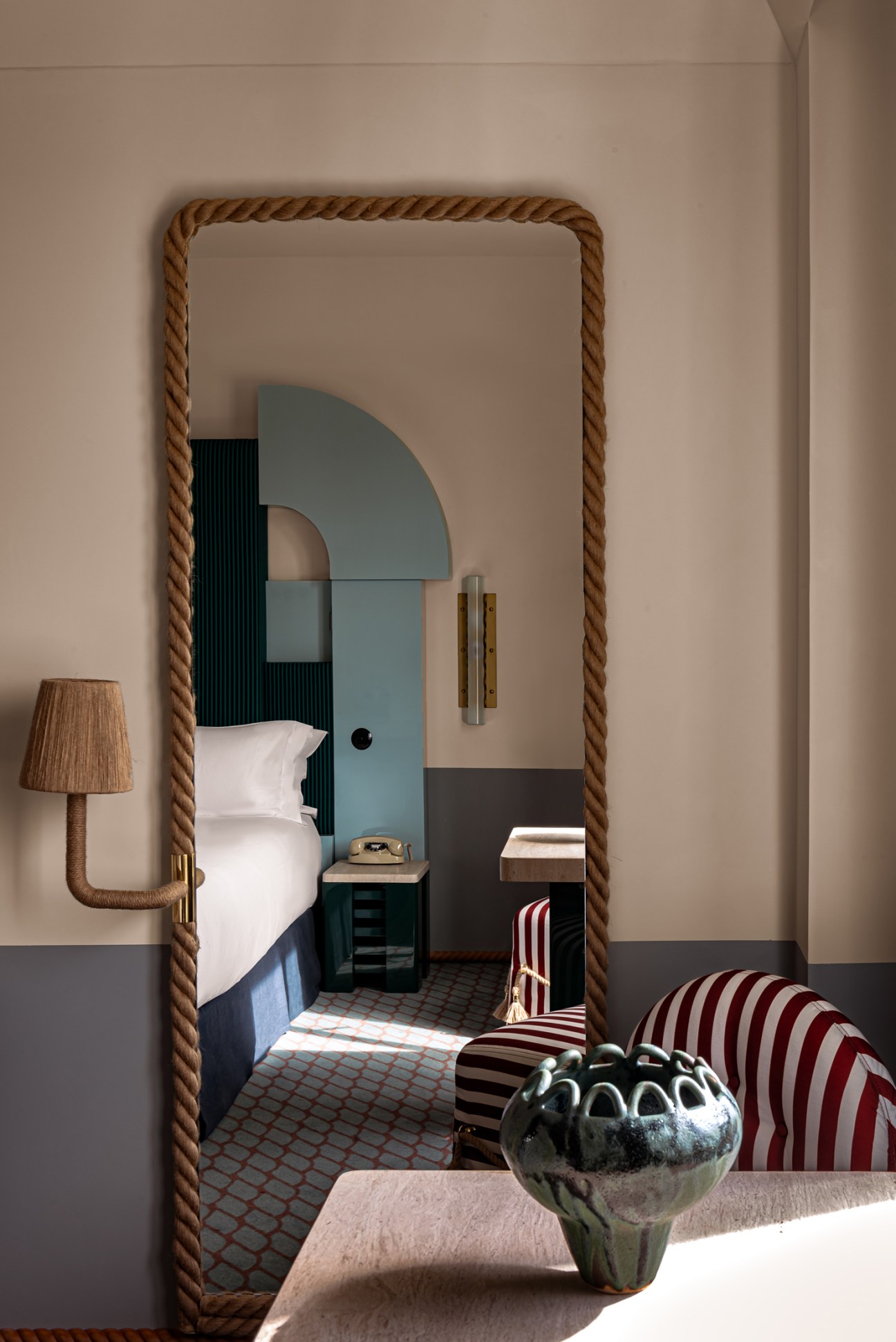
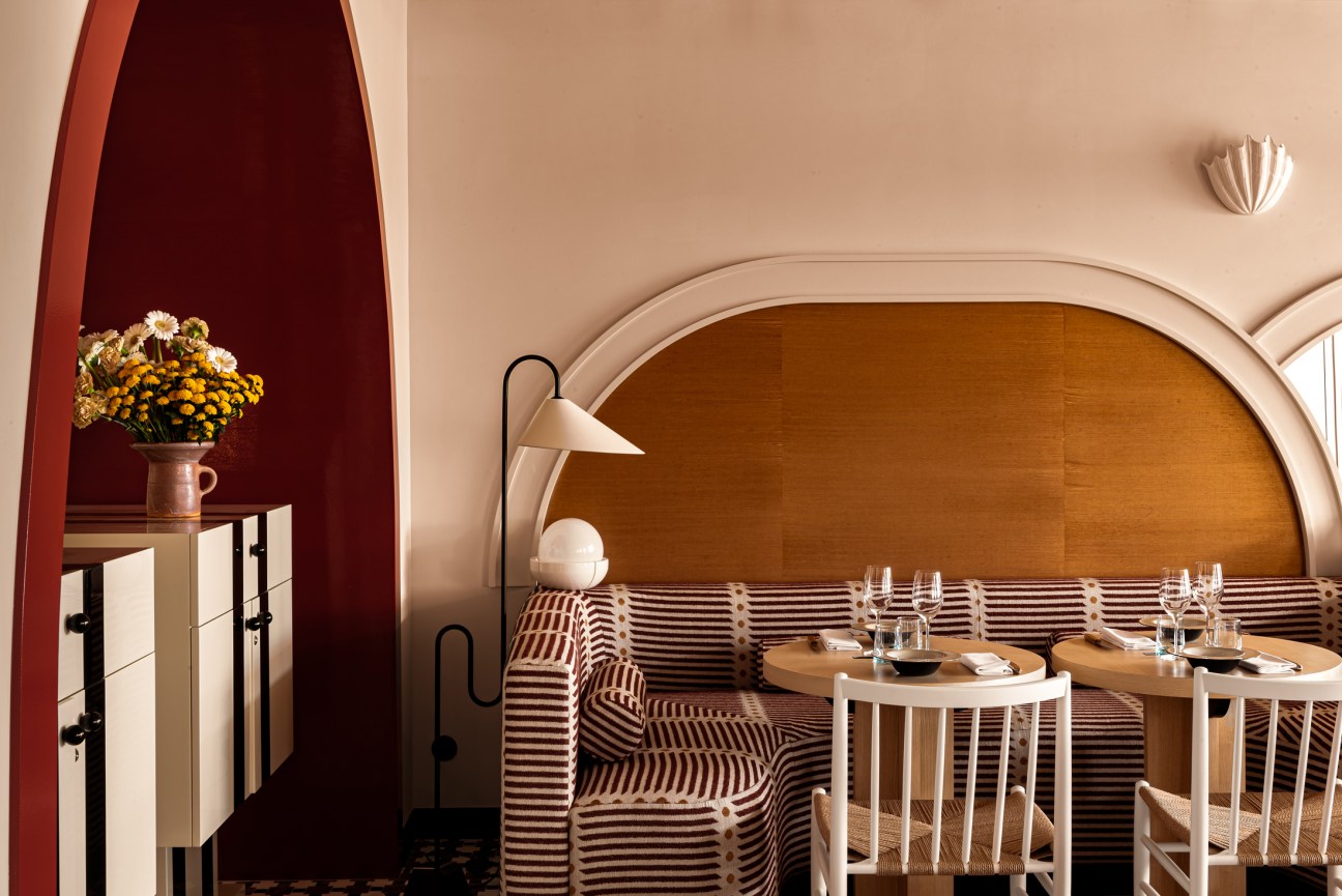
Set atop a cliff overlooking the Atlantic Ocean, Regina hotel is an unmissable early-20th-century building in Biarritz. The five-star hotel, previously managed by Accor, was taken over by French hotelier group Experimental in 2022.
“The goal of the renovation was to bring back some of the hotel’s grandeur and rethink its common areas, making it a real player within the local food scene,” co-founder Pierre-Charles Cros tells Monocle. New elements pay homage to the building’s regional heritage, while there are also modern Japanese pieces. “We wanted to emphasise Japan’s close ties to the Basque Country,” says Dorothée Meilichzon, founder of Chzon studio, the interior design agency responsible for the project. The renovation marks a return to the building’s belle époque elegance, with added contemporary comforts.
reginaexperimental.com
Inventory: Tech corner
From a finely tuned radio to a phone you can write on, the best new tech lifts from the old.
1.
R410 streaming system
Ruark

Encased in handsome wood-panelled cabinetry, UK audio company Ruark’s all-in-one streaming system has a classic look. Its touchscreen display allows you to select audio from a turntable, TV or Spotify; there are also DAB and FM tuners for the radio. This device is rich in audio quality and it looks sleek on the shelf.
ruarkaudio.com
2.
Galaxy S24 Ultra phone
Samsung

This smartphone is packed with innovations that are powered by artificial intelligence, including a feature that can translate your phone calls in real time. AI also enables deft photography edits, removing unwanted people out of a shot or eliminating irritating reflections. You can use a stylus to scribble right to the edge of its 6.8-inch screen, so you can be more precise than ever.
samsung.com
3.
FreeClips earbuds
Huawei
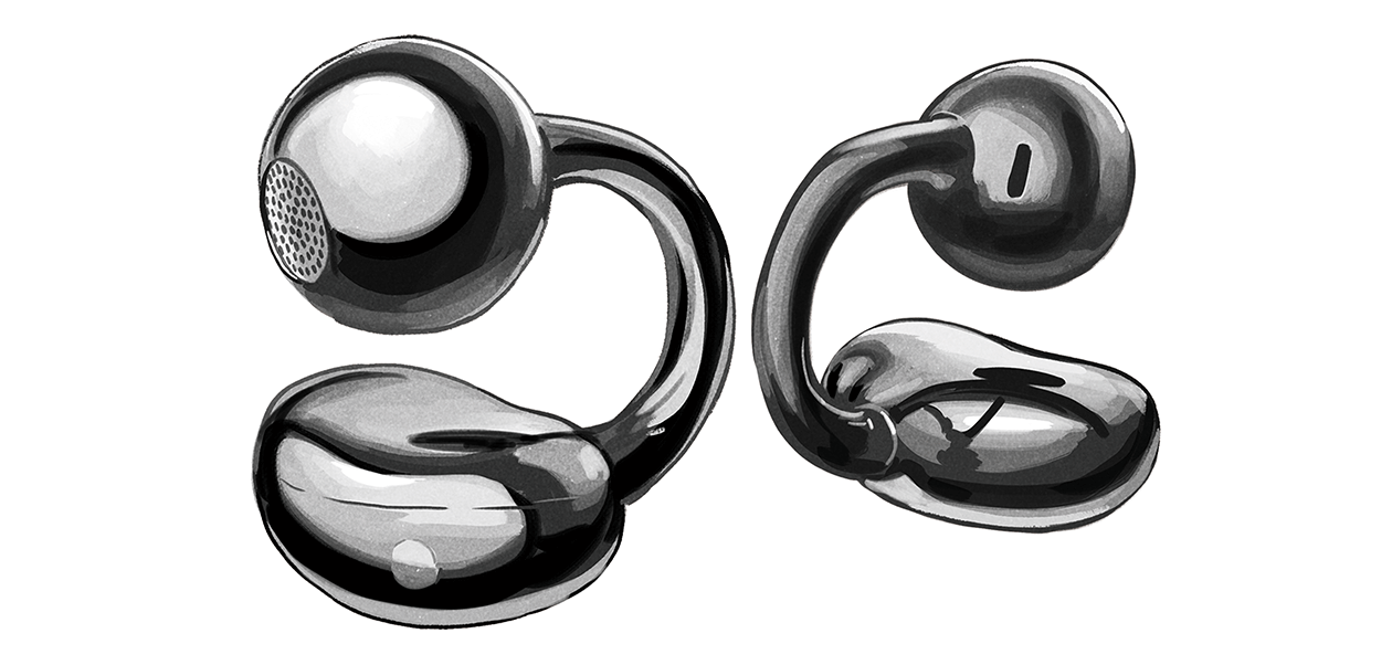
You’ve never seen earbuds like the FreeClips. While they might resemble a daring pair of earrings, they’re held sturdily in place by a flexible bridge that wraps around your ears. Open earphones can be prone to sound leakage but here it’s kept to a minimum, meaning that you can stay more in touch with the world around you.
huawei.com
You’ve got male: Brands to keep an eye out for in 2024
Magliano
Italy
Italy is known for storied fashion houses but emerging designers such as Bologna-born Luca Magliano are bringing new energy to its menswear scene. After winning LVMH’s Karl Lagerfeld Prize last year, Magliano presented his new collection in Florence at Pitti Uomo.
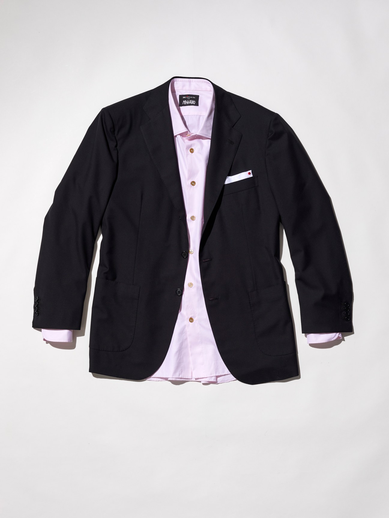
Offering a take on classic dressing updated with subtle draping, he also collaborated with some Pitti Uomo heavyweights. One was Kiton, creating a suit cut in a Neapolitan silhouette. “Kiton’s drastic hand-sewn approach allows it to reach the highest standards,” he says.
magliano.website
Drôle de Monsieur
Paris
“It’s hard to launch a brand when you’re not in a major city but we wanted to show that it’s possible,” says Dany Dos Santos, who co-founded Drôle de Monsieur with Maxime Schwab in Dijon in 2014. Embracing their outsider status, the duo made a name for themselves with casualwear bearing slogans such as “Not from Paris Madame”, a phrase that became a rallying cry for entrepreneurs in second-tier cities across the country. In 2023, however, Drôle de Monsieur finally opened its first bricks-and-mortar shop in the heart of the French capital.
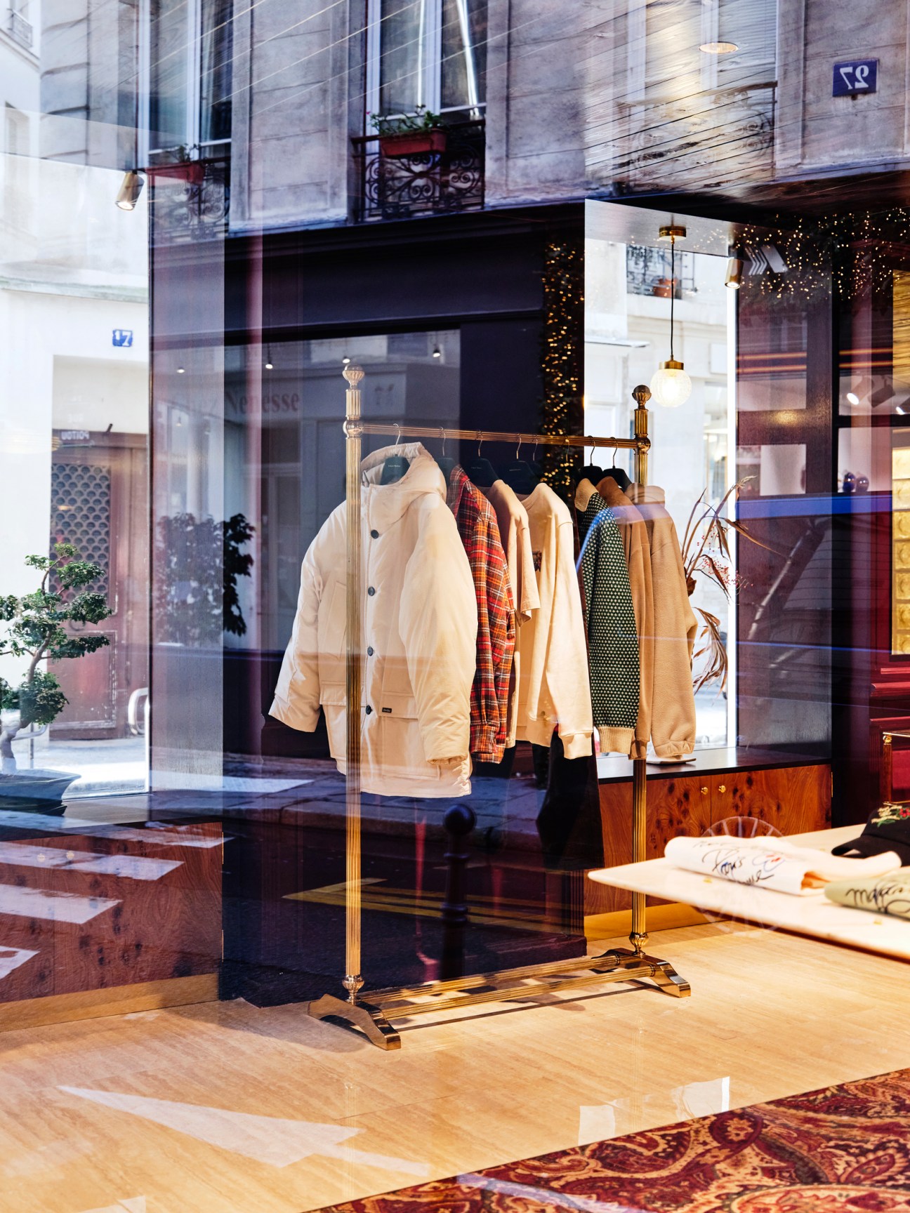
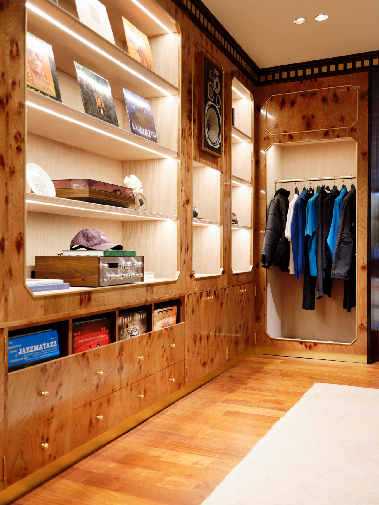
The boutique evokes an elegant 1970s hotel lounge, with art deco-style walls and a till that resembles a bar counter. “Hospitality and fashion have a lot in common,” says Dos Santos. “Both aim to make clients feel at home.” Alongside casual items bearing playful graphics, you’ll find a range of more formal designs: we recommend the elegant trench coats and shearling jackets.
droledemonsieur.com
Brioni
Italy

Under design director Norbert Stumpfl, Brioni has been quietly evolving into one of the key premium menswear labels in the market, offering meticulously crafted garments made using featherlight, natural materials and rare couture techniques. Stumpfl tends to favour minimal designs and neutral colours, letting the quality of his clothing do most of the talking. But when it comes to evening wear, he also makes a point to sprinkle the right amount of glamour on his designs. A firm believer in the power of a sharply tailored jacket, his latest evening wear creations, presented in Milan’s Circolo Filologico, included tuxedos and dinner jackets featuring elongated lapels and earthy colours, nodding to the work of Spanish artist and designer Mariano Fortuny.
You’ll also find jackets in the brand’s signature herringbone cloth that feature a layer of barely visible glass beads. Then there are one-of-a-kind pieces including a silk tuxedo jacket (pictured) with glitter embroidered underneath the fabric to add a faint sheen: a testament to the Brioni artisans’ impressive skills and Stumpfl’s commitment to “the culture of the human touch”.
brioni.com
The Elder Statesman
Los Angeles
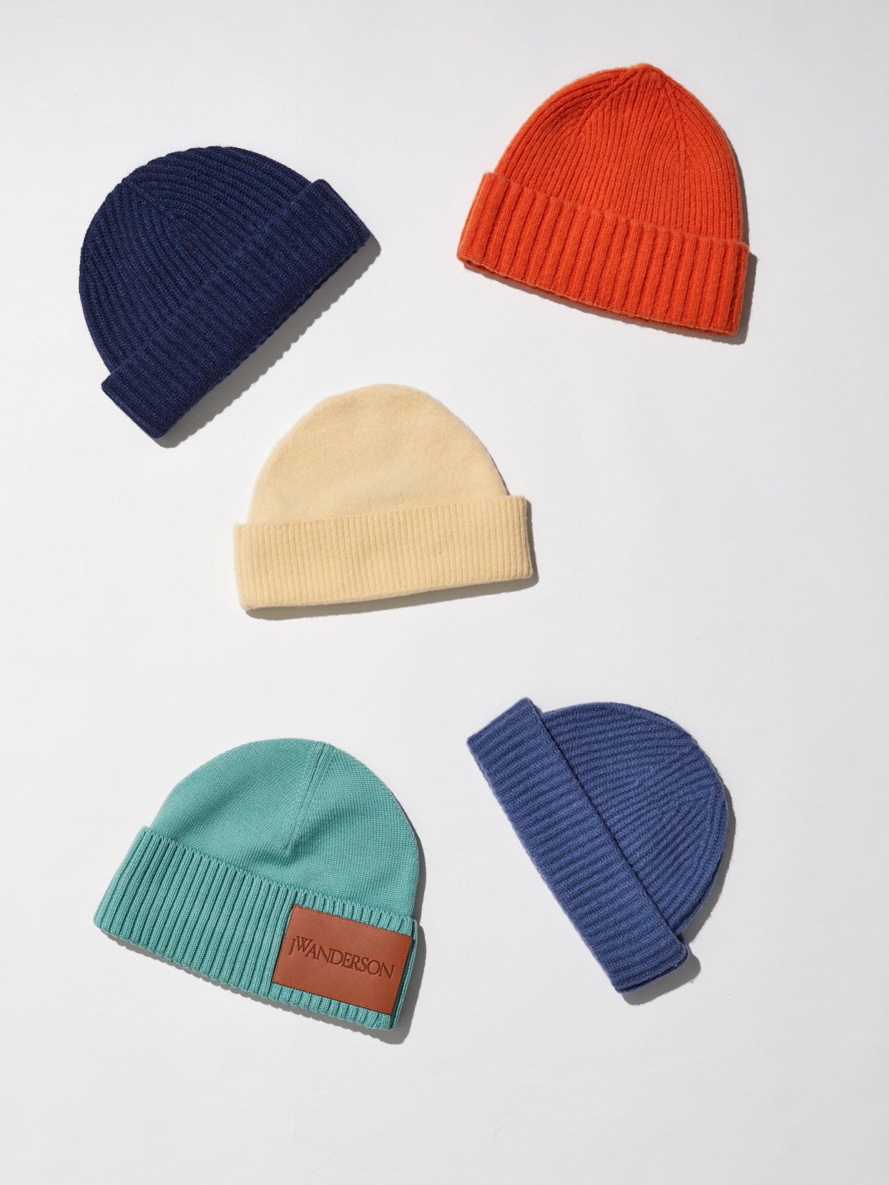
At Pitti Uomo, popular looks usually make themselves clear as soon as you start approaching the Fortezza da Basso, where the event takes place. This year, there was a colourful mood when it came to attendees’ accessories. The buyers, editors and stylists still wore the tweed coats and monochrome suits they are known for but also added woollen beanies in an array of bold colours.
On the runways of Milan and Paris later in the month, show guests kept their hats on to stand out and break up all-black winter uniforms. The accessory also made its way into brand showrooms – the luxurious styles by LA-based label The Elder Statesman, in mood-boosting yellow and green hues, were among our highlights.
elder-statesman.com
Celine X Master & Dynamic
Global

Fashion brands are now aspiring to connect with customers when they are eating, drinking and listening to music, not just when they are getting dressed. The result is a host of cross-sector collaborations, from Valextra’s tie-in with Bar Basso’s baristas to Bottega Veneta’s partnership with Korean kite artisans. This season, headphones were regularly spotted in brands’ showrooms, displayed next to hats or footwear. We have our eye on a pair by Celine in tan leather or black calfskin, made in collaboration with Master & Dynamic.
celine.com; masterdynamic.com
Acaba
Paris
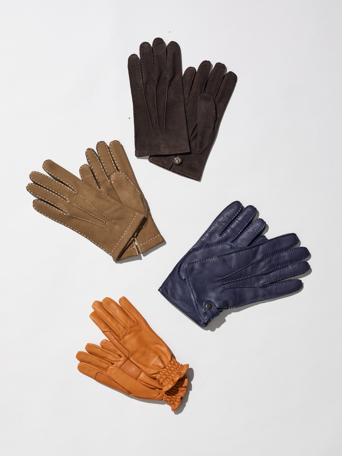
Leather gloves have become designers’ accessory of choice this season. Silvia Fendi added elegant pairs in saffron, burgundy, all-grey and khaki for Fendi – inspired by countryside living and hunting outfits worn by the UK’s Princess Anne. Giorgio Armani played with textures, juxtaposing velvet coats with padded leather gloves.
This is an easy styling trick: pick an eye-catching shade, from deep red to green or yellow, pair them with wardrobe staples like denim or monochrome suits – and if you get too warm, fold them over the belt of your coat. We like stocking up at Paris-based Acaba, a storied glove-maker whose shop at the Palais Royale is filled with handmade gloves in every shade.
acaba.fr
comment
Looks promising
Natalie Theodosi
For the menswear industry, the year starts with a medley of shows, presentations and social gatherings in Florence, Milan and Paris. The fast-paced schedule offers an opportunity to gather inspiration and take the temperature of the market. This year the mood was cautionary, with brands and retailers forecasting that, after three years of explosive growth, the luxury sector might finally find that its clients are bulging less.
However, challenging economic times encourage creativity and necessary course corrections. In this case, brands are slowing down, returning to their founding values and thinking about new ways to connect with customers. Some are doing so by raising quality standards, sourcing premium materials and partnering with artisanal manufacturers. Others are increasingly thinking beyond fashion: to keep customers interested there’s a need to create richer experiences.
For Gucci, for instance, success has become equated as much to people singing along to its remix of the 1970s Italian classic “Ancora, Ancora, Ancora” as buying into its new minimal aesthetic. In the same spirit, fellow Italian label Valextra joined forces with Milanese institution Bar Basso on a leather case and a pair of cocktail glasses, while in Paris, Louis Vuitton used its runway show to debut new music, including a collaboration between its creative director Pharrell Williams and folk band Mumford & Sons. This marks a new era for branding – expect to see fashion brands pursuing more partnerships with chefs, architects, musicians and hoteliers this year.
How will these shifting dynamics translate into the way we dress? Given the higher stakes, designers are suggesting that we too need to raise our standards and start dressing the part. There was a collective celebration of formality and the power of dressing up: smart brogues replaced trainers, sporty parkas were swapped with tailored coats and neck ties made a firm comeback, particularly at Prada, where the catwalk was transformed into a series of chic cobalt-blue office cubicles. We round up our highlights on these pages.
Theodosi is Monocle’s fashion director
Welcome to the world’s most exclusive gastronomic society
Alex Johnstone says that he was “flying blind” to begin with. The head chef for Justin Trudeau had been plucked from a small-town restaurant near the Canadian prime minister’s cottage in Québec. Recognising the importance of this new world took some time. “As you start doing more and more larger events, the gravity of the job slowly dawns on you,” he tells Monocle. Whereas a restaurant is all about the chef’s own creations, suddenly, “it’s not about you any more”. In his first year, Johnstone received a baptism of fire when he found himself cooking for Joe Biden, who is famously a lover of ice cream. “We were searching all the resources we could to find out every detail about what kind of ice cream he likes.”
What Johnstone didn’t know at the time is that there’s an exclusive club of contemporaries – chefs to the world’s heads of state and government – for just these sorts of culinary predicaments. “Heads of state have the red phone; we have what we call a blue phone,” says Christian Garcia, chef to Prince Albert II of Monaco and president of what’s known as the Chefs des Chefs Club. “When we have an official lunch or dinner coming up, we can ask each other, ‘What’s your boss’s favourite dish?'”

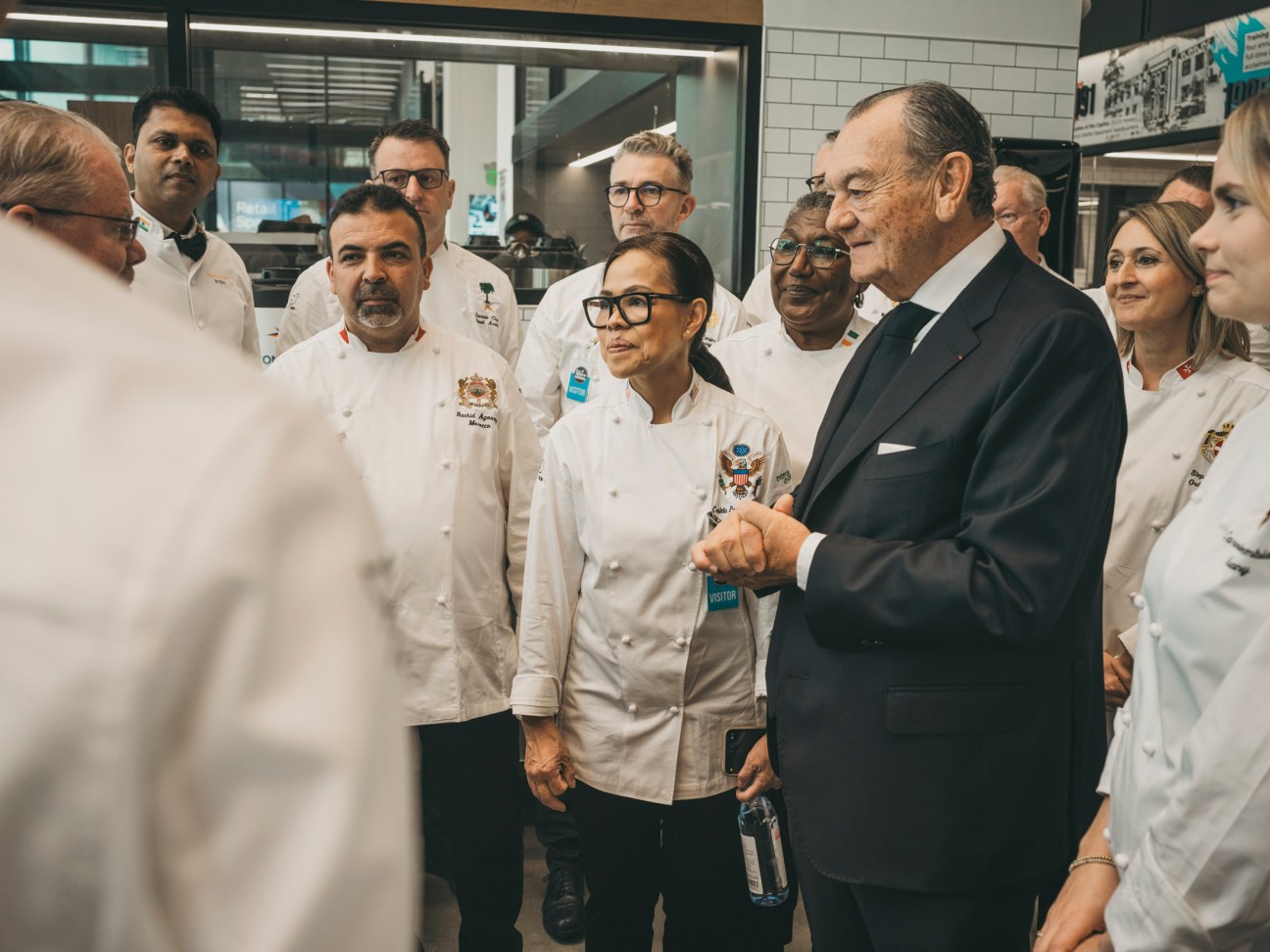
That exchange of information is a core function of one of the world’s most exclusive clubs, made up of just one member from any country: the personal chef of that nation’s head of state or government. Founded in 1977 by Gilles Bragard, a French designer of chef’s uniforms, the umbrella organisation is based in Paris but holds annual summits for its members in different capitals; the latest, which Monocle attended in November, was hosted in Washington. The summits are a chance for this elite group of chefs, who usually work in the background, to step forward and take centre stage. Over the years these summits have been attended by US presidents from Ronald Reagan to Barack Obama, and world leaders from Narendra Modi to Angela Merkel and Emmanuel Macron.
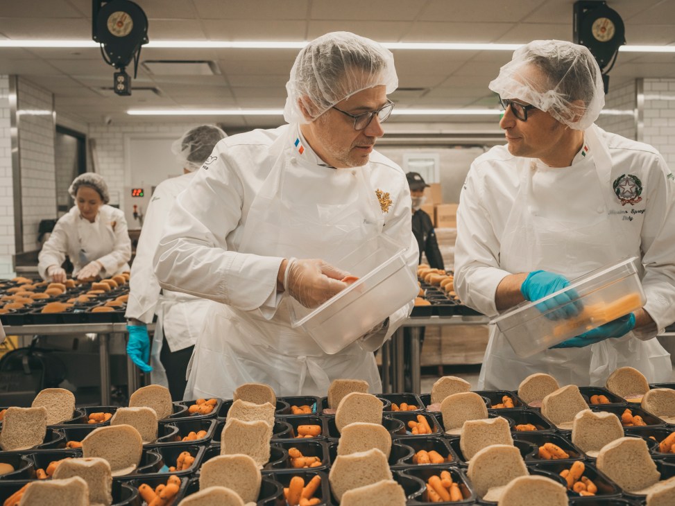
Every event also involves giving something back by highlighting a culinary cause or charity. In November, the group visited DC Central Kitchen, a local non-profit. The club of esteemed chefs were put to work cutting up pumpkin, squash and other seasonal vegetables, which they cooked alongside students from underprivileged backgrounds, some of whom have been given a second chance after serving time in prison. Willem-Pieter van Dreumel, chef to King Willem-Alexander of the Netherlands, was struck by the workload: 10,000 meals prepared every day for the poor in the US capital. “I’ve never had to do these kinds of amounts,” he says. Mike Curtin, CEO of DC Central Kitchen, says that his organisation has had several high-profile visitors over the years and puts all of them through their paces; he describes a particularly memorable moment when Bill Clinton was lunged at by a volunteer – to the horror of his Secret Service detail – because he scratched his face with a gloved hand (a sanitary sin) and tried to keep working. “We don’t really have time to be in awe,” says Curtin. Even so, he acknowledges that the visit from the Chefs des Chefs Club was particularly special. “We’ve never had this many talented high-profile chefs before,” he says. “To have these chefs who are carrying out diplomacy through food on a daily basis, it just fits so well with what we do on a daily basis: trying to build community through food.”
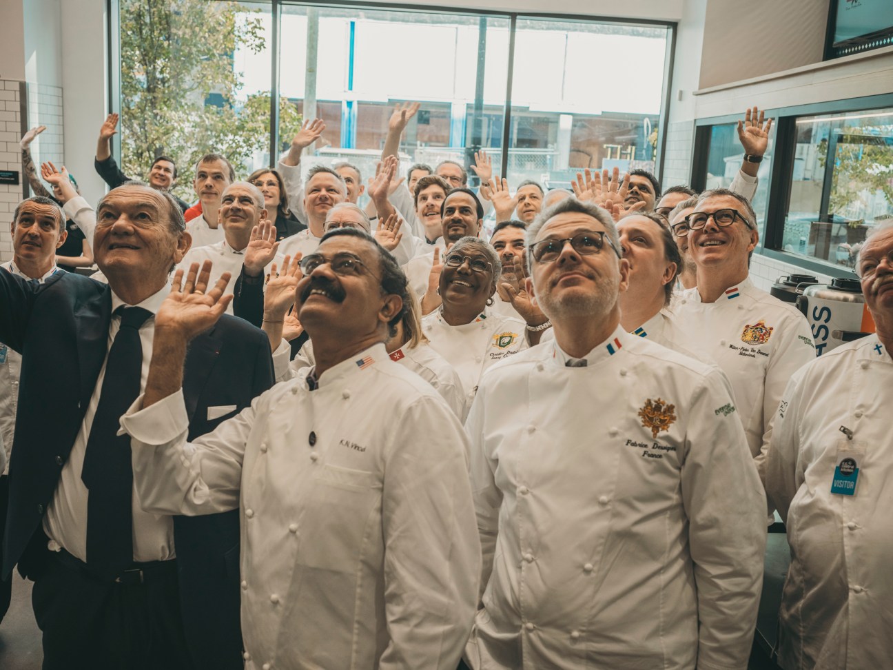
Beyond the pageantry, for the chefs themselves the summit is simply a chance to get together and let off (metaphorical) steam. Its members range from 20-year veterans to complete newcomers who are eager to learn and soak up the experience. “Honestly, I had no idea what to expect but it has been fantastic,” Canada’s Johnstone tells Monocle at an evening reception hosted at the French ambassador’s residence. “There’s such a huge gap: a range of ages and experience. We are all serving different types of leaders: we have a prime minister, presidents, kings. It’s wild to hear the stories.”
What’s striking is the job’s variety: chefs are typically responsible for everything from bilateral summits and state dinners, to everyday meals and the health of their very important employer. The wisdom imparted by veterans is less about recipes and more about things like presentation, how to run a presidential household and the importance of diplomatic tact. “We’re all fortunate in that we have personal insight into the families that we work with but we’re also all bound by that same discretion,” says Mark Flanagan, chef to King Charles III, and before him, for 20 years, Queen Elizabeth II. Flanagan says the late queen always stressed that it was as much about the staff as the monarch, “If we look after the staff, and we look after the team, the palace functions better and in a more harmonious way.”
Joe Biden’s fondness for ice cream aside, the chefs are generally coy about their leaders’ favourite dishes. This is partly for discretion but also to avoid repetition: Flanagan says that he learned this lesson the hard way before he became Buckingham Palace’s head chef during a visit of former French president Jacques Chirac. “Everybody knew that his favourite dish was tête de veau, made from calf’s head, and I was told, ‘This is his favourite, you must make it for him.’ So I practised and practised and practised but the poor man – everywhere he went, that’s all he got!” Flanagan says. “Another good thing that can come from the club is that we can phone each other up and say, ‘Whatever you do, don’t give him tête de veau.'”
What’s on the menu?
Joe Biden welcomes Anthony Albanese, prime minister of Australia
25 October 2023 at the White House
First course
Farro and roasted beetroot salad with popped sorghum in herb vinaigrette; butternut squash soup with smoked paprika and candied pumpkin seeds
Main course
Sarsaparilla-braised short ribs; sorghum-glazed young carrots; brussels sprouts, celery root purée and carrot jus
Dessert
Hazelnut and chocolate mousse cake with crème fraîche ice cream
Wine
Alexander Valley Chardonnay, 2019; Sequel, 2019; Argyle’s Extended Tirage Brut, 2012
Such advice can range from leaders’ allergies to specific likes and dislikes. And while there’s typically a protocol team that arrives ahead of any state visit to help orchestrate high-level functions, the personal touch is key for discovering more intimate details. “If the president of France is coming to the UK, I can pick up the telephone with confidence, speak to my colleague and say to them, ‘What about breakfast?’ Nobody ever talks about breakfast, but we need to start the day right,” Flanagan says. “And I can have that absolute confidence that the information we’re getting is accurate.” In other words, leaders’ chefs take as much pride in serving up big-ticket state dinners, showcasing their nation’s culinary culture, as they do in simply keeping the official household running smoothly. “We use food as comfort for them, as sustenance,” says White House chef Cristeta Comerford. “At the same time, we use food as a diplomacy tool. You make somebody happy with food. Things fall into the right place after that.”
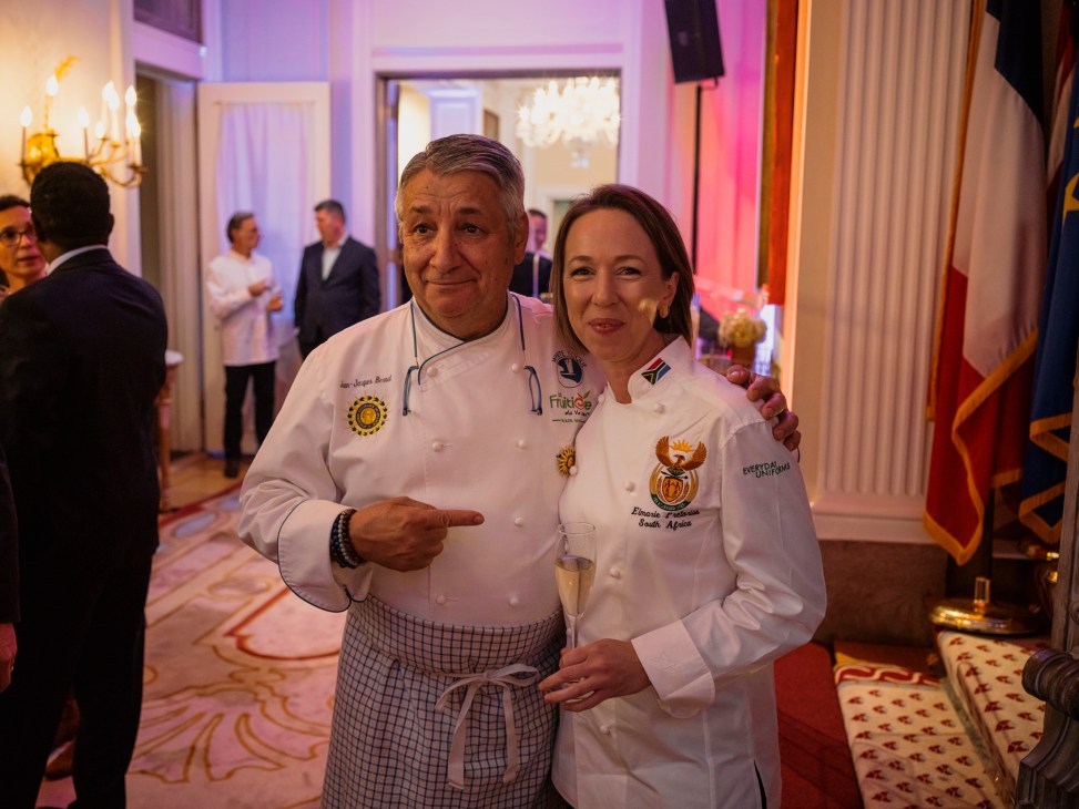
Elmarie Pretorius, chef to South African president Cyril Ramaphosa for the past 10 years, says that the job can be part “mind-reader”, honing your instincts and catering to your leader’s culinary moods on any given day. “We cook for important people but at the end of the day, whoever the guest is, they’re the one who I want to keep happy,” he says. In other words, the head of state is just another hungry person.
The role of a head-of-state chef stands apart from virtually any other job in hospitality. Not least because there are real-world diplomatic implications. “The leader who arrives in your country and who wants to discover it, you can let them discover your culture through cuisine,” says Laurent Billi, France’s ambassador to Washington. He notes that a mistake during a bilateral meeting can quite literally cause a diplomatic incident, while a positive experience can smooth over relations. Billi, who previously served as France’s ambassador to Thailand, remembers having lunch with a particularly aggressive Asian foreign minister (he won’t say which country but stresses “not China”) who insisted that western Europe was in decline and Asia was on the rise. By the second course and some French wine, the tone had shifted. “Suddenly they were looking at France as a great power in terms of gastronomy. The mood and dynamic of the dinner changed after that moment,” says Billi.
Then there’s the culinary diplomacy aspect: food gives world leaders and their staff a lasting impression of the country they’re visiting, a responsibility that chefs from smaller countries in particular take to heart. “Cuisine is everything: it’s culture, it’s authenticity and it’s the country itself,” says Christine Dadié, chef to the president of the Côte d’Ivoire. “The chef has a chance every day to provide the person who is exploring your country with the food that allows them to discover your culture.” No more is this true than during state dinners, events attended by hundreds of guests and an opportunity for a country’s local cuisine to shine. The dishes of state dinners are chosen carefully, the menu often making national headlines and serving as a nod to cultural ties between both countries. Amit Ghotwal, chef to India’s president, offers an example from a visit of Abdel Fattah al-Sisi for India’s Republic Day in 2023. Ghotwal’s menu called for a vegetable biryani, a classic Indian dish, but he married it with an Egyptian kabsa by using noodles and lentils. The result was a dish that “looks like kabsa, tastes like kabsa, but you also get the Indian flavours. That’s how we try to co-operate; it’s the best of both worlds.”


White House chef Comerford stresses the importance of seasonality during state dinners. “We also think about the guests who are coming and the themes, nuances or flavours that are really endearing to them,” she says. “And since America is such a wonderful conglomeration of different flavours and food from immigrants, we also want to incorporate that idea into the message.”
Presentation matters too. “When we formulate a state dinner, it’s all very considered,” she says. “Every decoration, every plate, every piece of entertainment is really thought out wisely.” Comerford adds that she takes an egalitarian approach, always putting in the same effort. “We have to make sure that no matter what country or continent or area you came from, you get the same hospitality as any other country.” That said, Comerford says that it was a particularly unique honour to host the Chefs des Chefs themselves for lunch at the White House, alongside Jill Biden, the US first lady, during November’s summit. “They really have sacrificed their hours and their time to serve others,” she says. “The least I can do is give them the best of what I can do.”
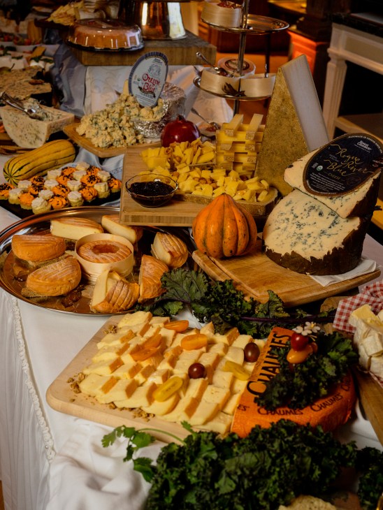
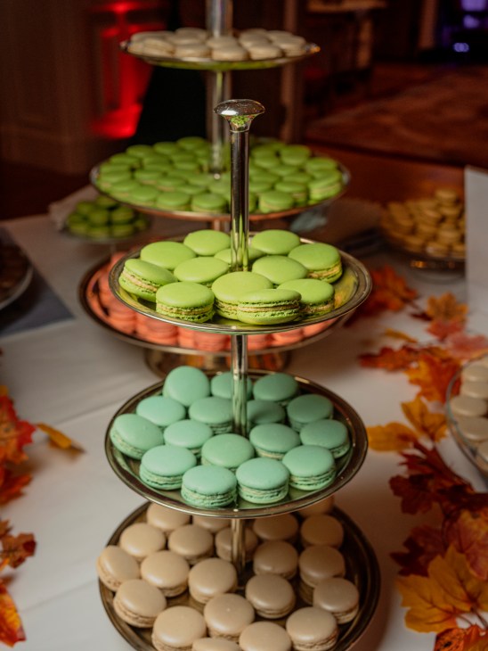
What’s on the menu?
Emmanuel Macron welcomes King Charles III
September 20 2023 at the Palace of Versailles
First course
Blue lobster and pot crab with fresh almonds and mint-coconut gel
Main course
Corn-flavoured Bresse poultry marinated in champagne; gratin of porcini mushrooms
Cheeses
Pélardon; 30-month comté; stichelton
Dessert
Pierre Hermé’s twist on his “Isaphan”, made with pink macaron and lychee sorbet
Wine
Bourgogne Bâtard-Montrachet Grand Cru, 2018;
Château Mouton Rothschild Bordeaux, 2004
India’s president, Droupadi Murmu, welcomes her Egyptian counterpart, Abdel Fattah El-Sisi
5 January 2023 at Rashtrapati Bhavan, New Delhi
Starters
Dal shorba (Indian take on Egyptian lentil soup); rajgira doodhiya kebab (deep-fried amaranth and hung curd medallions); tandoori aloo (stuffed potatoes)
Main course
Paneer methi malai (cottage cheese with fenugreek leaves); rogani khumb (mushrooms in tomato gravy); chaunka bajra matar (pearl millets and peas); broccoli corn jalfrezi; dal raisina (lentils and tomatoes); dahi gujiya (lentil medallions); subz koshari (Indian take on Egyptian koshary); bread
Dessert
Jalebi with rabri (Indian counterpart to Egyptian meshabek); ragi laddoo (Sweet bites made from finger millet); seasonal fruit
Mint tea or coffee
The Zürich-based firm offering authentic modernist posters at entry-level rates
It’s a Monday afternoon in Näfels, a village in the Swiss canton of Glarus, and Lars Müller is hard at work. The publisher and two members of his team are scrutinising several glossy prints in graphic designer Dafi Kühne’s studio, which is full of old type-casting machines and printing presses. Kühne has just introduced a “best of” selection of his work from recent years. His visitors look through the pile and pause when they reach a deep-blue poster announcing the launch of a magazine, with spindly letters spelling out the word “Neu“. “This could be good to add context to a selection [of Kühne’s work],” says curator Tanja Trampe. To which Müller answers plainly, “But do you like it?”
A studio visit by Müller is something that almost any designer would covet. Over a period of 40 years, his namesake publishing house has released more than 800 specialist design titles, including monographs of architects such as Peter Zumthor and Zaha Hadid. At 69, he is showing no signs of slowing down. When Monocle meets him, he is on a stock run for his latest venture: Flat & Bound, a shoppable online collection of some of the past century’s most precious printed matter.
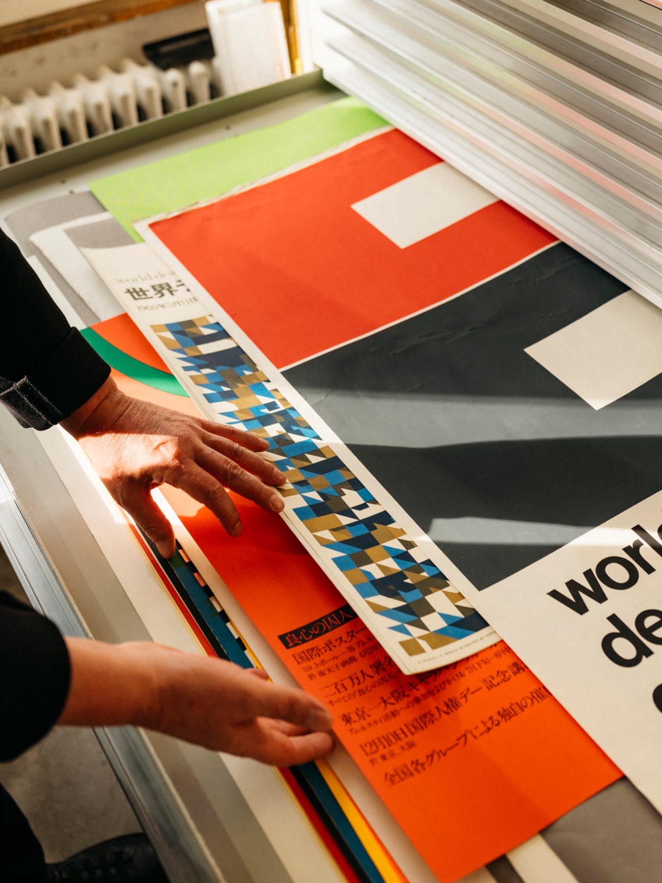

Kühne is the first contemporary designer to be included. Müller founded Flat & Bound in 2021 in order to sell works from his private library, a formidable collection consisting of gifts from friends, souvenirs from exhibitions and pieces nabbed from the homes of designers or picked up at antiquarian shops in cities from Oslo to Osaka. “I’m not a collector,” says Müller. “It contradicts my idea of being a publisher, which is about distributing to as many people as possible.”
Müller tells Monocle how he honed his eye for print. As a teenager he was already dealing in stamps. He later studied graphic design in Basel and Zürich. After graduating he headed to Amsterdam in the early 1980s to work for Total Design, the agency founded by Dutch graphic designer and typographer Wim Crouwel, who pointed out to him that books are the only printed matter meant to last. Müller then returned to Switzerland with a plan to venture into publishing. “I drove back with a car full of books,” he says. “That’s how it all started.”

The studio of Müller’s fledgling imprint soon started receiving weekly visits from revered designer Josef Müller-Brockmann. In the 1950s and 1960s, Müller-Brockmann had helped to define the grid-based, Helvetica-heavy Swiss style through his poster designs and by co-editing the influential Neue Grafik magazine with Richard Paul Lohse and Carlo Vivarelli. But by the 1980s, the rigid aesthetics of this old guard had fallen out of favour.
“They were not recognised by many young designers of my generation,” says Müller. “I was captivated by Müller as a warrior of modernism.” His mentor became a lifelong friend. In 2016, Müller-Brockmann’s widow, Shizuko Yoshikawa, gave his archive to Müller. The collection makes up a large part of Flat & Bound.
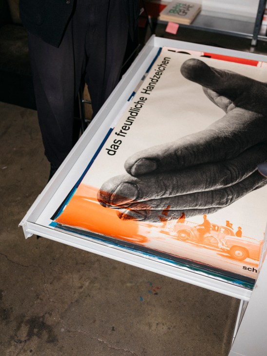
Browsing through the collection makes its high-calibre provenance evident. Among the hundreds of posters, books and magazines are many museum-worthy pieces, from prints by Japanese graphic designer Ikko Tanaka to a treatise by Le Corbusier with a dedication from the author. The collectables don’t all come cheap but are priced well below market rates. “Our clientele isn’t lawyer’s offices,” says Müller. “We look for aficionados, young people who might forgo a few pizzas to afford a poster.”

Müller’s approach to Flat & Bound mirrors his recipe for success in publishing. The programme of Lars Müller Publishers is focused on the 20th-century avant-garde. Alongside this canon, he presents a selection of contemporary design. Similarly, Müller is keen to complement Flat & Bound’s modernist archive with works by young designers. “It takes you out of your comfort zone,” he says. “You have to judge the work in a different way because the old rules cannot be applied.”
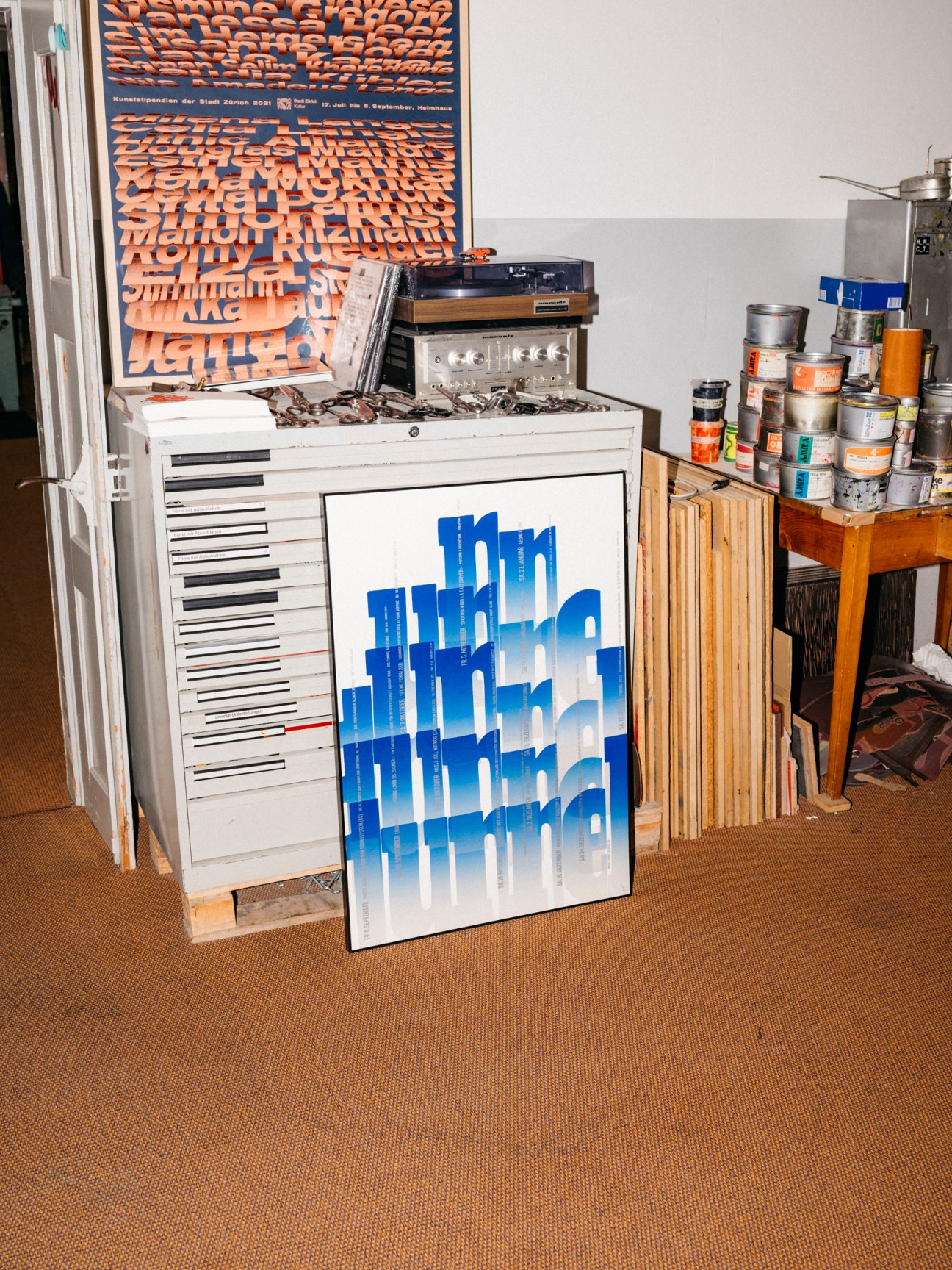
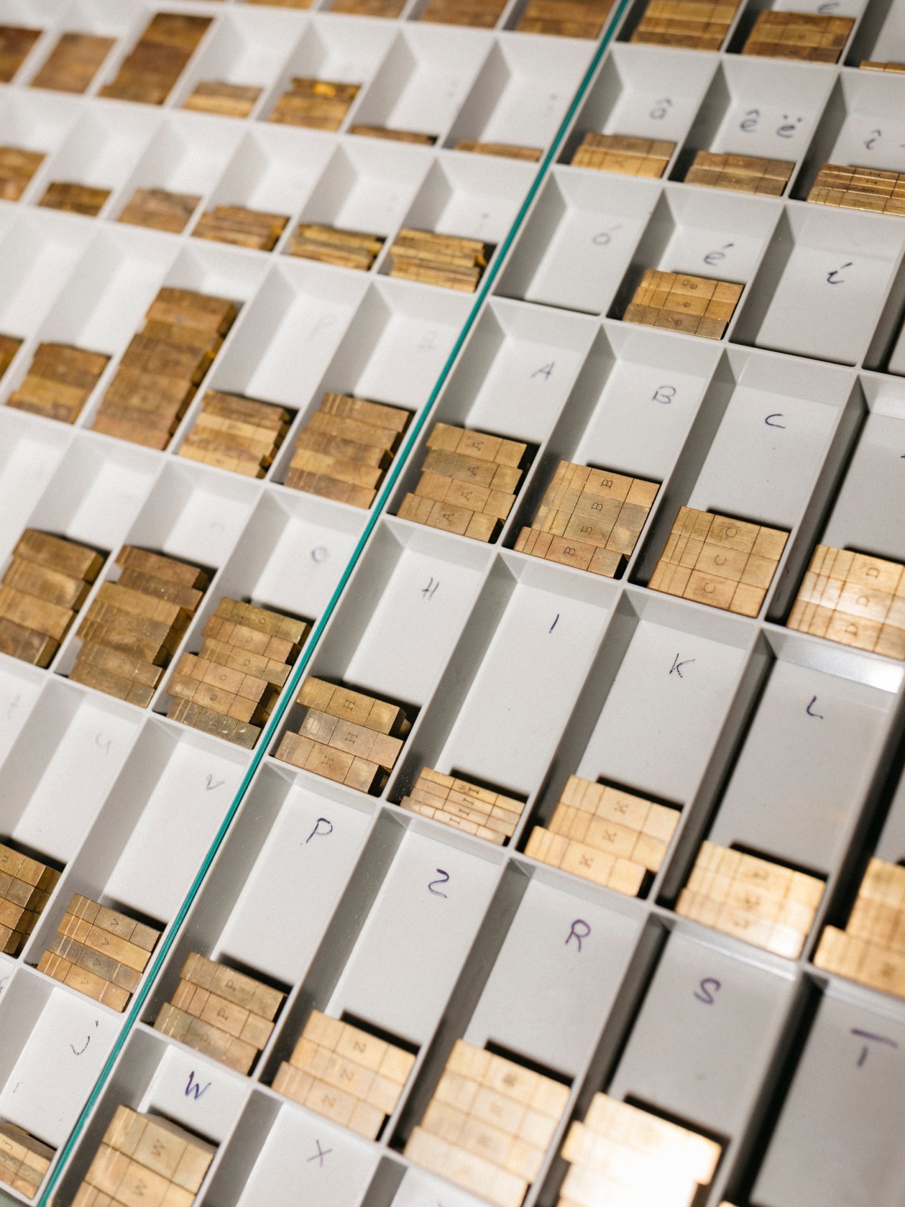
In the case of Kühne’s prints, the criteria for selection include scarcity, relevance and how representative a work is of the artist – though much eventually comes down to taste (the “Neu” poster doesn’t make the cut). Kühne is an ideal choice for Flat & Bound. He prints his posters manually in his studio, using equipment scooped up from moribund type foundries and presses. After almost two hours of deliberation in his Näfels studio, the team settles on a dozen works.
The posters are taken by Müller for storage at the Flat & Bound collection in Zürich, housed in the offices of the publishing house. There are no plans to open a retail space – the platform has already found its intended audience online.
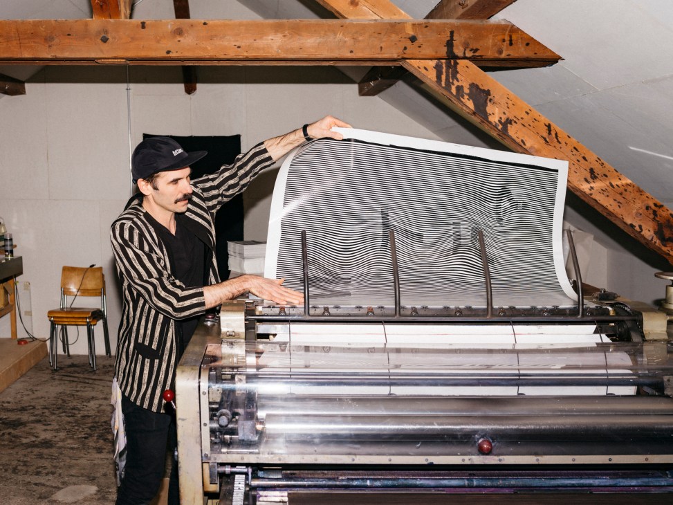
While Müller might not call himself a collector, he takes pleasure in a piece having passed through his hands. “It can stay for a while too,” he says, gesturing around the room. “This assemblage more or less reflects what society was like in the 20th century.” Dispersed once more, it might inspire graphic designers in the 21st.
flatandbound.com
Top Picks from the Flat & Bound collection
1.
Schützt das Kind!
Josef Müller-Brockmann
poster, 1956

2.
The 5th Sankei Kanze Noh
Ikko Tanaka
poster, 1958

3.
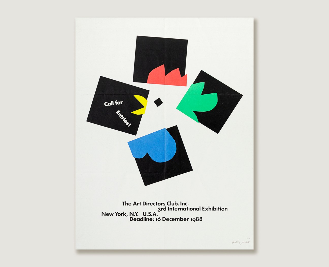
The Art Directors Club
Paul Rand
poster, 1988
4.
Exposition de la résistence italienne
Max Huber
poster, 1968 (reprint)

5.
Galerie Aktuell
Max Bill
poster, 1965

6.
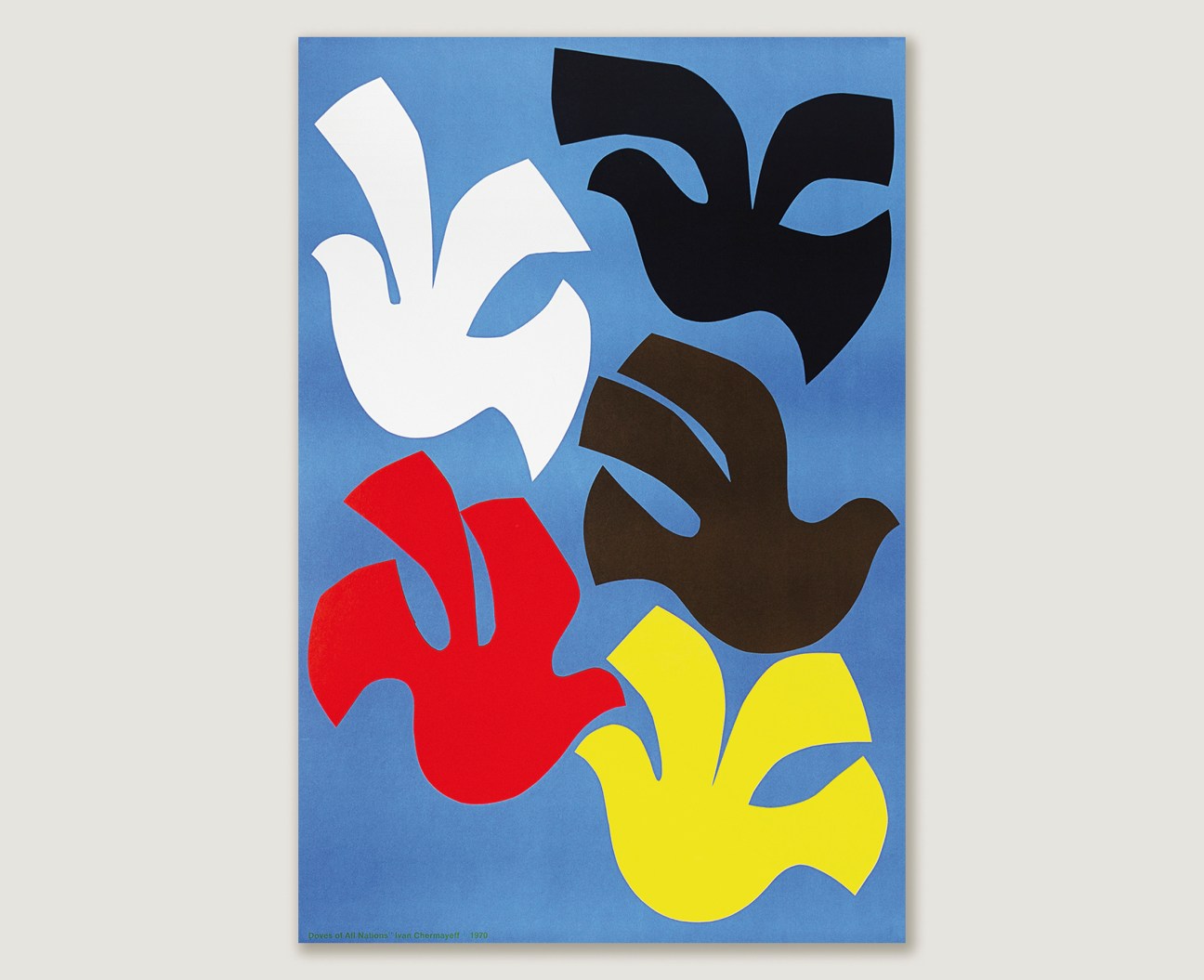
Doves of All Nations
Ivan Chermayeff
poster, 1970
7.
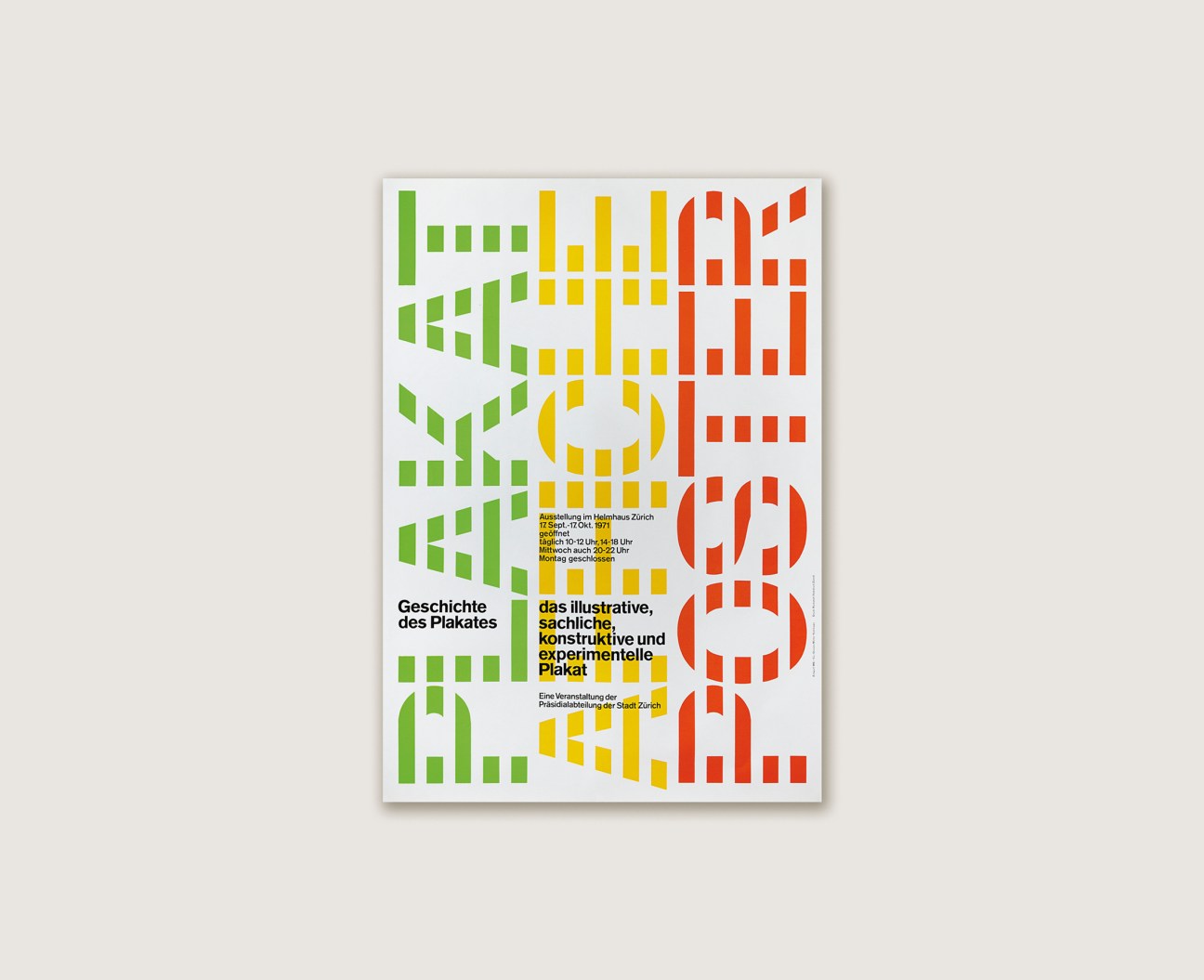
Plakat Affiche Poster
Shizuko Yoshikawa
poster, 1971
8.
Opernhaus Zürich, Medea
Josef Müller-Brockmann
poster, 1972
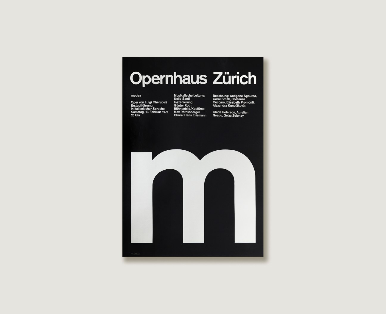
9.
Galerie Apel&Fertsch
Max Bill
poster, 1970
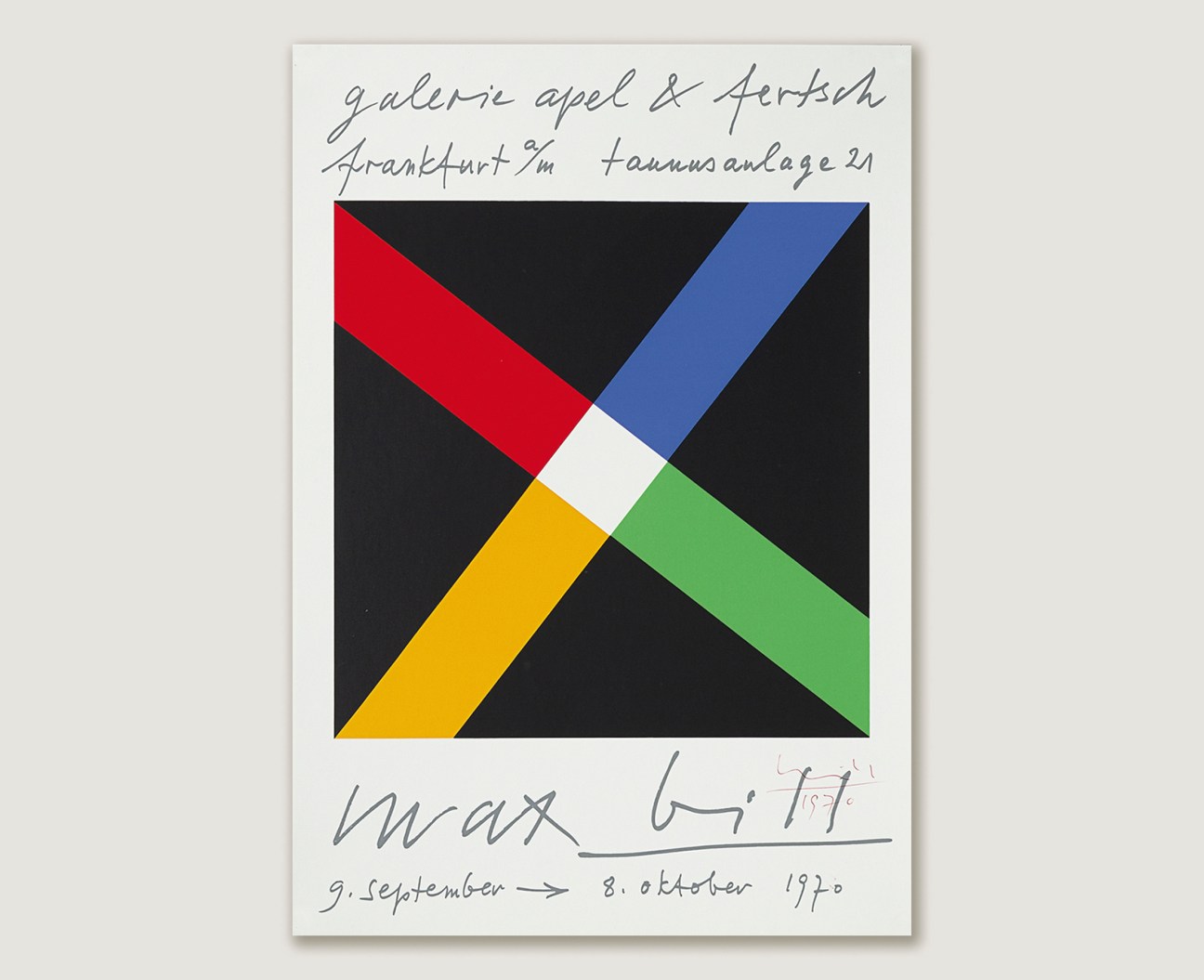
10.
Tokyo Olympic Games 1964, Runner
Yusaku Kamekura
poster, 1964

11.
Des Canons, Des Munitions? Merci! Des Logis… SVP
Le Corbusier
book, 1938

12.
Galerija Suvremene Umjetnosti Zagreb, Galic
Mihajlo Arsovski
poster, 1970
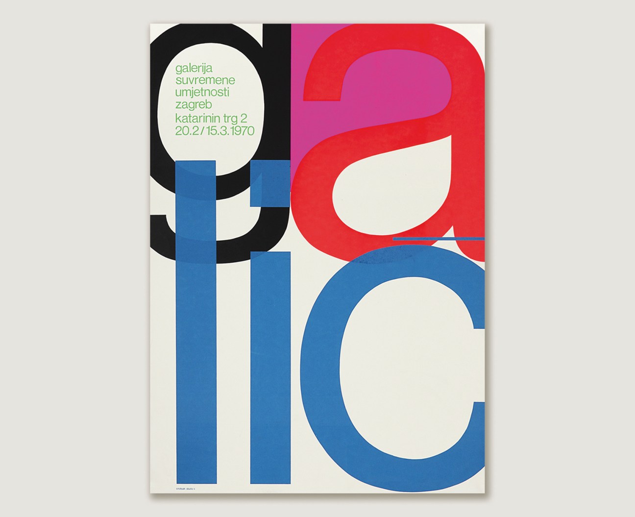
13.
Kammerchor Zürich, Antonin Dvorak, Requiem
Müller-Brockmann 1 Co
poster, 1969
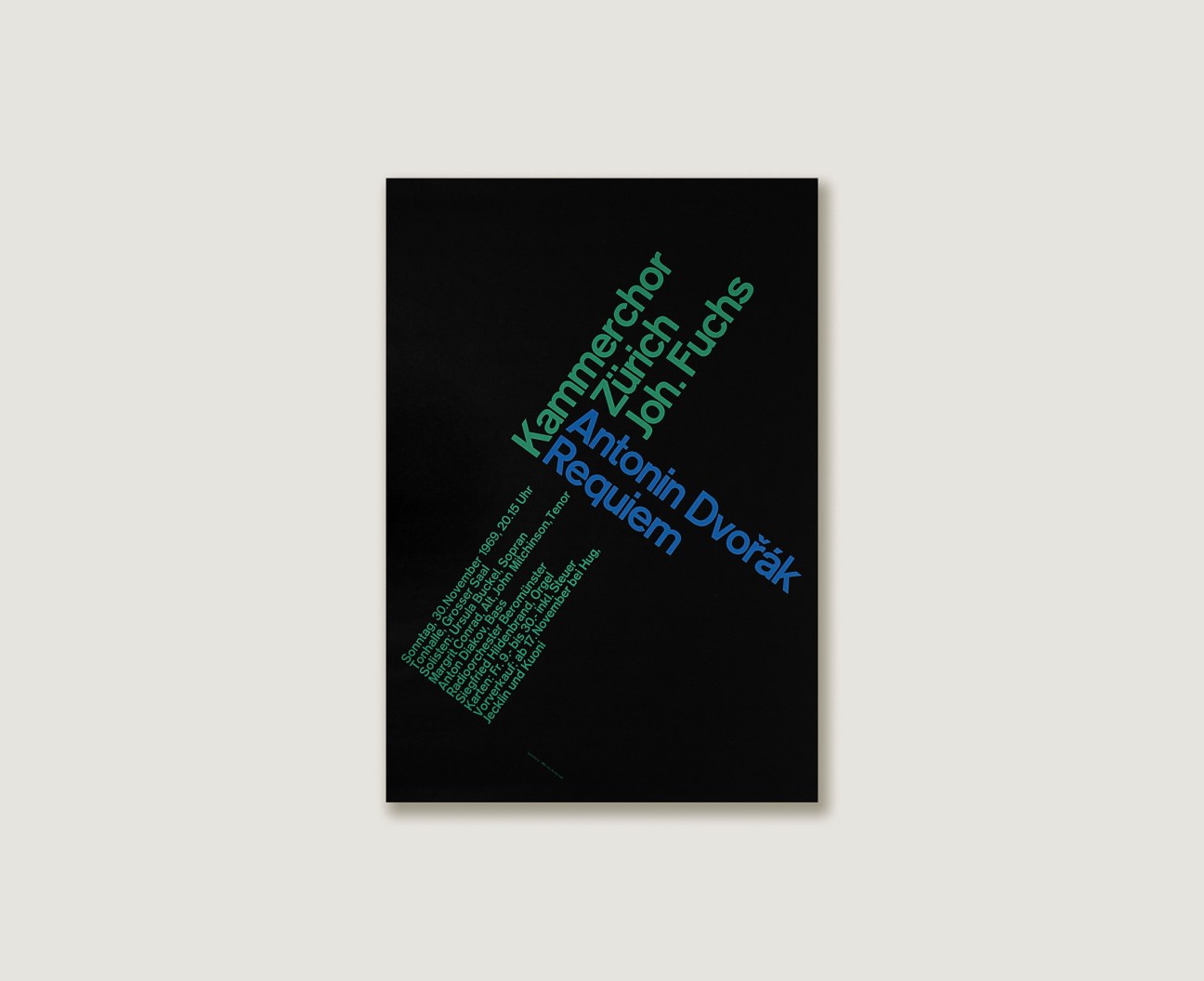
14.
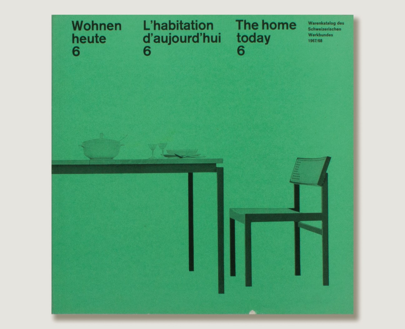
Wohnen heute 6
Richard Paul Lohse
book, 1967
15.
Neue Grafik 1
Richard Paul Lohse, Josef Müller-Brockmann, Hans Neuburg, Carlo Vivarelli
magazine, 1958

Read next: The Monocle City Guide to Zürich, featuring the very best hotels, restaurants and retail spots
Where next for luxury retail?
The debate
Towards the end of last year, luxury retail’s long-simmering problems reached boiling point. Global marketplace Farfetch was de-listed from the New York Stock Exchange, only avoiding bankruptcy when South Korean e-commerce giant Coupang bought its assets. London-based Matchesfashion met a similar fate. Valued at $1bn (€924m) just a decade earlier, it was acquired for £52m (€61m) by the Fraser Group, a business with little background in luxury. Meanwhile, Net-A-Porter remains without a buyer and US retailer Neiman Marcus has laid off more than 100 employees while it reportedly considers a merger with Saks Fifth Avenue.
At first glance, it might seem as though the luxury e-commerce sector, once known for its innovation and expert curation, fell apart overnight. Yet many of its current problems – overstocking and unhealthy discounting, for example – go back to the 2007 financial crisis and beyond. Breaking bad business habits will take time and many in the industry are taking a wait-and-see approach, as companies restructure under new owners. Yet this is also an opportunity to rethink the shopping experience, build better partnerships with brands and be more creative. Specialist retailers with a clear purpose are rising in popularity again, while labels are taking back control and experimenting with their flagship shops. We speak to experts from across the field to assess what went wrong and what lies ahead.
Meet the panel

Ida Petersson
The buyer
Petersson started her career as a buyer at Harvey Nichols department store in 2002, before becoming departmental buying manager for shoes, accessories and jewellery at Net-A-Porter. She went on to become the buying director of Farfetch-owned luxury retailer Browns, leading its men’s, women’s and accessories departments.

Christopher Morency
The brand strategist
Morency covered luxury fashion and retail as a reporter for The Business of Fashion and editorial director of Highsnobiety, before pivoting to become the chief brand officer of Budapest’s Vanguards Group in 2022. With fellow Highsnobiety alumnus Tom Garland, he launched new creative-growth company Edition+Partners and its sister agency, State of the Art, in January.

Georgia Stevenson
The investor
Stevenson is a partner at European private-equity firm Index Ventures, which she joined in 2019. She focuses on consumer and retail investments across the continent, with a particular focus on marketplaces. She previously worked at Deliveroo, launching the service in towns and cities across the UK.
Looking at recent developments in fashion retail, what do you think led the industry to this point?
Ida Petersson: The first time that I experienced major economic turmoil in my career was in 2008, after the collapse of Lehman Brothers. Everything in the US went on an 80 per cent discount. Our customers were global, so when they saw a product at full price at Harvey Nichols in London, they just went to the US. That’s when unhealthy discounting practices started and I don’t think we ever fully recovered. The second round of problems started at the height of the pandemic, when bricks-and-mortar shops were suffering and put everything on sale. That forced many brands to drop their wholesale partnerships. Meanwhile, e-commerce retailers became overexcited, thinking that they could continue to grow in double- or triple-digit numbers.

Christopher Morency: In that environment, the only thing that these companies were competing on was price. They made a stab at community-building for a while but were really betting on price and speed. That’s not good enough. Discounting will only take you so far before you end up with a loss-making business and a lot of enemies. This is why luxury brands pulled out of retailers and only use the consignment model.
Does e-commerce still have potential?
CM: The media loves a sensational headline – “Is this the end for e-commerce?” No, this is a multibillion-dollar sector. There are so many players out there and the offer is homogeneous, so we’re seeing a consolidation that needed to happen.
Georgia Stevenson: At Index Ventures, we have worked with a number of e-commerce businesses as seed investors – Farfetch, Net-A-Porter, Etsy – as well as brands with their own retail networks, such as Glossier or Anine Bing. We’re bullish on the future of e-commerce and excited about what Farfetch is doing, as well as what the partnership with Coupang will mean in terms of logistics and fulfilment. There will, of course, be challenges. In the short term, for example, there needs to be more focus on sustainable value propositions. Do you really need to deliver to the customers’ door in 10 minutes? But such re-evaluation is part of the process. We’re not the type of investors who would back off just because there are challenges.
Will the changing relationship between brands and retailers continue to shape the market in 2024?
CM: LVMH and Kering brands stopped discounting and engaging with wholesalers years ago because they wanted to control their stock, pricing and distribution. Now smaller brands are becoming equally fed up and focusing on direct sales and partnerships with boutiques that build more respectful relationships with them.

IP: The wholesale model of doing business can create a vicious circle. Many of the big players in that space are just seeking margins. Brands don’t always fully understand what they’re getting into when they sign up to it because they get too excited by a big name. But I’ve recently seen a shift: some brands are choosing to go with more specialist retailers because they are more protective and use discounting far less. And their customer base is loyal and drawn to creativity.
Do direct-to-consumer brands have more power today?
GS: As investors, we’re excited by direct-to-consumer brands. These businesses know their customers and connect with them without having to rely on third parties. Across our portfolio, there’s a theme of going back to basics, doing less and focusing on core products. That will continue as a result of the current funding environment. Wholesalers can play a part in a brand’s distribution strategy but you can’t be a hostage to them. Look at Glossier, which has an amazing direct-to-consumer audience and successful shops but, after years of building that ecosystem, recognised that working with [French retailer] Sephora was another avenue.
CM: Traditional industry power structures are breaking down. In past decades, a group of about 20 people – retail buyers, sales agents and editors – would determine which businesses would grow. But they no longer have the same influence, so many brands are doing things differently and seeing returns. That also reflects the tools that people now have at their disposal. They can whip up a Shopify page within 20 minutes and start selling.
GS: Exactly. A retailer procures, curates and sells goods, and everyone can do that today. So questions around the future of retail remain open. The market is no longer just for big brands or large enterprises.
As dynamics shift and brands take back control, have attitudes to investment changed? What are the benefits of raising capital?
GS: It’s an opportunity to build a community and retail experience without relying on those 20 or so traditional players to give you access to their customers. End, which is in our portfolio, is a good example: it used investment to become more scalable and move in different avenues.
Where do multi-brand retailers fit in this new landscape?
CM: The role of retailers hasn’t changed. Wholesale has always been a great tool for brand awareness and discovery. Retailers have always done those two things better than anyone else. They just got distracted by the number of brands that they can work with: Net-A-Porter takes on and drops hundreds of brands every season. Customers don’t need that much choice.
Retailers need to return to their role as curators and facilitators for new brands. And these start-ups should see wholesale as marketing channels, rather than as a cash cow. Otherwise, the retailer becomes your boss or, in effect, an unofficial investor.
IP: A multi-brand retailer offers customers a way to explore a universe, which can be really magical. Very few people are loyal to one brand alone; most want to be part of the multi-brand experience. That’s why 2024 will be the year of the specialist. And that doesn’t necessarily have to be done on a small scale. It’s about having a distinctive identity. We were successful at Browns when we were clear about who we were. There’s a lesson in that for retailers: there needs to be more collective risk-taking. You can’t just set yourself apart with discounts.
What should new owners of online retailers do to rescue the sector?
IP: The most successful will allow business units to run independently. Groups often try to tie everything together and make everything fit in one box. That’s when brands lose their identity. Look at LVMH: its brands are allowed to be very different. Walk into a Dior shop and you wouldn’t think that the label has the same owner as Loewe. People are obsessed with efficiency but if you have the same team doing everything, you erase individuality and things go wrong.

CM: What is it that makes e-commerce enjoyable? When I look at retailers’ “What’s new” pages, it’s often all the same. There needs to be another layer to the experience that’s tailored to today’s customer, whether it’s social commerce or live elements. It should be about more than just offering a product at a good price. You can’t be a big, faceless entity. You have to level with the people who are buying your stuff, beyond your top-spending customers.
How do you achieve that?
GS: Shops need to be destinations in their own right. You have to be intentional about every touchpoint with customers – online, offline, pre-purchase and post-purchase.
CM: People are starting to consider what their business could look like outside of the fashion industry. They want to reach even higher, tapping into hospitality, media and design. We can see that people, including younger generations, still value shopping together. That’s where hospitality spaces come in. On high streets, fewer people are carrying shopping bags but restaurants are full. It’s about understanding how to embrace the social element of shopping: acting as a curator, not just a seller. Then a shop can become a marketing channel. Loewe does this so well: a theme runs through what’s in the shop windows, the products and even the design of the receipt, so a customer is buying into a story.
What are the biggest challenges that these businesses face as they attempt to change course?
GS: A key challenge will involve supply chains. There’s a lot of volatility right now. On top of that, there’s the need to meet consumer expectations in terms of where a product is made. Successful retailers have to understand how to leverage technology and build better supply chains. That encompasses everything from giving attention to payment terms, setting up new shipping infrastructures and using sustainable packaging.
What about new opportunities?
GS: One of the opportunities that we are excited about is personalisation. We’re only at the start of this. Brands have been concentrating on the infrastructure of operating online but now it’s about understanding what it actually means to be in this space and to provide a good experience, beyond that “What’s new” page. Artificial intelligence will offer better personalisation in the long term but, in the meantime, there’s a lot of low-hanging fruit. The general theme of being a kind of concierge has a lot of potential.
IP: People are shopping very differently and it’s an exciting time to be experimenting. The way in which brands interact with male audiences has changed completely, regardless of their age. Even more traditional men – the kind who would historically come in once a season to do a big shop – have started to become more interested in fashion and be influenced by the news, TV series and social media. This has led to more impulsive shopping. There’s a big opportunity in menswear.
Many of these issues are centered in the West, particularly the UK and US. What can we learn from other markets?
IP: In Japan, for example, retailers’ commitment to the shop experience is on another level and I still don’t understand why this hasn’t come to Europe or the US. Whether it’s a boutique or a department store, the Japanese focus on the physical product but also employ things such as art, music and food to create something fully immersive. Mexico City is exciting right now, with so much new retail opening there, and India offers another huge opportunity. If you open your mind and you’re willing to listen and learn, this could be an amazing time. But you have to lose the fear.
Conclusion
Not so long ago, online and wholesale models of fashion retail seemed to be the future, offering scale and reach unimaginable in decades past. Yet their focus on speed and efficiency at all costs has proved to be their undoing, as major players struggle to survive and new owners sweep in, promising change. For businesses that are daring enough to reimagine the sector to meet the fast-evolving expectations of consumers, however, new opportunities abound.
The best of this month’s art and culture
Music
Phasor
Helado Negro
In Phasor, the eighth album by Helado Negro (aka Roberto Carlos Lange), the singer continues to deliver his customary atmospheric beats but there’s also a new sunniness here – a nod, perhaps, to his Floridian childhood. Where his previous album, Far In, was inspired by quarantine, Phasor is about getting out there. Among its highlights are the beautiful dream pop of “Best for You and Me” and “I Just Want to Wake Up with You”, an ode to comfortable love.
Out now
Girl with No Face
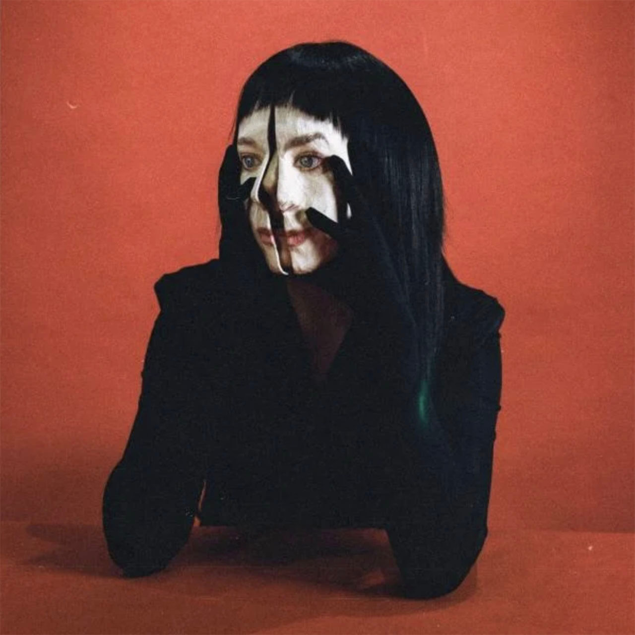
Allie X
Toronto-born singer Allie X’s third album, Girl with No Face, is a hedonistic set of 1980s-influenced electro tracks. At times, the bass-driven first single, “Black Eye”, sounds like a modern update of The Human League. The witty “You Slept on Me” perfectly encapsulates the self-produced album’s campy, danceable mood.
Released on 23 February
Letter to Yu
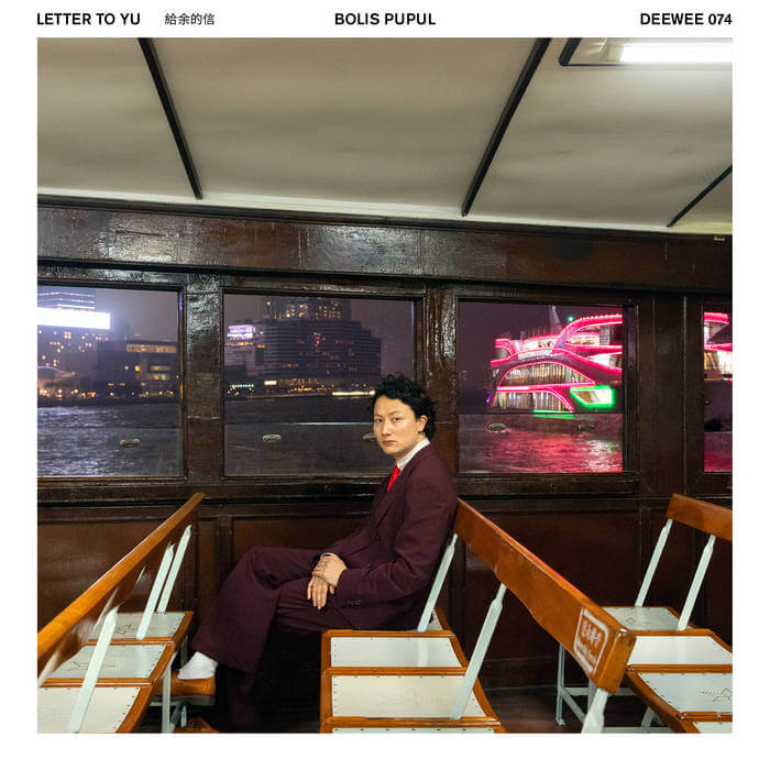
Bolis Pupul
Pupul’s debut solo album, following his successful collaboration with Charlotte Adigéry, is a homage to his late Chinese mother (his father is Belgian), who died in a traffic accident. It’s also a celebration of his Chinese roots. The album’s first single is the excellent “Completely Half”, built around field recordings taken on the Hong Kong subway; meanwhile, the propulsive “Spicy Crab” refers to the city’s seafood staple.
Released on 8 March
Film
Evil Does Not Exist
Ryusuke Hamaguchi
The latest film by Drive My Car director Ryusuke Hamaguchi tells the story of the battle between a resident of an unspoiled village and a developer intent on transforming it into a glamping spot. Hamaguchi turns a story of corporate greed into something far more human.
Released on 1 March
High & Low – John Galliano
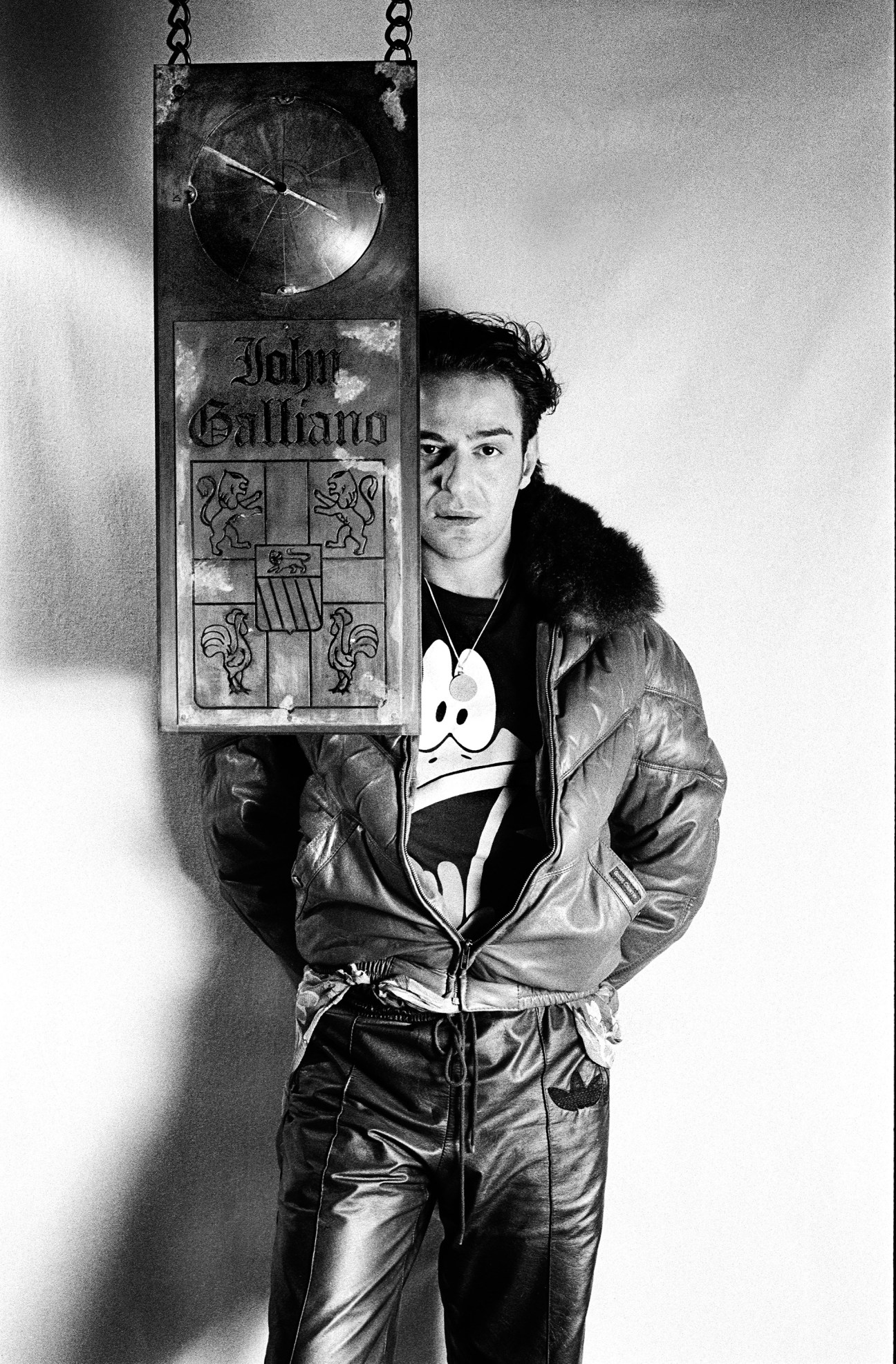
Kevin Macdonald
Fashion designer John Galliano’s rise was as swift as his fall after being ostracised from the industry after an anti-Semitic rant in a Paris bar. Oscar-winning Scottish documentarian Kevin Macdonald puts his subject into context, from Galliano’s rise while a student at Central Saint Martins to the gruelling demands placed on him as Dior’s creative director.
Released on the 8 March

The Teacher’s Lounge
Ilker Catak
Teacher Carla tries her best in a new school that is plagued by thefts. Taking matters into her own hands, she identifies the thief – causing members of the community to turn against each other. No good deed goes unpunished.
Released on the 22 March
Art
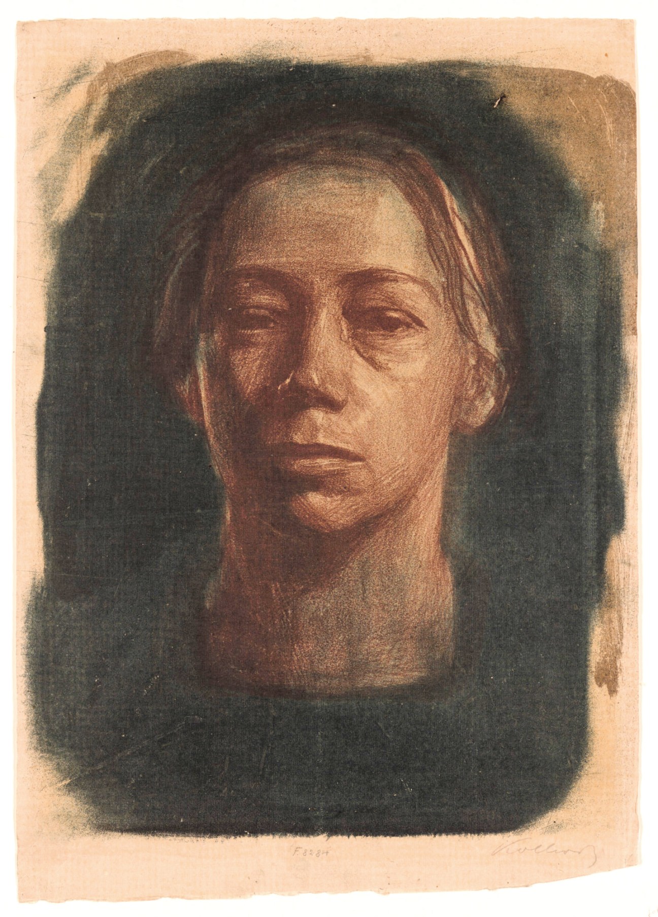
Käthe Kollwitz
Moma, New York
German artist Käthe Kollwitz, who died shortly before the end of the Second World War, did more than almost any of her peers to document one of the most tumultuous periods in her country’s history. This look at her long career takes us from her early engagement with the darker side of the Industrial Revolution to her explorations of the human cost of war, via peasant portraits and prints that double as pacifist propaganda.
Runs from 31 March to 20 July
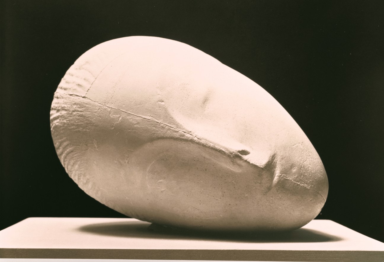
Brancusi: Carving the Essence
Artizon Museum, Tokyo
A contemporary of Pablo Picasso, Romania’s Constantin Brancusi was equally important when it came to introducing non-Western influences to 20th-century European art. The clean lines of his carvings reflect his serene approach to his craft and his search for his subjects’ essence. Drawings, photos and frescoes add further context to this first Japanese retrospective.
Runs from 30 March to 7 July
Photography

Boris Mikhailov
Fotomuseum Den Haag, The Hague
A timely survey of the work of the Ukrainian photographer and artist who has long explored the collapse of the Soviet Union. Hand-painted found photographs of Soviet soldiers are given layers of irony by Mikhailov’s lurid colours, while the rough edges and sepia tones of his 1982 Crimean Snobbism series add a conceptual edge to Black Sea holiday snaps.
Runs from 30 March to 18 August
Books
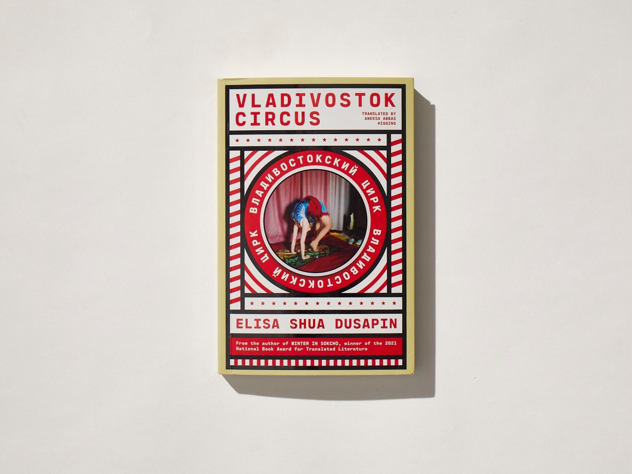
Vladivostok Circus Elisa Shua Dusapin, translated by Aneesa Abbas Higgins
In this perceptive new novel by the French-Korean author of The Pachinko Parlour, an art graduate arrives in the city of Vladivostok to design costumes for three performers preparing for the Russian Bar – one of the most perilous circus acts. Translated from French by Aneesa Abbas Higgins, it’s a sensitive, shrewd tale about friendship, creativity and what it means to put our lives in the hands of others.
Out now

Until August
Gabriel García Márquez, translated by Anne McLean
Shortly before he died in 2014, Nobel laureate Gabriel García Márquez, who was then living with dementia, decided not to publish his last novel. Now, a decade later, his sons have chosen to disregard his wishes and share it. Translated from the original Spanish by Anne McLean, Until August follows a middle-aged woman who takes an annual pilgrimage to the island where her mother is buried on the anniversary of her death. Sure to be one of the year’s literary highlights, the novel interrogates desire and fear with the sensitivity and depth that devoted readers expect from the Colombian author of One Hundred Years of Solitude and Love in the Time of Cholera.
Published on 12 March

Help Wanted
Adelle Waldman
More than 10 years after Adelle Waldman garnered legions of fans with her charming and clever first novel, The Love Affairs of Nathaniel P, she is finally back with Help Wanted. Where her debut focused on the romantic entanglements of the Brooklyn literati, her new work explores the economic dreams of poorly paid workers in the retail industry. At a superstore in Upstate New York, employees hatch a plan to promote – and so get rid of – an inept team manager called Meredith. This, they hope, will also improve their own prospects of promotion. A witty and perceptive portrait of people doing their best to make a living.
Published on 21 March
TV

The Regime
HBO/Sky Atlantic
Kate Winslet was spellbinding as a caring but overworked detective in US crime series Mare of Easttown. Now she delivers an equally striking performance in The Regime, a new series directed by film-maker Stephen Frears and The Crown‘s Jessica Hobbs. Winslet stars as an authoritarian leader of a fictional European country that is falling apart at the seams. Expect political intrigue and manipulation across six episodes penned by Succession writer and producer Will Tracy.
Released on 3 March
3 Body Problem
Netflix
The long-awaited follow-up project from Game of Thrones creators David Benioff and DB Weiss promises to be a sprawling, highly ambitious sci-fi epic. Based on a Hugo Award-winning book trilogy by Chinese writer Liu Cixin, it begins with the story of an astrophysicist who witnesses the murder of her father during the Chinese Cultural Revolution – before shifting gears to become a wild ride encompassing conspiracies, plenty of weird science and an impending alien invasion.
Released on 21 March
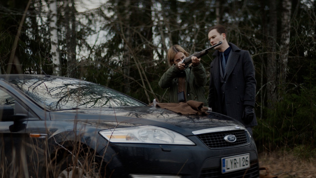
Arctic Circle, series 2
Walter Presents
Filmed in Finnish Lapland, this crime drama about police officer Nina Kautsalo (Iina Kuustonen) is almost as chilling and unforgiving as its setting. The first series, filmed prior to the coronavirus pandemic, notably followed the characters’ desperate attempts to control a deadly virus. In this second series, which recently debuted in the UK on the Walter Presents streaming service, Kautsalo is forced to confront a past that she is trying to forget after the discovery of her unexpected connection to a shocking murder.
Out now
The Lee Ungno residence: A traditional-style dwelling built to champion Korean art
A hanok sits in the idyllic landscape of Vaux-sur-Seine, a rural commune on the north-western outskirts of Paris. The architecture of this traditional Korean house is defined by its screwless construction and the use of structural timber columns, beams and giwa (clay roof tiles). This one is perched on a ridge overlooking the slow-moving Seine and surrounded by greenery amid a landscaped campus of four other buildings, including an old French country house and a striking contemporary structure.
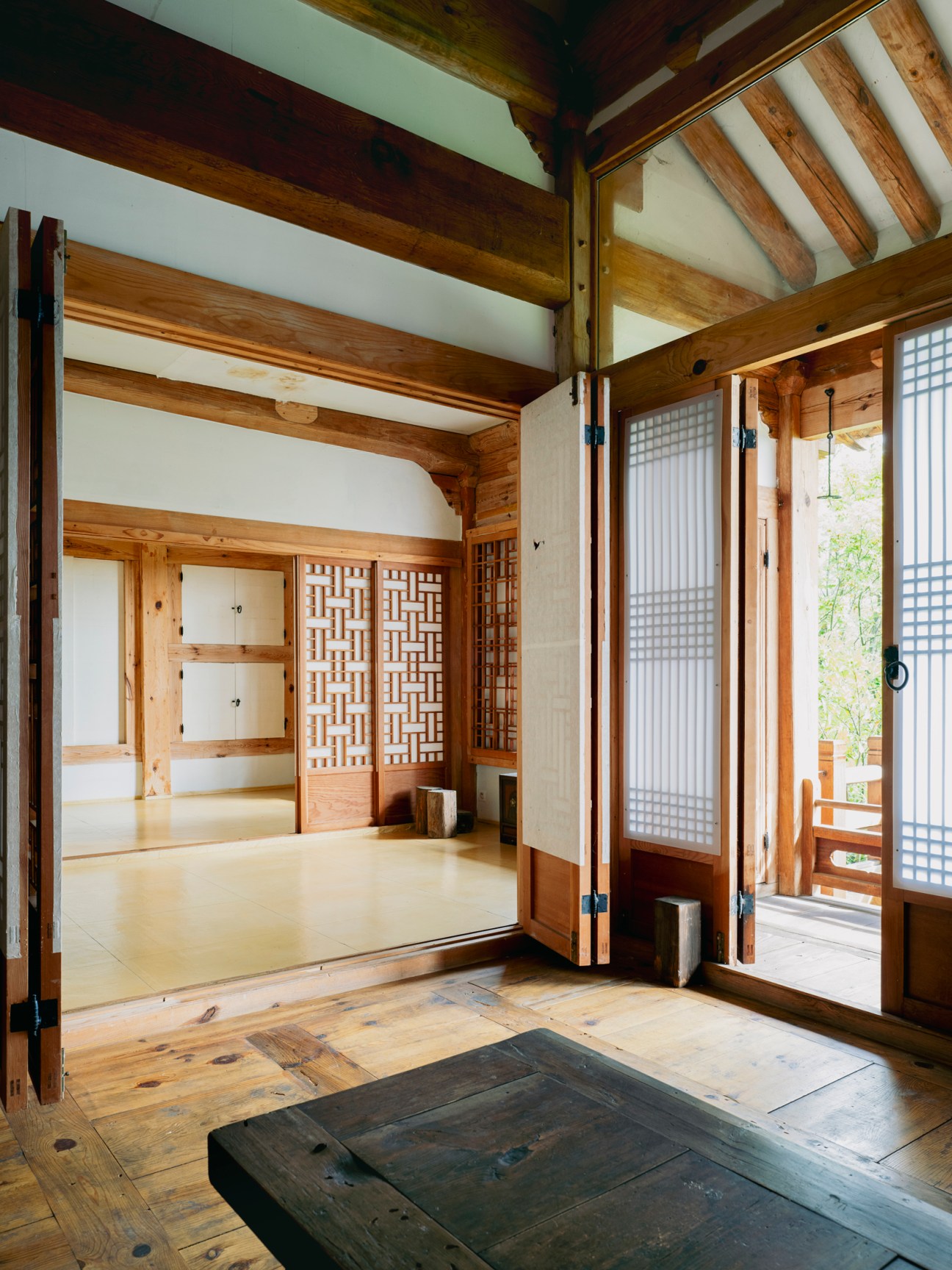
“Every building here has a longstanding story,” says the proprietor, Park In-kyung. A postwar and contemporary Korean artist, Park has girlish good looks that belie her 98 years of age. The campus has been her home for more than 30 years. Born in Korea in 1926, she married renowned mid-century artist Lee Ungno in Seoul in 1949.
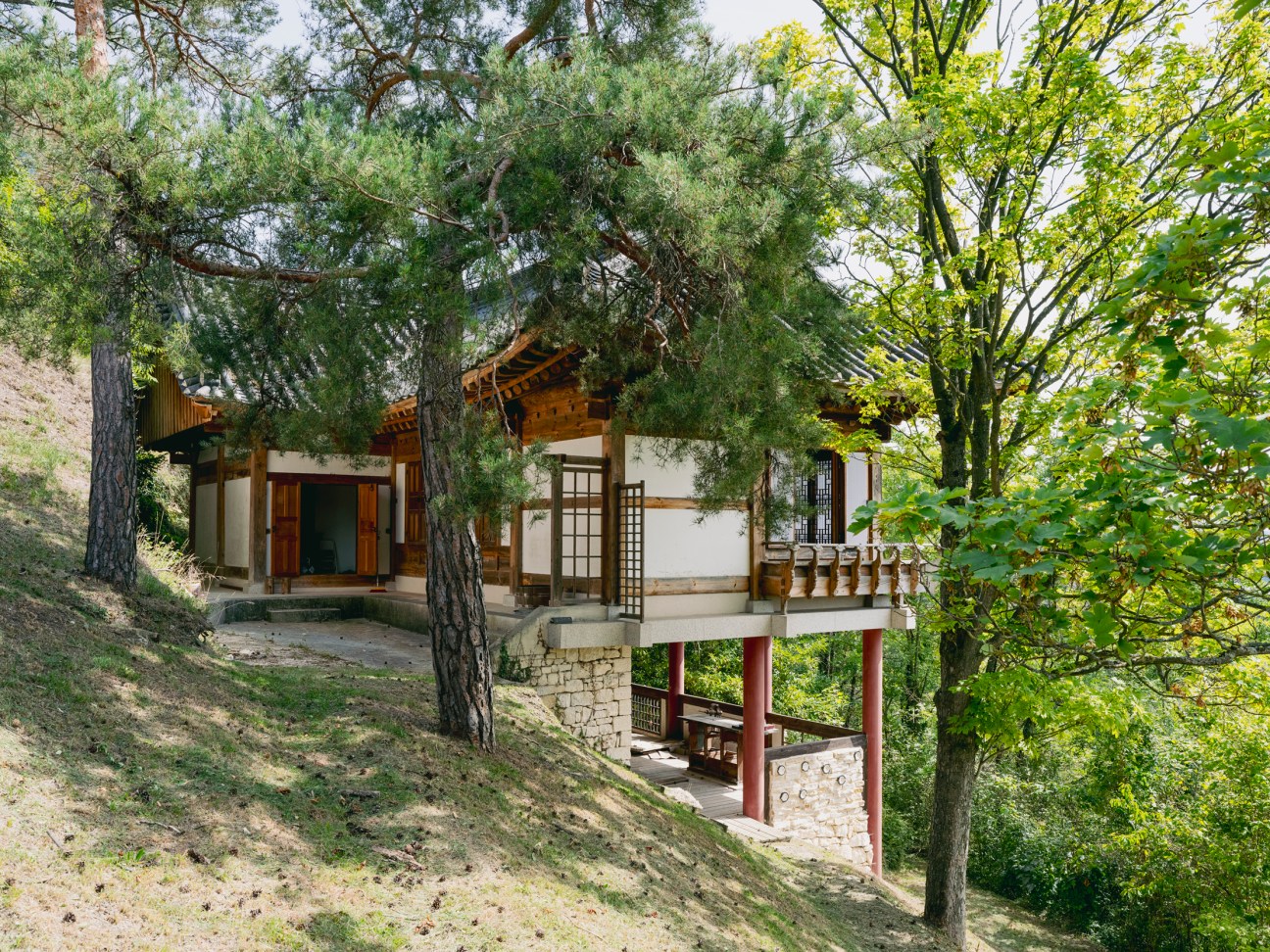
Keen to explore the intersection of Korean and European art, Park and Lee – who was also known by his nom de plume, Goam – relocated to Paris in 1960 at the invitation of renowned art critic Jacques Lassaigne. Over the ensuing years, Park and Lee continued to work and champion Korean art in Europe, establishing the Academy of Oriental Painting in Paris in 1964 and teaching traditional painting and calligraphy. Since Lee’s death in 1989, Park and their son, artist Lee Young-sé, have worked hard to continue his legacy. Key to this was buying a plot on the highest ridge in Vaux-sur-Seine on which to build the hanok. “A long time ago we lived in a place overlooking the Han river in Seoul’s Mapo district,” says Park. “I always felt a longing for my hometown so we chose a location where I could overlook the Seine.”
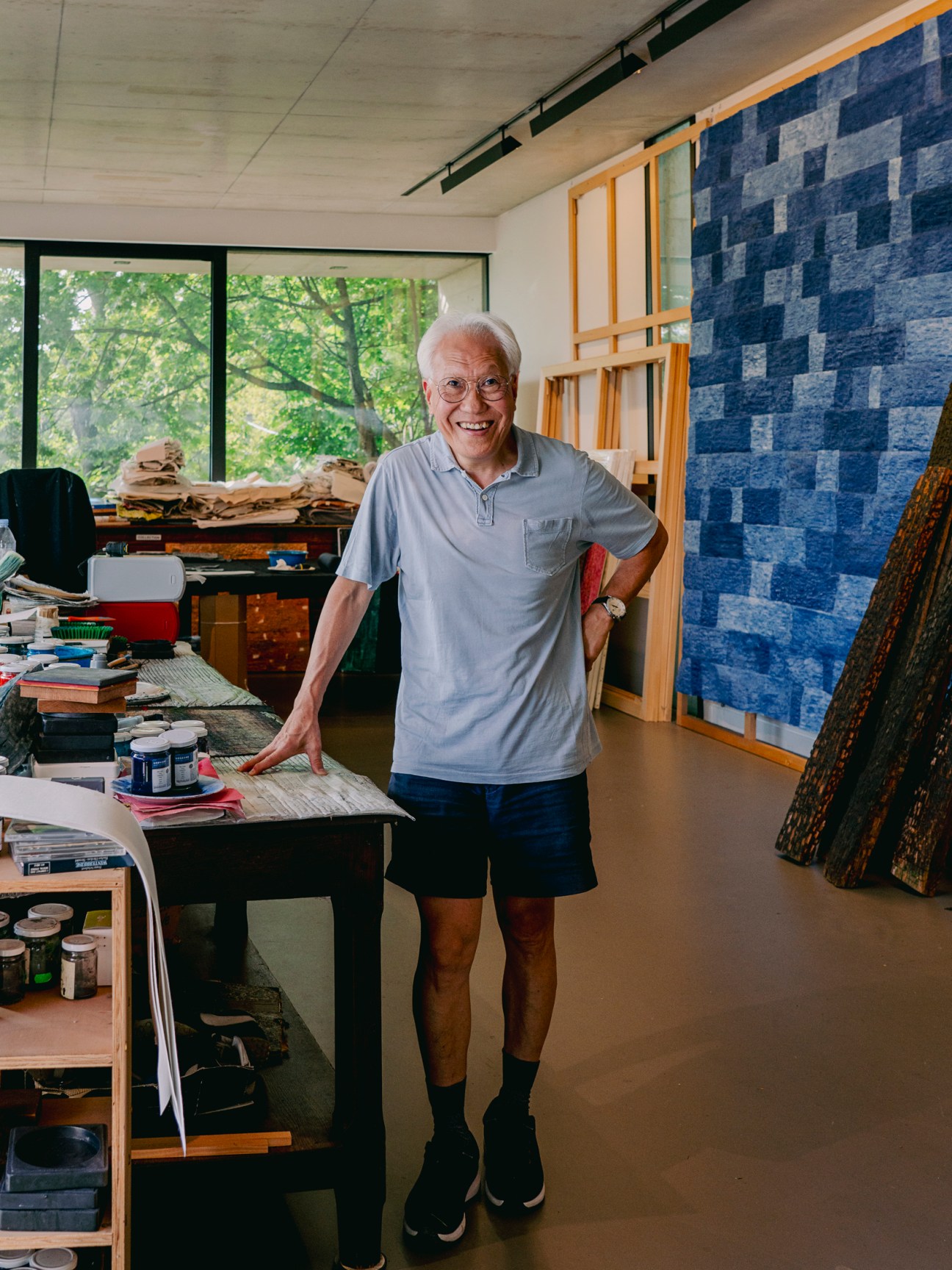
The initial idea for the structure had come from Ungno, with the artist expressing a desire for a daemokjang (master carpenter specialising in traditional Korean wooden architecture) to build a home for the family in France. “He said, ‘I want to build a hanok and hang a few of my paintings in it,’” says Park. To honour his wish and preserve some of his work, Park and Young-sé oversaw the ambitious house-building project. They knew that, in order for the structure to be authentic, it would have to be built in South Korea then dismantled before being shipped to France.
The structure was made using pine trees from Gangwon State, South Korea’s northeast state. To protect the timber from humidity on the journey to Europe, every component was starched with traditional Korean paper, which tightened around the wood as it dried, preventing the timber from twisting when it was exposed to moisture.
The project was reassembled with the approval of the local authority in Vaux-sur-Seine. On the final day of work, a message was engraved into the central ridge beam of the hanok, reading “At 11.00 on 28 June 1992 this ridge beam was raised to complete the framework of the roof. Infinitude and endlessness.” Those last three words expressed a desire for the building to have a timeless quality, much like Ungno’s work.
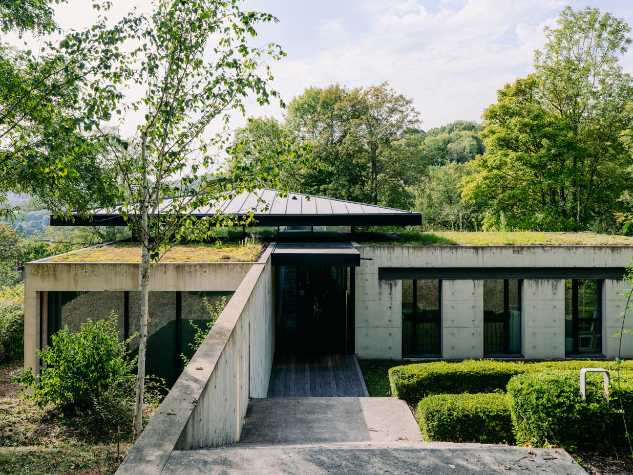
And indeed it does: the L-shaped structure finds harmony with the natural surroundings thanks to its clay walls and the hanji-finished wooden window frames – a materiality suggesting that the building might one day return to nature. It’s a quality enhanced by the hanok’s exterior windows, which frame views of the Seine. “Windows are the face of a hanok,” says Sim Yong-sik, a somokjang (Korean carpenter with a specialism in traditional wooden furniture) who worked on the project.
Park and Ungno’s contemplative nature is reflected in the decision to install low windows, which allow people to enjoy the views while sitting on the floor of the hanok, in traditional Korean style. “It’s crucial to consider not only the size of the house, the intensity of the wind and the amount of light but also the personality of the resident to make good windows,” adds Sim. The hanok is now used as a residential space.

Complementing the work of The Academy of Oriental Painting in Paris is the on-site Goam Academy, which has hosted calligraphy and ink-painting classes in a contemporary concrete building designed by French architect Jean-Michel Wilmote in 2014. “The Goam Academy continues the legacy of the Academy of Oriental Painting, which was the first institution of its kind in Europe,” says Young-sé, who explains that the building, like the art programming, aims to promote cross-cultural understanding between South Korea and Europe. Wilmote’s design is characterised by a uniquely shaped roof, which references the low hip-and-gable form of a hanok. Inside there is a similar sense of openness thanks to high ceilings and full-height windows, which establish a relationship between the indoors and outdoors, making it a perfect backdrop for creating art. “It’s a space where it is easy to move large-scale artworks in all directions,” says Young-sé, who uses the studio between academy terms. “And it has plenty of natural light.”
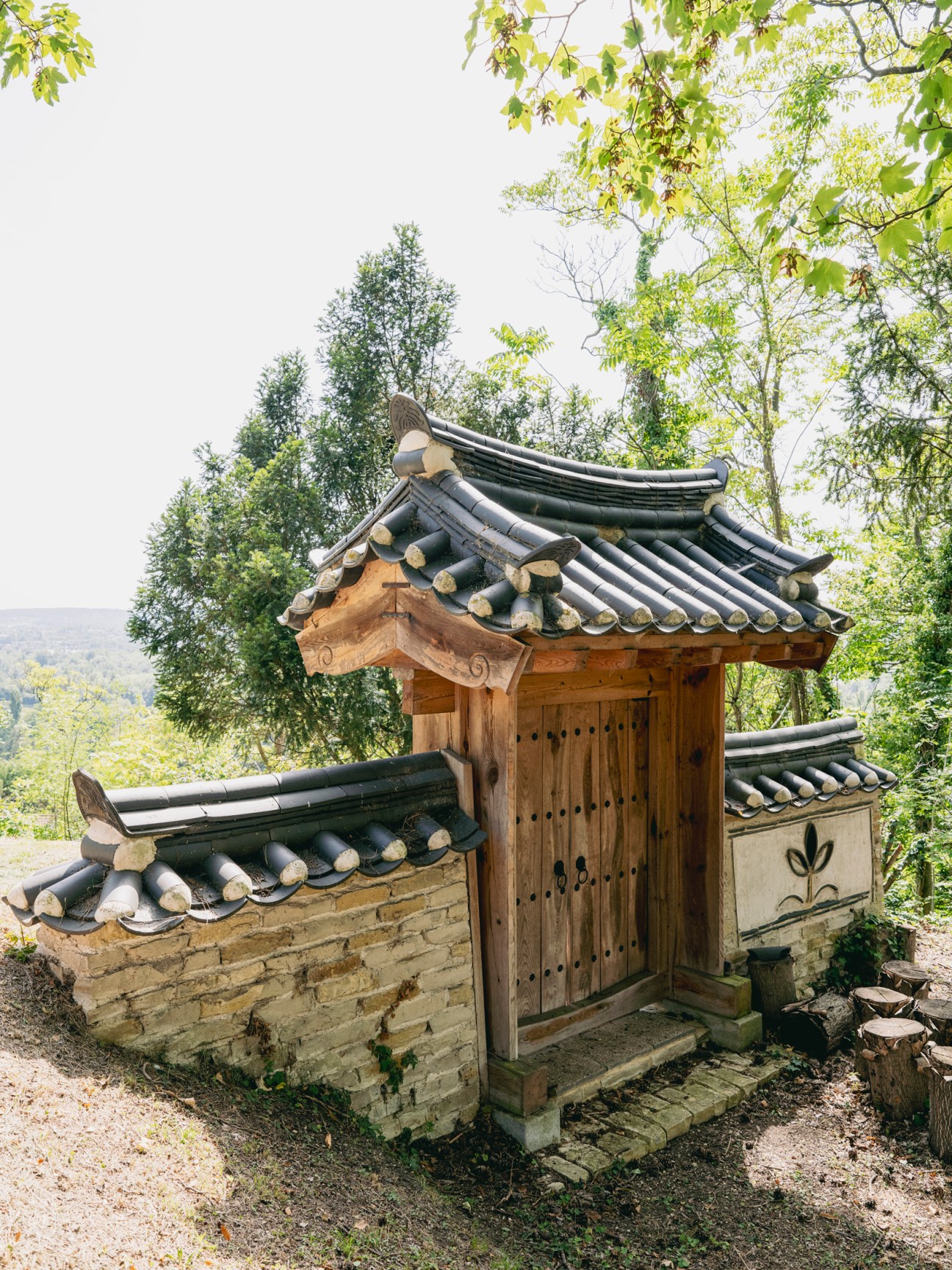
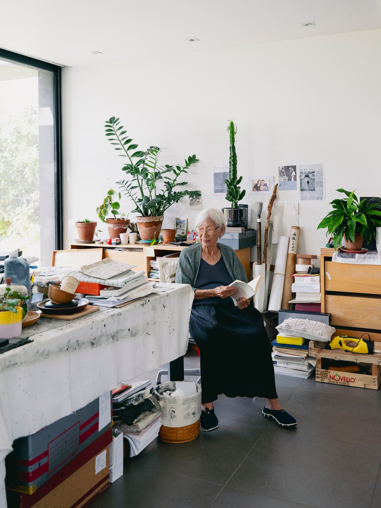
While completed posthumously, both buildings capture Ungno’s ambitions. It is a legacy that is protected by the fact that both Park and Young-sé continue to live on the site. Young-sé’s residence is an old farmhouse, which was already here when Ungno and Park bought the land; Park’s residence and studio is situated on the lot’s highest point – a two-storey building also designed by Wilmote. The latter is a bright space with a wide terrace from which Park continues to paint and draw. Her creative energy is also channelled into the role of honorary director of the Lee Ungno Museum in Daejeon in South Korea, where she is deeply interested in nurturing younger generations of artists who are looking to follow in her and her husband’s footsteps.
As part of her work with the museum, Park has launched the Paris Lee Ungno Residence programme, which brings three artists across to France every year. “I started running the residence programme to pave the way for young artists to interact with the wider world,” says Park, who remains glad that she and her family have been able to offer a warm welcome, and a spectacular setting, to contemporary South Korean artists in Europe.