
Issues
How a Swiss architecture duo transformed a dilapidated farmhouse into a light-filled, modern home on Lake Geneva
“How we ended up here is a fairy tale,” says Ueli Brauen. The co-founder of Lausanne-based practice Brauen Wälchli Architectes is referring to the home near the small village of Noville that he shares with Doris Wälchli, his partner in business and life. The fairy tale started here at the eastern tip of Lake Geneva in the early 1990s, when the couple had a client whose mother painted landscapes. “I saw one of her works featuring a little house in a field and said, ‘That home has some character,’” says Wälchli. “The woman told us that it was an actual house nearby.”
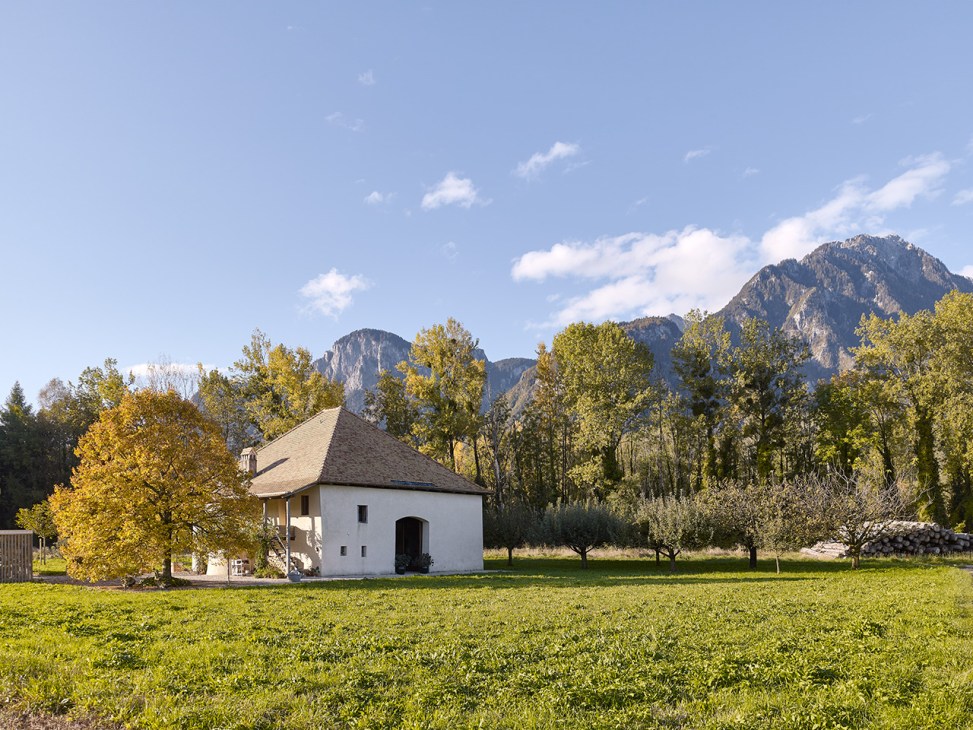
The architect duo promptly visited the property, finding a dilapidated structure in the middle of a clearing – an 18th-century stone farmhouse combining a barn, stable and living quarters. It had been abandoned for more than four decades. “We contacted the local community, who were the owners and had been leasing it out to farmers. They said that if we were interested, we could have it.” The commune owned a demolition permit for the crumbling building, which had vast cracks in its walls and damaged roof-tie beams (a previous tenant had sawn through them).
Despite this, both parties recognised the significance of the structure, a traditional Savoyard agricultural building with a square floor plan and boxy, mostly windowless façades. “It was once a common typology but now it’s very rare,” says Wälchli. “A lot of farmhouses in the region are abandoned because it’s not easy to receive permits to rezone these houses for purposes other than farming.”
The architects and commune came to an agreement whereby Wälchli and Brauen would have a free lifetime lease on the property on the condition that they rehabilitated the home. “The authorities also listed it as a historic monument, which gave us subsidies from the canton and Swiss governments.”
The successful listing ultimately funded the renovation of a structure that is now a love letter to the region. The duo, while being Swiss-German, felt themselves drawn to the French-speaking cantons in the west, first to study at the Swiss Federal Institute of Technology of Lausanne, and then by the lifestyle. “In Bern, where I’m from, we say that the people here drink too much wine and are always late – and we have adapted to that quite well,” says Brauen, laughing, before adding that the landscape is a pull too. The area around Noville is defined by the flat Rhône delta that transforms rapidly into mountains. “There’s no transition between the two landscapes. It means that when you see our home in this low clearing with steep mountains in the background, it’s like a rock, a strong form – a monument.”
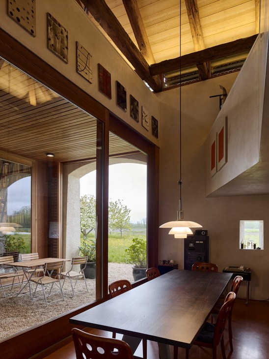
The brief that the duo set themselves was to enhance this existing character. “We wanted to give this place its splendour back,” says Brauen. “So we asked the house what it could be.” Its answer? A modern take on the traditional tripartite farmhouse layout. The stable was transformed into a living space, the ground-floor hay barn was reformed as a patio enclosed with sliding glass doors with bedrooms added upstairs, while the original kitchen maintained its function but was given a contemporary overhaul. “We adapted the project to the qualities of the existing building,” says Brauen. “The living room is small and the bedroom large. Normally it’s the other way round but the house wanted the layout to be like this.”
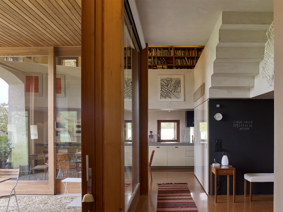
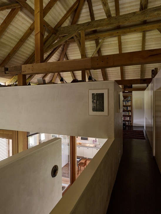
Key structural adjustments were made. The roof was restored with beams straightened and joints repositioned, allowing the exposed structure and rafters to be retained. All the roof tiles were replaced and crumbling walls repaired using rubble found on site. Modern conveniences were added: an insulating mineral render was applied to the walls and new underfloor heating is powered by a heat pump drawing energy from the water table below. Interior elements, except for two masonry walls, were stripped out, inviting light into the open-plan home. Mezzanines functioning as a reading room and study space hover above the ground floor, which includes a double-height living room, defined by a custom four-metre-high bookcase.
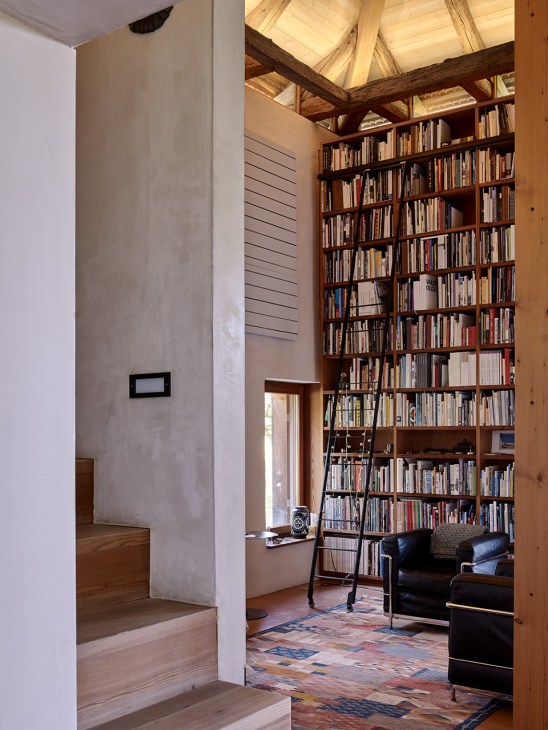
“It’s a reference to Pierre Chareau’s bookcase in Maison de Verre, the modernist glass house in Paris,” says Wälchli, who adds that the bespoke work serves a dual purpose. “The glass door for the patio can slide behind the bookcase, opening up the space.” It’s proof of a subtle efficiency now built into the house, with interventions allowing its original atmosphere to remain intact.
A case in point is the lack of windows. Three small openings were inserted in the upstairs sleeping quarters, with the local authority authorising the architects to make additional openings in the roof to bring in more light. They declined. “We said no because of the existing presence of the house,” says Wälchli. “We wanted to keep it as strong as possible.” As a result, they glazed the gaps between the roof and wall structure, which originally ventilated the barn, bringing light to the upper floor without altering the structure. A creamy Jura gravel was also laid around the house and in the patio space, reflecting additional light into the interiors.
Iconic furniture is dotted throughout the home: Le Corbusier armchairs; a small table by Pierre Chareau that sits in front of the bookcase that he inspired; bentwood dining chairs by Josef Hoffmann, a Jean Prouvé table; Eames side tables; Louis Poulsen pendant lights; and simple timber stools to the design of mid-century Swiss carpenter Jacob Müller.
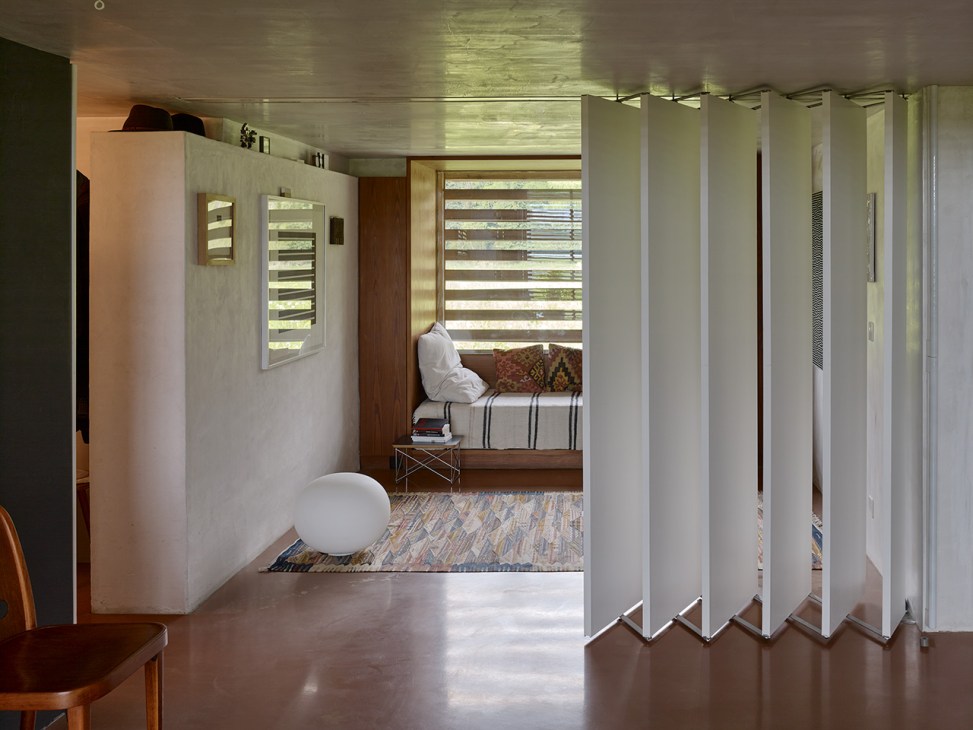
All of this complements custom in-built furniture, including a long daybed sitting in a nook that can be sectioned off by sliding horizontal lamellas. “It’s a reference to the mihrabs of Arabic architecture – Ueli worked in the Middle East,” says Wälchli. “The daybed corner is perfect for coffee on winter mornings when the sun comes through the space. In summer we move out to the patio; we live in the house according to the changing seasons.”
Despite this inbuilt seasonality, the house remains visually connected to itself year-round. “Wherever you are, you can see the whole volume,” says Wälchli “When you’re in the ground-floor kitchen, you can see the top of the roof. It feels generous. There are high spaces and compressed spaces, and there are few windows, but all of the openings have views like paintings.” It’s an appropriate observation, given that a painting first drew Brauen and Wälchli here. Some 30 years on, the duo have transformed the home on that original canvas into a living work of art.
Colom: The new three-storey, multi-brand shop in Palma that’s raising the bar for retail
In the heart of Palma, the doors have just opened on a new multibrand shop for men and women – and it’s one of the braver retail ventures that the city has seen in a long time. Challenged by the impact of tourism, many old-school bakeries and shops here have closed and trinket merchants have replaced them. But in the heart of the Mallorcan capital are a trio of neighbouring businesses that cater for locals and the sort of visitors who want to return home from a city saunter with something more substantial than a fridge magnet.
These are places that are helping to raise the bar when it comes to design, service and the commitment to doing retail well. Monge is a purveyor of Mallorca-made shoes; Relojería Alemana is a luxury watch and jewellery shop; they are now joined by the three-storey Colom, which takes its name from the street where they all sit, Carrer de Colom.
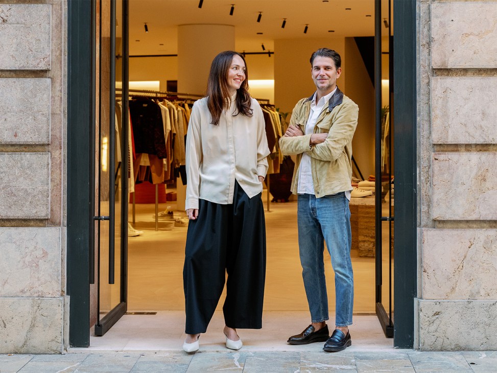
Colom was created by Suso Ramos – the co-founder of another fashion shop in the city, La Principal – his partner in life and work, Liticia Cerqueira, and Pablo Fuster, whose family owns the watch store. “We had been talking about opening a womenswear shop for many years – somewhere with the space to show brands,” says Cerqueira. “Suso and Pablo had lunch one day and Pablo mentioned this vacant property. Suso suggested a pop-up but Pablo said, ‘Let’s do a store.’”
Instead of just offering upscale womenswear, they decided to bring in menswear, luggage and fragrance across the 750 sq m space. To re-engineer the building, the team called on De Prada Arquitectura, whose founder, Carlos de Prada, had designed a house for Ramos and Cerqueira. Here, he inserted a black timber staircase that unites the three floors, employed local furniture-makers (Resmes) and lighting producers (Contain), and commissioned vitrines and benches from island carpenters.
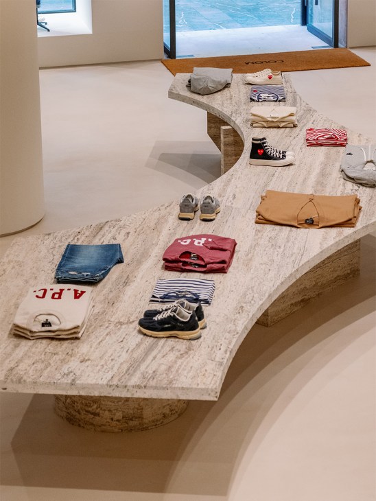

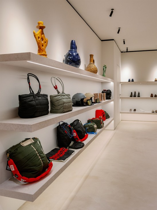
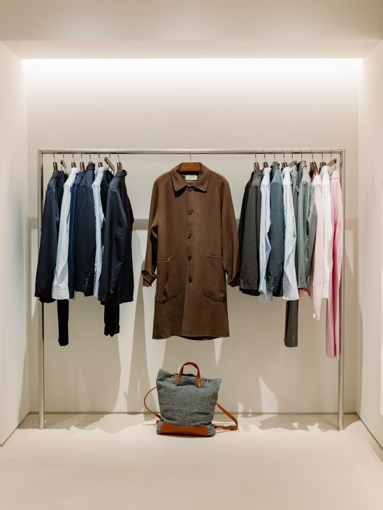
The outcome is a tranquil backdrop to the collections on display. “The architecture cannot eclipse the clothing; it works like a gallery, a space where you can show the clothes,” says De Prada. He stresses that the final design was the product of a close partnership with his clients, who were keen to treat materials with respect and eliminate the use of chemical-heavy paints. “I love this profession, this island, but you need the right clients to help protect it.”
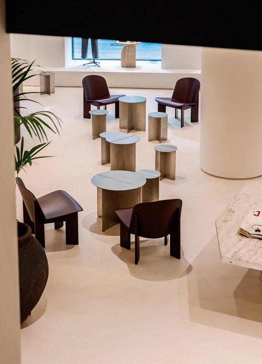
The shop’s spacious, elegant design is important for more than simply customer experience. “At La Principal, we don’t have enough space so we focus on casualwear. But here we can attract more elevated brands and give them the space to be shown well,” says Cerqueira, who is from Paris and has worked for Veja, Maison Margiela and Maison Kitsuné. In addition to Officine Générale, Barena Venezia and By Malene Birger, the shop also sells the Mews Clothing line, founded by La Principal.
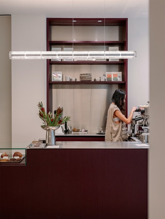
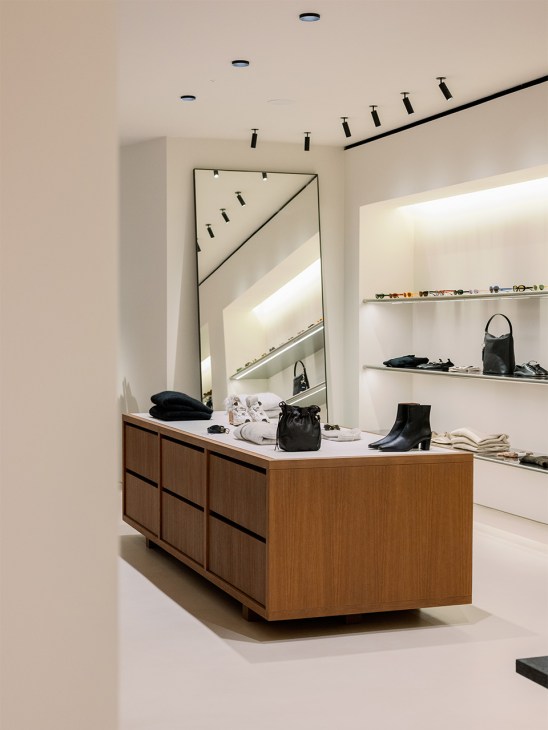

Though in its infancy, Colom is already finding an audience, many of whom have a base on the island. “People are coming in and saying, ‘We really needed this,’” says Cerqueira. She is clear, however, that there’s lots of work ahead as they develop a store that’s short on pretension and high on design – a place that shows what the city could be like with fewer trinket shops.
Carrer de Colom 9, Palma
Read next: The Monocle City Guide to Palma, featuring the best hotels, restaurants and retail spots in the Mallorcan capital
Studio Nicholson’s Nick Wakeman and Aaron Levine launch minimalist menswear capsule
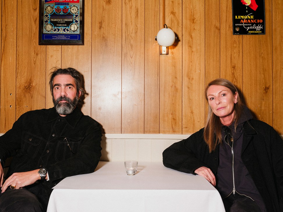
Once you reach a certain level of success, true peers can be hard to find. When Monocle meets Studio Nicholson’s founder and creative director, Nick Wakeman, and American menswear designer Aaron Levine an hour before the launch party for their joint collection, the pair are adamant that they couldn’t have done this with anyone else. “This is not a brand collaboration,” says Wakeman. “We’re co-designing.” Wakeman founded her brand 15 years ago; Levine spent the early part of his career revitalising some of the US’s biggest high-street names, such as Vince and Abercrombie & Fitch, before launching his own label in 2024.
Now, he’s challenging Wakeman to reinterpret Studio Nicholson’s distinct, minimalist aesthetic through a 26-piece co-designed capsule collection. The line includes everything from knitwear to denim shirting and suede jackets, taking cues from vintage and transatlantic references. It even ventures beyond the brand’s signature monochromatic palette. Here, the two designers discuss how they work together and why experience, humility and integrity matter.
How did the collaboration come about?
Nick Wakeman: Studio Nicholson has collaborated with other brands before but I have never worked toe-to-toe with another designer. I wanted something to light a firework in me and, during a management meeting, I suggested bringing in someone to work alongside me. Aaron’s was the only name I put in the pot.
Aaron Levine: We’d spoken online for a few years and finally met a year and a half ago in London for a 15-minute breakfast. It clicked. Since then, we’ve met regularly in Paris or London and begun making something together – I’d been suggesting we should for years.
Did you find common ground from the beginning?
NW: We were already sending each other reference points: films stills, archive imagery, memes of Rod Stewart on a boat. Aaron had this great presence online. I remember seeing him in his garden wearing a terry robe and Charvet slippers and thinking, “This guy doesn’t care – I love that.”
What did the design process of creating your capsule collection look like?
AL: We’d never done this before and I was nervous. I came to London for a week and first thing on Monday morning we headed out to source some vintage pieces for reference. I need to see all the textures and colours together, so I laid out outfits on the floor. It looks chaotic to other people but that’s how it comes to life. Nick got it immediately – we were speaking the same language.
Aaron, you have admitted that you may have been let go from your role at Abercrombie & Fitch for not saying “yes” enough. Why challenge ideas?
AL: I spent about 20 years working in big, publicly traded companies. There are boxes to tick and creativity becomes a pitch. Saying “yes” is easier. With Nick, it’s not about selling an idea. It feels like being in a band again, playing music that you love.
NW: As much as you have brilliant people working for you, they’re not always going to throw you a curve ball; they want to please. He’s not like that. After 30 years in the industry, it’s rare to work with someone the same level as you. Your peers are the ones with a Rolodex of information and the reference points – fashion is intellectual after all. You need that mutual respect to hear those opinions and take the challenges.
What’s the difference between working with highstreet brands and higher-end, more niche labels?
AL: The brands I’ve chosen to work with are global, vertically-integrated retail brands. I don’t sign up to the high street. I let the design teams know that straight away. At Abercrombie, we completely changed its customer demographic – you can do whatever you want to do, as long as you are true to the customer you’re targeting. It doesn’t matter if it’s a mall-based store or luxury label, you have to have integrity.
What have you learnt from working together?
NW: I don’t usually gush about anyone, but I’ve loved having a proper partner. And as much as I talk him down from doing turquoise ribbed sweater, we meet in the middle. I’d never have made the pieces in this collection otherwise.”
AL: I feel like I worked 20 years in this industry to be able to work with Nick. She’s taught me discipline.
A culinary roadtrip through Latvia’s Gauja valley, visiting the best restaurants beyond Riga
Most visitors to Latvia stop in Riga. Every year, more than a million tourists pass through the old town to see its art nouveau façades and dine in its restaurants that now rival those of its Nordic neighbours. But if you’re on the lookout for an experience that’s a little closer to nature, head north into the forests and farmland of the Gauja valley. This is Latvia’s breadbasket, brimming with fruit, fish and game. It’s also where you’ll find new and innovative restaurants that are quietly turning the countryside into a culinary destination.
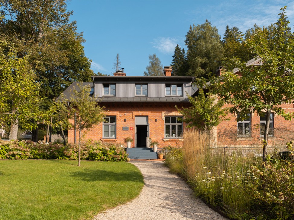
Riga to Ligatne, 90 minutes by car
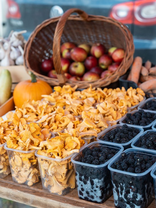
Drive north from Riga and, after an hour, you’ll reach the sandstone valley around the town of Sigulda. There are castle ruins on the hillsides as the river wends past pine forests and through meadows. It’s not just beautiful but bountiful too: freshwater pikeperch swim in the lakes and chanterelles nestle beneath trees; strawberries and apples grow fat before the long winters set in.
In the town of Ligatne, once known for its paper mill, pride of place belongs to Pavaru Maja (“chefs’ house”). The restaurant, which has received a Michelin Green Star for its commitment to sustainable cooking, occupies a historic red-brick villa that stood abandoned until Eriks Dreibants and Juris Dukalskis took it over. On a recent afternoon, the pair poured a shot of birch-sap syrup while unwrapping cheese from Soira, a local maker.
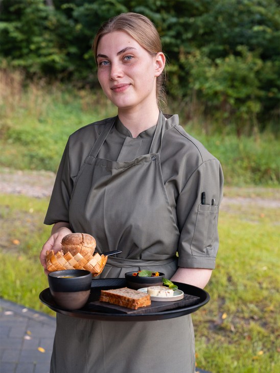
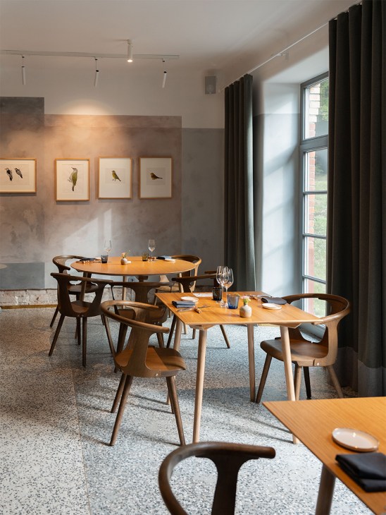
“We had a restaurant in Riga but here you can be closer to the farmers,” says Dreibants. “You get to know the people who grow your carrots or make the honey that you use.” Its eight-course set menu changes every few months to reflect the seasons and the team makes the most of the local community: its ceramics, for example, are made by potters in the region. Its plates are fashioned from birch bark and guest chefs regularly grace the kitchen to offer something new.“That keeps us on our toes,” Dukalskis tells Monocle. One week it might be an Icelandic-Lithuanian collaboration, the next an inventive take on those freshly caught perchpike.
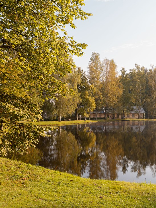
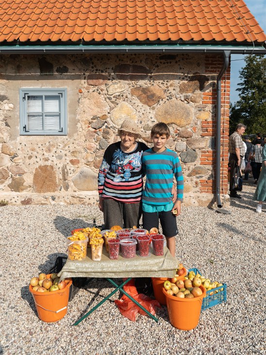
Ligatne to Cesis, 30 minutes by car
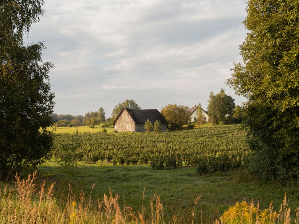
About 20km further north, you’ll find a medieval castle built by the Livonian Order in the middle of Cesis, the town where chef Maris Jansons moved after two decades in the capital.
Jansons was in charge of Biblioteka No 1, one of Riga’s top dining rooms, but found himself craving a slower pace of life that was more in tune with nature. “Everything was concentrated in Riga – but why not here?” he asks as we tuck into marinated strawberries served with birch-sap ice cream and locally baked rye bread.
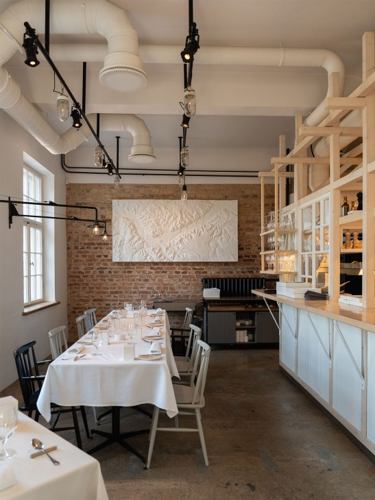
In 2017, Jansons opened Kest, a 25-cover restaurant. It has a deliberately muted aesthetic – think white tablecloths, simple glassware and a veranda-like interior – that allows the food to do the talking. Its name means “the other side of the river” in the Livs language; Jansons likes the way that it evokes the Gauja and the ideas and goods that have long flowed along it.
His menus continue this theme, offering venison and berries in the warmer months and dishes such as preserved tomatoes when the mercury falls – though you’ll also find a kabayaki-style cod dish with Japanese mayonnaise on the list.“Quality first, not geography,” says Jansons.
The desserts here, however, lean conspicuously into local specialities. In the summer, there’s a dish that riffs on the traditional honey cake with sour cream and sea buckthorn. Jansons insists on challenging himself with every menu change. “If it doesn’t surprise me, why would customers be surprised?” he asks.

When Jansons started Kest, Cesis wasn’t quite ready for what it served. “In rural areas, people like to cook at home,” he says. “Restaurants weren’t really part of the culture at the time – a result of the Soviet years.”
But curious diners eventually found the restaurant: at first, it was Rigans seeking something different, then tourists and, more recently, local residents looking for somewhere exceptional to celebrate special occasions. Jansons sees the project as cultural as much as culinary. “Food is how we reclaim what was taken during the Soviet occupation. It is art and tradition. It’s what keeps a nation together.”
Cesis to Valmiera, 30 minutes by car
Further north still is Valmiera, a town with a theatre, a booming industrial base and a growing population of younger people moving back from the capital. It also boasts Akustika, a restaurant that has helped to make dining out a part of local life here.
Its founder, Ugis Bormanis, is originally from Riga. Like Kest, it took time for residents to come round to what Akustika offers. “We were more ingredient-driven than people here were used to,” says Bormanis. “At first, they didn’t understand. Now, most of our guests are locals.”
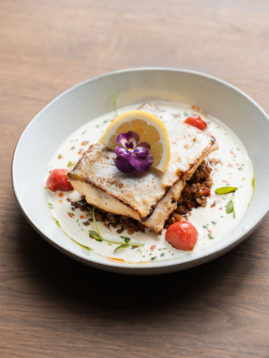
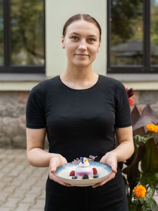
The restaurant seats 70 and is often full at weekends. Duck breast is the bestseller; other favourites include freshwater fish from nearby lakes and beef tartare sourced from an organic ranch. Bormanis likes to keep things simple. “Don’t cover the flavour – you want to taste the beef, not the garnish,” he says.
On the drinks list are lemonades flavoured with quince, meadow flowers and basil, and wines from producers that aren’t stocked by supermarkets in Riga. “We want people to try something that’s new but still feels close to them.”
Our culinary picks
Pavaru Maja
Farm-to-table restaurant amid natural surroundings.
Kest
An ambitious take on Latvian cuisine by one of the country’s best-known chefs.
Akustika
A popular neighbourhood bistro with seasonal dishes.
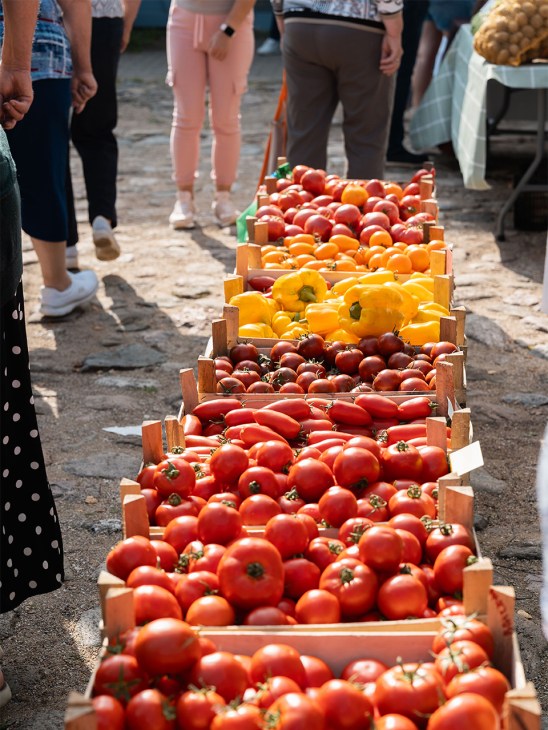
Straupe Slow Food Market
Farmers sell their fresh produce here on Sundays.
Getting here
First, fly to Riga Airport. It offers direct flights to and from more than 100 destinations so getting here shouldn’t be difficult. Rent a car and stock up on snacks and drinks: this is a two-day trip on pleasant roads that takes you through national parks, beautiful villages and verdant farmland. The best place to stay on this route is the medieval town of Cesis.
Inside Amy Powney x Finisterre’s design-led capsule wardrobe for your outdoor adventures
Amy Powney began her career “sweeping the floors and working her way up” at Mother of Pearl, the London-based ready-to-wear label founded by Maia Norman. She became the brand’s creative director in 2015 and, for nearly a decade, worked to modernise the its business model by moving away from runway shows, offering seasonless designs and investing in natural, environmentally friendly materials. Her impact has been felt across the fashion industry – she has helped to educate consumers to make better shopping choices and held her peers to higher standards.
At the start of 2025 she decided to go out on her own. She launched Akyn, a women’s ready-to-wear brand, and soon forged a partnership with Cornish label Finisterre, known for its specialist outdoor wear. “I just turned 40 and felt it was the right time to go my own way,” says Powney. “The world has changed so much, I wanted to say something different.”
Building a sustainable supply chain is key to her strategy, with Akyn producing in small Portuguese factories and using only four fibres: cotton, lyocell, regenerative wool and European linen. “Until the industry finds a viable recycling solution, I don’t want to take part in the fossil-fuel industry, so I limit our fibre pool to natural or regenerative textiles,” she says. “My ultimate vision is to create a product that leaves no trace.”
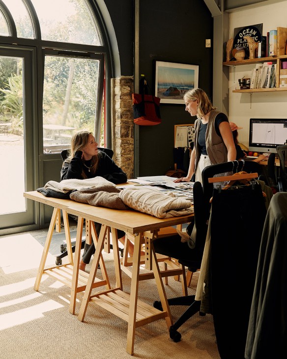
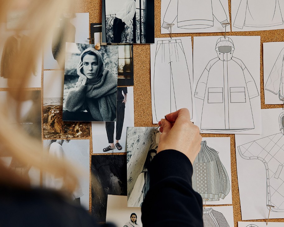
This time, Powney is thinking more deeply about the creative process. “We lost connection to the craft and the process. When I think back to my time as a student, we were researching the likes of Martin Margiela, Coco Chanel and Alexander McQueen, and so much was about design. If we can emotionally engage people back to the product, we can get them to be less consumption-focused and more swooned by creativity and connection [to the makers].”
Powney is also ensuring that she is surrounded by people who inspire her, appointing an advisory community that includes the Tank magazine CEO, Caroline Issa, and Textile Exchange’s Claire Bergkamp. “I want this to be a community brand,” says Powney. “That’s why I didn’t name it after me. I believe in being part of a network.”
It’s also why she began working with Finisterre at the same time as she was launching Akyn, having found common ground with its founder, Tom Kay. “What you see is what you get with them, there’s so much heart and soul in what they do,” says Powney, who has been visiting Cornwall, in the southwest of England, to design her first collaboration collection with Kay. “As a designer who was so accustomed to working around the clock and never leaving the studio, it was so nice to visit the Finisterre HQ and connect to nature, to a different way of making products. Going for a morning swim is part of their routine.”
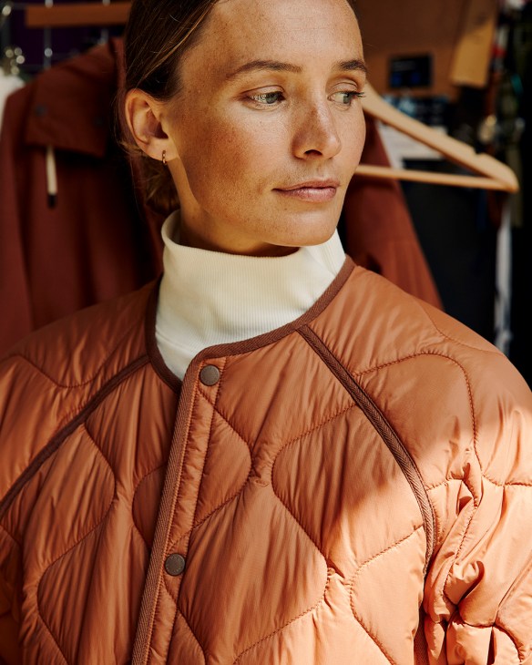
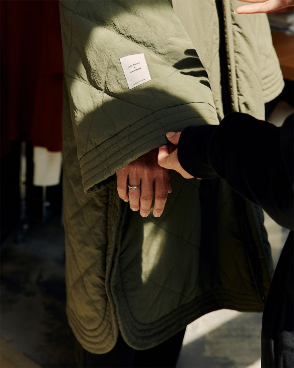
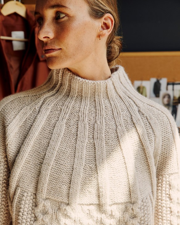
The new capsule includes the kind of coldweather essentials in which Finisterre specialises: a waterproof parka in elegant burnt orange; a quilted jacket made of recycled fishing nets; a long coat that can double as a beach robe. There’s also knitwear, from cosy fishermen’s rib jumpers to knitted balaclavas – part of a strategy to expand the brand’s offer to include more urban wear and fashion-focused designs.
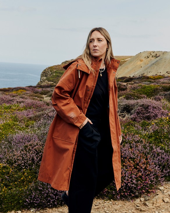
“There’s a massive gap in the market for outdoor products that are also design-led,” says Powney. “Urban brands tend to prioritise design, while most outdoor brands purely focus on function. We wanted to create something beautiful, with interesting silhouettes, that still retains all the technical qualities. Our brands are very similar in terms of our ethos, we just produce very different clothing. It was amazing to meet in the middle.”
akyn.com; finisterre.com
How Lisa Yang’s Inner Mongolian cashmere balances rapid growth while staying independent
In her wood-panelled Stockholm headquarters, Lisa Yang pulls out three little bags of undyed, unwoven cashmere yarn – they are as light as air and smooth as butter to touch. “Inner Mongolia produces the world’s best cashmere because the extreme cold causes its cashmere goats to grow exceptionally fine, long and soft undercoats,” she says, as she slowly unravels parts of the woolly clusters. “We always source the best cashmere available. This one is particularly soft, durable and lightweight.”
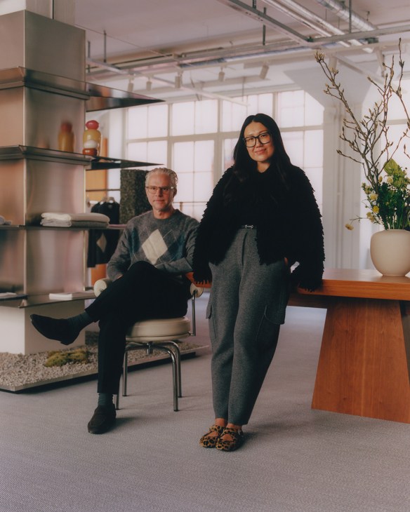
Having grown up near Inner Mongolia, a northeastern region of China, Yang’s familiarity with the fibre stretches back to her childhood. Her parents were involved in textile production and she would visit factories and cashmere herders as a young girl. When she moved to Stockholm, Yang put this knowledge to good use by launching her eponymous label with her husband, Samuel Stenberg, in 2014. The result is one of the fastest-growing cashmere specialist brands in the luxury market.
“We had this shared dream to build a perfect business,” says Stenberg from the office that he shares with Yang. The couple are dressed in cashmere sets from their own collections (grey trousers and a voluminous black cardigan for her and a fuzzy argyle jumper for him) and we are surrounded by fabric swatches, sketches and inspiration mood boards. “Our three pillars are to be profitable, low-risk and scalable. We started with no external capital, which meant slow growth at the beginning, but word of mouth eventually helped fuel growth.”

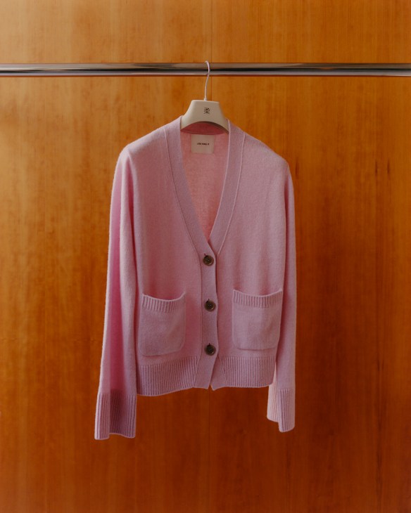
The brand, which has remained independent, turned over €20.8m in 2024, with a 900 per cent increase in sales over the past four years. The company is stocked in more than 500 retailers across 45 countries and Stenberg and Yang also hint that a retail shop might be on the cards in the near future.
The construction and quality of the cashmere is part of the duo’s winning formula but the appeal also lies in competitive pricing. Classic cashmere jumpers are priced between €335 and €990, with costs determined by the quality of the fabric rather than marketing or inflation.
“We use the best fibres and try to push the craft, working with the fit, the silhouette, the details and innovation,” says Yang as she moves around the company’s showroom, where knitwear across a soothing palette of butter yellow, dark grey and cream line the rails. “The inspiration for the designs comes from Scandinavia but I wouldn’t call the style minimalist,” she says. “We like colour too much to be considered minimalists.”
lisa-yang.com
From Trump to Milei, these are the gifts our world leaders desperately need
There was once a time when world leaders would give a pro forma response to the stock interview question, “What do you want for Christmas?” The answer would be something along the lines of “world peace” or “ending hunger”. But the current crop of global potentates includes several people from whom such a reply might be hard to believe. So let’s ponder instead: what should our overlords ask for?
Friedrich Merz, road bike
Germany is racing to modernise its defence industry while also upgrading its creaking infrastructure. Friedrich Merz, a selfprofessed cycling enthusiast, should get out onto the nation’s bridges and roads to test their condition. His bike should be an expensive one – perhaps an Achielle Ernest – so that he’ll take extra care navigating (and noticing) any potholes.
Javier Milei, six-month macroeconomics workshop
Argentina seems locked in a feedback loop: sharp fiscal and monetary policy moves, market sensitivity and fragile macro fundamentals. Javier Milei should be given a voucher for a six-month macroeconomic policy workshop, along with the book This Time Is Different by Carmen Reinhart and Kenneth Rogoff. The book provides a forensic checklist of how crises repeat – lessons that the workshop could develop into concrete steps.
Sanae Takaichi, ‘Billy Elliot’ DVD and golf lessons
Sanae Takaichi is a great admirer of Margaret Thatcher but Japan is not the UK of the 1970s and policies that work in one political culture or time can fracture another. A DVD of Billy Elliot, a film about a young male ballet dancer in northeastern England in the 1980s, should balance her rose-tinted view of the Iron Lady. And because Takaichi is not a golfer, a voucher for some golf lessons should also make it into her stocking. Flexes on the fairway remain door-openers to international deals.
Recep Tayyip Erdogan, beekeeping starter kit
Turkey is one of the world’s major exporters of honey but it was recently rocked by scandals over counterfeit products. A beekeeping starter kit would help to address this reality at two levels. The hive would be a hands-on reminder that supply chains and standards aren’t abstract; they are jars on a shelf. Rebuilding capacity often begins with small, visible corrections that signal a different set of priorities – and economies, like beehives, can be delicate things.
Donald Trump, voucher for dinner with four historians
What better than an invitation to an undisclosed location for an evening of fine dining that would bring together leading public intellectuals and historians to discuss the perils of sleepwalking into world wars and the long-term consequences of disrupting global trade? The line-up could include historians Adam Tooze, Christopher Clark, Margaret MacMillan and Jill Lepore. Perhaps Xi Jinping could come along too.
Monocle’s cosy manifesto: 15 Nordic-inspired tips to beat the chill this winter
As the northern hemisphere hunkers down for winter, thoughts have naturally turned to staying cosy. But “cosy” isn’t simply a matter of keeping warm: it’s a state of mind. Soft materials, the use of timber and tonal lighting are all necessary to conjure up the feeling. We guide you through the dark days ahead – and let’s just say that our friends in the Nordics are ahead of the game on all (cold) fronts.
1.
Dodge the draught
Windows can be a bane or a boon when it comes to an evening spent indoors: even the most picturesque old apertures (such as the vast, single-glazed vensters lining Amsterdam’s canals) can quietly ruin the mood as the cold creeps through. Technological solutions, including vacuum-packed glass to keep panes slim, are becoming affordable. But if you’re searching for something able to withstand a Nordic gale, the Danes do it best: from Horsens-based Velfac to Viborg’s Unik Funkis and Glaseksperten in Hjørring.

2.
Go snug
Room size matters. Architects need to create homes with cosy corners and rooms that embrace you. While cavernous open-plan spaces can inspire awe, we all need moments of privacy and refuge (from the day, your children, your work-from-home partner). That bijou home office and book-lined snug are accidental embassies.

3.
Put a cork in it
What if we told you about a material that’s light, simple to install and easy to work with? It also absorbs sound and resists water and fire. It’s renewable, biodegradable and you can even enjoy it with a glass of wine. Cork – the bark of a species of oak tree – might have been embraced too enthusiastically in past decades but it’s time for a comeback. Portugal grows 50 per cent of the world’s supply and firms such as Amorim have helped to get this product into everything from homes and furniture to spacecraft.

4.
Under the hat
Colder temperatures offer the perfect excuse to add a hat to your look – it’s the oldest styling trick in the book and will also keep you warm. Finnish-Greek label Onar Studios makes the cosiest shearling bucket and aviator-style hats. If you prefer a more discreet look – and we don’t blame you – you can’t go wrong with a classic fedora by Mühlbauer, Vienna’s most elegant milliner. onarstudios.com; muehlbauer.at

5.
In the best light
To create a welcoming atmosphere, select lighting in warm tones and position fixtures and lamps below eye level. Keiji Takeuchi’s Poet pendant for Italian brand De Padova sits on the floor, while Catalonian interior design practice Santa & Cole’s Sylvestrina mimics candlelight’s gentle flicker. For an evening wind-down, UK-based firm Ocushield has developed bulbs that block the blue light that disrupts sleep cycles. The key takeaway? Invest in lighting by companies that prioritise softness and warmth.

6.
Cosy people are happier people
Can something as simple as the temperature change how we feel about ourselves and the world? We instinctively connect physical comfort with positivity and there’s a growing body of research that’s, well, warming to the idea too. Peer-reviewed studies have shown that feeling toasty promotes interpersonal warmth (cold people are meaner), while a Swiss study from 2023 confirms that it makes us feel better.

7.
Standard bearers
Passivhaus is one of the best standards for well-insulated homes that require little in the way of energy for heating and cooling. The voluntary German code dates back to the early 1990s, when a four-unit row house was built in Darmstadt-Kranichstein that helped to codify these new standards. In 1996 the Passivhaus Institut was founded in Darmstadt and has been a boon for the crusade for cosiness. But you still need to furnish with soft touches (don’t keep things too functional).

8.
Woolly thinking
When thinking about winter layering, it’s easy to overlook the most important layer of them all: undergarments. Investing in your underwear and opting for natural materials will help to keep your body temperature under control as you move between warm indoor and chillier outdoor spaces – not to mention the added comfort. Heritage label Zimmerli is our go-to for high-quality underwear, crafted in Switzerland from the finest silk, cotton and wool.
zimmerli.com

9.
Great Danes
Copenhagen – the closest thing there is to a socialist utopia on Earth – is pioneering one-for-all, large-scale heating. Using energy from biomass that would otherwise go to waste, the system supplies hot water and warmth to 98 per cent of its residents. The City of Copenhagen works with Denmark’s largest utility company, HOFOR, to provide the water and wastewater treatment.

10.
Pump it up
It’s best to huddle together for warmth – that’s the logic of collective heat-pump solutions. These systems generate heat for multiple residences from a central source. Often taking the form of a communal boiler or heat pump in the basement of a building, they involve pipes circulating hot water into heat radiators or emitters warming rooms and homes. It’s an efficient, lower-cost approach for communities.

11.
Spring into action
Whatever you think of the Romans (if you think about them at all), these tough campaigners knew how to warm up when the lands they conquered got cold and their bodies ached for the warmth of the southern Italian sun. It’s why you’d find them enjoying the geothermal springs of Baden-Baden, Bath or Budapest (and that’s just the Bs). If you’re in the Hungarian capital during a cold snap, the waters at the art nouveau Gellért or the more baroque Széchenyi (both about 40C) remain a wonderful way to warm up.

12.
Full steam ahead
Finnish saunas are less about chatter and more about calm. It’s an age-old ritual of contrasts – hot steam, followed by a quick plunge into cool air. The result is focus, balance and a warmth that lingers. Harvia, the Finnish maker of saunas and heaters, keeps that tradition alive by focusing on natural materials and heaters engineered to give you the perfect löyly – the word that Finns use to describe the hot and restorative feeling that only a sauna can provide.

13.
Two in a bed is warmer than one
Our bodies radiate heat and so it makes sense that your partner can act like a human radiator, especially if you pick wisely – some people are just hotter, temperature-wise, than others. Transference of heat happens best when you’re both only sporting one layer of clothing or nothing at all (now you’re talking!). Scientists also suggest that jumping jacks are good at raising your body’s temperature. Or try some other under-the-duvet manoeuvres… Even if the science is a little shaky, two in a bed is surely more fun.

14.
Or you could just get a hot-water bottle
There’s a certain satisfaction that comes with the nightly ritual of slipping a hot-water bottle under your covers. While the rubber variety has been tried and tested for over a century, new players, such as Dutch company Stoov, offer rechargeable alternatives that harness warming infrared rays. But why add more technology to your life than is necessary? We’ll stick to our boiling water, thank you, and swaddle our bottles in cashmere covers from Johnstons of Elgin.

15.
Dress for the great indoors
A lot of effort goes into finding the puffiest puffer jacket or the perfect waterproof gloves for outdoor adventures – but what about dressing for the great indoors? Perfecting your look for staying in is an art. Start with a well-fitted cashmere set: Begg & Co’s hooded sweaters and knitted trousers are designed with lounging in mind. Finish the look with a pair of shearling slippers from Austrian label Ludwig Reiter and a tall glass of merlot.
beggxco.com; ludwig-reiter.com

Illustrations: Peter Zhao
The best cultural releases from 2025: The most notable films, books and music
As part of our cultural round-up The Wrap, we asked 10 friends of Monocle – from a diplomat to a festival director – to share the best works that they have encountered over the past year.
Joyce Wang
Interior designer
The best thing I watched:
The heartwarming film How to Make Millions Before Grandma Dies, directed by Pat Boonnitipat, offers an insight into the nuances of Thai and Chinese culture that I otherwise would not have known about. It’s a serious subject told with humour.
The best thing I read:
I re-read parts of Kazuo Ishiguro’s Klara and the Sun this year for inspiration for a project. I love imagining the different spaces from the text.

The best thing I listened to:
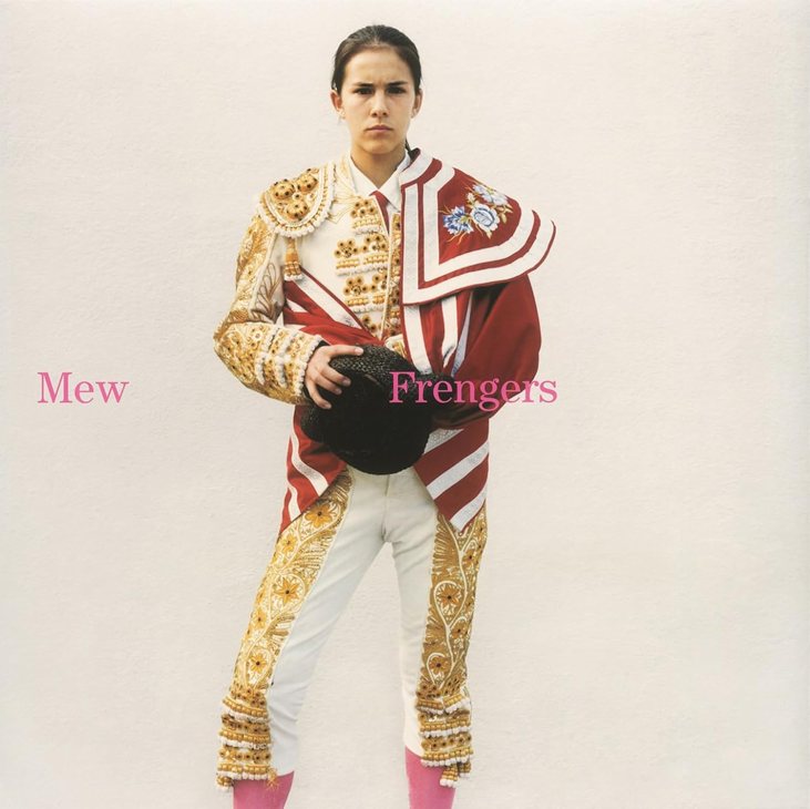
I’ve loved the Danish band Mew since the early 2000s and they are coming to Hong Kong soon. I first heard them live in Los Angeles.
Wang is an interior designer based in London and Hong Kong.
Tim Weiner
Writer
The best thing I watched:
The Seed of the Sacred Fig, directed by Mohammad Rasoulof, who fled Iran on foot last year after repeated jailings, arrests and harassment. It’s a brilliant movie about repression and resistance in Iran, when “women, life, freedom” was the rallying cry.

The best thing I read:
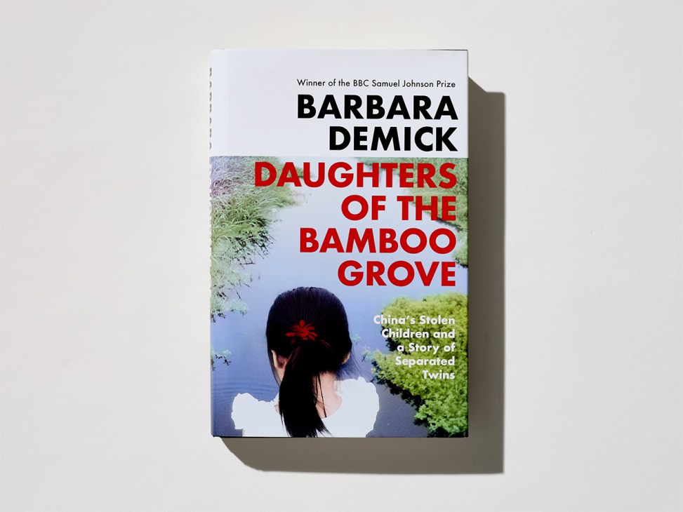
Barbara Demick’s Daughters of the Bamboo Grove: China’s Stolen Children and a Story of Separated Twins is an epic of literary non-fiction describing the ripping apart – and the reunion – of sisters born under the one-child policy.
The best thing I listened to:
The song “Breaking” by Anohni and the Johnsons [from the sessions for the album My Back Was a Bridge for You to Cross]. Like Édith Piaf, Anohni has a voice that encompasses all the terrible beauty of the world.

Weiner is an American writer and the author of ‘The Mission: The CIA in the 21st Century’.
Antonio Patriota
Diplomat
The best thing I watched:
I loved Kleber Mendonça Filho’s The Secret Agent. It’s a gripping, intelligent film that sheds light on Brazil’s recent past, with cinematic finesse. It’s both thrilling and thought-provoking and illustrates the damage done to society by authoritarian rule and the culture of impunity that it promotes.

The best thing I read:
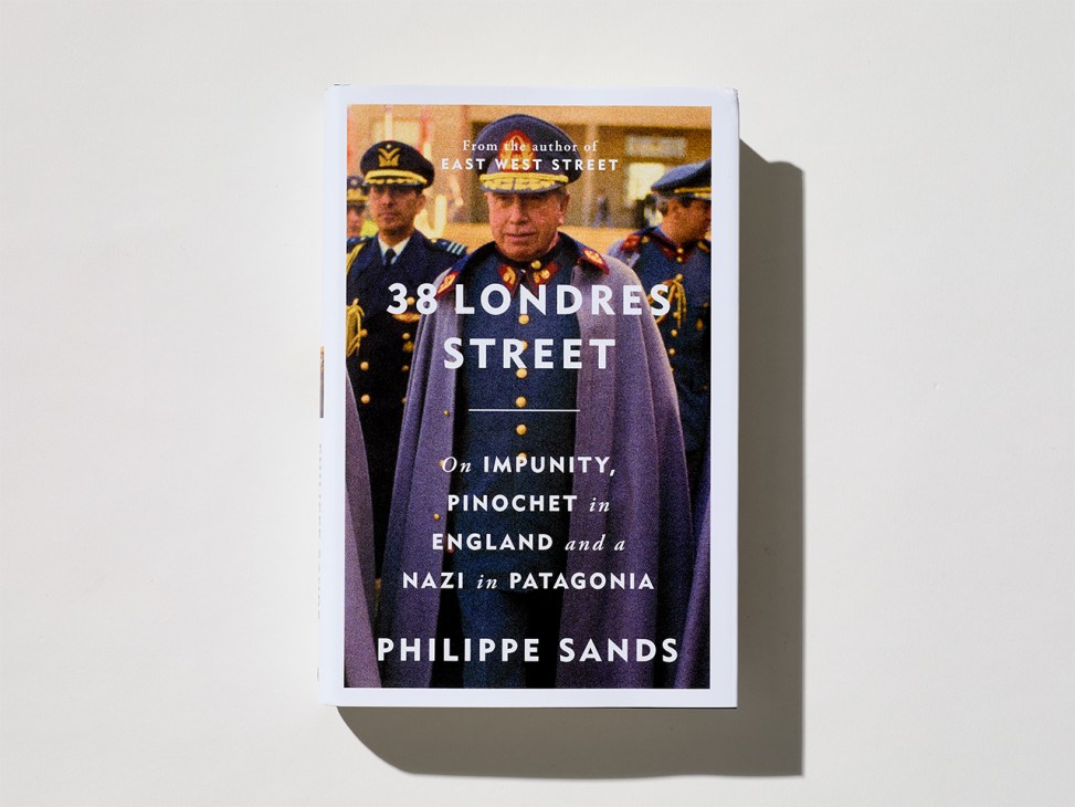
Philippe Sands’ 38 Londres Street: On Impunity, Pinochet in England and a Nazi in Patagonia is a masterful blend of personal history and international law. The book is meticulously researched and a groundbreaking testimony of the link between Nazis guilty of war crimes and the torture chambers of the Pinochet regime in Chile.
The best thing I listened to:
Abdullah Miniawy’s album Le Cri du Caire; in particular, the song “Pearls for Orphans”. Miniawy’s voice is just unforgettable. His music is poetry in motion, very spiritual and transcendent. It’s a compelling tribute to child victims of violence.

Patriota is the Brazilian ambassador to the UK.
Nina Conti
Comedian
The best thing I watched:
I was lucky enough to see an early screening of Aneil Karia’s Hamlet. I have never before been able to follow Hamlet’s every feeling so viscerally; it’s such a skilful and realistic performance from Riz Ahmed. A total masterclass in believability from beginning to end.
The best thing I read:
There are passages of Maria Bamford’s audiobook Sure, I’ll Join Your Cult where I had to pull over the car because I couldn’t stop laughing, especially her section on intrusive thoughts. Her worst fears are so dysfunctional, it just makes me glad to be alive.
The best thing I listened to:
This could be anything from Pavarotti to Aphex Twin, but this has caught me on a day when I have listened to “Shoulder Song” by Victor Jones about 20 times. There’s a strength in his voice and an honesty in his lyrics that throw a mighty gut punch. I think he’s going to be huge in no time.
Conti is a British comedian who directs and stars in new film ‘Sunlight’.
Bruna Castro
Writer
The best thing I watched:
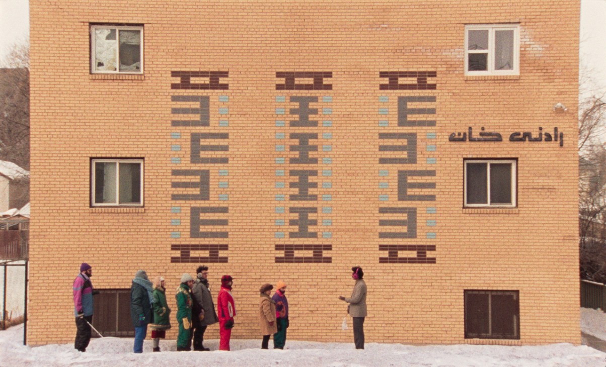
Une Langue Universelle [Universal Language], Matthew Rankin’s story set somewhere between Winnipeg and Tehran. I don’t really remember seeing a comedy quite like this before – it’s so quirky and poetic.
The best thing I read:
Camila Sosa Villada’s novel Las Malas (Bad Girls) is about a trans woman finding community on the margins, written in a style of magical realism. Camila Sosa Villada is a brilliant Argentinian author who deserves to be widely translated.

The best thing I listened to:
Colombian artist Lucrecia Dalt creates experimental music. As someone from Brazil, I know how frustrating it is when people reduce Brazilian music to the same three familiar rhythms. It’s the same with Colombia. I love cumbia but there’s so much more.
Castro is a Brazilian writer and the cofounder of new magazine ‘LatimLove’.
Henry Wilson
Designer
The best thing I watched:
The 2022 documentary Fire of Love tells the love story and work lives of two volcanologists and features incredible, slow visuals and a poignant, tragic end.
The best thing I read:
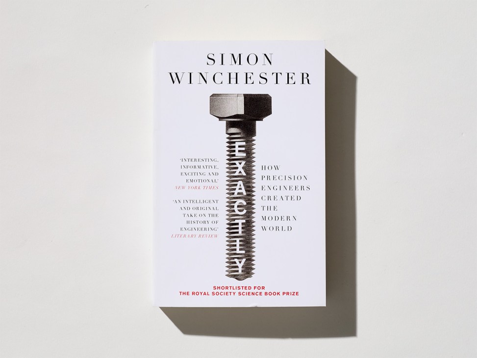
Simon Winchester’s Exactly: How Precision Engineers Created the Modern World is an inspiring account of the history of precision and its profound impact on our lives. I’ve made it essential reading here at the studio. The audiobook is also excellent.
The best thing I listened to:
Alabaster DePlume’s Visit Croatia EP. His music is melodic jazz and we often have this on repeat in the studio and store. There’s a wonderful softness to it; I imagine it’s the kind of music my objects would listen to if they could.

Wilson is a designer based in Sydney and the founder of Studio Henry Wilson.
Robin Givhan
Fashion editor
The best thing I watched:
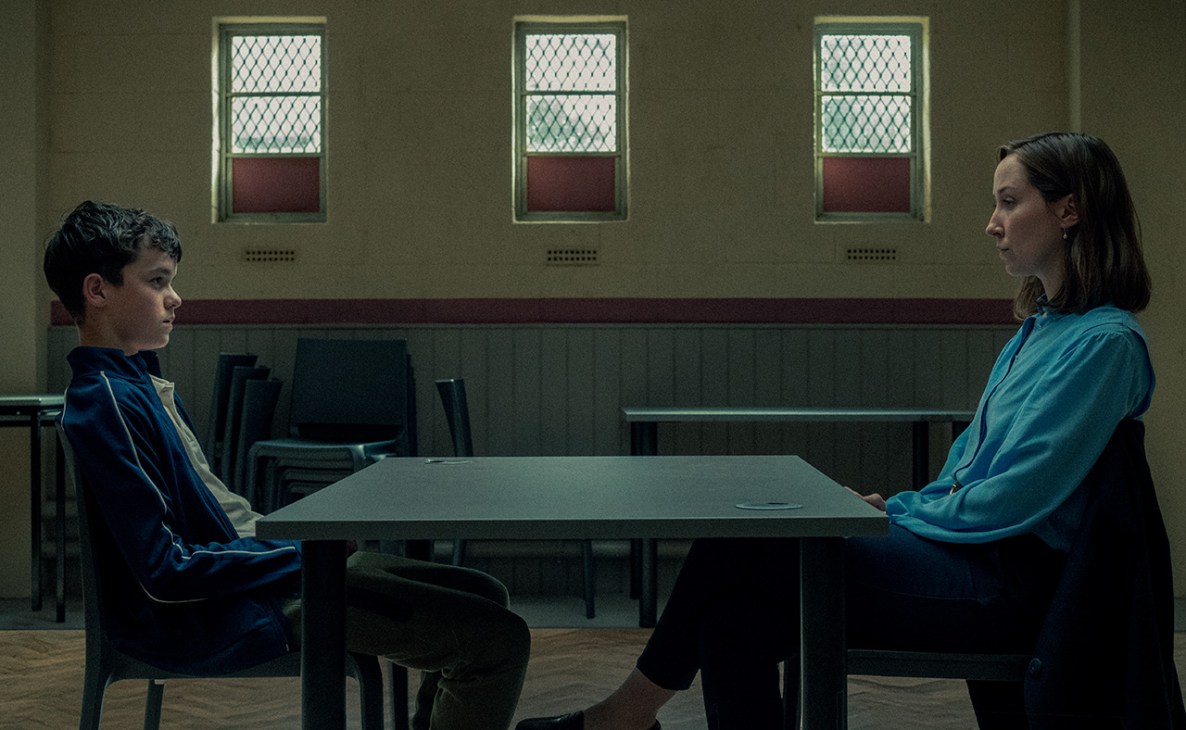
The Netflix series Adolescence is about a boy from an average, decent family who’s accused of a terrible crime. It’s a gutting story of our times that comes with no clear answers, only profound questions about isolation, virtual relationships and masculinity.
The best thing I read:
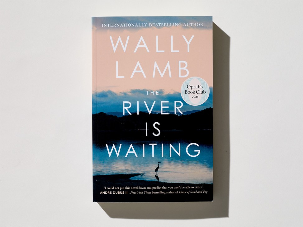
Wally Lamb’s The River is Waiting is a novel about forgiveness and what it means to those who receive it and those who are willing to offer it.
The best thing I listened to:
I love the New York Times’ The Interview podcast. Lulu Garcia-Navarro talks at length to people who are famous, powerful or simply interesting. There are no gimmicks. It’s just an exceptionally well-prepared interviewer asking smart questions, listening carefully and being curious rather than judgemental.
Givhan is the author of new book ‘Make it Ours: Crashing the Gates of Culture with Virgil Abloh’.
Zaho de Sagazan
Musician
The best thing I watched:
Sean Baker’s The Florida Project, a beautiful film about children living on the margins of society. It’s full of colour and innocence, yet deeply heartbreaking.

The best thing I read:
All About Love by bell hooks made me rediscover what love means: its essence, its depth and its power to transform. It’s a book that questions everything we think we know about love and invites us to live it more consciously.
The best thing I listened to:
All the albums by Italian artist Andrea Laszlo De Simone have been the soundtrack of my year. His latest, released this year, is sublime. There’s something timeless and cinematic in his music that stays with me.

De Sagazan is a French singer-songwriter whose new album, ‘Les Symphonies des Éclairs (Orchestral Odyssey)’, is out now.
Bob van Heur
Festival director
The best thing I watched:
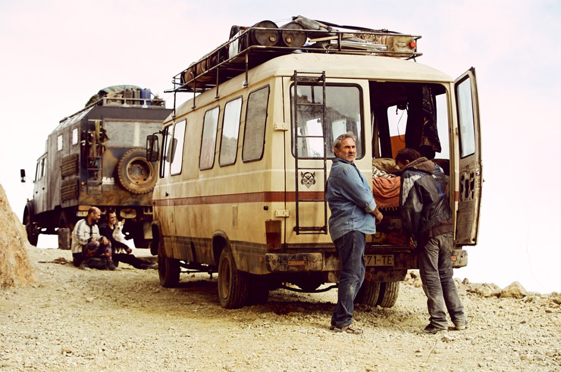
Oliver Laxe’s Sirât isn’t the best movie per se but it’s the most intense and epic movie I have seen. It leaves you stunned, mind-blown and even a bit traumatised. It has the epic proportions of Aguirre, the Wrath of God.
The best thing I read:
In Kalaf Epalanga’s book Whites Can Dance Too, so many of my interests come together: music, the realities of touring musicians, passport inequality, references to my favourite city, Lisbon, and an endless stream of mostly Angolan musical references. It’s told in three parts and has the dynamic energy of a great album.
The best thing I listened to:
Amor de Encava, from the Venezuelan collective Weed420, sounds like nothing else I’ve heard. A collage of sounds mixing Salsa Baúl, noise, reggaeton, encava bus sounds and more. With each listen you discover something new.
Van Heur is the founder and artistic director of Le Guess Who? festival.
Lynne Tillman
Author
The best thing I watched:
In four, hour-long films, Adolescence is a raw, unflinching depiction of a human dilemma and the ethical challenges that nearly break a family.
The best thing I read:
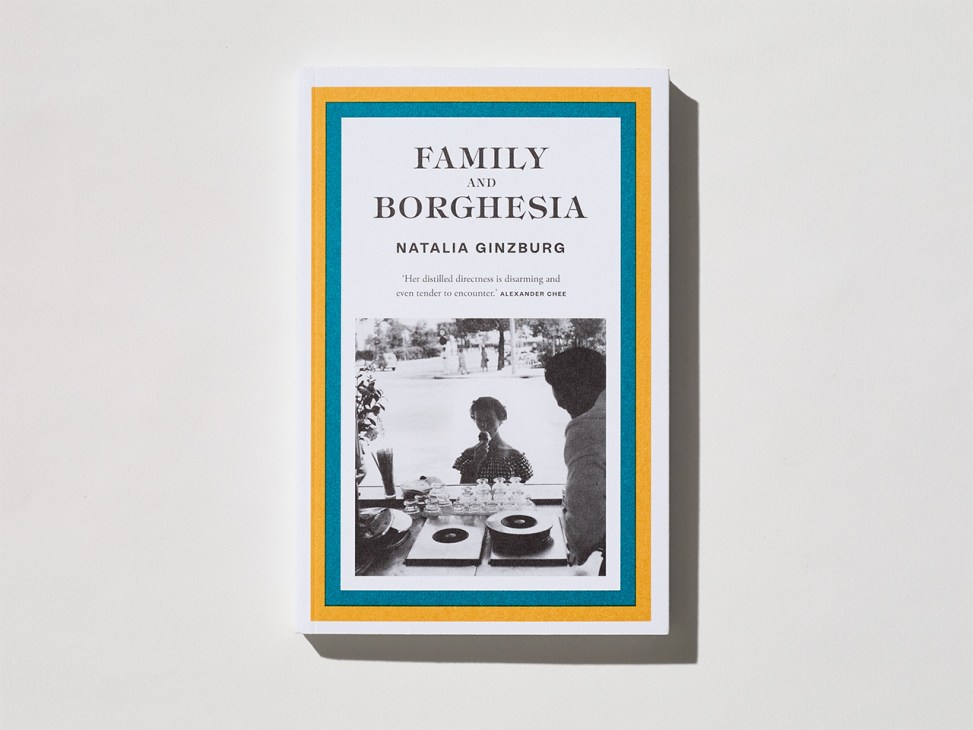
Natalia Ginzburg’s novel Family and Borghesia (translated by Beryl Stockman) portrays the “ordinary” worlds of two families in scrupulous and fierce writing, stripped bare of sentimentalism and melodrama.
The best thing I listened to:
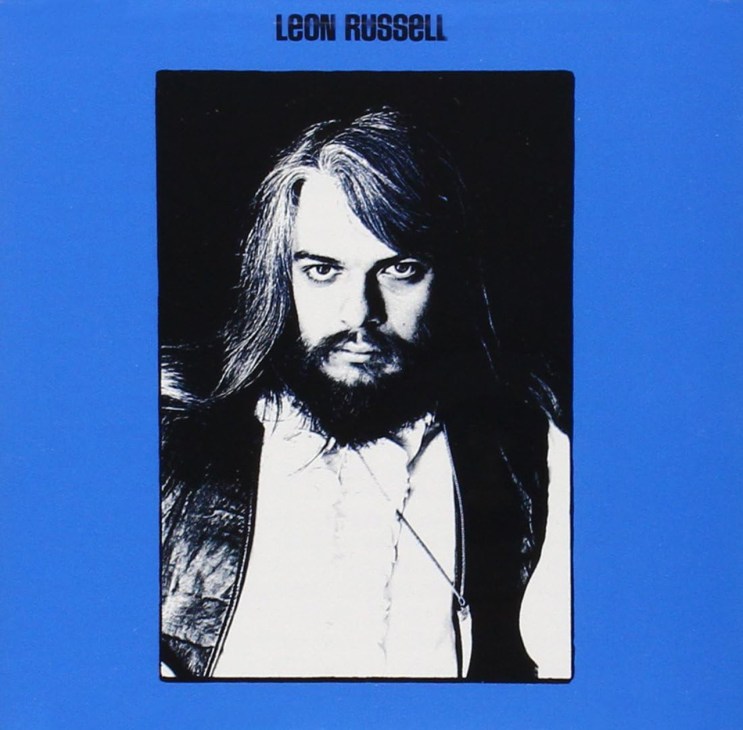
Leon Russell’s “A Song for You”, sung by Russell, Ray Charles and Willie Nelson – the moving lyrics and Ray Charles’ piano-playing “feel” love and death.
Tillman is the author of new book ‘Thrilled to Death: Selected Stories’.
15 brilliant books to gift your friend who has ‘read everything’
1.
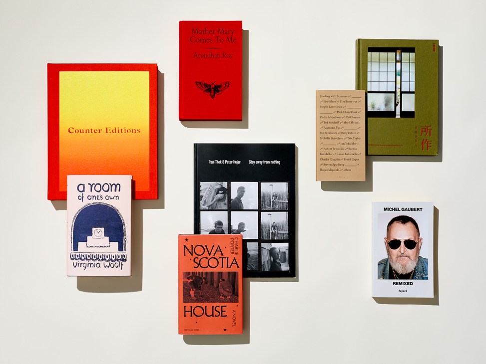
Counter Editions
For its 25th anniversary, art-book publisher Counter Editions has released a monograph cataloguing its key works. The design – including a screen-printed cover – mirrors the imprint’s exacting approach to printmaking.
2.
A Room of One’s Own
Virginia Woolf
This centenary edition of Virginia Woolf’s classic essay harks back to the original Hogarth Editions. It’s rebound with the same woodcut prints that her sister designed some 100 years ago.
3.
Mother Mary Comes to Me
Arundhati Roy
In her first memoir, Indian novelist Arundhati Roy describes her formidable mother as “my shelter and my storm”. That complicated relationship forms a central part of the book, told with raw honesty in Roy’s inimitable prose style.
4.
Paul Thek and Peter Hujar: Stay Away from Nothing
Edited by Francis Schichtel
Photographer Peter Hujar and painter and sculptor Paul Thek shared an intimate relationship as friends and lovers. Through photos, postcards, letters and the occasional doodle, Stay Away from Nothing captures the complex and tender nature of their bond.
5.
Nova Scotia House
Charlie Porter
This debut novel from Charlie Porter, the prolific fashion journalist and author of What Artists Wear, is a thought-provoking, emotional work on love and pain during the AIDS crisis.
6.
Shosa: Meditations in Japanese Handwork
Ringo Gomez-Jorge
The Japanese concept of shosa can be summarised as a respectful attitude, a mindful way of moving or a repeated action. This calming book features interviews with craftspeople, teachers and even a high-ranking Zen monk who discuss why shosa is important to them.
7.
Cooking with Scorsese and Others
Hato Press
Cinemas might be more closely associated with mindless consumption of buckets of popcorn than fine dining but food and film have long enjoyed a nourishing relationship. This slim edition features photography that centres on food from films as varied as the Charlie Chaplin classic The Gold Rush and Hayao Miyazaki’s anime Ponyo.
8.
Remixed
Michel Gaubert
Sound designer Michel Gaubert has been responsible for some of the most memorable fashion-show soundtracks of the past 50 years. His new autobiography is for those who appreciate boundary-pushing fashion and music with a little French flair.
9.
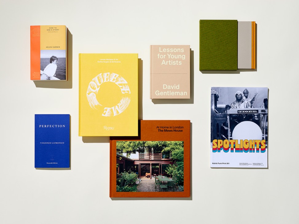
How to End a Story: Collected Diaries
Helen Garner
Australian novelist Helen Garner’s diaries were collected into a single volume for the first time this year. Her exacting eye makes this record of the minutiae of her life – including the unravelling of her marriage – a propulsive, generous read.
10.
Squeeze Me: Lemon Recipes & Art
Ruthie Rogers & Ed Ruscha
This unusual cookbook focuses solely on dishes that incorporate the humble lemon. The recipes come from Ruthie Rogers’ London institution The River Café, while the art and design are handled by US artist Ed Ruscha.
11.
Perfection
Vincenzo Latronico
This timely, ennui-laden depiction of an expat couple in Berlin who are attempting to live a perfect life was a literary standout this summer, with its bold, blue Fitzcarraldo Editions cover seen poking out of tote bags on beaches across Europe.
12.
Killing Time
Alan Bennett
This special edition of a new novella from Alan Bennett is the ideal size to slip into a stocking. Though the story – set in a care home during the coronavirus pandemic – is far from cheerful, it’ll be a fine, darkly comic accompaniment for winter nights.
13.
Lessons for Young Artists
David Gentleman
For the creatives in your life, there are few better presents than the no-nonsense words of British artist David Gentleman. While there are no short cuts to success, the 95-year-old’s fatherly advice is sure to help put you on the right track.
14.
Spotlights
Habibi Funk
The musical catalogue of Berlin-based label Habibi Funk Records showcases the best sounds from the Arab world. This smart new publication from the Habibi team continues that mission and features interviews with Arab music legends, retro album designs and new studio photography.
15.
At Home in London
Ellis Woodman
Though London’s mews were built in the 18th and 19th centuries as stables and servants’ lodgings for smart houses, they have since become desirable as bijoux homes and artists’ studios. This book captures their many contemporary functions and varied designs.