November / Global
The Agenda: Design
A chat with the founder of Sydney’s Studio Prineas, London-based Hût Architecture and the revival of the Memphis waterfront.
URBANISM — USA
Walking in Memphis
The city of Memphis, Tennessee, was founded on the banks of the Mississippi river in the 19th century but its modern waterfront has long been defined by unremarkable swaths of turf abutting the famous waterway. Now, a 12.5-hectare portion called Tom Lee Park has opened as a dynamic public and natural space, refreshing the city’s most prominent landscape.
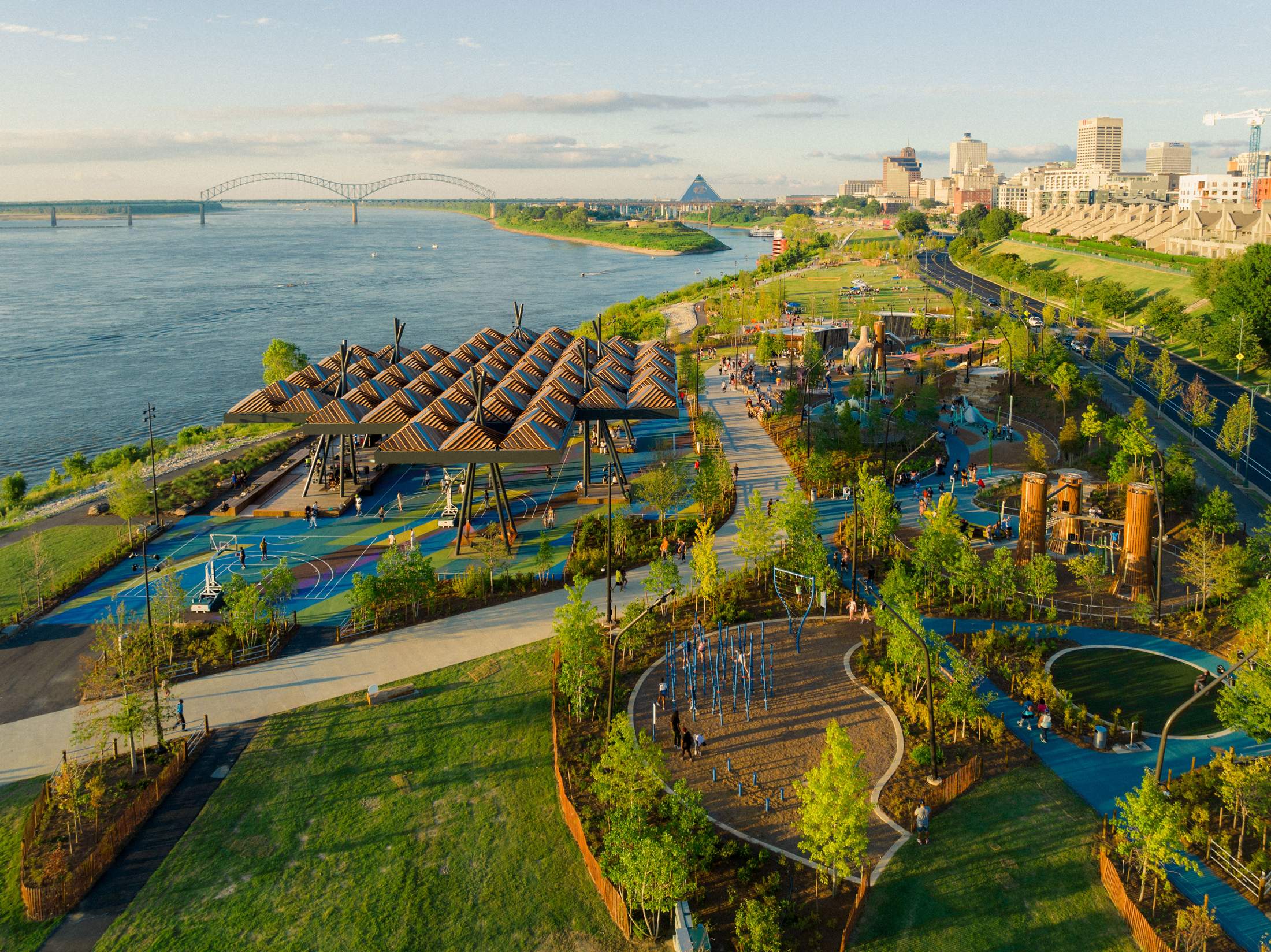
“The redesign was inspired by a desire for Memphians to come to the river to reconnect with each other and with the Mississippi,” says Kate Orff, founder of New York-based design studio Scape. “It’s also inspired by the story of Tom Lee, an African-American river worker who became a hero after risking his own life to save 32 people from a capsized steamboat in 1925. The space celebrates Lee’s legacy of generosity, while still confronting difficult and unfinished conversations about justice.”
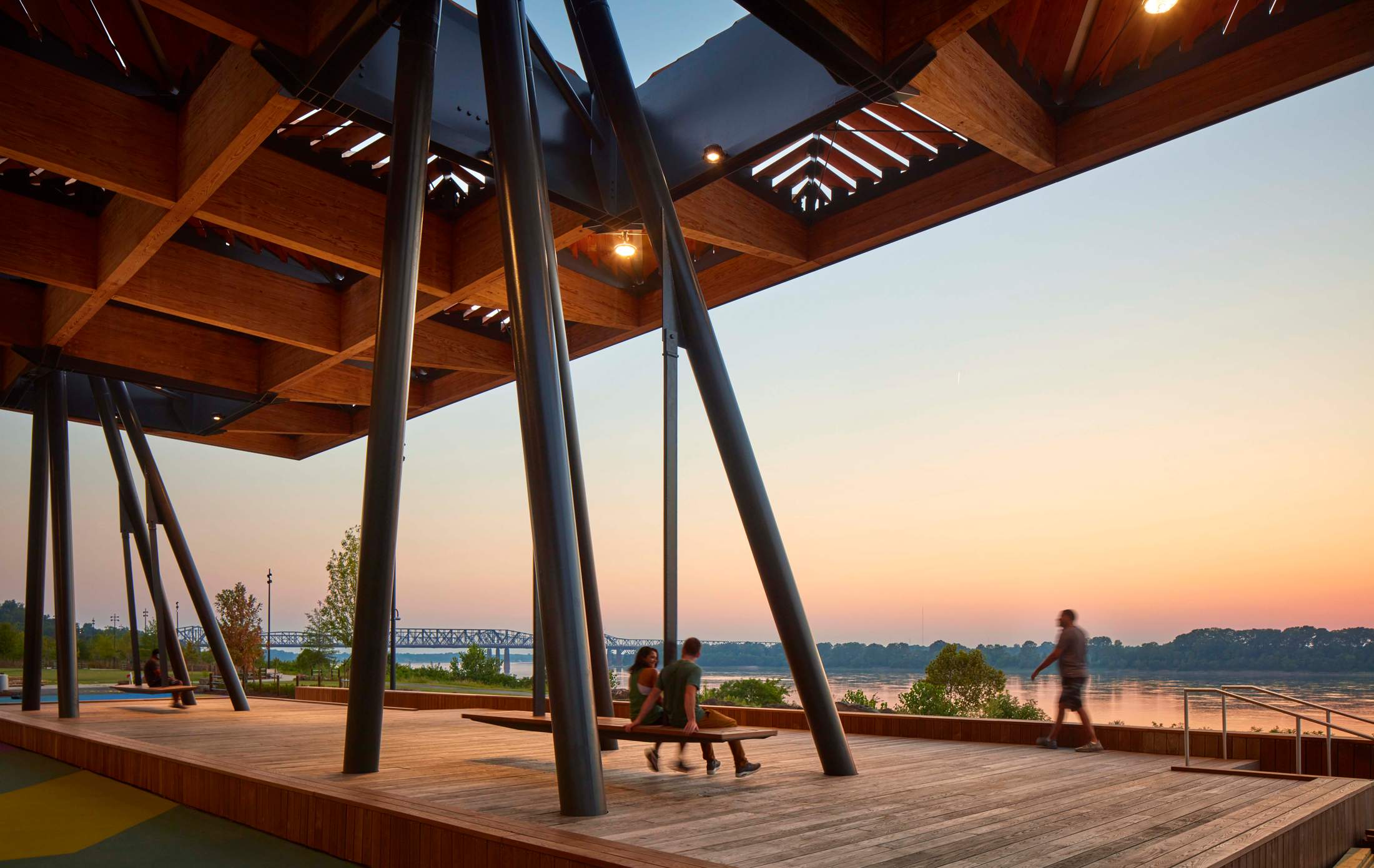
Brought to life by Scape and architecture firm Studio Gang, the new design has organised the parkland into a series of zones that mimic the sediment flows of the Mississippi. Boasting structures made from timber, a river-themed playground, sports and recreation courts, as well as picnic areas, the park also works to strengthen the connection between downtown Memphis and the river, with locals now having a reason to venture towards the water.

More than 1,000 new trees and native plants have also been added to the space, helping to replenish and restore the local ecosystem.
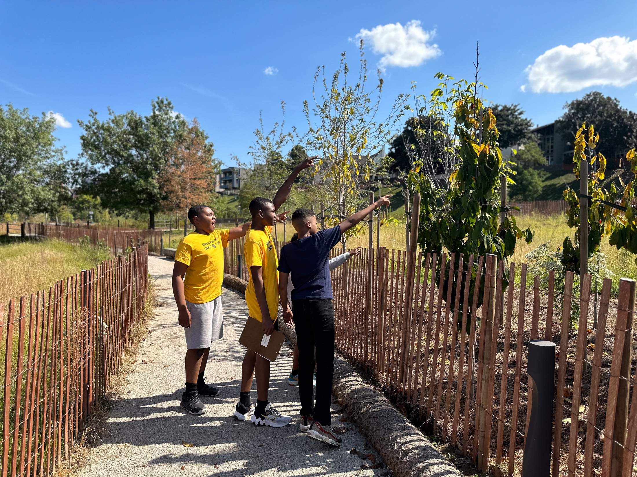
The transformation has added a new civic common space where Memphis residents are welcome to gather, exercise, relax and attend events alongside the ecologically revitalised river corridor. “Our job was to design a park that aspires to meet Tom Lee’s spirit of generosity,” concludes Orff. “Communities in Memphis are so vibrant. We wanted to make a park that enables that grit and love and creativity to come together in one place – at the river’s edge.”
DESIGN — EUROPE
Charged up

Frankfurt-based design firm e15 and Australian brand Zetr have joined forces to create a new flush-finished socket set-up to subtly incorporate power sources in office furniture. Called System 25, it can be fitted to e15’s own tables or integrated into products from other manufacturers. The nifty little gadget is composed of two parts: a power box which is fitted to the underside of desks and contains electrical charge, and a flush metal faceplate from which only essential cables, such as phone or computer chargers, emerge. Available in brass, bronze, steel or black steel finishes, there’s a host of options available to ensure that a table’s silhouette is no longer interrupted visually by clunky outlets.
e15.com, zetr.com.au
ARCHITECTURE — UK
East-end makeover
London-based Hût Architecture have transformed a former military drill hall into a new mixed-use development in the UK capital’s East End. The property, which has been largely undisturbed since the 1930s, when it served the Royal Army Service Corps 1st Anti-Aircraft division, had seemingly been doomed to a gloomy future of use as a storage space and the dilapidated backdrop for grunge fashion shoots. But the restoration has breathed new life into the building in the form of new offices, apartments and a coffee shop.
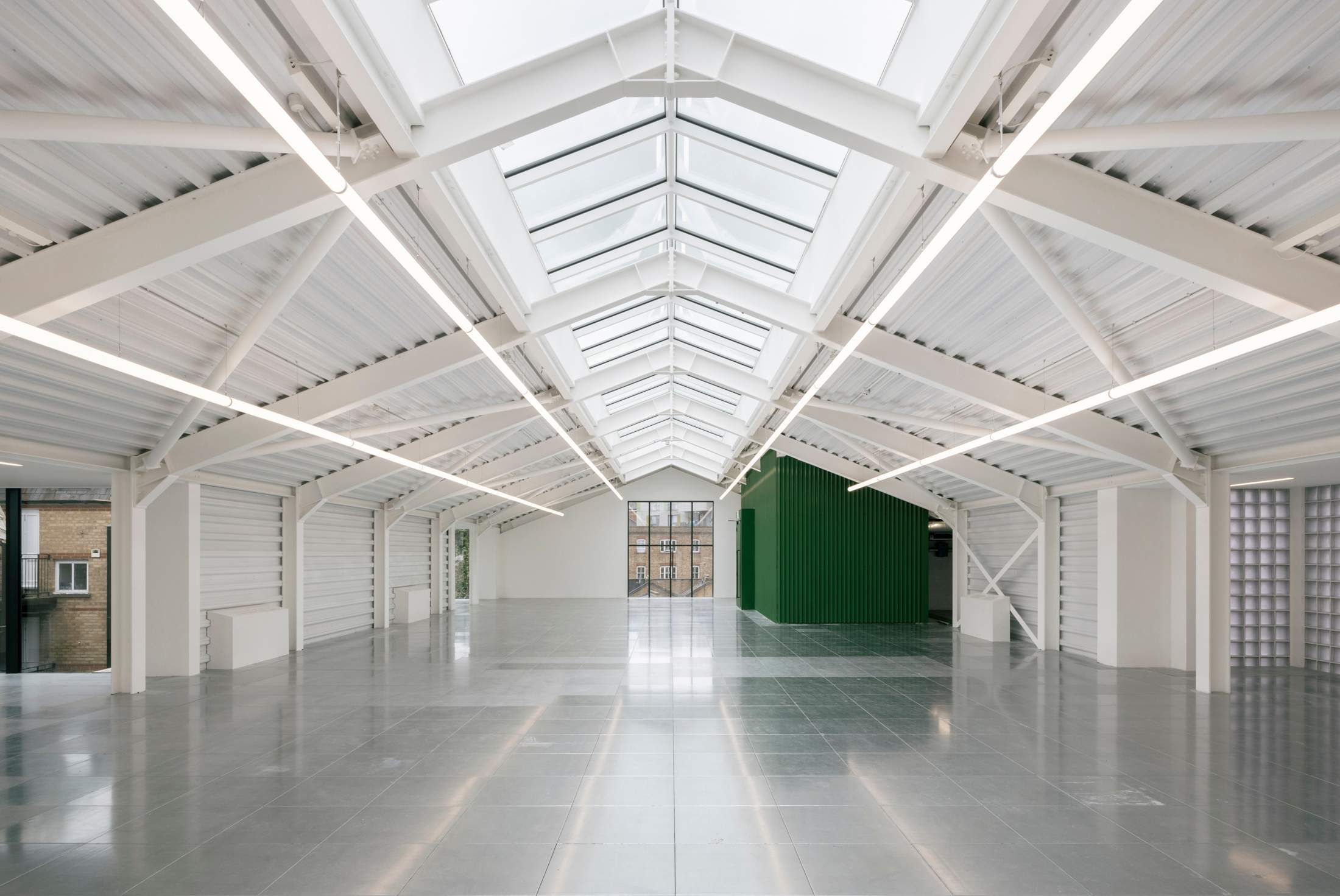
Roof lights and translucent block walls ensure that natural light glows across the exposed structure and brickwork, while also illuminating the forest-green accent colour that defines the renovation. From sheets of corrugated iron and steel beams that cross the lofty ceilings, to plants and vines that tumble down the exterior walls, the redesign’s juxtaposition with the original industrial feel brings a sense of purpose to a neglected urban relic.
hutarchitecture.com
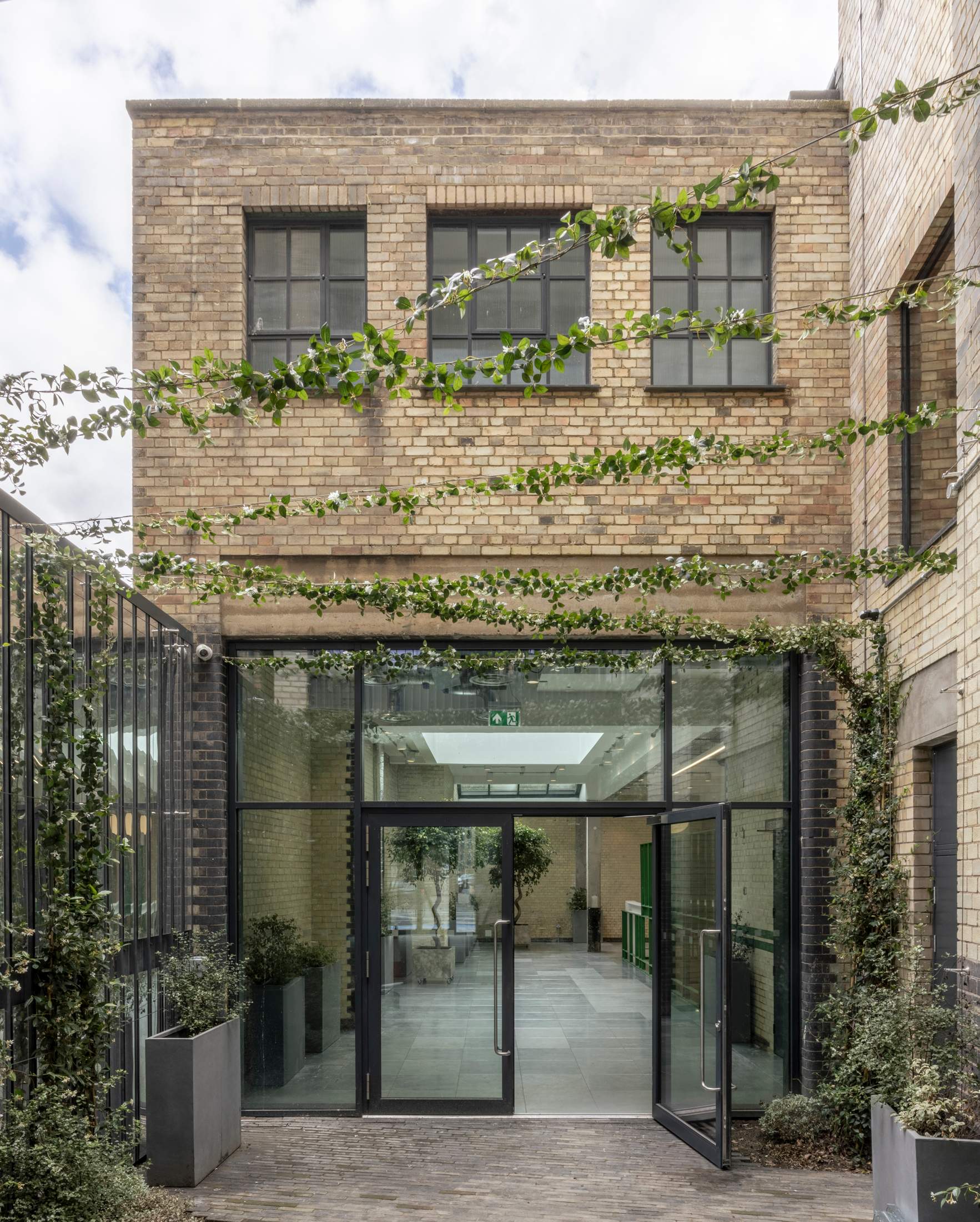
For more on Drill Hall, click through to our feature here, where the project sets the scene for a fine selection of sofas, chairs and lighting.
DESIGN — AUSTRALIA
Q&A
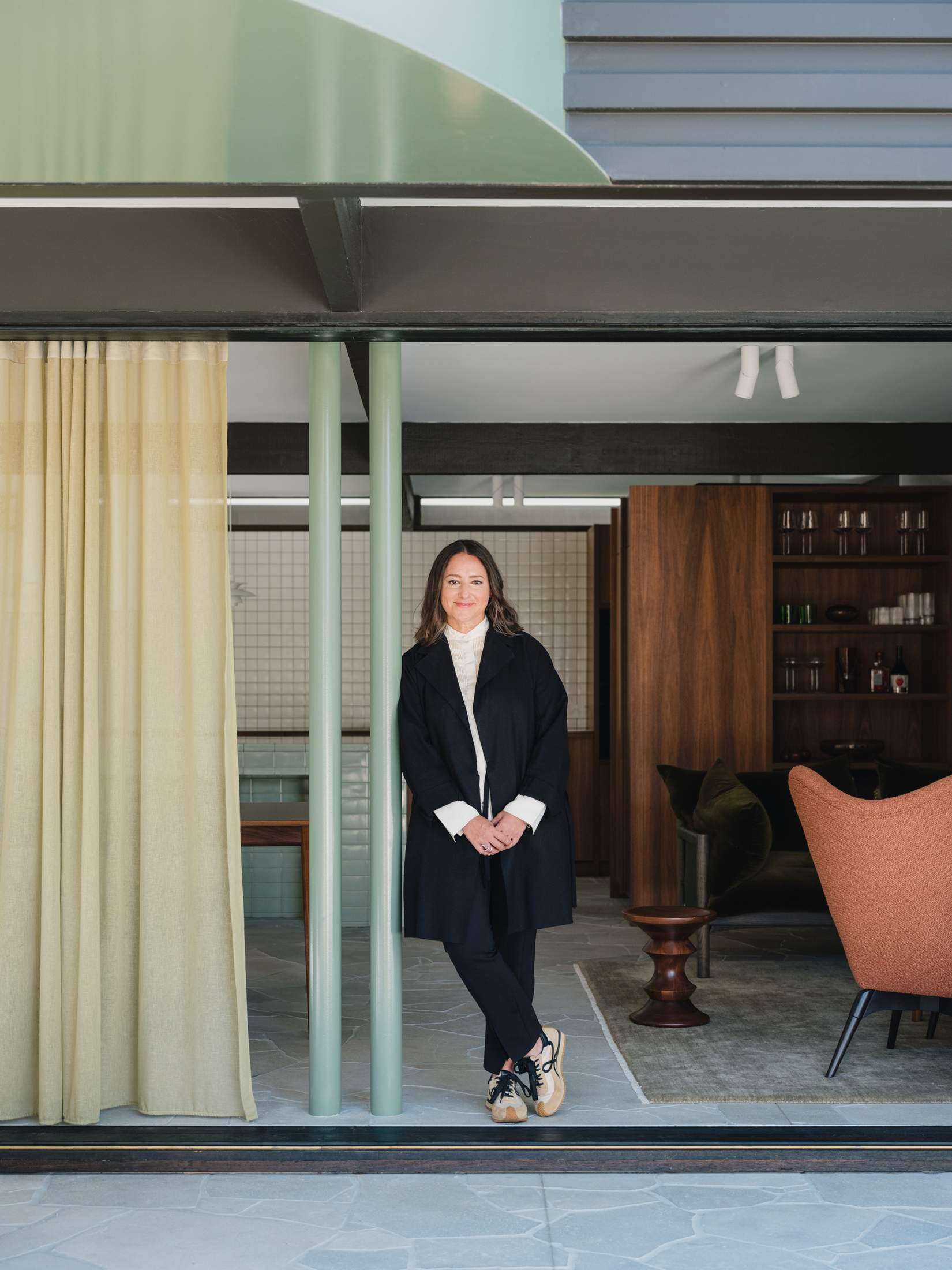
Eva-Marie Prineas
Founder, Studio Prineas
Since 2004 the Australian architect Eva-Marie Prineas’s projects have focused on building on Sydney’s historic architectural legacy, “thinking more and building less”. We asked her about her responsible approach to building and the peculiarities of work in Australia.
How does a ‘building less’ approach end up improving your practice?
It’s the most responsible way for architecture to move forward. When you’re working with existing buildings, you have to think about what you need to keep and what you might not necessarily have to keep; these are the decisions that are important moving forward, so that you’re doing as little as possible, but with as much impact as necessary.
Why is ‘responsibility’ your word of choice when describing your projects?
I feel that the word sustainable is almost an oxymoron in construction. Everything that we do is creating more of a carbon footprint. So it’s about being responsible about our choices and minimising the impact as much as possible.
How do you create architecture that is grounded in place?
With a recent project, we developed the landscaping as a reference ecology for the local area. We went for a bush walk with our clients and looked at all the planting, then we came up with a beautiful scheme. Once the garden started to grow, beautiful fauna were coming to the site.
studioprineas.com.au
ON DESIGN
NIC MONISSE ON...
The meaning of home
“My house is my refuge – an emotional piece of architecture, not a cold piece of convenience,” wrote Mexican architect Luis Barragán in 1948. These words – which I first read when I was at university about 65 years later – stuck with me as I set out to create a home of my own following graduation from design school. I spent the better part of a decade trying to inject some of myself – my own emotions – into the various residences I called home.
Places have been furnished with the colourful painting of an eagle that my partner and I picked up at a street-facing gallery in Amsterdam, a Renzo Piano sketch of the Centre Pompidou that the Italian architect gifted to me while I was reporting on his work, and Zig-Zag chairs of questionable provenance purchased from a quirky Dutchman in Surrey. The stories attached to each of these elicit strong emotions: feelings of love, pride in one’s work and a sense of adventure, respectively. But in reporting for this issue, I realised that I’d missed Barragán’s tip: the idea that the architecture should be eliciting emotion and not just the furniture and objects within it.
It’s something I’ve since addressed – or rather researched – with our reportage. In a world where we seem to be trending towards aesthetic sameness (visit any new development from Stockholm to Sydney and you’ll see the same colourfully-clad mid-rise mixed-use buildings), Alison Brooks outlines why it pays to tap in to the spirit of a place. This can be done, she says, by building in a way that pays respect to nature: homes can tug at heartstrings when they work with the slope of a site (rather than levelling it) or incorporate natural features (why not embrace an existing boulder or tree in the design?).
But perhaps the most informative note I’ve picked up from our reporting is the need for architecture that invokes pride too. Take our residents at the Mar Vista Tract. Inspired by their compact houses, they have banded together to form heritage protection groups, united by a shared appreciation for how the architecture encourages them to live a particular lifestyle built around community. The love that they have for their four walls is proof that residences can be so good – to the point where the Mar Vista crew won’t even sell, despite gargantuan offers – when actual architecture elicits powerful emotions, such as pride, and don’t simply provide a vehicle for living.

