
The Agenda: Design / Global
Identity politics
Carlota Rebelo meets the veteran graphic designer whose national branding for Portugal became weaponised in the country’s recent elections. Does he have any regrets?
It’s not often that a debate over branding and graphic identity grips an entire nation. But this has been the case in Portugal since May 2023, when the socialist administration of António Costa unveiled a new visual identity for government communications: a pared-back take on the country’s flag (the old government logo was an intricate distillation of the ensign).
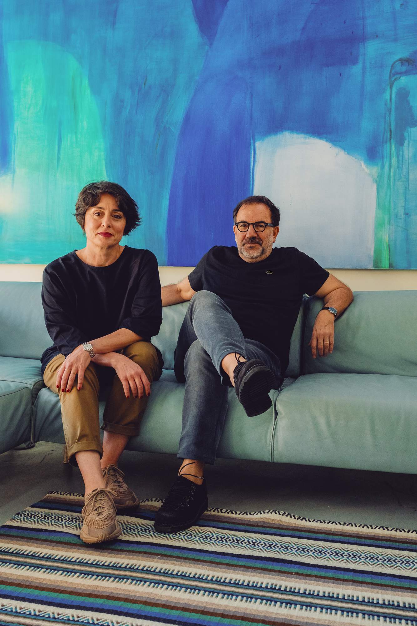
Designers Helena Sofia Silva and Eduardo Aires at home
Matters came to a head in March this year when, in the lead-up to the general elections, the newly commissioned logo and bespoke typeface became political weapons for the right. The opposition (now incumbent) right-wing Social Democratic Party equated the design with a lack of patriotism and accusations of wanting to rewrite history. “It fuelled a discourse that the right was looking to rally behind,” says Eduardo Aires, founder of Studio Aires and the man behind the design. “There was a focus on literalness and the official symbols of the nation.”
When monocle visits Aires in his studio-cum-home in Porto, the new government has just announced that it is abandoning Aires’s work and reverting to the old logo. “After the prime minister had named the 17 new members of his cabinet, the first key issue to be debated, and the first decision the new government made, had to do with design. That’s unprecedented.”
As we sit in the living space of the converted factory, it’s evident that this is a man who considers every project on its merits and makes no decision by accident. Now aged 61, Aires is Portugal’s leading graphic designer: a multiple award winner, internationally recognised. He’s also one of the brains behind the visual identities of renowned clients such as the City of Porto and the Amorim Group.
Despite the prominence of the project, Aires applied his usual methodology. For him, this was the only way to ensure that he could be objective about the work. “I like to create multifaceted teams to help me deconstruct and understand the task at hand,” says Aires. “Depending on the project, I gather together geographers, geologists, historians, poets and curators, so that I can have a polyhedral vision of it all.”
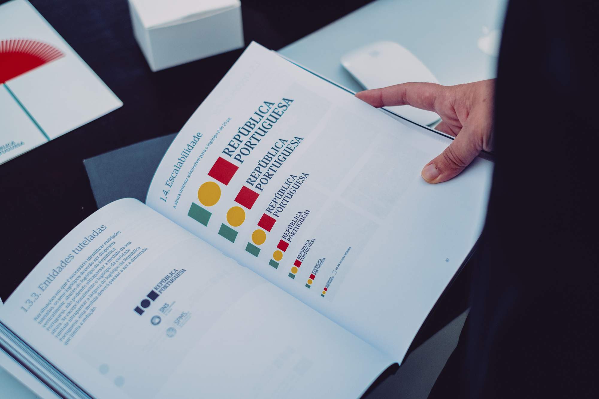
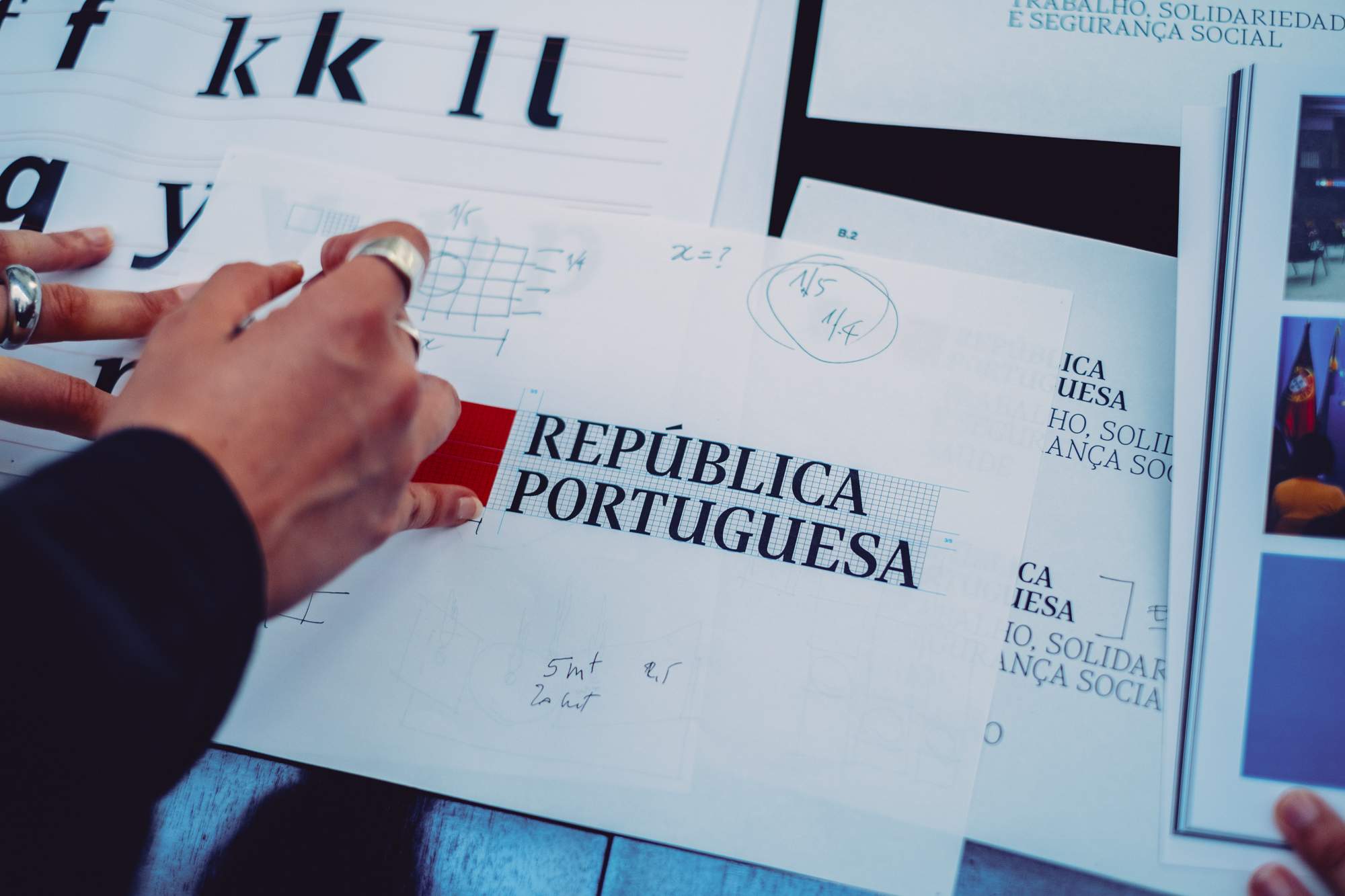
Research into the rebranding of the Portuguese Republic
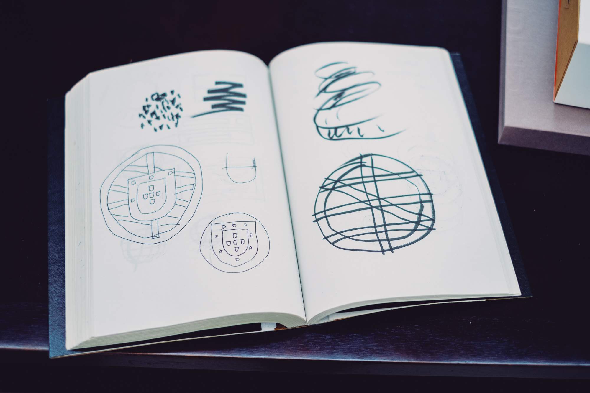
Hand-sketched logo designs
Together with his team, Aires pored through textbooks, archives and looked at the branding of other nations to establish benchmarks. He turned to the governments of the Netherlands, the UK and Switzerland, as well as taking lessons from the corporate world, from the likes of Deutsche Bank, where simple graphic branding has been deployed to convey messages of reliability and strength.
Aires’s research highlighted, for him, the need to go back to basics when creating a brand to represent the Portuguese people. “There’s inclusivity in simplicity,” he says. “By stripping down the more intricate elements of the flag, I was able to find a solution that is perhaps more representative of all Portuguese people, regardless of religious beliefs, gender or political preferences.” The result? A modern, simplified take on the Portuguese flag: a green block, a yellow circle in the middle and a red block. Accompanying it was a bespoke typeface, Portuguesa Serif, which was devised by designer Dino dos Santos. “There was a lot of work on creating serif and sans serif versions, combining heritage with modernity,” says Aires.
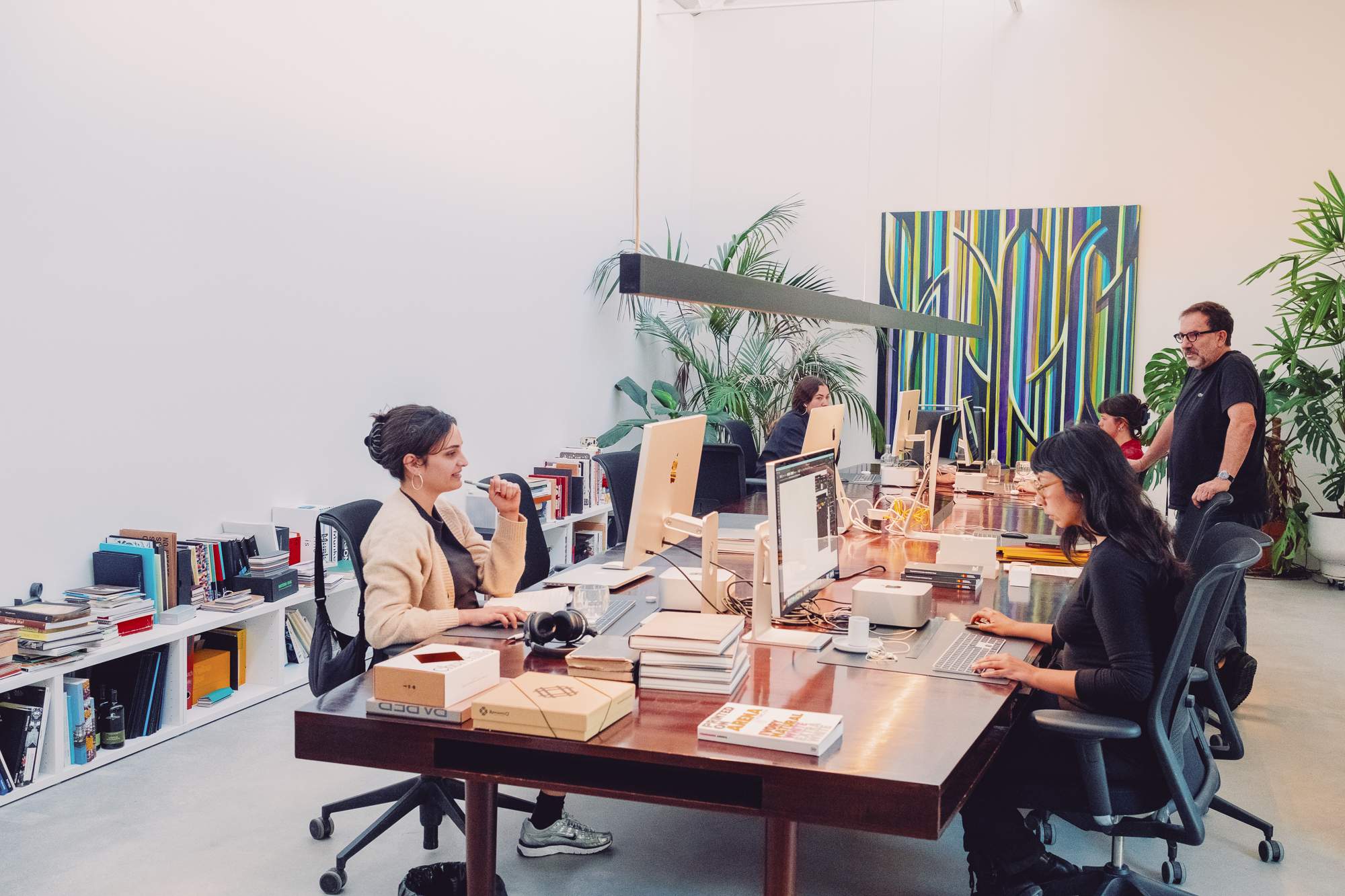
Aires at the studio with his professionally diverse team
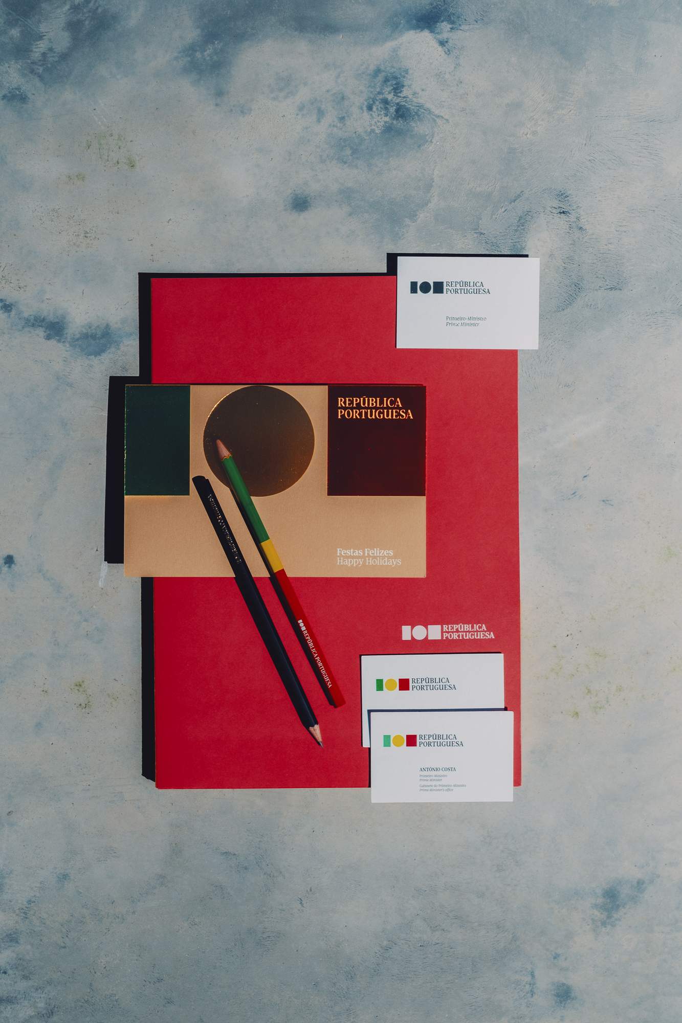
Materials created by Studio Eduardo Aires
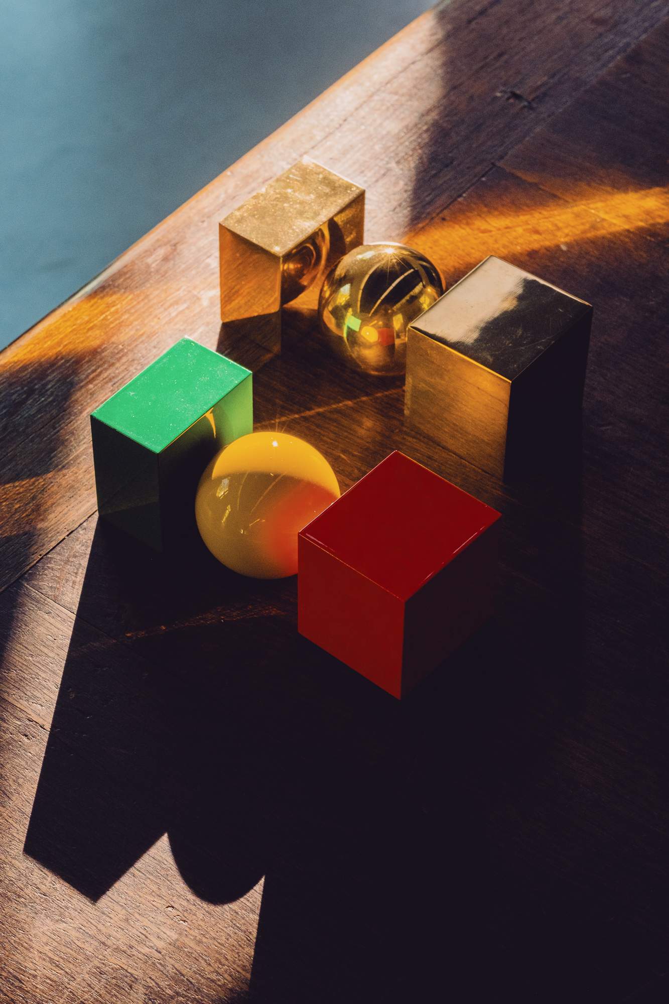
Aires’s República Portuguesa logo, rendered in 3D
There’s no question about the power that graphic and visual design has in our everyday lives. But, despite its importance, it’s still a profession that has no official union representing it in Portugal, which means that some commentators refuse to take it seriously. When Aires’s design was being used as part of a culture war during the election campaign, for instance, prime-time television hosts described the work as “childlike” and “easy”. “There’s this idea that anyone with a spare 30 minutes can be a designer, when in fact these so-called ‘simple designs’ have countless hours of complex work and research to support them,” says Aires. For him, it was lonely to face that criticism with few coming to his defence when the work was unveiled. “My client, the previous Portuguese government, stood quiet because it was in the middle of campaigning for re-election. And because there is no designers’ union, there wasn’t an authority figure who could come and put a stop to unfounded criticism.”
Dos Santos’s work, Aires says, was essential. In the age of disinformation, having a bespoke typeface that can only be used in government communications makes it easier to differentiate between what’s official and what’s fabricated. “We saw a glimpse of that before the elections, when the previous government announced the state budget, which was described by many as well organised and easy to read through,” says Aires. “We used the Portuguesa font, which played a huge role in making it accessible to all.” The hope was that the typeface would itself become synonymous with Portugal. “Unfortunately, there was not enough time to show all that we could achieve with this typeface. Our work was walked back before it even had a chance.”
Aires’s design might now sit in an archive and won’t be used by the government but the designer is optimistic that it will still have a legacy. “This will become a case study in years to come. From a professional point of view, no one had done this level of research into a nation’s branding before,” says Aires. “I hope that it will be studied in design schools across the globe for being one of the benchmarks in the field, which was entirely dismissed based on politically fuelled misconceptions, not on a professional basis.”
As Aires is walking through the inner courtyard of his studio, seeing monocle out, he reflects on the career he chose for himself. “To design is a noun and a verb. It’s the constant search for good shape, to differentiate from one another and to add value. That’s what makes me happy.” Would he change anything despite the recent controversy? “My father, who’s 88 years old, called me to congratulate me and say: well done son, you managed to make design, for the very first time, a topic of national significance.” —
