October / Global
The Agenda: Design
Expanding London’s green footprint, recycled-aluminium chairs and more.
RETAIL DESIGN –––– MEXICO CITY
Seeing the light

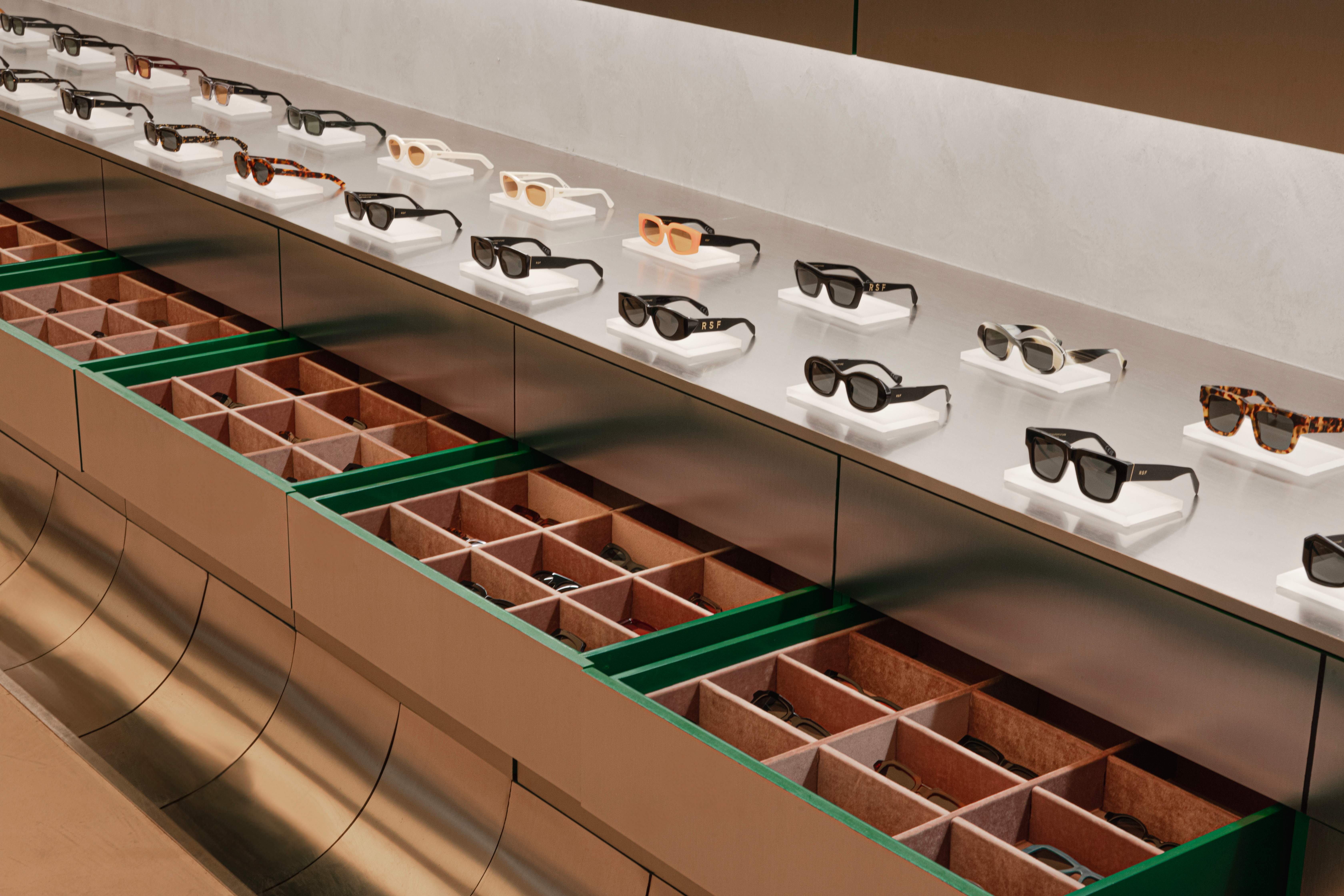
Italian optical retailer Retrosuperfuture is bringing its collection of elegant eyewear to Latin America with the opening of its first flagship shop in Mexico City. For this new retail space in the leafy Condesa neighbourhood, Dutch design studio Cloud has created a stainless steel-clad space. “We took inspiration from the architecture of a bank vault,” says Cloud’s Paul Cournet. “The metal-cladded walls are organised for all types of storage and display, with the centre of the space left as a void.”
It’s a sleek way for the brand’s customers to peruse its collection with a full-length mirror offering buyers a chance to reflect on potential purchases while also bouncing light through the space. The atmosphere within is enhanced by a giant lightbox on the ceiling, which reflects the ambience of a sunset to create a warming retail environment. It’s a combination of features that not only makes a visit here an enjoyable shopping experience but provides Retrosuperfuture with an inviting space in which to build a community. “The central void can be turned into a dance floor, a bar or a stage for performances,” says Cournet. “It’s a new place to gather for the city and for its social experiments, all under the ethereal ceiling.”

On DESIGN
nic monisse on...
The need to embellish
Do we need urban planners? This question was recently posed to me by a Geneva-based architect who had been tapped to help master-plan the last pocket of undeveloped land within the city’s limits. Explaining why he was involved in the project, he said that the authorities were looking to architects, rather than planners, to mastermind the scheme because the latter typically only operate on one scale. City hall felt that planners too often thought about the big picture, seeing cities as a series of “zones” and “movement corridors”, detached from the people inhabiting and using them.
I tend to agree. A problem that I frequently encountered when I was working as a landscape architect was planners who were more focused on numbers showing how people flowed and moved across a city, rather than what the experience was like on the street. The planning departments that I worked with felt that it was enough to have a diagram that highlighted where a bike lane was and how many people were using it, rather than investigating whether people might want to ride along such a path – or if they were just doing so out of necessity. Interrogating this quality is essential for delivering friendly, liveable cities.
That’s not to say that architects aren’t guilty of focusing solely on their plot (there are plenty who create insular buildings that don’t speak to the surrounding context) but rather that planning, while essential to city making, often misses a trick when those who practice it don’t think holistically and at a range of scales.
Herein lies a solution – doing away with the “specialist”. A good planner, it seems, shouldn’t only be a single-minded, specialised one but a creative with an understanding of architecture, furniture design and sociology. In short, to deliver well-rounded spaces, we need fewer Robert Moses types (the big-picture planner responsible for bulldozing large swaths of Manhattan in the 1960s in the name of efficiency) and more total designers, such as mid-century master Ernesto Rogers, who once declared that he wanted to design everything from “a spoon to a city”.
Taking such an approach should create cities and neighbourhoods that work on multiple levels, with consideration given to everything from the placement of furniture to the positioning of buildings. Geneva – should the architects fully execute their vision – might soon be the perfect example. —
URBANISM –––– SLOVAKIA
New tricks

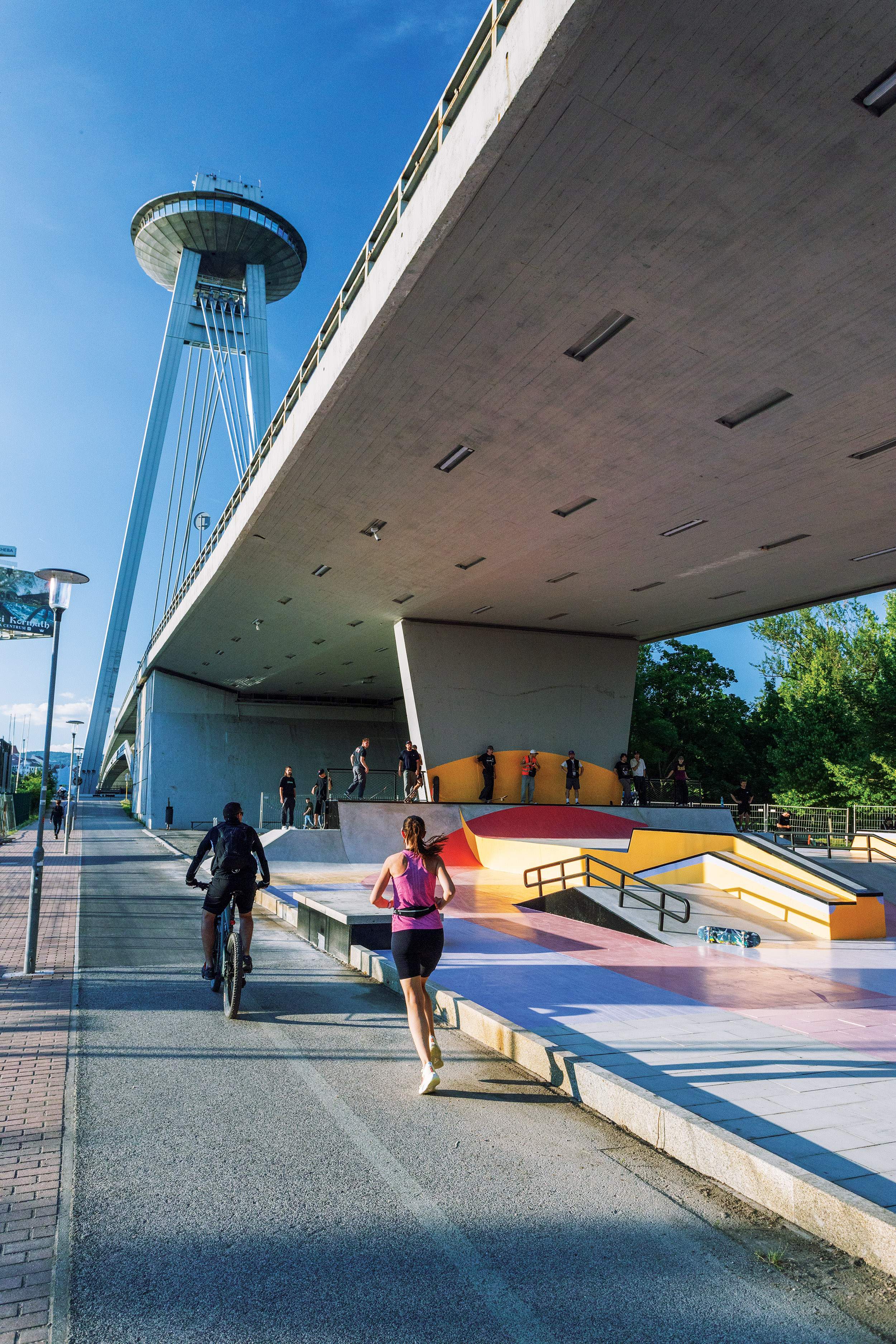
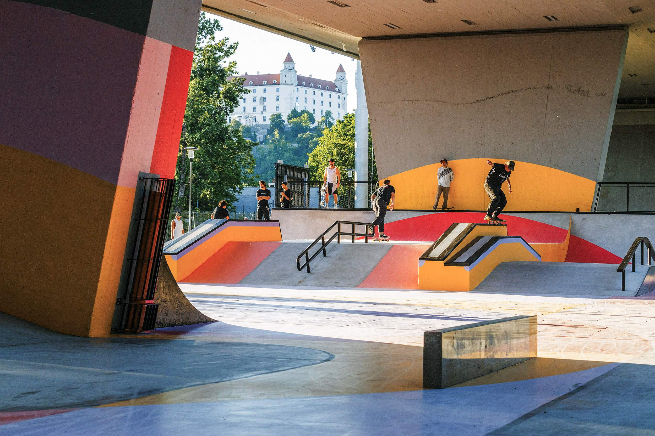
When architect Matúš Vallo was elected as mayor of Bratislava in 2018, he had a “blueprint” for the city that outlined which landmarks needed a revamp. On the list was the Most snp Bridge – or rather, its cavernous underbelly. A plan was hatched to turn the area crossing the Danube into an Olympic-quality skatepark and recreation area, with Czechia-based u/u Studio tasked with the pep up.
“Vallo told us that the city was missing spots for outdoor exercise,” says Martin Hrouda, an architect who runs u/u Studio alongside Jirí Kotal. “The area under the bridge was a brownfield site but it had so many advantages.” However, the protected status of the bridge posed problems to the flow that a skatepark requires. “It was difficult but we incorporated the bridge’s pillars in our design,” says Kotal.
As well as attracting skaters, the development has brightened up what was once a grey zone of neglect. It also underlines the fact that Vallo, now into his second tenure, might just be onto something with his blueprint.

URBANISM –––– UK
Comfort zone

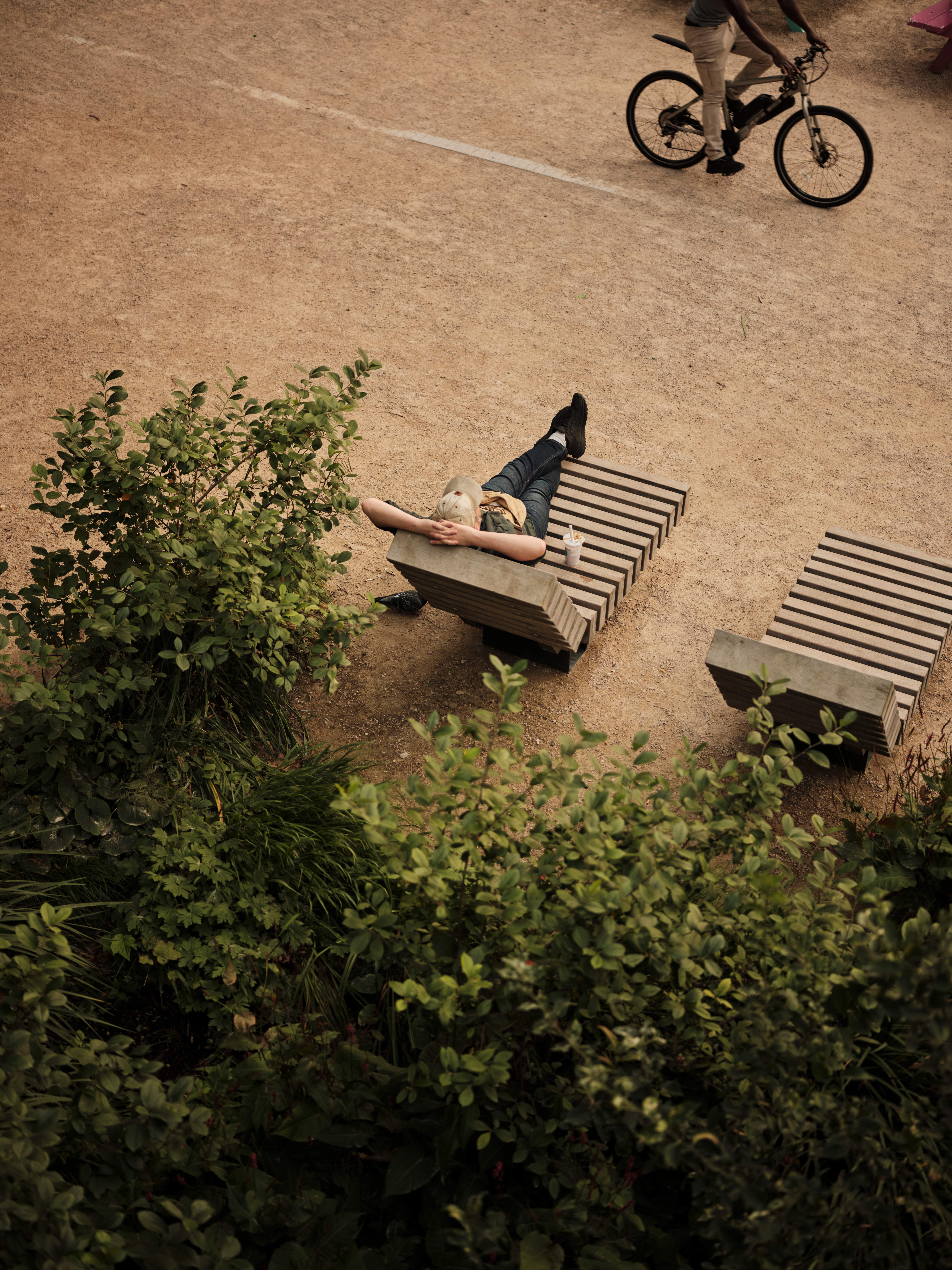
The busy junction at the heart of London’s Elephant & Castle neighbourhood is the epitome of a car-centric concrete mess. But adjacent to this intersection, the newly revitalised Elephant Park, completed to the design of international firm Gillespies, is providing a much-needed moment of calm.
When Gillespies started work on the project 10 years ago, the green space was surrounded by building sites, says Giacomo Guzzon, the practice’s head of planting. “At night, a gate would be locked to stop people from entering.” Now, when monocle visits on a warm autumn evening, there’s no sign of a gate, with the designers’ ambition to add permeability to the area’s urban fabric fulfilled. “We wanted to allow people to easily walk across the park, to access the shops and restaurants at the bottoms of the tower blocks that front onto it.”

Highlights of the green space include verdant planting that abuts the adjacent cafés and a playground and water-play area that’s a hit with local children. The effect, despite the popularity of both, is instantly calming. “In the evenings, when the kids are gone, it’s soothing to hear the sounds of the water,” says Guzzon. Office workers can often be spotted dipping their bare feet into the water.
This flow of people of all ages and walks of life is a big part of the site’s success, Guzzon explains that this is thanks to the abundance of opportunities for interaction, whether at the café or on the playground. “It’s key to creating lively cities.”
Design –––– uk
Just the ticket

Too often, when a piece of furniture is made from recycled materials, it can lack the polish associated with virgin finishes. UK designer John Tree’s Billet Chair is a pioneering chair made from 100 per cent recycled post-consumer aluminium. Using material provided by Oslo-based Norsk Hydro, the chair is held together by a clip hidden on the back; its extruded-aluminium profiles are devoid of fixings or adhesives. Its sensitive use of materials and the simplicity of its construction ensure that the chair can be fully recycled again at the end of its life.
johntree.net
UNIQUE AIRCRAFT
In the September print edition of monocle magazine, we published an interview with Warja Borges about her brand Unique Aircraft, which, due to a regrettable editorial oversight, contained misquotations of Ms Borges and incorrect information – namely the brand name and relevant project costs. This is the corrected interview.
Warja Borges holds an engineer’s degree in interior architecture. She worked at German studio Reiner Heim Aircraft Interior Design. In 2010 she founded Unique Aircraft. Working with major companies, Borges has designed all kinds of aircraft from smaller business jets to large Boeing/Airbus-type planes for private clients, governments and heads of state.
What is the typical budget range for the aircraft you work on?
Working on a business jet, clients’ requests are mostly refurbishments. Costs range from €500,000 to €2m, including the outfitting. My core business is one-of-a-kind interiors for large aircraft, planning the interior configuration from scratch. The range is huge, depending on the complexity of the interior, technical requirements and materials used; starting at about €30m for narrow body, up to €200m for a wide-body aircraft. The main drivers for the budget are the technology and manpower.
What are the usual (and unusual) requests from clients?
A usual request for a Boeing or Airbus-type aircraft would be a main lounge area with a combination of seating and dining, ensuite master bedroom, galley and crew area, guest seating or bedroom and an additional lavatory. Sometimes we do get the request to implement some beloved items or features.
What is most important when designing an aircraft’s interior?
The basic is to know the certification regulations and limitations and engineering constraints. The focus is on the passengers, their comfort and needs. With this in mind, my approach is holistic, stimulating senses to create an overall and unique flying experience.
unique-aircraft.com


