Jil Sander / Global
Second act
The husband-and-wife duo behind Jil Sander are searching for beauty in simplicity with the brand’s new shop in the UK capital.
The house of Jil Sander operates in a world of its own, divorced from trends, the fashion industry’s rigorous schedules and expectations for seasonal renewal. Not that it ever really sought to be part of the collective. When founder Heidemarie Jiline Sander presented her first womenswear collection in 1973 in Hamburg, she wanted to address professional women like herself with pared-back, modernist designs: the smartest wool trousers, the most elegant outerwear and the sharpest white shirts. Her debut collection instantly sold out and, soon after, women the world over couldn’t imagine buying wardrobe staples anywhere else.
In the 1980s, Sander decamped to Milan, finding ways to participate in the city’s fashion week on her own terms: her shows were always early morning affairs, her models were fresh-faced and dressed in pared-back looks that could be taken straight from the runway to the streets. She disregarded editors’ preference for late-night events, supermodel appearances and loud design, even if it meant that she rarely made front-page news. She was more interested in making clothes that enhanced the day-to-day lives of men and women – and did just that throughout the 1980s and 1990s, often referred to as the brand’s heyday.
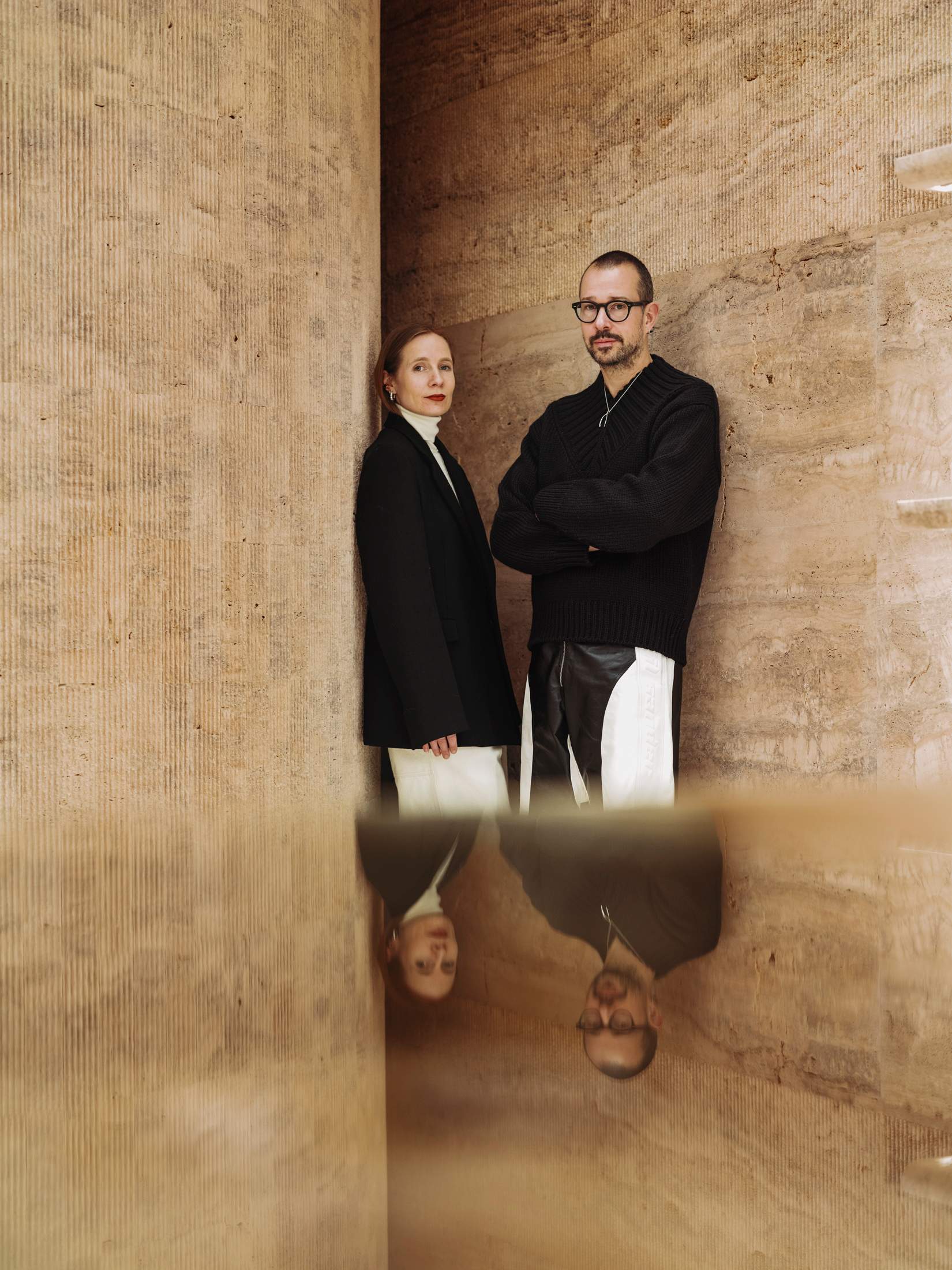
The 2000s were less stable, as Sander stepped down as creative director (she returned briefly in 2003 and 2012). The business changed many hands: from the Prada Group to private-equity firm Change Capital Partners, then Japan’s Onward Holdings Co and finally the current owner, OTB Group. Under OTB, the brand has reclaimed its individualist spirit and, along the way, regained cultural relevance and legions of new, loyal customers. This is thanks to Luke and Lucie Meier, who took over as co-creative directors in 2017. The husband-and-wife team didn’t set out to revive Jil Sander by following the usual branding playbook, often requiring a new logo, a highly publicised ad campaign and drastic change in design direction. They chose to focus on looser interpretations of Sander’s original independent spirit and sense of pragmatism, building a design language of their own – one that is based on intuition, the imagery they are drawn to, the architecture that inspires them and the conversations that they have with each other. “Lucie is always right,” says Luke, jokingly.
The designers stress that they don’t believe in hierarchies. In their studio in Milan, there’s always an open dialogue and they encourage everyone to add their own perspective to the briefs they set at the beginning of each season. “Interestingly, we usually arrive exactly where we set off at the beginning but it’s also important to leave the door open for the unexpected and allow a lot of meandering along the way,” says Luke, who applies the same attitude to his own life and career. Born in Canada, he moved from his home in Vancouver to study finance in Washington and business policy at Oxford University, before studying fashion at New York’s Fashion Institute of Technology and Florence’s Polimoda. He became Supreme’s head designer after a chance meeting with its founder, James Jebbia, and went on to co-found the streetwear label oamc. Lucie, who spent her early years in the Swiss village of Zermatt, followed a more traditional path into the industry, studying fashion marketing at Polimoda (where the two met) and going on to work for some of the most established houses in Paris, including Louis Vuitton and Dior.
Their experience stretches from rarefied haute couture to mainstream streetwear design, from the offices of dynamic New York start-ups to the ateliers of Paris’s most storied houses and from quaint, countryside living to life in urban, fast-paced fashion capitals. But the couple refuse to attach themselves, or Jil Sander, to any labels, instead bringing the full breadth of their identities and rich backgrounds into their work. “You could say that we’re Canadian and Swiss but we moved around so much in our formative years, it doesn’t feel like we’re from one single place,” says Lucie. “Our studio is the same. It’s fully international and everyone brings their own experiences and points of view.” At a time when brands are doubling down on national identity, the Meiers are going against the grain. “That’s an asset, right?” says Luke.

“Minimalist” is another label that the pair are eager to shed from the Jil Sander brand. Despite their affinity for neutral colour palettes and timeless silhouettes, including plenty of tailoring, they believe that “minimalism is old and boring”, and opt for simplicity or purity instead. “Even if you do something very bold, the approach can still be simple,” says Lucie, while Luke nods in agreement. “Pure or simple doesn’t mean boring, while minimalism can veer towards it,” he says. “You can have something fully embroidered or something in colour but it’s still a pure version of that design. There’s a bit more energy in this approach.”
This is why they always make a point to sprinkle playful details into their collections. Their autumn/winter 2023 range incorporated splashes of pastels, checkerboard patterns and 1990s-inspired colour-block leather, which took everyone by surprise. “The 1990s were a formative time for us, from the music to the cultural exchange that was happening,” says Luke, who is dressed in a pair of black-and-white leather trousers from the collection. “It felt inspiring and positive. I was studying at Oxford, I lived in New York for a while and felt that there was this open dialogue around the world, while now it seems like things are getting more insular and people want to close borders.” For Lucie, who is dressed in the kind of elegant black-and-white tailoring you would more easily associate with Jil Sander, the element of surprise remains important. “People might already expect something when they come to our shows or our shops but we need to exceed those expectations.”
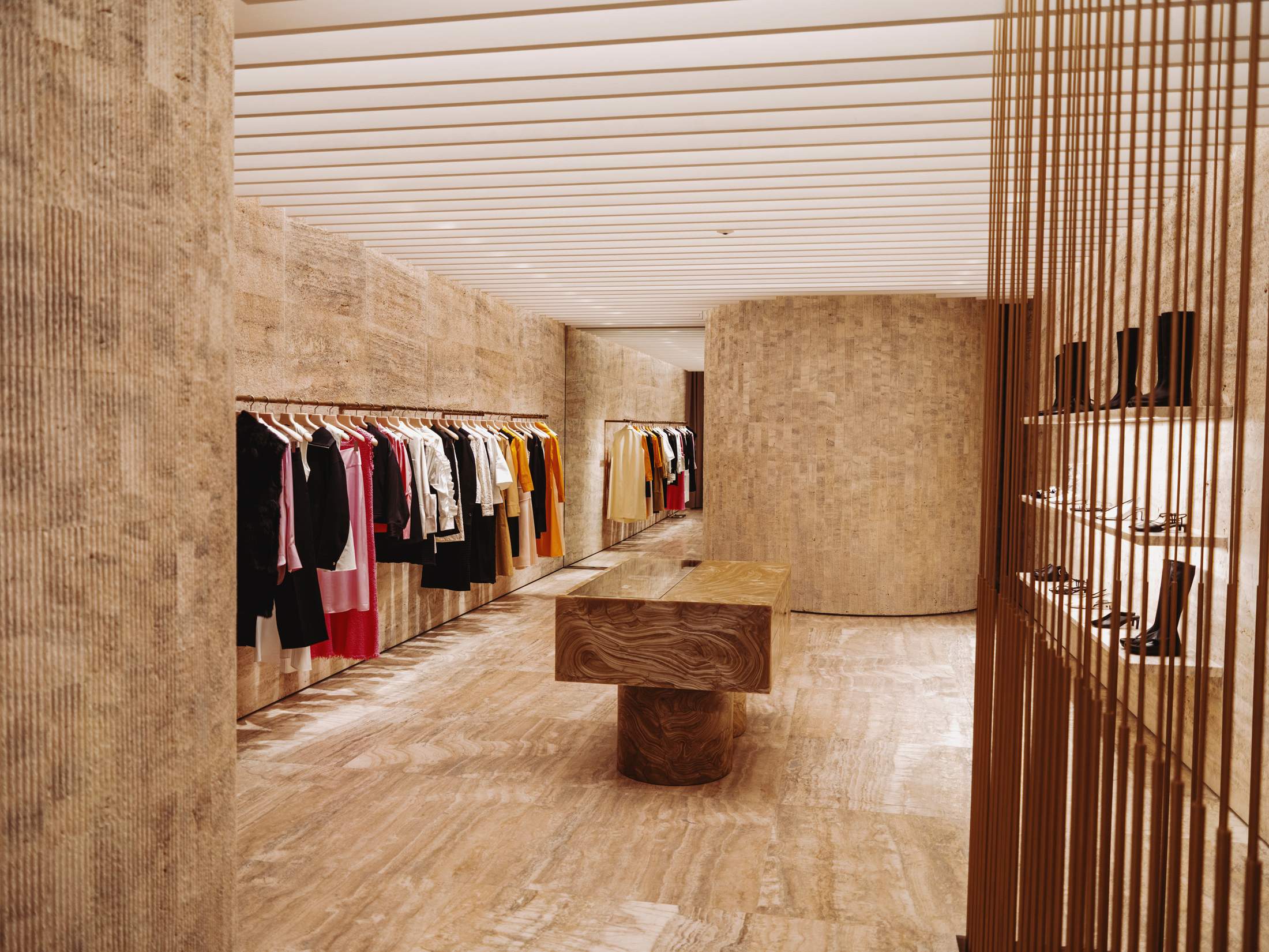
That was also the thinking behind Jil Sander’s new retail concept, formally introduced on London’s Bond Street this year. The aim was to surprise customers by marrying the purist design that the brand is known for with something warmer. “It’s easy to make something simple,” says Luke. “But to do something that’s simple but also has personality, soul and a warm energy is actually very difficult.” “It comes down to considering everything from colour to materials, and the small details such as the curves on the shelving. It all comes together to create this intimacy.”
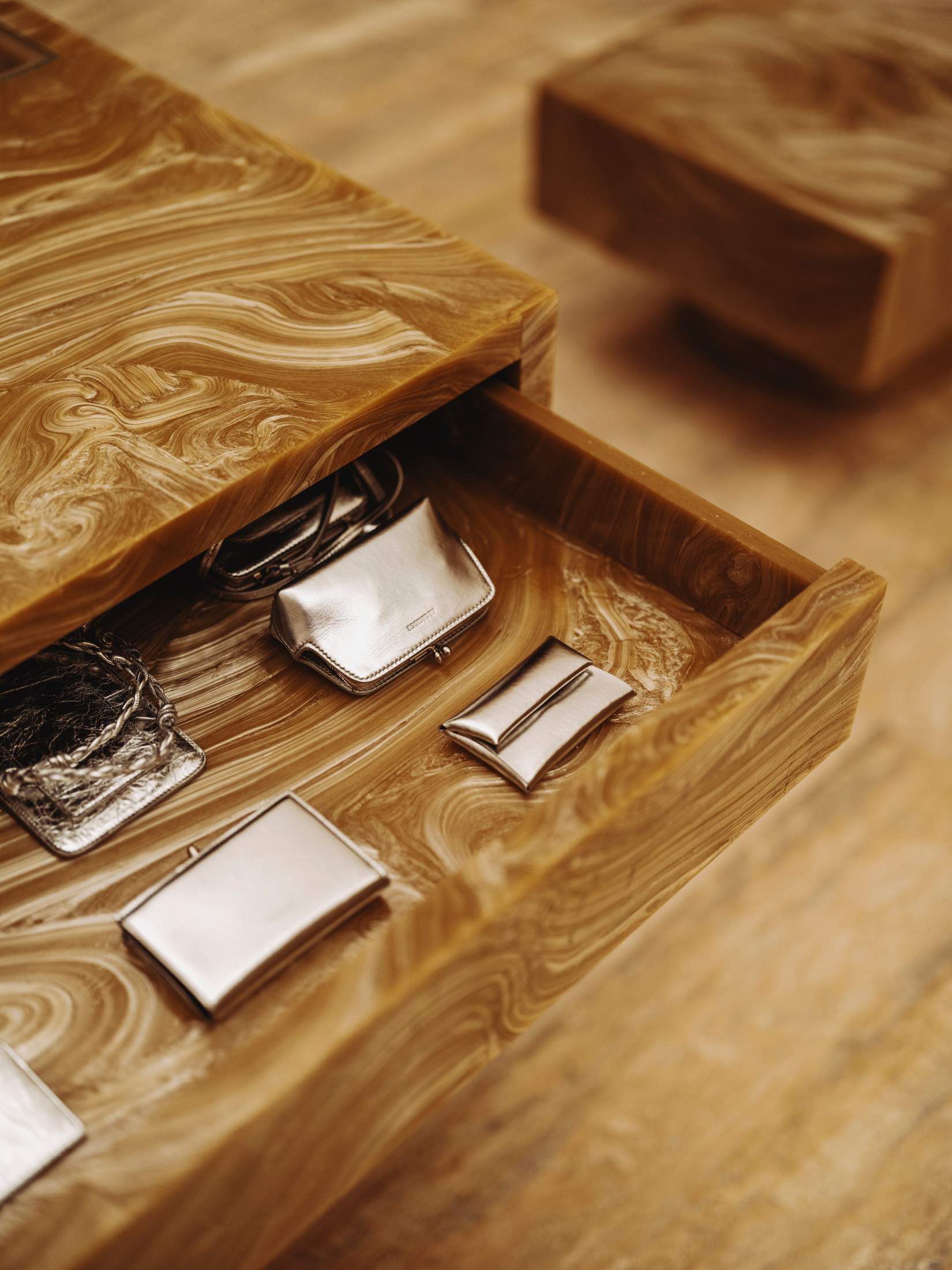
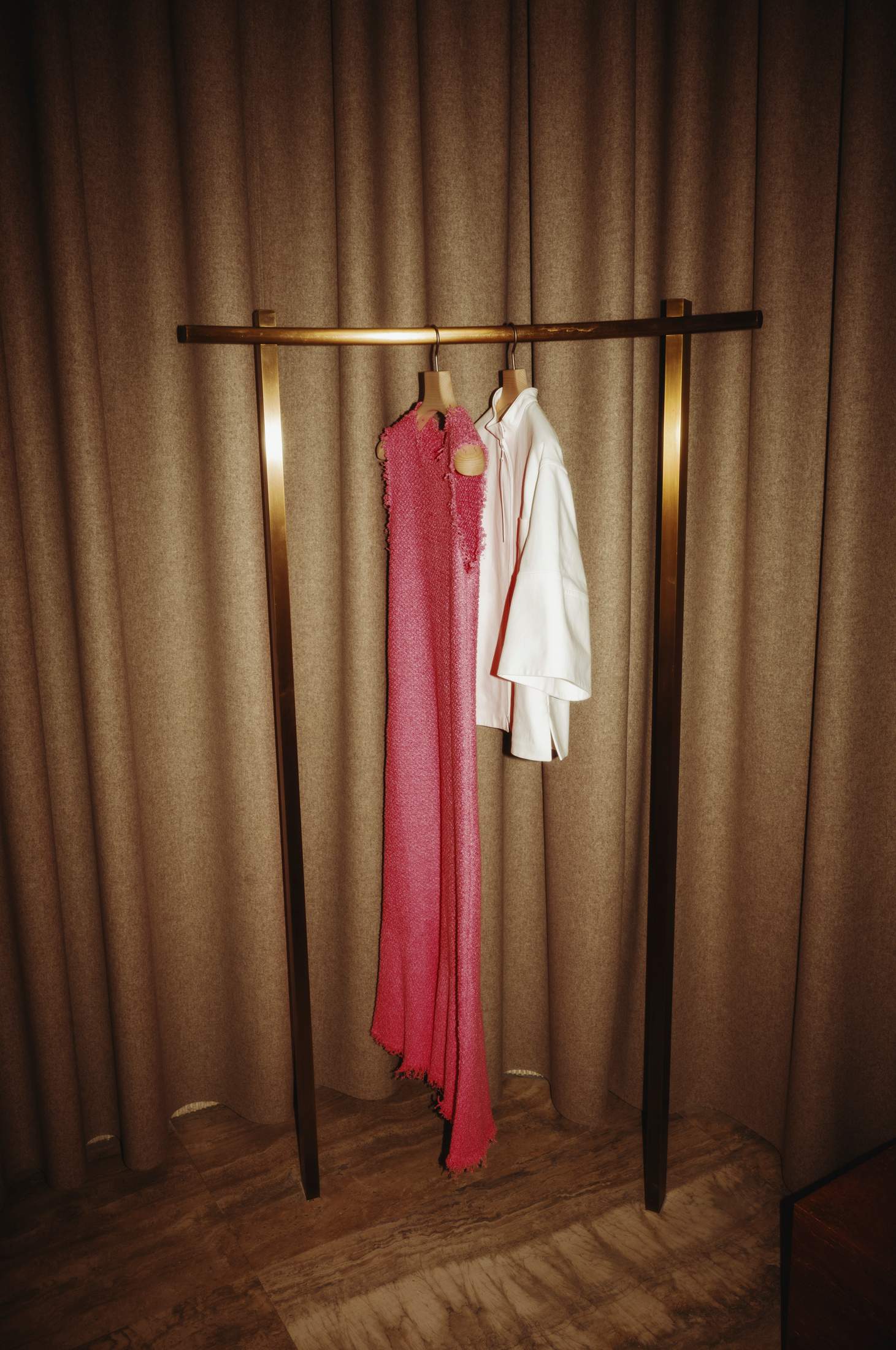
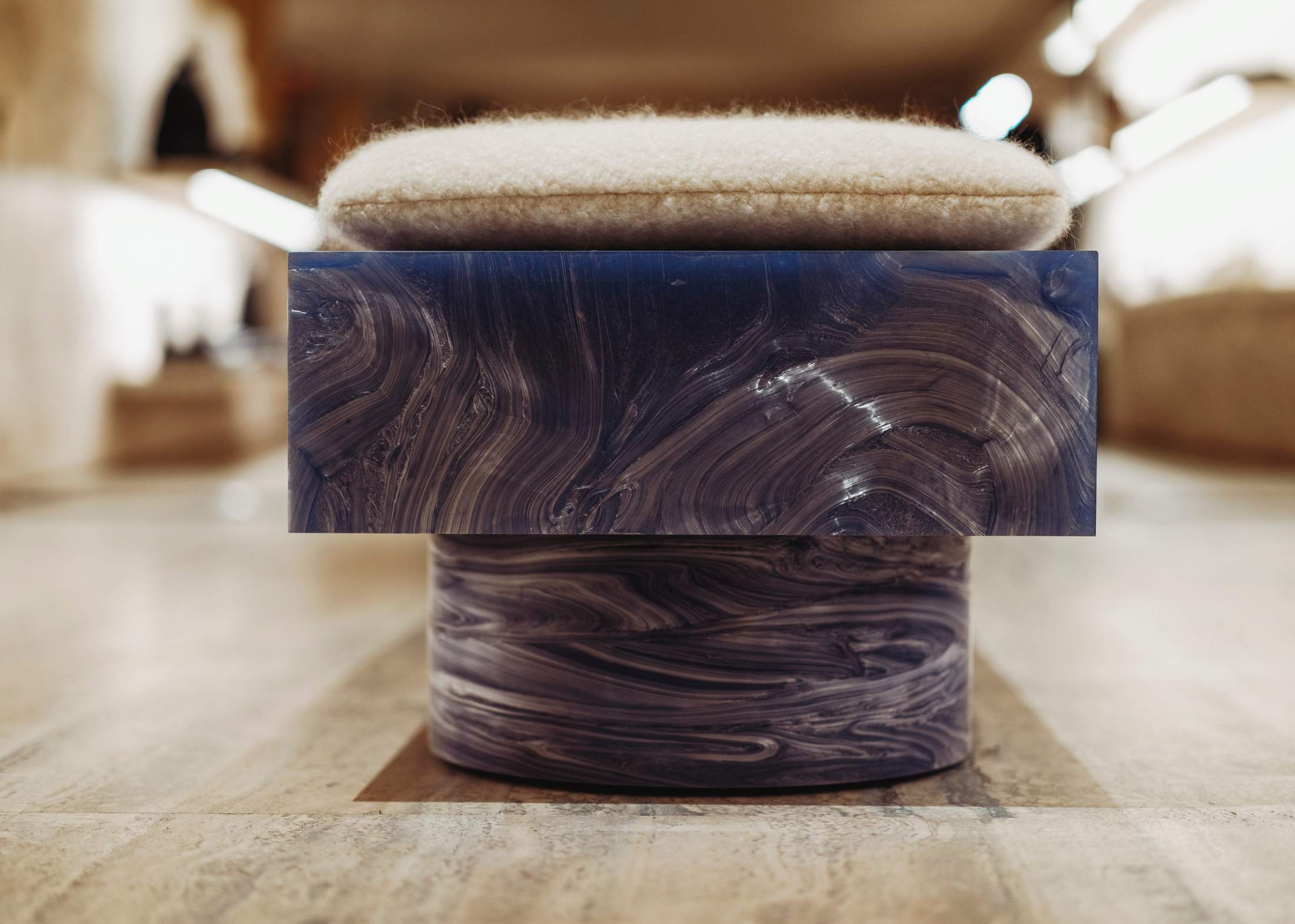
Indeed, the new space feels like a breath of fresh air on Bond Street, where new openings have become less frequent of late. At the door, smiling staff in crisp white shirts set the tone, while inside, the sense of warmth that the Meiers were aiming for is immediately felt through the use of raw travertine, brass poles that create more private, intimate sections and subtle touches of colour, like the pair of silver-blue benches, created using recycled CDs. There’s enough product on display to encourage browsing – a refreshing change from current design trends where shop floors are sparse and boutiques resemble museums. “The idea of slick, quite intimidating spaces is in the past,” says Luke. “There needs to be an element of discovery and you should feel like you’re having a unique experience. The sounds, the interaction with people, need to be at a very high level. This isn’t just a place where you come and pick something up; it’s a place to experience.”
To bring the experience to life, the Meiers collaborated with Olaf Kneer and Marianne Mueller, the architects behind the White Cube gallery in London, Celine shops and Saint Laurent runway sets. Like every Jil Sander project, the Meiers started with a creative exchange of “feelings, ideas and hopes for the project”. They didn’t want Mueller and Kneer to draw too much inspiration from their fashion, asking them instead to bring their own perspectives and expertise to transforming the compact, square space into something open and welcoming. “We talked a lot about volume, detail and our shared respect for materials, as well as the experience of a person in the space,” says Luke. “We wanted it to be considered and inviting, not overly decorative.” Without drawing too many direct references from the label’s clothing, Mueller and Kneer were inspired by design that transcends time. “People talk about a garment as your second skin, while architecture can be considered as a third skin; you need to live with it for a long time,” says Mueller. The sense of longevity they attached to the space informed their focus on natural materials – mostly wood, marble and travertine – treated in a variety of ways to ensure subtle elements of surprise. “At the end of the day, we all have more or less the same materials to work with so it’s all about how you treat them, how you choose to cut a stone,” says Kneer.
Luke is a big fan of London – and occasionally tries to convince Lucie to move there – but the location of their new boutique didn’t inform its design. Instead, they wanted to develop a new set of architectural codes for Jil Sander that could be adapted in other locations. Next up is Ginza in Tokyo. “We want to explore variations of the same theme and understand what the potential of our concept is when applied to different locations and cultural contexts,” says Luke, adding that they see their partnership with Mueller and Kneer’s cmk studio as long-term. “We’re excited about travelling to Tokyo together; it’s the biggest city on Earth but it still feels so relaxed, so quiet somehow.”
Despite the ephemeral nature of fashion, the Meiers apply this long-term thinking to all their projects, whether retail design, their seasonal collections or their ongoing print project, Jil Sander Publishing. Their latest volume, Manchester, was made in collaboration with UK photographer Chris Rhodes, whose portraits of musicians and DJs, such as Jeff Mills, reflect the designers’ fascination with the 1990s. “We don’t like loud, online [communication],” says Luke. “With print there’s a curatorial element: every page deliberately follows the next rather than having a series of hyperlinks that send you into a labyrinth,” says Luke. “Having the perspective of someone like Jeff Mills about the late 1990s was so interesting because there are so many parallels with what’s going on today. Technology was becoming part of people’s daily lives and there was more information exchange – the difference was that there was more optimism back then. We want to encourage people to think a little bit more like that again, instead of seeing darkness everywhere and thinking that artificial intelligence will destroy the world.”
At a time of global uncertainty, using creativity to inject a dash of optimism into the world is what the Meiers are ultimately hoping to achieve. “We’re not naive enough to think that what we’re doing is saving the world in any way,” says Luke. “But if we can inspire someone, work with great artisans who care about what they’re doing, that’s really important. In the end, it’s about good materials, good people, good design and a rigorous thought process – that’s our medium for commenting on the world.” — jilsander.com


