April / Global
The Agenda: Design
Copenhagen’s high hopes, a royal rumble in Saudi Arabia and Ecuador’s collaborative communities.
CITY PLANNING–––SAUDI ARABIA
Royal Invitation
Established in 2017, the Royal Commission for Alula is master planning a vast overhaul of its namesake conurbation – an oasis in the Saudi Arabian desert. “We’ve got about 42,000 people living in Alula and the ambition is that by 2035 we’ll have 130,000 residents,” says Navdeep Hanjra, the commission’s vice-president of planning and development. “The only way we can reach those numbers is by ensuring we have policies in place, so that people want to stay.”
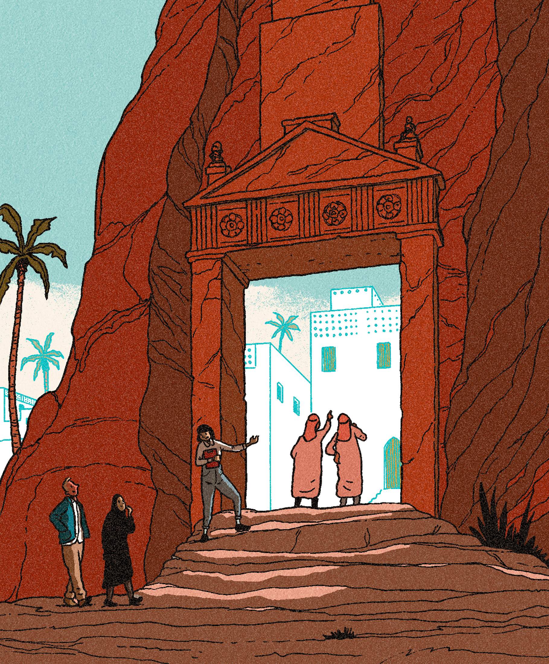
It’s an outlook that means Hanjra and her team are placing equal emphasis on improving the built environment and on the social aspects of city living. To deliver this vision, the Royal Commission for Alula has been working with the existing population from the outset. “We have launched a programme for local youth, training them to become guides. This allows them to give tours of the cultural sites in the area and capitalise on the knowledge they have from growing up in Alula,” says Hanjra. “This means they can talk about the more intangible heritage, having heard these stories from their grandfathers and so on.”
For Hanjra, such initiatives help build trust, a key element in delivering a place that makes new and existing residents feel welcome. “The only way you can do that is by involving people from the very start [of the master planning process],” adds Hanjra. “It’s about having a sense of belonging, where people see that the city is working to give back to the community and increasing opportunities for employment. We are putting Alula on the world map.”
On DESIGN
NIC MONISSE ON...
Beauty standards
I spent an early spring weekend in Clearwater Beach – and I can’t say that I plan on returning in a hurry. I found the contrasts in the small Floridian city, just outside Tampa, a little much: it’s a hotspot for college students seeking a beach break as well as elderly Midwesterners escaping the winter cold. Its architecture is equally varied. There are pockets of charming, low-slung condos and hotels from the 1970s and 1980s, with palm trees swaying in front of swimming pools. However, the 21st-century tourist and “snowbird” boom has seen countless big, brash apartment towers, devoid of personality and character, constructed on the beachfront too. The latter are, frankly, ugly.
I’m not alone in thinking this either. Clearwater City Council has been trying to find a way to halt the construction of these monotonous big-builds since the early 2000s. At every turn the local government has been hamstrung by the challenge of
While beauty may be subjective, a measure of whether a building is visually ‘interesting’ is much more objective
legislating for beauty – if a structure fits within the required footprint and height restrictions, it can be difficult to stop its construction on subjective grounds.
Fortunately, there might be a solution: a new book by Thomas Heatherwick, a designer who often plays on the outer reaches of the architectural establishment. Humanise: A Maker’s Guide to Building Our World suggests that while beauty may be subjective, a measure of whether a building is visually “interesting” is much more objective. Heatherwick Studio has developed a metric for calculating whether a structure has high levels of variation, detail and massing – architectural elements that create buildings which are, if not beautiful, certainly more interesting to look at than flat, plain, placeless towers.
While this digital technology is currently only employed by Heatherwick’s team, architects and city governments could use its principles to assess whether new design proposals will add to the visual appeal of a place. Should this happen in Clearwater Beach, I might even consider a return. —
RETAIL–––PARIS
Orange zest
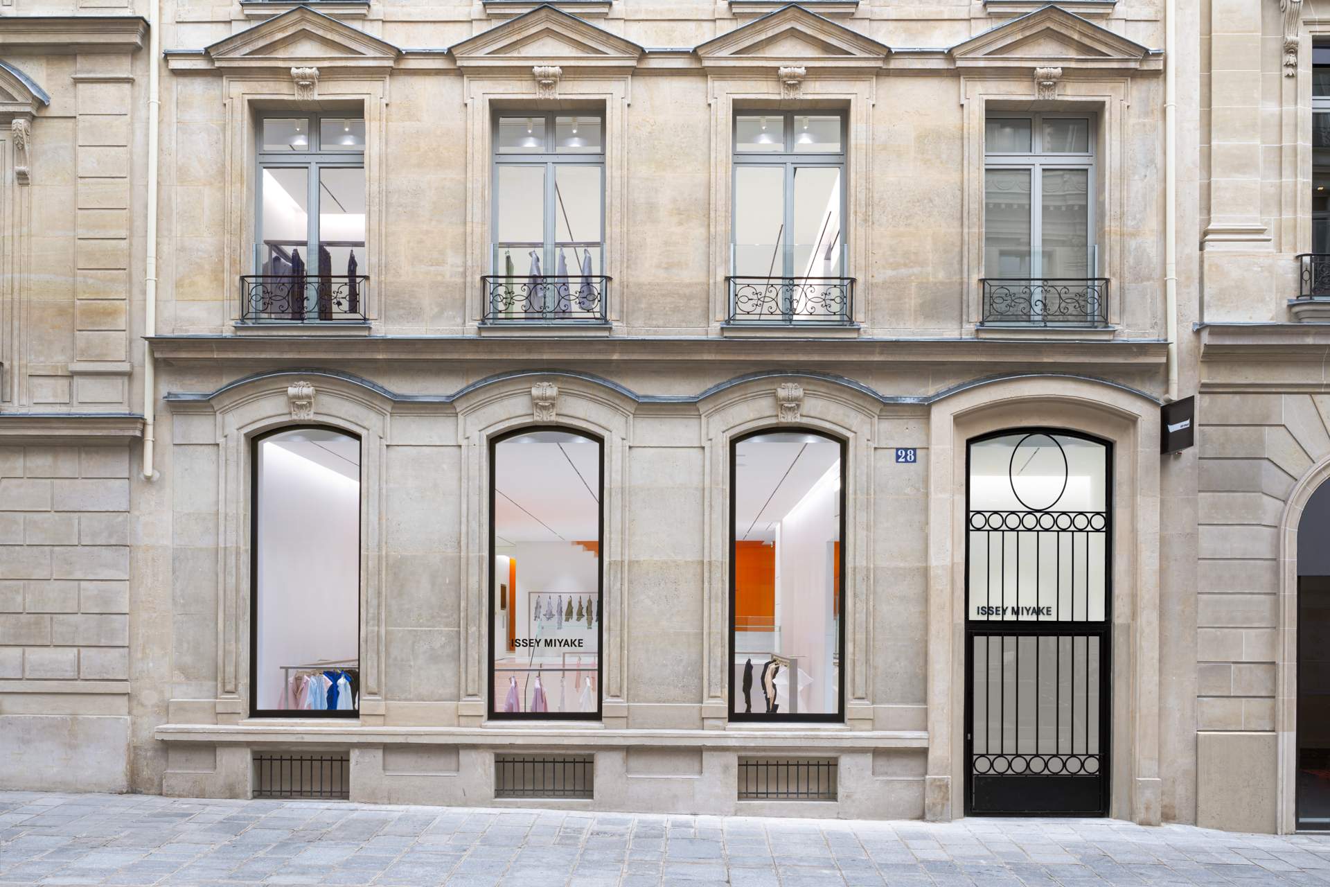
Out with the old, in with the new, as the adage goes. That’s certainly the case for Japanese fashion label Issey Miyake, which recently swapped its first Paris address on Rue Royale for a prime spot on Rue François 1er. Designed by Tokujin Yoshioka the new flagship occupies a 19th-century stone building in the 8th arrondissement.
A one-time employee of the brand, Tokyo-based Yoshioka retained the structure’s original façade – whose large windows flood the space with natural light – while reimagining its interior.
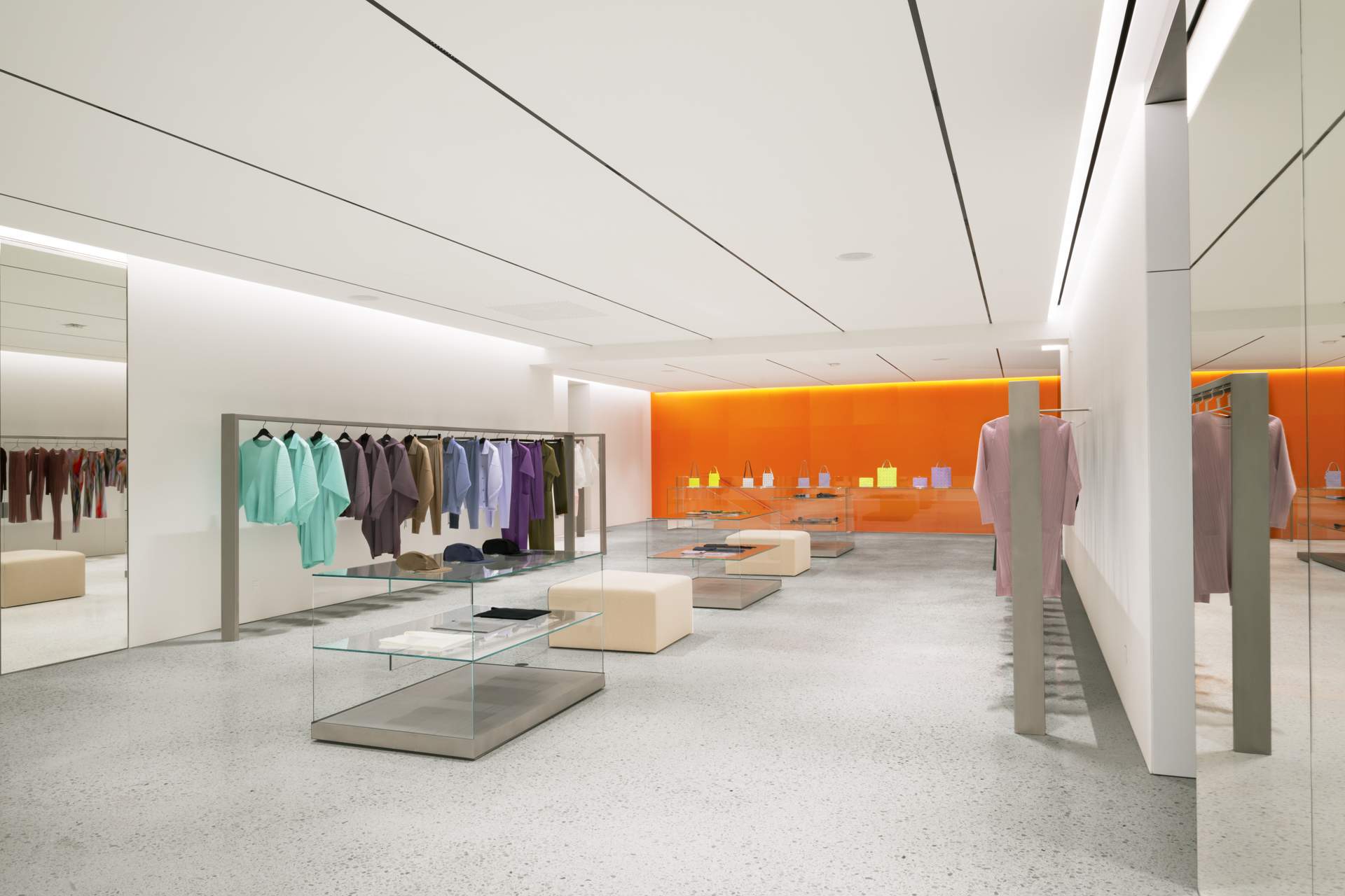
Inspired by Issey Miyake’s playful, minimalist aesthetic, pristine-white walls contrast with brushed-metal rails, beige stools and walls clad in orange anodised aluminium. “These contrasting colours, particularly the orange, give the impression of the sun,” says Yoshioka, who has designed a number of the brand’s shops over the past 30 years. “It adds a touch of futuristic energy to the space but also a sense of warmth, which reflects the philosophy of the brand.” The outcome? An uplifting spot to shop for your next L’Eau d’Issey fragrance or trademark pleated trouser.
ARCHITECTURE–––PORTO
Siza matters
The Porto School, a design movement associated with some of Portugal’s most distinguished creative minds, is today synonymous with the city’s contemporary architectural vernacular. Likewise, the Serralves cultural campus has come to define Portugal’s contemporary art scene. Now these two symbols of Porto have come together in a new space, with the completion of the Serralves museum’s Álvaro Siza Wing, designed by its namesake architect. And while the first exhibitions hosted in the structure will celebrate the work of the Pritzker Prize-winner, this is not the first time Siza has left his imprint on the estate – the nonagenarian architect designed several of the buildings adjacent to the original art-deco Serralves villa.

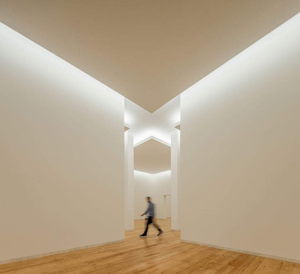
The new, 4,200 sq m wing has corners that protrude into the sky and geometric cutouts that open up views into the surrounding Serralves park. Spread across three floors, its halls will host exhibitions dedicated to art and architecture. “Álvaro Siza is one of the greatest names in the history of architecture,” says Ana Pinho, CEO of the Serralves Foundation. “Here the Serralves Collection will be on permanent exhibition, while we will have dedicated space for architecture programmes.”
SOCIETY–––ECUADOR
Free for all
Guayaquil, Ecuador’s most populous city, is growing at a rate of more than 50,000 people per year, with new infrastructure needed to cater to new communities. One such project is the Hijos del Suelo (Sons of the Land) communal house in the El Faro de Mapasingue neighbourhood.
Funded by Italian ngo Cooperazione Internazionale, it was designed by local studio bbl, a collaboration between architects Pierre Berrú, Juan Carlos Bamba, and Jorge Ludeña. The trio took on the project pro bono, hosting participatory design sessions with almost 300 local families.
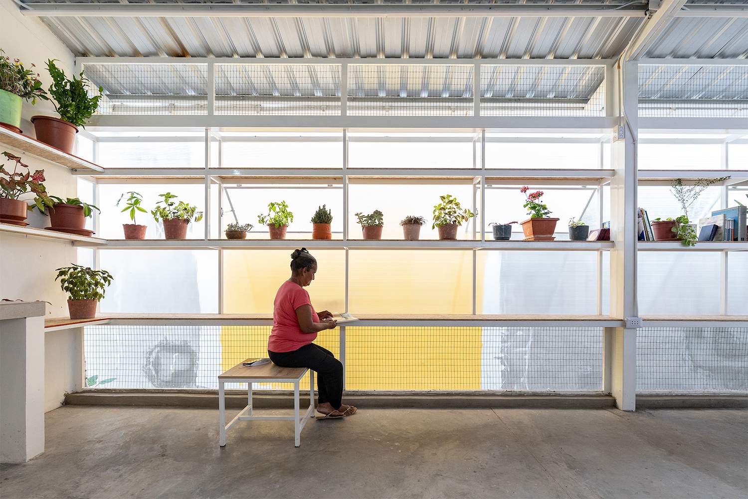
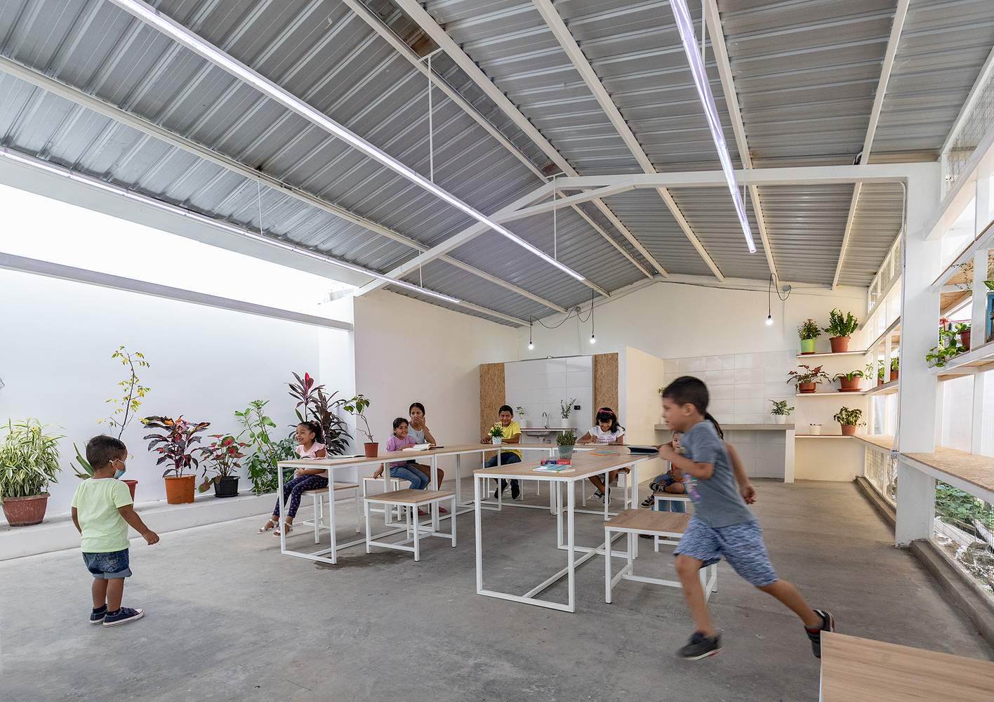
“Our approach stems from the Ecuadorian concept of minga, a tradition where members of the community collaborate on tasks like farming, construction or cleaning – all for free,” says Berrú. “On this project, we did everything through minga, including collecting furniture and objects to put inside the space before it was opened to the public.”
Today the space serves as a kindergarten and event space for the community; social workers also use it for their programmes. “Even with all the rough patches in the neighbourhood, it warms our hearts to see how the locals cherish and look after this building, never messing with it,” says Berrú. “It’s a sign that they’re happy and it shows that the space we created suits their needs just right.”
URBANISM–––COPENHAGEN
Hitting the high notes
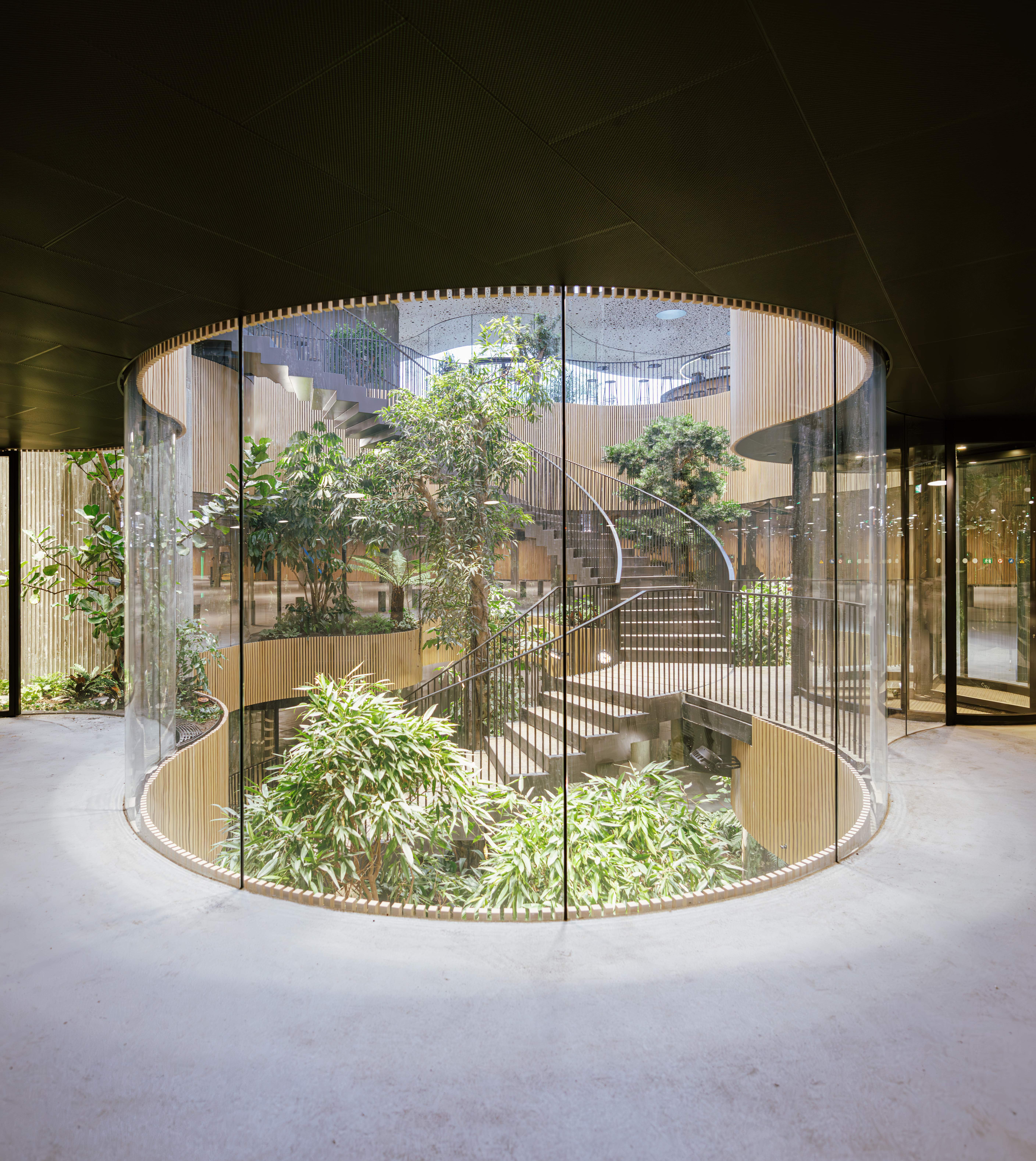
Copenhagen’s waterfront has undergone impressive redevelopment in recent decades. A host of cultural institutions and recreational hotspots have been built on the harbour, transforming it from a highly polluted industrial port into one of the most popular destinations in the Danish capital. The latest addition to this ever-evolving urban landscape comes courtesy of local architecture studio Cobe, which was tasked with creating a parking facility for the Opera House. The result? Opera Park, a lush space on top of the requisite underground car park.
“The unused plot was meant for housing but the client scrapped the plan,” says Cobe architect Alexander Ejsing. “Instead, we created a new recreational spot for everyone to use.” The park features winding paths that cross through six gardens with vegetation from different parts of the world, inspired by the area’s history as an international trade hub.
“Winters are long here, so we didn’t want the park to be desolate half the year. It’s important we make good use of it”
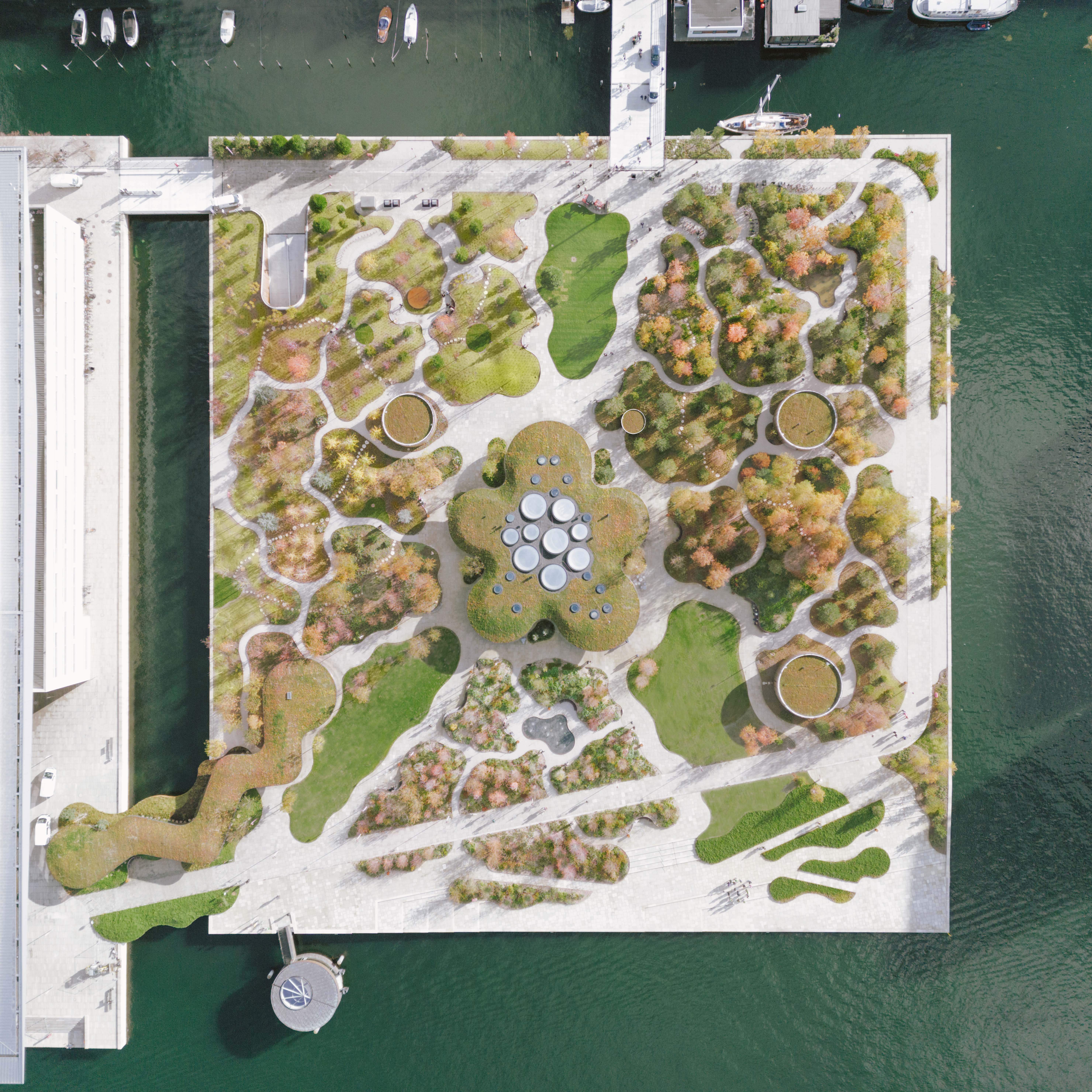
At the heart of the green space is a glass pavilion with expansive views of the surroundings and water. Inside, a restaurant and café offer seasonal dishes, while a garden of tropical vegetation, which includes a 12-metre-tall tree, leads to the underground parking lot.
Beyond providing a destination for food and drink, the pavilion plays a crucial role in making the green space a year-round destination. “Winters are long here, so we didn’t want the park to be desolate half the year,” says Ejsing. “It’s important we make good use of it.”


