Design: Top 50 / Global
And the winner is...
The latest edition of the Monocle Design Awards is here to celebrate the year’s most inspiring and ingenious products, models and structures – and the people who conceive them – as they set the standard in both form and function across private and public spaces.
What makes good design? At monocle, our view has always been that it involves people and projects that seek to improve quality of life. So it’s only natural that the Monocle Design Awards should build on this outlook, with prizes highlighting the ways in which enjoyable, attractive and practical works can enhance our homes, offices and cities – and help to build communities too.
For this fourth edition of the annual awards, as in previous years, monocle’s team of editors and correspondents have scoured the globe for those who are setting new benchmarks. There are 50 prizes, presented in no particular order, covering works from six continents and 31 countries. Among the winners are a freshly developed typeface for a West African dialect, a smart airline update from a French high flyer, a zippy new bike from Switzerland and an impressive imprint from Chile.
Our hope is that this listing doesn’t just recognise best practice and acknowledge those making our lives better and more beautiful – but that it serves as a resource too. Want to find out about the ideal architect to work with for your next residential project? The graphic design studio to commission for a packaging update? Or the chair that would perfectly complement your dining room table? Well, read on and find out.
1
best portable light
W241 Faro lamp
Sweden

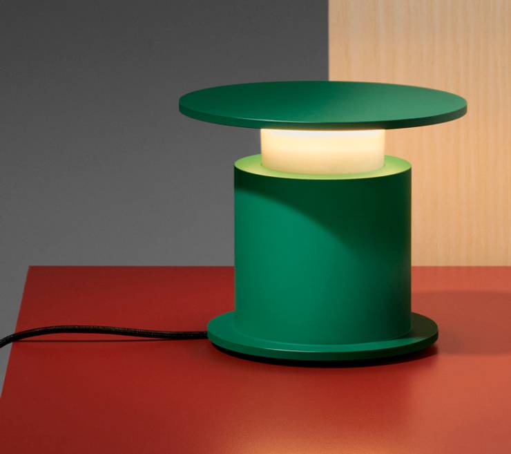
The lighthouse-shaped silhouette of Wästberg’s Faro lamp encapsulates the dimly lit Mediterranean milieu where the Swedish manufacturer and UK architect David Chipperfield found their guiding light: Corrubedo, the vibrant Galician fishing village where you’ll find Chipperfield’s airy Bar do Porto. The portable, rechargeable lamp emanates a particularly gentle glow, the result of its unusual form and sheltered light source. Crafted from aluminium, the sleek piece balances modesty and grandeur. It’s a marriage of Chipperfield’s minimalist style and Wästberg’s flair for crafting lower-energy alternatives to conventional lights. Despite its size, the w241 Faro stands remarkably tall.
wastberg.co
2
best community initiative
Community Plant Library by One Bite Social
Hong Kong
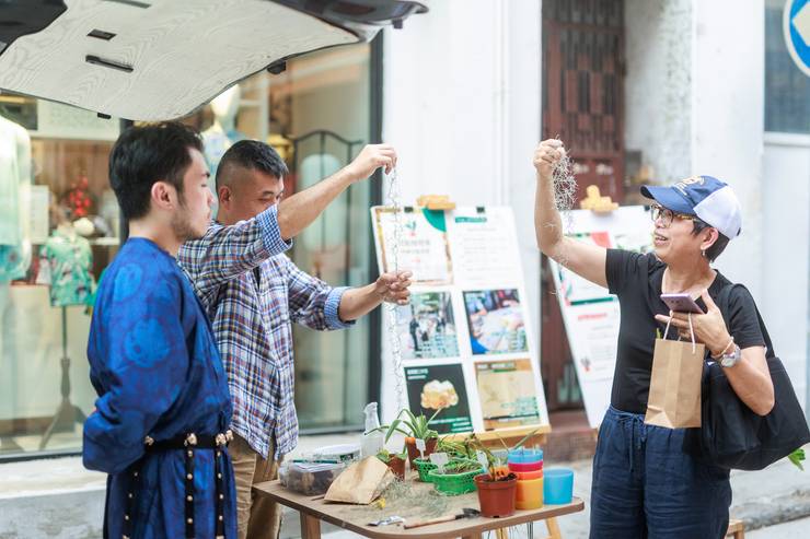
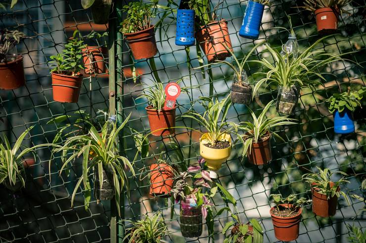
Though there’s plenty of greenery surrounding Hong Kong, the city can often feel like a concrete jungle. It’s a narrative that One Bite Social, the charity division of architecture and urbanism firm One Bite, set out to change in 2021, when it launched a Community Plant Library in the San Po Kong neighbourhood. “It’s an old industrial area,” says Sarah Mui. “We wanted to use plants to bring the community together.” To do so, Mui and her team spoke to residents and shopkeepers about the vegetation on their streets, from their favourite trees to potted plants. Over six months, installations were designed around a selection of plants, while regular workshops were held on topics such as plant dyes and upcycling coffee grounds.
The project was a hit and spawned two more Community Plant Library initiatives in the Sheung Wan and Sham Shui Po neighbourhoods last year. While all of these initiatives have now wrapped up, their effect is still felt. In Sheung Wan, there is a plant exchange station and continuous engagement within the community.
“Plants connect all ages,” says Mui. “Every mobile Community Plant Library session attracted people of all ages and plants became the connector for conversations.” It’s an outcome that wouldn’t have been possible without One Bite Social’s designs. The project is an example of how small interventions can have lasting benefits.
onebitedesign.com
3
best office edition
Zuzulu System by Alki
France
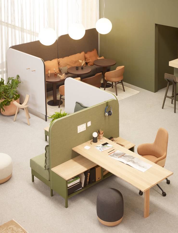
When Basque Country-based industrial design studio Iratzoki Lizaso set out to create a workplace furniture range that would offer intimacy while fostering collaboration, it teamed up with family-run company Alki. The result is the modular Zuzulu space-planning system, named after the traditional seat-cum-table found in the kitchens of Basque farmhouses. Made from oak panels and fabric-upholstered partitions, the system can be rearranged to organise open-plan spaces to meet various needs. Whether you need individual workstations, meeting areas or breakout zones, the possibilities are endless. The system can even be combined with Alki’s other furniture collections. Colourful and full of character, the Zuzulu system will bring a sense of warmth to any work environment.
alki.fr
4
best café
Byasa Café
Indonesia
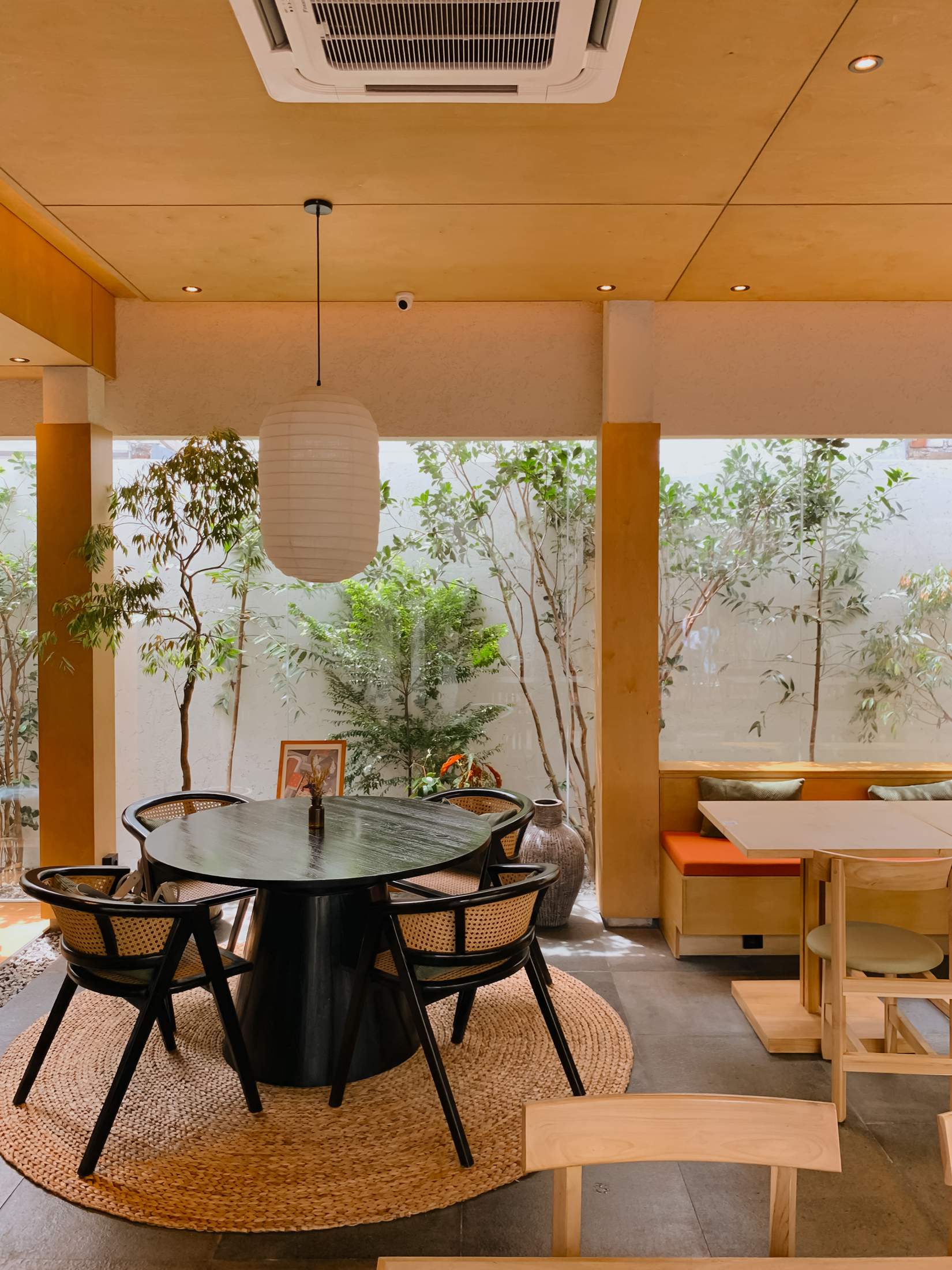
Byasa Café is a relaxed addition to the growing hospitality scene in Bandung, a bustling metropolis that’s a three-hour drive south-east of Jakarta. Set in a generous, open building in the heart of the city’s commercial centre, the café was

designed by homegrown architects Studio Asa, with interiors that nod towards refined Japanese minimalism. Yet the mood is unmistakably casual and approachable.
“We wanted to build a space that is not only visually pleasing but also intriguing and stimulating to the senses,” says Studio Asa’s Amelinda Vidyasti. It’s an outlook that led Vidyasti and her co-founder, interior designer Bey Riffandie, to create a series of interconnected spaces that unfold as customers move through the venue. A narrow three-metre-wide passageway, lined with bamboo, leads to the sun-filled heart of the café, which spills out onto a verdant courtyard.
The result? A hospitality outpost where coffee isn’t the only pick-me-up. The urban sanctuary-like atmosphere ensures customers can recharge, feeling far removed from the city despite being in its densely populated centre.
studioasa.id
5
best new branding
Cask by Shinanoya
Japan
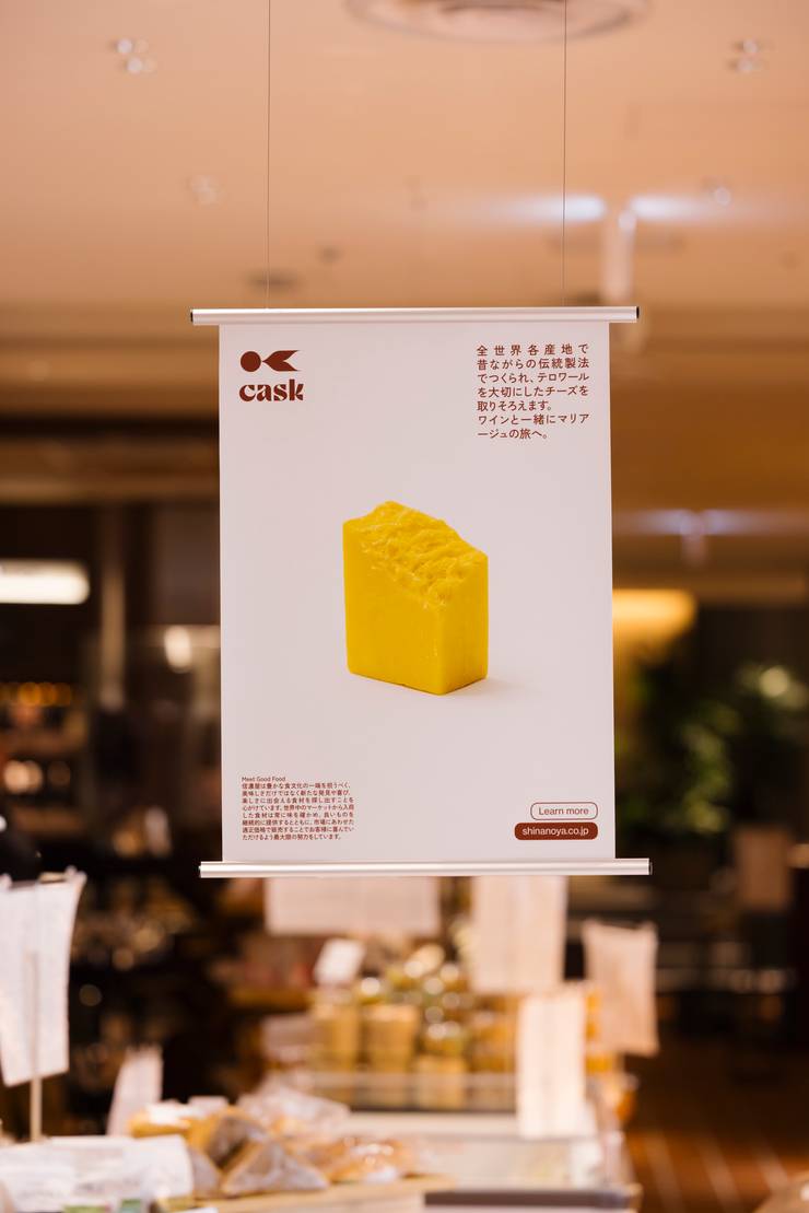
With almost 100 years of selling food and wine under its belt, grocery company Shinanoya in Tokyo had earned a rebrand. For its new logo, it hired design studio Faa, comprising graphic designer Junichi Ishikawa and creative director-cum-photographer Satoshi Matsuo. Thrilled with the results, the company worked with Faa again on a concept that it had for Toranomon Hills Station Tower. Instead of fruit and meat, this shop would sell prepared food, healthy bento boxes, cheese and wine. Faa came up with the name, Cask, and a compelling logo, complete with an original typeface.
The resulting logo references the ropes that encircle traditional Japanese barrels alongside a circle that evokes a cask or bowl. A nice touch is the posters that hang in the shop (get those on sale alongside the organic rice), which each show one product or glass of wine. “We wanted the posters to be as simple as possible,” says Ishikawa. “Honesty and transparency about where food comes from is important to Shinanoya and we wanted to express that visually.” Faa is barely a year old but is building an impressive portfolio of work. This talented duo aren’t bothered about conventional categories and happily stray into interiors for the likes of Tokyo café brand Parklet. And don’t bother looking for them on social media; they have been too busy to work on that. Just head to Toranomon, select some wine from Cask’s impressive cellar and take in some finely executed branding work.
shinanoya.co.jp
6
best floor lamp
G21 by Ligne Roset
France
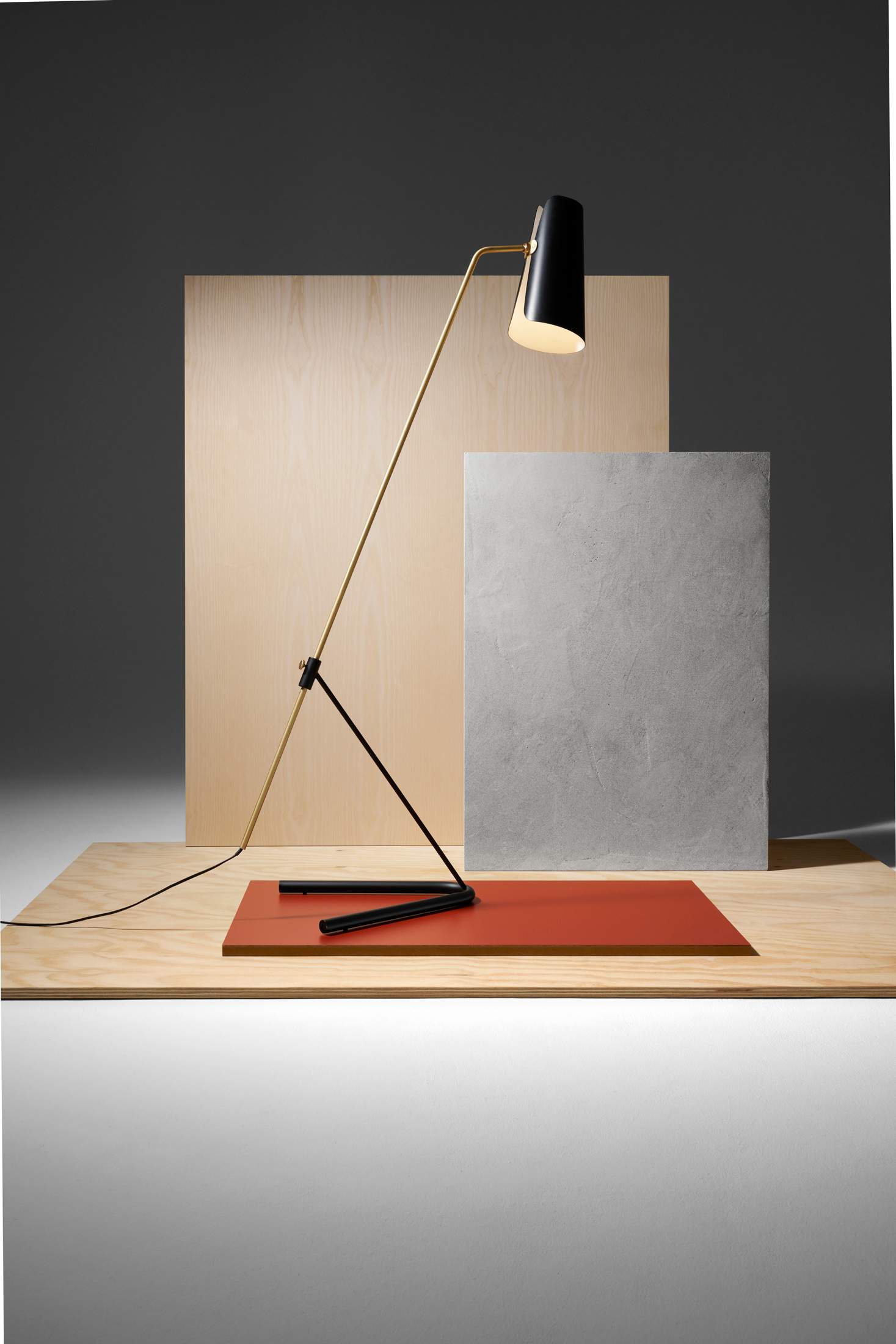
Connoisseurs of French mid-century design will delight at the news that engineer, designer and interior architect Pierre Guariche’s beautiful pieces are getting a second outing thanks to French furniture manufacturer Ligne Roset. One of the highlights of this line of reissues is the G21 floor standard lamp, which Guariche designed in 1951. The elegant luminaire has a delicate aluminium shade, a slender stem in lacquered brushed brass and a V-shaped base. A sliding peg lets the user adjust the height for greater comfort. All this carries the G21 into the 21st century with credence and grace.
ligne-roset.com
7
best shop fit out
Bottega Veneta
Italy

For Italy’s luxury fashion houses, there’s nothing more covetable than a spot in Milan’s Galleria Vittorio Emanuele II. Its newest arrival is Bottega Veneta, which opened an outpost in the 19th-century glass-vaulted arcade in early 2024, transporting customers into the brand’s modernist world. Bottega Veneta’s creative director, Matthieu Blazy, who designed the shop himself, chose to focus on three materials – glass, Italian walnut wood and green Verde Saint Denis marble – highlighting the power of stripping things back and offering a confident, focused point of view.
The result is a space that feels warm and welcoming, with natural materials set in contrast to industrial glass blocks on the walls, while softer touches include plush emerald-green carpets and leather sofas. These furnishings are all part of an existing design language written by Blazy and translated inside Bottega Veneta outposts around the world.


The new Galleria boutique offers a natural continuation of this retail vision, set inside a historic, albeit unusually compact, location. But instead of limiting Blazy, the shop’s size offers opportunities to play with scale – the large curved staircase at the centre has even more visual impact in this small space, for instance – and to highlight one- of-a-kind designs, including a series of Sardine bags, featuring handcrafted ceramic handles. The modular shelving used to divide the space also creates a more intimate, homely feel.
“There are different experiences of space in the store,” says Blazy. “I wanted to express the idea of a domestic interior referring to Italian modernist architecture, and to capture the intimacy and the imagination of getting dressed.” It’s an ambition that Blazy and Bottega Veneta have successfully fulfilled.
bottegaveneta.com
8
top school design
International Community School
Iraq
When Lebanese architects Ahmad Beydoun and Ghida Khayat got the call in 2019 to design an international school in Baghdad, they left their jobs in Beirut and formed design studio Muduni – “urban” in Arabic.
Muduni let the school’s form be led entirely by its function. “Most schools separate different-aged students from one another,” says Beydoun. “We wanted to emphasise mixing and playing together.” As a result, the four different buildings – for kindergarten up to high school – congregate around one central space. It works perfectly for the Iraqi capital’s climate, with the buildings shading the courtyard.
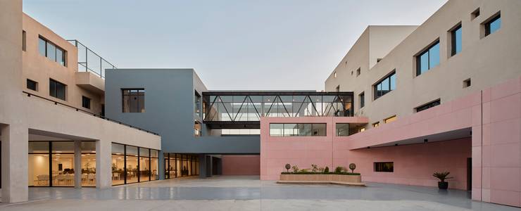

The commission wasn’t without its challenges. “The Iraqi education ministry had a lot of specific demands,” says Beydoun. For instance, despite greatly increased safety in Baghdad over the past few years, authorities wanted a thick wall to protect the students. So Muduni made the building’s base into a blast wall, moving all the classrooms upstairs.
Despite this challenge, the resulting building is decidedly playful. A central curved ramp sweeps from the ground floor, creating flying walkways. Beydoun explains that every viewpoint leads the eye to the central, focal space: a large, block-like library. “It’s the main meeting place; we emphasised it to promote reading books and the value that brings to growing up.”
muduni.com
9
best community project
Mariam’s Library
Tanzania
When Mai Al Busairi, principal architect and founder of Parallel Studio, tackled the not-for-profit design and build of a library in a rural Zanzibar village, she wanted to ensure it would serve the community well. Rather than creating something she assumed the villagers would want, she asked them what they needed. “The school principal told me that the lack of books makes it hard for the teachers to teach,” says Al Busairi. The pupils also needed a sheltered place to spend time away from the harsh sun in the early afternoon. So the idea for a school library was born.
Prior to the build, Al Busairi spent more than a month on site, monitoring the effect of the sun, wind and rain. This approach led to the creation of walls made from local clay bricks and punctuated with open windows to allow for a through-breeze, opaque fibre sheets to strain the harsh sun, and a cantilever roof to allow rain to run off. “We wanted it to be sustainable,” says Al Busairi. “We didn’t want to add a cost to the school by making them use electricity for the library’s operation.”
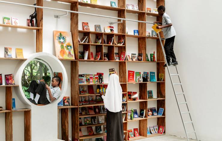
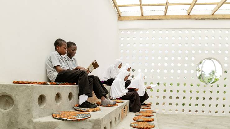
The result is a reading refuge where the school’s students, as well as children from the surrounding community, can spend their afternoons soaking up stories. For Al Busairi, the library serves as an example of how an architect’s valuable skills can positively affect under-served communities. She hopes it will motivate her peers back home in Kuwait. “I want to shed light on dedicating a small amount of profit or something beneficial to the people in need.”
para-llel.co
10
best lamp
Céramique by Flos
Italy
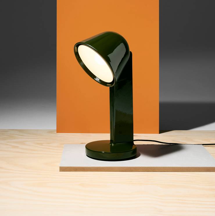
Italian lighting company Flos has long been known for its ingenious use of glass but this year it made a smashing debut in the world of ceramics. Working with French design scion Ronan Bouroullec, it created Céramique, a fun, sculptural table lamp made up of a single ceramic structure with a fixed light diffuser. Three variations are available with the luminaire angled in different directions (pointing up, down or sideways), allowing variation in lighting configurations. The crystalline lacquered finish comes in three different colourways – mossy green, navy blue and rusty red – all characterful colours that will brighten any space.
flos.com
11
best new car
Renault 5 EV
France
When Renault first launched the 5 in the early 1970s, it effectively invented a new breed of car: the small hatchback, perfect for European cities. Its pleasing boxy shape and uniquely sloped rear end resulted in it becoming wildly popular, but by the 1990s it was discontinued. How wonderful it is, then, to have it back now as the 5 EV – remodelled as an electric car but still imbued with that same plucky Renault 5 spirit and with those original design cues very much intact.


This is the case right down to details like the waffle-patterned headliner fabric. But it’s not all just retro design fun, the vehicle is downright practical, with the perfect blend of compactness and utility. The back seats have enough legroom that passengers won’t be complaining to cut field trips short. The boot can easily handle your groceries (though we wouldn’t attempt much more than one large suitcase back there). Want to tow something? You can even do that, dragging up to 500kg behind. The biggest battery version will provide 400km of range as well.
Practicalities aside, Renault hasn’t lost its sense of fun here – there’s even an optional baguette carrier by way of a wicker basket that’s ideally sized to transport your fresh loaf home or to a picnic. In other words, the new Renault 5 is the perfect playful little city car, though you might be inspired to take it further afield as well – in no small part because it will look so damn good doing it.
renault.fr
12
best urban intervention
Golden Horn Sports Park
Turkey
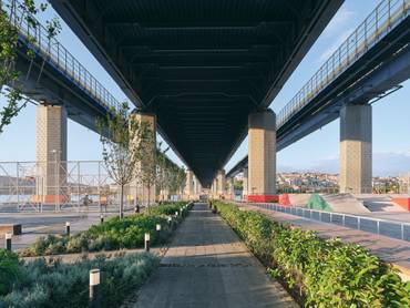
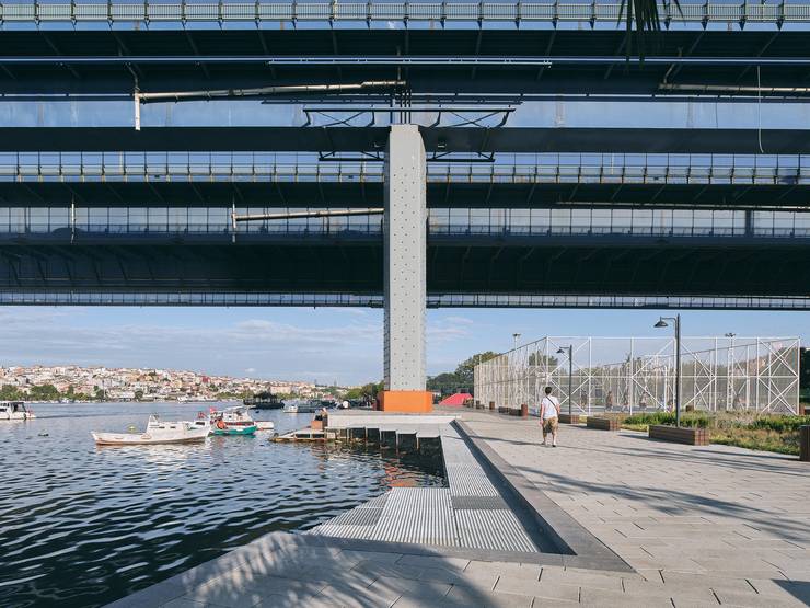
On Istanbul’s famous waterfront, the Golden Horn is an inlet of the Bosphorus backed by the city’s best known landmarks. For years it lay derelict, cut off by the main road that runs alongside it. Now, with the opening of the Golden Horn Sports Park, a mixed-use facility designed by husband-and-wife team Ervin and Banu Garip, it is a focus of the city’s social and sporting life.
“Before, you couldn’t walk next to the water,” says Renay Onur, general manager of the Istanbul municipality’s sports facilities. “The idea was to convert the Golden Horn into a place where Istanbullus can walk, play sports and spend recreational time in an uninterrupted way.”
The park covers an area the size of four football pitches and incorporates sports fields, walkways, grassy areas and bases for the city’s rowing, canoeing and sailing federations. The park’s design nods to the Golden Horn’s recent history as Istanbul’s industrial hub, with a skate park located right under a train bridge, while greenery is crammed into the once-barren space.
The project is a testament to the fact that a smartly designed urban landscape can elevate the visual quality of a city while inviting its residents to be healthy and active too. Eleven more waterfront parks are now planned for other unloved parts of Istanbul’s coastline.
yesil.istanbul
13
best new museum
Siyadi Pearl Museum
Bahrain
Until the 1920s, when the Japanese invented cultured pearls, a Bahraini pearl necklace was worth as much as a building in Manhattan. This turned the tiny island nation on the Persian Gulf, where divers harvested gems from oyster beds, into a wealthy trading outpost. It’s a heritage celebrated at the newly completed Siyadi Pearl Museum, designed by Anne Holtrop.
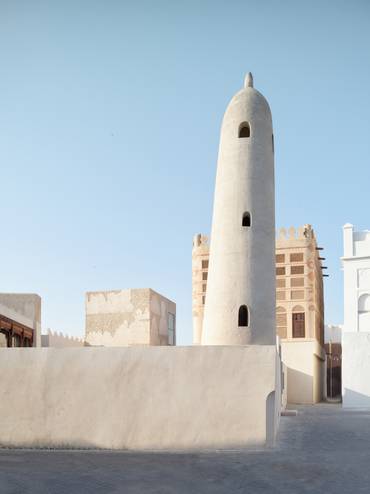
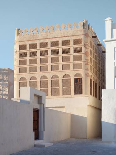
The Dutch architect started working on the project in 2016, not long after he moved from Amsterdam to Muharraq (it was commissioned by his now-wife, Palestinian architect Noura Al Sayeh). The site was the Siyadi Majlis, part of the old residence of one of the country’s foremost pearl-merchant families. Holtrop discovered that the building’s history was embedded in its walls – it was constructed using slabs of coral stone and plastered with crushed oyster shells. But half of it had been rebuilt in the 1980s. By clearing this section, Holtrop made way for a new annexe, with rooms that vary in height from two to eight metres and showcase Bahraini pearl jewellery.
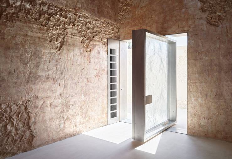
Holtrop, who has his studio nearby, uses material experimentation to riff on Bahraini architecture without falling into pastiche. The opaque, sand-casted glass doors, for instance, were inspired by traditional Islamic window screens. “I wanted to let in the light but not the view,” he says. Such an approach has led to the creation of a museum that strikes a balance between the historic and the contemporary – the perfect setting for introducing visitors to the most famous aspect of Bahrain’s cultural heritage.
anneholtrop.nl
14
best two-wheeler
Monopole No 1
Switzerland
Looking to up your city commute? Then get on the saddle of a Monopole No 01. The newly launched brand’s singular model is designed in Switzerland and manufactured in France, in a superlative marrying of design merit.
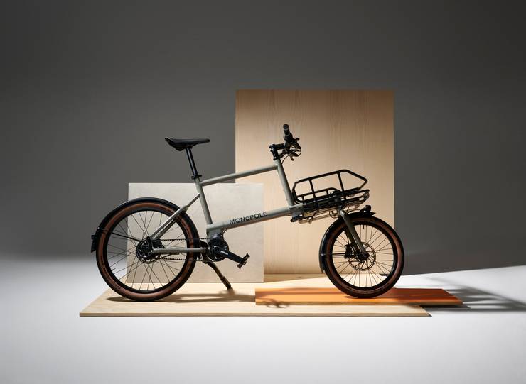
The bike’s svelte, hand-welded steel frame, varying wheel diameter and modular cargo racks that have a 30kg capacity – perfect for hauling a weekend bag, groceries or box of wine – results in a functional freewheeler that will carry you for 45km on full charge. And, at just 22kg in weight and 190cm in length, the bike can both transport and be transported. It’s a smart solution to facilitate quiet and clean car-free centres that Monopole addresses with characteristic Helvetic confidence.
monopole.cc
15
champion of craft
The Invisible Collection
France
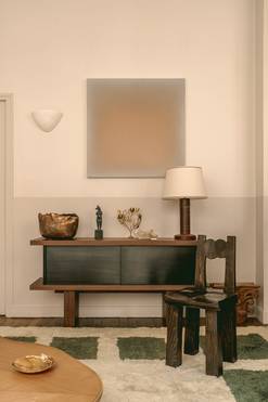
Founded in 2016 by Anna Zaoui, Isabelle Dubern-Mallevays and Lily Froehlicher (who monocle spoke to below), The Invisible Collection began as an online marketplace to make contemporary interior design more readily available to the public. Today the company has outposts in London, Paris and New York, and regularly collaborates with Chanel’s craft ateliers Le19m and French cultural institution Mobilier National.
Why does Invisible Collection mostly focus on new design?
We saw these incredible designers such as Studio Ashby and Pierre Yovanovitch being appointed by private clients, a hotel or a restaurant to design spaces and furniture. We found it sad that these pieces could be seen in magazines but weren’t being sold elsewhere. Our goal is to give these designs a second life and international reach.
How do you select the designers that you champion?
They tell us about their work and inspirations, and why they create. There’s an element of cultural relevance; the designers and pieces that we select need to stand the test of time too, hopefully to become tomorrow’s collectables. The designers need to have relationships with ateliers – the hands to deliver an idea and a vision. And they need to be able to customise pieces so our clients can modify designs to suit their homes.
theinvisiblecollection.com
16
best in brick
Dr Vishnuvardhan Memorial Complex
India
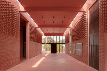
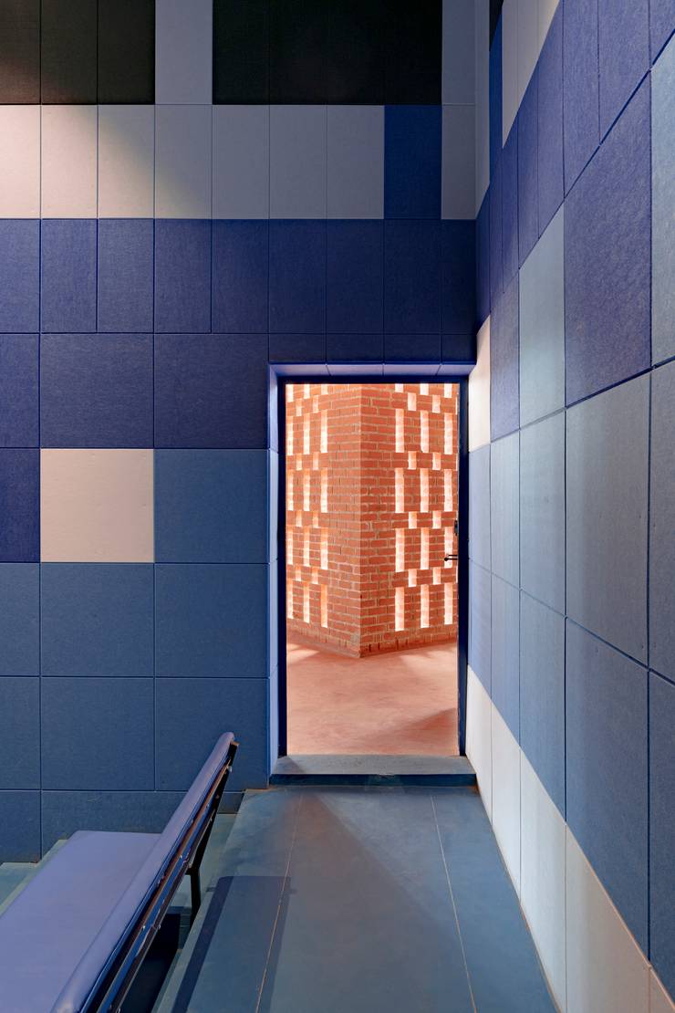
In India, as memorials to demigod actors go, statues set in landscaped gardens are most popular. But an imposing brick and concrete venue on the outskirts of the southern Indian city of Mysuru offers a new take on such tributes. When a memorial for late superstar Vishnuvardhan was proposed, his family insisted on a space that went beyond the norm, to include a venue where the region’s artists could hone their craft. They felt this was in keeping with the actor’s philanthropic bent.
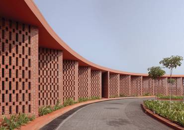
Working to the brief, Bengaluru-based M9 Design Studio created two distinct structures: a sunken gallery to showcase the actor’s life and work, built almost entirely of concrete; and a performing arts venue that uses brick creatively. “Because of their longevity, the choice of materials was obvious to us,” says M9’s founder Nischal Abhaykumar. Highlights include a perforated exterior wall made of brick, which draws on the form of theatre curtains and has been engineered without iron and concrete. Inside, brick has been layered to create texture, while skylights create a diffused warmth.
Since opening in 2023, the venue has been frequented not only by theatre groups and Vishnuvardhan fans, but also schools, which use it as a teaching space. Given the memorial’s mission statement, one could say it has started off on solid ground – thanks, in no small part, to its brick foundation.
mnine.in
17
best retrofit
Renata
Brazil
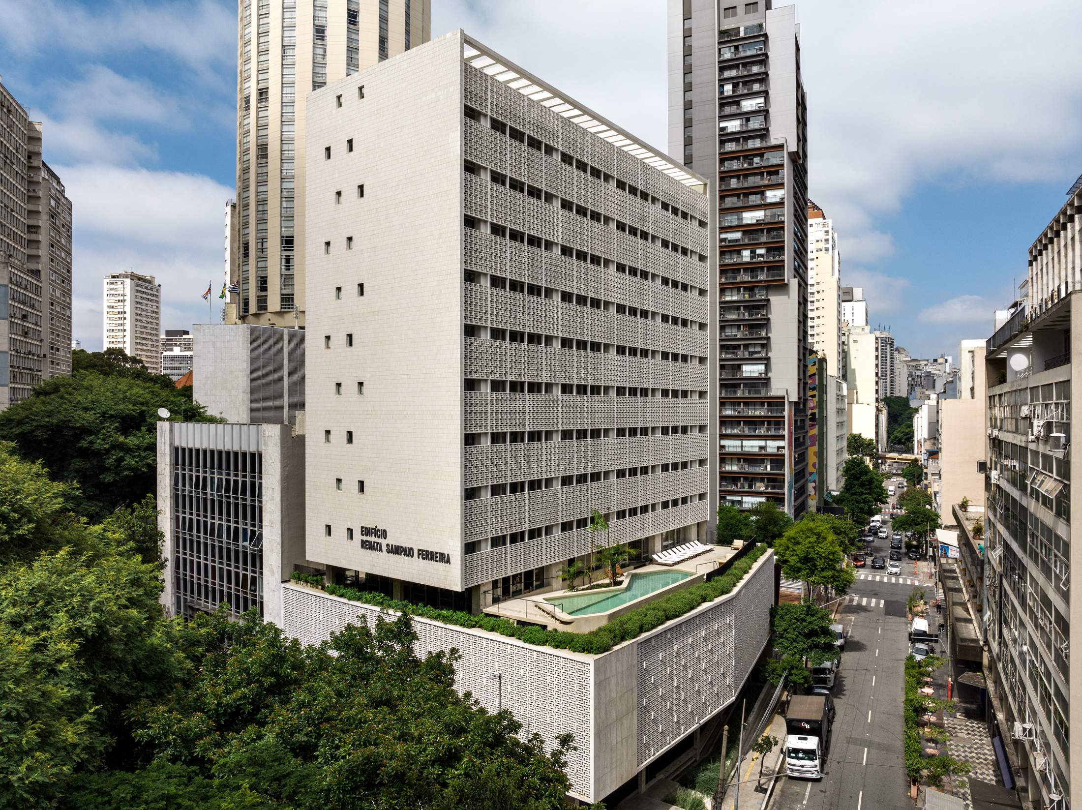
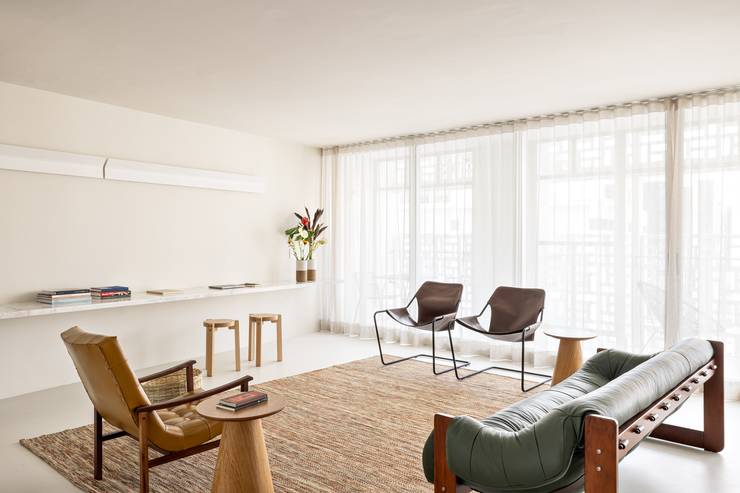
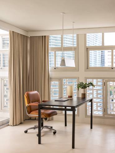
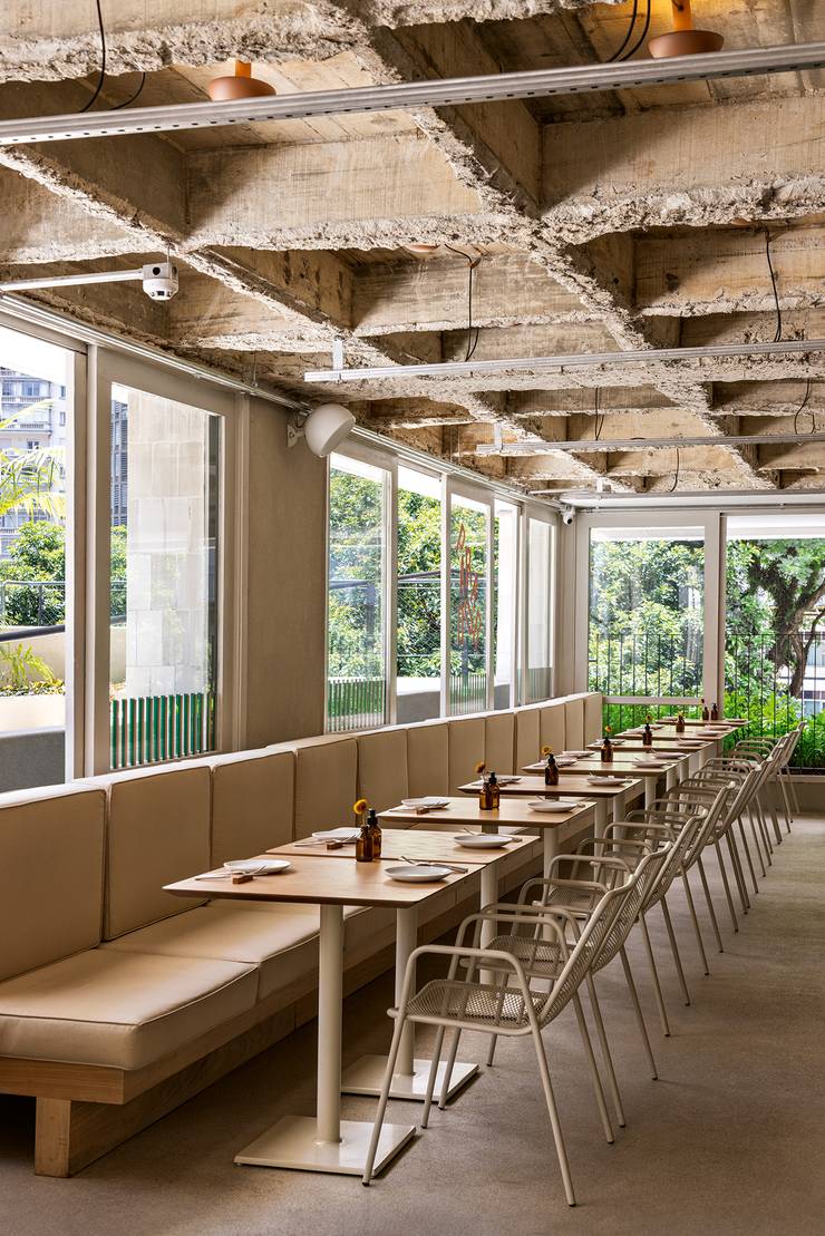
Edifício Renata Sampaio Ferreira, completed in the 1950s by architect Oswaldo Bratke, is one of São Paulo’s most celebrated buildings, thanks in no small part to its impressive façade of cobogós (breeze blocks). The building has been recently retrofitted by Metro Arquitetos, which has transformed the former office building into Renata, a structure that’s open to the public.
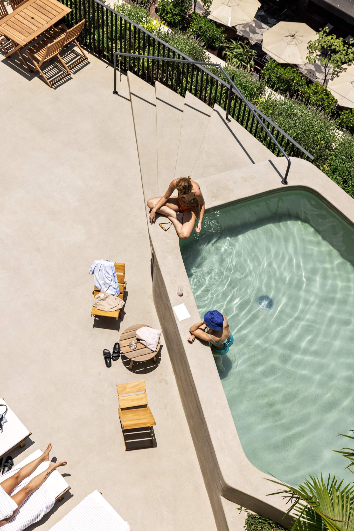
Highlights include a café, Nata; the Lágrima bar (inspired by Tokyo jazz bars); the Renata brasserie; and a beach-style third-floor pool that offers views of the city. Commercial spaces have also been transformed into residences, enabling some Paulistas to call the building home; 93 new apartments have been furnished with a mix of modernist Brazilian furniture and Japanese minimalist pieces.
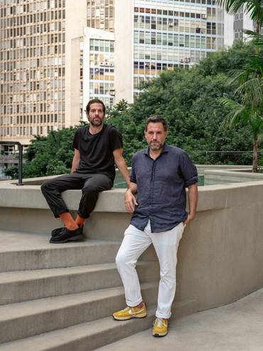
The transformation is significant for the community but it took plenty of effort. “Retrofit is a very specific challenge but it’s a service to the city,” says Metro Arquitetos co-founder Gustavo Cedroni. “With Renata we are preserving something that is unique. Our modernist architecture in Brazil is very relevant but it’s only now that it has become common to restore it.” With a benchmark project like Renata under its belt, expect more historic mid-century Brazilian buildings to get the Metro Arquitetos experience. This will not only preserve the country’s famous architecture but give citizens structures to be proud of again.
metroarquitetos.com.br
18
best institutional renovation
US Embassy Campus
Guatemala
The latest diplomatic outpost in Guatemala, the US Embassy, designed by the Miller Hull Partnership, is set on a forested plateau outside Guatemala City. The project is one of 178 that have been constructed in partnership with the US government as part of a push to improve security for American diplomats.
A series of geometric structures, the complex is surrounded by gardens planted with native species. “We drew on the ceremonial and residential planning of Maya cities,” says Miller Hull’s Mathew Albores. The main stone-and-glass building towers above the rest and is clad in brise-soleil to minimise heat gain. In a pleasing contrast, the lower buildings are finished with a granite of different shades and textures. Inside, a triple-height gallery space has views of an outdoor courtyard and forested ravine beyond. “The intent was to create an environment that provides a sense of formal grandeur while at the same time is warm and inviting,” says Albores. The effect is a dignified structure that’s grounded in its locale – an appropriate ambition for embassy architecture, and diplomats themselves.
millerhull.com

19
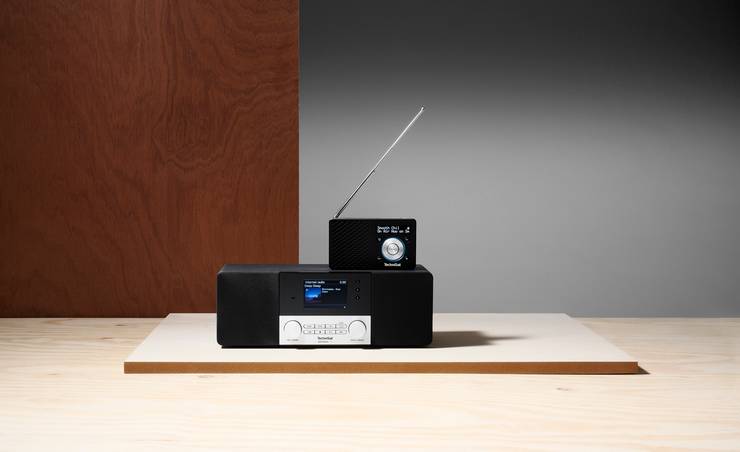
best radio
TechniSat
Germany
TechniSat has built a reputation as a top radio manufacturer with its satellite reception technology, experience in solutions for connecting data and having the broadest line-up in the market. At the forefront of its offerings are the Digitradio 4 IR – a digital hybrid that blends internet radio capabilities with Bluetooth audio streaming – the portable Digitradio 1 and the Techniradio 40 clock radio.
technisat.com
20
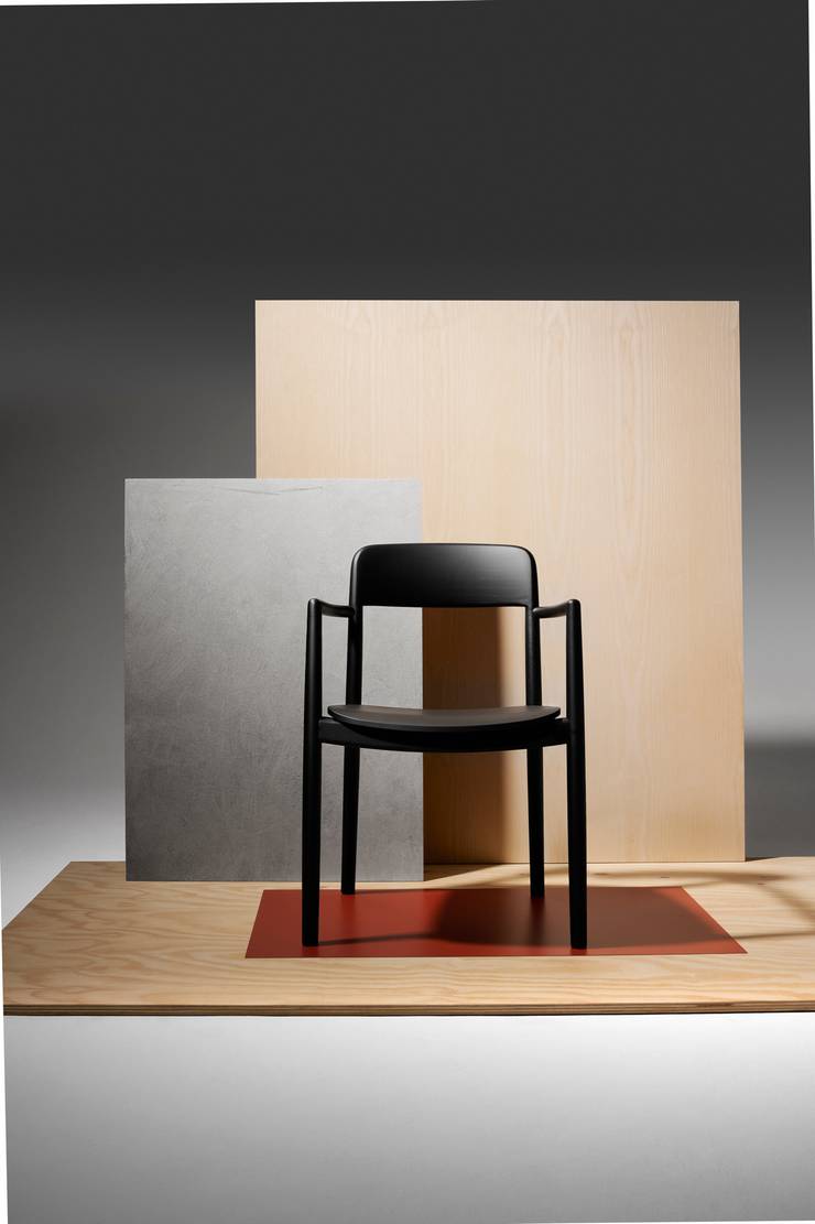
top dining chair
Villetta by De Padova
Italy
Too often, dining chairs prioritise looks over comfort. The Villetta chair sacrifices neither, instead balancing both of these crucial elements. The charcoal-coloured frame is sourced from solid aniline-dyed ash formed into sleek legs and armrests, plus a generous seat, making for an excellent place from which to relish long meals. And while the form might seem simple, it has been in development since 2016, when the Italian furniture powerhouse De Padova began collaborating with its Milan-based designer, Keiji Takeuchi. That the project has taken eight years is a testament to the brand’s commitment to unhurried processes that uphold quality above all else.
depadova.com; keijitakeuchi.com
21
best storage solution
Tylko
Poland

Launched by Benjamin Kuna and Jacek Majewski in 2015, Warsaw-based furniture brand Tylko creates custom-built shelves and wardrobes. “We wanted to do things differently from the outset,” says Majewski. “We identified the main sticking point that many people have with furniture: everyone’s home is built differently.”
Expanding from the initial idea of creating customised products, Tylko has set up an online system that allows customers to construct their shelving and storage units digitally, picking out colours and dimensions that suit their home. “This allows people to use the products for a long time,” says Majewski. “We have been around for 10 years now and people aren’t throwing the shelves away.” He credits Tylko’s longevity to its recognition of the realities of modern lifestyles.
“People are very mobile,” says Kuna. “We have designed the furniture so that it can be disassembled when they are moving house and reassembled multiple times over.” That trait underscores the appeal of Tylko and its refreshing offering of an antidote to the flat-packed furniture industry.
tylko.com
22
workshop of choice
La Metropolitana
Mexico
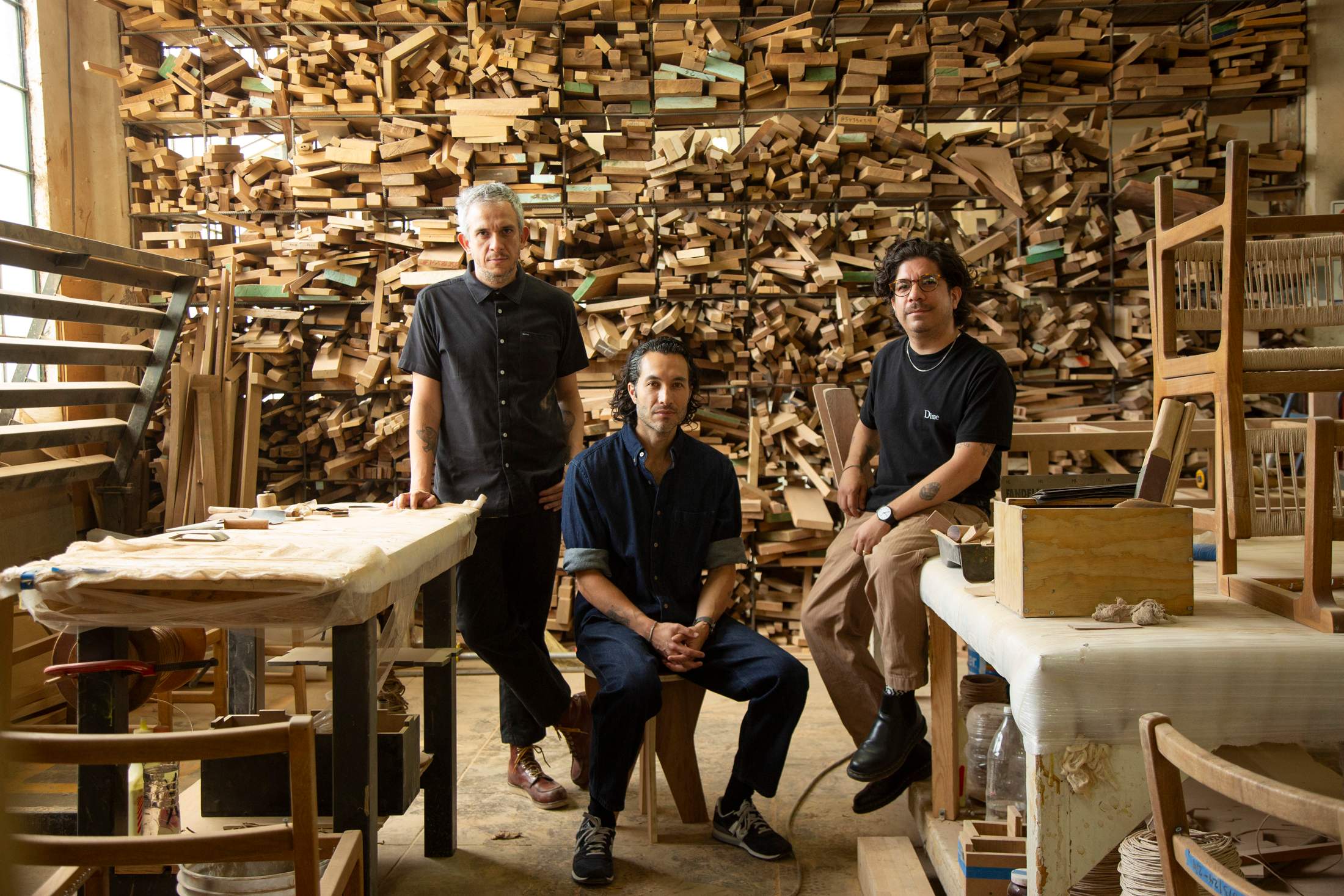
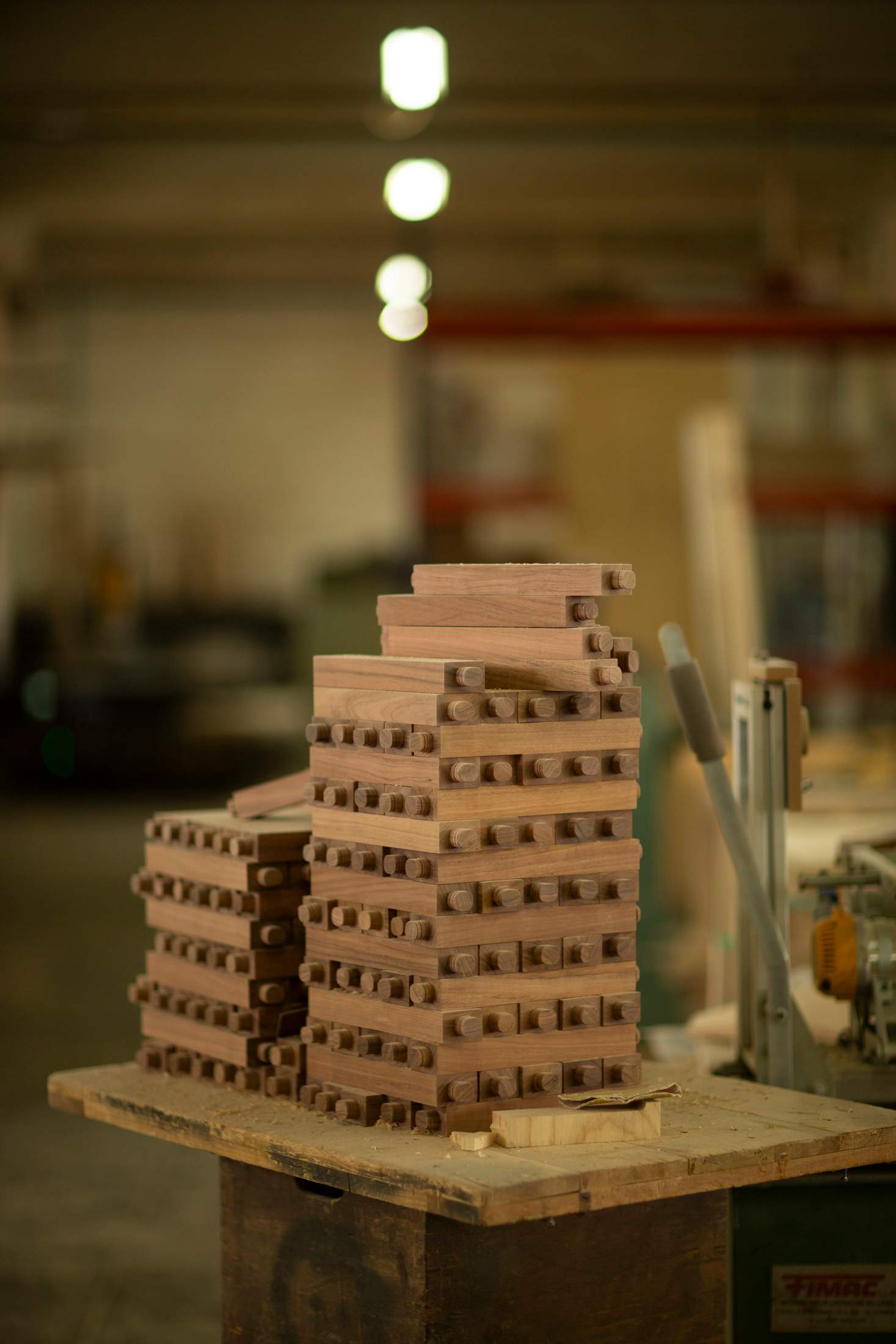
“When we started La Metropolitana, we found that we didn’t have a strong woodworking tradition in Mexico,” says Rodrigo Escobedo, who established the Mexico City-based studio and workshop in 2010 with Alejandro Gutiérrez and Mauricio Guerrero. “We decided to fill that gap.”
The company is known for wooden pieces and bespoke timber projects. Its off-the-shelf chairs can be found around the world, while restaurateurs and retailers from Copenhagen to Chicago are commissioning bespoke pieces. This international presence allows the trio to focus on growing in a more socially responsible way. “The studio and factory has become what we call fabrica escuela,” says Escobedo. “It’s like a factory school, where we teach people how to produce using our methods and technology.”
The studio is also integrating more women into its work processes in a business that is historically male-dominated – about 30 per cent of its workforce is now female. It’s a company that takes a holistic approach to trying to be better – one that other workshops would be wise to follow.
lametropolitana.com
23
top game
Uno X Kartell
USA
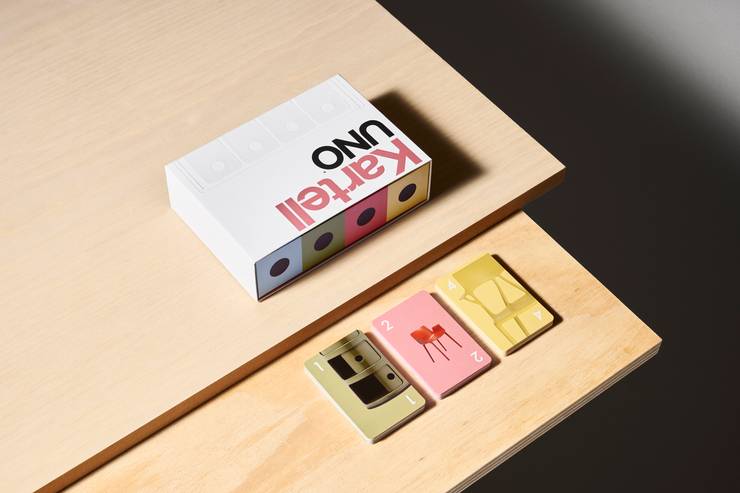
Design collaborations don’t get much more playful than this: the popular US card game Uno has united with Italian furniture company Kartell to create a design-inspired deck. The cards feature images of Kartell’s most recognisable designs, including the Bookworm shelf by British-Israeli industrial designer Ron Arad and the Louis Ghost chairs and gnome-shaped Attila side table by French designer Philippe Starck. With its clean graphics, simple sans-serif typeface and subdued pastel tones, the deck is a creative reimagining of the iconic game.
Also on the cards though? Beyond the deck, Kartell is releasing a version of its Componibili plastic storage unit – created by Italian modern designer Anna Castelli Ferrieri – with four tiers that echo the four categories of the Uno cards.
kartell.com; creations.mattel.com
24
best in the kitchen
J*Gast
Germany
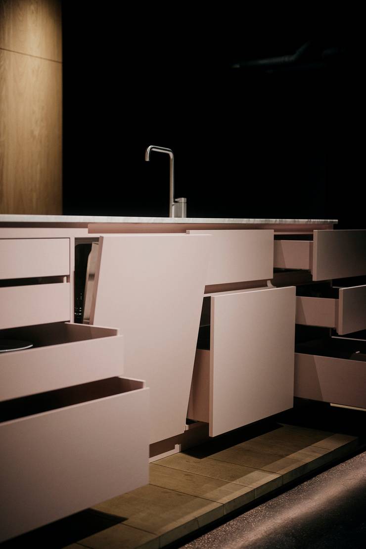
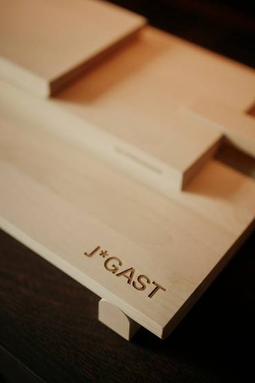
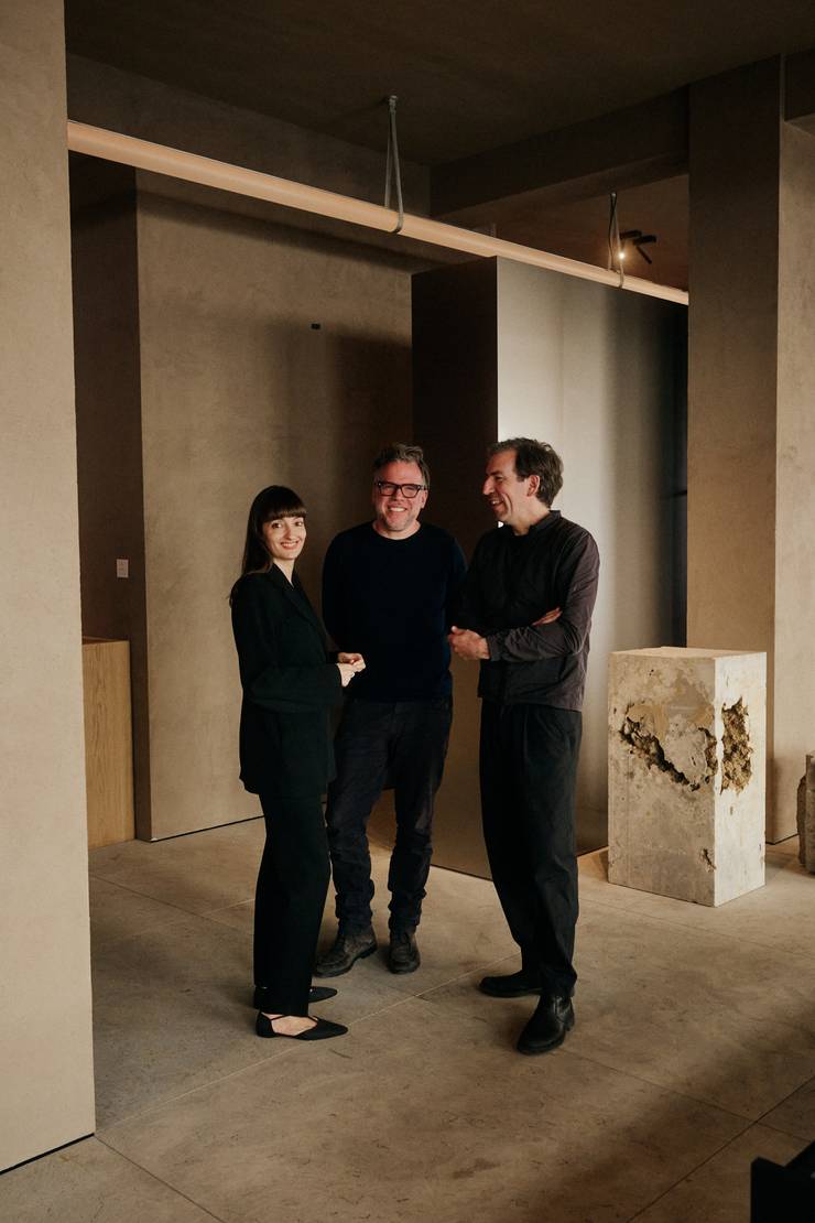
Tobias Petri and Sven Petzold, founders of interior design firm Holzrausch, had long dreamt about better built-in kitchens. When they realised three of their friends from product design and carpentry backgrounds shared the same opinion, they established J*Gast. “The kitchen market is a bit old-school,” says Petri. “You can change worktops and panels but there’s nothing new in the construction.” Working from J*Gast’s Munich showroom, the nimble team is now upending the way they are built.
Traditional built-in kitchens are made with morbidly named “carcasses”, cabinets installed box by box, often with cheap mdf crammed inside. To counter this, J*Gast has patented a lightweight wooden frame that’s fitted to the back wall, with the sides and shelves simply slotted in. It’s an approach that reduces material usage and makes the operation more economical and sustainable.
The kitchens look the part too. Designer Mike Meiré, hired as art director, created the brand identity and selected the colours and materials. Eschewing the standard faux finishes, the worktops come in solid marble, timber or stainless steel.
jgast.com

25
best in education
Krabbesholm Højskole
Denmark
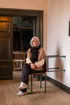
Creativity, community and social interaction are at the heart of the teaching at Krabbesholm Højskole in Skive, northern Denmark. The school for adults focuses on courses in art, design, architecture and visual communication. The højskole concept dates back to the 19th century and is uniquely Danish. Partly funded by the government, these schools occupy a special niche between a secondary school and a university, and students of all ages can spend six months to a year receiving a different kind of education in almost any subject – but Krabbesholm, which was founded in 1885, is one of the few that focuses on the creative industries.
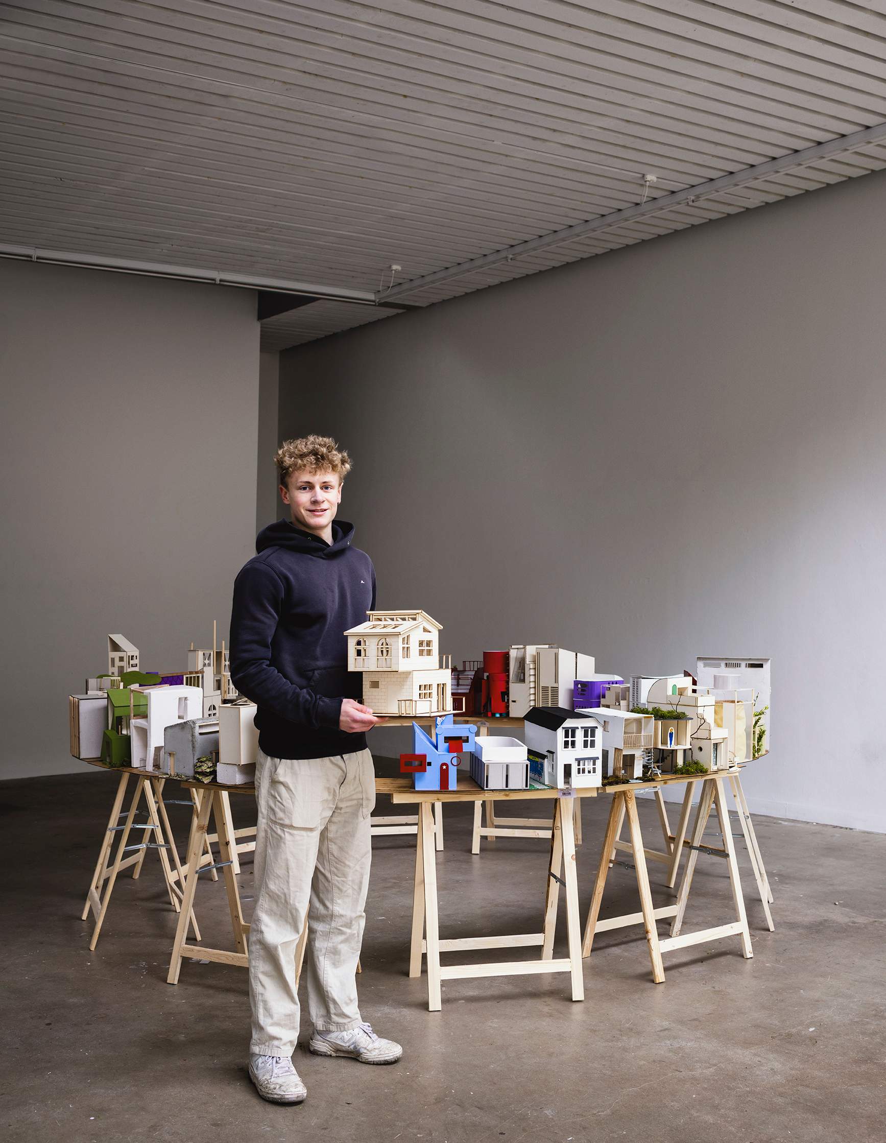
There are no exams, no grades and no degrees at the end of it. There aren’t even admission requirements. Students and teachers live at the school, where they are encouraged to participate in community living through singing in the morning assembly, sports activities and philosophical discussions. “It’s human beings we make, not scholars,” says the school’s principal, Caroline Høgsbro. “We have total freedom but you can’t just teach a skill. You have to reflect on what you are doing and put the human being in some sort of context.”
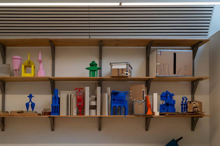
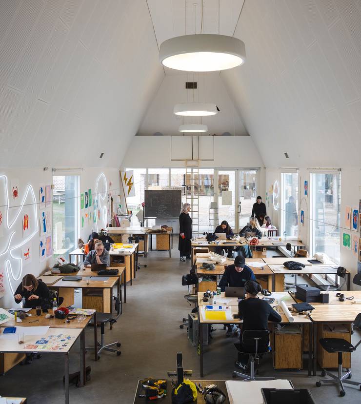
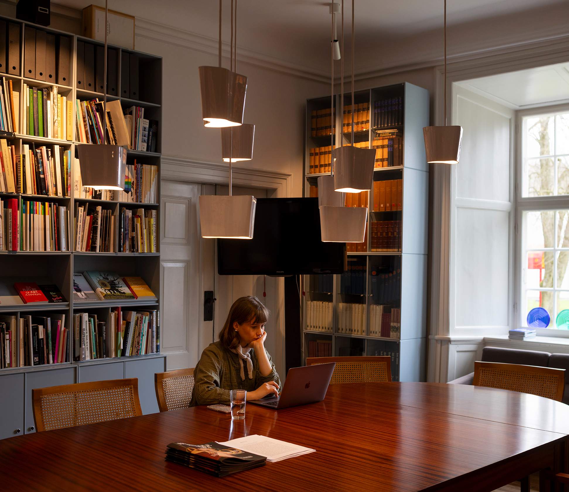
Set in a 16th-century mansion on the edge of a town facing the Skive fjord, the school has gradually expanded over the years to include workshops for carpentry, ceramics, sewing, analogue photography and print-making. And while the school is open to all ages and nationalities, the majority of the 122 students are between the ages of 18 and 24 and from Denmark or Norway. Some of them focus on creating a portfolio to apply to art school but most of them see their time here as part of a gap year, an opportunity to explore crafts they wouldn’t normally have access to.
It’s an outlook tied to another untranslatable Danish word often referenced at Krabbesholm: “dannelse”. Similar to the German “bildung”, it can be defined as a kind of “self-cultivation” – a personal journey involving education and philosophy. This means no subject is taught for its own sake. Instead, they must be connected to their impact on the world, an approach that is helping Krabbesholm deliver a new generation of socially conscious designers.
krabbesholm.dk
26
best exhibition
Mise en Page
France
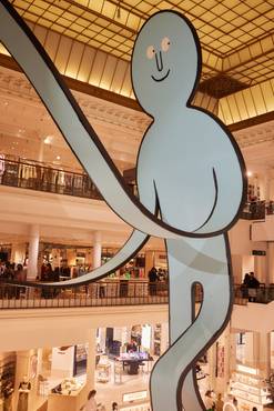
Books are certainly fashionable. Brands such as Chanel, Azzedine Alaïa and Marc Jacobs have gone beyond clothes and handbags to launch their own literary events, city guides and bookshops. So when renowned editor Sarah Andelman, former director of high fashion boutique Colette (which sold books too), was asked to curate an exhibition for Paris’s Le Bon Marché, she decided to bring all of these literary creations together in one place.
The outcome was Mise en Page, a pop-up exhibition that ran from February to April and united products from Andelman’s favourite bookshops: tote bags, T-shirts, stationery, mugs and more. “It’s some of my favourite things from around the world,” says Andelman. “When I’m in New York I always stop at Strand, Pillow-Cat and Books are Magic; I love Cow Books in Tokyo, and in Paris we have Shakespeare and Company, Ofr and Yvon Lambert.” There were exclusive collaborations with fashion brands like Louis Vuitton, Kitsuné and Assouline too, as well as items celebrating the written word.
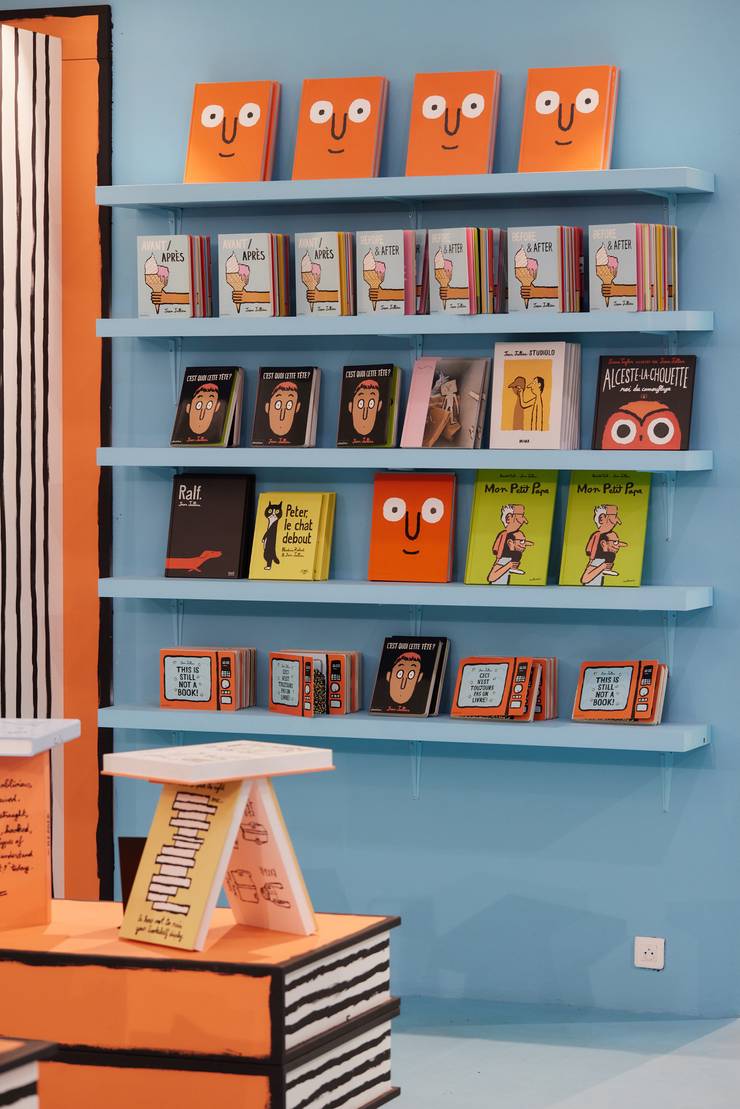
Occupying multiple floors of the Paris department store, the exhibition featured illustrations from Jean Jullien, whose “paper people” characters popped in windows, while enormous sculptures sat in the middle of the store, next to the Andrée Putman-designed escalators. By making merchandise a feature, the exhibition allowed visitors to buy into the showcase. A savvy move, both culturally and commercially.
lebonmarche.com
27
best Archival revival
PK4 by Fritz Hansen
Denmark
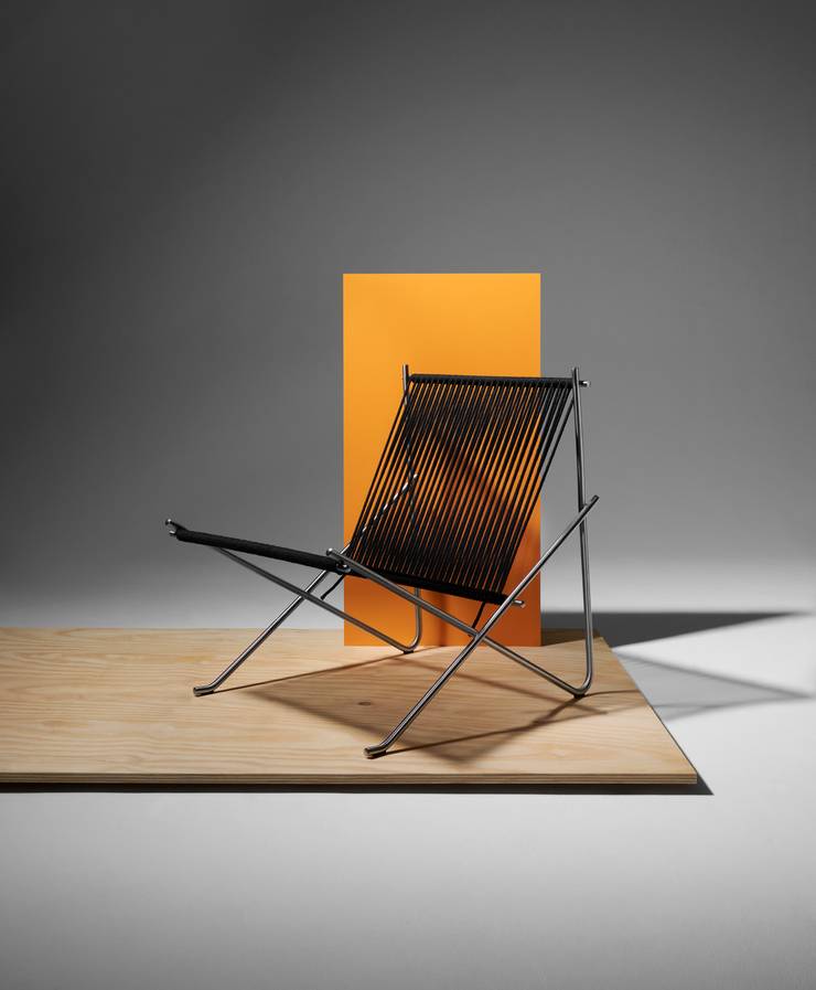
Despite having been designed in 1952, the pk4 Lounge Chair looks as modern today as it did then. This is particularly appropriate given that Fritz Hansen has put the iconic seat back into production. Designed by Poul Kjaerholm, the pk4 is characterised by its sleek, minimalistic style and architectural form. Today, the chair is crafted with a high-quality stainless-steel frame and a seat and back made from a length of flag halyard rope, making it as durable as it is elegant. Its angular form showcases Kjaerholm’s distinctive style, whose clean lines are able to transcend decades, making the pk4 perfect for any homeowner looking for an heirloom piece that will be a perfect fit for any home.
fritzhansen.com
28
leading design gallery
Omet
Mexico
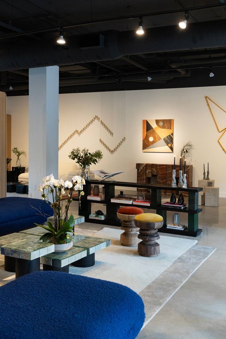
As an architect practising in Mexico City for 25 years, Lorena Vieyra was well placed to gauge the growing interest in Mexican design and seize the momentum. In 2023 she founded Omet to present her homeland’s rich design and craft scene to the world.
“I have seen how design here has evolved over the past decade and have seen talent emerge,” says Vieyra. “I also saw it was an important moment for Mexico in terms of international interest because Mexican designers started looking inward instead of what was going on in Europe and the US.”
Omet’s offerings include home accessories, lighting and furniture that are entirely made in Mexico by local designers including architect Tatiana Bilbao and textile designer Marisol Centeno. A strong sense of craft imbues the pieces on offer with an emphasis on noble materials such as wood and stone sourced from regions including Oaxaca and Puebla.
Vieyra is interested in tapping into a sense of “Mexicanity” that goes beyond local resources and clichéd colourful prints. Instead, she invites contemporary artists and designers to channel their understanding and vision of what it means to be Mexican by reinterpreting their shared heritage.
Since its inception, Omet has launched two collections (with a third under way) and opened a retail outpost in Austin, Texas. “We have set the basis for what we want to do,” says Vieyra. “We have started conversations and brought ideas to the table that we will continue to work on. It’s only the beginning.”
While all of the pieces in Omet’s collection are crafted in Mexico, Vieyra is extending Omet’s platform to Latin American designers too, recognising the need for Mexico to be a craft and design leader in the region. Omet’s work is offering not only a platform for Mexico’s designers and craftspeople but an opportunity for them to be regional and global industry leaders.
omet.co
29
best healthcare
Ersta Sjukhus
Sweden
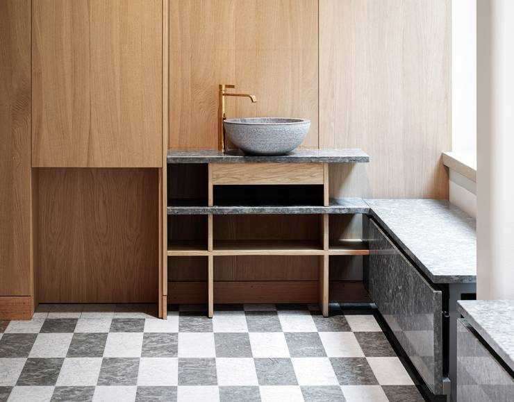
The new hospital-building at Ersta Sjukhus on the island of Södermalm in Stockholm is an airy yet homely space with soaring ceilings and wooden furnishings. “Ersta Sjukhus balances the feeling of a private home and a modern hospital,” says Hanna Philipsson, lead architect on the project with Tengbom, the practice that finalised the hospital plans, which were originally developed by the firm Nyréns Arkitektkontor.
The property connects snugly with the part of the hospital that has been operational since 1864, when it cared for and boarded destitute women and children. It’s this link to buildings and the wider city that defines Tengbom’s work.
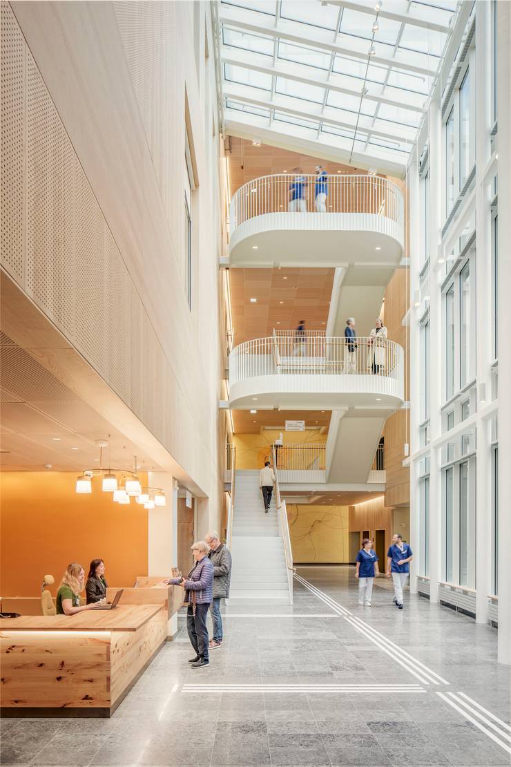
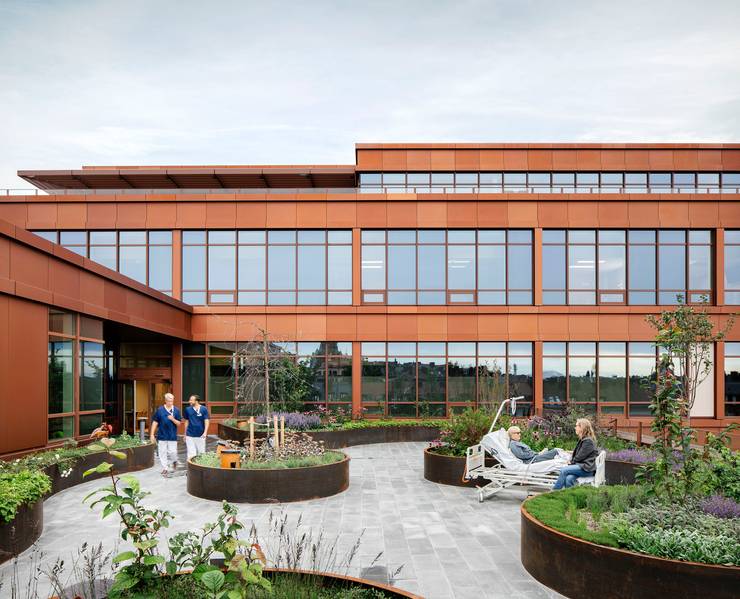
In partnership with interior designer Emma Olbers, the practice used ochre-yellow hues inspired by the neighbouring buildings. This interaction between inside and outside is enhanced by the gorgeous views of Stockholm’s rooftops and the waters surrounding the archipelago from the hospital rooms. The large terrace on the sixth floor, where the hospice is located, also encourages outdoor respite. Patients can be wheeled out in their beds and families can gather in nooks where raised flowerbeds offer privacy. Patients can pick wild strawberries or smell fragrant herbs that grow within arm’s reach.
A final touch – a nod to the hospital’s past – is the Marie lamps that are distributed throughout the building, developed by Swedish firm Ateljé Lyktan and inspired by the nurses’ hats worn in the past. The result of this careful combination of details is a hospital that doesn’t just save lives but improves the quality of it for everyone inside.
tengbom.se
30
best design bookshop
Hyper Hypo
Greece
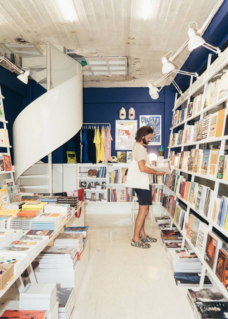
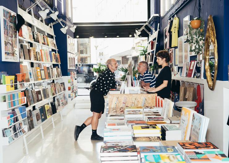
The stylish but whimsical bright white and cobalt blue interior of Athens’ hippest – and only – dedicated art and design bookshop is a somewhat perfect reflection of what the small but mighty Hyper Hypo does best. Founders Andreas Kokkino and Stathis Mitropoulos pair their razor-sharp curatorial skills with a natural love for bringing people together in an operation feels as much a bookshop as it does talking shop for the city’s flourishing art and design scene.
In addition to stocking a unique mix of classic and contemporary theoretical texts and art tomes, the Monastiraki shop also hosts events that foster and grow its community – and we’re not just talking about the odd in-store signing. “We’ve done about 50 events over the past two years,” says Kokkino. Alongside collaborations with contemporary galleries such as The Breeder and Carwan, these have included the Greek launch of the legendary Butt magazine and a party for Objects of Common Interest, the New York-based Greek design duo, who launched a book about US sculptor Isamu Noguchi’s relationship with Greece.
Hyper Hypo simply wants to address those who share the same passions and philosophies they do. “We don’t dumb it down, we don’t compromise and we pick hard topics,” says Kokkino. “I think people appreciate that.” Whether it’s hosting the city’s more alternative artists or stocking a slightly racy publication, Hyper Hypo’s confidence that Athens is ready for something a little more provocative has duly paid off – and shows the power of a bookshop to bring people together.
hyperhypo.gr
31
top architect: residential
Point Supreme
Greece
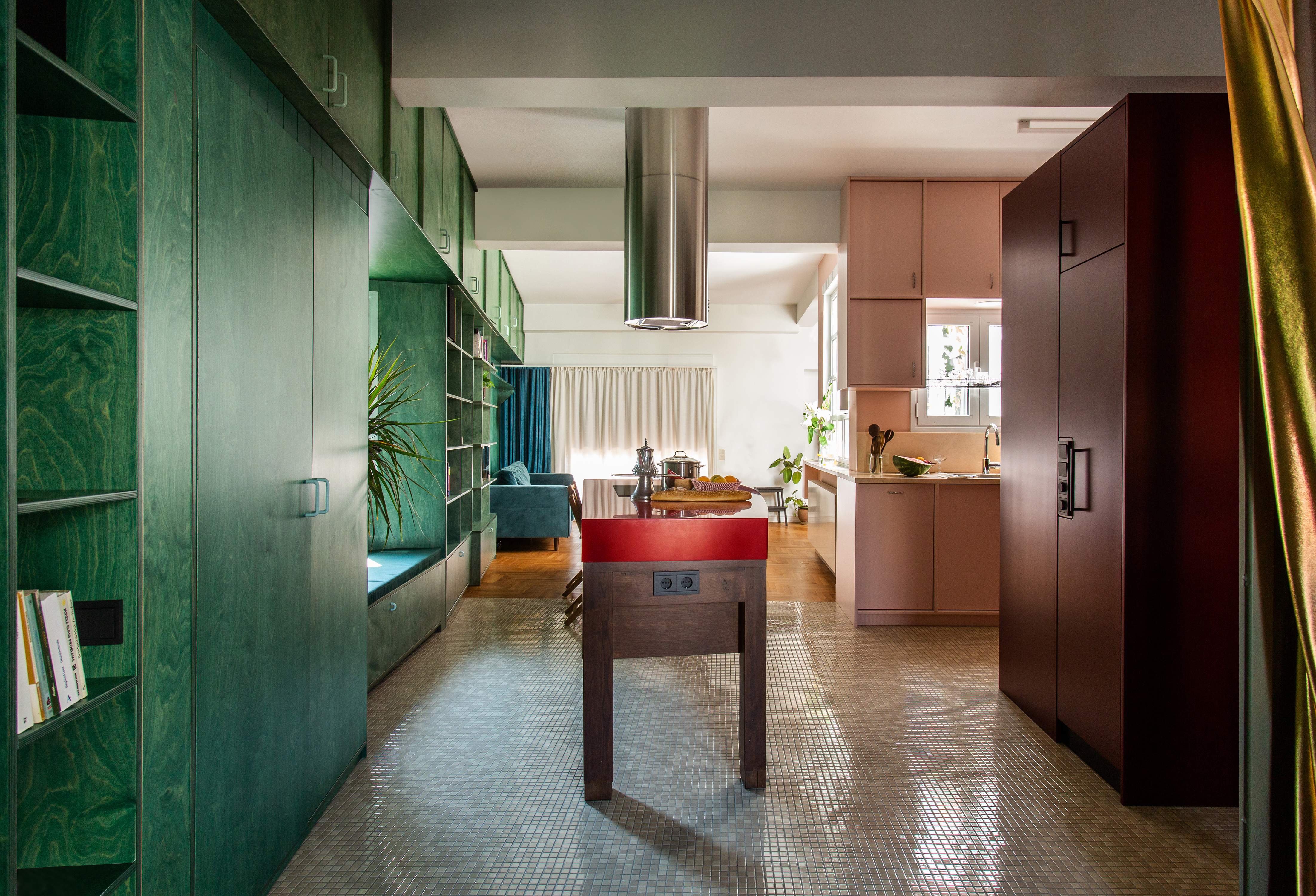
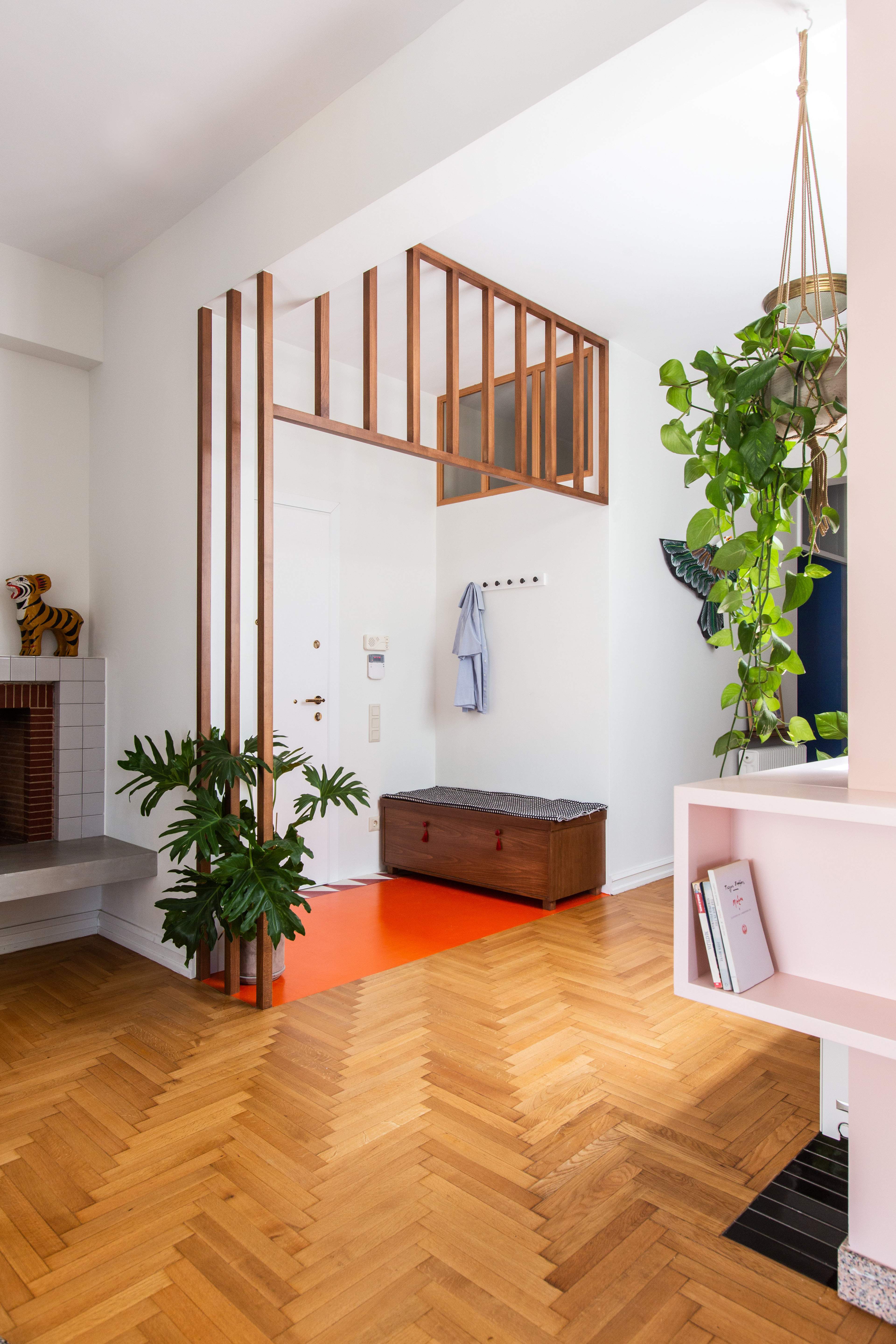
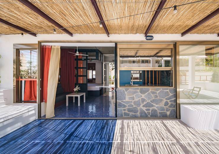
There’s no mistaking a home designed by Point Supreme. Founders Konstantinos Pantazis and Marianna Rentzou have mastered the art of using bold colours to create striking living spaces, whether that’s via azure floor tiles, crimson cabinets or a bright yellow staircase. “Our work is never neutral,” says Pantazis. “We try to create a sense of vibrancy and character.”
But the architects’ playfulness isn’t just limited to colour. Their designs combine materials such as raw concrete, cork cladding and terrazzo flooring to create a collage of textures. These adventurous combinations make Point Supreme stand out in its native Greece. “In Athens, most new architectural projects are grey and black,” says Rentzou. “And on the islands, it’s all beige, stone, wood and white. We think that’s lazy.”
What sets the firm apart is its knack for opening up spaces to reinforce a sense of flow – its properties are often subdivided using sliding partitions, curtains and hanging shelves. “We want our homes to promote social interactions among those occupying them,” says Pantazis. This, he notes, is important in a place like Athens. “It’s a very dense city. So we try to create deep, open views. And the light is usually fantastic, so it makes sense to play on it as much as possible.”
Open, multi-use spaces also nod to Greece’s architectural heritage. “The sense of super-functionality is very Greek,” says Pantazis. “Particularly on the islands, where a single room can be a whole home. There are no divisions between bedroom, kitchen and living room. The result is lively and humane.”
pointsupreme.com
32
best packaging solution
Acquabox by Monday
South Africa
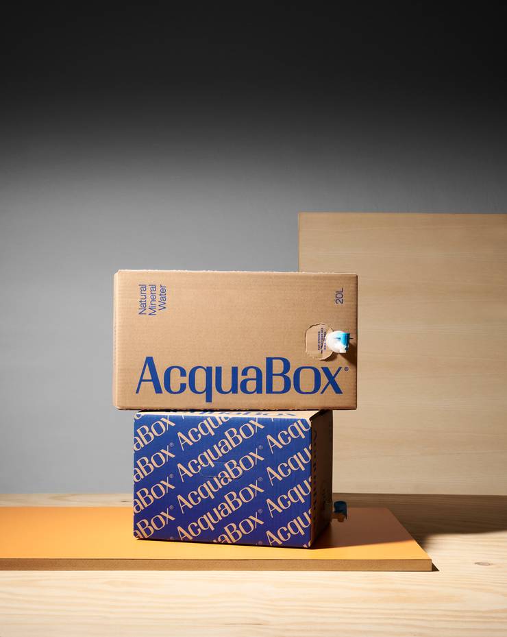
It’s often the simplest designs that solve the biggest problems. In this case, a portable bag-in-box water dispensing solution that provides easy access to good-quality mineral water. “There are a lot of areas in South Africa where clean water supplies are becoming a big issue,” says Francois Rey, creative director and designer of Monday Design, the Cape Town-based studio that worked with Acquabox on the branding and material sourcing. Large plastic water bottles are readily available around the country but the largest are 10 litres and they’re clunky and awkward to pour.
“In terms of functionality, it’s easy to use,” says Rey, citing the plastic tap as a straightforward but revolutionary pouring solution. When working with Acquabox to design the packaging, the two most important elements Rey considered was making it sustainable (it’s 100 per cent recyclable and the box is unbleached) and keeping costs down. The boxy shape means the cooler can easily be placed on a countertop or slotted inside a fridge. For people who might want to use it outside or take it camping, the exterior acts as a shield against sunlight, which can negatively impact water left in plastic. It’s also far more easily transported than plastic or glass bottles. It’s a prime example of smart packaging design that makes lives easier – we should be thirsty for more such examples.
mondaydesign.co.za; acquabox.co.za
33
best airline update
Air France A350
France
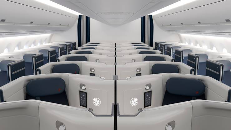
Air France has been busy lately, ordering new aircraft and modernising its cabins in a concerted effort to leap ahead of the competition. A case in point is its refurbishment of the Business Class cabins on its a350 fleet. These are being updated and improved to provide closing-door suites with improved storage, nicer finishes and better overall comfort. It also solves a consistency issue. Early a350 deliveries featured an entirely different type of seat to the rest of their long-haul fleet. Meanwhile, 777s are also getting an almost indistinguishable product installed. It’s news that has us particularly excited for the new La Premiere First Class, which is due to be unveiled later this year.
airfrance.fr
34
leading urban landscape
Marrinawi Cove
Australia
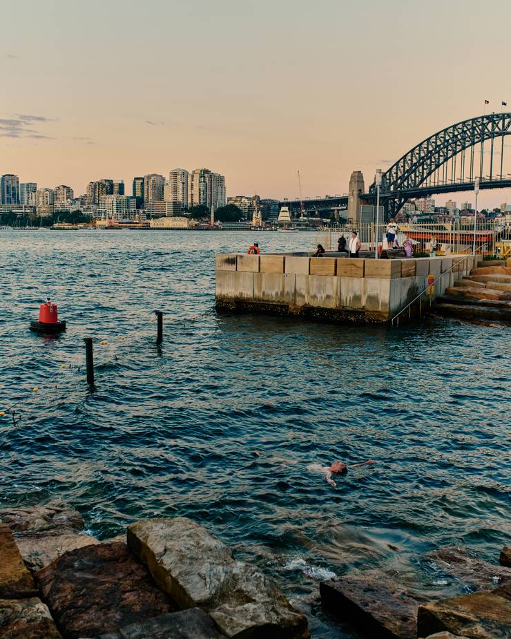
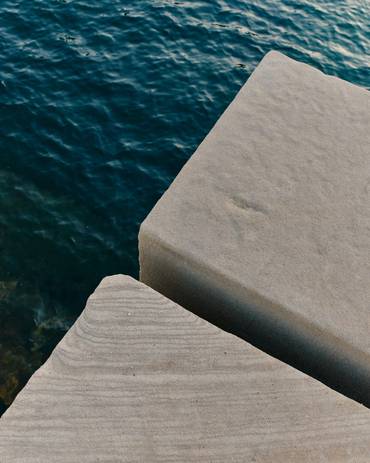
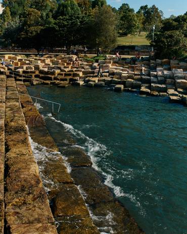
A pre- or post-work swim at the beach is a cherished daily habit for many Sydneysiders during the year’s warmer months. But since last summer, a convenient new option has allowed the residents and corporate denizens of Sydney’s cbd to incorporate a mid-day ocean swim into their routines too. This is thanks to Marrinawi Cove, a new swimming basin at the northeast edge of Barangaroo – part of the gargantuan and ongoing urban regeneration of the western section of the Sydney Harbour foreshore. It sits in the shadow of the Harbour Bridge, moments from the high-rises of the commercial district.
smc Marine, which specialises in marine design, construction and engineering, was commissioned by the New South Wales government to convert the cove into a suitable swimming area. It was a considerable challenge: although swimming is common in the outer sections of the harbour, the waters in the centre of the estuary are notoriously shark-filled, congested and were, until recently, unfit for swimming.
After analysing the site conditions and the wave patterns of the inlet, a seawall and shark barrier was installed at the cove, which has the dual effect of attenuating the sometimes rough swell of the harbour while acting as a natural habitat to promote the propagation of native seaweed and marine life. Next came swimming platforms, changing rooms, showers and signage. The result is Sydney’s first “city beach”, which is also the first swimming area west of the Harbour Bridge in more than 50 years. It’s a remarkable work that is having a large lifestyle impact but with a light environmental touch. Unsurprisingly, Sydneysiders have taken to it with immediate gusto.
smcmarine.com.au
35
best student project
Fire Extinguisher
Sweden
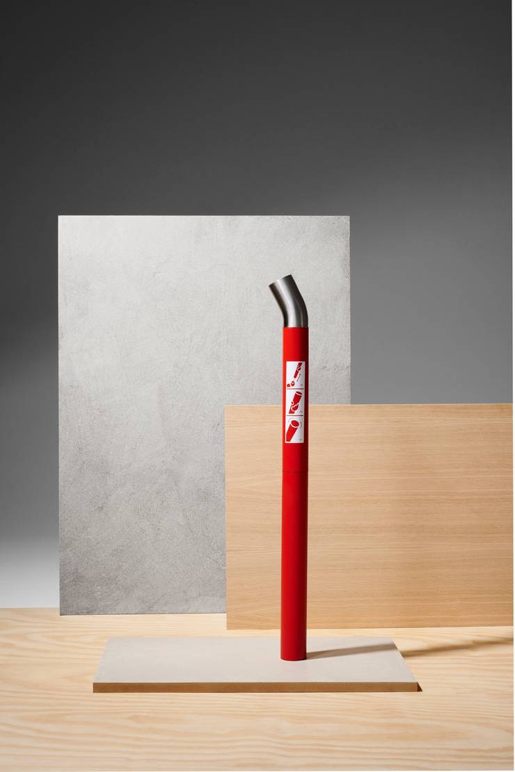
Given their ubiquity, it’s a shame fire extinguishers aren’t designed with more care, aesthetically and environmentally. This is why this reimagining, courtesy of industrial design student Albin Jonsson caught our eye at this year’s Stockholm Furniture Fair. As part of his studies at Sweden’s Lund University, Jonsson sought to design an update of the fire extinguisher with circularity in mind. “I was curious about the way traditional extinguishers come already pressurised, meaning that in a couple of years they need to be discarded due to loss of pressure,” he says. “I was thinking about alternative solutions and ended up with a manual pump combined with environmentally friendly extinguishing powder, in this case baking soda.” With a sleek steel handle and essential user information on prominent display, this fire extinguisher would slot well into hallways and homes without being too obstructive, yet still offering essential safety.
lunduniversity.lu.se
36
best for furry friends
Kanto
Finland
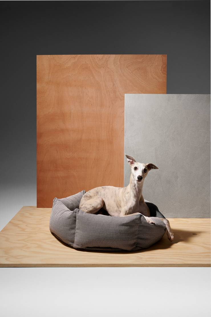
As all dog owners know, what might suit our furry friends isn’t always what’s best for our home decor. That’s something that new Finnish company Kanto is fixing with a range of smart dog beds that were also designed to minimise environmental impact. Our pick of the bunch is the Luoto in Eos Bordeaux Black, which is made using a natural, handwoven fabric by Finnish textile designer Johanna Gullichsen and the same premium European bedding used for humans. Developed using a lot of, ahem, animal testing, you can be sure that Fido won’t give this bed a snub. Our model Twinka (pictured) can attest to the fact that the upcycled fabric, available in Gullichsen’s patterns inspired by Greek mythology, is extremely comfortable
“We tested various materials, shapes and sizes with all kinds of dogs to find something that they liked,” says founder Annu Ansén. The bed’s nest-like design is timeless and unassuming, and fits various interior-design aesthetics. The material itself is allergen-free and void of microplastics, while also being durable and scratch-resistant. Crucially, it’s machine washable too, pairing practicality with style and ensuring that the bed can endure the inevitable canine fits and outbursts. “Dogs are our family members and they deserve the best spot in our living room,” says Ansén. Thanks to Kanto, such a spot can be home to a beautiful work of design too.
studiokanto.com
37
leading furniture maker
Frederik Fialin
Germany
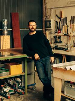
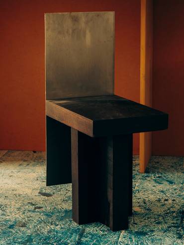
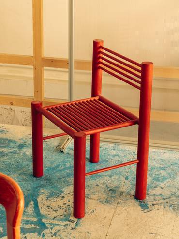
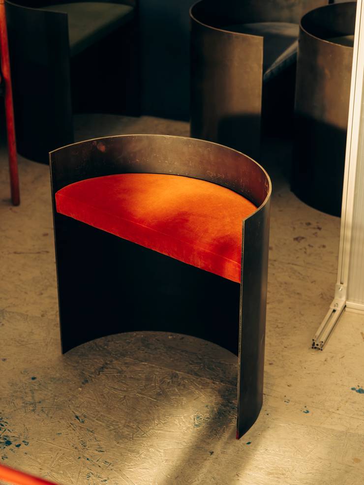
Frederik Fialin is a Danish furniture-maker but not exactly of the classical sort. Soon after finishing school in Copenhagen, he moved to Berlin to assist in an artist’s studio. “Manufacturing-wise, it doesn’t get much better than the art world,” he says. “You work with a huge array of materials.” Four years ago, he slowly started marketing his angular, colourful furniture and released his first collection, Assembly 0.1, last autumn. With eight items including a modular bookshelf and a Paul Kjaerholm-inspired lounge table, they can be ordered as they are or be customised.
For those who want to commission a piece, Fialin’s appeal lies in the fact that his designs don’t easily fall into a category. He is wary of Berlin’s industrial and raw-minimalist aesthetic and names mid-century and contemporary masters ranging from Carlo Scarpa to Maarten Van Severen and Yrjö Kukkapuro as influences. “You need a traditional, old-school education,” he says. “Then you can deviate from that.” His spirit of experimentation makes him an appealing creative partner.
frederikfialin.com
38
best type development
ADLaM alphabet
Guinea & USA
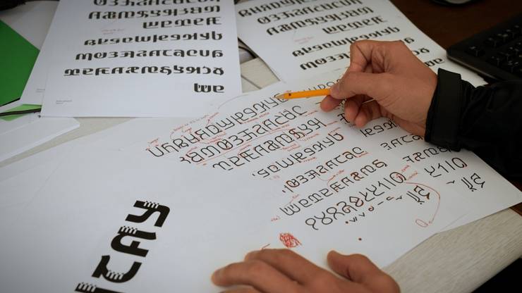
Spoken by the Fulani, a West African community of more than 40 million people spread across the world, the Pulaar language had no unified writing system and was at risk of extinction. Enter Guinea-born, Portland-based brothers Ibrahima and Abdoulaye Barry. The pair teamed up with Microsoft and New York-based creative agency McCann to develop a digital version of the language, producing its first-ever written alphabet last year.
“For the Fulani, the alphabet wasn’t just a tool for expression, but an operating system for survival,” says Shayne Millington, chief creative officer at McCann. “The risk was that their culture would be swallowed by one that could operate in a digital world.” The brothers worked with the Fulani community to ensure the typography incorporated design elements that represented its culture and weaving patterns from traditional textiles.
To promote its use across the region, the typeface was made available for download on desktop and mobile. McCann and the Barry brothers also worked on books, educational materials and classroom resources. The digitised alphabet has since been welcomed by the Fulani community, with local governments recognising it as an official alphabet. “Our goal was to increase access to the new system and the chances for the language to thrive,” says Millington. The project is a powerful reminder of type’s ability to reflect, and in this case preserve, culture.
mccann.com
39
top architect: retail and hospitality
Norm Architects at Audo
Denmark
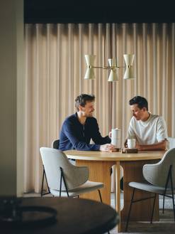
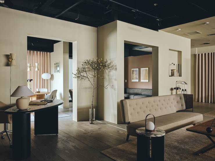
Copenhagen-based Norm Architects has, since it was founded in 2008, become known for its sleek hospitality, commercial and retail outfitting. In addition to completing a host of projects in its hometown, the firm is also prolific in Japan. It’s perhaps unsurprising given that there’s a certain sensibility shared between Japanese and Nordic design; one that’s rooted in an authentic commitment to quality, functionality, simplicity and craftsmanship.
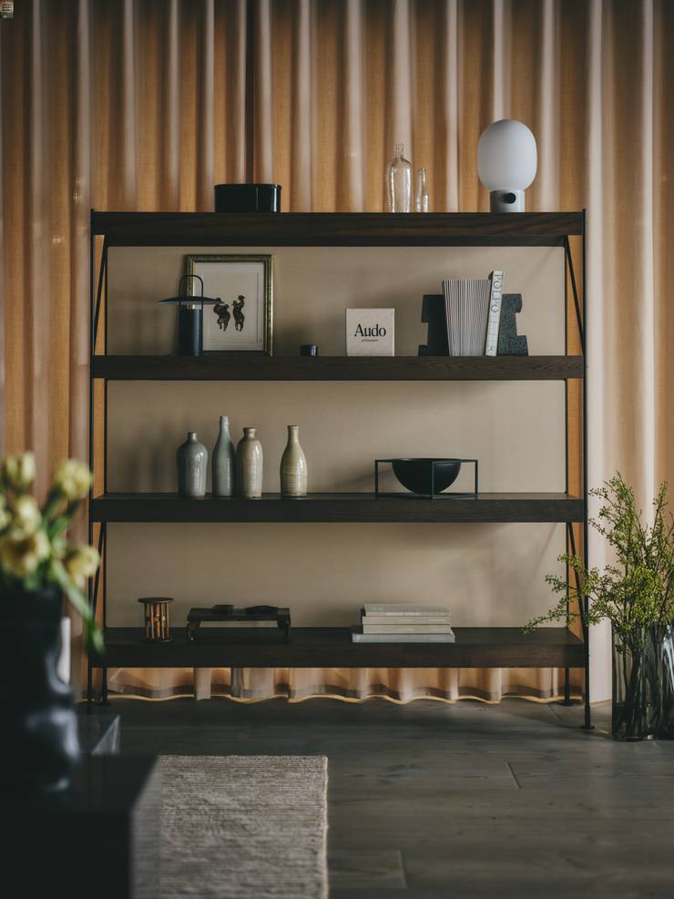
Its latest project in Nippon is a showroom for Danish furniture-and-homewares brand Audo Copenhagen – and it sets a benchmark for good retail design. “A core part of the concept behind Audo Copenhagen lies in creating a sense of community,” says Frederik Werner, designer and partner at Norm Architects. Werner oversaw the project, which is defined by warm, earth tones and materials such as concrete and timber. The showroom can also double as an event space and will eventually play host to exhibitions and collaborations celebrating both Japan and Denmark. “We want to find ways for this brand to work closely with kindred spirits,” says Werner. The architect’s ambition goes beyond simply furnishing a space and shows the potential for retail and hospitality locales to be more than just places of commerce – they can be community builders too.
normcph.com, audocph.com
40
top architect: COMMUNITY
Tosin Oshinowo
Nigeria

Tosin Oshinowo founded Lagos-based design practice Oshinowo Studio in 2013. In recent years she has emerged as a leading voice on architecture and design, thanks to her practice and work as co-curator of events such as the Lagos Biennial. More recently, the Nigerian designer has expanded her work beyond West Africa, curating the most recent iteration of the Sharjah Architecture Triennial and headlining the 2024 Melbourne Design Week.
What are your current priorities as a designer?
I’m conscious of producing work that is respectful of the environment. Thankfully, it’s getting easier to sell this to clients as it comes from a place of strength and beauty. I’m also trying to push alternative building technologies; the sorts of things that the practice showed at the Sharjah Architecture Triennal. Take rammed earth. It’s a materal that comes from a project’s context and leads to healthier buildings. It’s a comfortable material that stays cool during the day.
How do you want to be remembered?
I just want to create architecture that will add value. It’s not about what the a building looks like but rather about how it makes people feel and how useful it is. I’m not fixated on something being iconic, which is a natural thing for architects to focus on. If we practise for the love of adding value, as opposed to the gratifying ourselves by creating iconic buildings, then we will produce much better architecture for cities.
oshinowostudio.com
41
best design imprint
Ediciones Puro
Chile
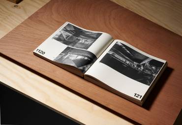
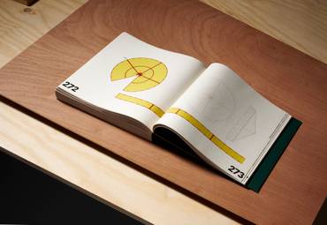
It’s no longer necessary to be in New York or London to make great art and design books. Case in point: Ediciones Puro, a small Chilean publisher with a focus on art, architecture, photography and design. Founded in 2004, Ediciones Puro roots its mission in the spirit of close collaboration. The team works closely with authors and designers to translate their work into high-quality print. Highlights include Obra Gruesa/Rough Work, a publication dedicated to architect Smiljan Radic, and a book of photographs by French-US photographer Justine Graham. Anyone looking to publish their own design-minded monograph would do well to reach out.
puro-chile.cl
42
top material innovation
Bananatex
Philippines & Switzerland
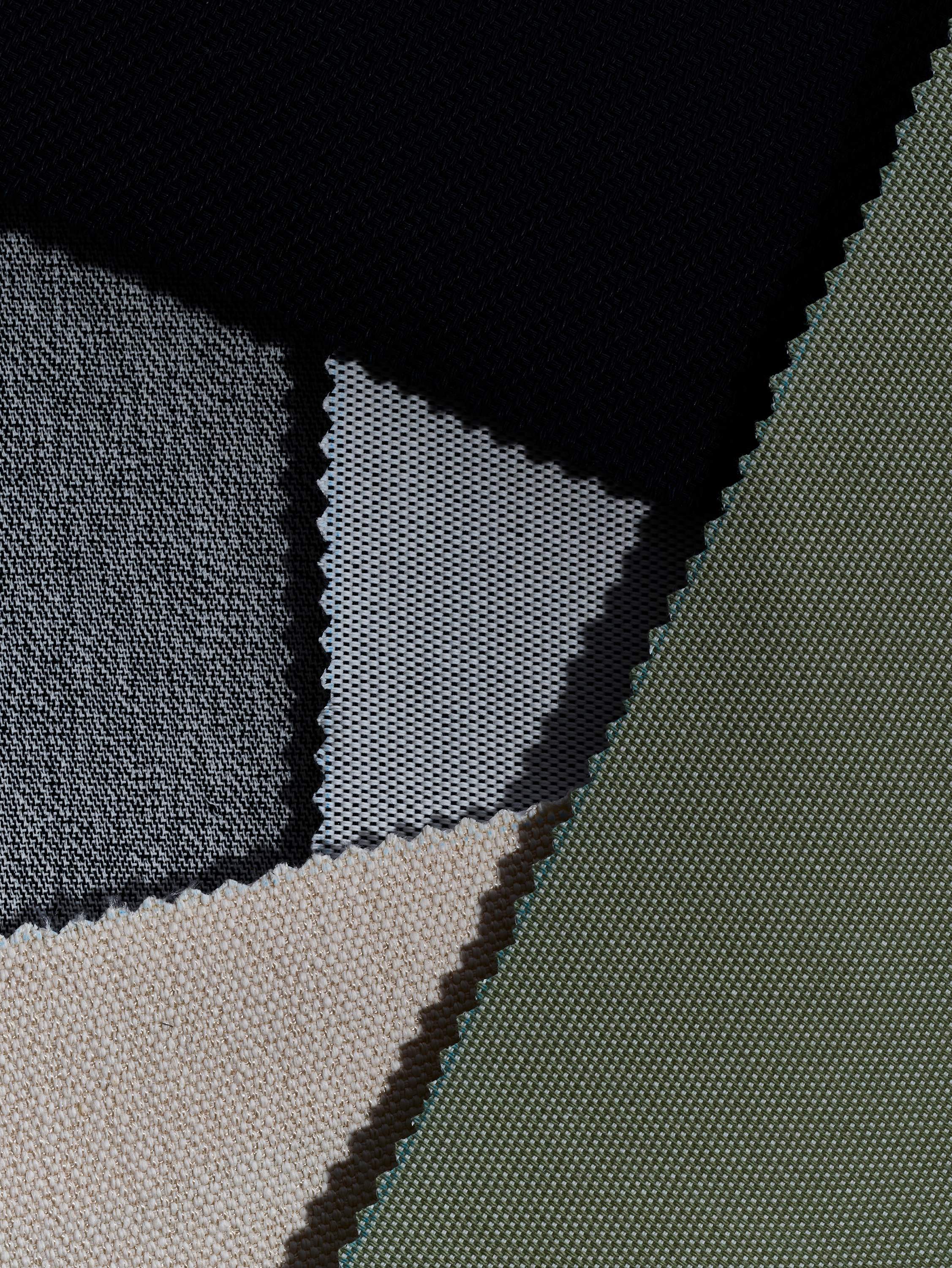
“We saw the potential to create something better in terms of sustainability and functionality,” says Christian Paul Kägi. The co-founder and creative director of Swiss clothing brand Qwstion, Kägi and his team are behind the textile Bananatex. Made from the abaca banana plant, it was developed for use on the brand’s bags, has a remarkable tear resistance that ensures durability, and its cultivation demands zero watering, pesticides or fertiliser. Abacá plant fibres are extracted, converted into yarn, then knitted into Bananatex. It’s currently produced in the Philippines, where the plant occurs naturally, using Taiwanese textile manufacturing expertise.
The product is now sold as a stand-alone textile.“We created Bananatex for brands and designers who are looking to replace plastics with plants,” says Kägi, adding that it’s not simply a substitute for synthetic materials, but rather a component contributing to positive industry-wide change. It’s an outlook that should be applauded: making eco-friendly material alternatives accessible to make a difference at a global environmental level.
bananatex.info

43
most creative work space
ASL Studio
France
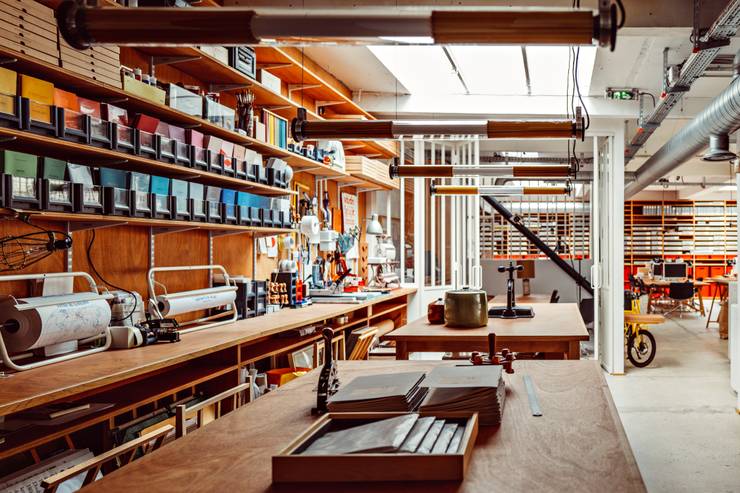
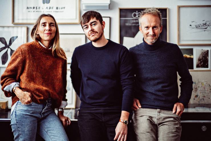
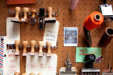
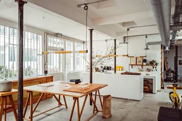
Parisian furniture and interiors brand and workshop, A.S.L, is the brainchild of designers Antoine Ricardou, Clémentine Larroumet and Reynald Philippe. Inspired by the studios of creators like Donald Judd and Alvar Alto, it’s no wonder their atelier in the Rue Saint-Lazare of the 9th arrondissement, reflects their love of open spaces and clean lines. “We bought an old jewellery workshop at the back of a courtyard in the centre of Paris and cleaned the entire space to keep its bare shell,” explains Clémentine Larroumet. “We then equipped it with only the functional elements: trestle tables, worktops, kitchen and multifunctional shelves.”
Keeping function at the core of the design has not only made the atelier a calming space to work, but one that encourages dialogue and creativity. “We are convinced that creation comes through experimentation. Everyone must be able to experiment in order to create,” says Antoine Ricardou. “We put in an intaglio press, a ceramic kiln, and tables for painting and drawing. And in the middle of all this, to say welcome, a real functional kitchen for cooking and making coffee all together.” The atelier is a reminder of the importance of ensuring a workplace is kitted out for successful experimentation – while offering moments for team building too.
asl-paris.com
44
best manufacturing hub
Hall 4 at MÜHLE
Germany
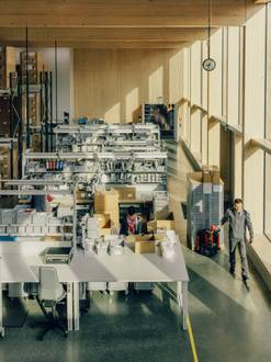
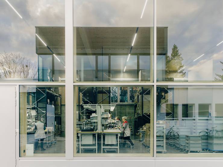
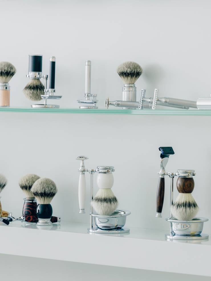
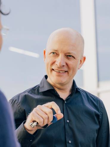
From its headquarters down to its carefully made products, Germany’s Mühle takes design seriously. Founded as a manufacturer of shaving brushes by Otto Johannes Müller in 1945, it has grown into a leading supplier of high-quality accessories for wet shaving. “Good design is part of our dna at Mühle. Our creative language aims to be clean and fresh, with a classic touch,” says third-generation owner Andreas Müller, who runs the company with his brother, Christian. This includes a focus on sleek designs made from traditional materials such as chrome-plated metal, anodised aluminium, wood and porcelain. Products, which include razors, shaving brushes and accessories, are stamped with the brand’s logo, featuring the letter “M” juxtaposed with a windmill (Mühle means “mill” in German).
It’s an attention to detail that’s present in Mühle’s newest building, Hall 4, on its campus in Stützengrün. Here, products are packed by hand before being shipped off to customers and suppliers. For the project, Mühle turned to husband-and-wife team Sebastian Thaut and Silvia Schellenberg-Thaut, founders of architecture firm Atelier St in the nearby city of Leipzig. The architects were inspired by the precision of the company’s chrome-plated razors in creating the building’s façade. “We wanted the structure to look sharp, with shiny metal that echoes the style of Mühle’s products,” says Thaut, gesturing at the anodised-aluminium exterior. This contrasts with the softer appearance of its interiors, which are fitted out with locally sourced fir timber. The hall contains an office and an upstairs meeting room, where the Müller brothers can welcome guests and show off new products.
The resulting space is an example of how a company’s headquarters should represent a brand’s identity as much as its products. “Everything from our website to our architecture is a touchpoint. The design needs to be consistent,” says Andreas.
muehle-shaving.com

45
designer of the year
Studiomake
Thailand
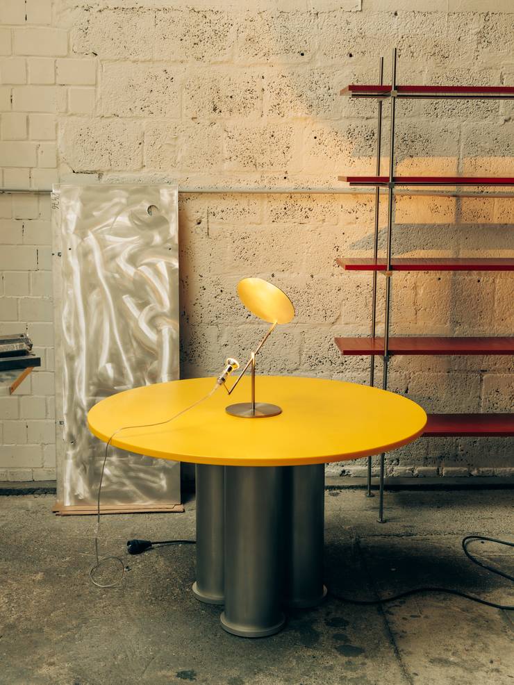
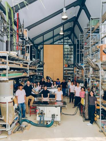
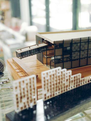
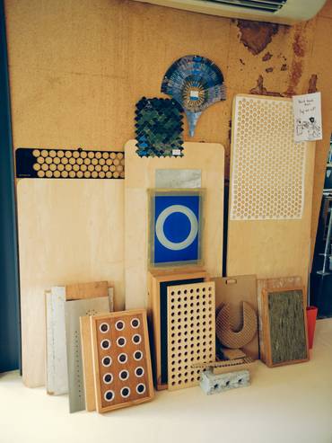
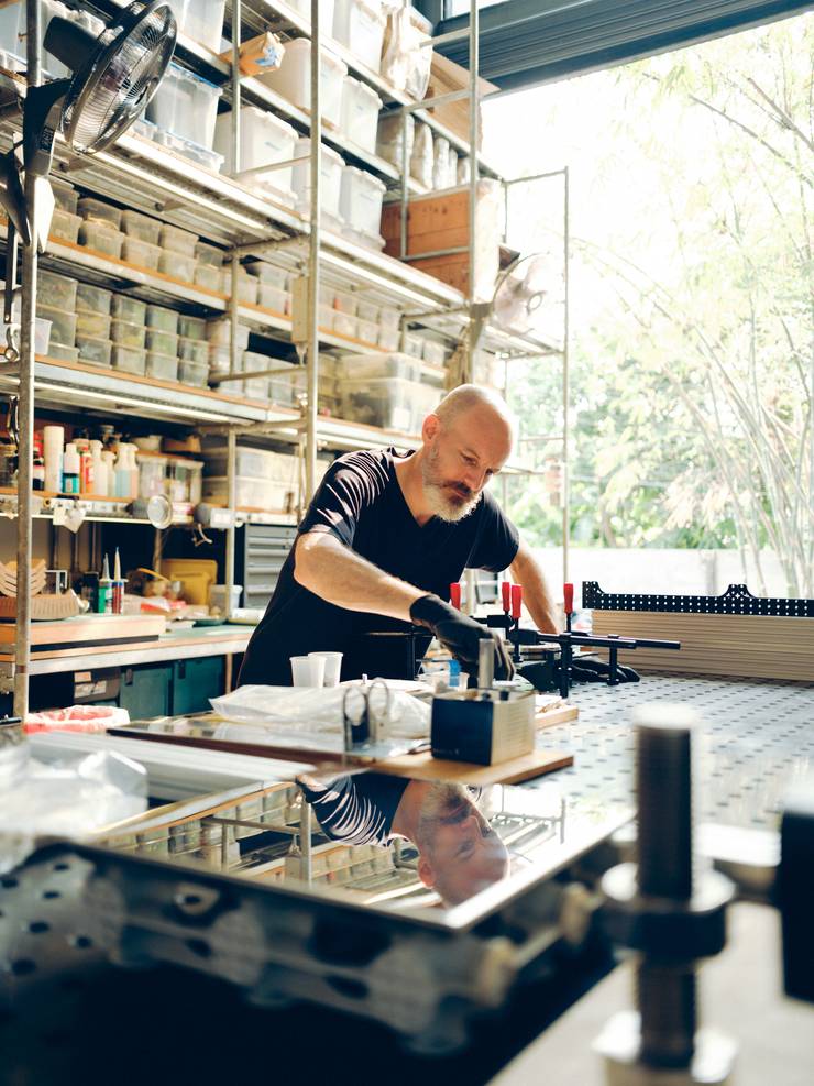
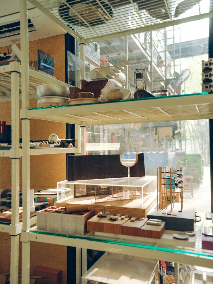
Studiomake’s founder David Schafer finds it easier to tell potential clients what his firm doesn’t do (conventional interior design) than try to explain what it can. There’s no recognisable aesthetic or signature products – only considered solutions. “Everything we design is responding to a specific problem,” says Schafer, whose projects include a reusable restaurant workshop and equipment for Thai coffee brand Roots, a rotating interactive play wall for a community mall, and kinetic shelving for a touring art exhibition. “Unless it’s weird, we’re not even in the room.”
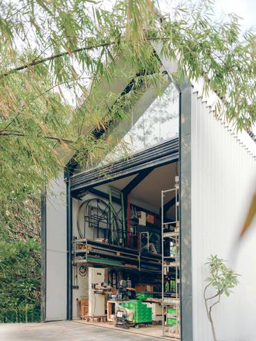
The headcount at Studiomake is split evenly between designers and metal workers under Schafer’s leadership at Baan Sai Ma, a two- storey office, workshop and residence on the outskirts of Bangkok
Studiomake’s biggest current project is a prefabricated, split-level house in the Thai capital. Expected to take three years in total, the design and build could have a significant legacy far beyond its diminutive footprint. Schafer has a dream of creating prefabricated homes in Thailand for export to the US. “I’m interested in mass customisation – the idea that a product can be easy to adapt and suited to different scales, site conditions and life situations,” he says. A range of prefab homes could either become the solution to Schafer’s own specific problem, defining what Studiomake does; or, much more likely, add another string to its already impressive, custom-made bow.
studiomake.com
46
best folding chair
Olaio ‘ik’
Portugal
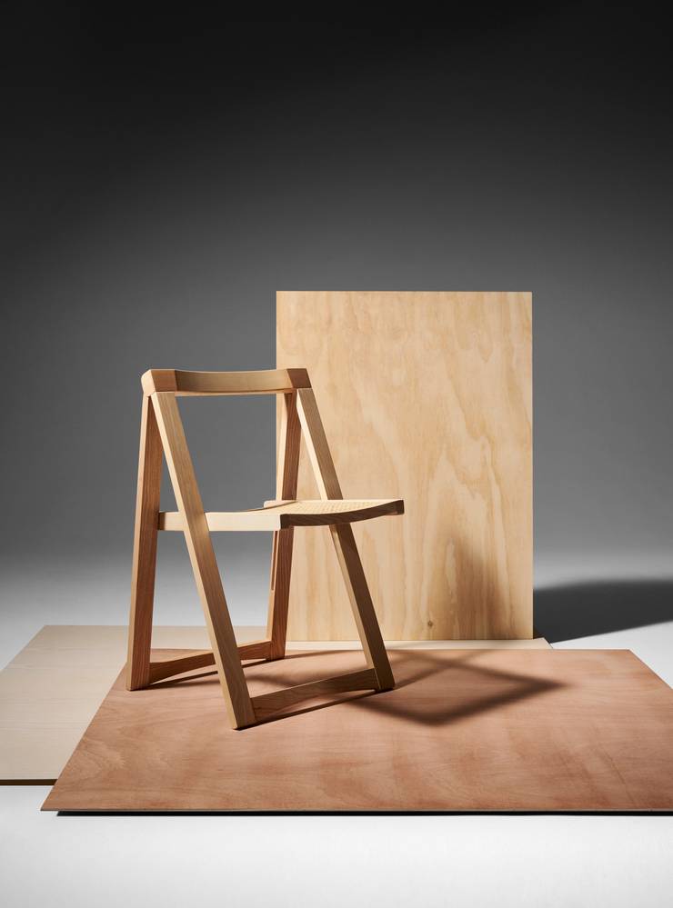
Accommodating extra guests for dinner can present a conundrum for city dwellers without the luxury of ample storage space. Thankfully, Portuguese design brand Olaio has created the “ik” – a foldable functional chair, which is set to be a hit in the domestic environment – and, perhaps, a savvy solution for event and cultural spaces looking to enhance their stock of ease-to-store chairs. Originally founded in 1886 and relaunched in 2016, the brand still looks to honour the art nouveau seats first manufactured in the mid-century. It can be evidenced in this design, which is available in dark freijó wood and light natural ash, with a cane-woven seat making for the perfect party piece that can be folded away, leaving no trace of the festivities.
olaio.pt
47
best temporary installation
‘Of Palm’ Pavilion
UAE

Abdalla Almulla, an Emirati architect and founder of Emirati design studio Mula, turned heads at the recent Dubai Design Week. He won the commission for the event’s flagship installation at the centre of the city’s creative district for the duration of the week. “Of Palm” was inspired by – and made from – palm trees, showing the potential of using local materials in a country reliant on imported design.
Tell us about the ideas behind the design of “Of Palm”?
I wanted to create something embedded and sustainable in Emirati culture. The tree has had many roles in society, including for food, fuel and architecture. I liked the idea of using one material source to create multiple functions.
Talk us through the project’s form
It’s a radial pavilion with columns constructed from the trunk and a ceiling made from palm-leaf mats. The idea is to show you can create different parts of architecture through a single tree.
Will more indigenous materials be used in UAE architecture?
I have been highly focused on this in my practice and career. We need to incorporate local materials into construction and think of new ways to develop them with today’s technology. We did this to design the roof for “Of Palm”, using computational technology to map out how many mats would be required to assemble the structure.
dubaidesignweek.ae
48
best new brand
Tamart
UK
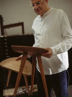
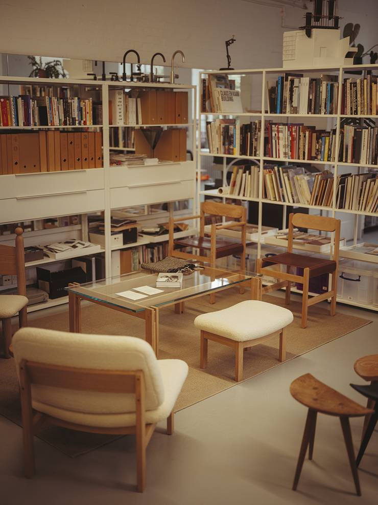
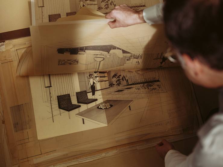
It was only natural that London-based Amos Goldreich, son of late Israeli architects Tamar de Shalit and Arthur Goldreich, should follow his parents’ footsteps into the design world. Now, following his discovery of an archive of thousands of their photos, paintings, illustrations, plans and designs, he’s continuing their legacy top. In spring 2024, Amos launched Tamart, a furniture brand reimagining the duo’s designs by using British timber.
“The only changes I wanted to bring to the pieces were inspired by my parents’ ethos,” Amos tells monocle during a visit to his studio. “Their work was always specific to where they were working or lived. So I needed to update the pieces to fit London – the upholstery and carpentry are done locally, and the prototypes are created in the capital.” Tamart’s debut collection is crisscrossed with the pair’s energy. “Because the majority were made for specific projects, each has a story to tell,” says Amos. The Clore lounge chair, ottoman and coffee table designs were originally for a penthouse that De Shalit designed for arts patron Sir Charles Clore in the 1960s, while the Central Stool comes from her student days in London in the 1950s, where she first met Arthur Goldreich.
At the heart of the collection are designs that Amos believes worthy of the international stage. But they also brim with personal and historical connections, making the pieces an appealing addition to any home.
tamartdesign.com
49
best adaptive-reuse project
Newlab by Civilian
USA
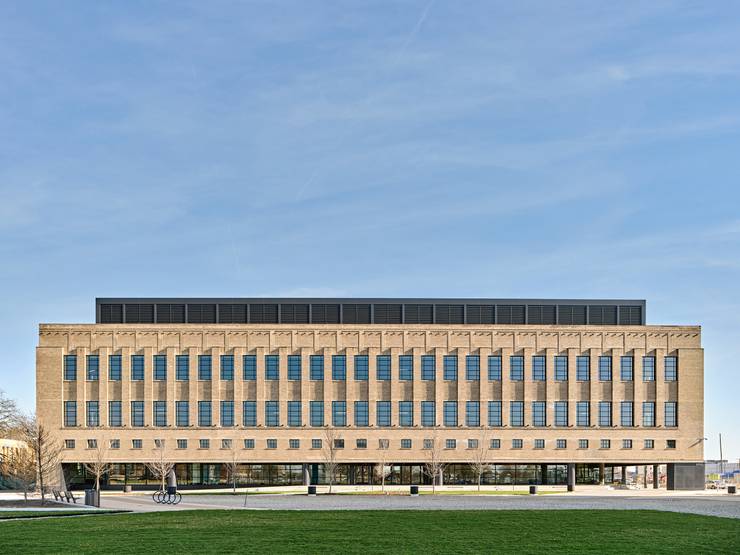
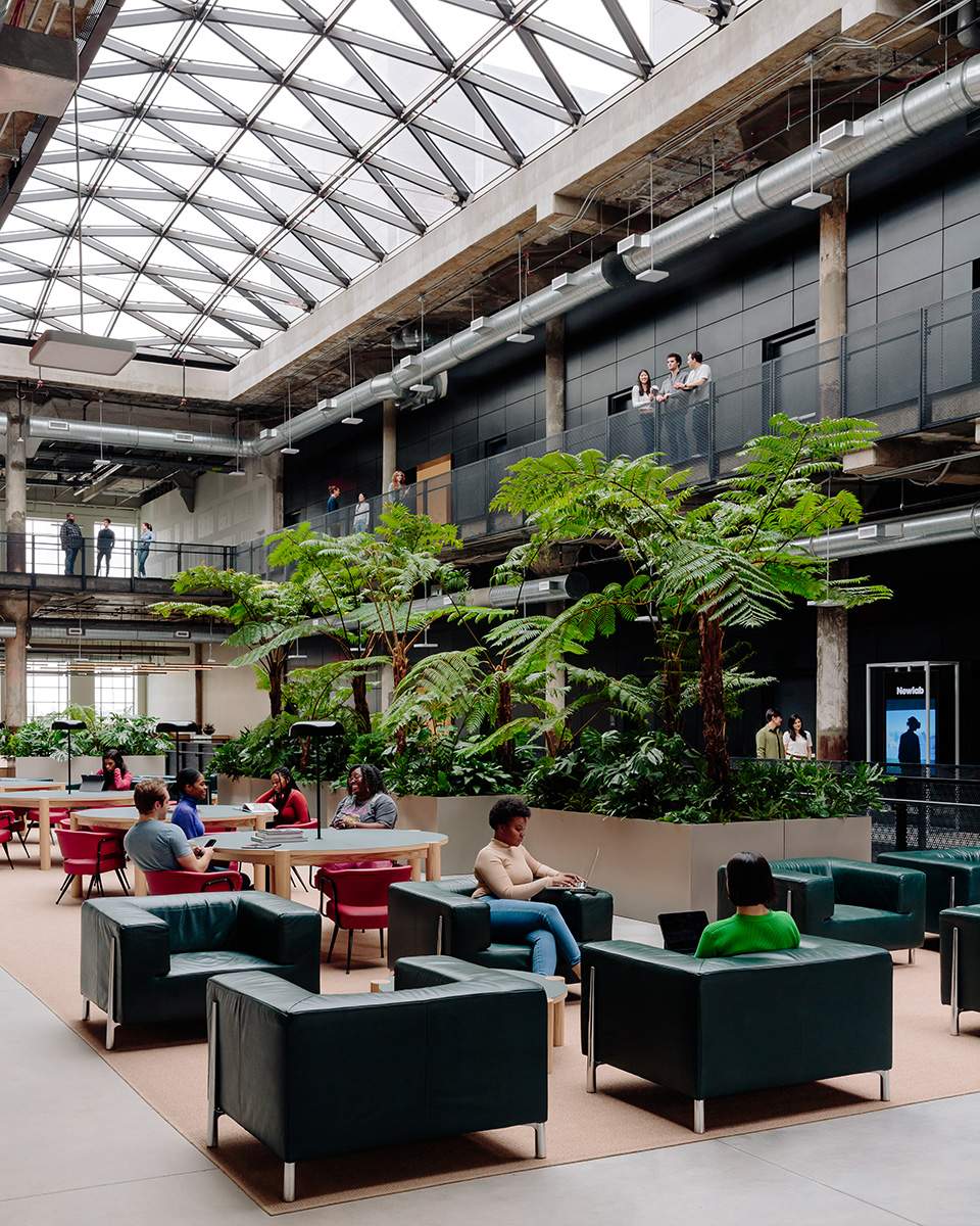
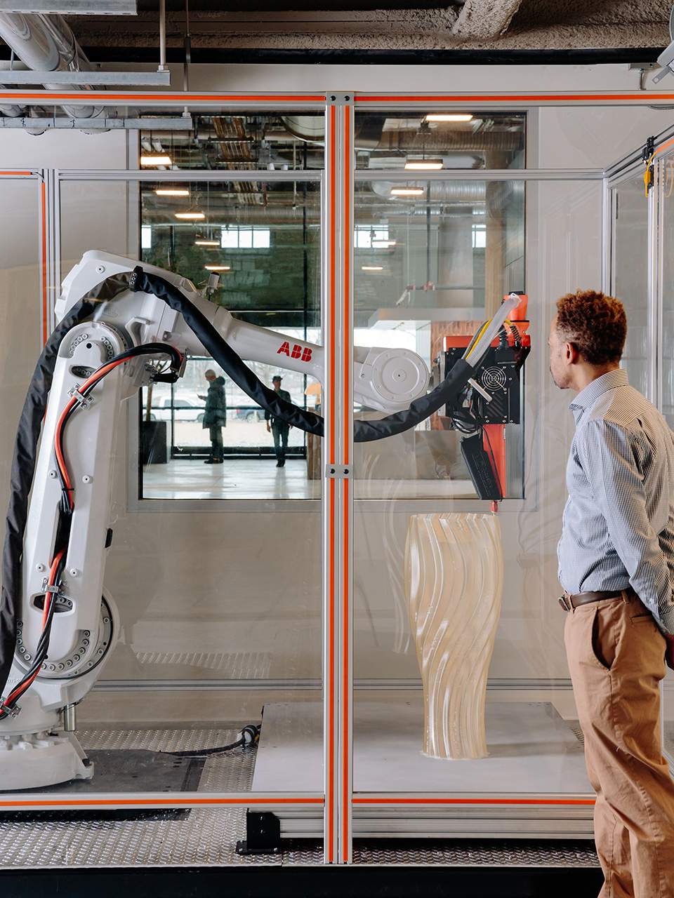
It is always challenging to deliver a knockout renovation but that is exactly what Nicko Elliott and his partner in work and life, Ksenia Kagner, have achieved with the refit of a robotics company’s headquarters in Michigan. The architect couple run Civilian, a Brooklyn-based design studio. They recently completed their biggest commercial commission yet: the interior outfit of Newlab in Detroit, which was designed by US architect Albert Kahn in 1936.
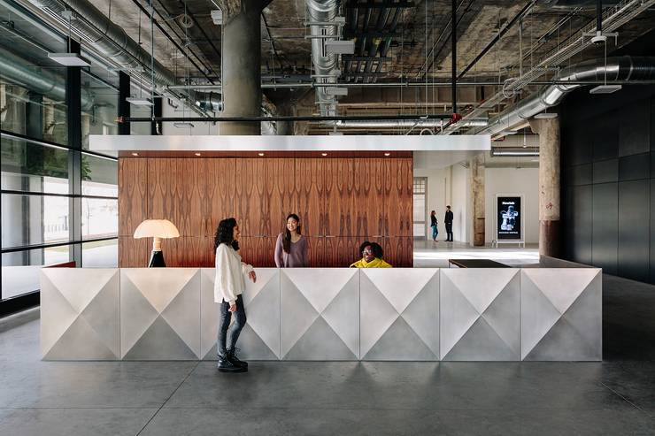
Civilian’s ambition for the project was to create a space that responded to the site’s social, historical and material context, while also serving its newest users. “This building sat vacant for almost 30 years and had such an interesting past as a book depository for the city’s public schools, as well as a mail-sorting facility,” says Elliott. “It was necessary to pay homage to that.” To do so, existing details have been retained and restored throughout.
But Civilian’s biggest achievement at Newlab is the way that has established visual connections and transitions between different parts of the building. A rosewood-and-stone lobby opens into a buzzing robotics lab, the event space is lined with full-height windows that look into a fabrication area and a collaborative workspace ends with views into the metals-lab workshop. All forms of labour are “elevated and receive the dignity that they deserve,” says Elliott.
civilianprojects.com
50
best in transit
Zürich Hauptbahnhof
Switzerland
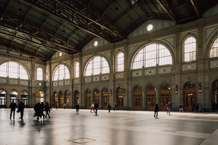
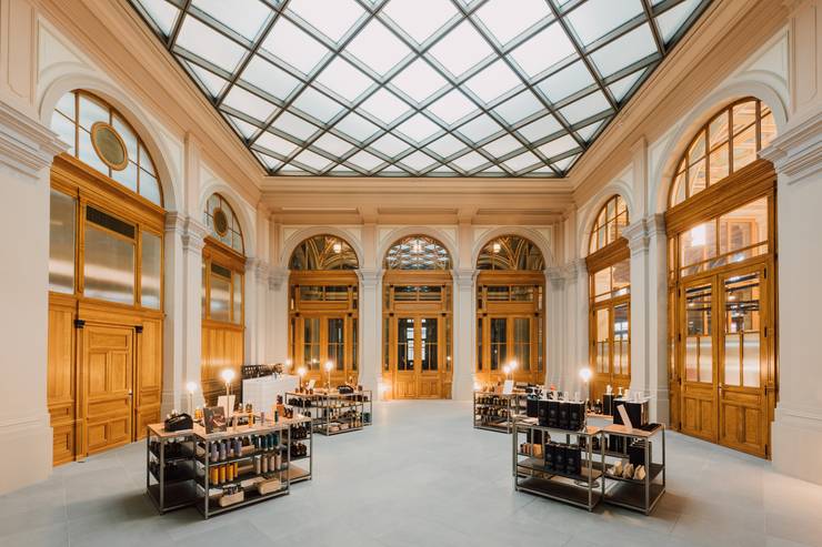
Zürich Hauptbahnhof’s is Switzerland’s busiest train station – and a recent renovation of its oldest building ensures it now serves as a grand entrance to the city. Berne-based Aebi & Vincent Architekten were commissioned by the Swiss Federal Railways (sbb), which gave the architects a complex task and a project that took more than 14 years to finally complete, with the final stage opened to the public at the end of 2023.
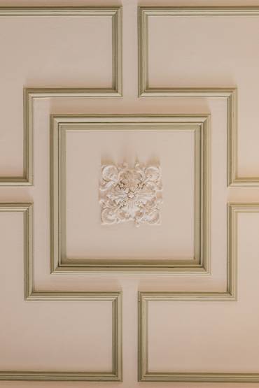
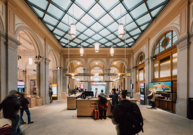
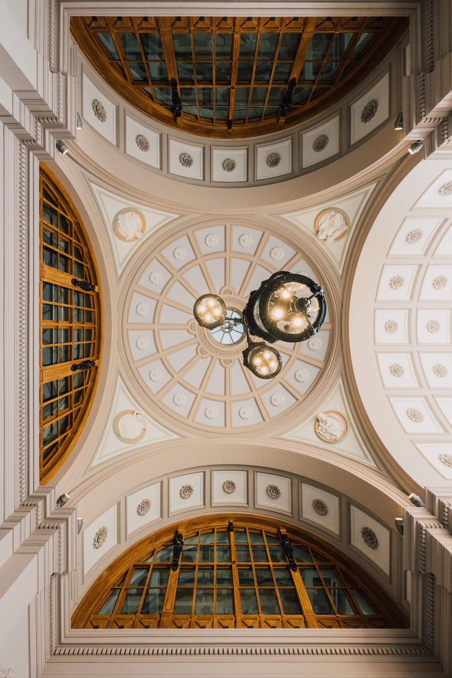
The wait has proven to be worth it. The overhaul of the heritage-protected 1871 sandstone building has resulted in the restoration of many historic elements, with the replacement or repair of 500 rosettes, 300 ceiling cassettes, 180 archways, 80 angels, lions, Hermes and Atlas figures. Naturally, for a building of its age, there were some surprises along the way, including the discovery of original marble columns. “These were hidden under 13 different layers of paint,” explains Beatrice Bichsel, head of sbb Real Estate.
Efforts have also been made to create a space that serves commuters and travellers as well as local businesses, ensuring the building remains lively at all times. New ticket offices, retailers (including a branch of Zürich-made soap brand Soeder), health clinics, offices and restaurants. There’s also a newly finished passageway linking the station hall to Bahnhofstrasse, Zürich’s main downtown street.
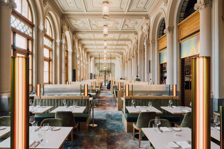
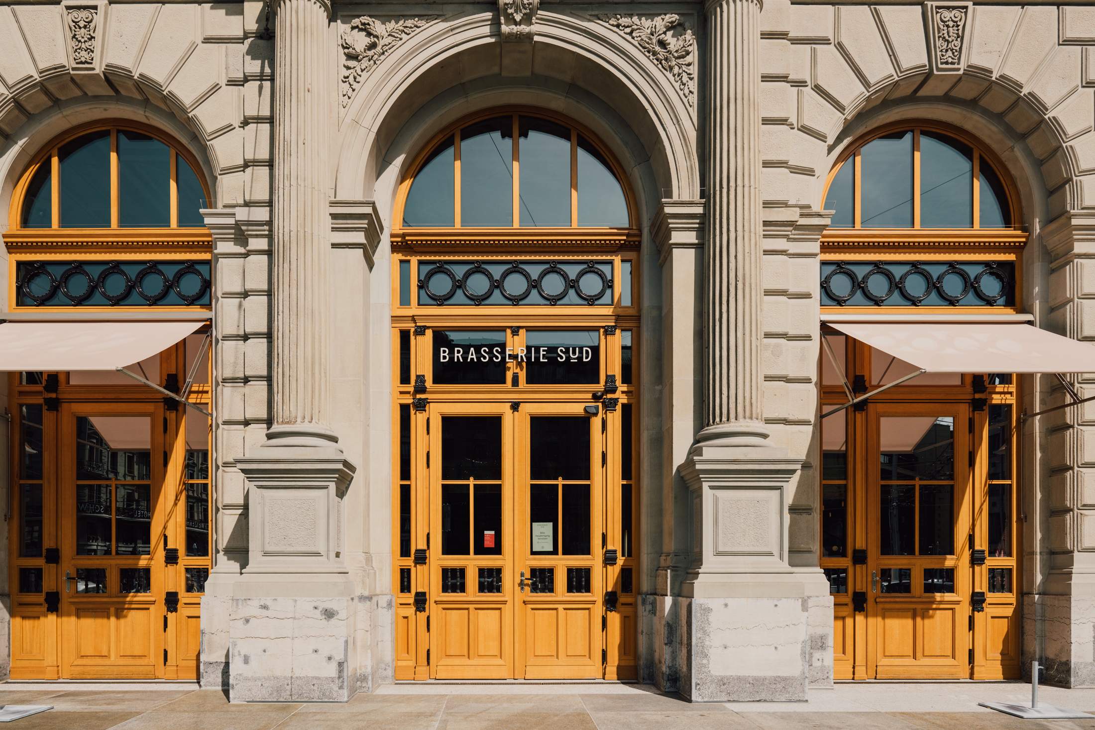
A highlight is Brasserie Süd, an all-day dining offering courtesy of local duo Nenad Mlinarevic and Valentin Diem. The bright space has instantly become a centre point thanks to its delicious fare, intimate bar and the bright and welcoming interior. “We took inspiration from the menu that Nenad and Valentin created as our starting point, but it was essential for us to work with historic matter and create a balance through the new and old,” explains Deborah Suter of architects Suter Plus who designed the brasserie, which is now filled with businessmen, families and tourists.
The project is a reminder of the power of a transit hub to not only connect its community, but reflect and serve it, too. Zürich Hauptbahnhof has got its groove back, meaning we’d be happy to wait for the next train just a little longer.
aebi-vincent.ch, suterplus.ch

Monocle Design Award
Harry Thaler
Italy
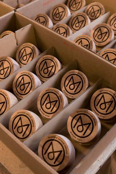
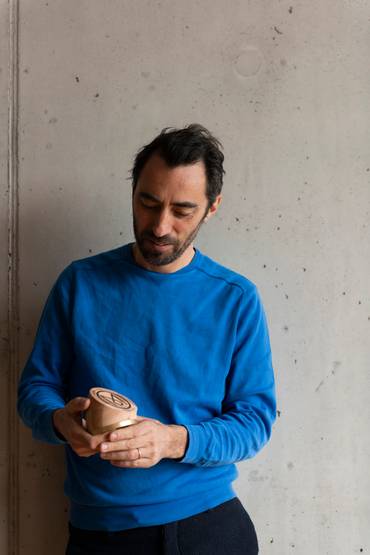
Bolzano-based Harry Thaler has conceived the Monocle Design Awards trophy since the prizes’ inception in 2021. Every year, he has subtly updated the curving timber form that is not only ornamental but practical too: it doubles as a paperweight that would make a perfect addition to any winning designer’s desk.
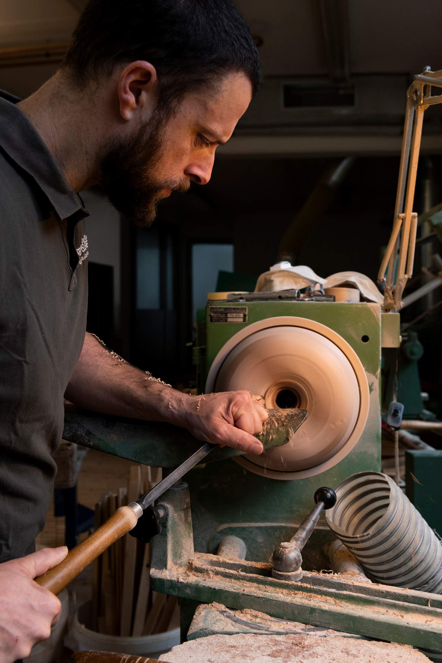
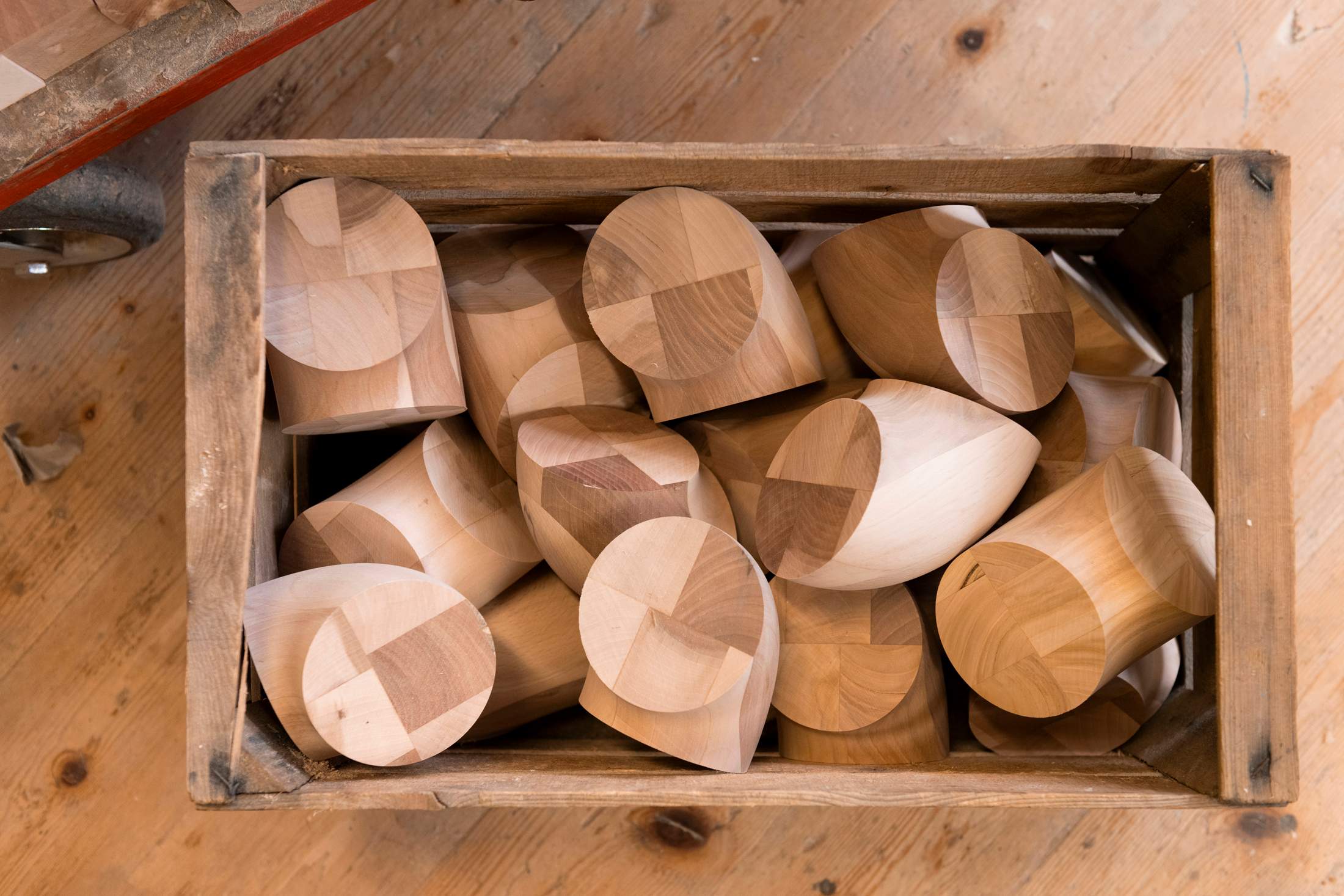
“Every January I think about the next step [in the trophy’s evolution],” says Thaler. “So, I asked the craftsman who makes it, Martin Klotz, whether we could put all different types of wood together to make this year’s version.” Klotz’s answer? “Of course.”
The duo collected offcuts from Klotz’s Tscherms-based workshop’s floor – mostly scraps from other jobs – and glued them together to form blocks. They then sculpted these into the trophy’s distinctive curved form using a lathe. “We carved it out like a doughnut and then cut it like a cake,” says Thaler.
The approach resulted in a distinctive patterned effect, with the grain and rings of every type of wood, including walnut and ash, visible. The effect is deliberately disorienting. “I wanted the winners to pick it up and wonder how it was made,” says Thaler. It’s a noteworthy ambition: after all, good design should push us to ask questions about how, what and why we make things. It’s appropriate, then, that this outlook is now embodied in the Monocle Design Award itself.
harrythaler.it
