May / Global
The Agenda: Design
Lisbon Design Week and a mid-century cooking school's new recipe for success.
Jesse Lee
Founder, Basic Space

Design Miami debuts a new edition of its fair in Los Angeles on 16 May. Founded in Florida in 2005, the fair has ballooned in recent years with outings in Paris, Basel and Shanghai. It was acquired by entrepreneur Jesse Lee, creator of BasicSpace, in 2023. Headquartered in LA, Basic Space is invite-only and sells high-end limited-edition fashion, furniture and more online.
You’re bringing Design Miami to Los Angeles. Why?
Los Angeles is the right market for us because there are a lot of people with money to spend on their beautiful homes.
Why acquire Design Miami?
Craig Robins, who co-founded Design Miami, was an investor in BasicSpace, so we knew each other well. I saw an opportunity for design to become the next big thing. Fashion and art are now mainstream but collectable design is still nascent and niche.
Can people buying sneakers from BasicSpace be enticed to spend $15,000 [€13,850] on a Brazilian modernist chair?
The price isn’t the problem; it’s just that a lot of people have not been exposed to the world of design and don’t understand that it can accrue value.
Where next?
Expect us to have a presence or another fair in Asia next year.
Design Miami LA runs from 16–20 May;
designmiami.com
hospitality––– singapore
Breath of fresh air
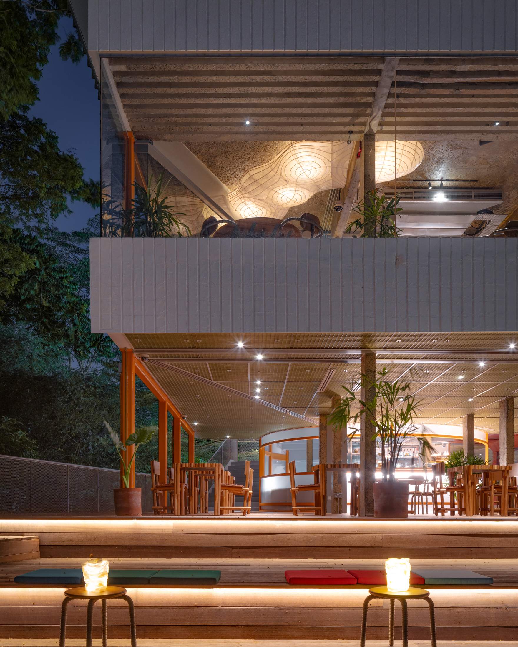
The Air Circular Campus and Cooking Club, a new dining project from Bali-based Potato Head, has opened in Singapore’s Dempsey Hill district. David Gianotten and Shinji Takagi of Dutch design firm oma have transformed the original modernist building, a clubhouse for civil servants built in the 1970s, into a multi-use space with a restaurant, cooking school and farming programmes aimed at promoting sustainable culinary practices. The result shows how top hospitality and architecture firms can come together to have a positive effect on local communities and ways of building. “We are convinced that architecture and design can make a difference through active engagement with different disciplines,” says Gianotten.

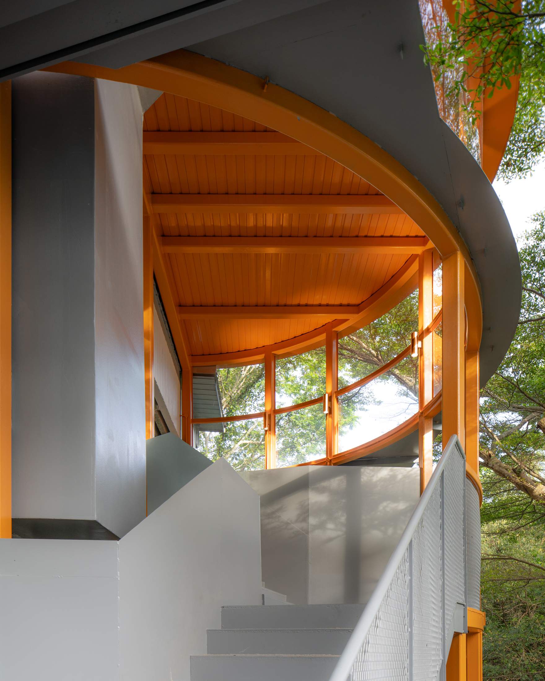
The architects expanded the two-storey building by adding wooden terraced patios that spill onto the front lawn for outdoor dining. Footpaths are threaded through lush green spaces so that visitors can wander through the farm and enjoy picnics on the grass. True to Potato Head’s love of sustainable and upcycled materials, all the furniture, which was created by Catalan designer Andreu Carulla, is made from recycled timber, plastic and styrofoam. A round, orange steel frame at the back of the building houses a spiral staircase. The campus offers an abundance of greenery in densely urban Singapore and is a welcome addition to the city’s culinary and cultural landscape.
oma.com; aircccc.com
fashion –––tokyo
Dream coat
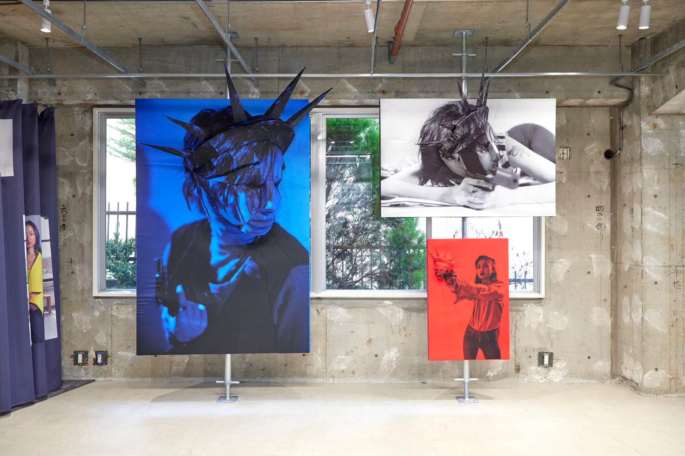
Ryuhei Oomaru’s Overcoat in Tokyo is a canvas of creative ingenuity and meticulous design thought. For this follow-up to the fashion brand’s New York base, Oomaru, a designer, collaborated with local firm Atelier Write to redefine an office on the second floor of a 1980s apartment building.
The partnership weaves previously hidden structures that lend themselves to the shop’s looks and functionality with elements that serve multiple functions, such as exposed steel joints used to hang stock and fabrics. The chromatic garments hang like modern art exhibits, their vibrant hues stark against the raw concrete backdrop.
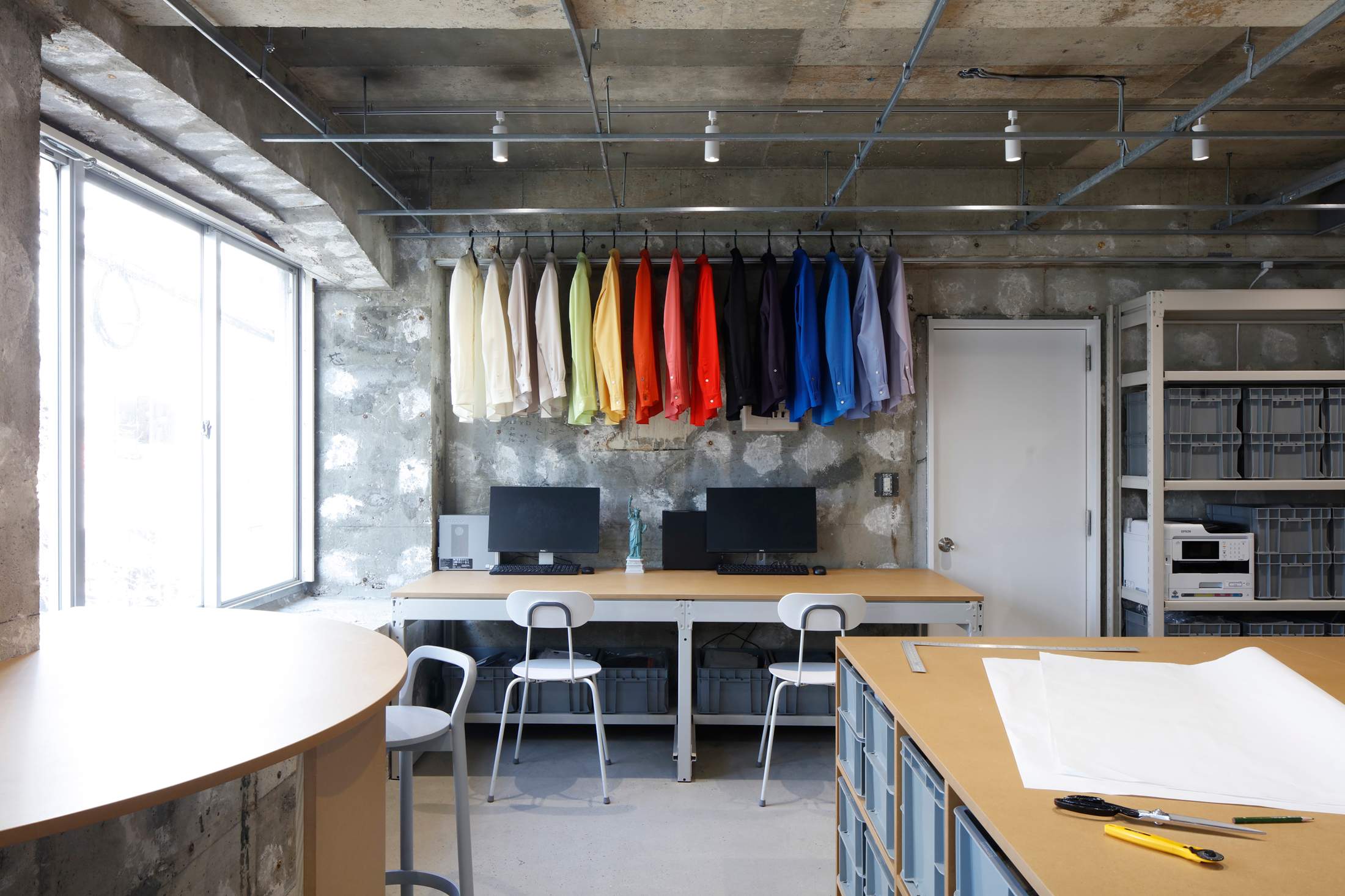
“Since we can keep the entire fashion cycle in one place using the interchangeable layout, it makes the staff’s workflow efficient,” says Oomaru. By breaking down the barriers between maker and buyer, customers aren’t just purchasing a garment but engaging in a narrative and forming a connection with the creator. “I want to see who is interested in my creation,” adds the designer, who is known for his smartly tailored coats, jackets and trousers. “I want my space to become a place where my staff and customers come together to talk about creation.”
overcoatnyc.com
On DESIGN
Nic Monisse on...
Modus operandi
The Monocle Design Awards are here. This is our recognition of the industry’s finest work this year. And while the full report can be found on pages 115 to 146, this column presents an opportunity to reflect on a few of the key design themes that monocle’s editors and correspondents picked up on while reporting for the prize. —
1
Embrace the environment
Good architecture should work with the climate in which it’s set – and many of the projects highlighted in the awards do so. In Guatemala, for instance, Miller Hull devised a brise-soleil for a building that allows cooling breezes to flow in, while mitigating the heat of a tropical sun.
2
Communication is key
Graphic design is often a late consideration but it can be crucial to a project’s success. It can also go a long way to improving quality of life and protecting culture. Case in point: the newly developed alphabet, Adlam, that for the first time gives physical form to a verbal-only West African language.
3
Put people first
Many of the outstanding projects featured started from a place of prioritising people. One of our Top Architects, Tosin Oshinowo, encourages designers to pursue human- centric over iconic architecture.
4
Elevate the everyday
Objects we encounter constantly should be a joy to use – and to look at. That could be as simple as having a beautiful dining chair by De Padova that makes mealtimes something you want to stretch out for hours.
5
Material concerns
With any architectural or furniture project, material selection is crucial. Dubai studio Mula showed that more consideration should be given to the use of unconventional local materials by creating a pavilion out of every component of a palm tree.
furniture ––– brazil
Q&A
Cléo Döbberthin & Lorenzo Lo Schiavo
Founders, Palma
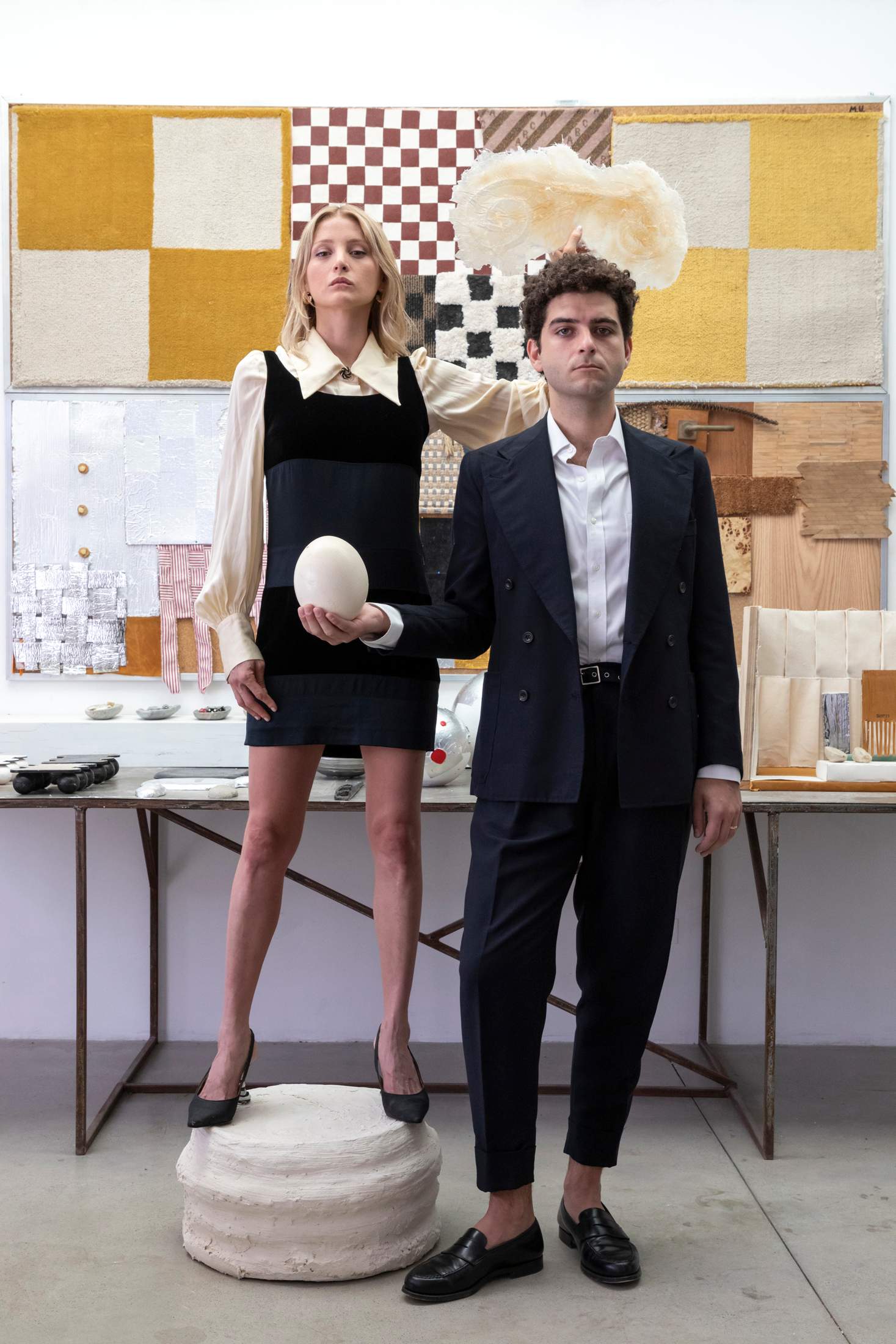
São Paulo-based studio Palma was founded in 2020 by friends Cléo Döbberthin and Lorenzo Lo Schiavo. The duo launched their second furniture collection at Salone del Mobile in April. They tell us more about their work.
You’re both from São Paulo. How did you meet?
cd:We grew up in the same group of friends and the same environment but met properly when we were studying at the architecture university, Escola da Cidade. We lost contact but then reconnected in 2019.
Describe your design ethos.
ls: We joke that sometimes we have a Frankenstein aesthetic. We put together inspiration from a billion different things but somehow it works. We have lots of fun, making our pieces in our studio in São Paulo’s Barra Funda neighbourhood.
Tell us about Barra Funda.
cd: The best art galleries are here. We wanted to add a bit of design too and that scene is growing into a design hub with many ateliers and studios.
What’s it like to work in Brazil as a designer now?
cd:When we launched our first collection, we were trying to create a culture of collectable design here. To bring something we already see in Europe, the US and even Mexico. Here, the relationship between art and design still feels very separate – but it’s changing.
palmapalma.com.br
residences ––– lisbon
Packed house
Lisbon’s sunny climate and warm hospitality have been a major draw in recent years, attracting not only tourists but creatives enamoured by the vibrant arts and design scene. In late May, the Portuguese capital celebrates this community with the second edition of its Lisbon Design Week, during which local studios and workshops open their doors to the public. One venue on everyone’s must-see list is La Junqueira, an artist’s residency in Belém.
Founded in 2018 by French artist Stéphane Mulliez, the project offers three-month stays to artists, all of which culminate in a show. “The aim is artistic expression, pushing artists to discover aspects of Lisbon and Portugal, be they cultural, architectural or sociological,” she says.
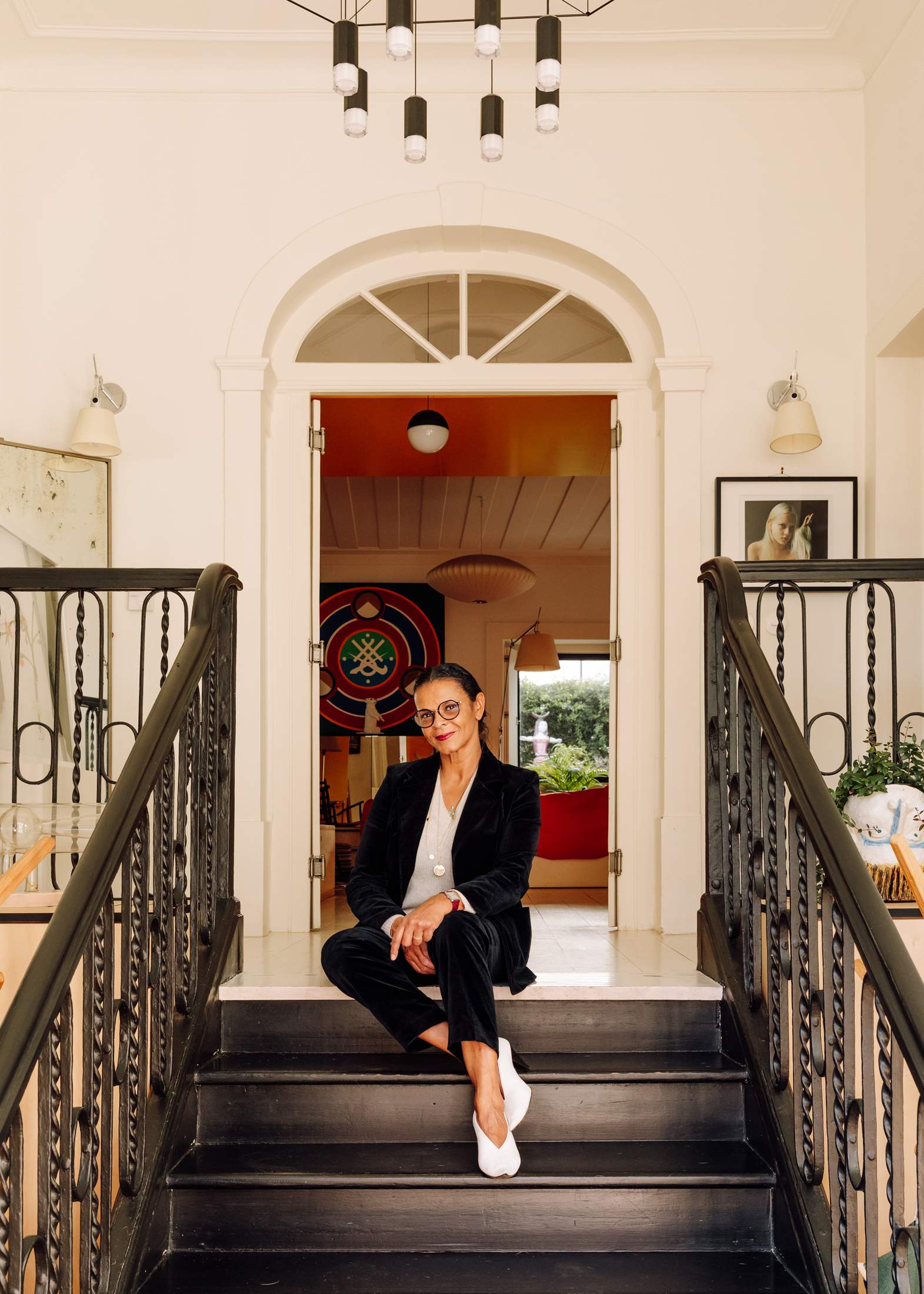
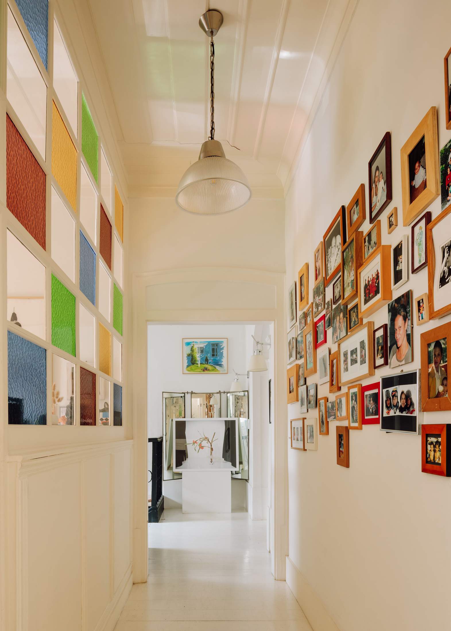
Mulliez (pictured) restored two floors of an 18th-century building, previously a primary school, to carve out a home for herself, as well as accommodations for visiting artists and an exhibition area. There is also an atelier nearby where residents work. Mulliez was careful to ensure the original details weren’t lost. Multicoloured stained-glass panels in a hallway filter light into her office, while ceramics, a popular craft in Portugal, feature heavily – a decorative band of traditional azulejos line the lower wall in a room used as a workshop.
The residency is eager to promote local craftsmanship. “We want to build relationships between artists and artisans,” adds Mulliez. French artist Pauline Guerrier developed ceramic panels after working with Viúva Lamego, a storied Portuguese producer known for figurative tiles.
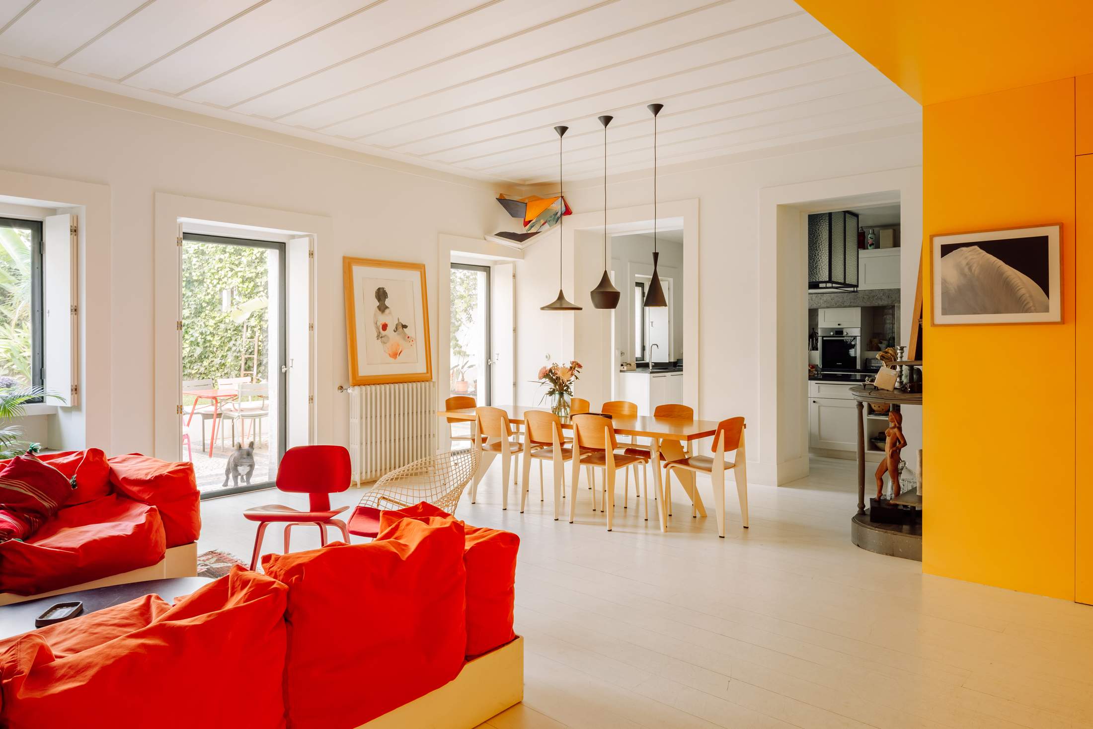
Several works by past residents are prominently displayed by Mulliez in her living room, punctuated by a pair of bright Superoblong sofas from Cappellini. A photo by 2019 resident Louis Heilbronn faces a dining set from Jean Prouvé lit from above by Tom Dixon lamps.
In her garden, Mulliez has outdoor furniture from French brand Fermob. At Lisbon Design Week, visitors will see pieces by sculptor Max Coulon, who will use local woods such as oak and eucalyptus to create large-scale pieces. Should you not be able to visit during the event, consider applying for a residency – at the very least, it will be a chance to see Mulliez’s remarkable residence and workshop.
lajunqueira.org
Lisbon Design Week runs from 22–26 May.
sport ––– bordeaux
Keeping track
Paris-based K-Architectures recently oversaw the renovation of Pierre-Paul Bernard Stadium in Talence, a suburb of Bordeaux. Built in 1976, the stadium was in need of a tasteful update. The practice refurbished everything from its 1,500-seat grandstand to its worn-out track, all while adding a sports complex with indoor practice halls, a gym and an administrative department.
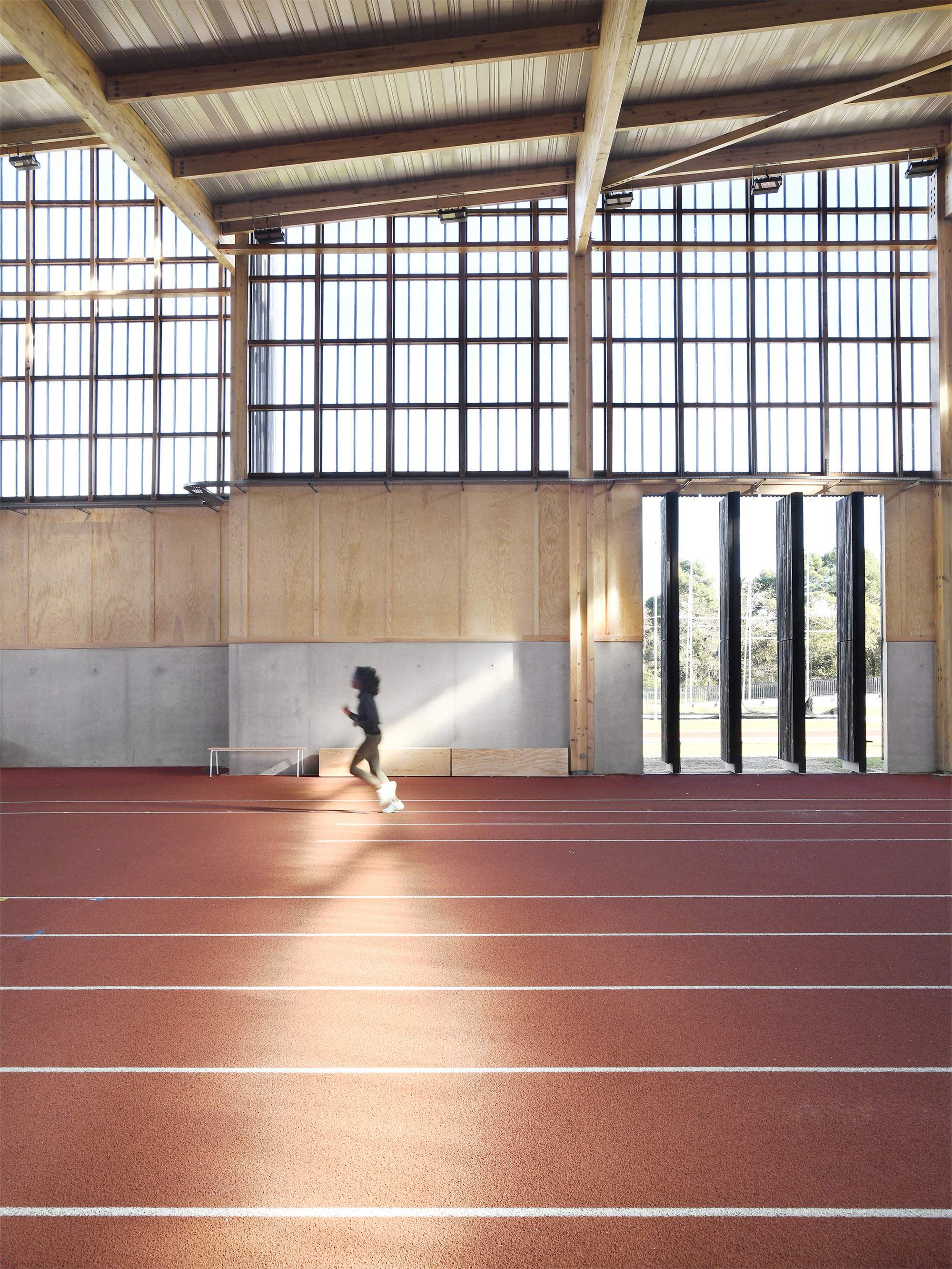
The stadium is located on the edge of the protected Thouars Wood, which meant that architects Karine Herman and Jérôme Sigwalt had to ensure that the project would not encroach upon the ancient green space. The handsome wood-framed halls were conceived as a group of barns featuring low-slung, corrugated-metal roofs and façades clad in burnt pine, inspired by Japan’s yakisugi (burnt cedar) technique. The grandstand was
updated without changing its structure. Its base, benches and façade were repainted and given a dark tint and the changing rooms were modernised. The athletics track was expanded from six to eight lanes, making it more useful for competitions, both national and international. “The asymmetrical overhanging roofs and use of wood evoke girolles, the small traditional houses in the region’s sandy pine forests,” says Sigwalt.
k-architectures.co


