
My Cabinet: Hacking Gutenberg / Berlin
Font of knowledge
In Germany, one typographer and his team are pressing for visibility in print in new and innovative ways.
One of Europe’s largest collections of letterpress equipment lies half-hidden in an inner courtyard on Berlin’s Potsdamer Strasse. The duplex studio of Hacking Gutenberg is home to a mass of proof presses, casting machines and cases of rare woodblock type that can rival the collection of any typography museum. The difference is that here, staff and visitors are encouraged to use the materials. Hacking Gutenberg’s mission is to update the letterpress, which was created by Johannes Gutenberg in the 15th century, for the present day. “You understand the world by touching things,” says founder Erik Spiekermann. “I’m afraid that our ability to do this is decreasing.”
Hacking Gutenberg is the result of a lifelong obsession with type. Spiekermann is one of Germany’s most prolific and revered graphic designers. He has shaped the visual identities of both the Deutsche Bahn and Berlin’s public-transit system, as well as that of car brands such as Audi and Volkswagen. Before he launched his first branding agency, Meta Design, in 1979, Spiekermann ran a typesetter’s workshop. Having grown up near Hanover, next to the printer of a local newspaper, he opened his own business as a teenager. “I just caught the bug,” he says. The collection at Hacking Gutenberg is Spiekermann’s second attempt at rehoming unloved machinery: his original equipment burnt down in a fire in London in 1977. “I promised myself that I would rebuild it when I retired,” he says.
But Hacking Gutenberg does not run at a regular pensioner’s pace. Spiekermann employs three staff for marketing and hosting workshops, and a handful of freelancers hire desks on the mezzanine. The office also hosts The Other Collection, a publishing house that prints books using laser-cut polymer plates on a letterpress machine from 1954.
“We’re no Luddites,” says Spiekermann. “If Gutenberg were alive today, this is how he would do it.” Spiekermann is also helping to redesign the Bay Area Rapid Transit system. Most days, however, he can be found, along with his team, between the whirring presses on Potsdamer Strasse. —
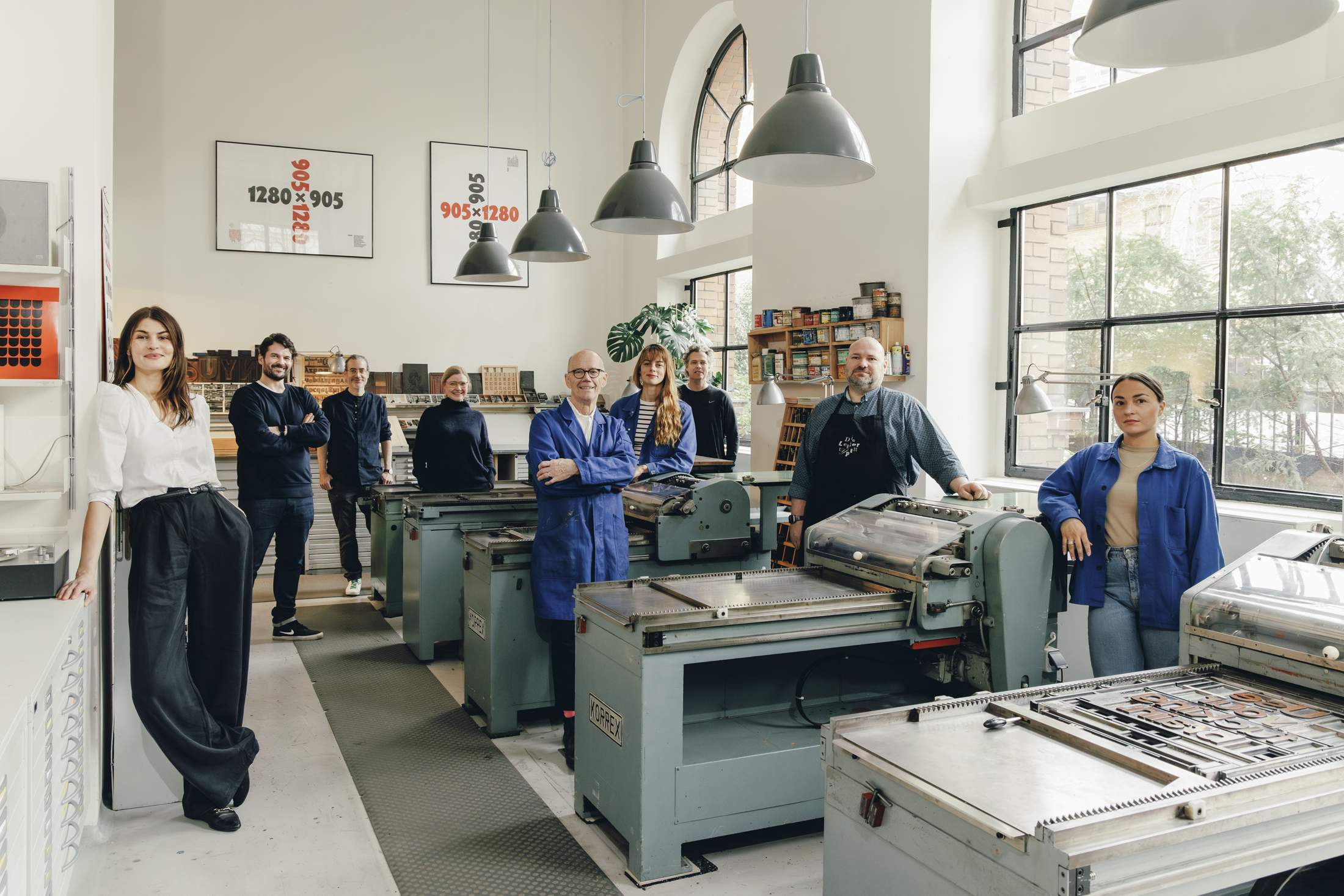
Erik Spiekermann, (middle)
Founder
Spiekermann’s favourite typeface is always the one that he last designed. Right now that’s Neue Serie 57, a sans-serif option based on an old type case from Berlin-based foundry Berthold.
1. Christin Franke
Art director
To Franke, freelancing for Spiekermann is like a designer’s version of “working with Lagerfeld”.
2. René Bieder
Type designer
Bieder first visited the workshop on an open day in 2016 and moved onto the mezzanine in 2019.
3. Michael Kuphal
Web designer
The web designer recently joined the team. He’s figuring out how the analogue machinery works.
4. Birgit Schmitz
Editor, The Other Collection
Schmitz selects novels and non-fiction titles to be published in letterpress editions.
5. Lilith Zachwieja
Workshop manager
Zachwieja likes to introduce visitors to the analogue machines. Her favourite font is Fanfare from 1927.
6. Sebastian Dörken
Graphic designer & photographer
The freelancer met Spiekermann during his studies.
7. Daniel Klotz
Typesetter & bookbinder, Die Lettertypen
Klotz prints letterpress using his 1954 Heidelberg Cylinder.
8. Helene Bunge
Sales & marketing manager
Bunge’s favourite font is Banco, which appears on ‘The Big Lebowski’ posters.
