September / Global
The Agenda: Design
The new Finnair lounge at Helsinki Airport, Japanese townhouses and more.
design –––– Helsinki
Lounge act
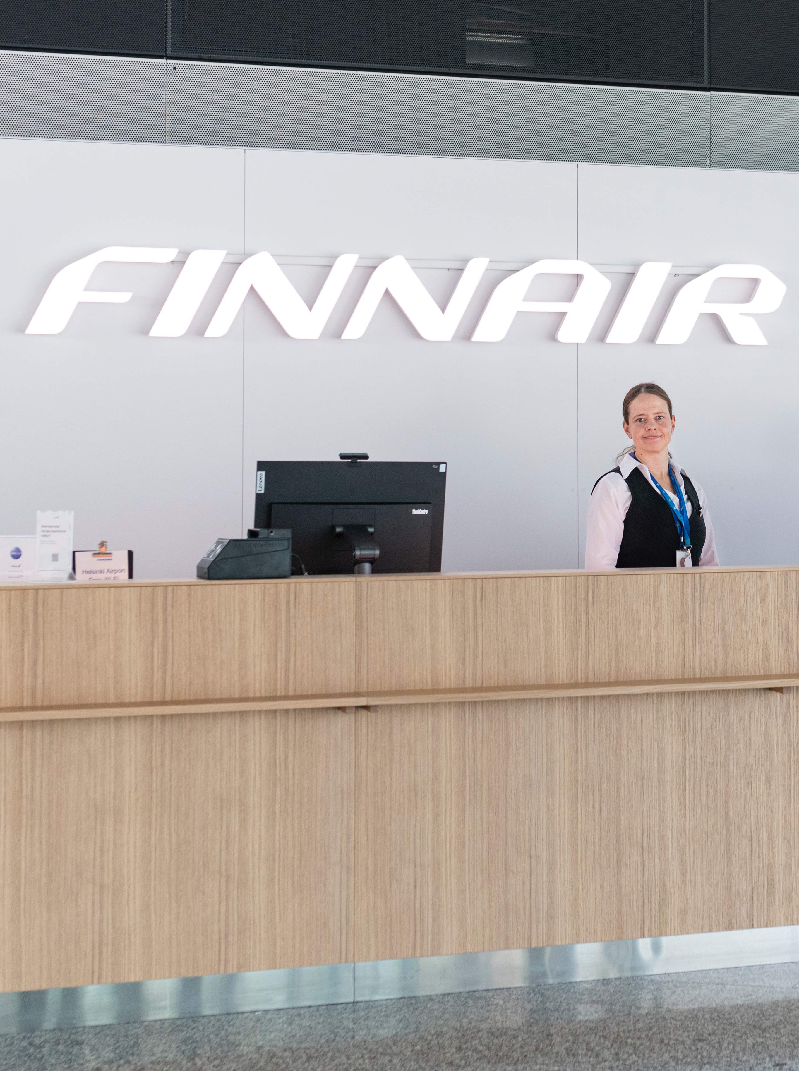
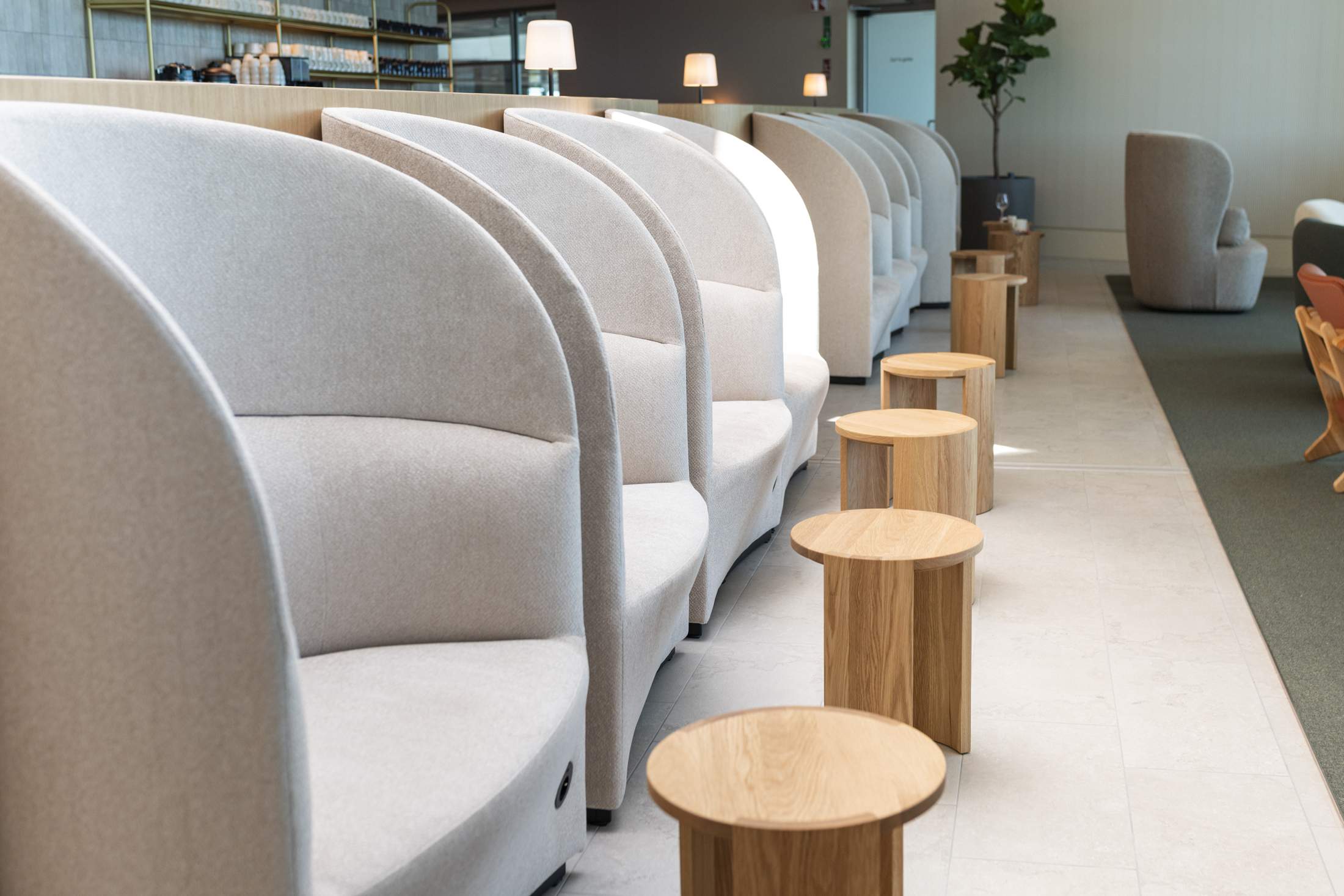
Finnair commissioned Helsinki-based designer Joanna Laajisto to create a new 440-seat Finnair lounge at Helsinki-Vantaa Airport. The recently opened space, which is located on the Schengen side, is influenced by Finnish nature and features local wood, stone, leather and woollen fabrics. “I wanted to create an environment that gives your senses a moment of rest from the hectic world of travel, the type of positive feeling you get when you collapse in your own bed,” Laajisto tells monocle.
The materials are complemented by Finnish furniture, including Artek’s Domus chairs, Made by Choice’s Goma bar stool by Thomas Sandell and Centenniale coffee tables designed by Laajisto for Finnish furniture maker Nikari. “I used round shapes as a nod to the cabin experience and to create a cosy atmosphere in what is a busy environment,” says Laajisto (pictured).
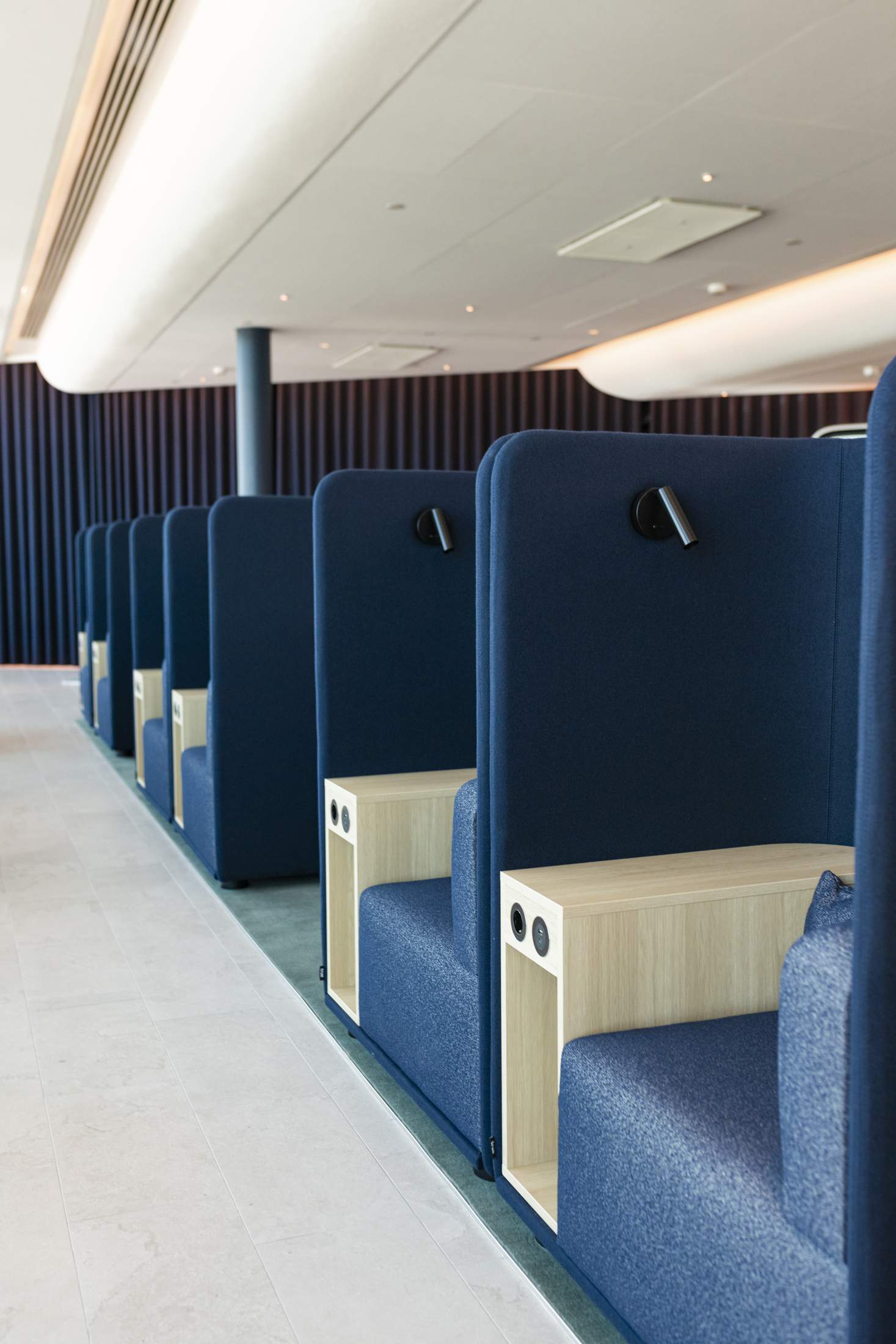
The lounge features separate yet subtly demarcated areas for a range of uses. “A great lounge caters to various use cases,” says Meri Järvinen, Finnair’s head of airport customer experience, as she walks monocle through the lounge’s quiet zone, where dark blue seats reminiscent of Finnair’s award-winning AirLounge Business Class seat have been laid out in a two-by-two configuration. “Some people want to freshen up and relax; others want to celebrate and socialise, while we also have a lot of commuting passengers who need a space to work before or after their flight.” Järvinen adds that Finnair also went to great lengths to address acoustics. Laajisto’s team soundproofed spaces for conference calls and meetings, to ensure that those taking a short nap after their 13-hour inbound flight from Haneda are not woken by a cacophony of voices from someone’s laptop. The only downside is the potential that one might snooze past their departure time – they will, at least, wake up comfortable and well fed.
transport –––– Zürich
Little and large

Passengers looking out onto Zürich airport’s runways might well be intrigued by a new sight: small, bubble-like cars zipping between aircraft. Three of these two-seater electric vehicles, made by Swiss brand Microlino, are now ferrying the staff of Switzerland’s flag carrier, Swiss, between tasks on the tarmac. A partnership was signed between the two brands this summer. “Bigger cars can do other jobs, such as transporting maintenance teams, luggage and tools around the grounds,” says Swiss’s project manager Marcus di Laurenzio. “But Microlino offered us exactly what we needed for other members of our team: the car is designed to travel short distances with a maximum of two people, which is perfect for our staff moving between meetings at our headquarters, a 10-minute drive away, and logistics operations at the airport hangars.”
Di Laurenzio explains that the decision to work with Microlino was in part about kick-starting a collaboration that speaks to the power of a country’s best transport brands coming together. “We want to promote Swissness and send a message to Zürich Airport passengers looking on,” he says. “It has a bit of Beauty and the Beast about it – the biggest people-mover in Switzerland meets the smallest people-mover in Switzerland.”
interview –––– usa
Q&A

Yves Béhar
Chief designer, Fuseproject
Swiss-American designer and entrepreneur Béhar is founder and chief designer of San Francisco-based Fuseproject. His practice is guided by the belief that design is a tool for not only showing us the future, but bringing us to it.
What is design to you?
Design has always been about the opportunities to be diverse, to try new things, to learn. I’m currently working on a truck for US electric vehicle manufacturer Telo. We’re hoping to present full-size, functioning versions by the end of the year.
How do your Swiss roots influence your work?
I have a Swiss inclination for engineering and precise realisation. An idea might initially seem impossible but it requires good thinking, good manufacturing and good engineering. So I’m never afraid of taking risks – it’s part of the thrill of design.
What’s next?
There’s a lot in the works. The past three years have been interesting because I have an office in Lisbon [after buying Portuguese digital design agency Mindshaker] and my office in San Francisco. I reacquired Fuseproject in 2023, so it’s an exciting time. And there is a forthcoming boom in San Francisco. A lot of people are surprised when I say that but a lot of human-centric technologies are being developed there that we, as designers, will have access to, which I find very exciting.
residence –––– nara
Character revival
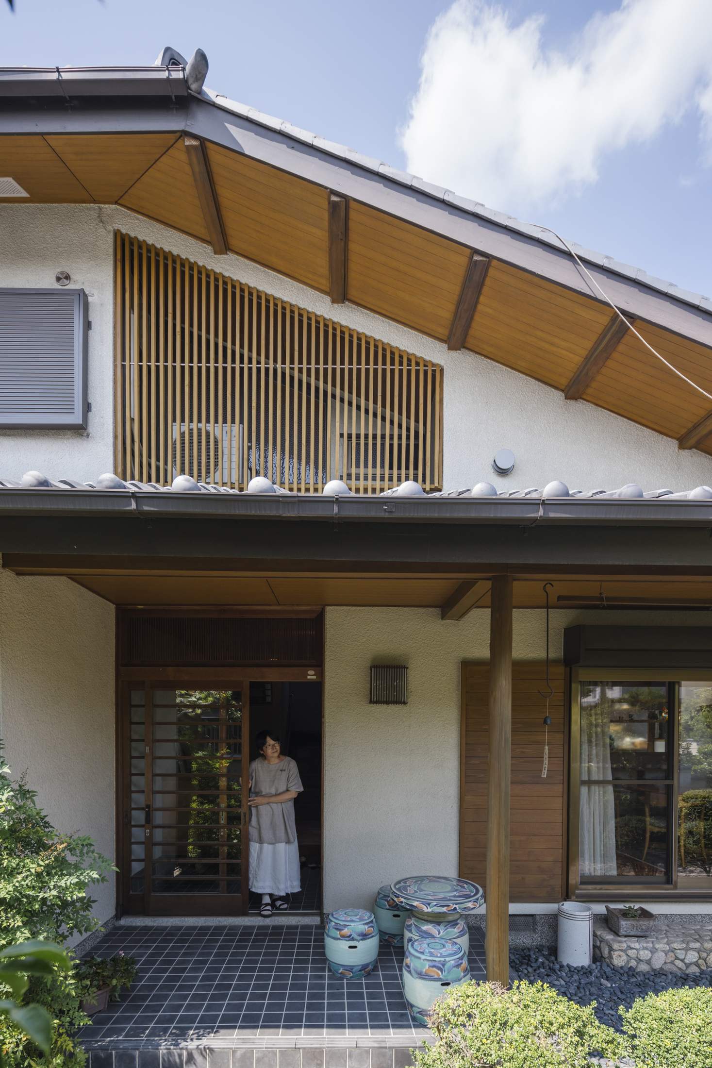
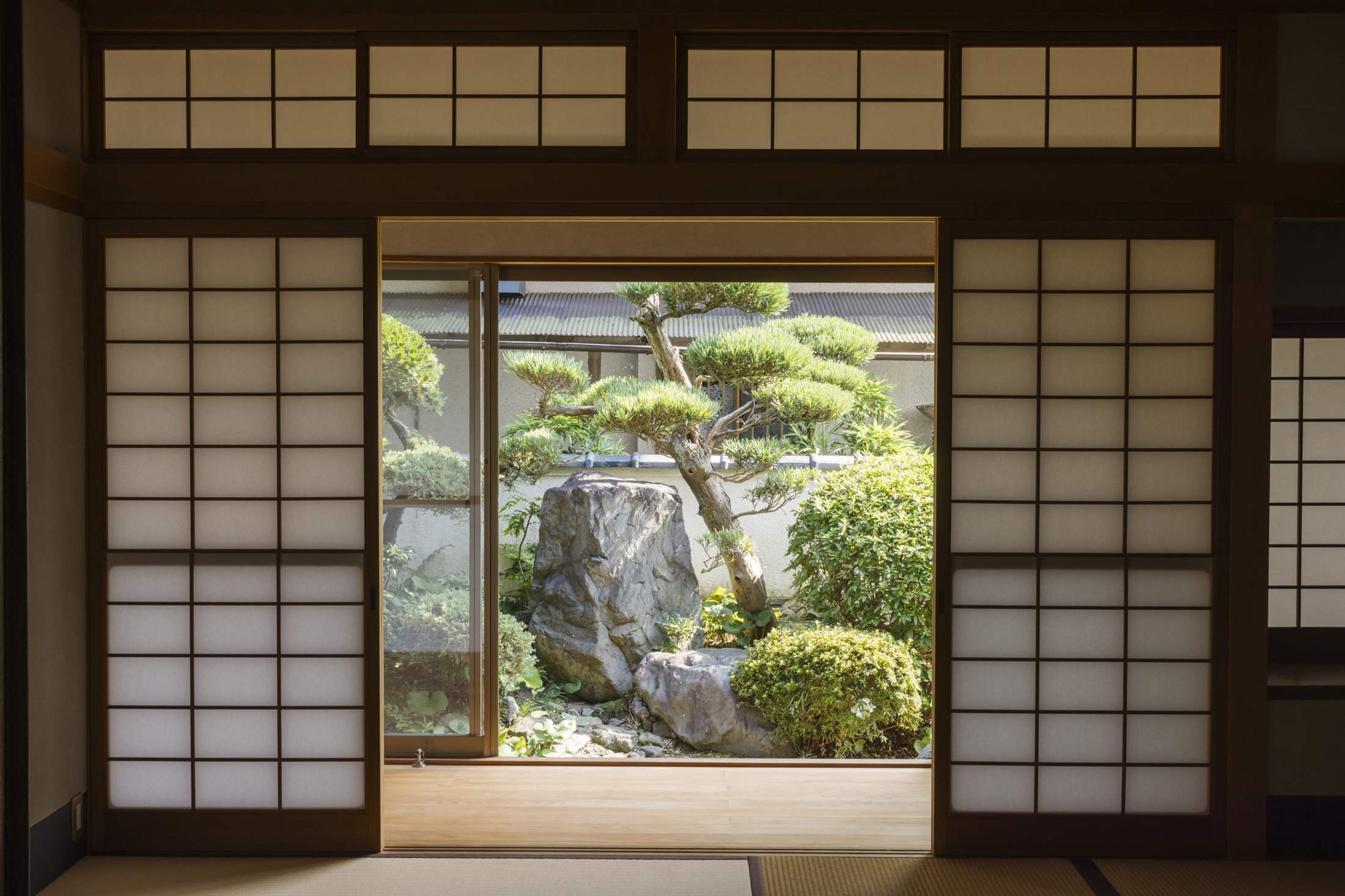
There is an abundance of older building stock in Japan’s rural prefectures and smaller cities, from traditional folk houses to machiya townhouses – and many of them are ripe for renovation. The restoration of such structures is essential to protecting the country’s distinct architectural character – work that has become a key focus for architect Yoshihiro Yamamoto and his Kansai-based firm Yoshihiro Yamamoto Architects Atelier (yyaa). “Working throughout Nara, Kyoto and Osaka, there is such an abundance of historic architecture,” says the 47-year-old architect. “While new buildings are great, I also want to play a role in cherishing the old ones.”
When it comes to these renovation, restoration and repair projects, Yamamoto believes in the value of not imposing himself too heavily on the design. Instead, he develops uniqueness by listening to the client’s needs and finding optimal solutions. Case in point is his work on Mederu House, which has been home to the Kimura family for more than 30 years. As Noriko and husband Keisuke Kimura approached retirement, they enlisted yyaa to rework their beloved residence for their next chapter.
The couple’s affection for their home saw Yamamoto focus on ways to improve their quality of life. The first step was a reconfiguration that saw the dining room relocated so it is adjacent to the kitchen, which was redesigned to make the preparation and enjoyment of food an experience to share and savour. With garden views and ample natural light, aided by the addition of two skylights, the space was soon at the centre of daily life.
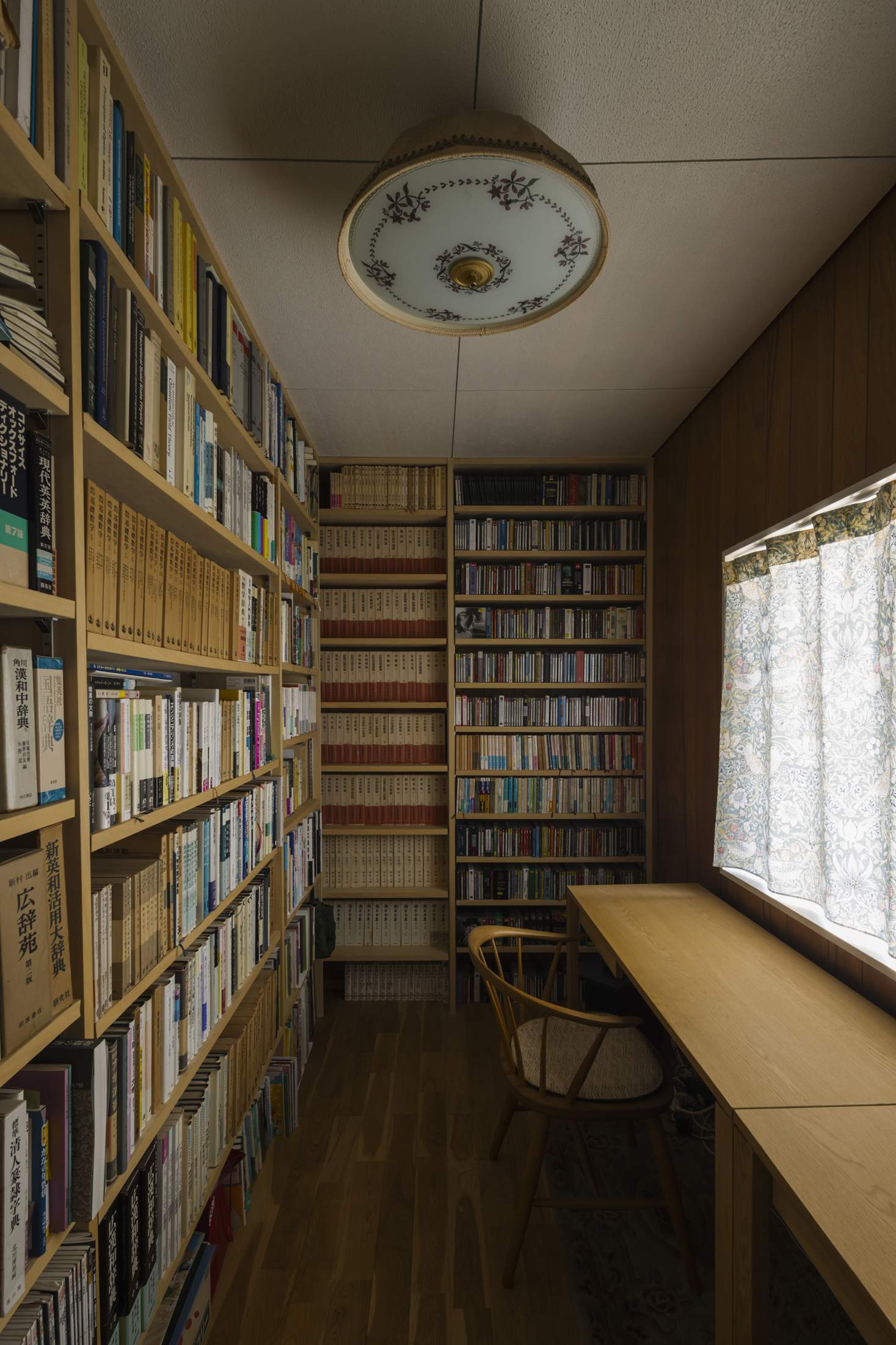
The architect also countered a lack of storage by creating built-in shelves, which are used for the display of art and antiques dating back to the eighth century. “I spent time showing Yamamoto-san every single piece I wanted to have on show,” says Noriko, with a laugh. “He measured them one by one, then designed the space and fixtures to fit them perfectly.”
Yamamoto’s focus on balancing practical measures with charming touches extended to the traditional tearoom and gallery, where functional issues were addressed alongside additions including Yoshino cedar floors and Makoto Kagoshima-designed paper on the sliding fusuma panels. The renewal inspired Noriko to restart tea-ceremony lessons. “Since the renovation, my mood has brightened and we can enjoy a more relaxed way of life.” The project shows the power of a renovation to not only preserve the architectural character of a place but also to support the ambitions of its residents.
