Post-it notes / Global
Sticking around
It’s hard to imagine life without the Post-it. We talk to four creatives about how the humble but ubiquitous sticky notes have improved their work, from organising maps to involving 30 households in the design of their new homes.
The origin of sticky notes is the stuff of r&d legend. Spencer Silver was a research chemist at 3M, the Minnesota-based industrial and consumer products company, seeking to concoct an adhesive strong enough to hold airplane parts together. Instead, in 1968 he developed acrylate copolymer microspheres, a sticky adhesive that came off surfaces easily and didn’t leave residue. Silver evangelised his invention within 3M and patented it in 1972 but no obvious commercial application emerged. Another chemist learned about Silver’s adhesive and thought it would make for a handy bookmark. The eureka moment had come, and 3M launched the Post-it Note in 1980.

In the 40-plus intervening years, 3M has sold billions of sticky notes and manufactures enough of the paper each year to reach the moon and back 13 times. The product has twice the brand trust as its nearest competitor, according to surveys. While the original 76mm by 76mm squares in canary yellow continue to be the top seller, Post-it Notes now come in more than 500 variations in 26 colours.
Sticky notes have ardent fans across all disciplines and ages. But Adrienne Hovland, who was until recently global portfolio director for Post-it Note, finds designers the most dedicated. “I feel like a celebrity when I walk into a creative agency or design studio,” she tells monocle. Digital competitors haven’t put a significant dent in the sticky note’s appeal and Hovland attributes the paper Post-it Note’s longevity to simple human cognition. “There’s something about being able to see it all in front of you that clarifies what you need to do, how you want to group things and where you need to go next,” she says. “That’s inherently why they endure with the design community.”
monocle spoke to four US creatives with a professed love of sticky notes about how the humble product helps them bring thoughts to life, convey ideas to clients and keep them organised. —

Jenny and Anda French
The architects, Boston
How do you get about 50 households to agree on a design for their future home? With sticky notes, of course. Jenny and Anda French, who together run Boston-based architectural practice French 2D, took on the ambitious task of designing a co-housing building in Massachusetts. The clients consisted of a range of potential residents, from baby boomers to millennials, who all agreed that they wanted to live together in individually owned flats with private kitchens and living rooms that are attached to a common house with a larger kitchen, dining room, music space and garden.
Translating this into concrete and wood, however, meant securing consensus on every detail. So the team devised a traffic signal-esque colour-coded sticky-note scheme of green, yellow and pink Post-its that were distributed to the 30 households. Everyone also received a single blue sticky note to signal exceptional approval of a design option.
“This is your voice and this is how we can see all of your voices together,” says Jenny (pictured, on right, with Anda) of how they described the scheme to their clients. The process helped the group to choose the building’s design, from its shape, unit types and common spaces to the materials used and connections to outdoors. The green and yellow notes illustrated sufficient consensus to move on without wasting time, while the hot pink notes created an instant “red light” moment for the group to hash out their differences in real time.
It took 12 workshops and seven years to bring the 30-unit project to fruition. But when the residents moved into their new homes in 2023, they had the satisfaction of knowing that both they and their neighbours fundamentally agreed on every detail – any leftover hot-pink sticky notes could be drafted for grocery lists instead.

Mario García
The media strategist, New York
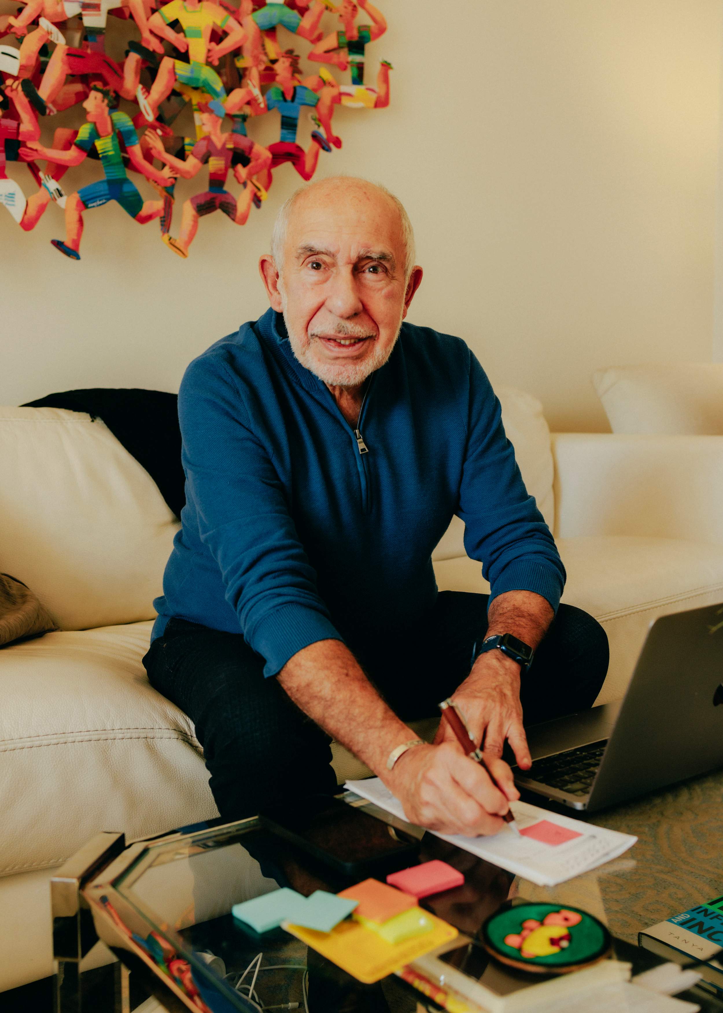
Cuban-American journalist Mario García is a highly sought-after design and editorial consultant who works for various media outlets around the world. He advises the likes of The Times in the UK, Singapore’s The Straits Times, Der Tagesspiegel in Germany, and Khaleej Times of Dubai, on how to improve their mobile storytelling offerings.
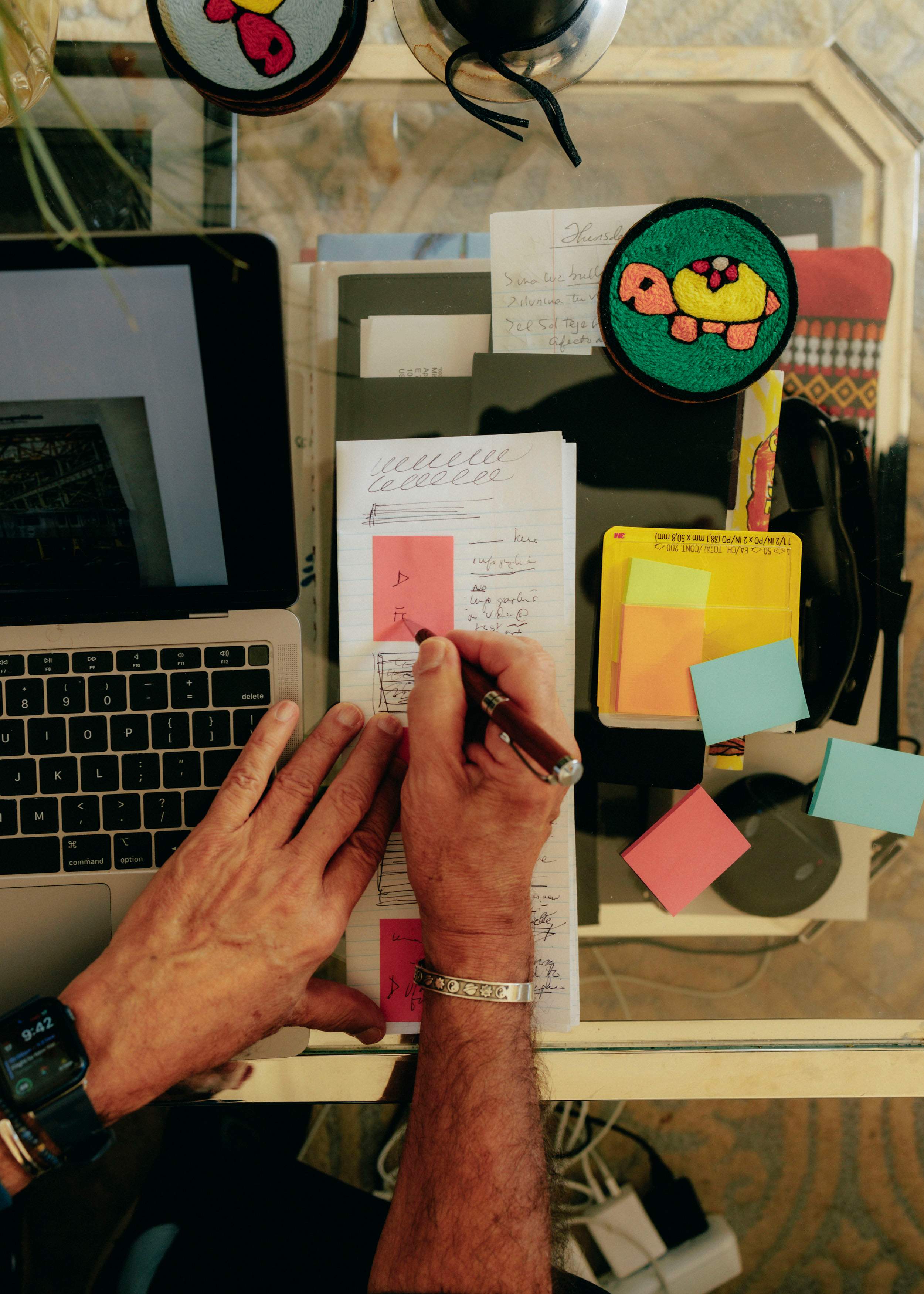
Whichever newsroom he lands in, however, must provide one simple tool that is absolutely essential for him to run his workshops: sticky notes. That’s because he trains his clients on how to deploy visual assets in a mobile story – where to intersperse videos, photos and graphics with text – by mapping them out with sticky notes, preferably the yellow ones. He picked up the technique from a New York Times staffer who became one of his graduate students at the Columbia University School of Journalism.
“Sticky notes are a functional way for a journalist who normally works with words to understand how visuals can become like paragraphs that advance the story,” he says.

To illustrate his point, García explains that the average time readers spend on a mobile story clocks in at 30 to 33 seconds. So an outline with 15 sticky notes – representing 15 different assets – makes it clear that some of the visuals need to go, or readers are unlikely to scroll through the story until the end. “Sticky notes help you see where you are with visuals.”

Marta Bernstein
The graphic designer, Seattle
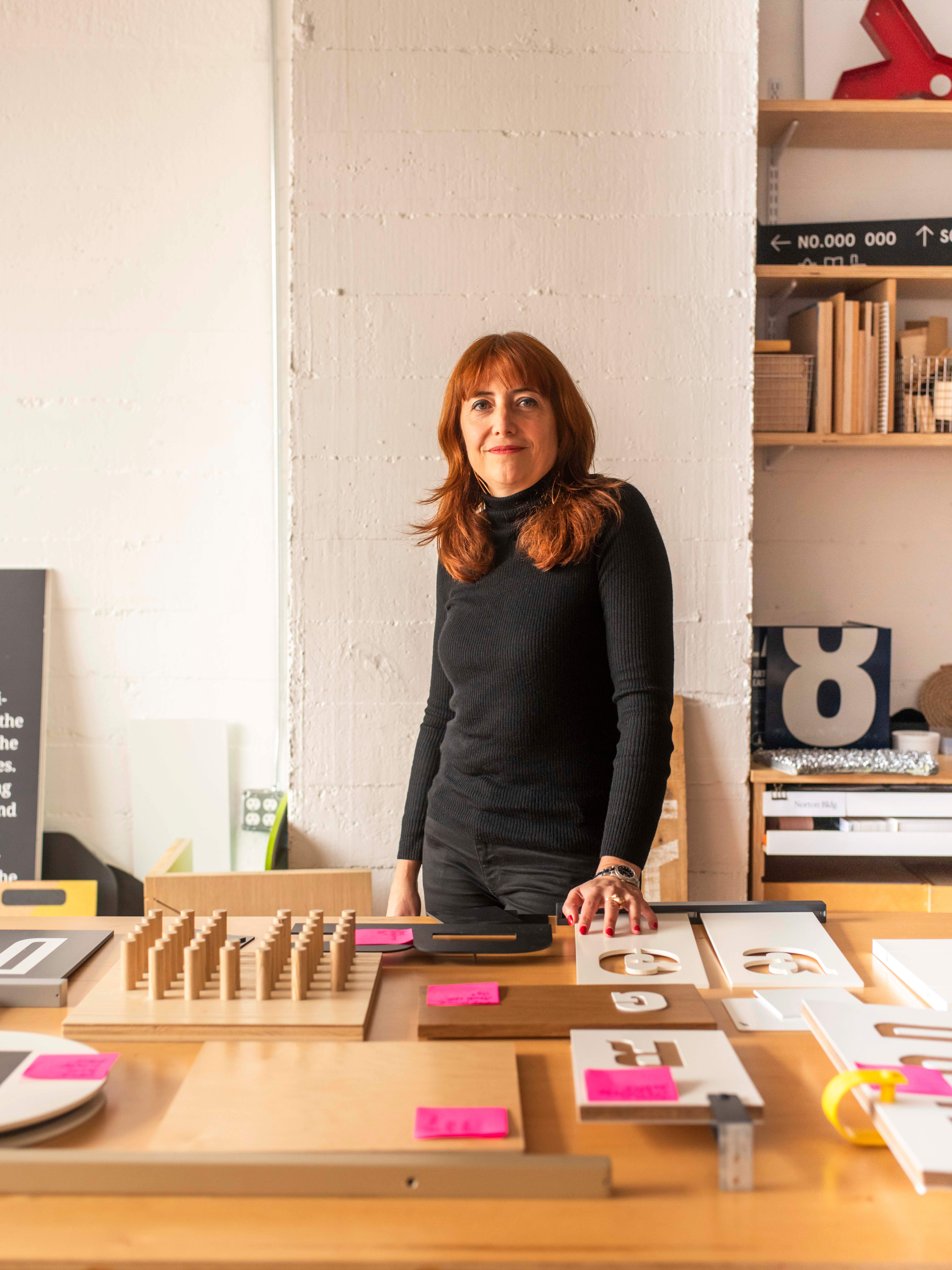
A potpourri of typefaces articulating various building names, directions, department titles, exhibition descriptions and other bits of information adorn signs of different shapes and sizes inside Studio Matthews, a Seattle-based design practice. Italian graphic designer Marta Bernstein has had her hand in many of these projects as the firm’s co-creative director.
When monocle visits, Bernstein is fresh off a meeting with a neighbourhood business improvement district and is peering over a clutch of sticky notes in orange, yellow, pink and light blue affixed to a map. Each refers to a local landmark with text jotted down explaining the location’s significance. This early-stage information-gathering workshop was designed to inform the direction of travel for an as-yet-undefined project – the end result might be wayfinding signage, informational maps or a local history kiosk.

For Bernstein, having the client huddle over a physical map rather than collecting ideas to type up on digital charts is vastly preferable. “People are looking at things instead of doing things,” she says. “The fact that people are standing, writing and physically moving in the space makes them way more engaged than just sitting and looking at a screen where someone is adding input.”
Bernstein says that four colours are the maximum she’ll bring to an engagement; more than that and any colour-coding scheme begins to fall apart. monocle peers inside the studio’s supply drawer where sticky notes – all Post-it brand, in a mix of 76mm by 76mm square and memo-sized – are neatly arranged. The latter are particularly useful for intraoffice communication. “It’s nicer to leave a sticky note on someone’s desk than to send them a Slack message,” she says.


