Design: Residence / Sydney
Born again
The smart renovation in a Sydney suburb breathes new life into the work of a pioneering home-builder.
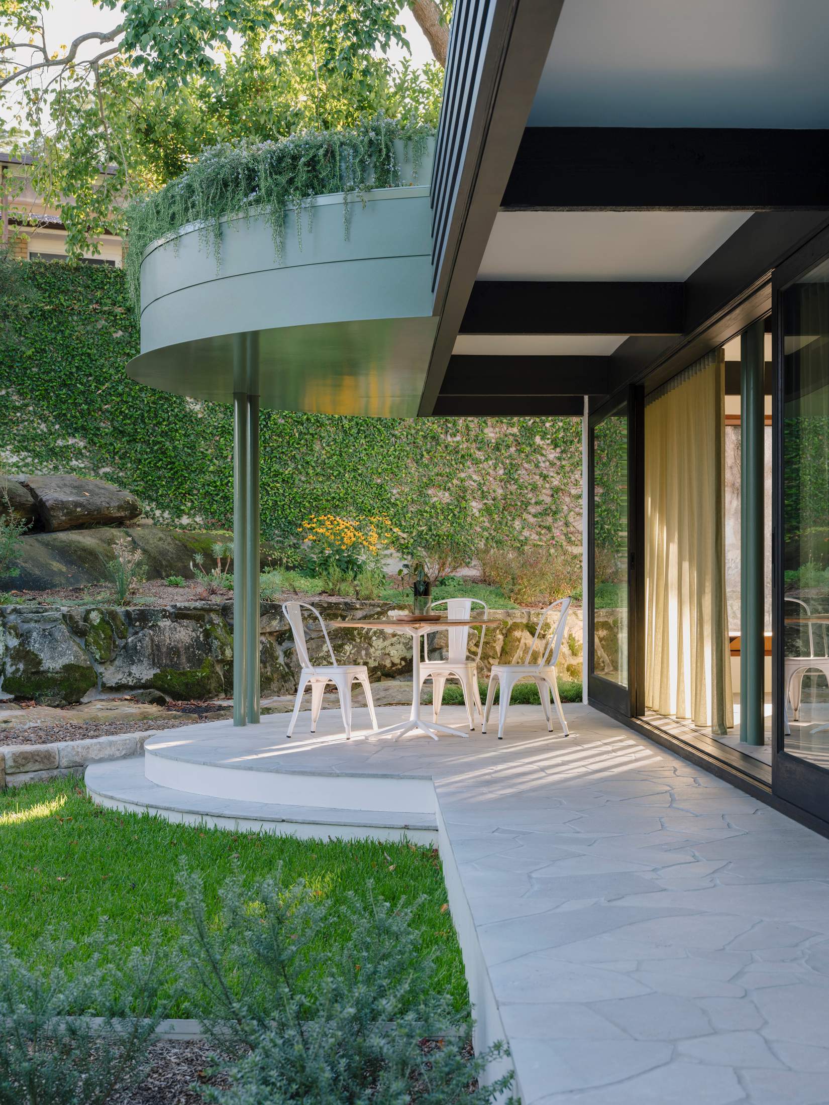
After the Second World War, many young families pursuing the Australian Dream of owning a detached home on a quarter-acre (1,012 sq m) block built their houses on the bushland fringing the country’s cities. By the 1960s there were countless companies capitalising on this ambition. A leader among them was Pettit + Sevitt. Established in 1961, the home-builder was prolific in Sydney’s northern suburbs, creating houses that were revolutionary at the time. It employed top architects to design compact, modular components that could be adapted to (often difficult) on-site conditions, such as uneven or sloping terrain.
“These houses were really beautifully designed,” says Sydney-based architect Eva-Marie Prineas, who founded her namesake studio in 2004. “They still have great bones but some elements feel a little flimsy now. So many have been knocked down.” Fortunately, there are some design buffs willing to commission architects, such as Prineas, to reimagine Pettit + Sevitt homes for contemporary living.
“We knew that we had to change the plan but we tried to keep the home’s original character”
Studio Prineas recently renovated one such residence, New Line House, in the Sydney suburb of East Ryde. Overlooking Lane Cove National Park, it was a Pettit + Sevitt Lowline model, an award-winning project home designed by architect Ken Woolley in the early 1960s. Positioned to preserve the site’s natural slope, the original single-level building was flat-roofed with Oregon-wood ceiling beams and boxy cedar windows. “When I started on the project, I didn’t want to touch anything,” says Prineas. “But the house wasn’t working in the way you need a contemporary home to function, in terms of flow, space or its connection to the garden.”
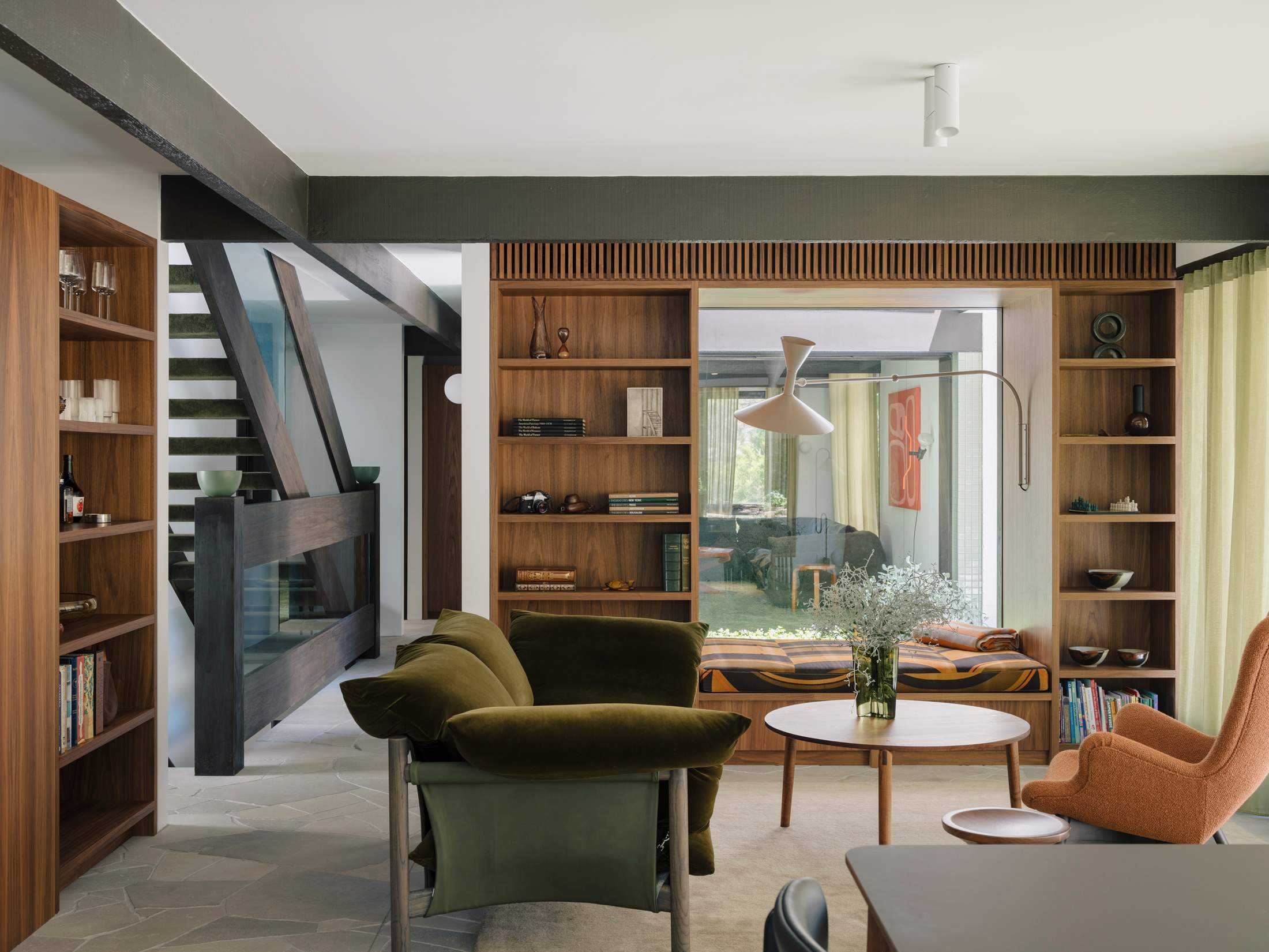
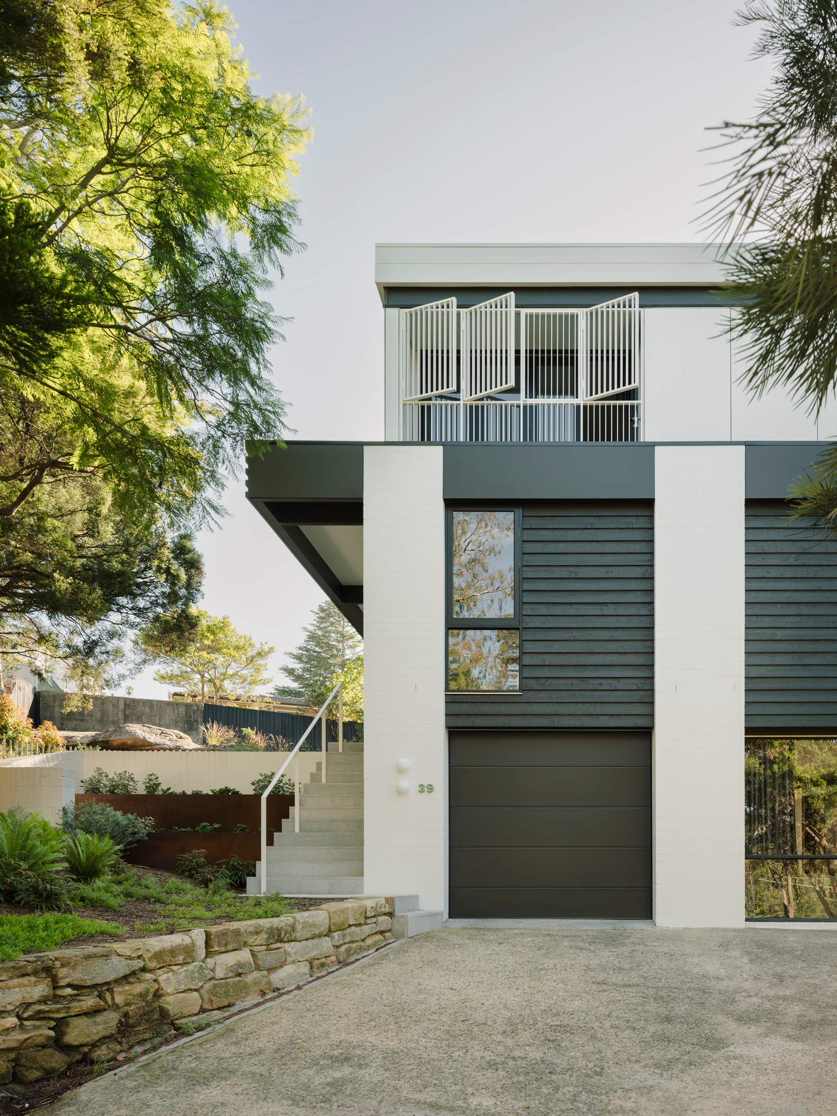
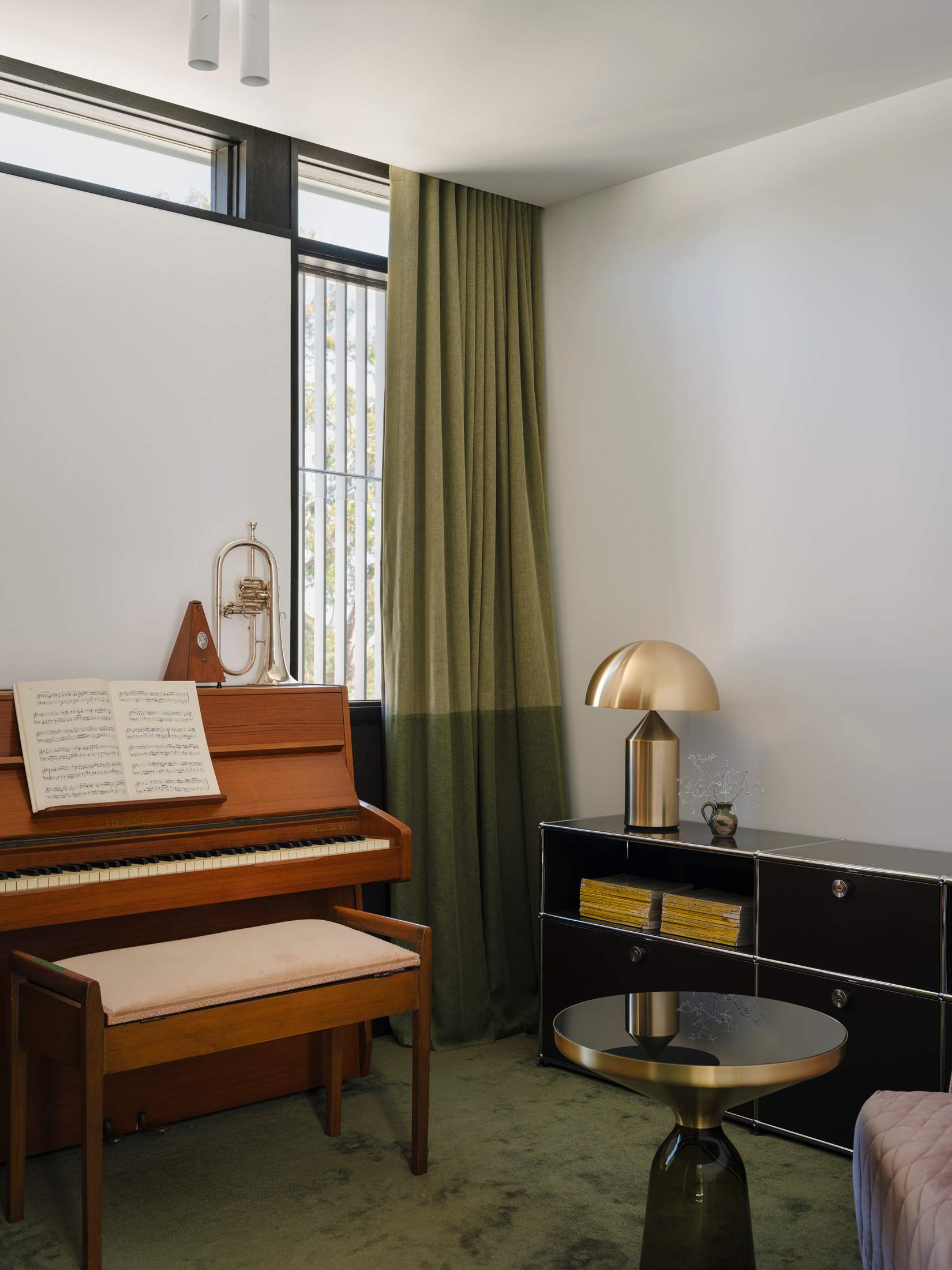
The architect’s solution was to keep the outline of the home compact – an approach at odds with the suburban-development trend of flattening blocks and prioritising large building footprints. She decided to go up, instead of out. “We knew that we had to change the plan but we tried to keep the home’s original character,” says Prineas. The roof was removed and another floor added but the original beams were carefully restored. Upstairs, four bedrooms and a sitting room can now comfortably accommodate a family and guests, while the ground level has been opened up to make room for a kitchen, a dining room and multiple sitting areas. Meanwhile, a new wine cellar and a home cinema are tucked behind the existing garage, which nestles into the hillside.
Prineas also designed and commissioned bespoke furniture and cabinetry to make the most of the home’s small footprint, including custom wardrobes in the main bedroom, shelving in the living areas, a walk-in pantry and a bathroom vanity. “Bespoke furniture will always give you more control,” she says of her decision to make custom additions to the home. “It allows you to get the right materiality and proportions for the space. And it means that you don’t have to try to fit a square peg in a round hole.”
Pettit + Sevitt timeline
1961: Brian Pettit and Ron Sevitt establish their namesake development company
1962: Architects Ken Woolley and Michael Dysart design the first Pettit + Sevitt split-level house
1967: Woolley’s Lowline B wins the Australian Institute of Architects award
1978: Original Pettit 1 Sevitt closes
2010: Ron’s widow, Val Sevitt, relaunches Pettit + Sevitt with an updated version of the Lowline
To complement the carpentry and bespoke fit-out, Prineas carefully selected the furniture and homeware in the residence. Louis Poulsen ph5 lights hang above the tiled kitchen island and Le Corbusier-designed Lampe de Marseille Mini Nemo wall lamps illuminate the living room; around the dining-room table are Scape chairs by modernist furniture designer Grant Featherston. “I made every decision while remembering what the house was and is,” says Prineas, explaining why she chose to focus on iconic mid-century wares.
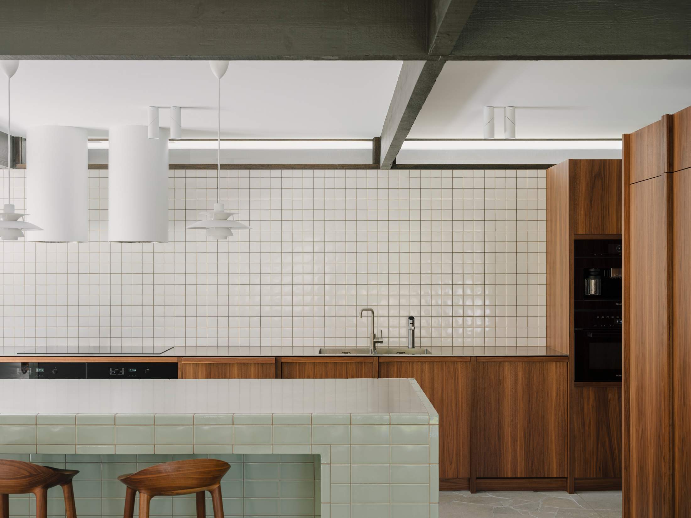
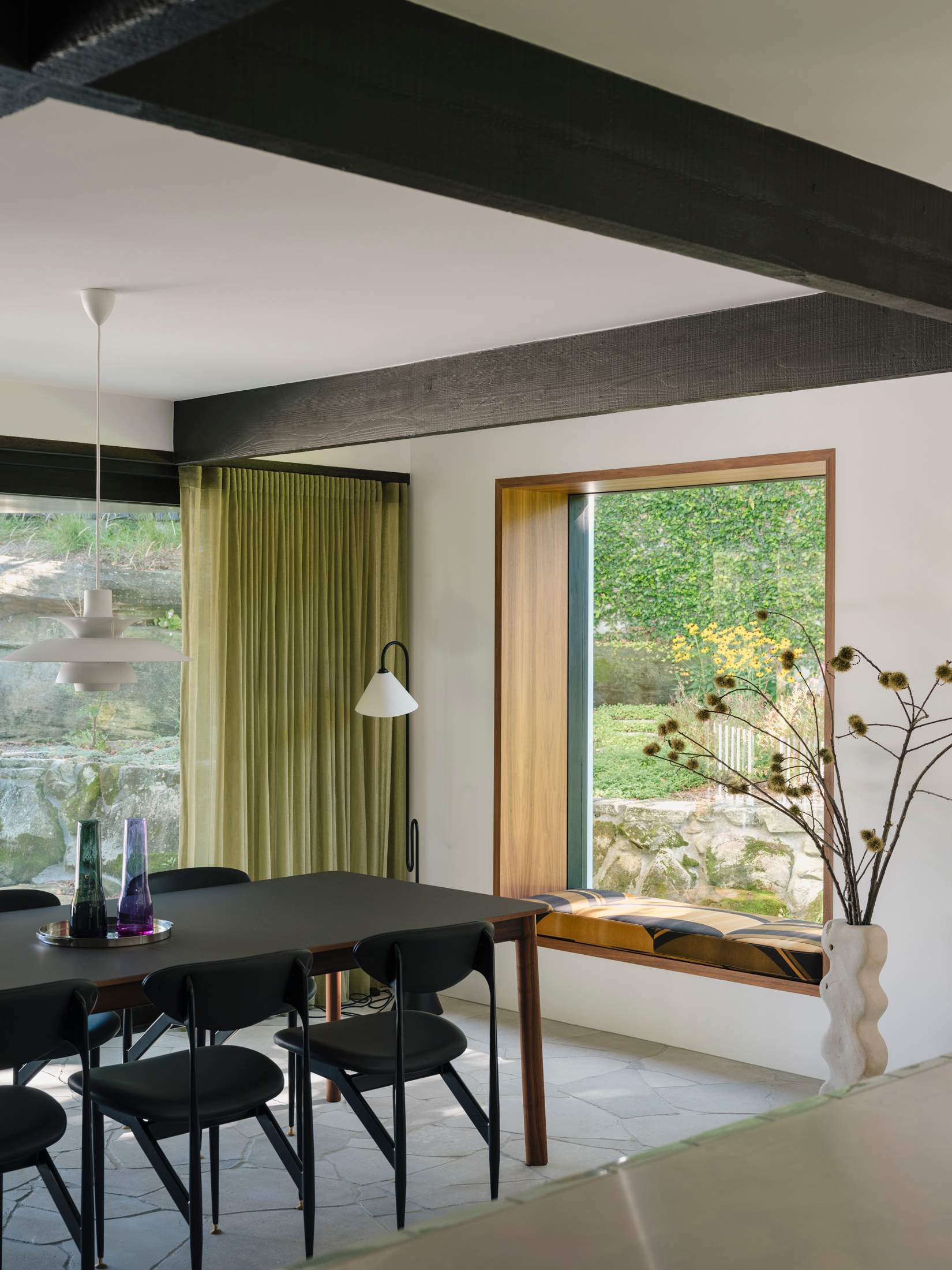
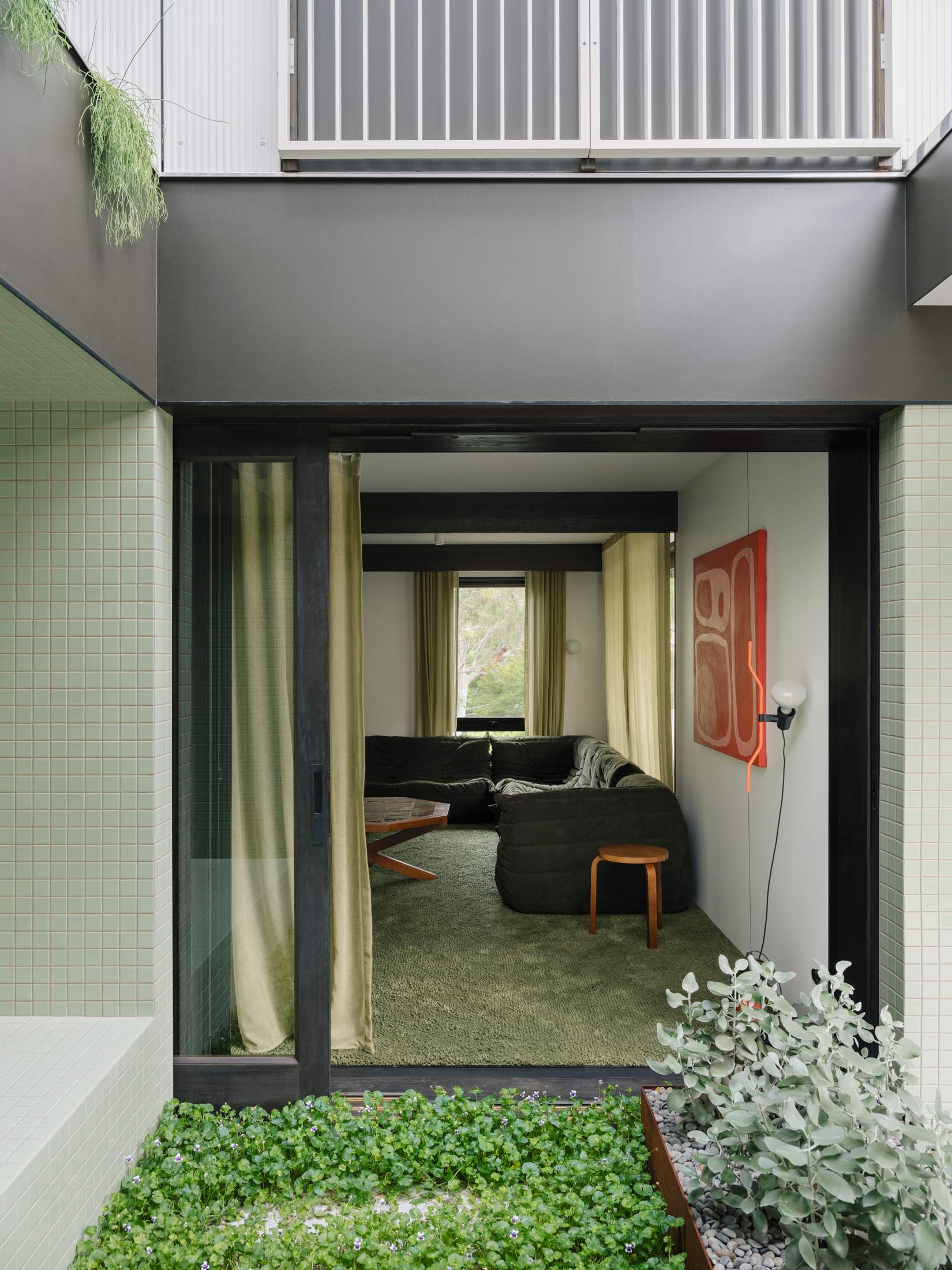
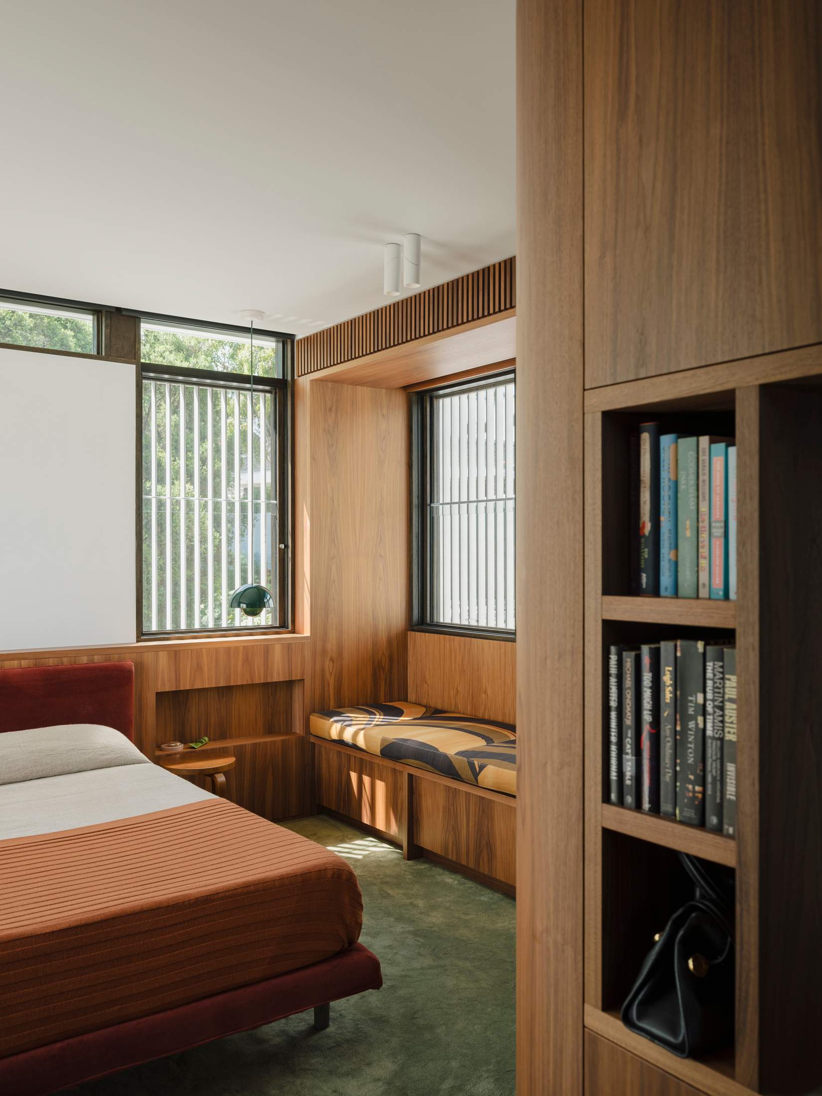
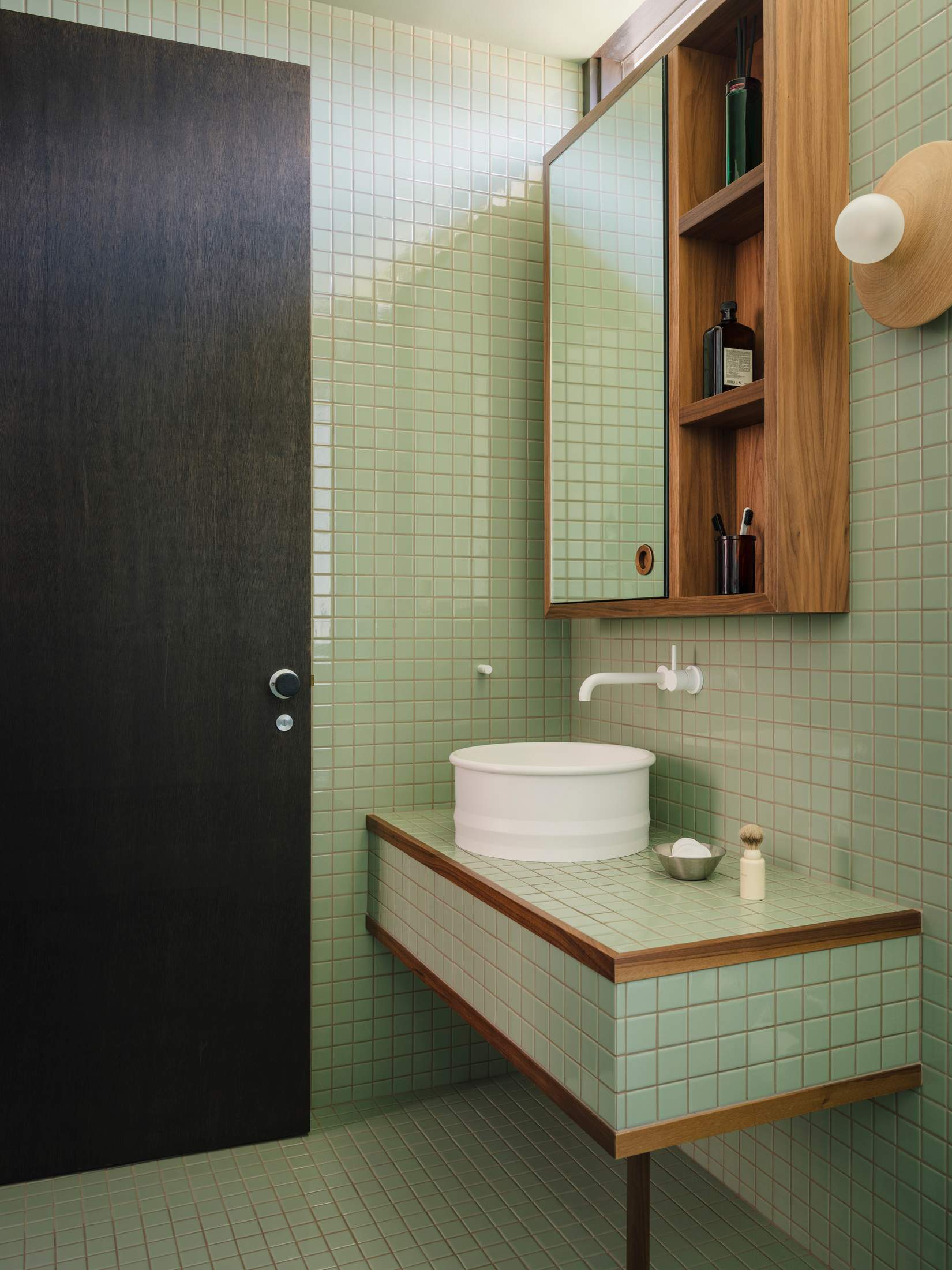
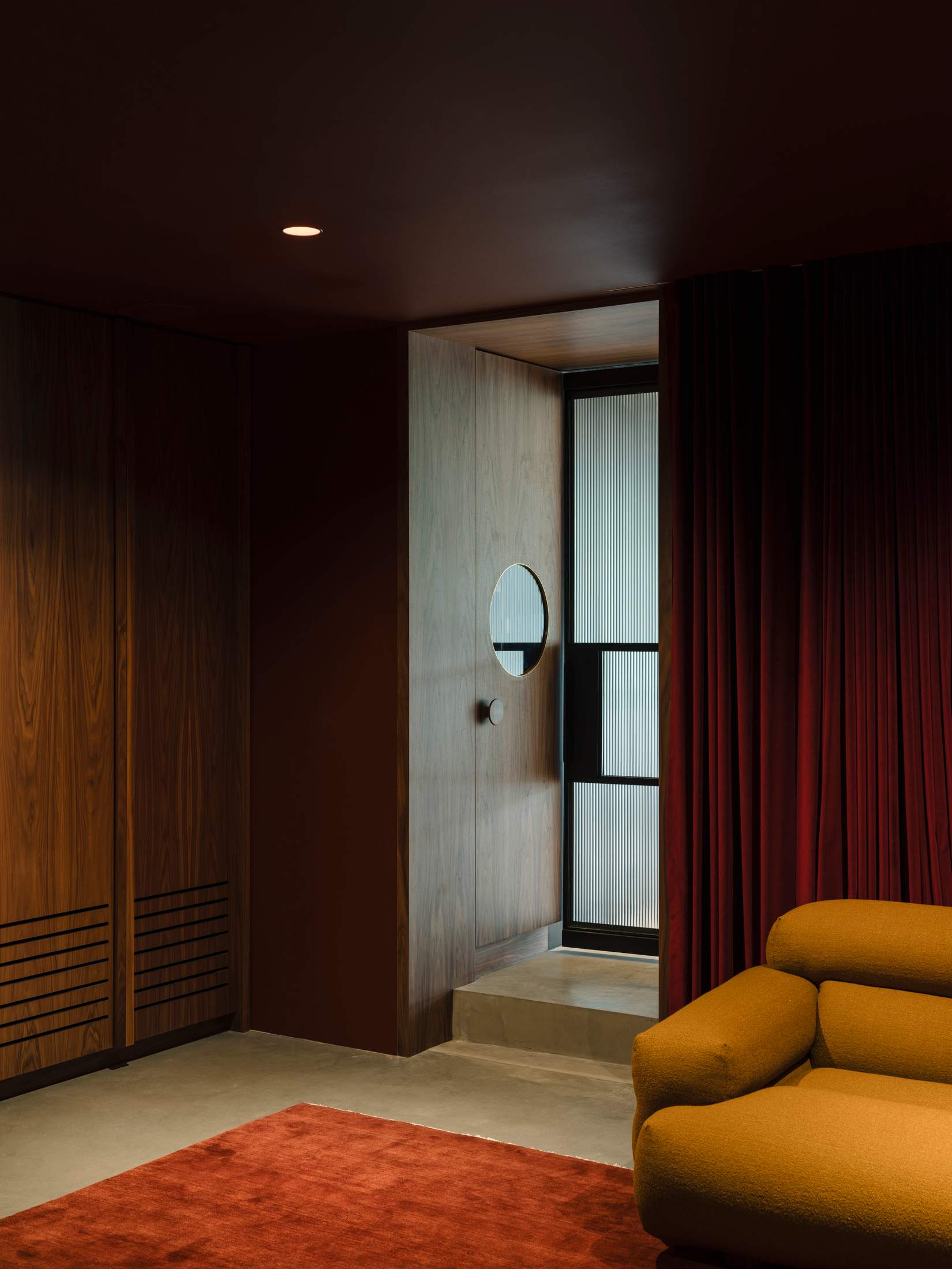
The original developer devoted plenty of attention to landscaping and the gardens. Prineas continued this, working to find ways to enhance the connection between the interior and exterior. The home now has pockets of greenery on the rooftops that can be glimpsed from the bedrooms, while a small internal courtyard breaks up the sitting rooms downstairs – a decision that has as much to do with improving cross-ventilation as with the notion of bringing the outside in.
Limestone paving extends seamlessly from the living spaces to the patio and veranda, visually linking the indoors and outdoors. “We wanted to connect the home with the garden and the rocky outcrop that tumbles down the slope, because it’s a special part of the site,” says Prineas. “If people were doing a new subdivision now, they would take the rocks out.”
Such choices have helped to protect the legacy of Pettit + Sevitt, ensuring that the firm’s once pioneering ideas – the importance of the outdoors and natural light, and the need for quality suburban architecture – live on. “The original house was more than 50 years old,” says Prineas. “It hadn’t had a renovation and was no longer functional. Hopefully, we have been able to give the home another 50 years.” —


