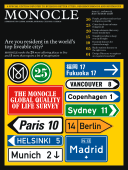
Copenhagen / Denmark
Copenhagen: design city
There are many reasons why Copenhagen trumped the other cities in our quality of life survey. One of them is its undeniably seamless urban planning, paving the way for the mobility, and ultimately, the happiness of its residents. Without resorting to branding wars or architectural gimmicks, Denmark’s capital is, put simply, designed for life.
Architecture: the meatpacking district behind the central station is an up and coming area, with cultural institutions and commercial spaces being planned. A residential area to look out for is Sluseholmen, in the south harbour.
Environmental issues: the annual Green Mermaid Festival promotes Copenhagen as Europe’s green capital, bringing together everyone from politicians to pressure groups.
Starting a business: in February the European Commission ranked Denmark as the fifth most innovative country in the world in, among other categories, entrepreneurship.
Key developments: an entirely new sustainable neighbourhood is being planned for the north harbour. It will include more than 2,000 housing units plus leisure and business space.
Media: a wide range of newspapers; six dailies including Berlingske Tidene and Politiken. Børsen is Denmark’s equivalent to the Financial Times. Danmarks Radio operates two TV and four radio channels.
The Nordic region is perhaps the most conflict-averse stretch of land on the planet. The Swedes and Finns are officially neutral. And the Norwegians, Danes and Icelanders, while members of NATO, are about as peaceful a trio you’ll find anywhere in the world. In some capitals the countries share common diplomatic space. In the air, three of them are the backers of the SAS airline brand. In drinking establishments on a blustery day, all the respective nationalities have something a bit off-colour to say about one another (the Swedes think Finns are a bit slow, the Danes think the Swedes are too uptight and the Norwegians reckon Icelanders are all a bit mad) but when the sun comes out, they’re best friends. Or are they?
It’s not a conflict that shares column inches with FARC rebels in Colombia or the British Army hunting the Taliban in southern Afghanistan, but three Nordic capitals are officially at war. Naturally the foreign ministries in Helsinki, Stockholm and Copenhagen each have their own version of events, but observers agree that long simmering rivalries boiled over in 2005 when a group of PR kamikazes in Stockholm decided to brand their city as capital of all Scandinavia. Since then, each has been using what it sees as its most powerful weapon to win allies, attract investment and bolster brands: design.
I’ve been covering the region and its skirmishes for the better part of two decades. In 1992 I documented the rise of Stockholm’s advertising hothouse. In 1996, I was in Helsinki to witness the unveiling of regional powerhouse Nokia’s new headquarters. In 2000 I was chronicling the explosion of Copenhagen’s new breakthrough fashion labels. Each city feels it’s the rightful heir to best design city in Europe, if not the world. The Finns feel that the purity and international recognition of Alvar Aalto, with jolts of colour from Marimekko and Nokia’s sheer scale, also help to put Helsinki out front. Stockholmers see themselves as world leaders thanks to a combination of forces, from Whyred at the edgy end of the spectrum, H&M in the middle and the rarefied luxury of Josef Frank’s work for Svenskt Tenn at the other. Down in Copenhagen, locals might be a little less vocal than the rest, but they’re hardly leaning back in their Børge Mogensen safari chairs.
If the 1950s and 1960s put Denmark on the map as an innovator in contemporary design and architecture, then it’s arguable that the following three decades were spent living off the royalties and staying cosy in the afterglow. Complacency aside, the good news is that all of those Royal Copenhagen tea sets sold in Ginza department stores gave Copenhagen the cash to fashion itself as a transport and financial hub for northern Europe, and paved the way for myriad experiments in innovative urbanism. Copenhagen and its environs are only now starting to benefit from many of these initiatives. On the far side of the Baltic, Stockholm and Helsinki are more than just a little jealous that Copenhagen hasn’t so much created formidable design clusters to promote fashion, furniture and architecture but has composed a design soundtrack to accompany daily life.
For a city to qualify as being well designed or engineered for living, it has to pass the friction test. This simple gauge starts the moment you step off the train or plane and measure how much friction comes between you and your final destination – the more friction under foot or tyre means the slower you move; the slower you move means there are too many obstacles hindering your journey, and if obstacles are hindering a straightforward trip from A to B, you’re in a poorly planned, badly designed city. In Copenhagen, life is close to being friction-free.That the city and state government have been investing in more rail lines has been a help, but it has been the ongoing commitment to two- and three-wheeled transport that underscores the government’s belief that healthy, mobile people are happy people. When Ipsos Mori scans the world, the Danes emerge as the happiest people in the world. And why wouldn’t they be?
Every time I go to Copenhagen, I run a mental tab on all the things that make the city so appealing. On a visit days before this issue closed I tallied the following simple elements that go a considerable distance to improving the lives of locals:
01: A new subway straight to the airport.
02: An airport that’s virtually carpet free – teak floors rather than carpets mean you cover more ground.
03: “Reol” culture – a uniquely Danish cube-based storage system that is core to brands such as Montana and Trekanten. No good home or office is without it.
04: Cykelmageren bicycles – no handbrakes, no fuss.
05: A cleaned up, swimmable harbour.
06: The most competitive barista scene north of Torino.
07: Spirit engineering a K Bar.
08: Interior and art innovation at restaurant cum gallery Karriere.
09: A custom of leaving babies outside in their prams to both cry and sleep.
10: Flat-bed toasters to make monitoring easier.
Residents in the Christianshavn part of town may not feel like they’re living in the most brilliantly planned area of the city, however. Rapid, slightly knee-jerk, developments in the inner harbour in the very late 1990s (every big city is regenerating its harbour, so let’s do the same) lacks the density to make it feel like a cohesive neighbourhood. But local planners have learned from this and are determined not to repeat the canyon effect residents feel when they cycle home on streets with no retail or office life at ground level.
As Helsinki continues to fashion itself as the European capital on Asia’s doorstep and Stockholm embarks on the biggest planning rethink in its history (it involves taking the city vertical), Copenhagen has as many initiatives on the go, if not more. To date, Copenhagen has played with a cosy, inviting sense of scale to sustain vibrant neighbourhoods and link communities. A host of new developments could easily upset the balance and throw up obstacles that would spoil the city’s friction-free, exquisitely designed urban soundtrack.
Bedtime story
Copenhagen came dangerously close to not making it to No. 1 because it lacks an outstanding hotel. That was until we met Jacob Grønlykke. Blinking in the sun, Grønlykke proudly points out the handcarved, Arabic-inspired façade that replaced the original faux cladding of the newly renovated Nimb building in the Tivoli gardens. It’s one of its many new design elements since his family-run business took over the 5,000 sq m building two years ago. Reopened in May, Nimb is now home to two restaurants, deli, bar, vinoteque, dairy, chocolate factory, conference rooms and a boutique hotel.
In the hotel, you’ll find glasses by Danish designer Cecile Manz and bespoke bathroom taps by Toni. Materials are kept simple. Slabs of Swedish Öland stone feature throughout, and Matteo Thun designed the white aluminium façade. “What we offer is something we’ve put extreme effort into,” Grønlykke says.