Design / Global
Next big thing
There’s a shift happening in the world of graphic design and creative agencies. No longer do big-name companies with vast resources command all the best work. Instead, discerning clients are turning to small, nimble firms that are better able to serve their needs. We meet three of these creative up-and-comers.
Many people still think of creative agencies as massive entities with sprawling sites where smart-looking, bespectacled creatives churn out fantastic ideas for corporate clients. But the model is changing. Whether it’s a major project for a fashion behemoth such as Loewe or a brand refresh for a top-tier cultural institution, smaller companies are increasingly winning work over big, global agencies.
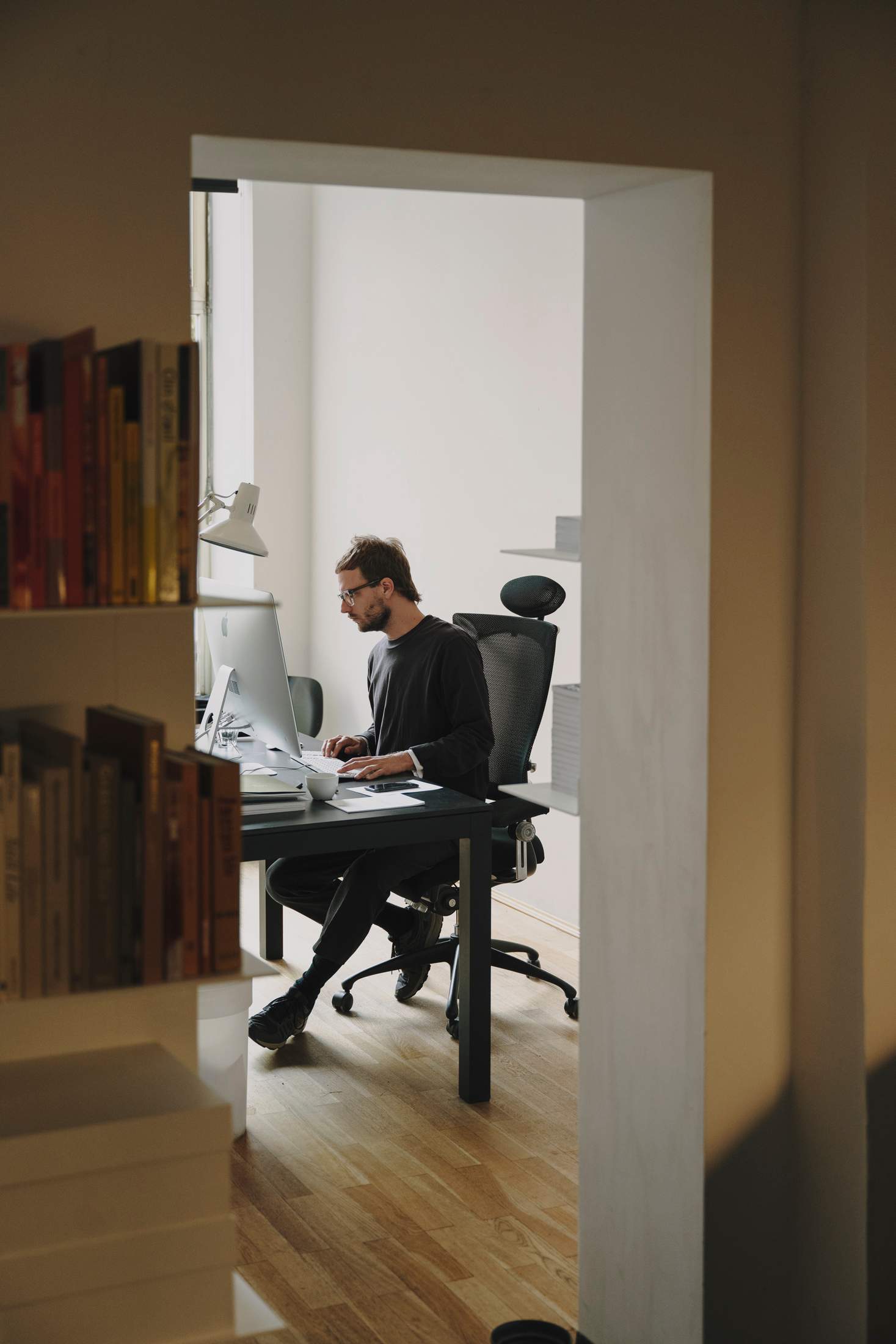
Designer Ingmar Spiller
There are many reasons for this, from an increase in freelance talent with whom small firms can collaborate to the appeal for a client of having a more personal relationship with those who they commission. We weigh up these factors and look at three small graphic-design and creative-direction agencies producing world-class work. They’re heralding a new, more collaborative and dynamic era for their industry.
Herburg Weiland
Munich
“I’m totally happy with our situation,” says Tom Ising, who co-founded Munich-based creative agency Herburg Weiland with two friends in 2001. “We’re a team of 10 staff and I would never trade this to run a studio of 200 people.” Surrounded by Herburg Weiland-designed architecture books with typographically bold covers, posters created for some of Germany’s top cultural institutions and a polite, all-black-clad team of junior creatives, Ising has laboured for 20 years to form his ideal set-up.
“The work we do tends to shift to match the skills of our people,” says Ising, who today heads up the studio with Yvonne Bauer and Stephanie Ising (also his wife). “For instance, if someone starts here who is good at 3D animation then we weave this into our process and come up with client solutions involving more of this. The skills of the people who join us transform the course of our agency. When you’re a team of just 10 people, the abilities of one person can really change things.”
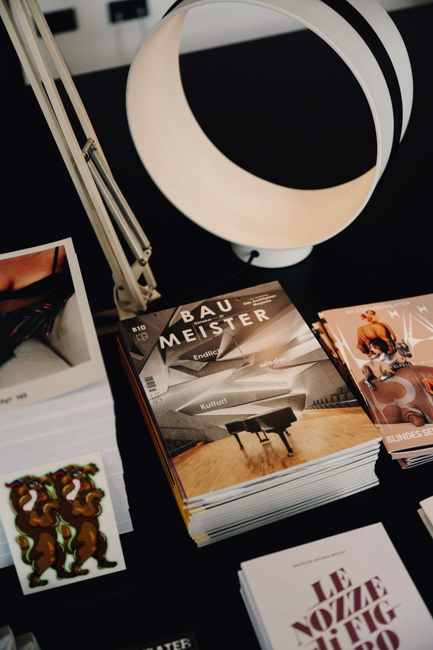
‘Baumeister’ magazine
Studio dog
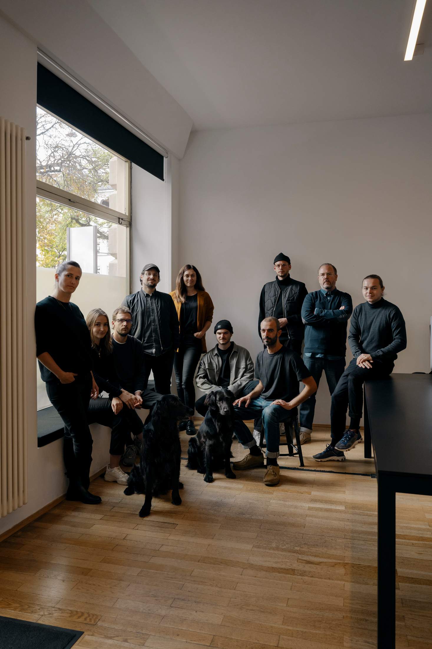
Herburg Weiland team
Right now the format of the firm’s work drifts from motion graphics to beautifully bound books. One recent highlight is a series of outdoor display videos featuring gigantic goldfish floating through a sea of trees to promote composer Peter Eötvös’s Sleepless at the Berlin State Opera. Another is an illustration-laden special edition of German architecture magazine Baumeister that was co-created with Norwegian architecture giant Snøhetta.
Unlike larger agencies, which often present multiple options or “routes” in their pitches to clients, Herburg Weiland likes to work hard on one great idea, which a potential client can take or leave. This singular approach often creates results that the team at Herburg Weiland are all keen to support and on which they want to work passionately and collaboratively. “It doesn’t matter if the client is the Bauhaus in Dessau or a Swiss dentist,” says Ising. “We treat every job the same way, trying to find a result that is perfect for both the moment in time when we deliver it and for the larger purpose of the institution.” He adds that his firm strives to avoid following trends or developing its own “signature” style.
This confident approach is mirrored in the firm’s output, with clever typographical treatments tending to win out over lush photography-aided works. As an example, billboards designed for Schauspiel Köln (and now frequently photographed by city residents) simply sport a text call-to-action, “Kiss Me! Touch Me! Feel Me! Now!”, executed with vibrancy.
For Ising, the firm’s best work delivers a big punch with a small footprint. “With the Bauhaus Dessau Foundation we made the whole design system using the Arial typeface, which in our industry should be a no-go,” he says. “But because it was Arial it became a totally universal piece of work. It seemed simple but it encapsulated the whole spirit of the Bauhaus: design that could be used and understood by everyone.”
herburg-weiland.de
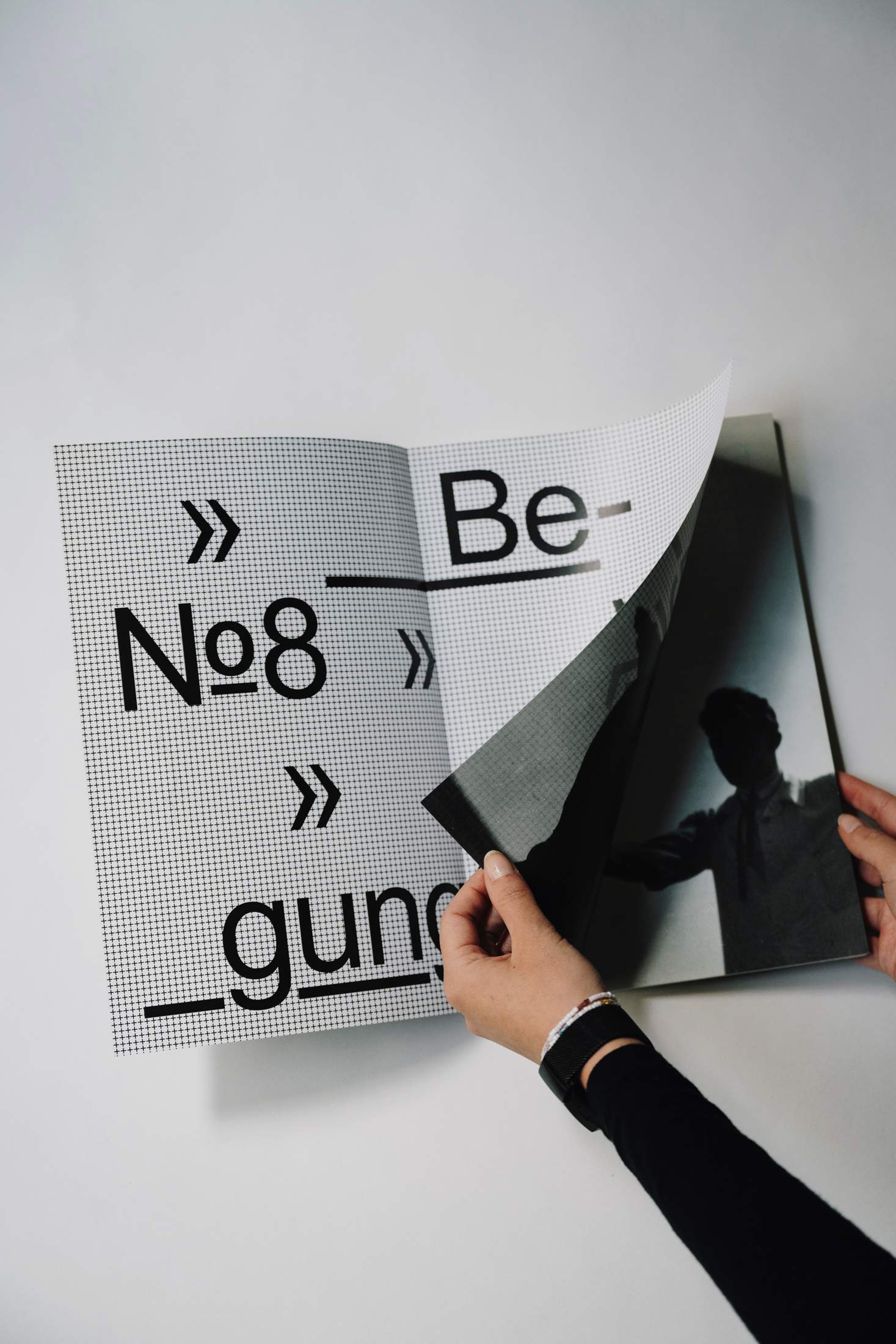
Bauhaus magazine
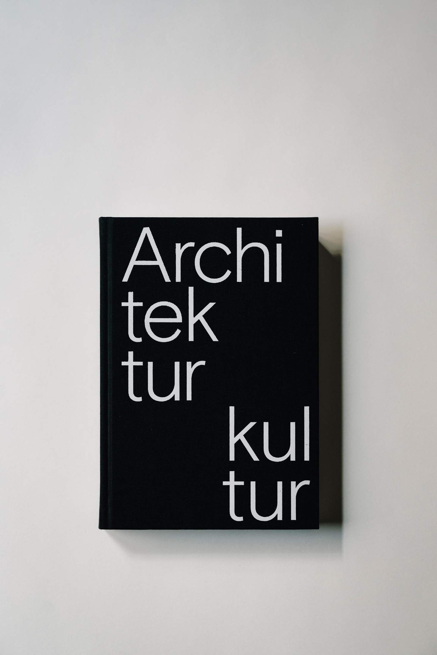
Book designed for architecture firm Euroboden
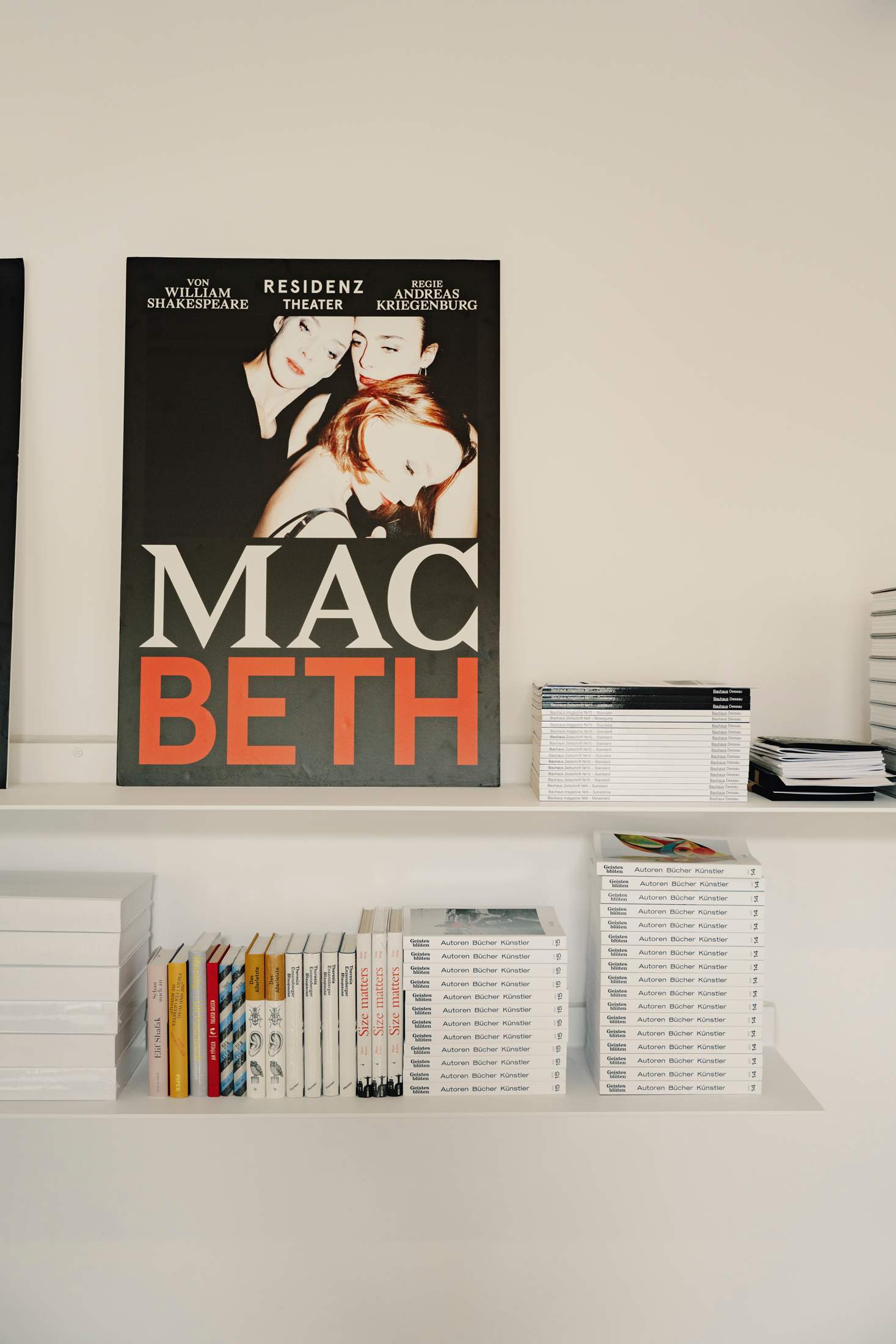
Poster for ‘Macbeth’ at Residenz Theatre, Munich
Studio FNT
Seoul
After establishing graphic design outfit Studio fnt as a sole practice in 2006, founder Jaemin Lee has taken to the task of scaling up at a deliberately slow pace. “We’ve maintained an attitude to keep it on a small scale,” says Lee, who brought in partner Heesun Kim a few years after launching the business and today runs an office of nine full-time staff. Both Lee and Kim have seen the pitfalls of moving too quickly; previously they were colleagues at a web agency during the dot-com boom (and its subsequent burst) at the end of the 20th century.
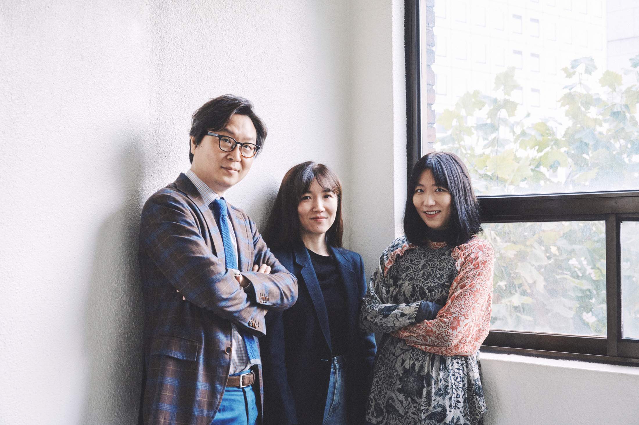
Studio FNT’s Jaemin Lee, Heesun Kim and Woogyung Geel in Seoul
The partners’ past career experiences also pushed them to work with traditional media. “We wanted to create something more relevant to our lives than an interface for electronic products,” says Lee. Over the years, Studio fnt has updated the brand identity of the Hyundai Department Store chain and designed colourful staccato-patterned packaging for Seoul-based Felt Coffee. The firm has revamped the logo of South Korea’s leading animal-rights group Kara in sharp, bold typography, and produced a series of hanji, traditional Korean handmade paper, for the Korea Craft & Design Foundation, a government-run organisation promoting cultural heritage.
The Korea Craft & Design Foundation project, Lee says, is the sort of work of which his studio strives to do more, with cultural projects becoming the firm’s calling card. Studio fnt has long designed the promotional campaign material for the Seoul Record Fair; in 2020, Lee and his team worked on an exhibition about the possibilities of vinyl records at the Culture Station Seoul 284, flexing their creative muscles by forming a beautiful hoarding that wrapped around the event’s main building. A huge representation of a vinyl record served as both the door and as a piece of advertising.
The firm has worked hard to enjoy the luxury of being selective with clients. The recipe to this success? One key ingredient seems to be a relaxed office culture, where everyone does a bit of everything. “It’s both challenging and enjoyable that we don’t have a fixed daily routine,” says Lee. He adds that, on any given day, one or more staff members might be holding meetings while others could be giving lectures at nearby schools or photographing completed projects at the in-house studio. “More than meeting more new clients, we value the experience of getting to know one client more deeply,” he says. “We work with customers whose purpose we can agree with.”
studiofnt.com
N-E
Madrid
Madrid is the ideal place to start a business that is built on communication. Madrileños love to talk. “Madrid is a city that welcomes all kinds of people and is always full of life,” says Anna Ponsa, studio manager and creative at n-e. “Opportunities are constantly popping up; it is the ideal setting to meet new people and generate new work.” Founded as a graphic design studio in 2014, n-e has since evolved into a creative agency that works on branding, editorial, art direction and experiences for clients primarily in fashion and culture.
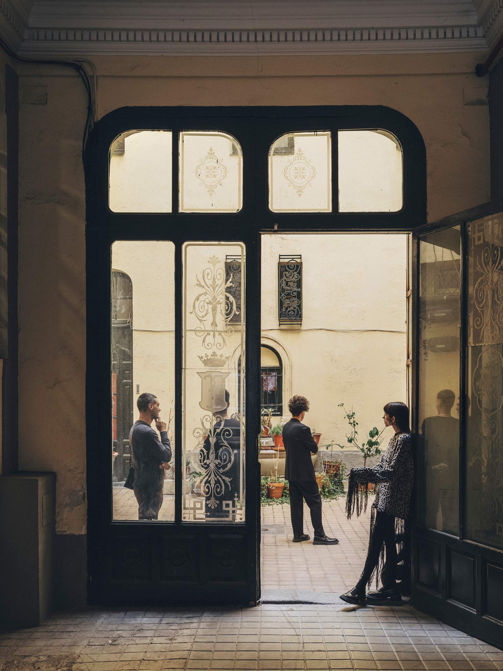
N-E studio
The firm’s office in a 19th-century palace at the heart of the Malasaña neighbourhood is bright with a high ceiling. Its original fixtures include double-height windows and a fireplace that add a sense of historical weight to the cutting-edge content that it produces. “Historically, Malasaña was the cradle of Madrid’s contemporary movements,” says Ponsa. “It’s where creativity emerged. Our space is a place where classic and modern coexist in harmony.”
And clients, such as Loewe, Hermès, the Madrid city council and various leading cultural entities, choose to work with n-e for its unique, intellectual approach and affinity with the local scene. “When we start a project, we try to understand the client’s needs as if they were our own,” says co-founder Miguel Naranjo. “We always undertake a written exercise that serves as a guide to identify those needs. We work with ideas, regardless of the medium.”
The studio’s methodology is based on collaboration. A small permanent team of creatives collaborates with multidisciplinary partners to come up with ideas for their clients. The result is considered design, including thought-provoking visuals that emerge from deep research and the intense focus of its team of graphic designers.
Recent work ranges from Odda, a sumptuous, chunky biannual fashion and art magazine edited in New York, to a complete identity for Mexican fashion brand Dancassab.
n-e’s agility, size – currently it has just five full-time team members – and ability to communicate well internally keeps its work dynamic. The agency is hesitant to grow. “We don’t set ourselves any limits,” says Naranjo. “But we never want to stop being n-e. It is important to us to find that balance where we can remain faithful to what defines us but also explore new horizons.”
naranjoetxeberria.com
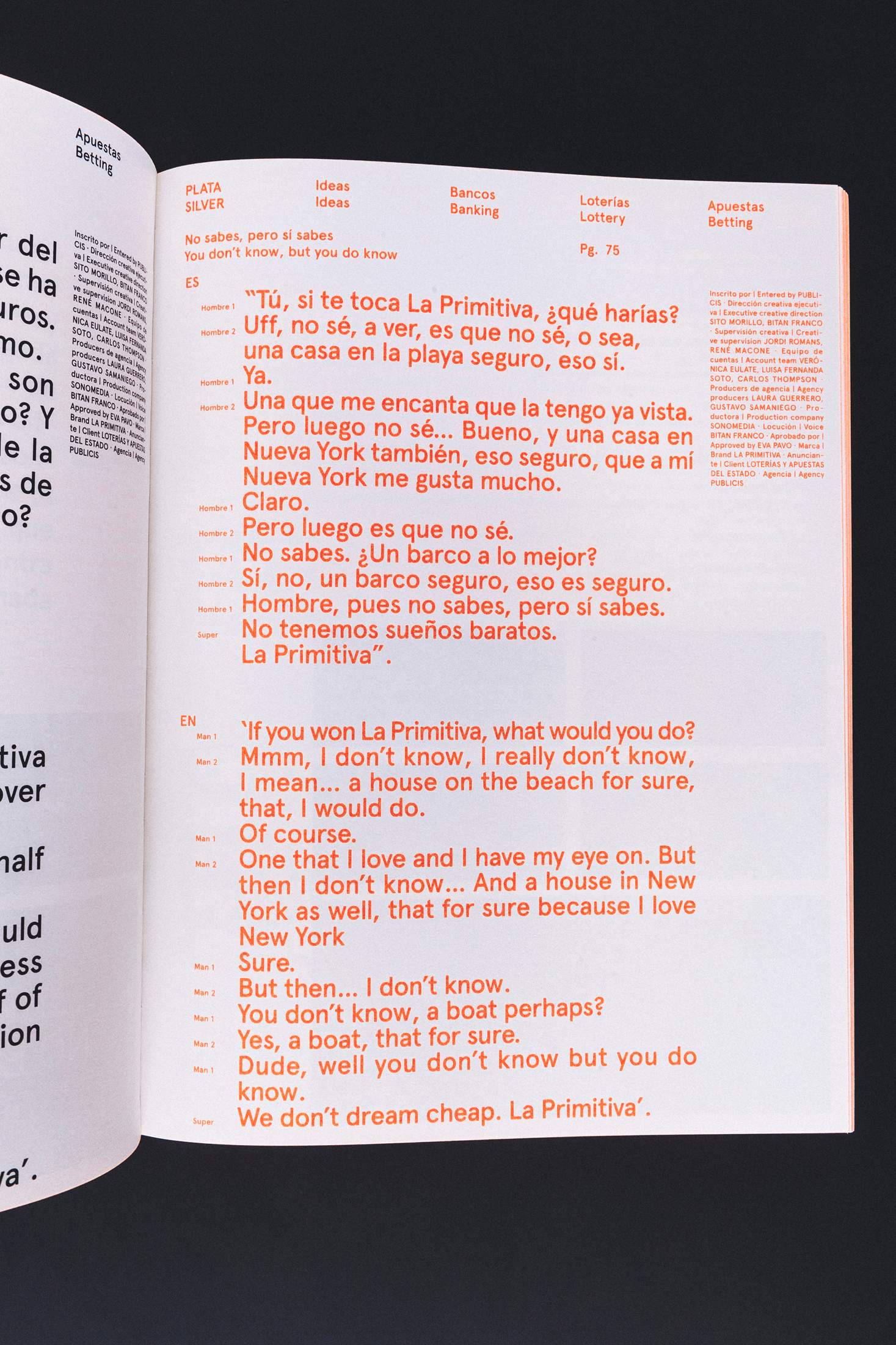
Work by N-E for the 2017 Spanish Advertising Annual
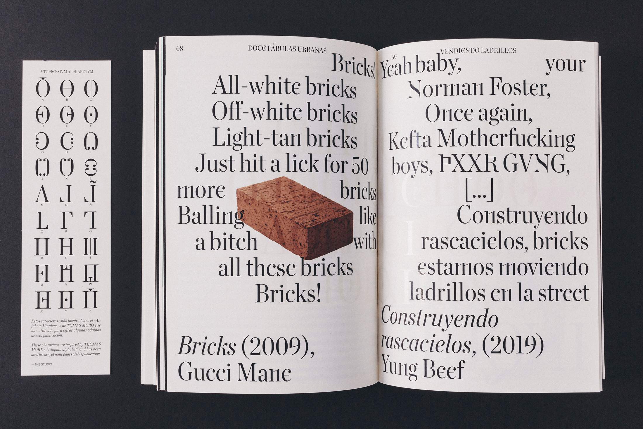
Catalogue by N-E for ‘Twelve Cautionary Urban Tales’
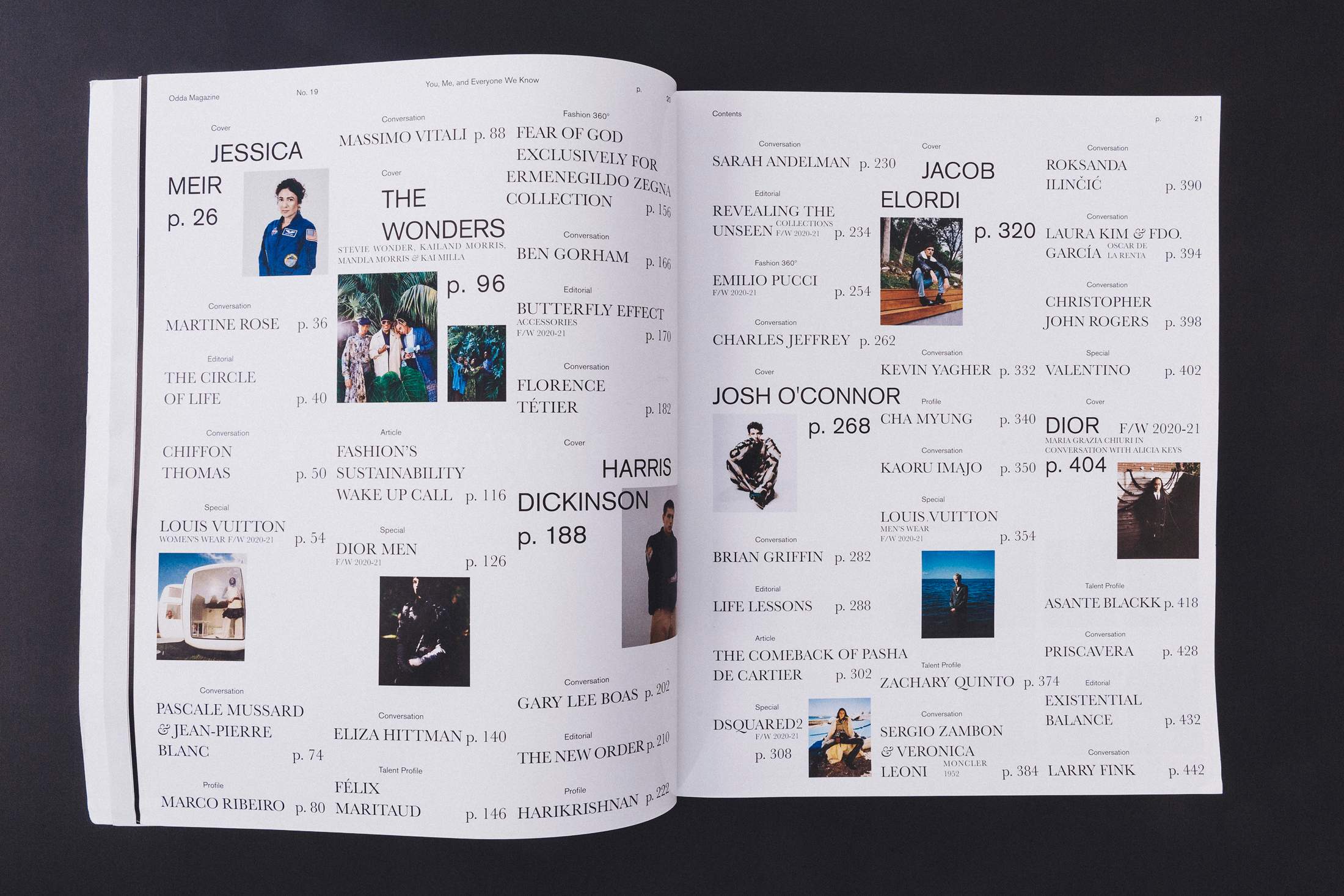
Spread from ‘Odda’
Photographers: Dirk Bruniecki, Pyo Kisik, Ben Roberts


