Making good / Global
Design awards 2021, part 1
Our first ever Design Awards are here, honouring the year’s 50 most thoughtfully made objects and buildings.
Weeks of conversations with our correspondents across the globe and hours of interviewing designers from Stockholm to Seoul have resulted in the inaugural Monocle Design Awards. We’ve enlisted our international photographers and journalists to tell these stories but it’s the world-class body of work that is the real hero. Having spent the past 14 years profiling the globe’s most interesting architects, urban planners, graphic designers, creative consultants and furniture-makers, we felt that it was time to recognise this talent more formally.
monocle’s focus has always been on telling stories about improving quality of life and creating more liveable cities. These awards pay tribute to this approach and highlight how enjoyable and useful good design is in enhancing our lives.
Now settle into your most beautifully crafted chair and prepare to learn about 50 designs that will make your life much better.
1.
best temporary architecture
The Braunstein Taphouse
Denmark
That temporary architecture tends to be tasteless makes sense: why put effort into a design that will be demolished in a few years? The answer lies in the Braunstein Taphouse on the harbour of the town of Koege, which is almost too good-looking to be taken apart.
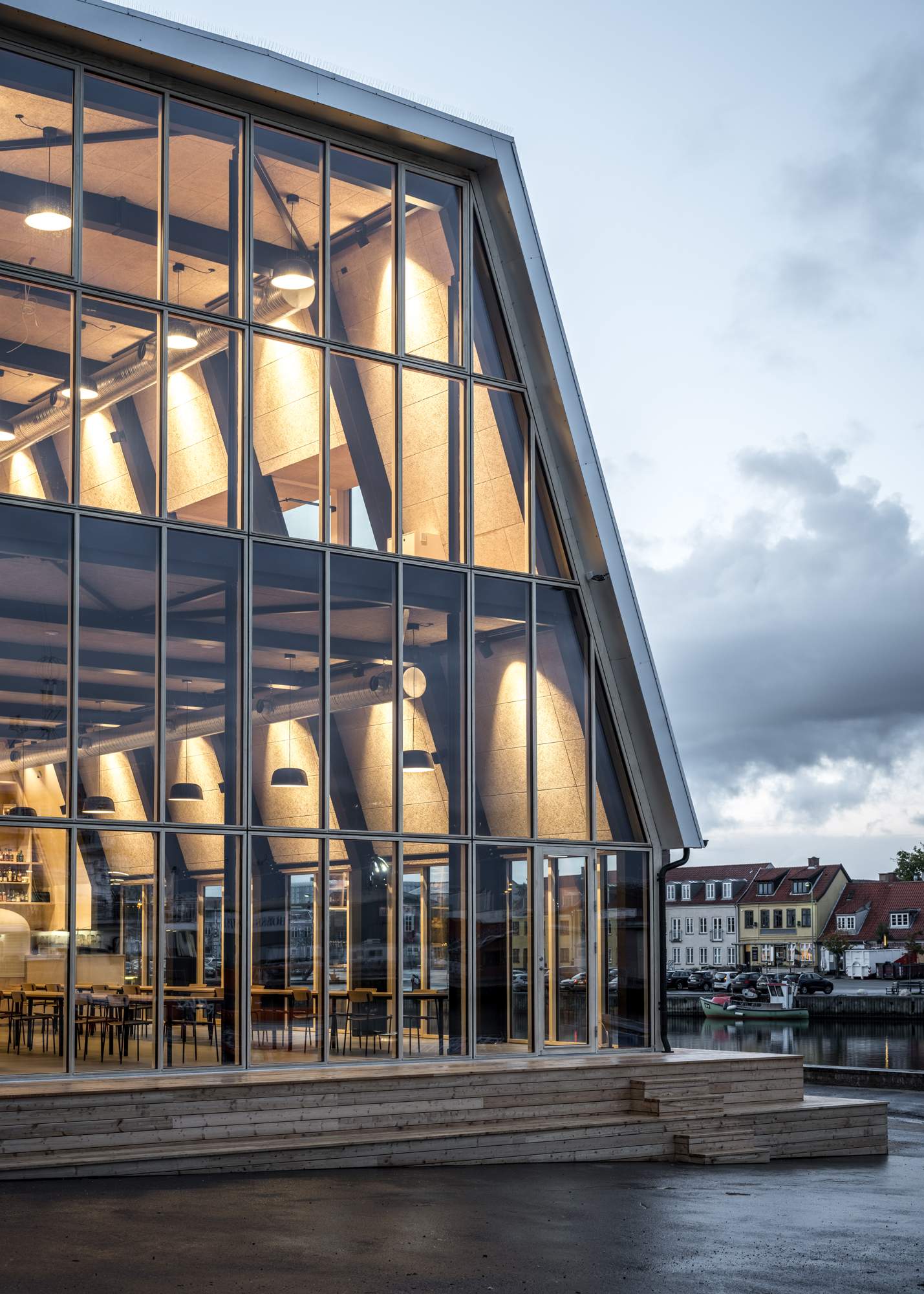
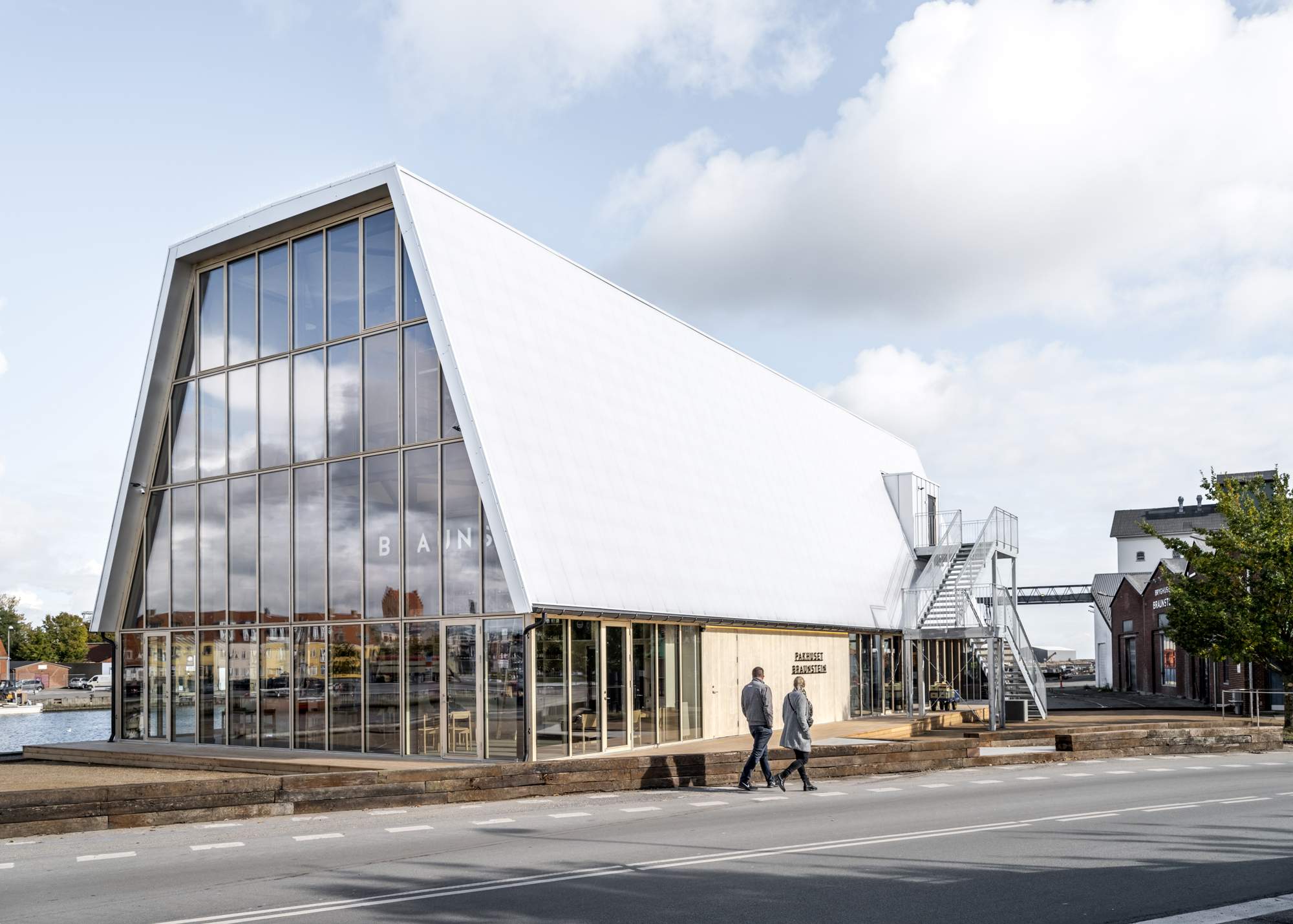

Composed largely of timber, the establishment contains a microbrewery, a café and event spaces, and is designed by Danish architecture firm Adept with a smart consideration of the building’s limited lifespan. “We have worked with the principle of ‘design for disassembly’,” says Anders Lonka, founding partner at Adept. “It is constructed with only mechanical joints and no paintwork.” It has already become important to the community, while familiarising people with an area that soon will be developed into a new destination for the town.
adept.dk
2.
best compact camera kit
D-Lux 7 Street Kit
Germany
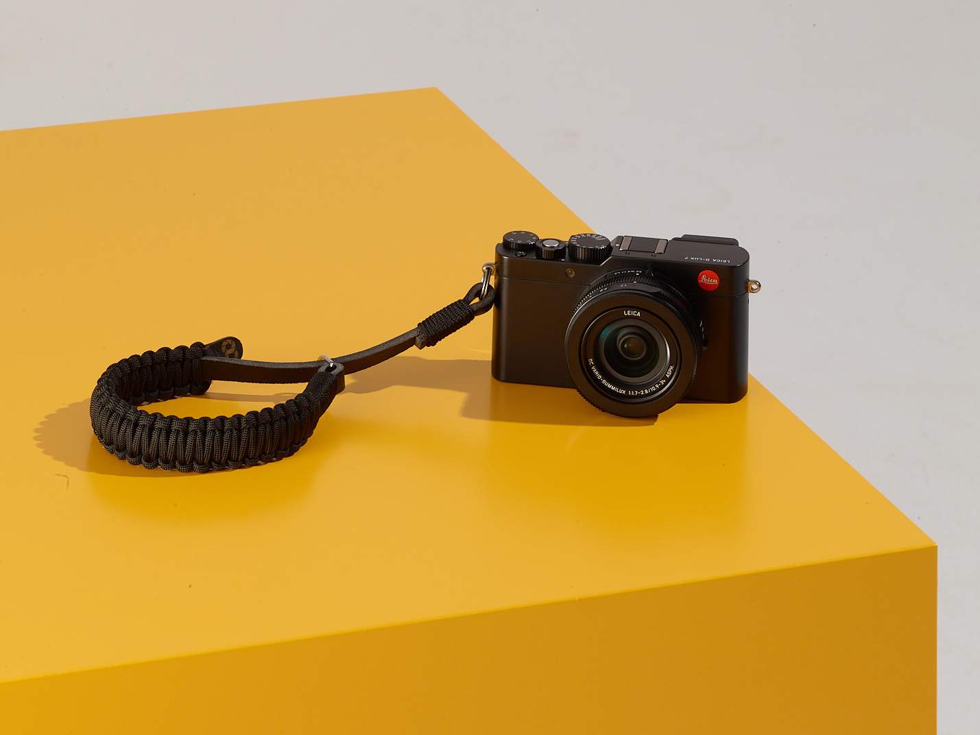
Pros might chastise us for saying this but when it comes to taking photographs – for many of us – looking good in the process is all part of the art.
This is one of multiple reasons why squinting from the sun into our smartphones as we try to capture the architectural wonders of our cities is not monocle’s preferred method of taking good photos. Thankfully, German camera giant Leica has just released an appropriate solution. To match its sleek and top-performing D-Lux 7 camera (which comes in this bundle), Leica’s D-Lux 7 Street Kit offers a stylish handgrip, an auto lens cap, a black paracord wrist strap and an extra battery. Sure, it all performs beautifully but damn if it doesn’t look good too.
leica-camera.com
3.
best brand refresh
Yamato Holdings
Japan
For Japanese people, the mere glimpse of the kuro neko (“black cat”) logo unfailingly translates into images of Yamato Transport trucks and its army of delivery staff. After all, the logo has been seen across the country on uniforms and vehicles since it was designed in 1957. Updating one of the nation’s most iconic brands, therefore, is no small task. But this 2021 renewal courtesy of master graphic designer Kenya Hara is smart and subtle – a testament to our feeling that strong branding doesn’t necessarily have to be loud.

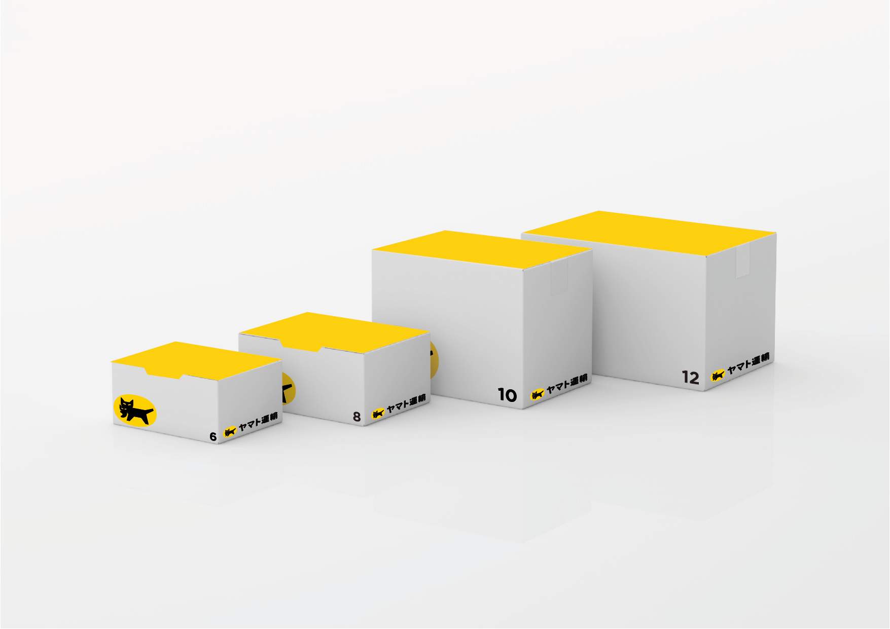
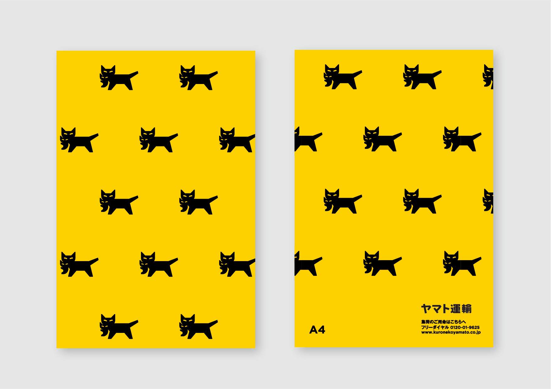
Following the makeover of staff uniforms last autumn, this spring the Japanese logistics giant updated its corporate logo. “I made sure that the scene of a cat carrying a kitten is still instantly recognisable,” says Hara, who refined the details of the form without breaking the meaning of the symbol. “It’s an environmental design too, so I chose a harmonious colour scheme,” he adds. Indeed, Yamato’s fleet of nearly 57,000 trucks has to zip across the length of the country sporting this new identity without disturbing the landscape – whether it be in the city or the countryside. So a subtle shade of grey was deployed as a backdrop for Hara’s punchy yellow-and-black logo on vehicles with yellow and white used elsewhere.
yamato-hd.co.jp

4.
most fun design
Beams x Ziploc Umbrella
Japan
Rainy days, like most things, can be remedied with good design. Japanese retailer Beams and US household brand Ziploc have collaborated on an umbrella made from recycled Ziploc products, including its resealable lunch bags. It’s nice to know that one material can keep both you and your sandwich dry.
beams.co.jp
5.
design CEO of the year
Knud Erik Hansen
Denmark
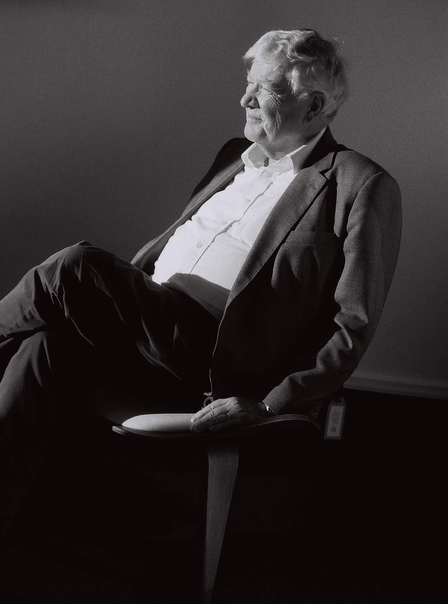
At the age of 70, Knud Erik Hansen is setting the standard for running a successful design business and his slew of recent industry wins made him a clear favourite for our ceo of the year award. At the helm of Danish furniture firm Carl Hansen & Søn, he’s spearheaded the company’s rocketing growth for the better part of 20 years. And, among other things, he’s done it thanks to the championing of his nation’s age-old carpentry tradition: keeping production a stone’s throw from where his grandfather started the company more than a century ago and relying on wood sourced from nearby forests. Through sustainable manufacturing and sourcing materials of the highest quality available, Hansen is demonstrating to furniture brands that it’s possible to make a mark and become successful, while staying true to the things you care about, as he tells monocle.
Your company has been growing consistently. What do you attribute your success to?
In 2020 we experienced the kind of growth we’d usually see spread over seven years. It was unbelievable. In 2002, when I took over, we employed 20 people and we are now more than 400. It has to do with consistency: we don’t compromise, we don’t move production out of the country and we only use nature’s products – well-treated and sustainable wood.
Your grandfather started the company to produce furniture of great quality. What does that entail a century later?
Things haven’t changed much. Maybe we added a few machines here and there. But the idea of good carpentry remains the same. Furniture should be produced the way it was designed – using the best wood and putting pieces together in the right way – by people who have deep knowledge of how to work with the material.
You are still crafting furniture in Denmark. Any plans to move production abroad?
No. The carpentry skills in Denmark that go back centuries have made people enjoy design and craftsmanship, and they feel honoured in extending the legacy. Most of our carpenters come from within Denmark and we don’t want to change that.
Any exciting new releases in the pipeline?
Yes. We’re collaborating with designers in Denmark and abroad. And we’re doubling the number of releases that we produce compared to a few years ago, which is almost overwhelming.
What do you see happening within the company in the next three years?
If there is one thing I am sure of, it is that we will have to expand our production facility – even though we just did. I’m afraid that we are running out of space again. And we are expanding right here, in Denmark. We are not moving anywhere.
carlhansen.com
6.
best proposed design
‘Rational Simplicity’
USA

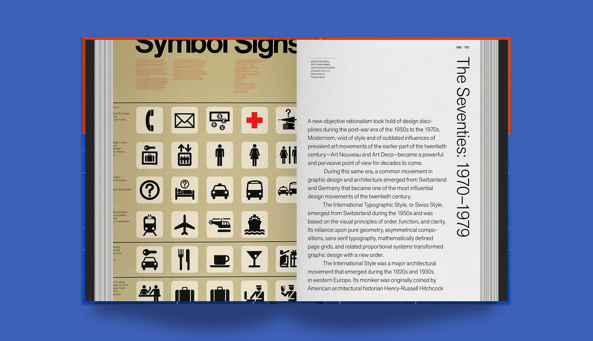

A gem of modernist design has found a new audience with the help of a crowdfunding effort to publish this handsome Rudolph de Harak monograph, Rational Simplicity. The project, written and designed by former De Harak studio partner Richard Poulin, analyses the work of De Harak, whose 1950s album art and paperback covers combined modernist ideas about simplicity with more abstract geometric designs. The coffee-table book, now published by Thames & Hudson, is likely to be released early next year after a successful awareness campaign.
vol.co
7.
best mascot revival
Oriental Brewery
South Korea
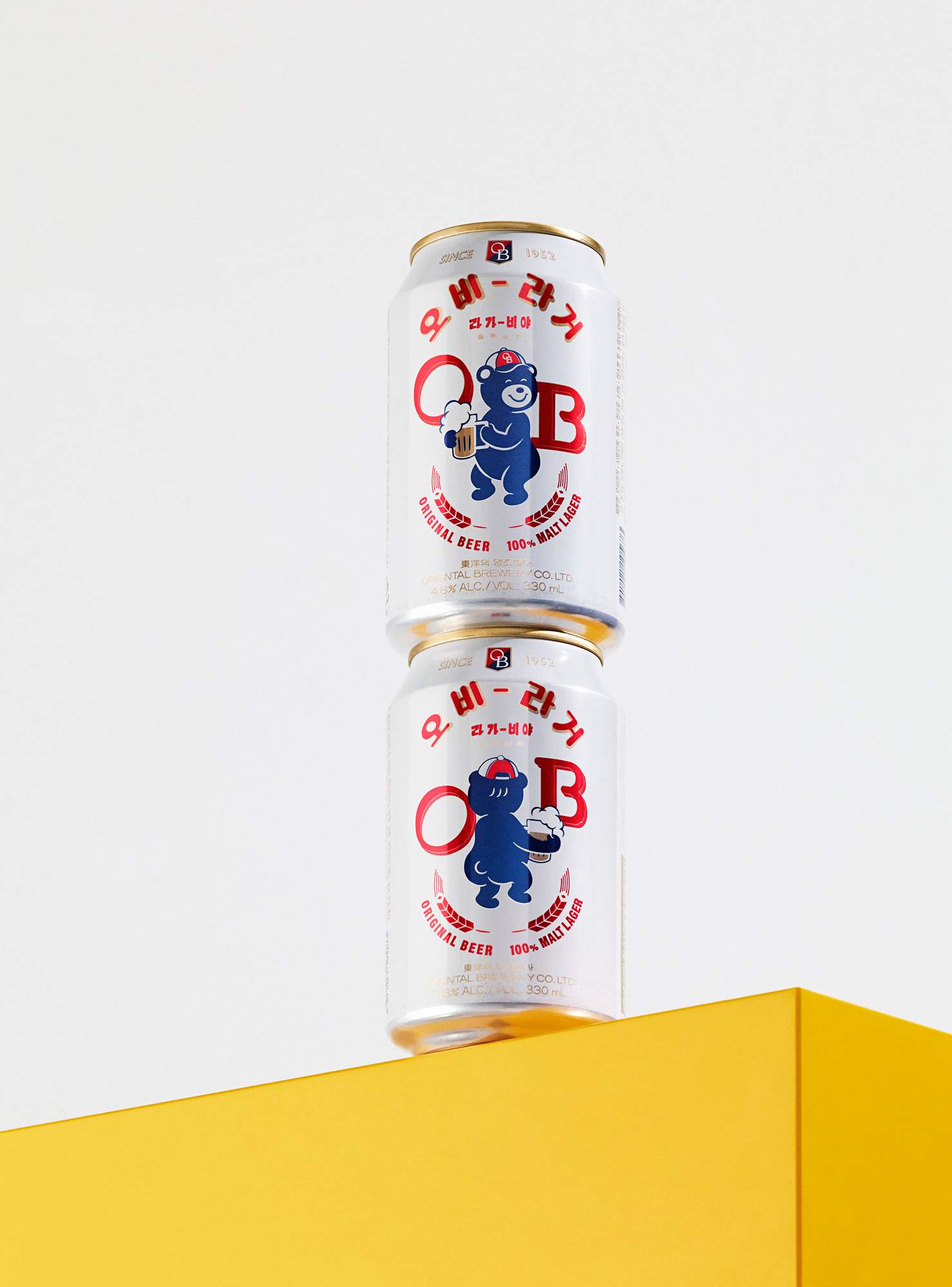
The reinvention of this 69-year-old South Korean brand riffs on Seoul’s “newtro” (new retro) trend. OB asked Sunny Studio to revive a mascot of the company’s now-defunct baseball team, Lala Bear. Lala proved so popular that a fashion collaboration with Guess and a set of emojis followed. A familiar face to goad us toward another drink? Genius.
sunnystudio.kr
8.
smartest residential building
14 Accommodations
France
Tucked in the courtyard of a 1970s apartment block, the breathtaking design for this residential building in the 12th arrondissement of Paris evolved from pure necessity. “We needed to fit all construction elements through an opening only 2.3 metres wide,” says Raphaël Renard of French firm Mars Architectes. “Working with timber was simply the logical solution.” Fortunately so, as its masterful employment elevates this project into a class of its own. Imbued with the natural warmth of the European Douglas fir, the apartments boast a balcony, ceiling-height windows and fine wooden flooring. Each apartment has access to an inner courtyard that helps to provide a sense of community. Laudably, the architects devoted just as much care to the surroundings, creating a haven of more than 30 regional plant species in what had previously been a barren concrete enclosure.
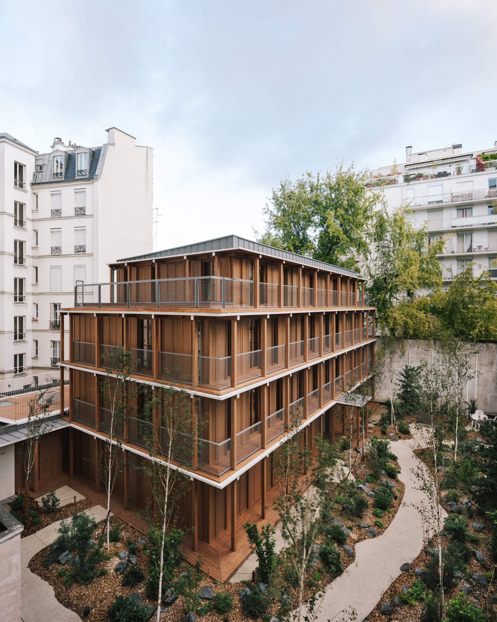
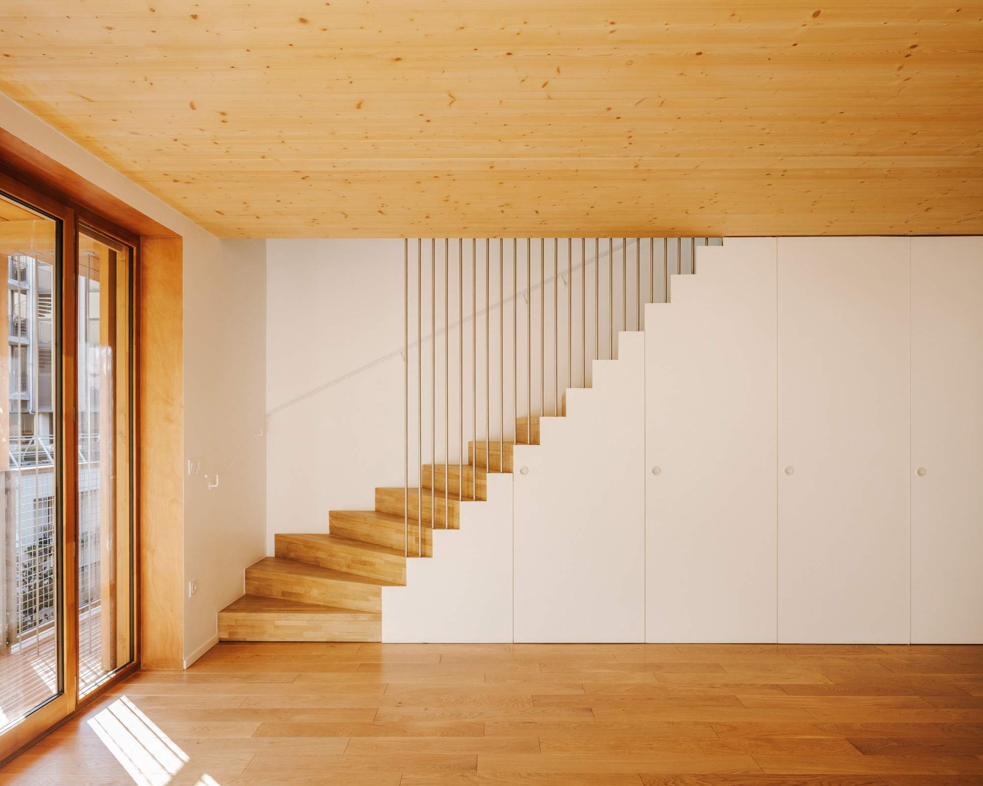
This regard for detail and wellbeing, frequently lacking in new builds, sent Parisians clamouring. On completion last October, rental contracts were snapped up from developer Gecina within a few days. “The feedback from the residents has been that they are delighted, so we are happy too,” says Renard. Indeed, 14 Accommodations shows that, in expert hands, architecture is only enhanced by being in a tight spot.
mars-architectes.com
9.
best use of materials
Hildebrand
Switzerland
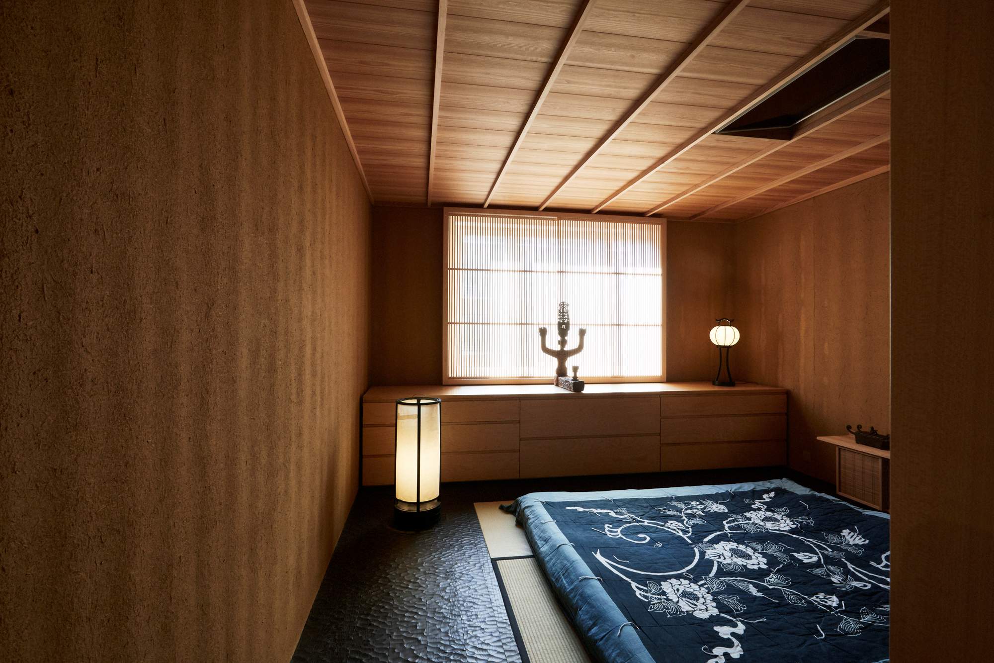
The natural properties of wood have always made homes more idyllic places to live in. Spend a few nights enjoying Alpine hues in a Swiss timber chalet or dipping into a hinoki tub and enjoying the aroma that’s generated, and you’ll catch our drift. It is for this reason that we’re rewarding the work of Swiss architecture firm Hildebrand, led by architect Yuichi Kodai, in this remarkable renovation of a Zürich apartment. He has carefully combined Japanese design smarts with high-end Swiss carpentry to transform an old flat into a handsome new home. Contrasted with framed koshi windows and hand-formed earthen walls, the effect is truly luxurious despite the humble materials.
hildebrand.ch
10.
best rural architecture
The Wachthuus
Switzerland
Rural architecture should celebrate its landscape. Jonathan Tuckey Design has done just that with a new restaurant and bar in the Swiss Alps reimagined from an decommissioned military outpost.
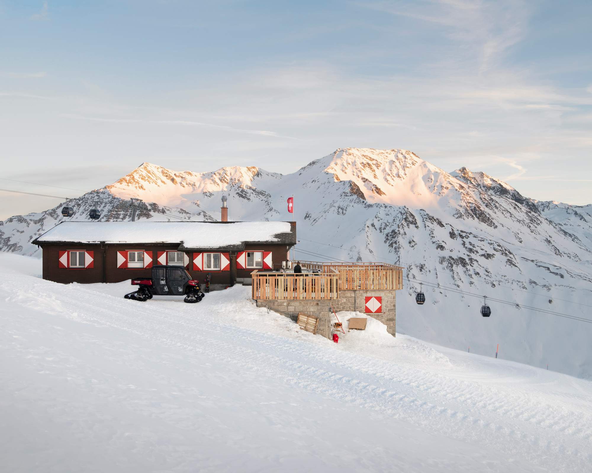
To ground it in its location, new walls were made from reclaimed timber boards and the red-and-white designs on its external shutters are a welcoming nod to the region’s wayfinding signage and traditionally painted louvres too.
The result is a cosy space in which to stop for a glass of wine (when your friends think you’re on a black-diamond run), or to stay overnight and enjoy your breakfast with views over Andermatt.
jonathantuckey.com
11.
best public furniture
Hamntorget
Sweden
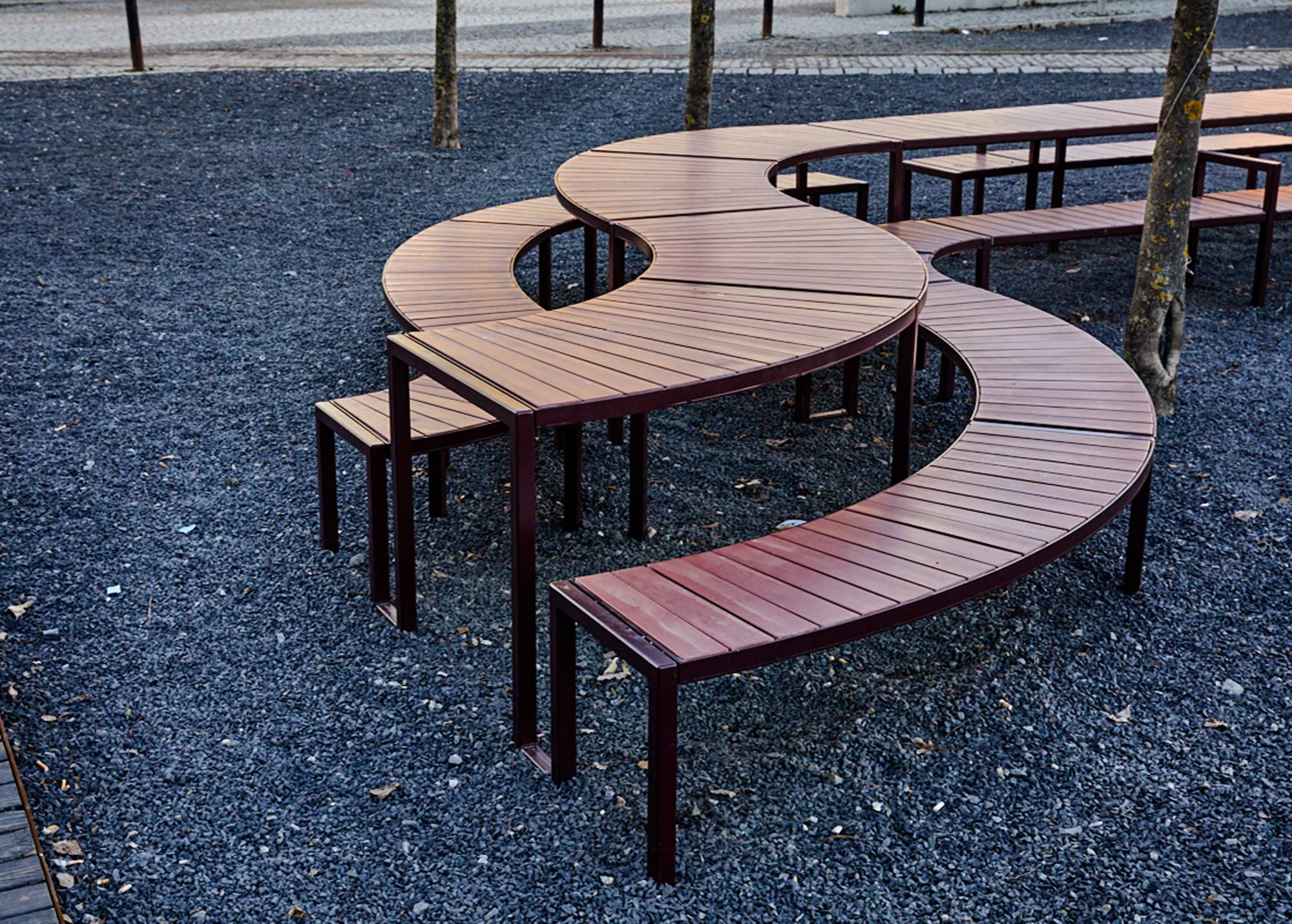
Good public furniture should entice people to linger – something that White Arkitekter has nailed with its communal table at Hamntorget. At 20 metres long, it has transformed a forgotten spot on Stockholm’s Hammarby canal into a destination. monocle particularly likes that the timber is finished using shou sugi ban, a Japanese technique in which wood is charred to waterproof it.
whitearkitekter.com

12.
best new talent
Nkuli Mlangeni-Berg
Sweden
To succeed in design, it’s important to be locally minded and globally reaching. Young designers working out how best to do this would do well to turn to our best new talent winner, Nkuli Mlangeni-Berg. Her textile brand, The Ninevites, celebrates the power of craftsmanship to create objects of real beauty that empower corners of the world we rarely see represented in international design.
Mlangeni-Berg might be based in Stockholm but her mission is to widen the horizons of a highly Eurocentric market; something that monocle believes is long overdue. The brand was born during her time at Kaospilot, Denmark’s alternative business school. A research project took her to Peru to discover the nation’s indigenous textile industry. In Lima she met master weaver Mario Quispe, who helped her to produce prototype designs which he wove by hand from wool sourced nearby.
Mlangeni-Berg has expanded production to her native South Africa, where she has enlisted female artisans in remote areas who weave her made-to-order rugs using lush, local mohair; the results are then shipped to customers around the world. “In South Africa a lot of indigenous craft is dying out because people are so obsessed with everything being produced at a fast pace,” says Mlangeni-Berg. “I’m trying to bring awareness to it and make more people excited about passing these skills on to the next generation.”
theninevites.com
13.
best reissue
Round D.154.5 chair
Italy
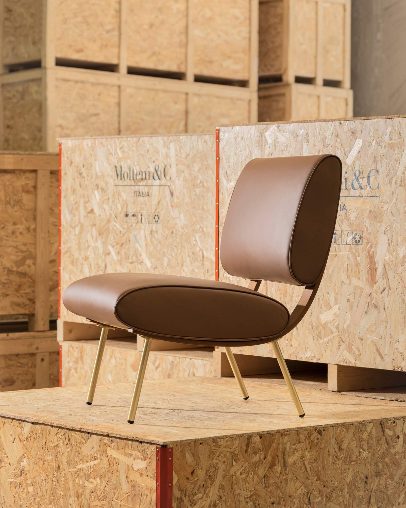
Gio Ponti is one of few to deserve the title of “visionary”. Years before we all became hooked on ready-to-assemble furniture, the Italian architect conceived the Round d.154.5 chair. It catches the eye with its aerofoil shapes and featured in many of Ponti’s interior design projects. We pay tribute to Molteni&C for bringing this gem out of the archive and reissuing it for a new generation.
molteni.it
14.
best packaging
Convenience Wear
Japan
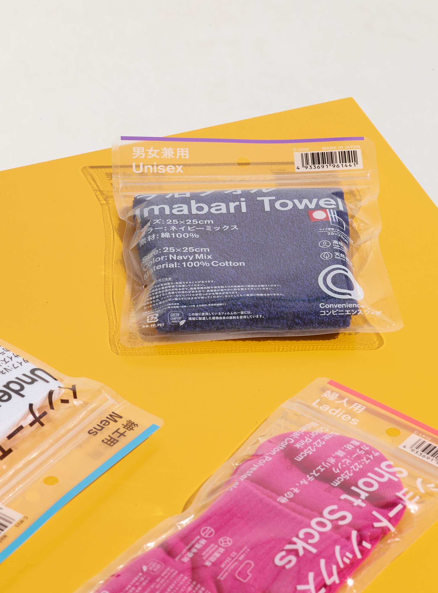
Launched by Japanese shop chain Familymart, Convenience Wear is a line of daily essentials including underwear and handkerchiefs. “Our design direction was clear communication because the line is sold to people of all ages, nationalities and professions,” says creative director Hiromichi Ochiai, who also heads fashion label Facetasm. “We kept the graphics and text to an absolute minimum,” says art director Takahiro Yasuda. Enticing and practical (particularly for those who’ve woken up somewhere unexpected) this shows that even basics can be enhanced through clean, cool design.
family.co.jp
15.
most innovative building company
Timbeco
Estonia
The Design Award for the most innovative building company goes to Estonia’s Timbeco. The firm’s new prefabrication technology has made it a world leader in constructing prefabricated wooden houses, which help to speed up construction times and are better for the environment. Timbeco’s buildings – such as the terraced houses in Kabelvåg, Norway and apartment buildings in Norrköpping, Sweden (pictured) – feature stylish exteriors that help them to blend seamlessly into their natural surroundings, while the company’s innovative use of wood pushes the building industry towards a more sustainable future. “Wood is the perfect building material as it ties up co2 from the atmosphere,” says Timbeco’s sales director Tõnis Vaiksaar.
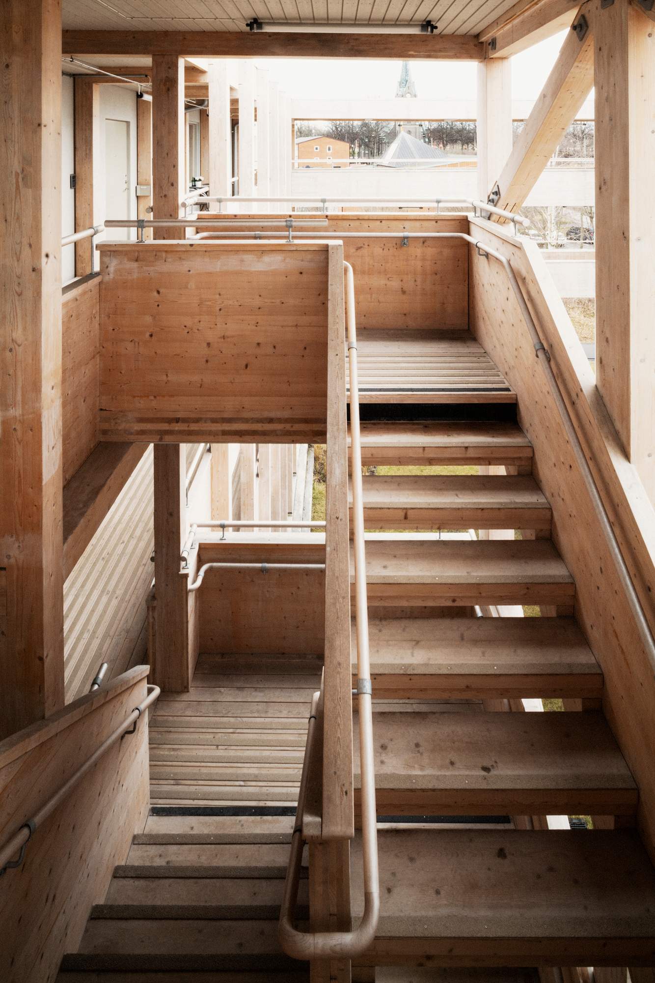

Let’s face it, nobody wants to live next to a construction site. Timbeco is transforming the industry by shortening construction times down to just one week, compared with more traditional methods of on-site construction that often take up to a year. “This means that we disturb the neighbours less and that the building quality is higher too, given that the elements have been built in a dry and heated environment,” says Vaiksaar.
timbeco.ee
16.
best urban revitalisation
Chaarani Stairs
Lebanon
Residents of Tripoli will tell you of design’s power to heal and reconnect communities as a result of the outstanding and moving work of Eva Studio. By using traditional, locally manufactured encaustic cement tiles, the firm brought life back to a tired set of stairs where tensions and clashes between the Lebanese community and Syrian refugees were routinely taking place.
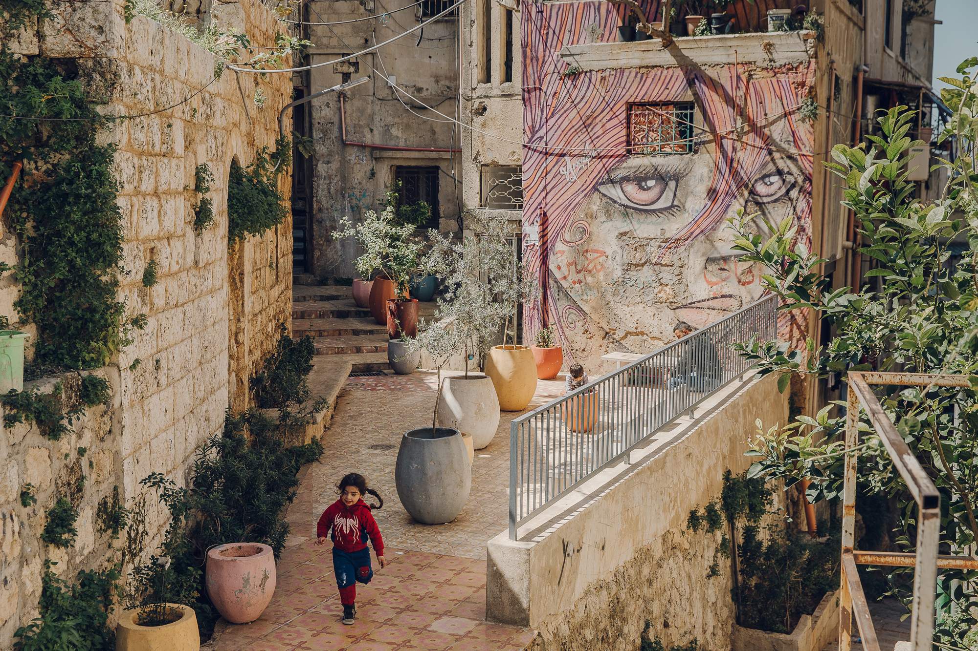
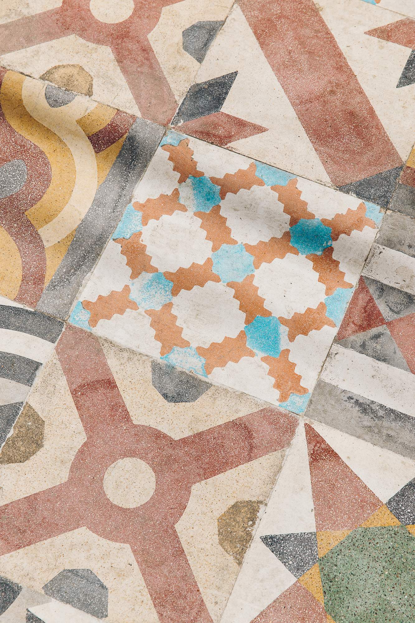
Thanks to new public furniture, a mural and the shade of lemon trees that line the stairs, people from all walks of life now spend time here. If the Lebanese and Syrian children playing on the stairs are anything to go by, there can be no doubt that this is a world-beating revitalised space.
evastudio.co.uk
17.
best material
Spinnova
Finland
Finnish textile company Spinnova’s wood-based fibre is on course to transform the way that the fashion and design industries use materials. Compared with the likes of cotton or polyester, Spinnova’s fibres use far less water and are much more frugal with environmental resources. monocle firmly believes that sustainability should not come at the cost of a high-quality look and feel, which is why we’re awarding Spinnova our inaugural award for best material.
“We work with some of the biggest brands in the fashion industry, who all say that our fibre feels similar to cotton or linen – even wool,” says Spinnova’s founder and ceo, Janne Poranen.
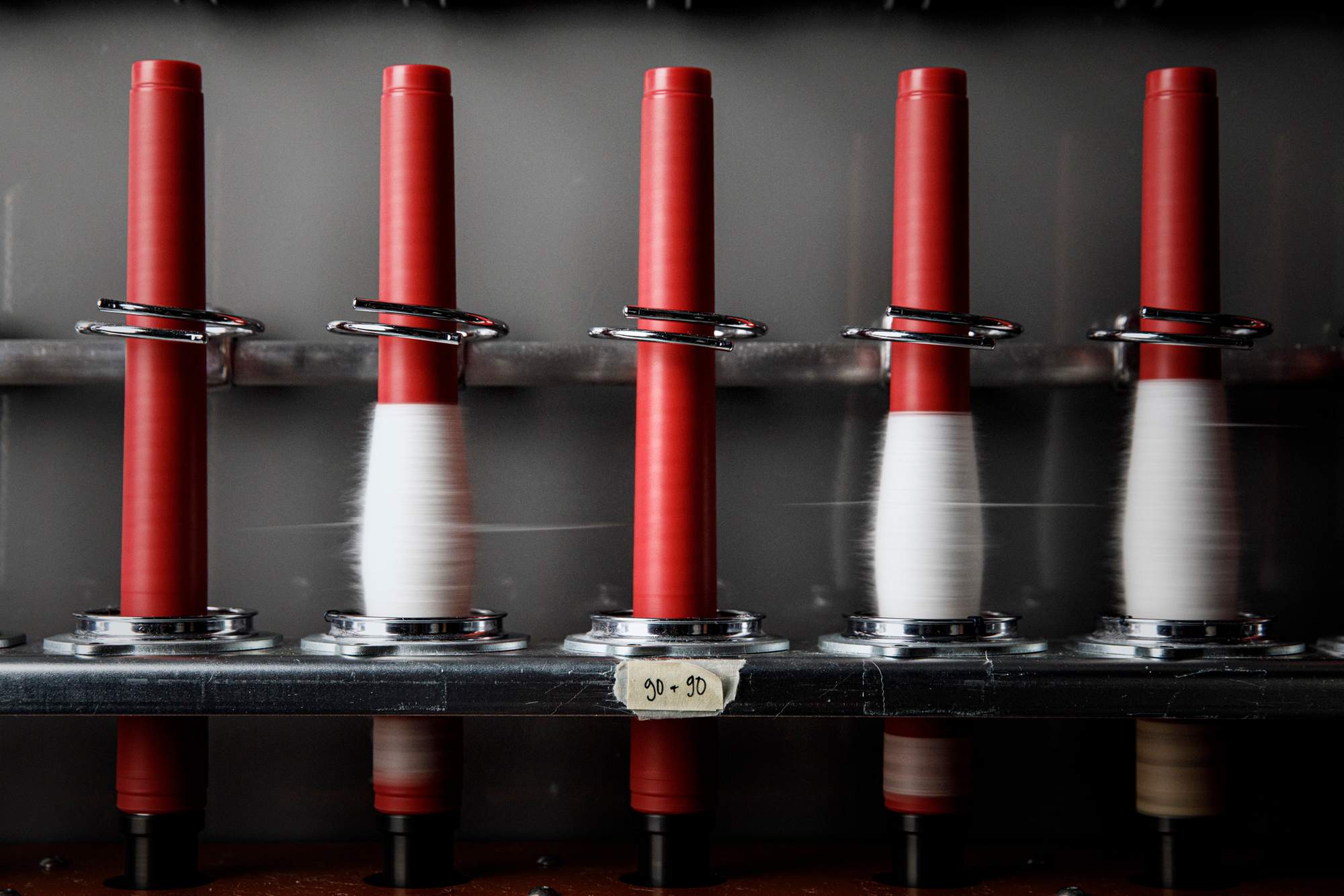
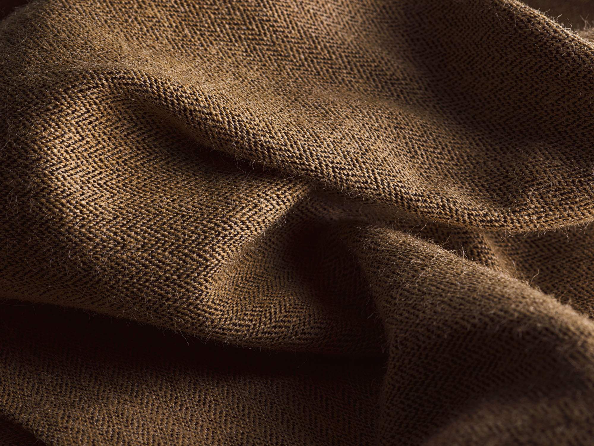
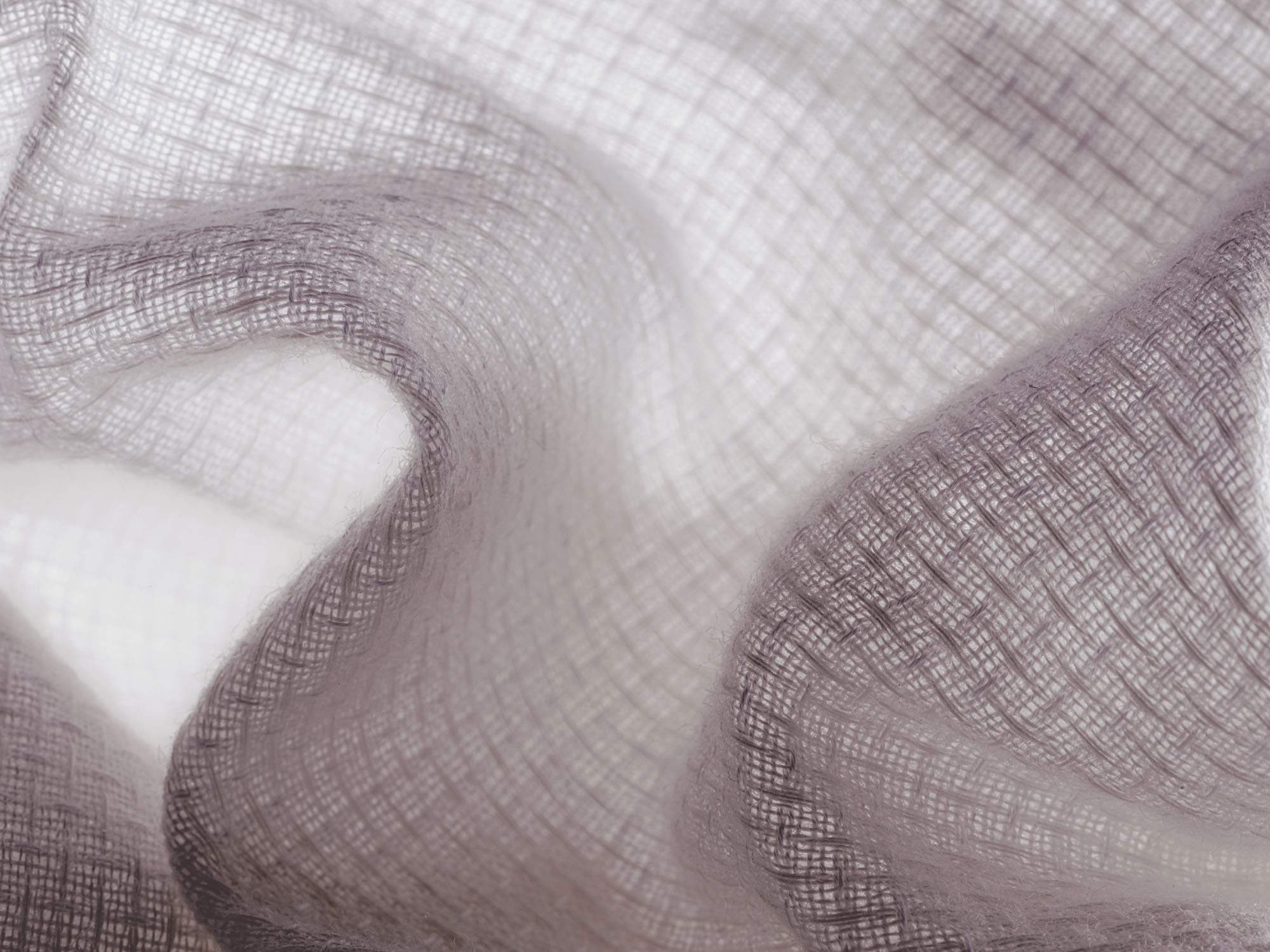
Its product is already used by the likes of Marimekko, h&m and Bergans, and Spinnova has recently anounced a €50m production scale-up near its pilot factory in the Finnish town of Jyväskylä. With all this in mind, Poranen promises that the company is set to reveal a swathe of new big-name clients later this year.
spinnova.com
18.
best urban intervention
The Underline
Miami
Using lessons learned when pioneering New York’s famous High Line, landscape-architecture studio James Corner Field Operations has taken things to a new level on The Underline in Miami. It does a lot with a little, taking under-utilised land beneath the city’s elevated railway and improving quality of life in a sunny city where most residents use cars to get around.
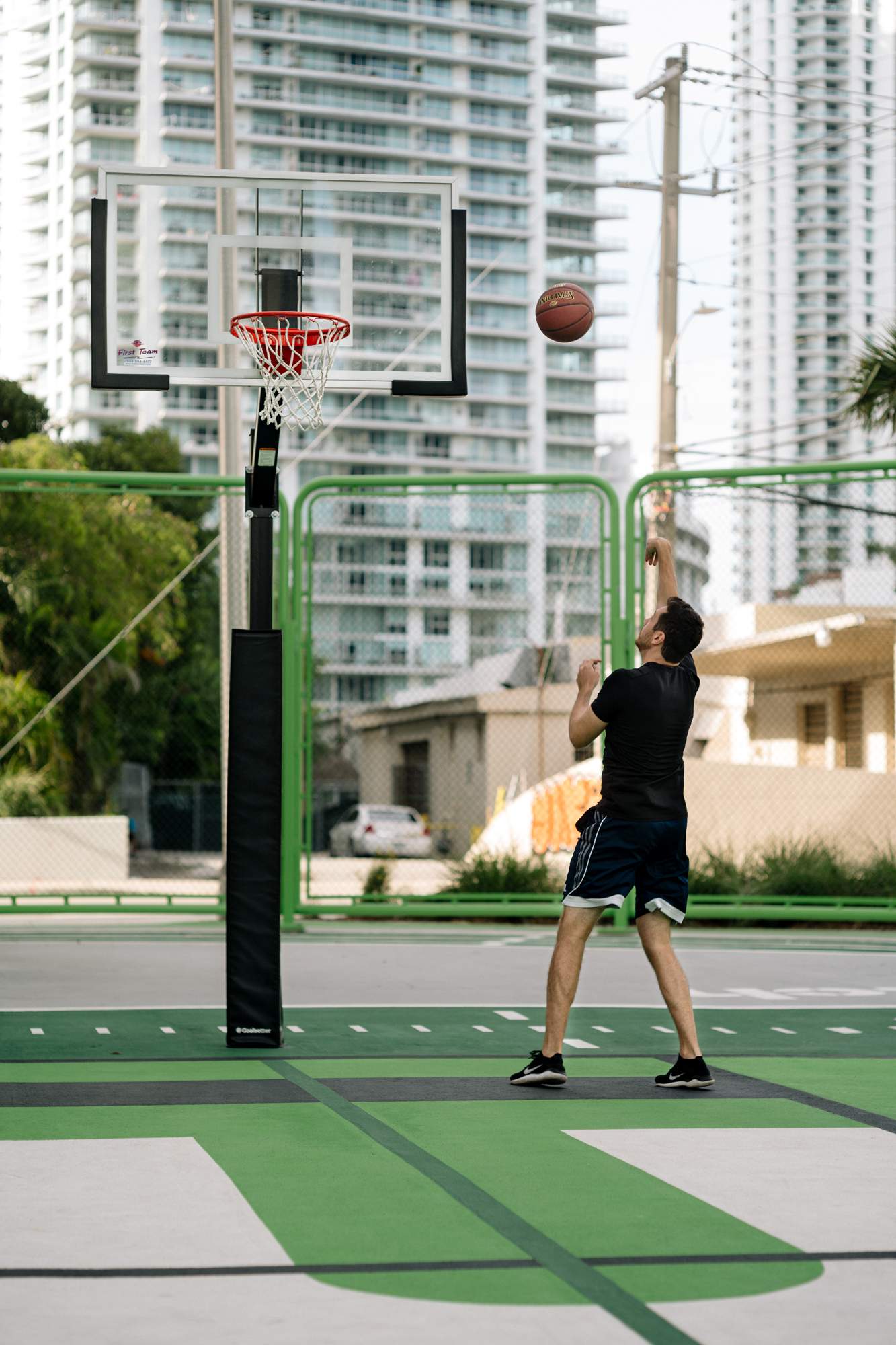
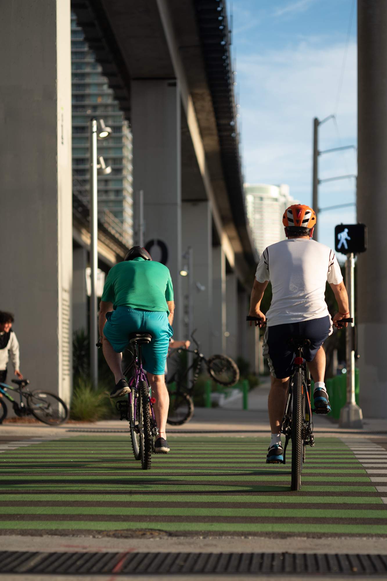
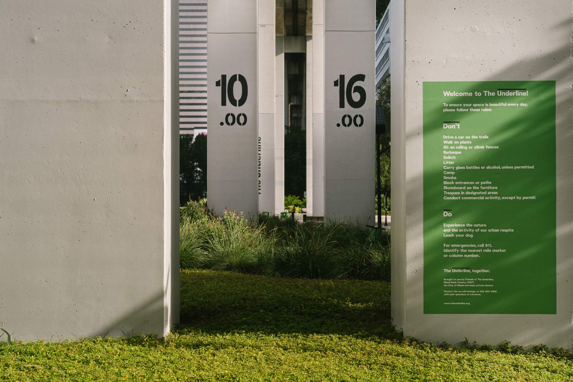
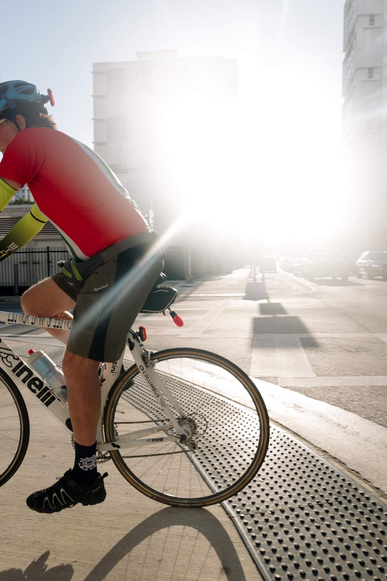
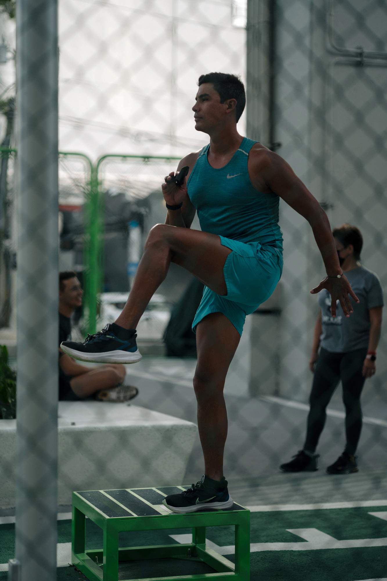
Its outdoor gym, basketball courts and running track, as well as new bicycle and pedestrian paths, allow citizens to be more active. Whether they’re limbering up for a yoga class or taking up new cycling commutes, residents of Miami will surely agree with monocle that this verdant space is a top example of an urban intervention for 2021.
fieldoperations.net
19.
best social effort
Lafarge Holcim
France & Switzerland
French-Swiss conglomerate Lafarge Holcim is one of the world’s biggest manufacturers of building materials but for the past 20 years, through an independent foundation, it has walked the walk when it comes to helping the world to build better. For managing this balancing act – adding architectural value to cities in the developing world while fighting to clean up concrete’s reputation – we’d like to recognise it with our award for best social effort.
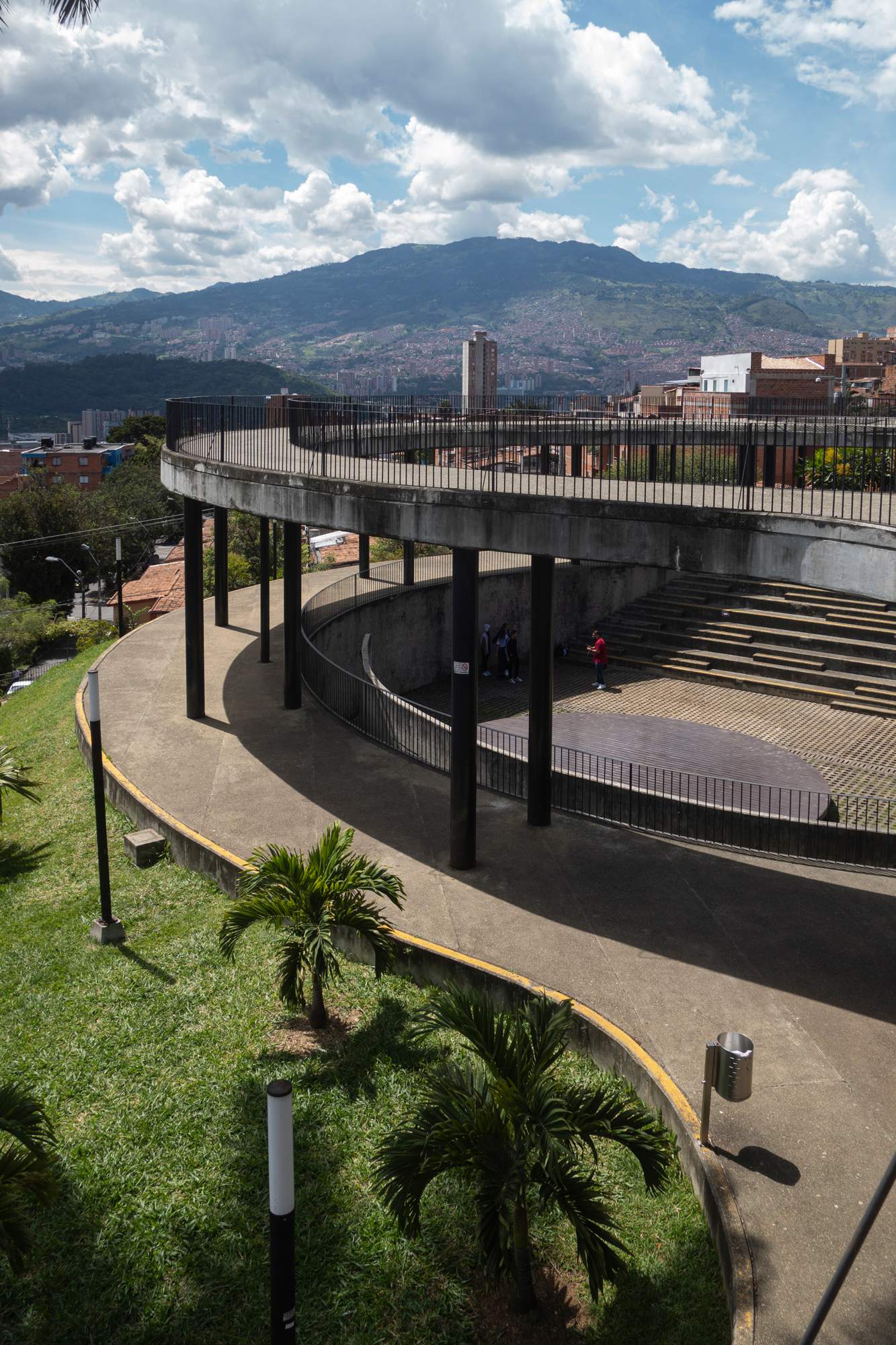
“Considering the global extent of urbanisation today, the built environment figures prominently as a leading driver of climate change,” says Kevin Jones, who works for the company’s charitable arm. Through the Lafarge Holcim Foundation for Sustainable Construction, the firm is pouring money (and its concrete) into projects such as uva La Imaginación in Medellín, Colombia. Here it aided in the transformation of a decommissioned water reservoir into civic space, converting a once off-limits area into a park for cultural and sporting activities.
The sensitive intervention was led by a team of young architects from Colectivo 720, a Cali-based architecture firm founded in 2011. Its improvement of the urban fabric fostered interconnectivity between previously under-served communities and enhanced quality of life. Moreover, the project became a blueprint for a new urban-development policy focused on the recognition of good architecture and public spaces for wellbeing.
lafargeholcim.com
20.
architect of the year
David Chipperfield
UK & Germany
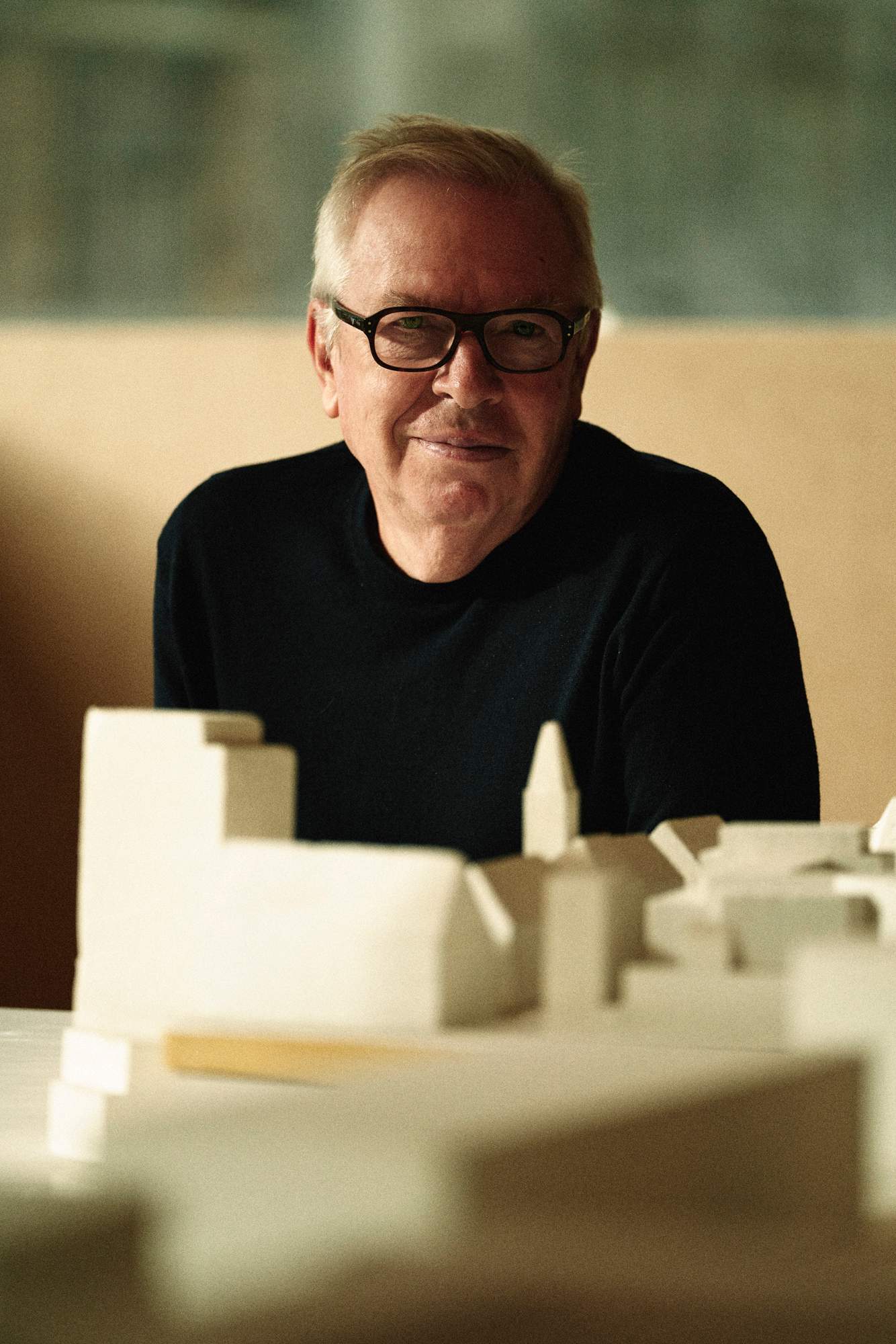
monocle’s inaugural architect of the year award goes to British architect David Chipperfield, whose buildings around the world invariably exude a calm openness and a sensitivity to environment and history in both material and form. Chipperfield’s aesthetic could be called sensitive and quiet. But in the case of Berlin’s Neue Nationalgalerie – a museum originally designed by architectural pioneer Mies van der Rohe in 1968, refurbished by Chipperfield’s Berlin office and reopening this summer – it’s meant to be downright silent. Chipperfield himself is not: he’s become an insistent voice promoting more climate consciousness, social engagement and better urban planning in the UK and beyond.
The Neue Nationalgalerie reopens in summer. What updates might a visitor who already knows this glass-box museum notice?
In theory, the visitor shouldn’t notice anything. The task was to repair the building and give it another 50 years of life, at least – to bring it back to its original state. In the process of doing that, we made several improvements: there’s more technical space, for example. The casual visitor will probably not notice anything but those looking carefully will see that the building looks better than it ever did.
Like a good facelift?
Maybe. But you usually notice that! It’s more a rejuvenation. It has been like restoring a 1968 Mercedes. You’ve done a lot to make it work better but effectively it looks extremely like the original.
You edited ten issues of Italy’s ‘Domus’ magazine last year. What did you learn?
It gave me time to talk to colleagues. For the past 30 years, the practice of architecture has been focused on objects, the effects of increasing land values and the market forces of the private sector. We’ve changed from an immediate postwar position, which was more socially focused on rebuilding society with new schools and cultural institutions. We’re now slightly shocked that we find ourselves rather disengaged from political and social influence, and struggling when we have to think much more seriously about social issues. How can we scramble back some of that position from where we sit now? I’m optimistic about this. I detected a general interest and a commitment to shifting architectural practice towards these issues. But how can we redefine our territory? We can’t do this slowly; we don’t have a lot of time.
What can architects do?
We can be activists and we can be more provocative within our practices. We can challenge clients: for instance, if a client wants to knock a building down, we can certainly say, ‘Why not reuse it?’ But we can’t operate independently; we reflect the values of society. It’s easier when mayors say we don’t want to knock down old buildings. Architects will benefit if society shifts its values. We can leverage that shift.
davidchipperfield.com
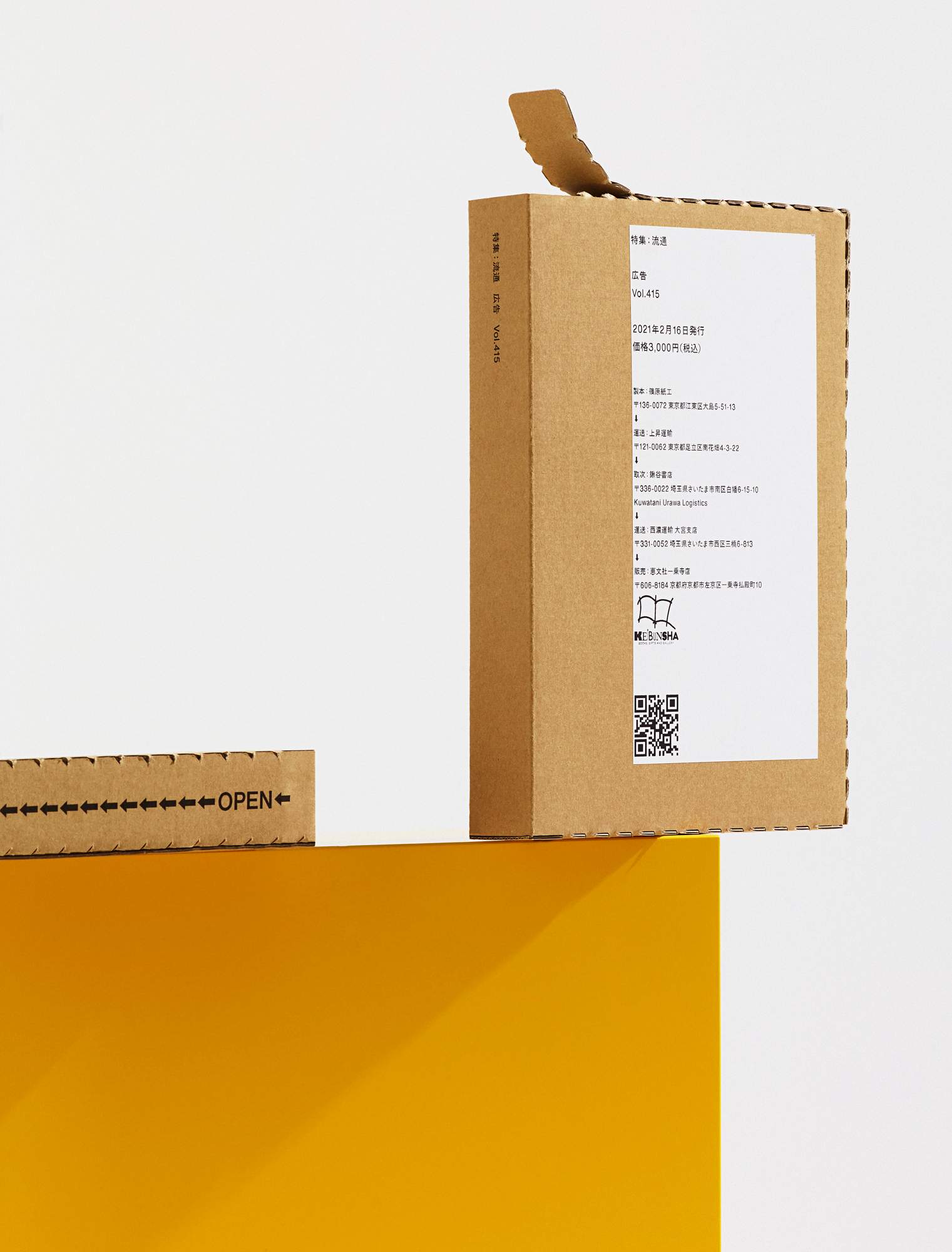
21.
innovation in print award
Kohkoku Magazine
Japan
There are no rules for magazine binding, so independent Japanese title Kohkoku sought to maximise its impact. In place of the typical spine-binding, it developed a system whereby the delivery box itself becomes the publication after the recipient peels open perforations on the side.
With 250 different custom covers that list distributors, shipping companies and bookshops, the format is an unconventional way to raise its readers’ awareness of publishing’s distribution chain.
kohkoku.jp
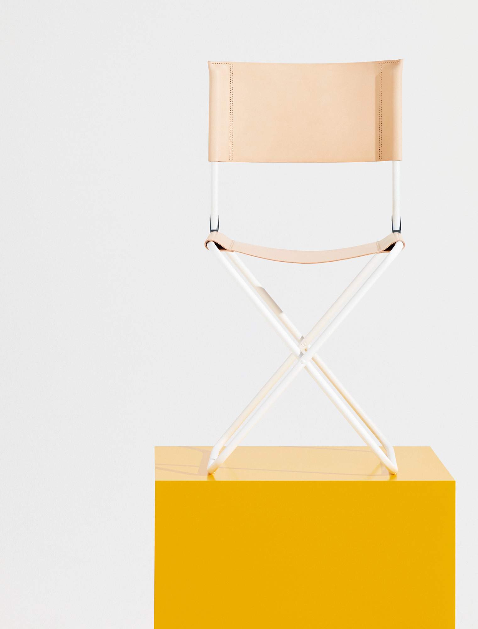
22.
best collaboration
LaFuma x Bleu de Chauffe
France
Good collaboration needs both parties to play to their strengths, which is why we were particularly excited when French brand LaFuma, known for its 1950s camping chairs, began to work with legendary leather bags brand Bleu de Chauffe. Together, they’ve produced a smart folding chair with a tubular steel frame and butter-soft leather seat. Two brands are indeed better than one.
lafuma-mobilier.fr; bleu-de-chauffe.com

23.
best visual merchandising
Studio Astolfi
Portugal
Visual merchandising remains a bedrock of selling and when done right, the practice is a joy to behold. For one of the world’s finest examples, we’re celebrating the work of Portugal’s Studio Astolfi, which has carved out an attractive niche with window displays for brands including Hermès. Founded by Joana Astolfi, a trained architect with a love of art, the studio’s work for the famed luxury goods purveyor has wowed passersby of its shops in Portugal, Spain and France. Her imaginative commissions can take upwards of two months to realise and feature both static and moving parts.
She relies on a small staff and an external team of woodcarvers, welders and glass-makers to bring her sketches to life. From handmade model aeroplanes to beautiful spinning tops made from cherry and walnut, Hermès is able to elegantly showcase its handbags and scarves each season within Astolfi’s fanciful miniature worlds.
“Window displays are a sort of open-air gallery,” says Astolfi of the wunderkammer-like scenes her studio creates, including a mountain railway and underwater world complete with a giant squid. “Online shopping is flat; this is the opposite. It’s scenographic and it lifts people’s moods.”
studioastolfi.pt
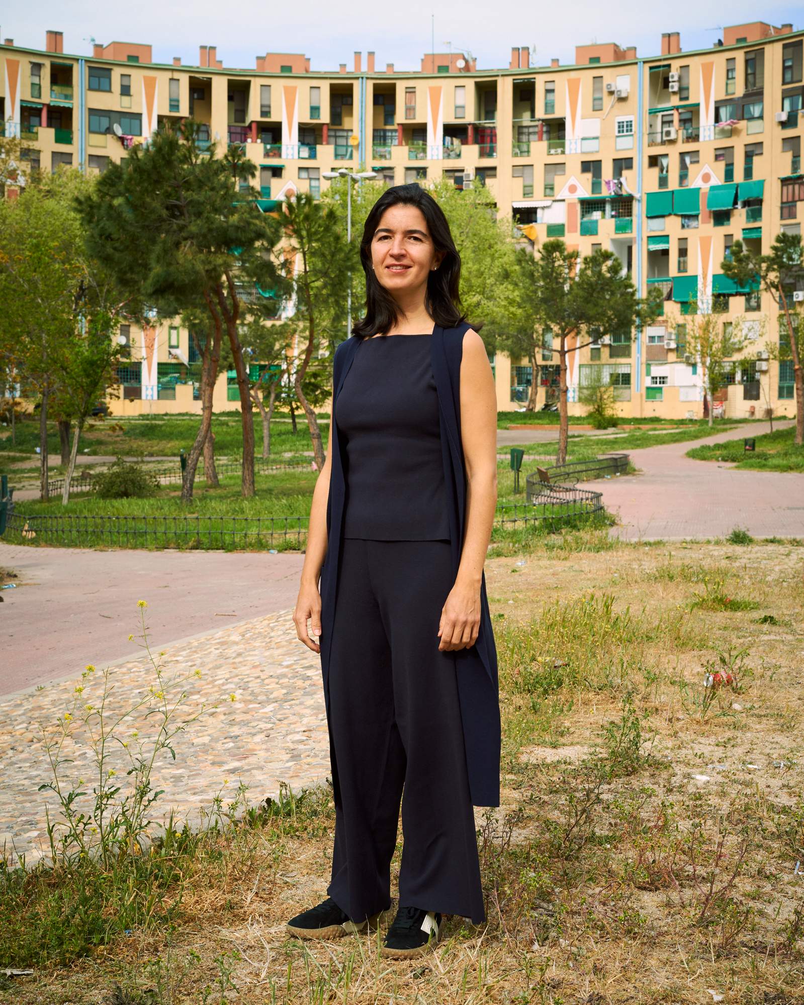
24.
best social architect
Fernanda Canales
Mexico
Fernanda Canales does not build enormous residential towers, flashy offices or headline-grabbing memorials; she builds communities. monocle is giving this Mexican talent the Design Award for best social architect because of her deep commitment to architecture as a force for good. “Architecture defines the interaction between people,” says Canales. “It builds frustration or openness.” Her projects strive for the latter. In several of Mexico’s most troubled border cities she has created multipurpose public spaces – a park, a reading room, a health centre and an auditorium – where residents have the rare chance to “feel safe and at home” and interact with neighbours. In Mexico City, her sensitive approach has led to housing that helps inhabitants embrace their surroundings. Canales sees architecture as “our window to the world”; she likes to keep that window open.
What does architecture mean to you?
It’s our primary element of protection and also our primary element of interaction. It defines our sense of self and our relationship with other people, with the world, with rain – whatever you decide to leave outside. It’s the physical element that allows you to shut something out or open up to it.
You seem very interested in how architecture affects people’s lives…
We can’t speak about isolated buildings. I’ve always thought of the impact of architecture rather than the building or interior space itself. My whole career has been spent trying to understand the relationship between a bed, a sidewalk and a city; the effect of a carpet or rooftop that, in a way, defines society and culture, and their relationship with resources. As architects, we build society and a way of understanding the place where you live.
How important is a site-specific approach?
The processes we usually follow in architectural offices are mistaken because we’re dividing what happens on the site from what happens on a desk or a laptop. We’re making decisions very far away from where things are happening, from the sun, noises or topography. It’s not possible to understand all of those things from just a couple of visits. My generation has tried to learn how to do a project without visiting the site, just by having aerial photos and doing international competitions and global architecture. I try to spend as much time as possible at the site. I don’t have a team with an established office. I work with a very local understanding of who’s going to build a project and what’s going to happen when it’s built. When you translate a drawing to a topography, many things are happening that no computer or video call can help with. So for me, it’s more about walking – doing architecture with your feet.
fernandacanales.com
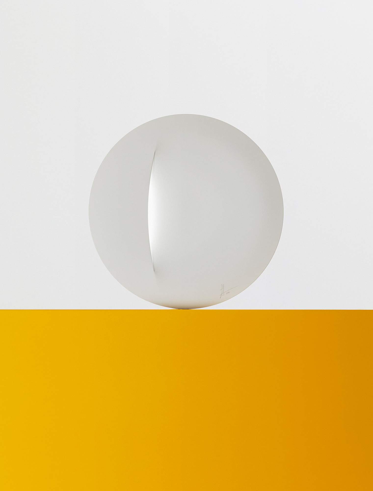
25.
most accessible design
LED Wall Lamp
Sweden
Good design doesn’t have to break the bank, and Dutch-Kiwi designer Sabine Marcelis proves that with her led Wall Lamp, produced for this year’s Ikea Art Event. In the vein of the great mid-century designers like Charles and Ray Eames, who used mass-production to bring fine furniture to the wider world, Marcelis has tapped into the potential of Ikea’s supply chain to ensure that anyone and everyone can enjoy her lamp. The subtle statement piece can be lit in a selection of five different colours, making it perfect for any space and any time of day. That’s why it’s in our awards lineup – and the homes of monocle staffers too.
ikea.com
Photographer: Rasmus Weng Karlsen, Simon Bajada, Lea Meienberg, Felix Odell, Maria Klenner, Juan Felipe Rubio, Gesi Schilling, Benjamin McMahon, Rodrigo Cardoso, Kohei Take, Jan Søndergaard, Erik Von Frankenberg. Images: Charly Broyez. Still life: Jonas Marguet, Luigi Fiano

