Healthy homes / London
Key to a happy home
There’s something wrong with the homes being erected around the globe: they are all about a chilly display of wealth, not creating a place that makes you feel safe. It’s time to campaign for a new healthy architecture.
The early modernists had a thing for light, air, hygiene and health. Johannes Itten, one of the first masters of the Staatliches Bauhaus in Weimar, would assemble his students every morning for a series of rigorous lunges, breathing exercises and meditation. (He also prescribed a vegetarian diet and imposed regular fasting periods at the school.) From Le Corbusier’s Cité Radieuse in Marseille, complete with a rooftop gymnasium and running track, to Berthold Lubetkin’s Highpoint in London with its tennis courts and long outdoor pool, buildings had a social function: to keep their occupants healthy and invigorated in body and mind.
The debate has moved on from how buildings can influence lives, brains and bodies. Today architecture is often in pursuit of a grand statement, an original concept or – at the behest of developers – a projection of affluence. If anything the tenets of the early modernists – light and openness – have been hijacked. When a swimming pool is placed in a residential complex it is usually in the spirit of luxury, a statement of prestige rather than physical self-improvement.
Yet the notion of health and wellness is re-emerging and it is not simply a discussion about hi-tech circadian lighting features and molecular air purifiers. For designers such as Ilse Crawford, director of the London-based Studioilse, it is time to readdress some fundamental principles. “Why is it that how we live has somehow become a sidelined part of the debate?” she says Crawford, having worked on projects that range from small apartments to the Ett Hem hotel in Stockholm. “There’s a sense that [the home] is not designed around what people really do but around an abstract idea. We’ve prized the spectacular over the normal.”
Crawford puts human behaviour at the centre of her designs; she aims to venerate the acts of everyday life to create spaces that have warmth and intimacy. “Ultimately we are primal beings; we have a whole range of responses to the world that are fundamental to our nature and need to be part of the brief of any project,” she says. “It’s a question of analysing those things that make us human. We need to look to cultures that value the daily rituals – Japan or Denmark – where they prioritise the ordinary and give everyday moments a special context.”




Most homes are objects of pride; purveyors (and creators) of property and interiors have tapped into this urge to showcase and impress. Yet it is rare to find a developer who asks, “Will these large plate-glass windows make the new occupants feel overlooked, exposed and a little lost?” Or, “Will these materials communicate with their owners in a way that makes them feel safe and secure?” Even less likely: “This slick new wet room is impressive but will it make its owner happy and grounded? How will they relax without a bath?”
Yet some architects are starting to see the emotional pitfalls of the language of glass and volume. In a recent lecture called Treacherous Transparencies, marking the 2015 Riba Jencks Award in London, Jacques Herzog talked of the profound unease found in Mies van der Rohe’s iconic Farnsworth House in Plano, Illinois. Mies van der Rohe had obsessively sought ways to create large-volume spaces but ended up creating an exposed glass house that troubled its owner.
Our attachments to home are imbued with emotions. Details evoke responses, from the feeling of a brass key turning in the lock to the heavy and reassuring oak of a kitchen table. The tessellating pieces of a hardwood parquet floor are intricate, tactile and handsome but also bring an element of solidity and security. “Materials govern our responses to the home,” says Crawford, who works with natural materials such as cork, hemp, mohair and wood. “Touch is our first and last sense; it has a direct connection to our emotions.”
In fact there is a very good case for bringing natural materials into the heart of the home. “Wood has been proven to reduce stress and cortisol levels,” says Robert Penn, author of new book The Man Who Made Things Out of Trees. “It has a sensual power over us. I recently had a desk made from 125-year-old ash that I felled. You can look at its growth rings and think about the great storms and the winters. That’s a connection to the natural world. It has a positive effect.”
Penn’s book also makes a convincing scientific case for why trees should be part of every new project. He cites an experiment by US-based professor of architecture Roger Ulrich, which found that patients recovering from surgery in hospital rooms with a bosky view healed faster, took less medicine and had fewer postsurgical complications than patients with a window facing a brick wall. “There’s a lot of evidence to show that trees are incredibly beneficial both physiologically and psychologically,” he says from his house in a glade in Wales, where he spends his days chopping and seasoning wood. “Our relationship to them is primal.”
Some forward-thinkers in the healthcare sector are incorporating these ideas into patient care. “Views are very important,” says Laura Lee, a former nurse who is now CEO of Maggie’s, a UK cancer trust that has become a design pioneer. (Maggie’s has commissioned the likes of Kisho Kurokawa, Rem Koolhaas and Steven Holl.) “Your gaze needs to go somewhere. It might not be rolling hills but it could be a plant, a piece of art or an internal courtyard. It is a distraction.”
Maggie’s centres use the language of home to comfort cancer patients, who are often dealing with pain, discomfort and emotional upheaval. Lee talks of the importance of the “architectural journey to the kettle”. While the architects are free to interpret each brief, there are certain features the trust insists on: there must be somewhere to hang your coat, no signs on the lavatory door and the approach should welcome visitors. “At one of our centres you step off the tarmac onto a garden path and it’s got a subtle crunch to it; you’re surrounded by plants. It declares, ‘I’m alive and I’m present.’”
Our houses, flats and condominiums should also pique the senses: distract, soothe and elevate the most basic acts of everyday life. How we live, our human instinct to ensconce, congregate, hibernate and relate to nature and light, should provide some basic principles for the homes of the future.

01 Human interaction
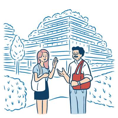
Residential developments should think of ways to bring people together. We are social beings so too many machines can leave us isolated. A concierge is worth investing in, especially one who doesn’t mind keeping a spare key handy and the communal areas clean.

02 The approach
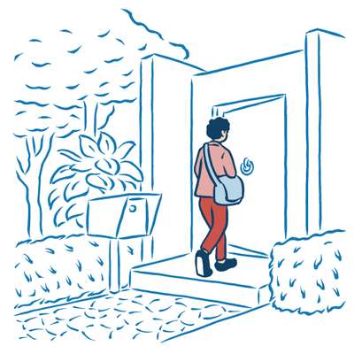
How does the path to your door make you feel? Do you relish the key turning in the lock or scramble across the threshold glancing over one shoulder? Homes should welcome us. This is a question of scale but also detail; the postbox, the door-knocker, the coatstand and shoe rack.

03 Views out and in
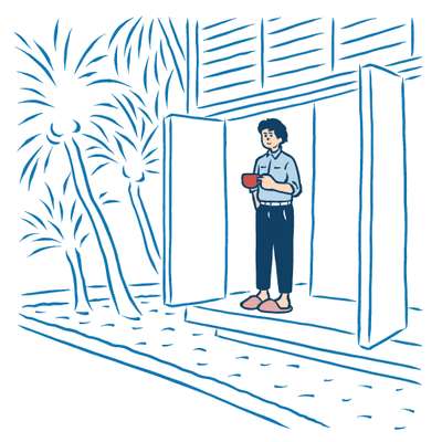
It doesn’t have to be an awe-inspiring alpine vista but the concept of “seeing out” has a bearing on our state of mind. There is a question of balance here: being overlooked can make you feel exposed and unsafe. Slatting, a clever use of shutters, should be a feature of every new home.

04 Greenery
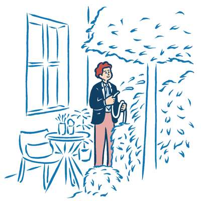
Planting should be an integral part of any development. Trees and plants are a source of oxygen, an energising, distracting and calming influence. Indoor plants soften and lift an interior.

05 Cars
Parking your car in the drive may be coanvenient but it encourages a sedentary lifestyle. New developments should promote parking clusters to make residents walk to their front doors.
06 Materials
Natural materials such as wood, cork and rattan all communicate different messages; we respond to them in the home.
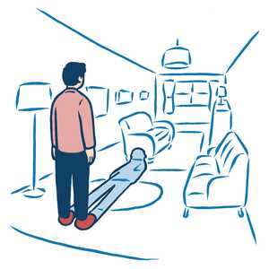
07 Rooms
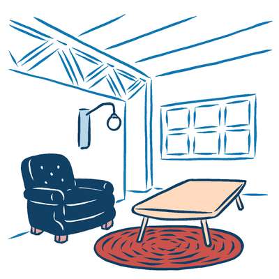
There is a slavish adherence to “open plan”; so much so that the merits of rooms with doors have been overlooked. They give privacy and warmth. Humans can feel lost (and cold) in vast double-volume spaces.
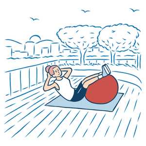
08 Rooftop exercise
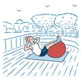
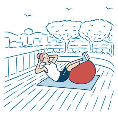
Outdoor exercise space, rather than an airless basement gym, gives a feeling of freedom, not to mention some bracing fresh air. Residential developments should utilise flat roofs as a space for running, swimming and workouts.

09 The kitchen
Why is it that people always cram into kitchens at parties? They are human places and should be the malleable spaces that provide the living, organic centre of the house, not fitted showpieces.
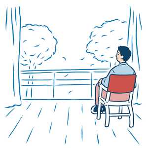
10 Light
A southwest terrace with enough space for a table (and a spot of exercise) was the signature of the early modernists. We need to reinstate the sunny space and make sure home-owners can stock up on vitamin D.

