Department store identity / Global
What’s in store?
Hopefully better graphics and windows in our department stores. To help, here are a few design cues for shaping smart packaging, signage and service to keep shoppers coming back time after time.

While the global face of retail may be changing, the department store remains an industry stalwart. From everyday essentials to more extraordinary buys, they offer an experience that simply can’t be beaten online; it’s the theatre of these places that keeps us returning. Their well-dressed windows inspire our wardrobe choices, thoughtful staff attend to our needs and then there’s that feel-good factor of strutting home with a handsome bag full of fresh purchases.
It’s not all smooth sailing for the department store though. Some major chains are shutting their doors and old family-run enterprises are also feeling the pinch as competition grows online. Yet smart brands such as Kadewe demonstrate that there is plenty of room for innovation and investment in the design of the department store.
Here we bring you the design identity checklist that the industry should be paying attention to.

01
Brilliant branding
Nordiska Kompaniet, Stockholm
Karin Svensson, marketing manager of Nordiska Kompaniet (NK), is tasked with keeping watch over the historic Swedish department store’s branding; every word, symbol and picture published under its banner must first get past her discerning eye. “Our visual identity is extremely important and we keep a tight rein on it,” she says.
Elegant branding has been a key part of NK’s allure for more than a century. Its logo is almost identical to the one that architect David Blomberg designed in 1902. Elongated, intertwined “N” and “K” characters are encircled by a ring and a square; the letters are black, the backdrop is white and everything but the square – a 1960s addition – is original. “The logo was a brilliant design from the start,” says Svensson.
For the past 25 years NK has regulated its visual profile with the aid of a hefty black handbook. Detailed guidelines ensure its legacy is protected and promote uniformity across the in-store departments, which are set up as individual companies.
NK has not been afraid to play with its branding on occasion: its signature shopping bag was created by blowing up the logo and printing it diagonally. “It’s so zoomed in that it’s more of a graphic pattern,” says Svensson. Ultimately NK stands out because it has kept a vice-like grip on its identity. “We are very careful about the brand – the logo, font, graphics – and we have the same DNA today as when the store was founded.”

02
Heritage Christmas window
Ogilvy, Montréal
For seven decades, Montréalers have made the pilgrimage to the Ogilvy department store on Rue St-Catherine for the unveiling of the Christmas windows. According to Normand Ciarlo, Ogilvy’s general manager and divisional vice-president, a commitment to tradition is one of the best ways to connect with a community that still values the physical shopping experience and a little bit of magic. “The windows are a landmark,” he says. “We have two or three generations who saw the windows as children and now bring their kids or grandkids.”
Change has come slowly since German toy-maker Steiff was first commissioned to create the woodland sets in 1947. Occasional restoration of the bears, ducks, monkeys and hedgehogs is undertaken by traditional toymakers. Recently the costumes were refreshed by Harricana par Mariouche, a fur specialist, bringing some quietly contemporary winter touches to the forest fashions.
In 2017 Ogilvy will expand and share its building with Holt Renfrew of the Weston family (owners of Selfridges and Brown Thomas). But there’s no doubt that the display will survive the transformation. “What that window does is bring stability,” says Ciarlo. “There will be room for it because it’s part of who we are.”

03
Sharp staff
Takashimaya, Tokyo
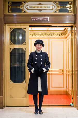
The female lift attendants who were once a mainstay of Japanese department stores have mostly disappeared. But at Takashimaya’s Tokyo flagship the six US-made Otis lifts can’t go anywhere without the erebeitaa gaaruzu (elevator girls) manually operating the cranks and pressing the buttons.
The fact that the lifts haven’t changed since the building was completed in 1933 only partly explains why the elevator girls are still around: it’s also because of Takashimaya’s insistence on old-fashioned hospitality. “Our job is to greet customers and help them find what they’re looking for,” says Miki Shinmura, who heads the team of 30 at the store in the Nihonbashi district. Dressed in crisp black-and-cream uniforms by fashion designer Jun Ashida (navy in spring and summer), they make customers feel welcome and at ease in a shop with hundreds of thousands of items spread across 10 spacious floors. The elevator attendants know exactly where to look for, say, a ceramic rice pot, school backpack or calligraphy brush.
Before joining the team, trainees spend six months on the sales floor and another month at the controls of the lifts but the job requires an almost daily mental cataloguing of products, brands and seasonal gift ideas that are constantly in flux.

04
Smart signage
Hyundai Department Store, Seoul
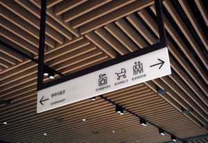
The Hyundai Department Store – one of South Korea’s big three alongside Shinsegae and Lotte – introduced a simple wayfinding system that pairs san serif fonts with a white background.
“As a premium brand, ‘less is more’ lies at the heart of our business,” says Park Ee-rang, art director of Hyundai in Seoul, who worked with graphic designers Studio fnt on the job.
Contrasting with the pink of its logo and shopping bags, this wayfinding system provides clear directions in a busy environment. “Not only does it upgrade the ambience but it also articulates the brand experience,” says Park.


