Office design / Global
Work in progress
Fifty years ago architects started to reimagine the office, wondering how it could become a more inspiring, democratic environment. Half a century later, as we prepare for another shake-up of the workplace, we look at the ideas that stood the test of time – and visit the German company rethinking open-plan.
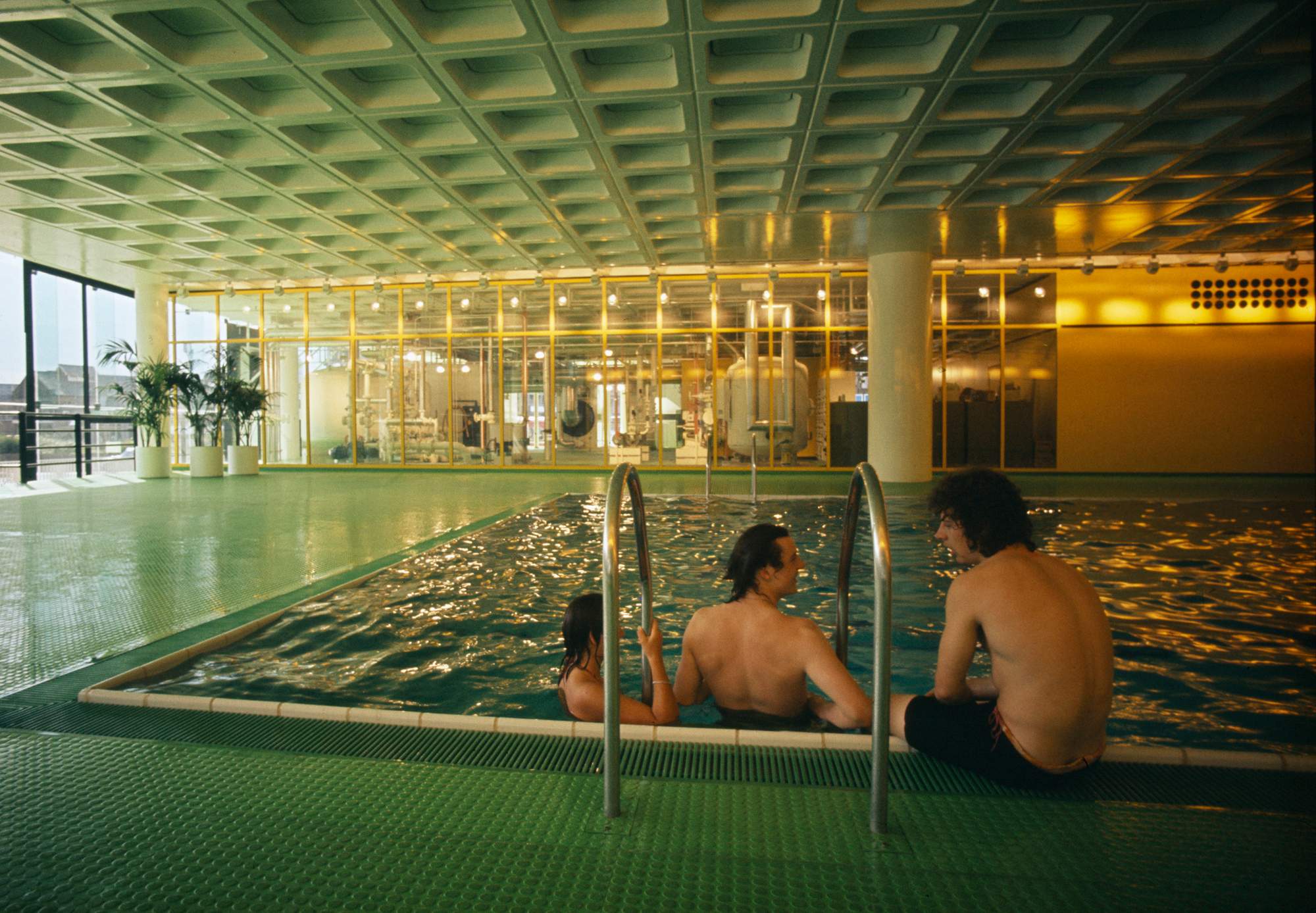
willis faber & dumas, Ipswich. Completed: 1975
In the early 1970s a young Norman Foster designed a handful of UK office buildings and did some outlandish things. He created low-slung, glass-encased structures for the dockside base of London shipping company Olsen & Co as well as for ibm’s head office in Portsmouth and the Ipswich HQ of insurance firm Willis Faber & Dumas. Some of these buildings overlooked green spaces and all of them consumed low amounts of energy, their transparent skins harnessing the elements to warm and cool the buildings naturally as much as possible.
These were egalitarian spaces, fizzing with social chatter. Their horizontal, open-plan forms – dubbed “groundscrapers” – gathered workers in one space, rather than dividing them into floors stacked on top of one another. And instead of sequestering away workers into individual offices, senior staff worked alongside their subordinates. The Willis HQ’s restaurant, rooftop garden and pool were available to all, while Olsen had art-lined walls. All three of Foster’s workplace designs were flooded with daylight and boasted a convivial atmosphere in which employees would share ideas.

“The core premise was about social equality, which is about quality of life at the workplace,” says Foster, the Pritzker prize-winning architect and founder of Foster 1 Partners. The long, mostly single-storey spaces were “much better [than tall towers] for connectivity between individuals,” he says. “If tasks are creative then they benefit from interaction.”
These environments contrasted with the hushed atmosphere and segregated cubicles that dominated workplaces at the time. Yet they stand in alignment with the offices of today. Some 50 years on, once-radical ideas have become mainstream. Modern workplaces embrace greenery and green energy consumption. And sociability at work is now a primary concern, with in-person interaction accepted as vital to creative thinking and wellbeing. By forcing us to work remotely, the pandemic has only highlighted the value of face-to-face sparring.
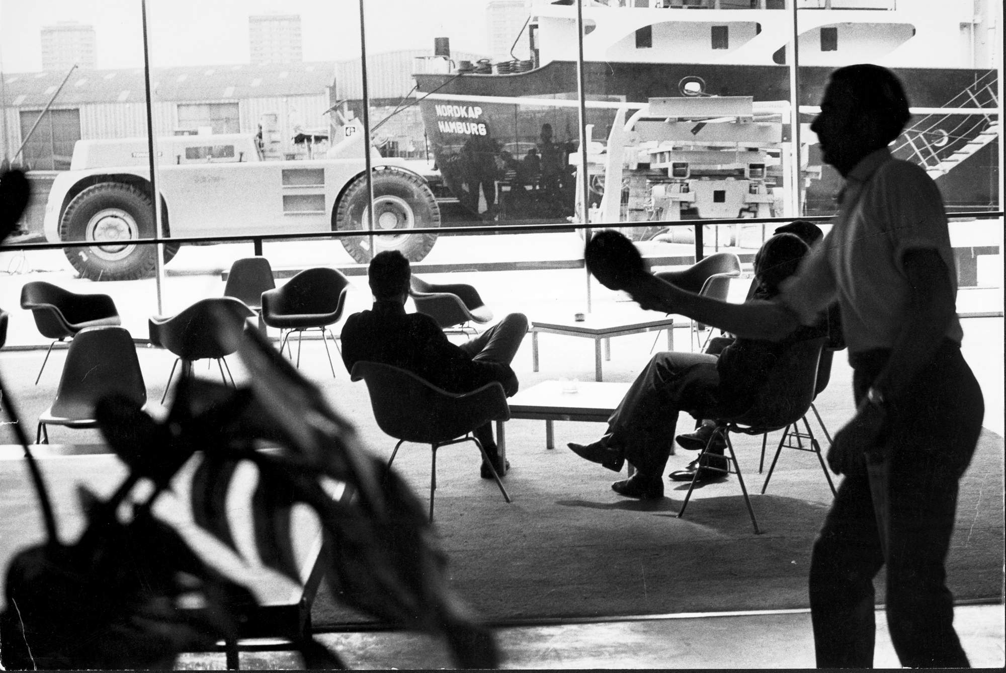
fred olsen, Isle of Dogs, London. Completed: 1970
Foster’s prescient works were remarkable yet they weren’t alone. Other agenda-setting projects from the 1970s – such as Arne Jacobsen’s National Bank in Copenhagen; Herman Hertzberger’s Centraal Beheer complex in the Dutch city of Apeldoorn; and Palmas 555, Juan Sordo Madaleno’s corporate tower in Mexico City – have stood the test of time. Whether it’s their celebration of raw materials, use of natural light or the way in which they complement their neighbourhoods, all have sentiments that chime with modern workspaces.
In fact, put any of them alongside today’s best new-builds, squint, and it’s hard to spot the difference. They share much with fêted contemporary designs, such as Foster 1 Partners’ Bloomberg HQ in London, with its sixth-floor “pantry”, a soaring space through which all employees must pass. Or Danish firm 3xn’s International Olympic Committee HQ in Lausanne, an elongated glass creation that’s filled with light and breakaway spaces for quick catch-ups.
The working world has changed immeasurably in recent decades due to smartphones, laptops and the “connected” culture that these things have enabled – which makes it all the more remarkable that some of the leading principles behind today’s workplaces are based on the ideas of great design minds half a century ago.
Yet the 1970s, in general, was not a brilliant time for workplace environments. The era had none of the largesse and corporate glamour of the 1980s. “Most offices in the 1970s were awful,” says Alexi Marmot, a professor at ucl’s Bartlett Real Estate Institute and the author of several books on office design. As she explains, there was typically a group area for typists but individual offices for almost everyone else. And you weren’t supposed to talk.
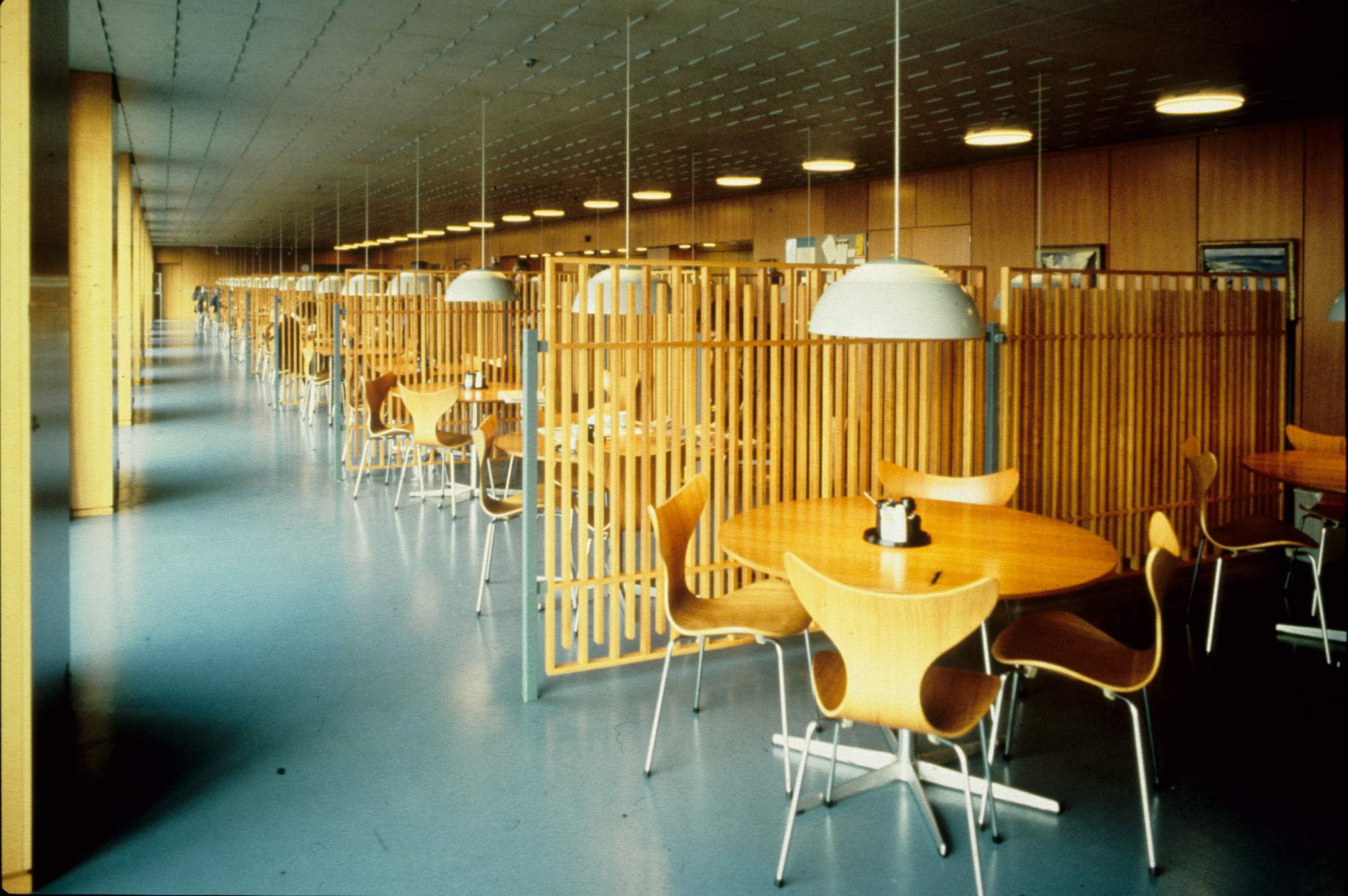
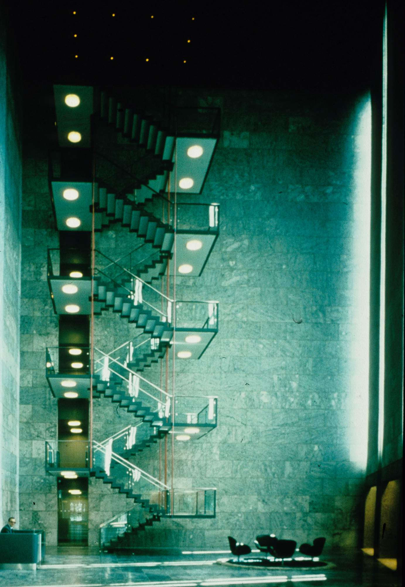

The designs by Foster and his fellow luminaries defied these norms. As Foster himself notes, these commissions only happened for companies run by “independently minded, slightly maverick” people, such as Fred Olsen or Willis chairman John Roscoe. “All of the individuals behind these buildings were prepared to take a risk and were open to a well-argued architectural equation,” says Foster. “They weren’t your normal bureaucrat; it certainly could never have happened out of a corporate or a bureaucratic mentality.”
The best spaces of this era used “honest”, unfussy materials and possessed an understated quality that resonates today, says Susan Jayne Carruth, an architect who is head of operations for gxn, a think-tank for Danish architecture firm 3xn. “The 1980s was more about the drama and grandeur; the 1970s had more of a human scale.”
Carruth cites two projects. First, Hertzberger’s development for insurance firm Centraal Beheer: a high-ceilinged space filled with raw-brick units that sit at different heights and provide a range of areas and vantage points for working and socialising. And Madaleno’s Palmas 555: a concrete tower that resembles a teetering stack of pizza boxes, offering workers views of the city, ample shaded areas and light-flooded communal space. “What these have in common, and where I see a further link to contemporary office design, is that they are shaped by a consideration of human needs,” says Carruth. “It’s not just form follows function but form follows behaviour.”
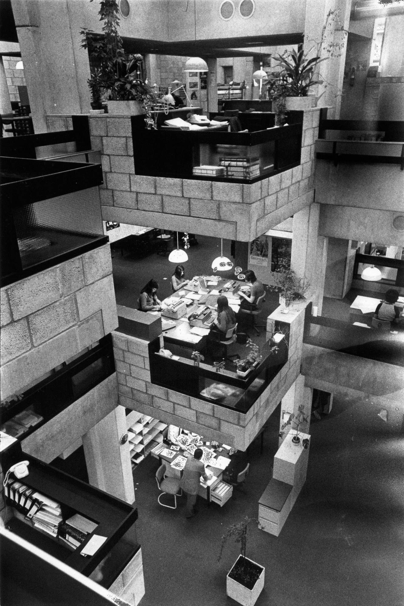
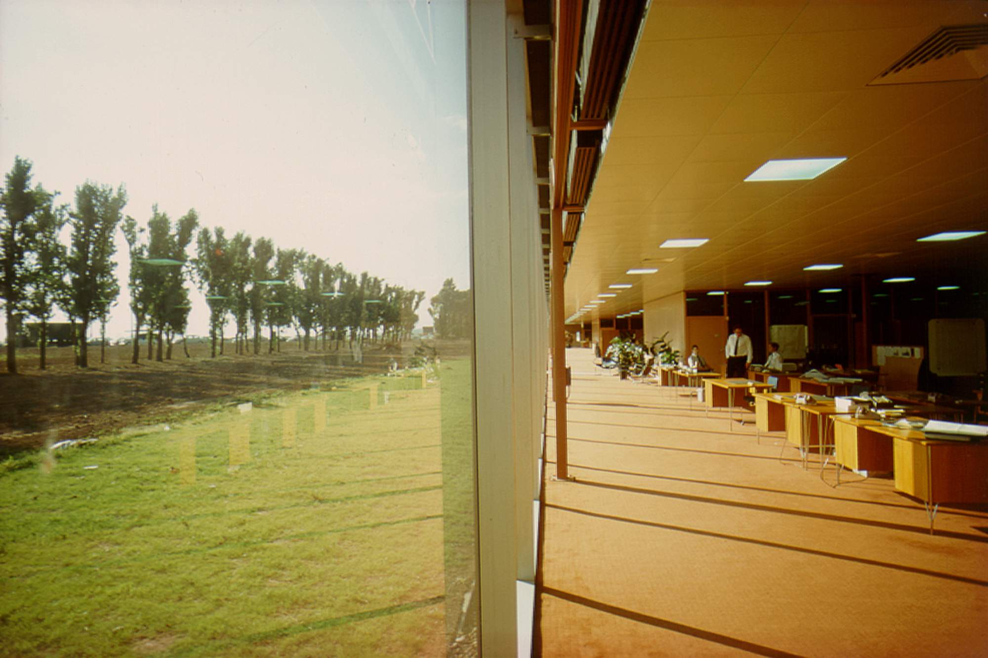
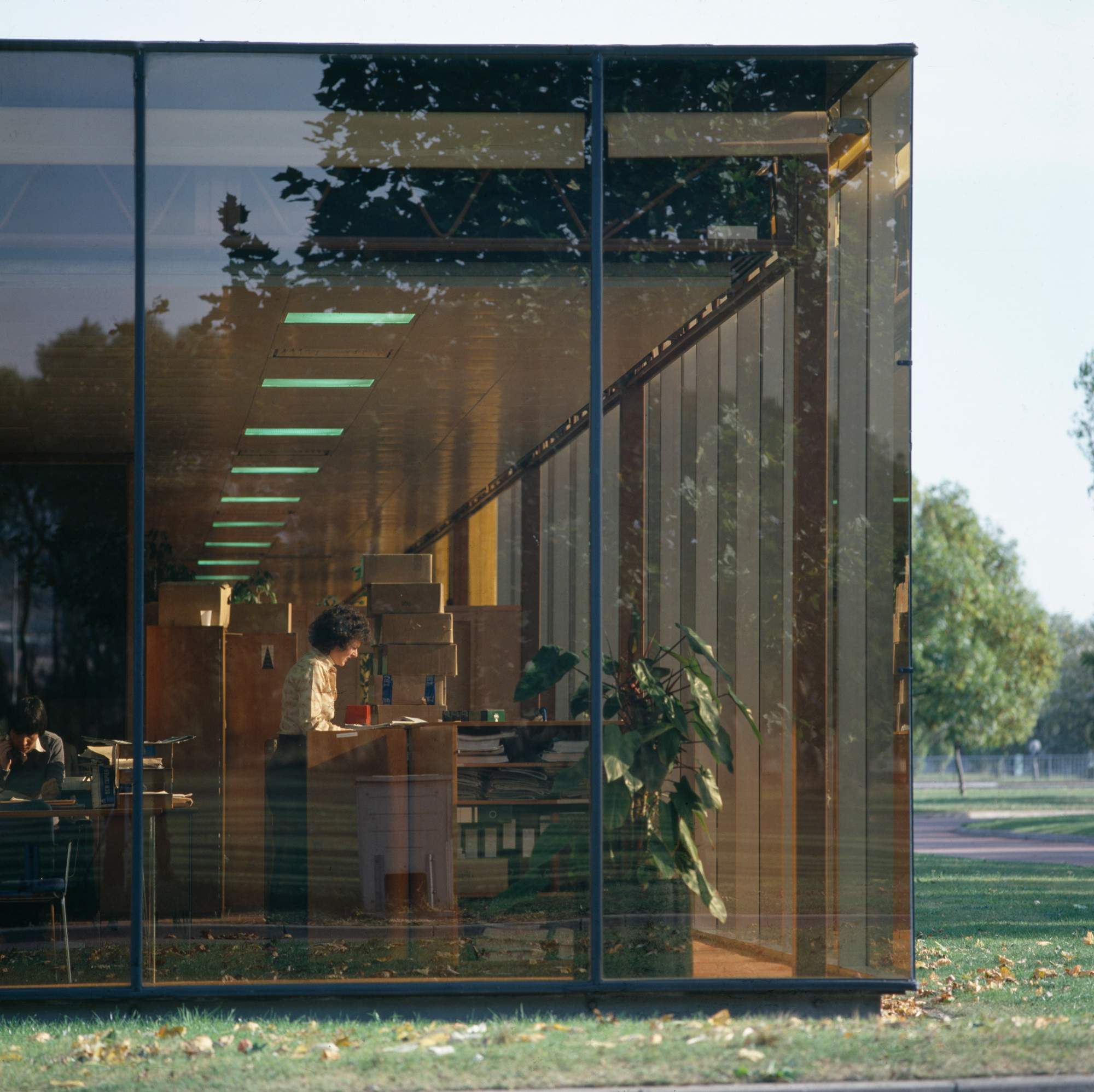
The decade’s best designs were flexible. Open spaces free of load-bearing walls were a feature of the International Style popular in 1970s and postwar architecture generally, says Peter Thule Kristensen, an architecture professor at the Royal Danish Academy of Fine Arts. This translated into office environments such as Foster’s ibm headquarters or Hertzberger’s Centraal Beheer, because they could be reconfigured to suit a company’s changing needs. This echoes with today’s companies, which like to be able to constantly rejig their interiors.
“These designs are not just form follows function but form follows behaviour”
Of course, what’s on the outside can be just as important. Take any number of Arne Jacobsen’s designs. Although the Danish master was conventional when it came to office floorplans – big lobbies; long corridors; small, discrete offices – his structures were masterclasses in how to design a building with respect for its context, says Kristensen. The National Bank in Copenhagen is undeniably modernist, yet it acknowledges the 19th-century classicist architecture in the surrounding neighbourhood via its use of marble and bronze.
Given the pandemic, considerable thought is once again going into what we need from our workplaces. In future, many of us will have more flexible schedules and spend less time in the office than we used to. But, as Foster says, “the things that you do need to go into the office to do have become more precious”. To achieve those precious things you need a site- specific building with warm interiors and a layout that encourages lively conversation. In short, you need what those employees at Willis Faber & Dumas in Ipswich had all those years ago.
Frankfurter Allgemeine Zeitung
Alternatives to open-plan
The office of the centre-right Frankfurter Allgemeine Zeitung, one of Germany’s biggest newspapers, has always been a unique place to work. Editorial independence is held so sacred here that journalists and editors are in one building and the commercial team in another. The two are joined by a skywalk that’s dubbed “the bridge of sighs”. In 2022, however, all departments will move to a modern building complex in Frankfurt’s European quarter.
Designed by Berlin’s Eike Becker Architekten, the new 18-storey building will provide space for 1,000 employees and was originally configured with open-plan working in mind. But then came the pandemic and the surge in remote working, so the board decided to get rid of one floor due to the high number of reporters who won’t be based in the office. “The situation also shed a light on another issue: the fate of the single-person office,” says company coo Volker Breid. The significance of enclosed, independent spaces for staff is rooted in the newspaper’s history where the idea of “independent minds” remains prominent. The paper doesn’t have just one editor but four – all of whom have individual offices.
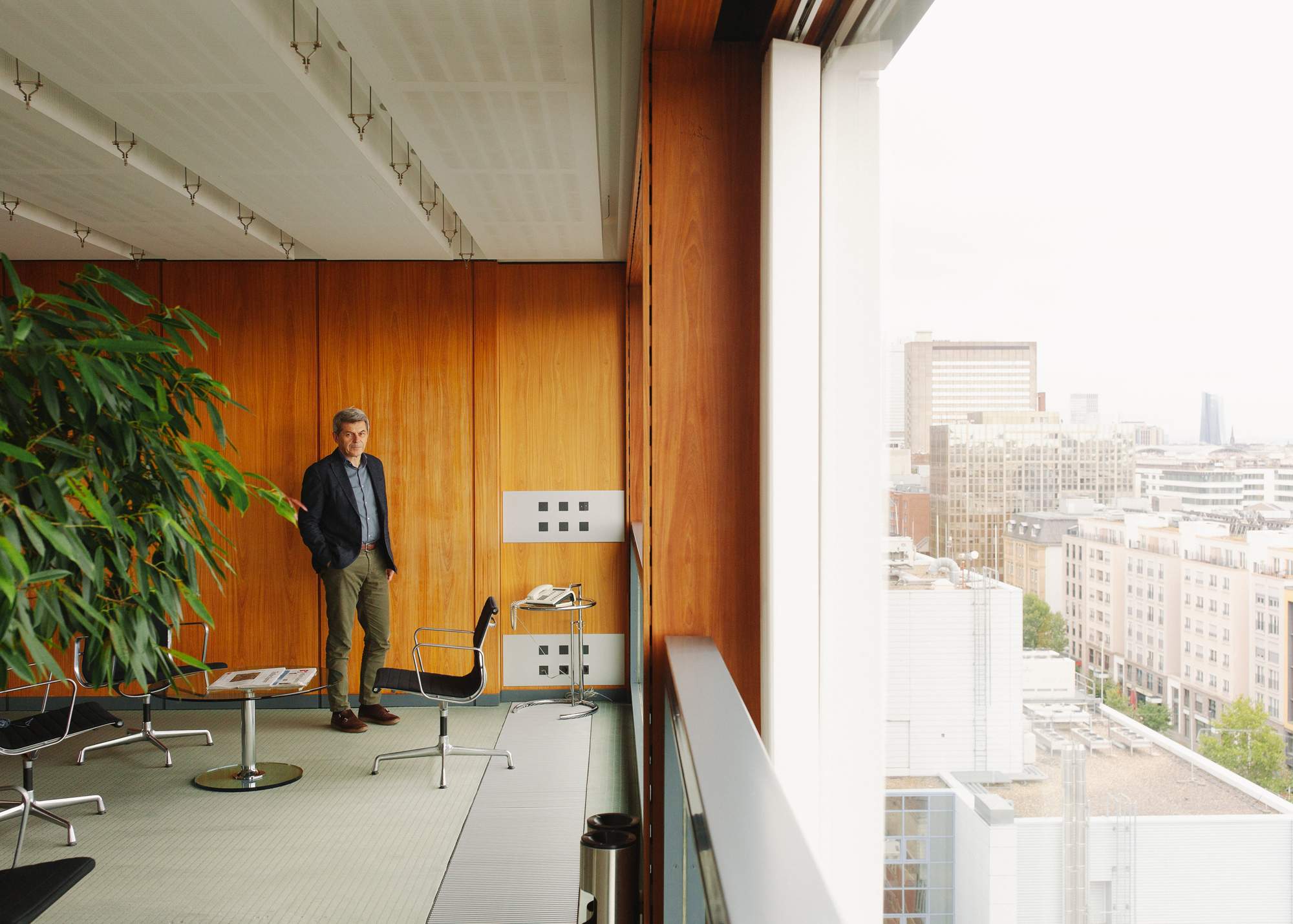
‘Frankfurter Allgemeine Zeitung’ CEO Volker Breid
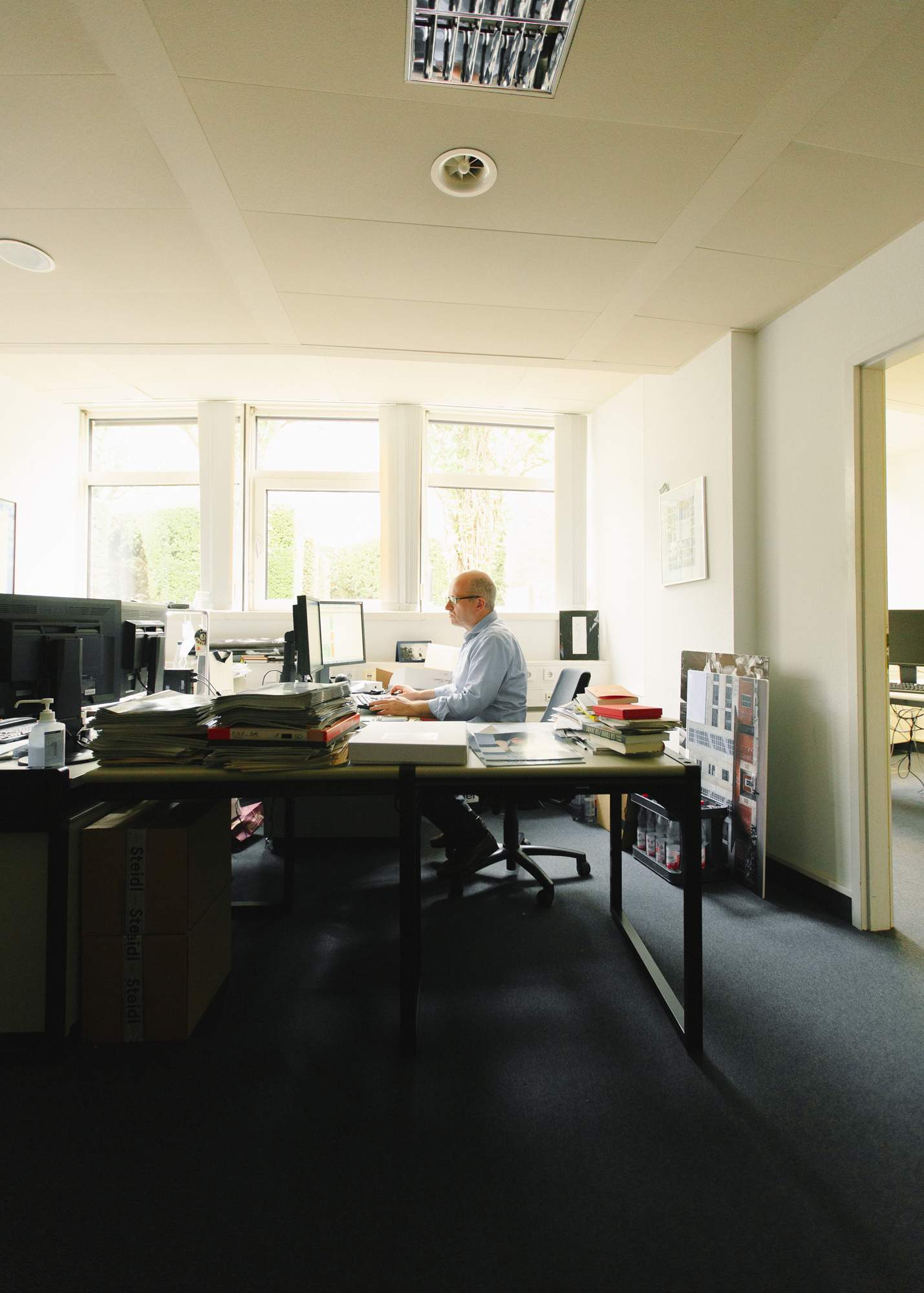
Journalist Alfons Kaiser at his desk
“Not everything that is fashionable has to be good,” says Breid of the growing business movement towards open-plan. After all, his journalists require a certain amount of peace and tranquillity to do their job.
It’s a view that’s in contrast to that of Axel Springer, publisher of Bild and Die Welt. For its new building, which opened in October, the firm decided to ditch single offices altogether. “Measuring one’s status by individual space is outdated,” ceo Mathias Döpfner told his employees, mentioning that he shares his own office with three fellow board members. But even though many companies highlight what they believe to be a sense of community and collaboration as a reason for the open-plan office, it’s primarily a means of saving money.
Studies have shown that when companies move to open-plan, the motivation and performance of staff declines, while working hours and sickness rates increase. Many German media companies seem to agree. Whereas other industries introduced open-plan Bürolandschaften (“office landscapes”), most publishers have remained advocates of individual offices. “We have never changed our office model because it works well for us,” says Philipp Wolff of Hubert Burda Media, publisher of titles including Elle.
“We want a space that doesn’t hinder good ideas but promotes them”
Many German newspapers still reside in the Pressehäuser (press buildings) constructed after the Second World War. The weekly Die Zeit, for example, occupies the same Hamburg base in which it was founded in 1946. “In a world of information bombardment, the individual office is the last refuge of a person who wants to finish a thought,” the paper’s deputy editor Sabine Rückert recently wrote in Zeit Magazin.

Reading material in Kaiser’s office

Frankfurt to the right; individual spaces to the left
A similar opinion is expressed by Gruner 1 Jahr, one of Europe’s biggest publishers. The firm resides in a huge ship-like building in Hamburg, comprised of smaller internal offices, but in the next few years it will be moving to new premises designed by UK architects Caruso St John. The design of this office for 2,200 employees is still to be confirmed but the company is keen on keeping the current work spirit alive. “We want a space that doesn’t hinder good ideas but promotes them,” says ceo Julia Jäkel.
In the end, Frankfurter Allgemeine chose a newsroom with open spaces, “but intellectually demanding content will be worked on in single rooms or dedicated spaces in the newsroom,” says Breid, initially a proponent of open-plan. “It was a learning process. But we took a careful look at our business model and asked: ‘Do the spaces that fit Google necessarily suit us as well?’ The answer is no.”
Images: Ken Kirkwood, Tim Street-Porter, Willem Diepraam, Andreas Trier Mørch, courtesy of The Royal Danish Academy of Fine Arts' School of Architecture, Design and Conservation


