
Packaging / Global
Let’s wrap this up
Creating food packaging that pops isn’t easy. We meet three studios helping businesses off the shelf.
Buenaventura
Granada, Spain
Olive-oil-adoring Spaniards have long grumbled about Italy’s habit of snapping up Spanish aceite de oliva, slapping a more elegant label on a sleeker glass bottle and reselling it as olio d’oliva. Beneath the complaints, however, many harbour a hint of admiration for their neighbours’ design finesse. Now younger Spanish studios are finally fighting back, convincing food producers at home to smarten up.
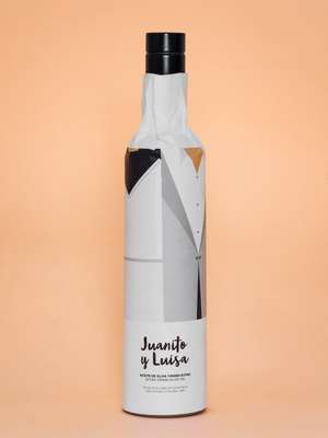
Based in the town of Loja, graphic and packaging-design studio Buenaventura is on the front line. Its close proximity to clients’ olive groves has cultivated greater understanding. “Spanish producers have realised that expanding into foreign markets is a question of survival,” says co-founder Ramón Soler. “This meant dispensing with cheap-looking plastic containers and thoughtless branding.”
A decade of financial strife has shaken industry complacency but it has also spurred fresh players in the food sector. “Most want to make a bolder impression, even if there’s a reluctance to gloss over tradition,” says Soler. In Andalucía, an appreciation for the past has seen its Hispano-Islamic cultural heritage inform the visual identity of new packaging.
Loja’s small-town pace has shaped the studio’s uncomplicated, cheerful designs. From bucolic bakeries to aspiring craft-beer brands, Buenaventura adorns each box, jar and bottle with bright colours, clear-cut typography and illustrations that embrace the surrounding region’s heritage. Longstanding client and award-winning olive-oil mogul Melgarejo has been producing its green-hued gold since 1780. Buenaventura’s designs, however, imbued its bottles with a distinct element of illustrative storytelling, taking cues from the mountains and chequered tablecloths that colour southern Spain.
The laidback rhythm of rural life allows the team to embark on a more patient design process with each client. “Living amid the visually rich culture of the Mediterranean marks our graphic approach,” says Soler. “But the nature and sunlight influence our attitude.”
“The food producers we work with pour their personality into what they do but, ultimately, the final product needs to seduce you with its clothes on,” he says. “Being able to see how our clients work helps us to create a correlation between the product and the way we dress it up.”


Thankfully the Spanish-Italian design rivalry is more instructive than ireful. “As farmers embrace the power of design, we often find ourselves repeating Italian designer Bruno Munari: ‘To complicate is easy, to simplify is difficult.’”
buenaventura.pro
Makoto Umebara
Kochi, Japan
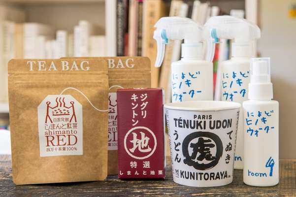
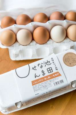
Makoto Umebara cuts open a box that has just arrived from one of his former clients: a young chicken farmer in a neighbouring town. “He sends 30 eggs every month. The deal lasts for as long as I am alive,” says Umebara. They’re the only payment he receives for redesigning the farm’s egg cartons – and revving up the business – six years ago.
This is typical for the 68-year-old, one of Japan’s most respected designers. Unlike many of his contemporaries, Umebara’s portfolio isn’t heavy on big-name brands. Over nearly four decades he is best known for having saved many small farms, fishing fleets and food brands that otherwise might have gone under. He works alone or with a small staff from a modest office attached to his home, which overlooks the Monobe River in Kochi prefecture, the remote southwestern locale where he spent his early childhood. “My clients are usually in a bind. Their products aren’t selling,” he says. “They’re on the verge of collapse. They have no money. Pretty packaging alone is not going to save them.”
Umebara’s ability to tease out the essence of a product using a dash of his signature humour, however, often does. You would have to travel to Kochi to come across much of Umebara’s work, which extends beyond packaging. His first taste of success came early, when he was approached by a struggling local bonito-fishing company that sold hay-grilled fillets. Doubling as copywriter and designer, Umebara painted a fishing boat and dreamed up the slogan, “Caught by fishermen, grilled by fishermen”. “The company’s economic prospects weren’t good,” he says. “I worried that part of Kochi’s traditions were at risk of disappearing.” Within a decade the company’s revenue had surged to ¥2bn.
Umebara uses a brush and ink on washi paper at a wooden table in his office that has long since turned black. Throughout his career he has created logos and labels for seaweed, curry, tea, brown sugar and chestnuts to name a few. His admirers praise the bold, rustic nature of his work; some see it as a criticism of the minimal aesthetic in Tokyo. “Writing freehand conveys the flavour of food much better than typography,” he says. “It evokes the character and scent of a place.”
How a product will look on a shelf is as important as its impact in someone’s kitchen. He shows a recent package mock-up for Tenuki Udon, a new instant-udon-noodle product that he designed for Kunitoraya, a Paris-based Japanese restaurant. “Tenuki” means to cut corners and is a play on tanuki udon, a standard dish. “You want people to react – to laugh, be surprised or even cry,” he says. “These items are usually expensive. But the producer can’t afford to buy ads. So the packaging is the advertisement.”
umegumi.jp
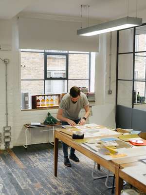
Here Design
London, UK
There are enough bottles of bourbon, rum and gin lying around Here Design’s East End studio to fuel the most raucous of office parties. Yet – in what sounds like the employee’s most-abused excuse – the booze is actually here for research and reference purposes.
Many of these vessels and labels have indeed been thought up by the firm’s designers. Since 2006 – when the studio was founded as a three-person operation by Caz Hildebrand, Kate Marlow and Mark Paton – Here Design’s work has focused mainly on all things food and drink. Now the 40-strong team is taking commissions from small vegetable seed-sellers, alongside big spirit brands.
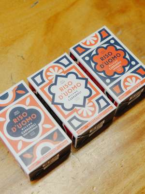
For Hildebrand, also a designer of cookbooks, choosing to specialise in this field felt natural. “As a designer you learn about the world through your work,” she says, pointing to the bright box she made for Milanese rice brand Riso D’uomo. “I would rather design something delicious than design an insurance policy.”
Creating everything from gazpacho bottles to pasta packets made for a particularly stimulating design challenge too. “There’s so much culture, social interaction, constraint and indulgence in food – so the packaging has to talk to at least some of those factors,” says Hildebrand. “But if you’re buying a garden hose you might not need to have such an emotional engagement to it.”
Behind her desk, books on everything from fortune-telling to Soviet posters of the 1970s line the shelves – and illustrate the breadth of influences that feed into every project. Ultimately though, everything begins with research into how each different liquor, jam or chocolate bar is produced; this narrative then informs the choice of pattern and typography. “The purpose for a lot of packaging is storytelling,” she says. “What food packaging shouldn’t do, however, is be more than the content within.”
As the number of small firms building distilleries and roasting coffee grows, brands big and small have discovered the appeal of stressing their small-batch credentials. For Hildebrand and the rest of Here Design, that means constantly reinventing a visual language that stays away from craft-paper clichés. “Words such as ‘authentic’, ‘heritage’ and ‘artisanal’ are overused now,” she says. “The interesting question for independent brands is how to assert those qualities without looking like a copycat.”
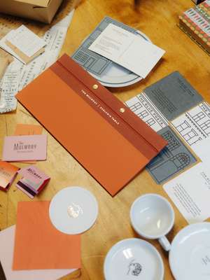
With their 18th-century-style serif type, the coffee cups the team designed for Covent Garden café Jacob the Angel are one canny way of going about differentiation – and so is the dramatic white ceramic bottle they chose for whisky giant Glenfiddich’s high-end line Winter Storm. “Above-the-line advertising is suffering because of social media; all the more traditional ways of marketing are in turmoil. But the one thing that remains steady is the actual product,” says Hildebrand, an embossed bottle of Manchester-made gin in hand. “That means packaging is more important than ever.”
heredesign.co.uk
