Restaurant design / Global
Rooms for improvement
Is there such a thing as a perfect restaurant? No – all sorts of elements add to the mix. That said, our favourite establishments share some confident design-minded details. Here are a few rules of thumb for making restaurants dignified and a pleasure to dine in. Our suggestions aren’t exhaustive or to be treated as an exact recipe but, rather, as a little food for thought. Why, for instance, are we in thrall to sound-bouncing concrete floors and exposed brick walls? Do we need to see the sweat on the brows of chefs? Does communal seating destroy the delight of discreet dining? Read on for our fixes.

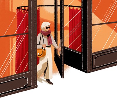
1. Draught dodger
For a warmer welcome
A curving curtain rail that covers the entrance (to curtail a draught from the door) makes a thoughtful first impression. It also makes the berth next to the entrance all the more desirable – nobody wants a gust of cold air from the outside as their dining partner.
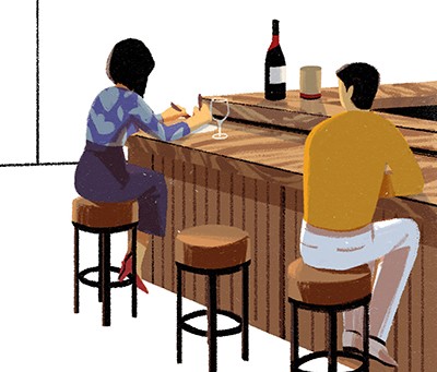
2. Single serving
Accommodating the individual
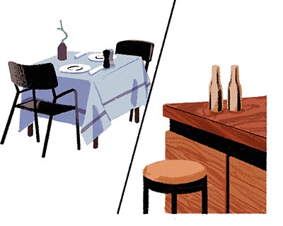
Bar seating adds options for diners, particularly for singletons and those in need of a swift bite (there’s nothing sadder than a table set for two with a single, self-conscious occupant). A view from the bar, either of a kitchen, the dining room or the drinks being muddled, is preferable too.
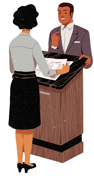
3. Serious reservations
The human touch
A sturdy handwritten reservations book and a person on reception who you can phone are becoming woefully rare. Computers can feel flawed and cold, especially if they’re telling you that your reservation hasn’t been registered; plus, there’s no chance of bagging your favourite spot. We prefer a smart maitre d’, a marble-topped waiter’s station and an inked reservation.
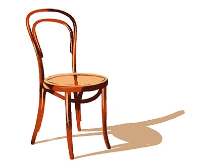
4. Bench mark
For comfort and joy .
We’ve reached peak bench. What happened to the simple dignity of having your own comfy chair? Communal seating feels a bit scholastic and miserly. Though your coat should have been whisked away from you as you arrived, a backrest is a beautiful thing to sink into while you’re enjoying a laidback lunch.
5. Uniform wares
Dressing appropriately .
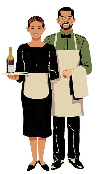
A smart look for staff is essential. Guests shouldn’t be confused with waiters and vice versa. Starchy suits only really work in old-school Italian joints but an elegant breton stripe and an apron looks smart and keeps distinctions clear. An unspoken dress code should also be implied to diners, if only by the surroundings.
6. Zonal defence
Adapting to the event
Different areas are better for different occasions. A chef’s table does wonders when business needs discussing or proposals need making. Informal seating for quick bites and a dining room for diners – à la Zum Schwarzen Kameel in Vienna – allow a restaurant to be different things to different people.
7. Pull it together
Drawing clear boundaries
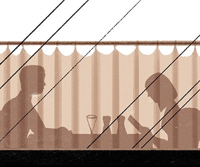
A low, lacy curtain, running the length of a window, shields guests from the gaze of passers-by and creates a barrier between the inside and out. Restaurants should do their utmost to preserve intimacy within but exude a tempting enough glow to pull in punters from without.
8. Booth hound
Providing personal space
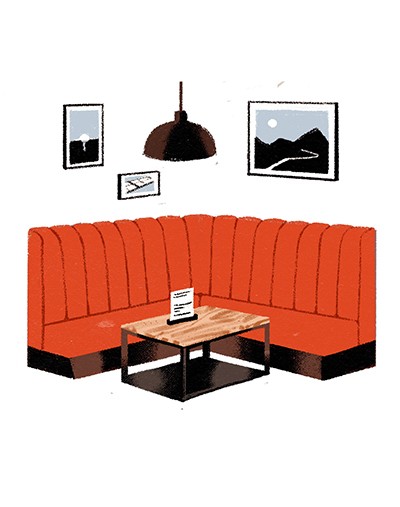
Communal dining, for all of the wispy talk of openness and sharing, is really a cash cow and an excuse for restaurants to cram people in. Booths – or just a spot in the corner – are excellent for privacy; remember sometimes that we eat out to spill a few secrets away from prying eyes.
9. Draw inspiration
The art of good taste
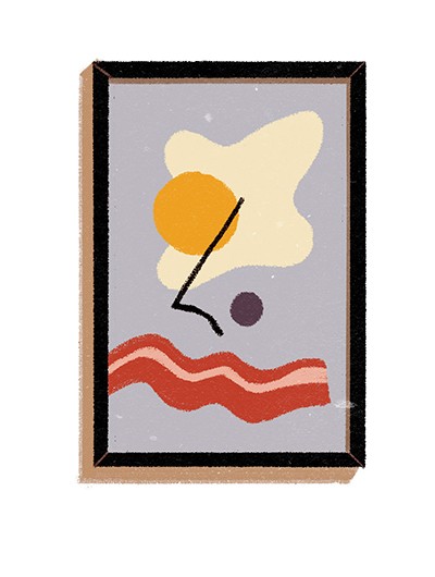
How about a little local art? Not so much that it becomes fussy and distracting but just enough to serve as a reminder that the joint supports its creative residents and has impeccable taste, as should any restaurant worth its salt.
10. Here’s the hook
For ease of access
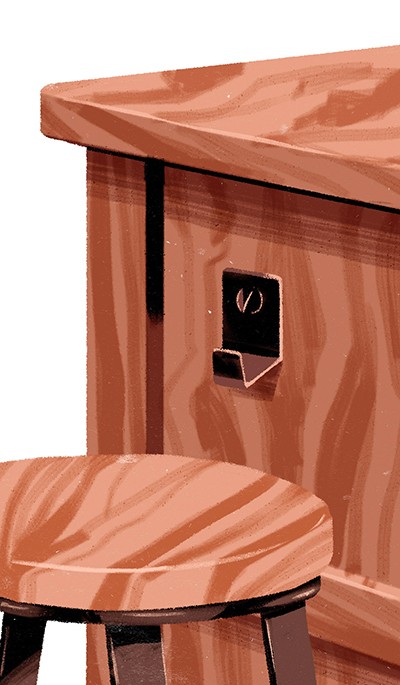
Diners don’t need their jacket draped on the back of their chair but they need their wallet from it to pay, so coat hooks should be close to guests’ seats. Bars can be kept clear of bags with a few judiciously placed space-savers.

11. Service please
Presentation is everything
We want a menu we can see and a short-ish but well-chosen wine list (chalkboards are fine but a copy should be printed and necks shouldn’t need craning to see the specials). If not printed, the menu should at least be handwritten handsomely and legibly.
12. Flush facilities
A not-so-public convenience
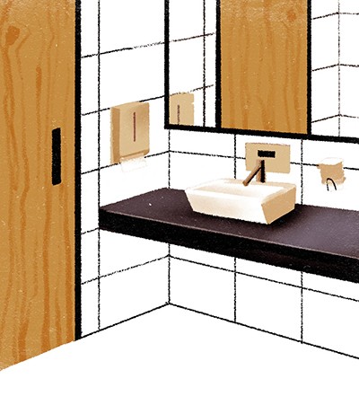
A befitting bathroom is a must. We need a break from the storage-cupboard-turned-water-closet that some rougher around the edges haunts offer. Think clean towels, good soap and hand-cream, plus soft music because... ahem. Also: doors that reach the floor.
13. Under-cover kitchen
Keep it confidential
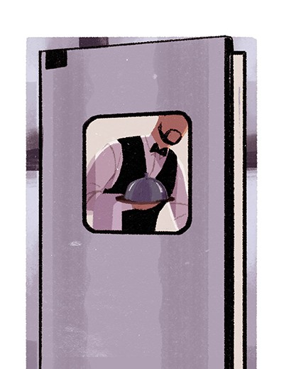
Open-plan has been overdone. How about a kitchen behind closed doors for a little mystery? We don’t always need to see the onions cooking or the industrial-sized squeezy bottles of mustard on the shelves to know what’s going on back there. Plus, stainless-steel and angry, sweaty folks in white overalls don’t always make for the best entertainment during dinner.
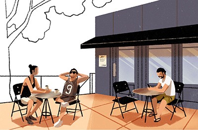
14. Alfresco arrangements
Exploring outer space
We’re partial to an outdoor terrace in which to sun during summer, smoke (after a few too many) or unwind and wait without the indignity of hovering by the door or on the pavement outside. It’s also a useful space for early diners to frequent before a table becomes free or a friend arrives.
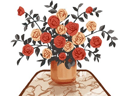
15. Eyes on stalks
A floral arrangement
Fresh flowers in fresh water show attention to detail and add colour. Greenery is good too but certain restaurants have taken it too far with vast fig trees or deathly creepers hanging from the rafters.
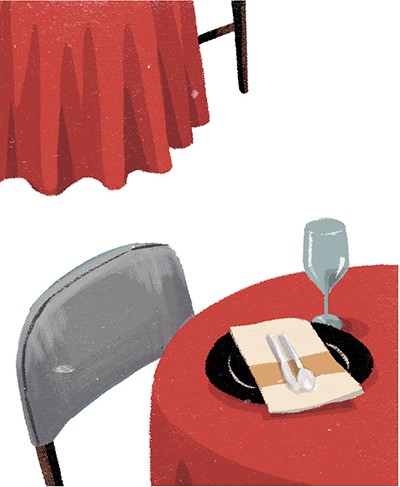
16. Lightness of touch
Adding material value
Dining room textures and tactility should include a little more thought than a brick wall and a hard floor. How about making the most of that old parquet or terrazzo? What about a leather banquet or two? Also good are crisp tablecloths and thick curtains; soft furnishings will help to transform a din into a more agreeable hum.
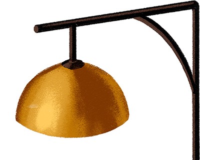
17. Throw shade
For an enlightened environment
Sconces casting a dim, flattering light, or an individual light on every table, keep each nook illuminated. This negates the need for gaudy pendants that make everyone under them look drawn, haunted and gaunt. And no LEDs please.
18. Bright idea
For a sunnier aspect
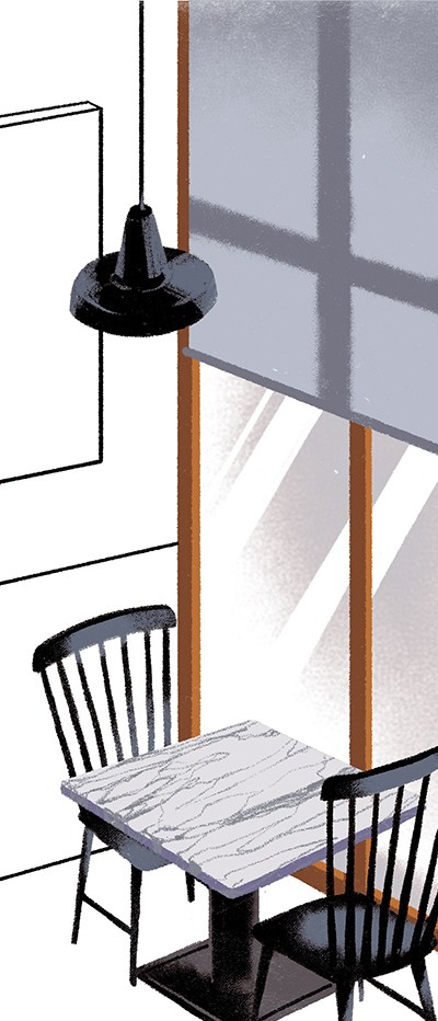
Natural light and clean windows (that imply everything else is looked after attentively) are apt for spaces blessed with the right weather and make for a revivifying early-in-the-day meal.
19. Next level
Sharp descent
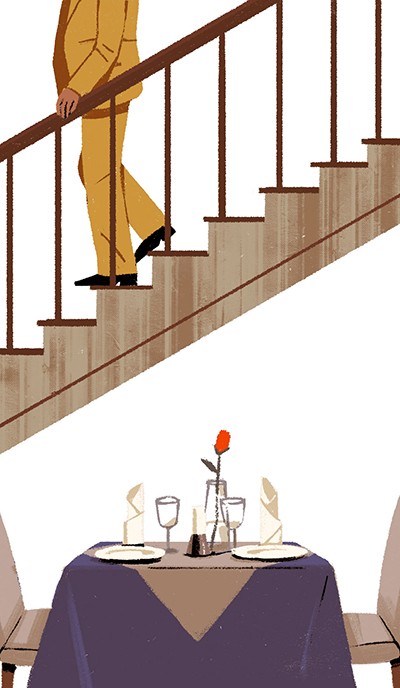
It’s odd how so few restaurants manage to maintain a buzz over more than one floor. In an ideal world, restaurants would work on many levels, with a dimly lit subterranean space that hums after nightfall, an airy ground floor for lunch and, if you’re lucky, a rooftop on which to soak up some rays with something chilled.
20. Covetable collateral
Don’t forget the branding
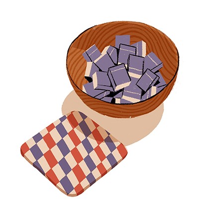
Something as simple and traditional as a book of matches that travels with guests beyond the restaurant is a clever example of free marketing. Likewise, a well-designed beer mat, napkin dispenser and canny logo all help to set a smart tone.


