Five design firms / Global
Made to measure
From a Taiwanese architect reinventing Asian retail design to a family-run wooden furniture maker in rural Germany, we select five design firms to watch (and employ) in 2015.
1- Baag
Buenos Aires
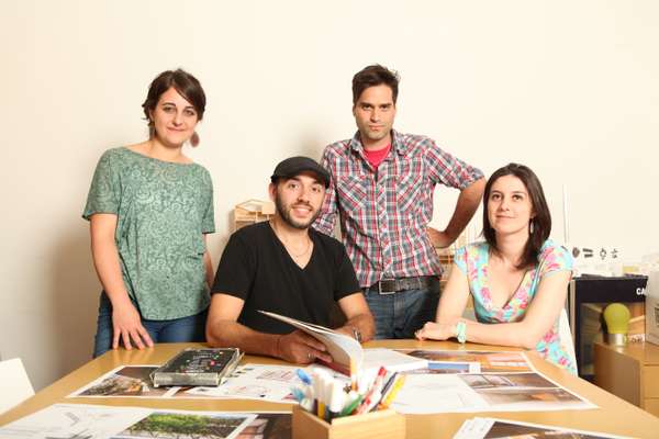
“We brainstorm ideas in workshops and continue to be involved until the build is complete,” says Gabriel Monteleone, partner at Buenos Aires-based architecture firm Baag (Buenos Aires Arquitectura Grupal). “Our methods are different but they allow us to hone our skills and grow as a team.”


All too often the act of architecture ends with a cad file and a set of builders’ instructions. Baag, established in 2007, is rectifying that. It is proving how a hands-on, resourceful approach to building design and project management not only solves the problem of budget constraints but also helps innovate new design solutions.
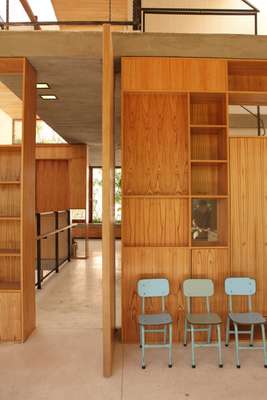
Baag has just nine projects under its belt; the best example of its innovation is the award-winning Casa Scout, a peaceful retreat for a Boy Scout group in a busy area of Buenos Aires. A protective metal lattice covers the building, an idea conceived when a surplus of reinforcement bars used to strengthen breezeblocks from a previous assignment was given a new lease of life. Large cedar-framed windows open fully to provide airflow over the four storeys. The iron grid covering the exterior acts as a framework for a green canopy, planted by the scouts. It insulates during the cold months while letting in winter light when the plants drop their leaves; in summer it offers shade while acting as a noise buffer and providing added security to the building. Spanning 340 sq m, the building is decked out inside with chinaberry wooden panelling.
Monteleone and his three partners – Griselda Balian, Gaston Noriega and Maria Emilia Porcelli – are as committed to the building process as they are to its design. The architects gain first-hand experience by working with materials in a workshop on their studio roof. “We adapt to resources available locally rather than aspiring to unobtainable hi-tech models in Europe,” says Balian. “We reinterpret rudimentary and traditional materials that are then used in new and exciting ways.”
The Baag architects are undeterred by limited funding for certain municipal commissions and seize every opportunity to experiment; they have clear objectives for the future. “We are striving to create architecture that has a place and a context,” says Monteleone. “We approach our discipline as a continual challenge rather than viewing it merely as a succession of completed works.”
2- BVD
Stockholm
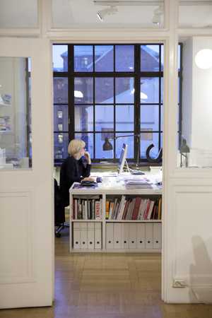
More than anything else it makes financial sense: do something timeless and classic and you’ll only ever have to pay one lot of agency fees. It is the basenote of all Scandinavian design to get it right the first time because it should last forever. That is why, if you had to describe the Stockholm design agency BVD with a single word, it would be “simplicity”. BVD is known for its graphically strong, bold designs for leading Swedish brands. Even its strictly black-and-white offices in Stockholm’s hip Södermalm district follow the same ethos. But arriving at those seemingly simple final results can take months of work.
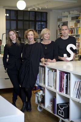
“Simplify to clarify: that is our philosophy,” says CEO and partner Diana Uppman. “When things are complicated we come in to sort them out, define what’s important and put those important things first.”
One of BVD's most successful recent projects is the rebranding of 7-Eleven Sweden, awarded Best of Show at the How International Design Awards in 2014. Senior designer Rikard Ahlberg used the brand’s colours and famous stripes in a new way, giving them a look that was 1970s-inspired with a contemporary edge. “We changed the typeface and applied a new design based on a system of stripes,” says Ahlberg. “The coffee mug was the key; we wanted to make it nice enough to place on a conference table.”
BVD has also worked its magic on brands such as Apolosophy, a cosmetics line developed by the Swedish pharmacy Apoteket Hjärtat; MarisPlus, a German premium Omega 3 product; and, more recently, the Swedish media house MTG. One of its newest clients is Coca-Cola’s Atlanta headquarters. Its plans for the classic drinks brand’s HQ are still a secret but chances are it will be applying its clean signature look, something that has already shown an ability to stand the test of time.
“Most of the things we have produced during our 18-year history are actually still out there,” says creative director Catrin Vagnemark. “It goes to show that investing in good design is sustainable.”

3- Ray Chen
Taipei
In a region where Japan leads the way creatively and Chinese consumer appetite for retail shows few signs of slowing, an unlikely Asian island nation is driving a new direction for retail design. While Taiwan may be better known as a hub for mass-product manufacturing, its geographical position and historical ties with China and Japan have allowed it to establish itself as an incubator where a unique aesthetic and creativity is found.
At the forefront of this change is architect Ray Chen, whose minimalist approach has come to represent a new contemporary-design identity for Taiwan. By bringing together a Japanese sense of style and his interpretation of Taiwanese culture, Chen’s works have gone on to set a global benchmark.
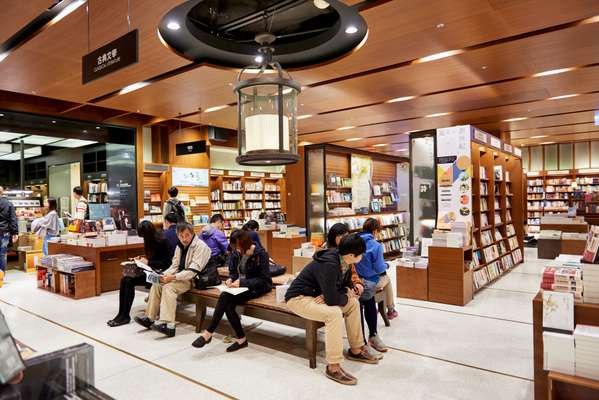
Chen has worked on more than 40 branches of Taiwanese bookshop-and-lifestyle conglomerate Eslite, shops for clothing label Pye and many department stores. He has designed restrained, simple spaces that upon closer examination reveal intricate details such as the use of persimmon wood from trees widely grown in Taiwan. “It is important to create spaces that speak to the brand’s personality while offering customers an authentic experience,” says Chen.
It just takes stepping into Eslite’s Xinyi flagship shop in Taipei to understand what Chen means. It is a giant space but Chen has divided the floorplan into independent sections to reflect the genre of books that sit inside. “For art and architecture I chose black and white, while for history and literature I used wood to reflect the character of libraries. This creates pockets of interest for customers and they’ll be more inclined to explore other parts.”
Over the course of 2015, Chen will continue to work on a full-scale rebrand for China Airlines: a chance to showcase his direction for design on a global platform. This is unchartered territory for Chen but he doesn’t seem to be fazed. “I’m nearly finished with the design for Airbus a350 but there are uniforms, lounges and much more to do. It’s all about marrying the Taiwanese lifestyle with an experience but this time in the air.”
4- Stattmann Neue Moebel
Westphalia
Mass furniture production may still linger on cheaper shores but for Europe’s artisan workshops, signs point to a positive year of growth. The most innovative craftsmen are standing up for themselves, repositioning their workflow and – most importantly – placing artistry and quality first. At the forefront of this is a German company that has turned its century-old business model on its head.
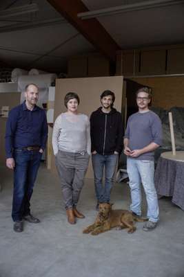
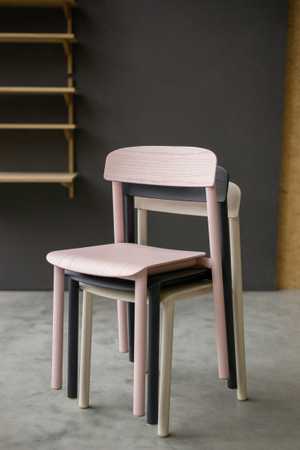
Set among the trees in rural Westphalia in Germany, carpenter Stattmann Moebel had produced beautiful pared-down chairs, tables, shelves and trays for private clients since 1896. So far so good but when fourth-generation owners Oliver and Nicola Stattmann took over in 2012 they decided to ditch the tradition of creating for other firms in favour of producing their trademark pieces under their own label.
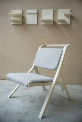
Operating under a mantra of “good design for normal people”, the newly monikered Stattmann Neue Moebel has been able to upscale and prosper through greater exposure to the market. The craftsmanship remains, as does the importance placed on longevity, sustainability and a love of oak and ash. But extra precision – helped by the introduction of cutting-edge milling machines – has given traditional carpentry a contemporary edge that is central to the label’s output.
“We’ve established a new geometry of putting wooden products together,” says Nicola, whose product-design background complements Oliver’s carpentry expertise. “You can assemble our pieces as many times as you want due to the quality of the wood and precise production methods, which includes checking the direction of fibres in the wood to prevent warping.”
With product development and brand distinction high on the agenda, Stattmann recognises two extremes in today’s consumer. “Some want furniture that is as cheap and trendy as possible while others are more conscious of craftsmanship and where the product comes from; it is these people that we want to please.”
5- Techné Architecture + Interior Design
Melbourne
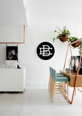
High-scale commercial architecture and interior design and honest, simple craft rarely go hand in hand. All too often, fit-outs are designed with contract furniture and off-the-shelf finishes, built to last but doing little to contribute to the community that will use them. One studio in Melbourne is hoping to dispel this divide. Techné Architecture + Interior Design is committed to bringing the skills of local craftsmen into commercial and hospitality spaces.
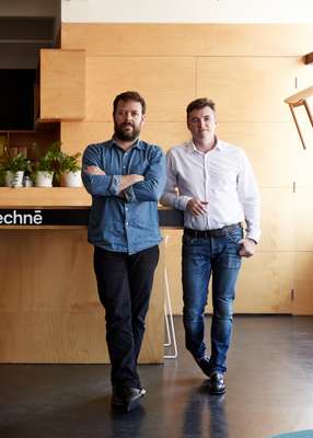
“Techné is Greek and means ‘to make poetically’,” says Techné co-founder Nicholas Travers. “We wanted our name to reflect the act of making architecture, not merely putting up buildings.”
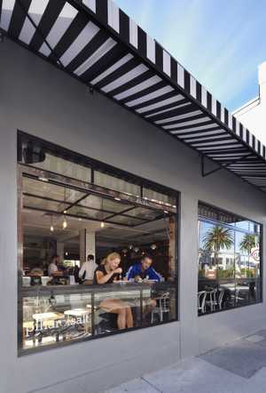
The firm was established in 2002 and now employs 27 design specialists. Most projects are in hospitality, including Pillar of Salt in Melbourne’s Richmond. The practice has extended into retail and education, including a beauty institute and work for the University of Tasmania. Larger-style commercial projects run to luxury car showrooms, with Techné appointed national architect for Porsche Cars Australia.
Despite the scale of some projects, craft is key and every design begins on paper. “I think most designers and architects have come to their craft through a love of drawing and we are no different,” says Travers. His appreciation of classic application extends to furniture, fixtures and lighting design. Local specialist craftspeople are commissioned on most jobs to create individual fittings and finishes; carpenters, blacksmiths, upholsters and stonemasons create one-of-a-kind designs. It is a dedication not often found in commercial spaces at such a premium level.
“Everything we commission is individual, from handcrafted benchtops to light fittings using repurposed materials; everything has to have longevity and purpose,” says Travers. It is a new step for his profession and sets a bold example that others should follow. “Practitioners are being bold conceptually and working hard to achieve local relevance through materials and cultural references in their work.”


