Future of the font / Berlin
Man of letters
Erik Spiekermann’s P98a studio has become a leading light in printing methods and typographical history. Here he casts his eye over the industry’s future in the face of changing tastes and technology.
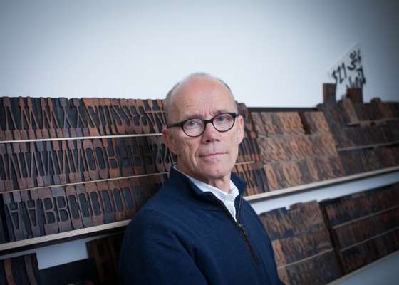
Tucked into a lush courtyard on Berlin’s Potsdamer Strasse is a gallery that is vastly different from the white cubes for which the artsy street is otherwise known. The first thing visible through its windows are not artworks but fantastic sets of wooden letters displayed on a long wall.
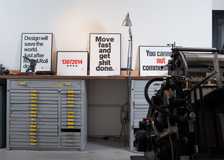
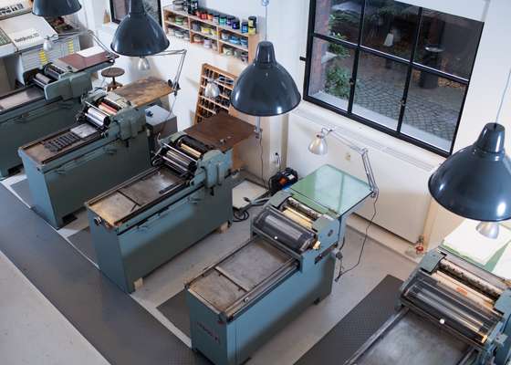
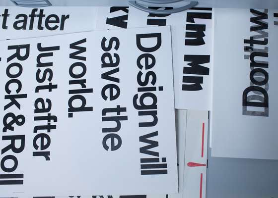
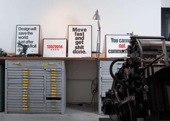
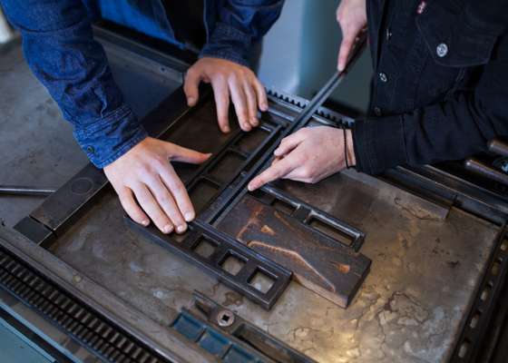
P98a is the name of acclaimed typeface designer (and self-professed “typomaniac”) Erik Spiekermann’s letterpress workshop. Opened in 2013, it’s not a public gallery per se but a meeting place for those interested in analogue typography and old-school printing methods, as well as a place for Spiekermann to tinker. Inside, heavy press machines wait for the designer – or on this occasion two young fellows from the Pasadena Art Center College of Design – to brush on some ink and print. Flat-file drawers teem with hundreds of smaller hot metal typesettings in Akzidenz or Bodoni; posters sport aphorisms such as “You Cannot Not Communicate”.
Spiekermann is famous for his hi-tech type – he’s designed a multitude of popular typefaces, created the look for The Economist and was the first to sell fonts online. But the energetic 67-year-old first learned typeface design, typesetting and printing the traditional way. His workshop uses methods dating back to Johannes Gutenberg: using moveable metal or wood Hochdruck (raised) letters inserted into German or Swiss-made handpresses. “My two missions are to preserve this old machinery, the product and abilities – being able to print, typeset, cut letters and bind books are dying crafts – and to bring people back to themselves again,” says Spiekermann.
Now is the perfect moment for the latter. Spiekermann sees the “maker” movement in full swing. In response to the world’s over-digitalisation (especially, he says, since smartphones were invented in the late 2000s) there is a yearning for handmade and bespoke things but also a drive to preserve centuries-old skills. The increasing popularity of letterpress printing is just one aspect of this. “The trend comes from the United States,” says Spiekermann, who has just returned from his design office in San Francisco. Demand there for handprinted products – as well as hands-on, physical work – has been growing since the turn of the decade, with graphic designers setting up small businesses making greeting and business cards, invitations, editioned books and more.
“They’re rescuing the old machines but not using the old type,” says Spiekermann. “They’re designing the letters on the computer then cutting them in polymer plastic, which lasts much longer than the older types of cliches,” he adds, dropping in a bit of jargon (a “cliche” is a printing plate).
On his trip, Spiekermann stopped in Wisconsin to have one of his own typefaces designed on screen and cut in wood. Spiekermann sees no problem in mixing technology and craft. “The typefaces I can get on screen are so beautiful and perfect. Why should I throw that away and pretend that computers don’t exist?”
The market for letterpress items and handbound books might be niche but, according to Spiekermann, it is deep. In cities from Seattle to Berlin the number of independent bookshops has been slowly increasing in the past two or three years. The nostalgia spills over into aesthetics: many small publishers (notably those in the art-world press such as Berlin-based Sternberg) have been switching from Helvetica to serifed “old fashioned” fonts, which are both easier to read and add, Spiekermann says, a “bit of noise” to a typeface. That ambient noise adds warmth like the atmospheric background in a musical recording and is a good thing.
And the future of typeface design itself? Spiekermann initially claims he can’t predict anything. “A lot of typefaces were defined in the 1470s in Venice. Garamond came in the 1560s. Bodoni made thin, fine, letters in 1800. It hasn’t changed,” he says. “All Helvetica did was leave the trimmings. Is there any place to go from that? No.” But after some thought (while talking rather animatedly throughout; he says he works ideas through while speaking), he crystal-balls the typography world after all. There is no end to the variations on typefaces, he decides, and designers from around the world will continue to create type to express themselves to best suit different languages, to communicate the messages of companies and clients.
Could there be a finite number of fonts? “Is there a finite number of books?” he asks. “There are just a few plots for books or movies – the western, the comedy, the drama – but that doesn’t stop people from writing stories. Even if the market doesn’t need any more typefaces – about 250,000 exist now – people would still make them.” The typeface market also has potential: only 25 to 30 per cent of websites worldwide use non-system fonts (an operating system’s primary typefaces).
In the end it’s about people. The nostalgia “trend” will likely even itself out soon (a trimming back of the hipster beard, perhaps) but Spiekermann is convinced that typography design, books and even text read on our multiple small devices will all return to considering very human constraints, needs and comfort levels. “I think we’re just going to where we were before,” he says. “Small screens are getting bigger, big screens are getting smaller and you know what? It’s going to end up looking like a book. We found out 500 years ago that the book is the optimal size for reading,” he says. “The best size for a page is the spread of my hand,” says Spiekermann, holding a spry example in the air. “You put 50 characters in a column and you have your point size, and each language has its own easiest fonts. That all defines it. The eye, the hand, the language. Not technology.”
That sees us return to Spiekermann’s broader mission of bringing us back to basics. Even though we are reading more than ever on a wider range of technologies using thousands of typefaces and fonts, we can’t and shouldn’t forget where we came from. And while a typomaniac can design a beautiful new typeface (a process Spiekermann likens to composing a symphony) he can’t reinvent the alphabet.

