Report / Global
Letters from home
We meet the makers and painters continuing the aesthetic legacy of their cities, creating and preserving signs with gold leaf, ochre-white paint and neon tubes.
The letters that are emblazoned onto our shops, cafés, cinemas and markets are often overlooked when in fact these commercial signs shape the identity of our cities. They are visual architecture, often every bit as interesting as the buildings they adorn. Whether it’s the neon swirling letters of Helsinki, the delicate handpainted watering holes of 1940s Amsterdam or the hand-soldered brass forms of Genoa, signs tell the story of a city. Too often the unique lettering that was created for the pharmacies, funeral parlours or hardware stores of the past is scrubbed out or boxed in under ugly, ill-thought-out replacements when a building or business is renovated. Here we meet the sign-painters, typographers and city-planners reversing this trend and heading a movement to preserve, protect and champion the rich layers of lettering in our cities.
1.
Visual memory
Genoa
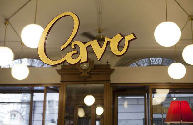
Genoa is home to an enviable mix of architecture, with palazzos and churches set in renaissance, gothic and baroque styles. Yet on closer inspection a similar diversity is seen on shopfronts where signs advertising businesses are composed in a variety of letterforms. Cavo, a fifth-generation pastry shop, has gold-leaf lettering in austere Roman script above its entrance, while its door boasts an elaborate cursive font at eye level. Panino vip, a simple sandwich shop, has a sign with a traditional forest-green background and yellow characters in two shades to mimic a sandwich’s layers.


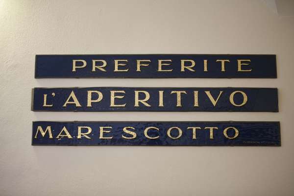
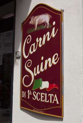

These distinctive works of graphic design are an essential element of the city’s urban decor and belong to a larger tradition once widely found throughout Italy. “These are signs done by hand without recourse to computers or digital fonts,” says James Clough, author of Signs of Italy, a book that documents the country’s abundant treasure trove of typefaces in public spaces.
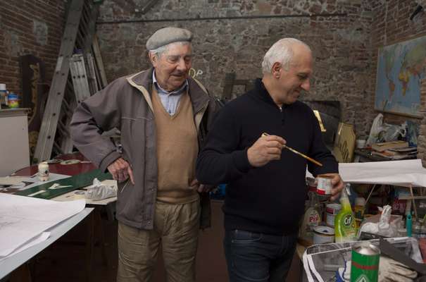
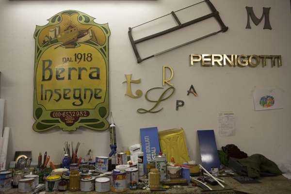
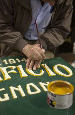
Much of the signage in downtown Genoa is the handiwork of one man: Alberto Berra. Over his long tenure the 88-year-old artist has relied on little more than a brush and a steady hand to paint on aluminium sheets. His creations often reference art nouveau lettering and scripts such as Uncial seen in Greek and Latin.
“We don’t use set fonts; it comes from memory. We try to give each sign a certain uniqueness,” says Berra, flipping through the invoice book his father kept with hand-drawn sketches for clients. Orders started in 1918, the year his family’s business began.
For fancier jobs, clients opt for 22k gold leaf on glass. “It’s a delicate job; if you breathe the gold blows away,” says Germano Romeo, a one-time Berra employee who has taken over the reins of the company from his mentor. Romeo demonstrates by stroking a brush against his cheek to give it a static charge and placing it over a wafer-thin gold foil, which jumps onto his brush. He cuts strips into curving lines for a “C”. “The imperfections give it character. You’ll never get the same from mass production.”
While sign-making in Italy is on the decline, Romeo is seeing a revival in Genoa. Orders from shops and restaurants show they still want to make a good impression. “People are attached to the old ways. These signs add a bit of personality.”
Font of fancy
A typographer and designer from Berlin, Verena Gerlach has always loved letters – in fact, she took a job at an art-house cinema as a teenager just so she could change the marquee sign. In the 1990s Gerlach began more closely examining the hand-lettered signs she had always noticed on east Berlin’s buildings, especially those in the Prenzlauer Berg neighbourhood, which largely survived the Second World War’s destruction and western capitalism’s sleeker signage. “The economy of scarcity of east Berlin had conserved the most beautiful, hand-painted letterings from before the First World War,” she says. Mostly made between 1900 and 1940, the signs displayed what products or services were available within small businesses, as well as company nameplates or posters.
Gerlach documented the signs and created a typeface called Karbid (a reference to the many signs for coal she found; some Berlin apartments are still heated with it), adopting and adapting elements from the façade letters. A font with vaguely art deco elements, bold lines and the occasional flippy serif, Karbid has been available since 1998; in 2011 Gerlach did a full redesign, greatly expanding the variations using improved technology. In 2013 a book documenting its process – and the fascinating photographs Gerlach took in east Berlin’s centre – was released through French publisher Ypsilon Éditeur.
2.
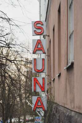
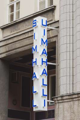
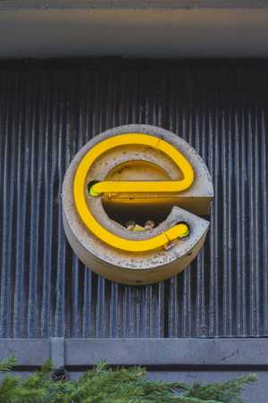
Fading of the lights?
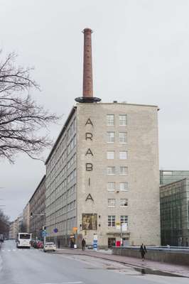
Helsinki
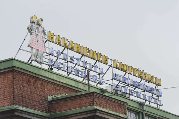
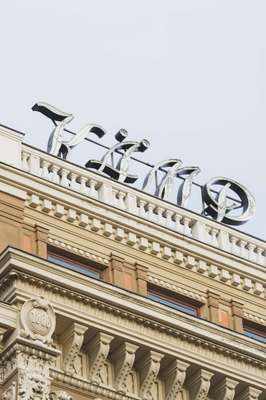
As dusk sets in on a cold Friday afternoon in central Helsinki, the grey, wet streets turn into a beautiful urban sea of colourful lights. The city is sprinkled with neon signs from different eras. Hakaniemi Square in Kallio would feel empty without the famous blue 1914 sign on the roof of the market hall advertising “Asusteita ja elintarvikkeita” (accessories and groceries), while Fazer’s art deco sign in chrome-and-blue neon tubes from the 1920s makes this café the heart of the Kluuvi shopping district.
Helsinkians returning home by ferry would feel lost if they weren’t greeted by the iconic Palace Hotel sign in the south harbour; it’s visible from the sea thanks to its classic serif block letters glowing in the night. Most people take these beacons for granted but their existence often hangs by a thread: almost none of the signs are protected, many have disappeared and the fate of the logos and symbols that remain depends on the goodwill of private landlords.
Now a movement to preserve and protect the city’s typographical heritage is gathering momentum. One of its main voices is Lauri Jääskeläinen, director of Helsinki’s Building Control Department, who sees the signs as an important part of the cityscape. Growing up in Helsinki in the 1950s and 1960s, he vividly remembers how they shaped his perception of the city. “I learned how to read by looking at them; they were fascinating and I wanted to understand what they said,” he says. “They started disappearing in the 1970s and 1980s. We’ve previously tried to force property owners to protect them with laws and permission but that required a lot of work and the results were meagre.”
Jääskeläinen believes the best way to preserve the city’s signs is by convincing their custodians of the positive historic value they represent. As old-style neon signs often require maintenance, many see them as an unnecessary cost but Jääskeläinen urges business owners to think about the image they project, even if that does mean having another brand’s name in lights.
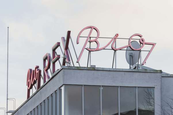
Helsinki’s inhabitants would seem to agree. When the city’s main daily newspaper, Helsingin Sanomat, asked its readers to vote for their favourite neon sign, answers poured in. Readers described the signs as magical landmarks and popular meeting places, and many remembered classics from years ago. Among the still-existing signs, the 1930s restaurant-cinema-and-shop complex Lasipalatsi was a clear favourite. Many of its iconic signs, such as the red-and-green “Bio Rex” for the cinema, were designed by the building’s architects Viljo Revell, Heimo Riihimäki and Niilo Kokko. “Few of the signs in Helsinki are protected but actually Lasipalatsi’s neon ads now are; the city-planning office decided on it,” says reporter Kaisa Hakkarainen, who initiated the vote together with Jääskeläinen.
Private initiatives to save the signs are also popping up. One of the city’s most enthusiastic neon activists is Ilkka Kärkkäinen, an art director and owner of advertising agency Dynamo & Son, which started a blog documenting classic signs three years ago. “During that time the interest has increased,” he says. “It’s possible that in the current economic crisis we have here in Finland, people feel it’s safe to go back to something that has always existed.”
The sign causing the most heated debate at the moment is the famous Palace logo on the roof of Eteläranta 10, a building originally designed as a hotel for the 1952 Helsinki Olympics by architects Viljo Revell and Keijo Petäjä. Today the building is the headquarters of the Confederation of Finnish Industries and an upcoming façade renovation threatens the classic sign. “We think it’s vital to save the Palace sign and have recommended protecting it,” says Jääskeläinen. “The City Museum is also working on it. But it’s a privately owned building so we’ll have to wait and see.”
With a preservation movement gaining pace, signs like this one – the building blocks of the city’s identity – may well be saved by their alluring and bright power. — ena
Word on the street
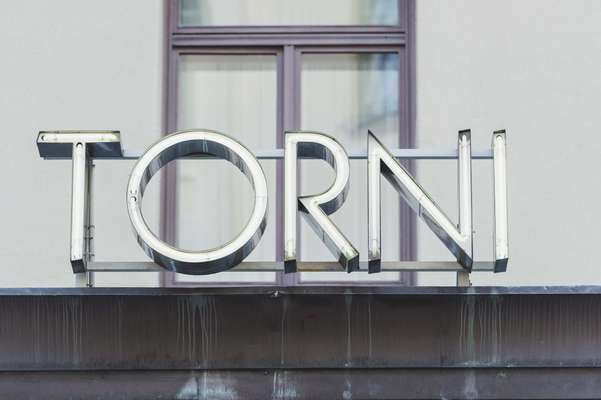
Ilkka Kärkkäinen organises tours around Helsinki, showing other aficionados the street signage he loves: a voluptuous 1950s pink-neon logo that spells “Sabrina” in cursive handwriting for a shop selling women’s lingerie; a 1930s stone-mosaic sign in the pavement by the entrance of Hotel Torni in Kamppi; an impressive iron gate with the building’s name “Suomela” in thick art-nouveau-style letters in Kruununhaka; and a 1903 ornamental yellow-metal sign for Signora Delizia, a coffee shop in Katajanokka
3.
Perfectly preserved
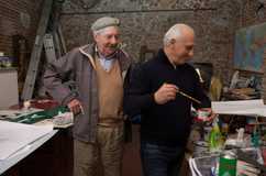
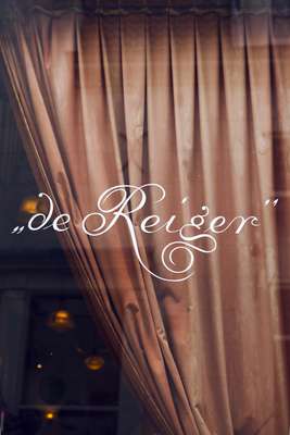
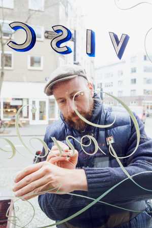
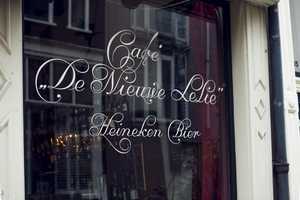
Jasper Andries pulls up in front of Amsterdam’s newly opened Viscafé De Gouden Hoek (The Golden Corner) on a custom-made cargo bike. He adjusts his beret, opens his blue toolbox, takes out a tub of ochre-white paint and begins to trace his brush across the glass, creating the curling, gregarious angles of the traditional Amsterdamse Krulletter. This lettering was once common in neighbourhoods such as Jordaan and De Pijp. “It’s the oldest way to advertise,” says the bearded illustrator-turned-sign-painter. “The challenge with the Krulletter is getting the balance right.”
Typically associated with the city’s brown cafés on whose windows it started to appear in the 1940s, the Krulletter was fathered by Jan Willem Joseph Visser. Bars across Amsterdam bear his signage, from the city’s oldest tavern Café Karpershoek to the wood-panelled Café Hegeraad. Over the years, many of the ornate letters have worn off or been replaced; no one seemed to understand their value until sign-painter Leo Beukeboom came along. Then he took over where Visser left off, touching up or adding to the old master’s work on Heineken’s payroll; it had been the Dutch brewery’s way of advertising.
“I just needed to see the letters, get the rhythm and the feeling, then I could do it,” says Beukeboom as he explains his method for reviving the Krulletter in the 1970s. “I’d stand outside the window painting my letters and inside there would be 50 people drinking beer. They would think I was only paying attention to my letters but I’d see everything. I watched them watch me.”
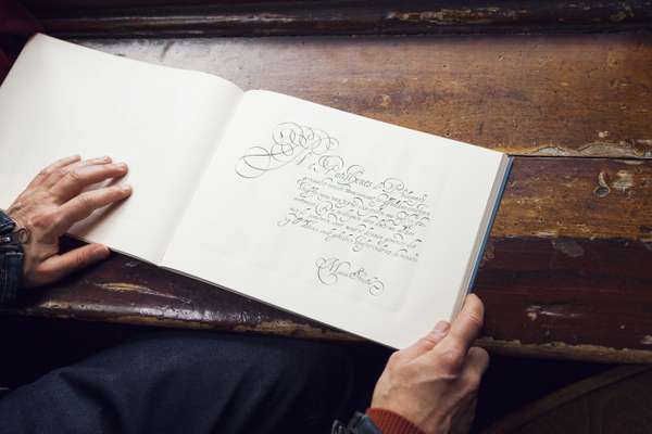
When Beukeboom retired in 2003 the Krulletter’s fate hung in the balance. That’s when another champion, Ramiro Espinoza, stepped forward. “The letters quickly caught my attention when I moved to Amsterdam,” says the Argentinian type designer and author of De Amsterdamse Krulletter as he passes the overgrown sign at Café T Smalle, where he first encountered the style. “The more I discovered, the more I felt the responsibility to keep this tradition alive. These things make the city unique.”
Espinoza tracked down Beukeboom and spent hours delving through archives. He found that this particular script was inspired by the late cancellaresca style – which calligraphers practised during the 17th-century Dutch Golden Age – as documented in a book by engraver Pieter van Looy Jr that Visser came across in his father’s workshop. “The letters Visser created bear the distinctive features of the Baroque quill,” says Espinoza. “They’ve resisted the test of time and have been appropriated by Amsterdam’s citizens as a true expression of their culture.”
Write on
The Krulletter is not the only letter style synonymous with Amsterdam: even more prominent is the Amsterdamse Brugletter. Created for the city and modelled on the 20th-century Amsterdam School movement, steel nameplates bearing Brugletters adorn hundreds of bridges across the capital. Yet unlike the Krulletter, this style’s inventor remains a mystery. And while the curly letter’s future is cloudy at best, the city is invested in upholding the bridge lettering that’s deemed a national heritage.
